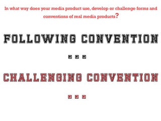
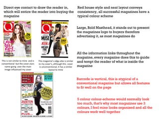
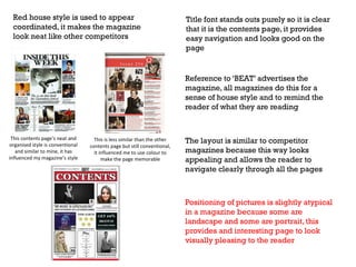
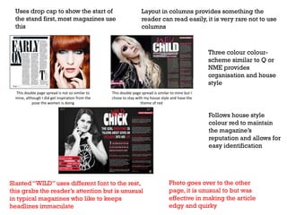
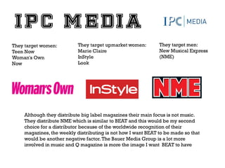
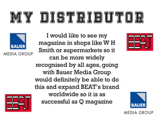
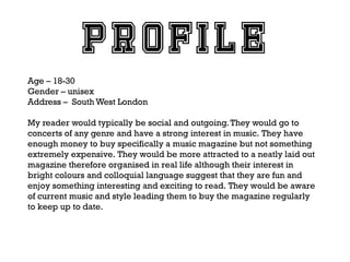
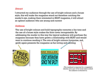
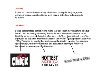
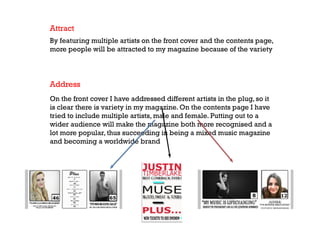
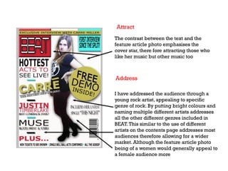
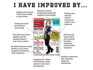
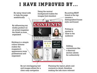
My magazine is…
In what way does your media product use, develop or challenge forms and
conventions of real media products

?
Direct eye contact to draw the reader in,
which will entice the reader into buying the
magazine

Red house style and neat layout conveys
consistency, all successful magazines have a
typical colour scheme
Large, Bold Masthead, it stands out to present
the magazines logo to buyers therefore
advertising it, as most magazines do

This is not similar to mine and is
conventional but the cover stars
name going over the main
image influenced my cover

This magazine’s edgy vibe is similar
to my cover’s, although this cover
is unconventional, it has a similar
layout to mine

All the information links throughout the
magazine, every magazine does this to guide
and tempt the reader of what is inside the
magazine

Barcode is vertical, this is atypical of a
conventional magazine but allows all features
to fit well on the page
5 colour colour-scheme would normally look
too much, that’s why most magazines use 3
colours, I feel mine looks organised and all the
colours work well together
Red house style is used to appear
coordinated, it makes the magazine
look neat like other competitors

Title font stands outs purely so it is clear
that it is the contents page, it provides
easy navigation and looks good on the
page

Reference to ‘BEAT’ advertises the
magazine, all magazines do this for a
sense of house style and to remind the
reader of what they are reading

This contents page’s neat and
organised style is conventional
and similar to mine, it has
influenced my magazine’s style

This is less similar than the other
contents page but still conventional,
it influenced me to use colour to
make the page memorable

The layout is similar to competitor
magazines because this way looks
appealing and allows the reader to
navigate clearly through all the pages

Positioning of pictures is slightly atypical
in a magazine because some are
landscape and some are portrait, this
provides and interesting page to look
visually pleasing to the reader
Uses drop cap to show the start of
the stand first, most magazines use
this

Layout in columns provides something the
reader can read easily, it is very rare not to use
columns

Three colour colourscheme similar to Q or
NME provides
organisation and house
style
This double page spread is not so similar to
mine, although I did get inspiration from the
pose the women is doing

This double page spread is similar to mine but I
chose to stay with my house style and have the
theme of red

Follows house style
colour red to maintain
the magazine’s
reputation and allows for
easy identification

Slanted “WILD” uses different font to the rest,
this grabs the reader’s attention but is unusual
in typical magazines who like to keeps
headlines immaculate

Photo goes over to the other
page, it is unusual to but was
effective in making the article
edgy and quirky
?

wd
Ho

r
ou
sy
oe

dia
me

u
od
pr

t re
c

t
en
res
p

p

rtic
a

lar
u

ial
c
so

s
up
gro
Her pose connotes attitude
giving other people of her age
the ability to think that they
could be as care free and wild
as her

Young female in the
image is edgy and
represents a young
adult woman that is
current. The black
and white
photograph
suggests something
classic, this
presents someone
who is timeless
therefore
representing a role
model and an
inspiration
The “WILD” highlights the
middle class people who would
speak in the casual tone this
magazine has. It connotes that
the feature girl has a typical
rock life that people only
dream of, therefore making
them want to continue reading

Use of colloquial language and
exclamations represent someone
young and humorous, the article
being about someone so outgoing
means the language has to match
therefore representing the fun
loving people that would buy the
magazine
The assumption of
“everyone” talking about this
artist creates a confident vibe
that represents every gender
and that they need to read
this article because
“everyone” else is
Her leaning forward creates an
attitude but is then smiling to
seems more approachable
connoting someone down to
earth, she expands the
audience and represents
someone more relatable

This album cover represents
someone more indie and the
colours connotes a calm tone
relating to more laid back
readers, this means the social
group represented by the
magazine is being expanded to
not only pop and rock but more
contemporary artists too
The “posh girl” represents a higher class
audience because of her reputation as
someone presentable and a role model
to those who want to be such a
respectable artist in the music industry,
she is a typical pop star so she will
automatically make the magazine
represent her fans

This is the only male on the contents
page and therefore represents men.
Because he has attitude and looks so
careless he also represents a current,
middleclass genre. The black and white
connotes a classic tone but also makes
the artist seem rough. The fact he isn’t
smiling represents a more serious
audience and entices the reader into the
reason as to why he looks so troubled
The five stars represents
quality and people who are
serious about listening to
good music. The quote “I
wrote my heart” represents a
softer more intense music
reader that would read the
magazine because of the
high quality content, maybe
attracting both upper and
middle class

The discount jumps out the
page to represent everyone
middle class who are looking
for something slightly
cheaper. The exclamatory
sounds exciting and
represents a positive group of
people who want to read
something upbeat in the
magazine
Overall, BEAT magazine tries to represent a wide variety of
social groups to expand the amount of readers. From middle
class to a slightly higher class my media product represents
them through a variety of genders featured in the magazine.
The use of colloquial dialect is aimed at a more laid back, care
free social group. The red colour scheme is bright and bold
although it doesn’t connote luxury it connotes happiness and
excitement which again represents every gender who are
middle class. The neat layout emphasises something easily
read and organised and that will represent every social group
who want something to read and enjoy which generally is who
my magazine strive to represent
te
itu
t
ins
ia
ed
of m y ?
ind
wh
tk
ha
and
W
uct
rod
p

t
gh
mi

ibu
istr
d

you
te

dia
me
r
It produces several music channels that fit into the genres included in my
magazine, which include:
4Music
The Box
Heat
Kerrang!
Kiss
Magic
Smash Hits
It distributes Q magazine which is a competitor of BEAT and because Q is so widely
known and has such a wide audience I think my magazine would be able to do the
same, and I think it deserves a worldwide recognition. It distributes monthly and that
is the frequency I would like BEAT to be distributed. The music channels Bauer Media
Group produce are what I feel would be the sort of music included in BEAT, it is
definitely the direction I feel BEAT should go in
They target women:
Teen Now
Woman's Own
Now

They target men:
New Musical Express
(NME)

Although they distribute big label magazines their main focus is not music.
They distribute NME which is similar to BEAT and this would be my second
choice for a distributor because of the worldwide recognition of their
magazines, the weekly distributing is not how I want BEAT to be made so that
would be another negative factor. The Bauer Media Group is a lot more
involved in music and Q magazine is more the image I want BEAT to have
I would like to see my
magazine in shops like W H
Smith or supermarkets so it
can be more widely
recognised by all ages, going
with Bauer Media Group
would definitely be able to do
this and expand BEAT’s brand
worldwide so it is as
successful as Q magazine
Wh

uld
wo
o

h
et
b

e
nc
die
au
e

u
yo
for

dia
me
r

rod
p

ct?
u
Age – 18-30
Gender – unisex
Address – South West London
My reader would typically be social and outgoing. They would go to
concerts of any genre and have a strong interest in music. They have
enough money to buy specifically a music magazine but not something
extremely expensive. They would be more attracted to a neatly laid out
magazine therefore organised in real life although their interest in
bright colours and colloquial language suggest that they are fun and
enjoy something interesting and exciting to read. They would be aware
of current music and style leading them to buy the magazine regularly
to keep up to date.
90% of people chose
casual and humorous,
this connotes a young
laid back vibe which is
my target audience

100% said laidback, this
is typical of someone
young and into music
which is the audience
BEAT appeals to most
60% said columned, this
suggests that my magazine
can appeal to those who
like a neater higher end
style. My magazine would
definitely not be scattered
and have a rock vibe
because that is the opposite
direction of my audience

The 50/50 result shows
the diversity of my
audience and how many
different genres BEAT can
appeal to e.g. those who
are indie and artistic or
those who like pop and
bright colours
I have done research into my audience’s class and at first did not think they were
part of the typical working class group. I think that they are more culturally aware
and know about what is happening other than the mainstream knowledge seen in
gossip magazines and the front-pages of newspapers like “The Sun”. So I then
stumbled upon the BBC website and found out my audience can be considered to
be in these rising groups of classes…

The link to the webpage - http://www.bbc.co.uk/science/0/21970879
New Affluent Workers: This class has medium levels of
economic capital and higher levels of cultural and social
capital. They are a young and active group.
Emergent Service Workers: This new class has low
economic capital but has high levels of 'emerging' cultural
capital and high social capital. This group are young and
often found in urban areas
u
yo
did
ow
H

u
yo
ess
dr
/ad
act
r
att

r

die
au

?
ce
n
Attract
I attracted my audience through the use of bright colours and a house
style, this will make the magazine stand out therefore catching the
reader’s eye, making them interested in BEAT magazine, it will attract
an upbeat audience who are young and current

Address
The use of bright colours and bold typography connotes a fun tone and
the use of a house style makes the front cover recognisable. By
addressing the reader in this way the typical audience will purchase the
magazine because they have grown a relationship with BEAT and would
want to continue reading it. The mix of bright colours (turquoise, red,
gold) again presents the magazine as fun loving and exciting

(The masthead is important for a magazine’s
identity and is part of the house style in which
the audience is attracted to)
Attract
I attracted my audience through the use of colloquial language, this
attracts a young casual audience who have a light-hearted approach
to music

Address
I used exclamatory sentences to make the text seem more exciting and fun
rather than serious, addressing the audience like this makes them more
likely to be interested. Also, the play on words “blood, sweat and tours” is a
light joke to uplift the mood and address the reader in an approachable way.
“Wild” creates an edgy vibe, addressing the reader, making them see an
quirky image, this typical attitude of a rock artist draws the reader in
because it’s the carefree life they want.
Attract
By featuring multiple artists on the front cover and the contents page,
more people will be attracted to my magazine because of the variety

Address
On the front cover I have addressed different artists in the plug, so it
is clear there is variety in my magazine. On the contents page I have
tried to include multiple artists, male and female. Putting out to a
wider audience will make the magazine both more recognised and a
lot more popular, thus succeeding in being a mixed music magazine
and becoming a worldwide brand
The contrast between the text and the
feature article photo emphasises the
cover star, there fore attracting those who
like her music but other music too

Address
I have addressed the audience through a
young rock artist, appealing to specific
genre of rock. By putting bright colours and
naming multiple different artists addresses
all the other different genres included in
BEAT. This similar to the use of different
artists on the contents page addresses most
audiences therefore allowing for a wider
market. Although the feature article photo
being of a women would generally appeal to
a female audience more
b
nt a
r
lea
u

o
ey
hav t?
c
hat
du
W
ro
sp
thi

e
ut t
o

lo
no
ch

o
s fr
gie

th
m

f
so
s
oce
r
ep

in
uct
r
nst
co

g
The right image
looks better

I created a small amount of Bevel and
Stroke to make the masthead jump out
of the cover and catch the readers
attention, making the outline darker
creates an image that stands out
Hold on the
ellipse tool

Set the colour gold,
press the paint icon and
…

… click in the circle
to create this

Add the text and
create a shadow

I chose to do this to balance out of the front cover page and catch the
readers eye so they see something good on offer, the gold connotes
quality and the exclamatory provides an exciting tone
To achieve an immaculately aligned
layout I had to line up all of the plug. I
pressed onto view and clicked grid

I then compared it to another
magazine and lined that up to see
how much space the plug should
take up

By looking at another
magazine I concluded that
I should only go as far as
the width of the mast head.
Now it looks neat and I
measured it so all other
plug was aligned therefore
creating the neat layout I
wanted
I put the images on to the
contents page by selecting open

I just continued
until the whole
page was full

The find and select the picture
you would like to insert

The more pictures I
added the more
my contents page
looked real
To create the stars I
pressed the
custom shape tool

I then selected
the snowflake
because it was
the closest thing
to a star
And selected 5 to create
and album review look
el
fe ll
u
ou f
y e
o th
d
o
at t
h it
w
k, om
as fr
t
y ion
ar ss
in e
im gr
el o
t?
r r
p p
uc
ur he rod
p
yo t
n
at t i
ck arn
ba le
g
in ave
k
oo u h
L o
y
We first had to make a school magazine before we made our music magazine and I
have made vast improvements over the period of creating my media product
Aligning the plug so
it’s the same length
to look neater

Using the neutral
background makes the
magazine look sleeker

Linking the fonts
so they don’t
look messy

Putting more
relevant
content
making the
reader more
informed

Planning the
layout, photo
and contents,
therefore
making an
overall better
magazine

The photo has better
lighting and the
shadow makes it
look more in place
By influencing my media
product on an actual
magazine the finish is
more organised
Cropping the edges
of the feature article
photo to look more
professional

Adding conventions
like a barcode
allows for
authenticity
By using visual aids
to help the page
aesthetically

Using the neutral
background makes the
images/text standout

By influencing my
media product on
an actual magazine
the finish is more
organised

Sticking to a simple
colour scheme
makes the
magazine’s
appearance more
professional and
organised

By not overlapping text
and images allows for a
clear easy navigation

By putting BEAT
brand at the top
creates a
distinguished house
style and brand

Putting in
quotes to
draw in the
audience

Adding
conventions like
a discount
section allows
for authenticity

Planning the layout, photo and
contents in detail, therefore
making the info more relevant
The right is more professional, uses better fonts and is sectioned
to be like a real magazine. The colours are also more organised
The image on the right has more of an impact on the reader and looks
like a genuine singer, it has better lighting and fits nicely on the page
The right is bolder and stands out more to draw the reader to the
magazine, it is also neater and more compact therefore looking
more professional

Media evaluation

  • 3.
  • 4.
    In what waydoes your media product use, develop or challenge forms and conventions of real media products ?
  • 5.
    Direct eye contactto draw the reader in, which will entice the reader into buying the magazine Red house style and neat layout conveys consistency, all successful magazines have a typical colour scheme Large, Bold Masthead, it stands out to present the magazines logo to buyers therefore advertising it, as most magazines do This is not similar to mine and is conventional but the cover stars name going over the main image influenced my cover This magazine’s edgy vibe is similar to my cover’s, although this cover is unconventional, it has a similar layout to mine All the information links throughout the magazine, every magazine does this to guide and tempt the reader of what is inside the magazine Barcode is vertical, this is atypical of a conventional magazine but allows all features to fit well on the page 5 colour colour-scheme would normally look too much, that’s why most magazines use 3 colours, I feel mine looks organised and all the colours work well together
  • 6.
    Red house styleis used to appear coordinated, it makes the magazine look neat like other competitors Title font stands outs purely so it is clear that it is the contents page, it provides easy navigation and looks good on the page Reference to ‘BEAT’ advertises the magazine, all magazines do this for a sense of house style and to remind the reader of what they are reading This contents page’s neat and organised style is conventional and similar to mine, it has influenced my magazine’s style This is less similar than the other contents page but still conventional, it influenced me to use colour to make the page memorable The layout is similar to competitor magazines because this way looks appealing and allows the reader to navigate clearly through all the pages Positioning of pictures is slightly atypical in a magazine because some are landscape and some are portrait, this provides and interesting page to look visually pleasing to the reader
  • 7.
    Uses drop capto show the start of the stand first, most magazines use this Layout in columns provides something the reader can read easily, it is very rare not to use columns Three colour colourscheme similar to Q or NME provides organisation and house style This double page spread is not so similar to mine, although I did get inspiration from the pose the women is doing This double page spread is similar to mine but I chose to stay with my house style and have the theme of red Follows house style colour red to maintain the magazine’s reputation and allows for easy identification Slanted “WILD” uses different font to the rest, this grabs the reader’s attention but is unusual in typical magazines who like to keeps headlines immaculate Photo goes over to the other page, it is unusual to but was effective in making the article edgy and quirky
  • 8.
  • 9.
    Her pose connotesattitude giving other people of her age the ability to think that they could be as care free and wild as her Young female in the image is edgy and represents a young adult woman that is current. The black and white photograph suggests something classic, this presents someone who is timeless therefore representing a role model and an inspiration
  • 10.
    The “WILD” highlightsthe middle class people who would speak in the casual tone this magazine has. It connotes that the feature girl has a typical rock life that people only dream of, therefore making them want to continue reading Use of colloquial language and exclamations represent someone young and humorous, the article being about someone so outgoing means the language has to match therefore representing the fun loving people that would buy the magazine The assumption of “everyone” talking about this artist creates a confident vibe that represents every gender and that they need to read this article because “everyone” else is
  • 11.
    Her leaning forwardcreates an attitude but is then smiling to seems more approachable connoting someone down to earth, she expands the audience and represents someone more relatable This album cover represents someone more indie and the colours connotes a calm tone relating to more laid back readers, this means the social group represented by the magazine is being expanded to not only pop and rock but more contemporary artists too
  • 12.
    The “posh girl”represents a higher class audience because of her reputation as someone presentable and a role model to those who want to be such a respectable artist in the music industry, she is a typical pop star so she will automatically make the magazine represent her fans This is the only male on the contents page and therefore represents men. Because he has attitude and looks so careless he also represents a current, middleclass genre. The black and white connotes a classic tone but also makes the artist seem rough. The fact he isn’t smiling represents a more serious audience and entices the reader into the reason as to why he looks so troubled
  • 13.
    The five starsrepresents quality and people who are serious about listening to good music. The quote “I wrote my heart” represents a softer more intense music reader that would read the magazine because of the high quality content, maybe attracting both upper and middle class The discount jumps out the page to represent everyone middle class who are looking for something slightly cheaper. The exclamatory sounds exciting and represents a positive group of people who want to read something upbeat in the magazine
  • 14.
    Overall, BEAT magazinetries to represent a wide variety of social groups to expand the amount of readers. From middle class to a slightly higher class my media product represents them through a variety of genders featured in the magazine. The use of colloquial dialect is aimed at a more laid back, care free social group. The red colour scheme is bright and bold although it doesn’t connote luxury it connotes happiness and excitement which again represents every gender who are middle class. The neat layout emphasises something easily read and organised and that will represent every social group who want something to read and enjoy which generally is who my magazine strive to represent
  • 15.
    te itu t ins ia ed of m y? ind wh tk ha and W uct rod p t gh mi ibu istr d you te dia me r
  • 16.
    It produces severalmusic channels that fit into the genres included in my magazine, which include: 4Music The Box Heat Kerrang! Kiss Magic Smash Hits It distributes Q magazine which is a competitor of BEAT and because Q is so widely known and has such a wide audience I think my magazine would be able to do the same, and I think it deserves a worldwide recognition. It distributes monthly and that is the frequency I would like BEAT to be distributed. The music channels Bauer Media Group produce are what I feel would be the sort of music included in BEAT, it is definitely the direction I feel BEAT should go in
  • 17.
    They target women: TeenNow Woman's Own Now They target men: New Musical Express (NME) Although they distribute big label magazines their main focus is not music. They distribute NME which is similar to BEAT and this would be my second choice for a distributor because of the worldwide recognition of their magazines, the weekly distributing is not how I want BEAT to be made so that would be another negative factor. The Bauer Media Group is a lot more involved in music and Q magazine is more the image I want BEAT to have
  • 18.
    I would liketo see my magazine in shops like W H Smith or supermarkets so it can be more widely recognised by all ages, going with Bauer Media Group would definitely be able to do this and expand BEAT’s brand worldwide so it is as successful as Q magazine
  • 19.
  • 20.
    Age – 18-30 Gender– unisex Address – South West London My reader would typically be social and outgoing. They would go to concerts of any genre and have a strong interest in music. They have enough money to buy specifically a music magazine but not something extremely expensive. They would be more attracted to a neatly laid out magazine therefore organised in real life although their interest in bright colours and colloquial language suggest that they are fun and enjoy something interesting and exciting to read. They would be aware of current music and style leading them to buy the magazine regularly to keep up to date.
  • 21.
    90% of peoplechose casual and humorous, this connotes a young laid back vibe which is my target audience 100% said laidback, this is typical of someone young and into music which is the audience BEAT appeals to most
  • 22.
    60% said columned,this suggests that my magazine can appeal to those who like a neater higher end style. My magazine would definitely not be scattered and have a rock vibe because that is the opposite direction of my audience The 50/50 result shows the diversity of my audience and how many different genres BEAT can appeal to e.g. those who are indie and artistic or those who like pop and bright colours
  • 23.
    I have doneresearch into my audience’s class and at first did not think they were part of the typical working class group. I think that they are more culturally aware and know about what is happening other than the mainstream knowledge seen in gossip magazines and the front-pages of newspapers like “The Sun”. So I then stumbled upon the BBC website and found out my audience can be considered to be in these rising groups of classes… The link to the webpage - http://www.bbc.co.uk/science/0/21970879 New Affluent Workers: This class has medium levels of economic capital and higher levels of cultural and social capital. They are a young and active group. Emergent Service Workers: This new class has low economic capital but has high levels of 'emerging' cultural capital and high social capital. This group are young and often found in urban areas
  • 24.
  • 25.
    Attract I attracted myaudience through the use of bright colours and a house style, this will make the magazine stand out therefore catching the reader’s eye, making them interested in BEAT magazine, it will attract an upbeat audience who are young and current Address The use of bright colours and bold typography connotes a fun tone and the use of a house style makes the front cover recognisable. By addressing the reader in this way the typical audience will purchase the magazine because they have grown a relationship with BEAT and would want to continue reading it. The mix of bright colours (turquoise, red, gold) again presents the magazine as fun loving and exciting (The masthead is important for a magazine’s identity and is part of the house style in which the audience is attracted to)
  • 26.
    Attract I attracted myaudience through the use of colloquial language, this attracts a young casual audience who have a light-hearted approach to music Address I used exclamatory sentences to make the text seem more exciting and fun rather than serious, addressing the audience like this makes them more likely to be interested. Also, the play on words “blood, sweat and tours” is a light joke to uplift the mood and address the reader in an approachable way. “Wild” creates an edgy vibe, addressing the reader, making them see an quirky image, this typical attitude of a rock artist draws the reader in because it’s the carefree life they want.
  • 27.
    Attract By featuring multipleartists on the front cover and the contents page, more people will be attracted to my magazine because of the variety Address On the front cover I have addressed different artists in the plug, so it is clear there is variety in my magazine. On the contents page I have tried to include multiple artists, male and female. Putting out to a wider audience will make the magazine both more recognised and a lot more popular, thus succeeding in being a mixed music magazine and becoming a worldwide brand
  • 28.
    The contrast betweenthe text and the feature article photo emphasises the cover star, there fore attracting those who like her music but other music too Address I have addressed the audience through a young rock artist, appealing to specific genre of rock. By putting bright colours and naming multiple different artists addresses all the other different genres included in BEAT. This similar to the use of different artists on the contents page addresses most audiences therefore allowing for a wider market. Although the feature article photo being of a women would generally appeal to a female audience more
  • 29.
    b nt a r lea u o ey hav t? c hat du W ro sp thi e utt o lo no ch o s fr gie th m f so s oce r ep in uct r nst co g
  • 30.
    The right image looksbetter I created a small amount of Bevel and Stroke to make the masthead jump out of the cover and catch the readers attention, making the outline darker creates an image that stands out
  • 31.
    Hold on the ellipsetool Set the colour gold, press the paint icon and … … click in the circle to create this Add the text and create a shadow I chose to do this to balance out of the front cover page and catch the readers eye so they see something good on offer, the gold connotes quality and the exclamatory provides an exciting tone
  • 32.
    To achieve animmaculately aligned layout I had to line up all of the plug. I pressed onto view and clicked grid I then compared it to another magazine and lined that up to see how much space the plug should take up By looking at another magazine I concluded that I should only go as far as the width of the mast head. Now it looks neat and I measured it so all other plug was aligned therefore creating the neat layout I wanted
  • 33.
    I put theimages on to the contents page by selecting open I just continued until the whole page was full The find and select the picture you would like to insert The more pictures I added the more my contents page looked real
  • 34.
    To create thestars I pressed the custom shape tool I then selected the snowflake because it was the closest thing to a star And selected 5 to create and album review look
  • 35.
    el fe ll u ou f ye o th d o at t h it w k, om as fr t y ion ar ss in e im gr el o t? r r p p uc ur he rod p yo t n at t i ck arn ba le g in ave k oo u h L o y
  • 36.
    We first hadto make a school magazine before we made our music magazine and I have made vast improvements over the period of creating my media product
  • 37.
    Aligning the plugso it’s the same length to look neater Using the neutral background makes the magazine look sleeker Linking the fonts so they don’t look messy Putting more relevant content making the reader more informed Planning the layout, photo and contents, therefore making an overall better magazine The photo has better lighting and the shadow makes it look more in place By influencing my media product on an actual magazine the finish is more organised Cropping the edges of the feature article photo to look more professional Adding conventions like a barcode allows for authenticity
  • 39.
    By using visualaids to help the page aesthetically Using the neutral background makes the images/text standout By influencing my media product on an actual magazine the finish is more organised Sticking to a simple colour scheme makes the magazine’s appearance more professional and organised By not overlapping text and images allows for a clear easy navigation By putting BEAT brand at the top creates a distinguished house style and brand Putting in quotes to draw in the audience Adding conventions like a discount section allows for authenticity Planning the layout, photo and contents in detail, therefore making the info more relevant
  • 40.
    The right ismore professional, uses better fonts and is sectioned to be like a real magazine. The colours are also more organised
  • 41.
    The image onthe right has more of an impact on the reader and looks like a genuine singer, it has better lighting and fits nicely on the page
  • 42.
    The right isbolder and stands out more to draw the reader to the magazine, it is also neater and more compact therefore looking more professional