The document analyzes and compares the websites of three magazines: Living North, ETC, and Luxe.
Living North's website is praised as the most professional and well-organized with a clear layout similar to the magazine. It uses multimedia like slideshows and social media integration to engage readers.
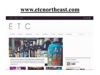
ETC's website also uses multimedia and social media but is described as a bit boring in layout.
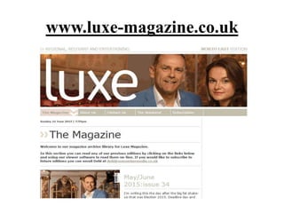
Luxe's website is criticized for being too basic and not providing much information about the magazine or how to connect with readers. It lacks features like search and has a simple, unengaging design.