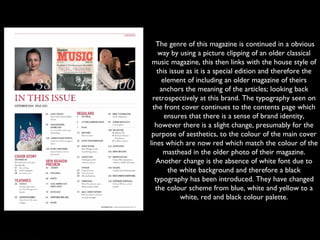
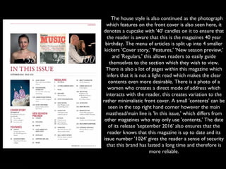
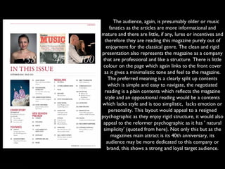
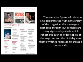
Classical music analysis
3
 The genre of this magazine is continued in a obvious
way by using a picture clipping of an older classical
music magazine, this then links with the house style of
this issue as it is a special edition and therefore the
element of including an older magazine of theirs
anchors the meaning of the articles; looking back
retrospectively at this brand. The typography seen on
the front cover continues to the contents page which
ensures that there is a sense of brand identity,
however there is a slight change, presumably for the
purpose of aesthetics, to the colour of the main cover
lines which are now red which match the colour of the
masthead in the older photo of their magazine.
Another change is the absence of white font due to
the white background and therefore a black
typography has been introduced. They have changed
the colour scheme from blue, white and yellow to a
white, red and black colour palette.
    The house style is also continued as the photograph
which features on the front cover is also seen here, it
denotes a cupcake with '40' candles on it to ensure that
the reader is aware that this is the magazines 40 year
birthday. The menu of articles is split up into 4 smaller
kickers 'Cover story,' 'Features,' 'New season preview,'
and 'Regulars,' this allows readers to easily guide
themselves to the section which they wish to view.
There is also a lot of pages within this magazine which
infers that it is not a light read which makes the clear
contents even more desirable. There is a photo of a
women who creates a direct mode of address which
interacts with the reader, this creates variation to the
rather minimalistic front cover. A small 'contents' can be
seen in the top right hand corner however the main
masthead/main line is 'In this issue,' which differs from
other magazines who may only use 'contents,' The date
of its release 'september 2016' also ensures that the
reader knows that this magazine is up to date and its
issue number '1024' gives the reader a sense of security
that this brand has lasted a long time and therefore is
more reliable.
     The audience, again, is presumably older or music
fanatics as the articles are more informational and
mature and there are little, if any, lures or incentives and
therefore they are reading this magazine purely out of
enjoyment for the classical genre. The clean and rigid
presentation also represents the magazine as a company
that are professional and like a structure. There is little
colour on the page which again links to the front cover
as it gives a minimalistic tone and feel to the magazine.
The preferred meaning is a clearly split up contents
which is simple and easy to navigate, the negotiated
reading is a plain contents which reflects the magazine
style and an oppositional reading would be a contents
which lacks style and is too simplistic,  lacks emotion or
personality. This layout would appeal to a resigned
psychographic as they enjoy rigid structure, it would also
appeal to the reformer psychographic as it has ' natural
simplicity' (quoted from here). Not only this but as the
magazines main attract is its 40th anniversary, its
audience may be more dedicated to this company or
brand, this shows a strong and loyal target audience.
     The representation of this
magazine is a minimalistic magazine
which focuses more on its
informational content over an out-
going style, they do this by using a
dull colour scheme. Its unique selling
point is the niche genre and
therefore they need to focus less on
the actual design of the product to
attract the readers attention.
     The narrative / point of this issue
is to celebrate the 40th anniversary
of the magazine, this message is
anchored through-out as there are
many signs and symbols which
reflect this such as older copies of
the magazine and the birthday cake
theme which is repeated to create a
house style.
     The narrative / point of this issue
is to celebrate the 40th anniversary
of the magazine, this message is
anchored through-out as there are
many signs and symbols which
reflect this such as older copies of
the magazine and the birthday cake
theme which is repeated to create a
house style.

Media analysis 3 c

  • 1.
  • 2.
     The genre ofthis magazine is continued in a obvious way by using a picture clipping of an older classical music magazine, this then links with the house style of this issue as it is a special edition and therefore the element of including an older magazine of theirs anchors the meaning of the articles; looking back retrospectively at this brand. The typography seen on the front cover continues to the contents page which ensures that there is a sense of brand identity, however there is a slight change, presumably for the purpose of aesthetics, to the colour of the main cover lines which are now red which match the colour of the masthead in the older photo of their magazine. Another change is the absence of white font due to the white background and therefore a black typography has been introduced. They have changed the colour scheme from blue, white and yellow to a white, red and black colour palette.
  • 3.
        Thehouse style is also continued as the photograph which features on the front cover is also seen here, it denotes a cupcake with '40' candles on it to ensure that the reader is aware that this is the magazines 40 year birthday. The menu of articles is split up into 4 smaller kickers 'Cover story,' 'Features,' 'New season preview,' and 'Regulars,' this allows readers to easily guide themselves to the section which they wish to view. There is also a lot of pages within this magazine which infers that it is not a light read which makes the clear contents even more desirable. There is a photo of a women who creates a direct mode of address which interacts with the reader, this creates variation to the rather minimalistic front cover. A small 'contents' can be seen in the top right hand corner however the main masthead/main line is 'In this issue,' which differs from other magazines who may only use 'contents,' The date of its release 'september 2016' also ensures that the reader knows that this magazine is up to date and its issue number '1024' gives the reader a sense of security that this brand has lasted a long time and therefore is more reliable.
  • 4.
         Theaudience, again, is presumably older or music fanatics as the articles are more informational and mature and there are little, if any, lures or incentives and therefore they are reading this magazine purely out of enjoyment for the classical genre. The clean and rigid presentation also represents the magazine as a company that are professional and like a structure. There is little colour on the page which again links to the front cover as it gives a minimalistic tone and feel to the magazine. The preferred meaning is a clearly split up contents which is simple and easy to navigate, the negotiated reading is a plain contents which reflects the magazine style and an oppositional reading would be a contents which lacks style and is too simplistic,  lacks emotion or personality. This layout would appeal to a resigned psychographic as they enjoy rigid structure, it would also appeal to the reformer psychographic as it has ' natural simplicity' (quoted from here). Not only this but as the magazines main attract is its 40th anniversary, its audience may be more dedicated to this company or brand, this shows a strong and loyal target audience.
  • 5.
         Therepresentation of this magazine is a minimalistic magazine which focuses more on its informational content over an out- going style, they do this by using a dull colour scheme. Its unique selling point is the niche genre and therefore they need to focus less on the actual design of the product to attract the readers attention.
  • 6.
         Thenarrative / point of this issue is to celebrate the 40th anniversary of the magazine, this message is anchored through-out as there are many signs and symbols which reflect this such as older copies of the magazine and the birthday cake theme which is repeated to create a house style.
  • 7.
         Thenarrative / point of this issue is to celebrate the 40th anniversary of the magazine, this message is anchored through-out as there are many signs and symbols which reflect this such as older copies of the magazine and the birthday cake theme which is repeated to create a house style.