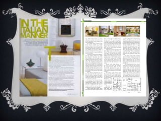
The document summarizes design elements used in a magazine promotional sheet (DPS). It keeps the text, language, colors, and layout consistent to present a professional, sophisticated appearance for mature audiences. The masthead text stands out more to attract attention, while the article text and formal language match the target convergence. Bold yellow and green colors are used to make the DPS stand out. Images are placed together at the top so as not to interrupt the more text-focused information.