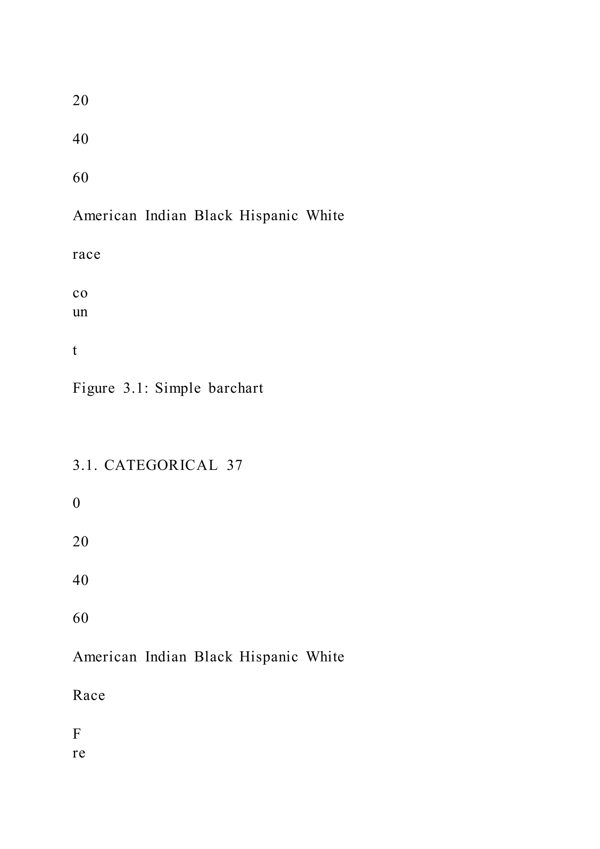
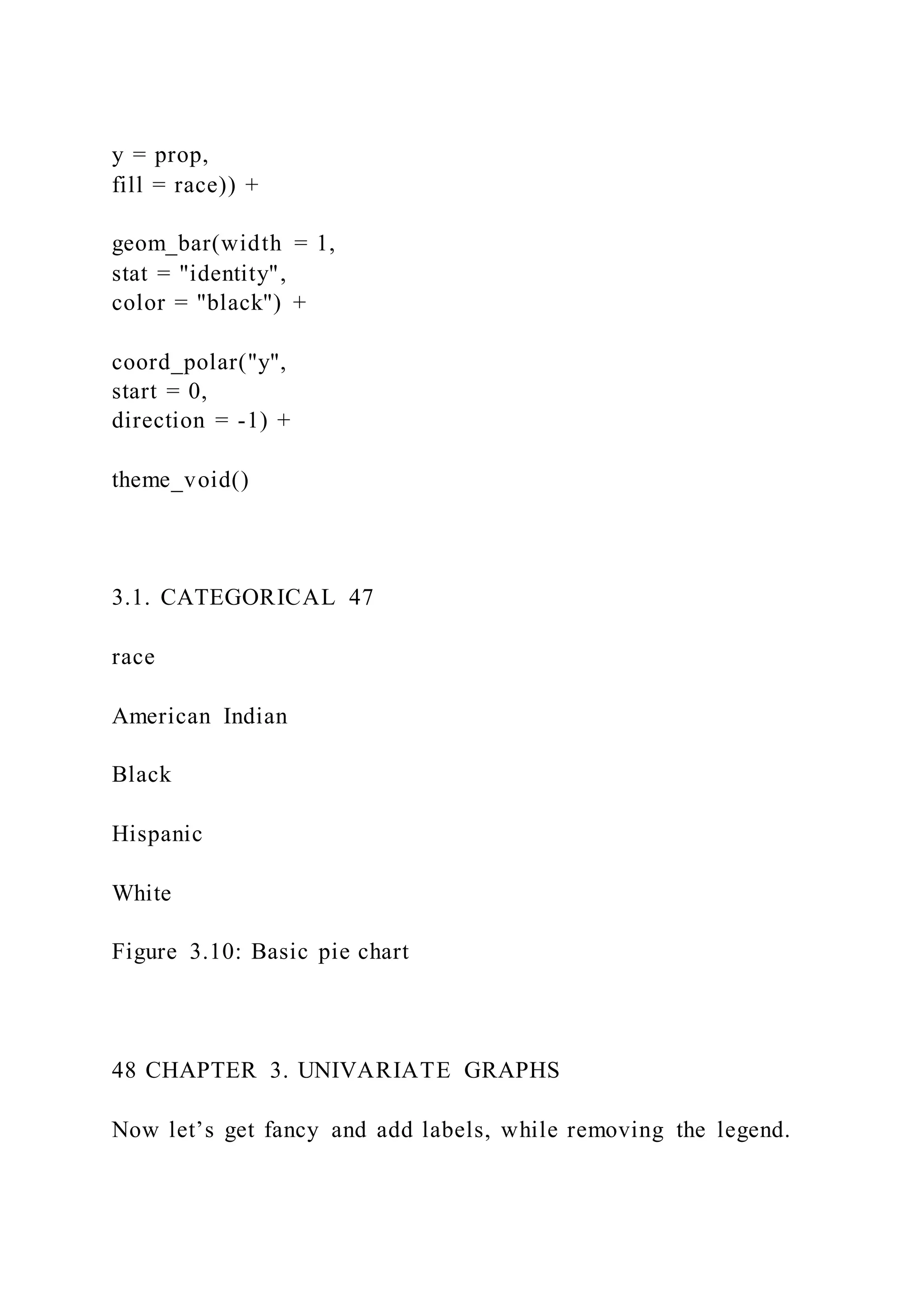
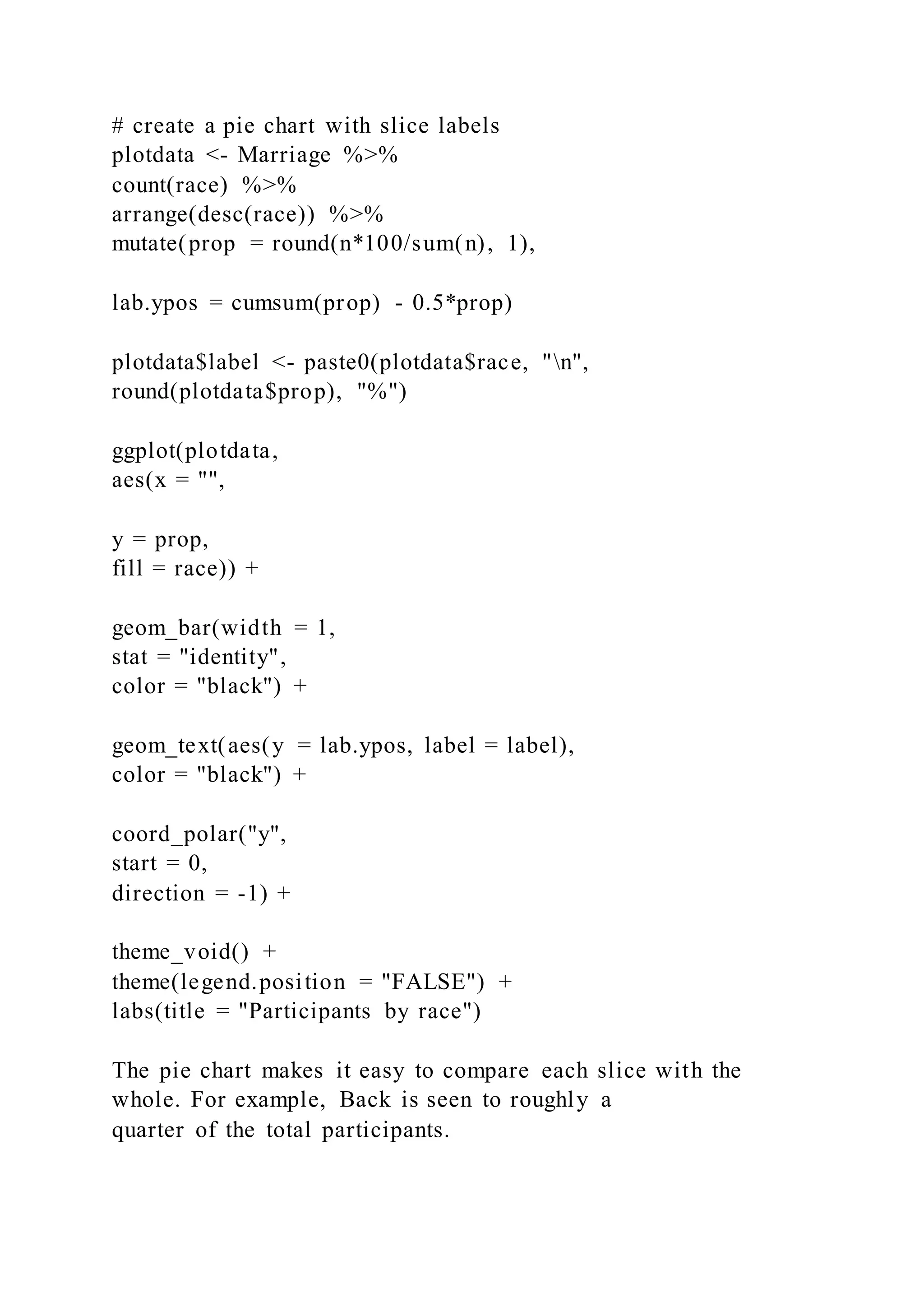
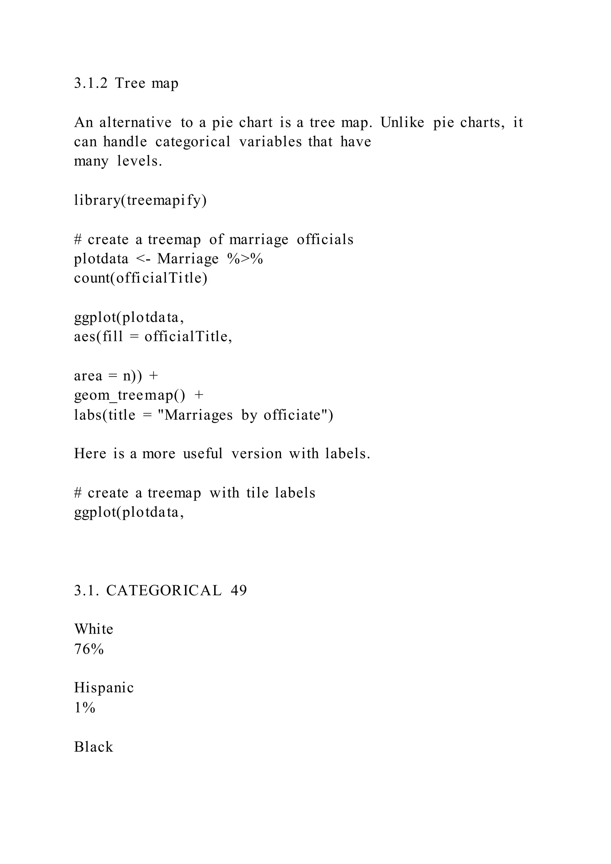
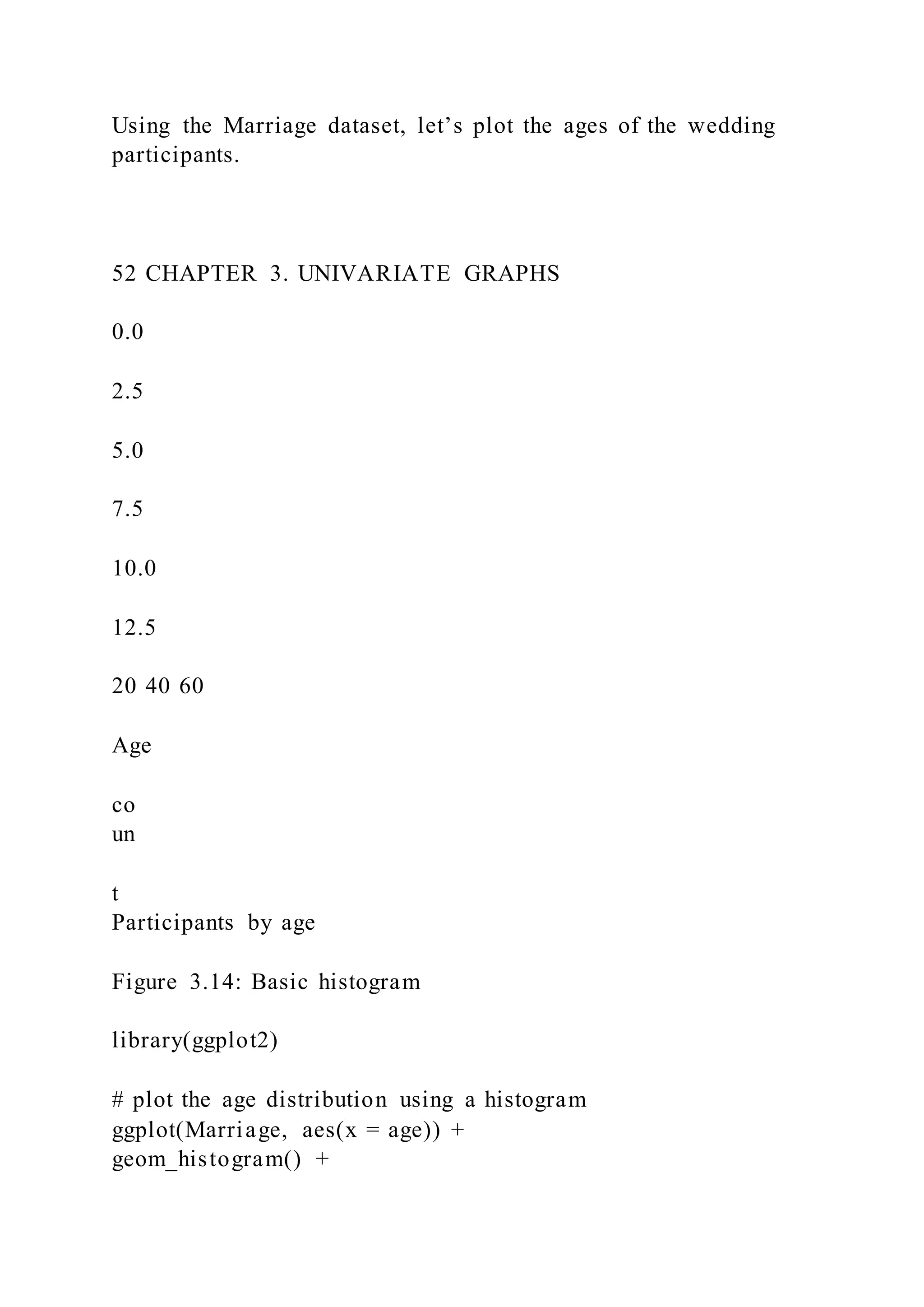
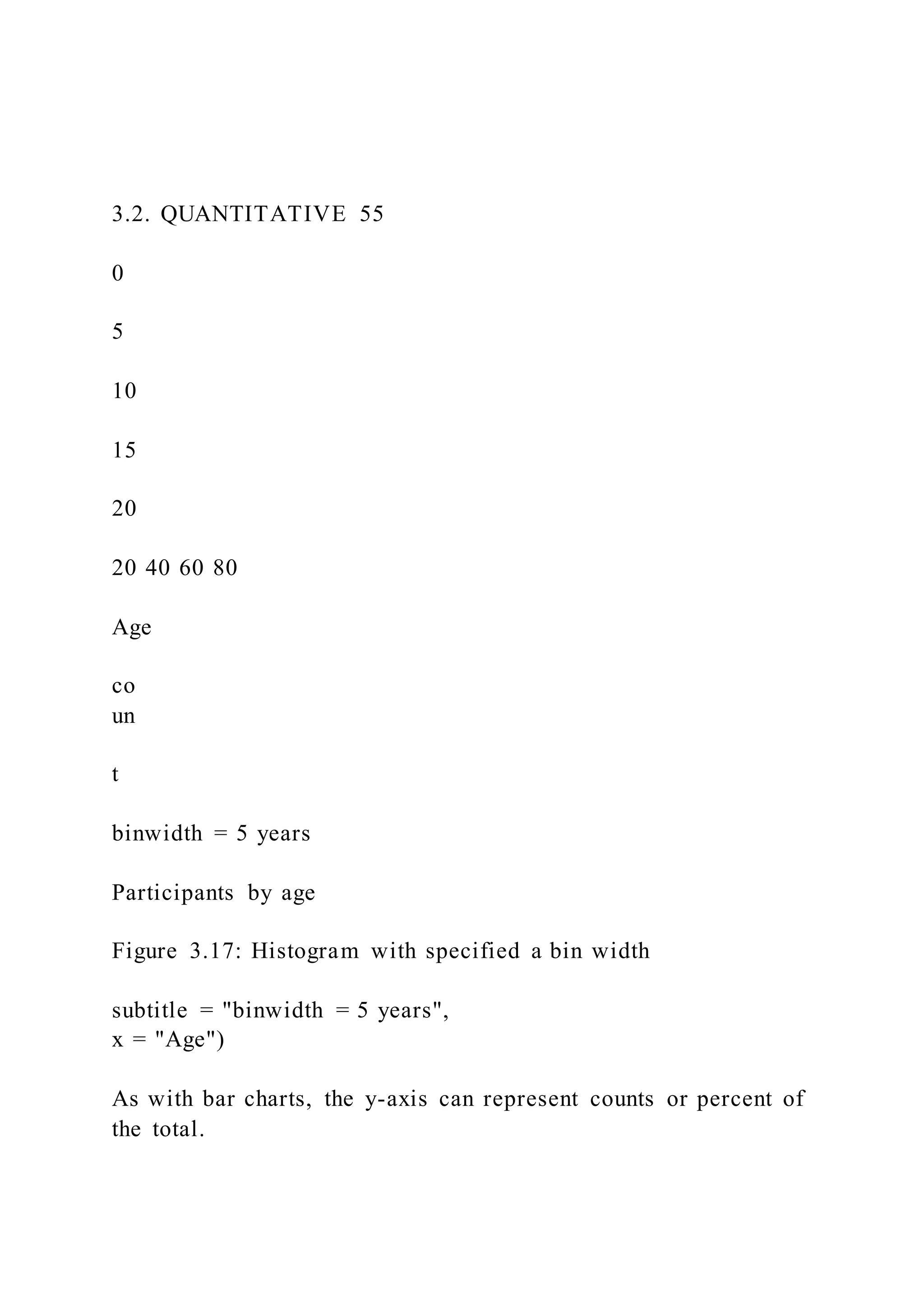
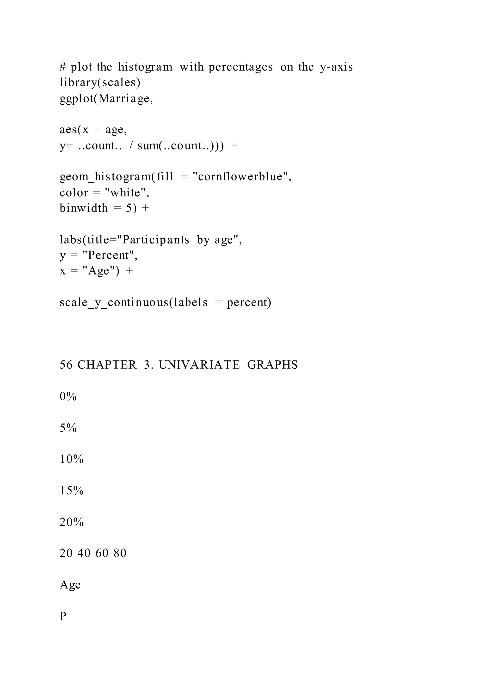
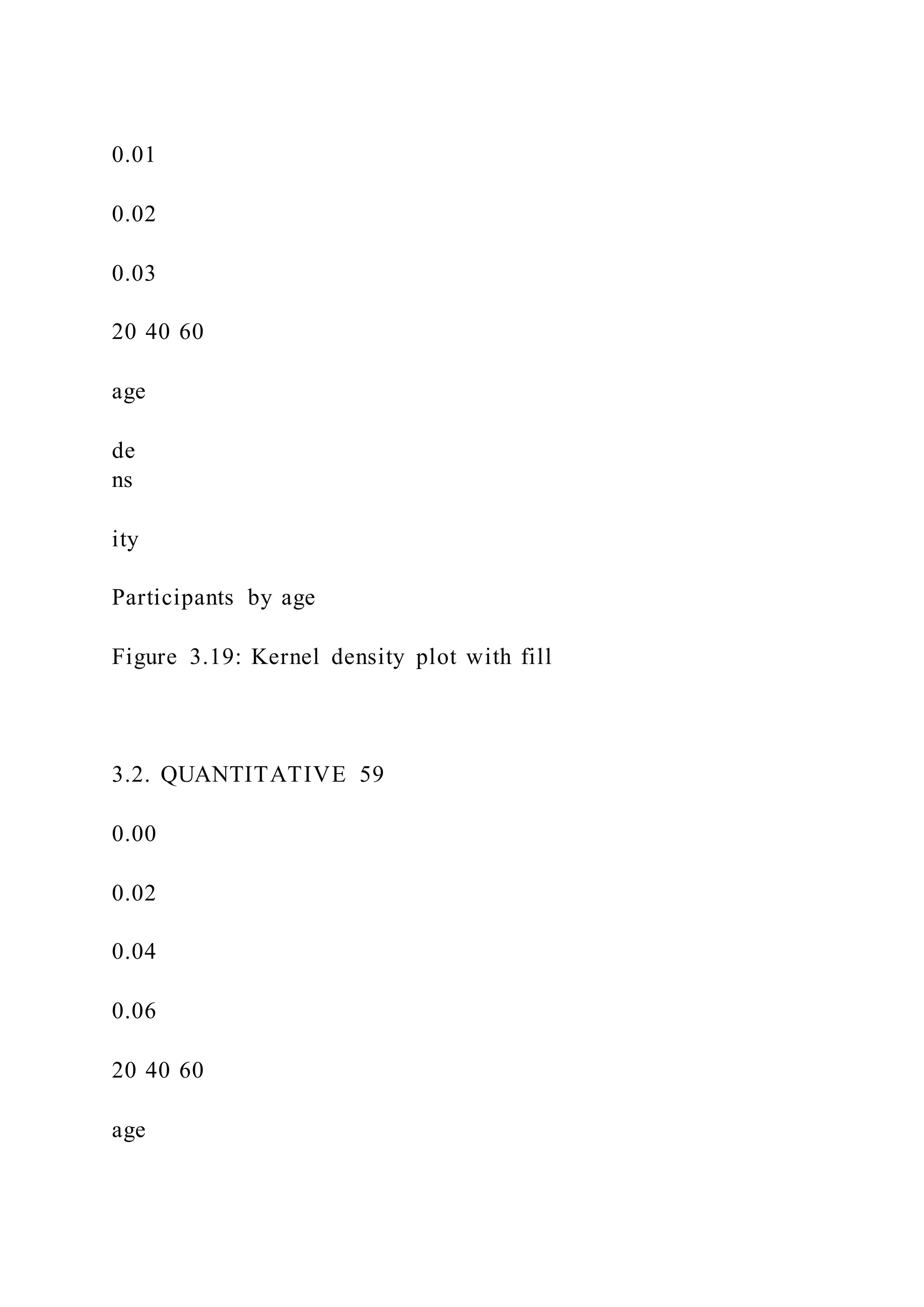
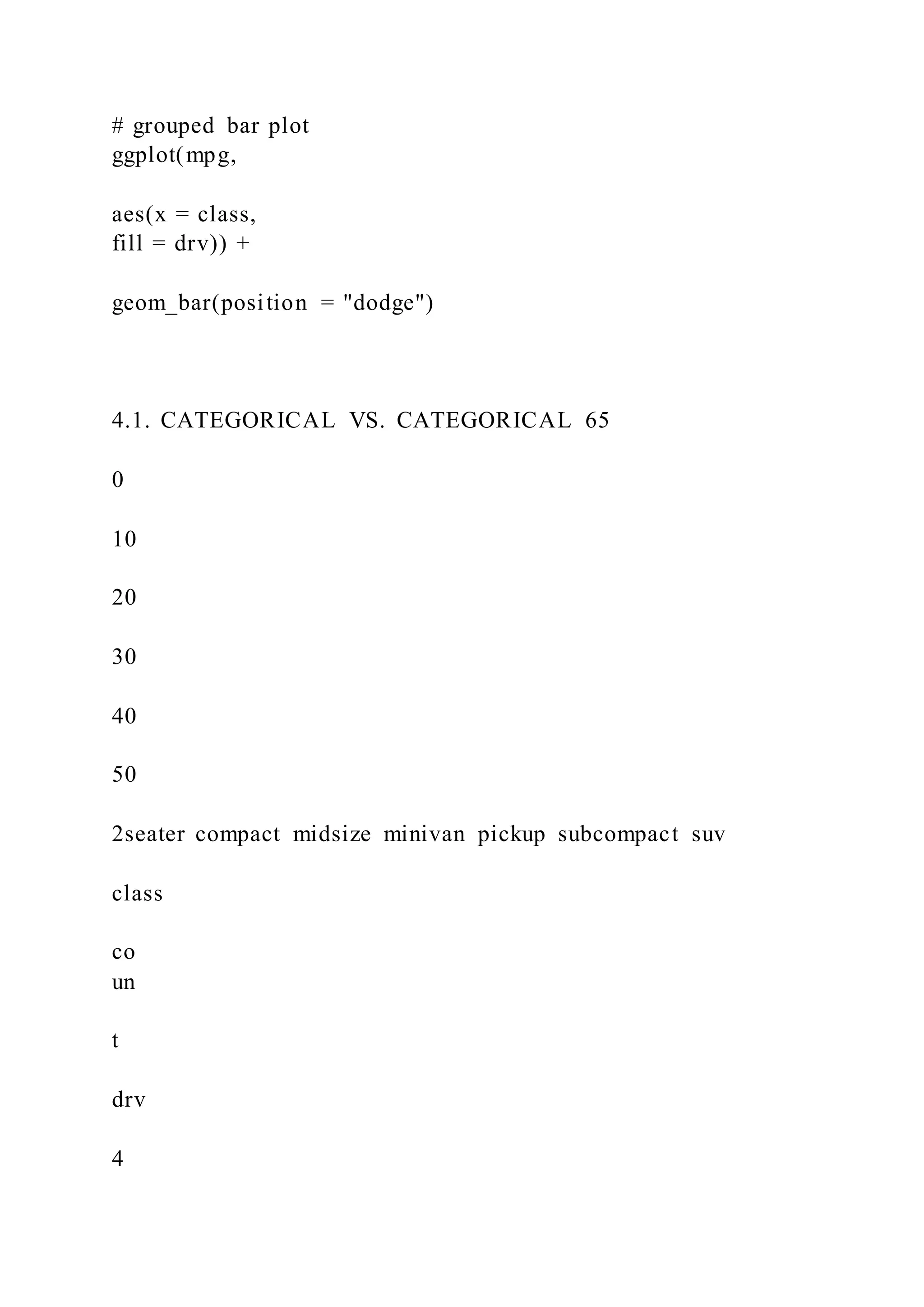
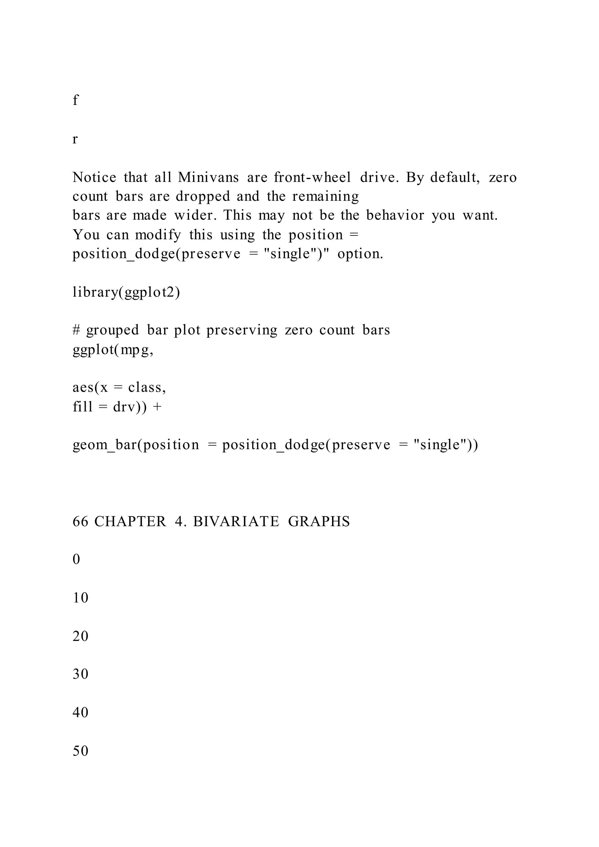
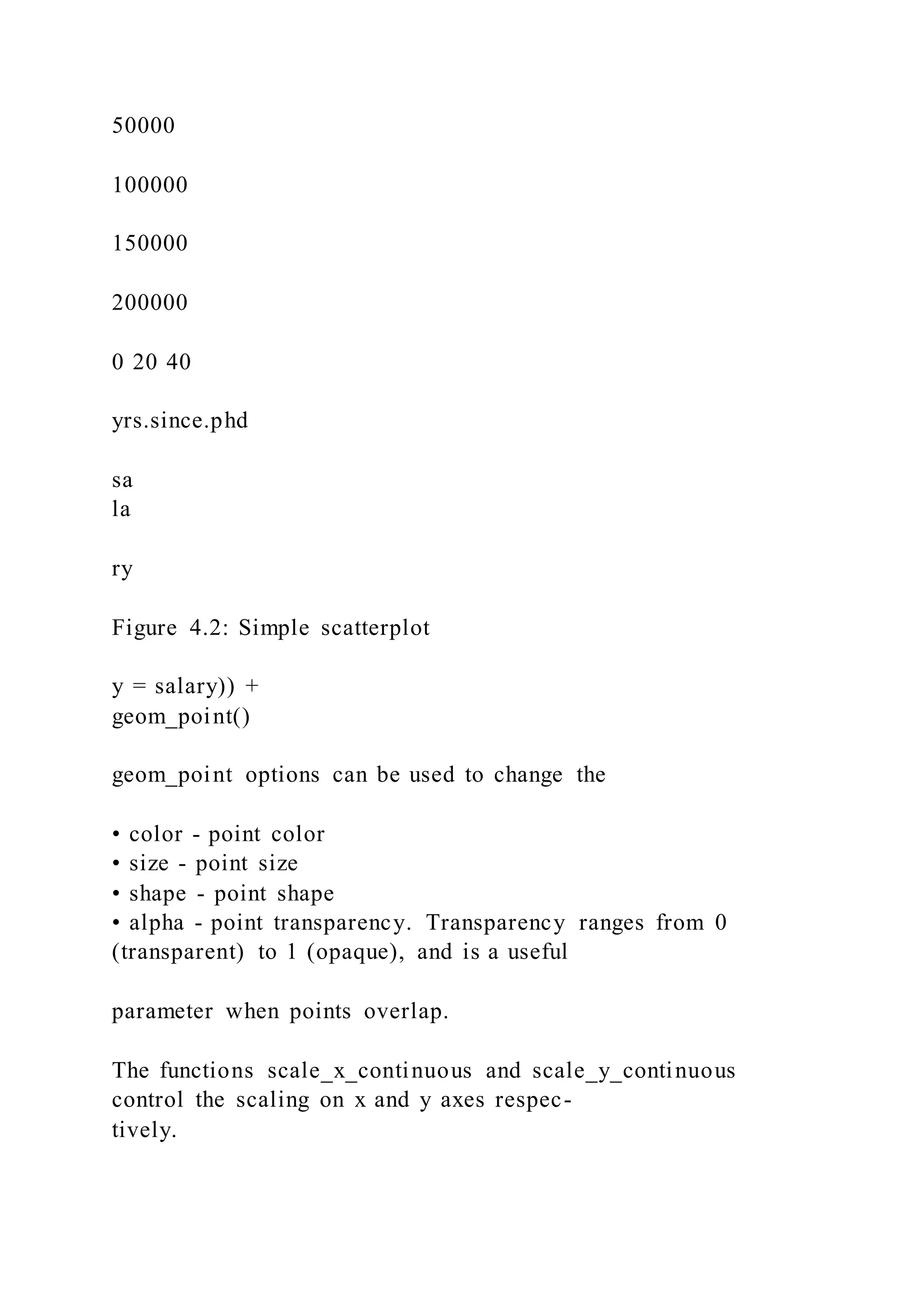
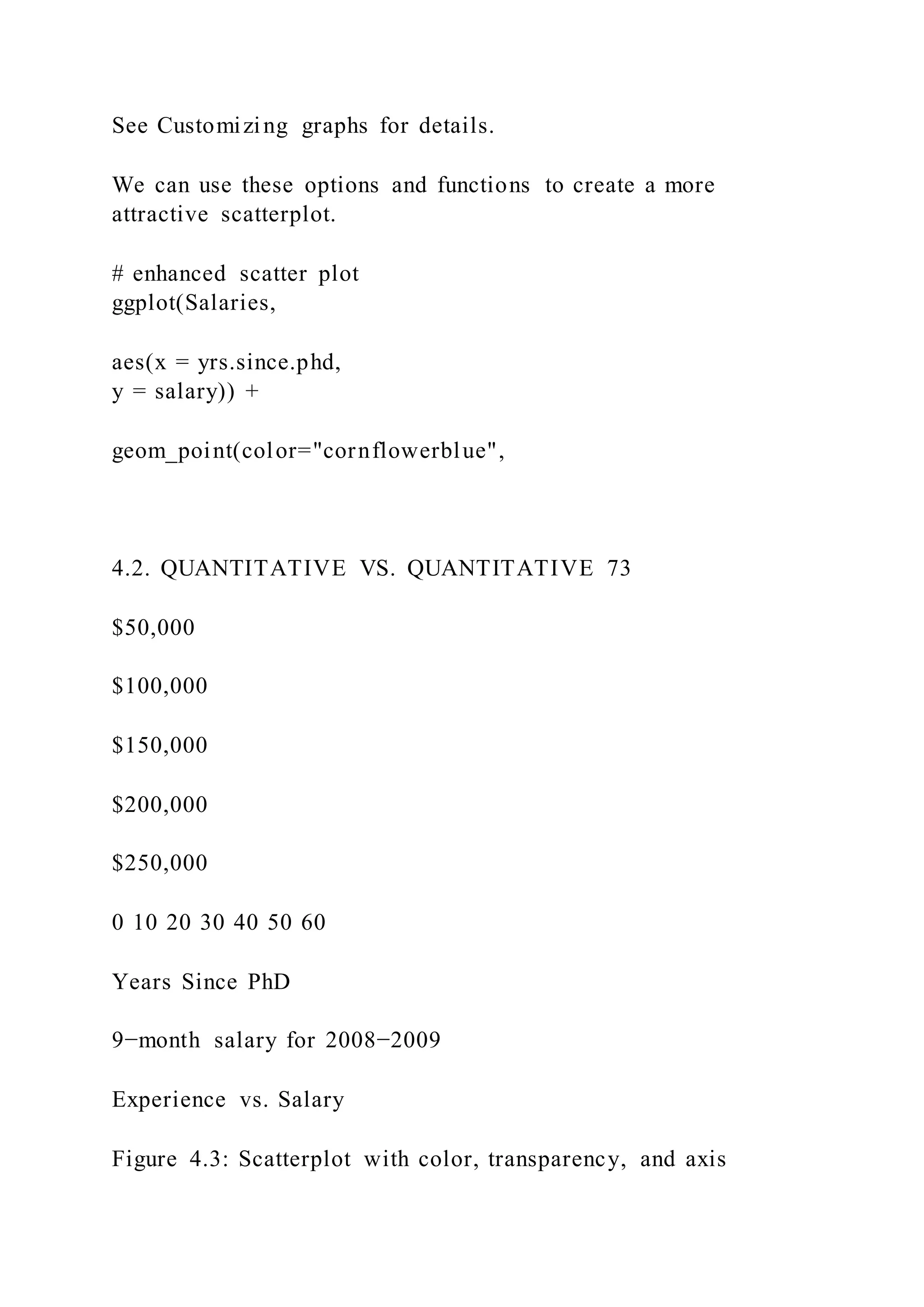
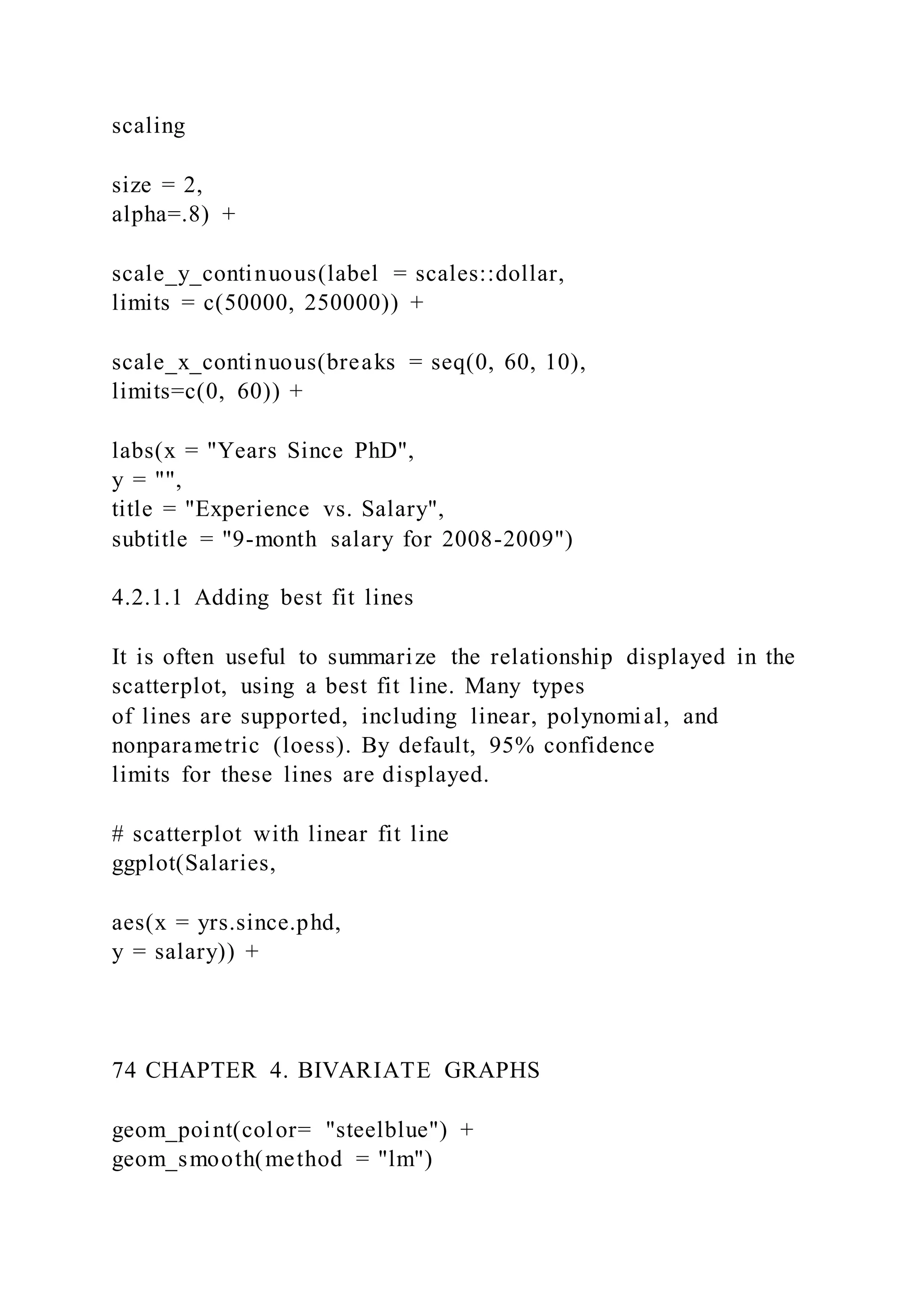
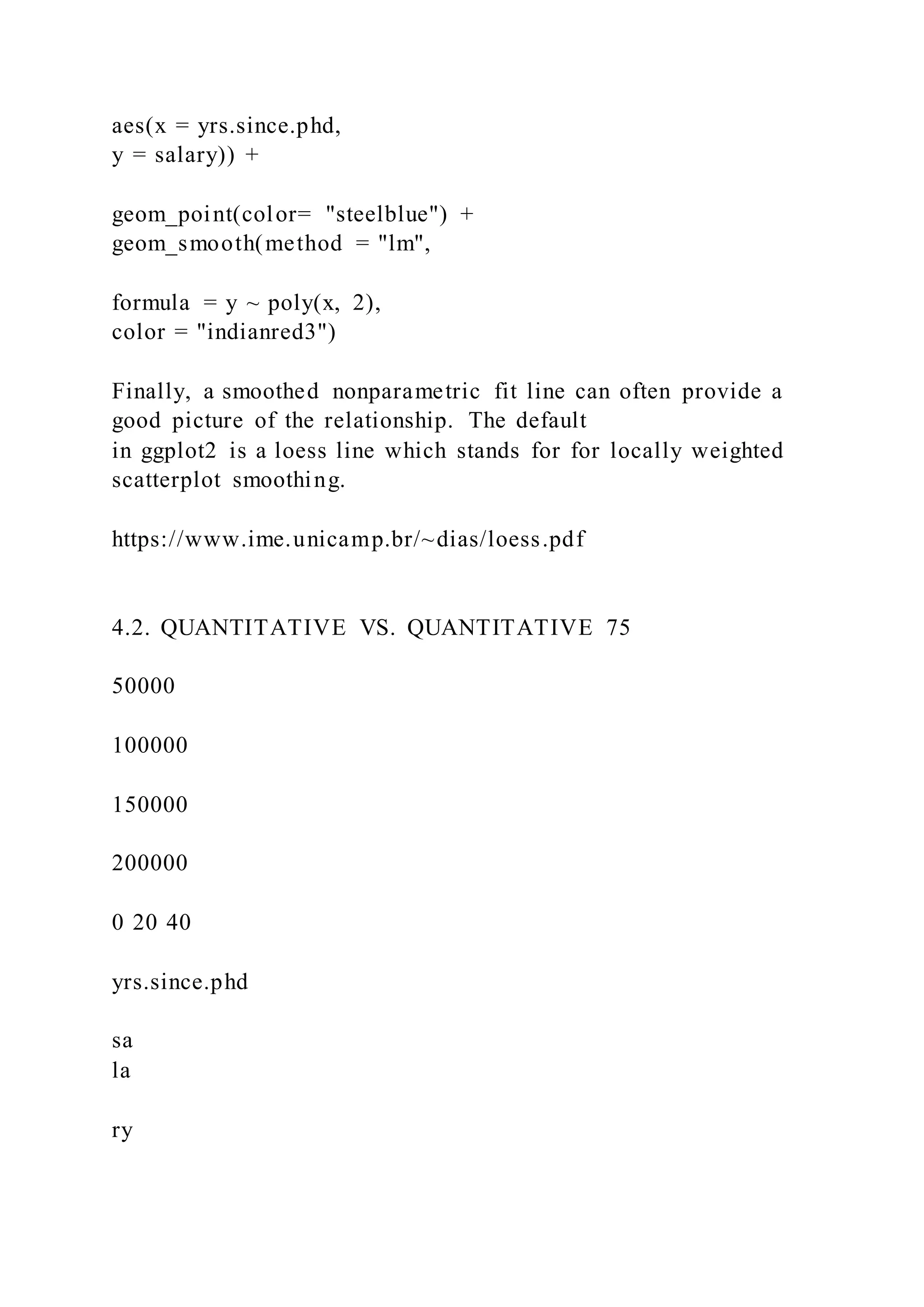
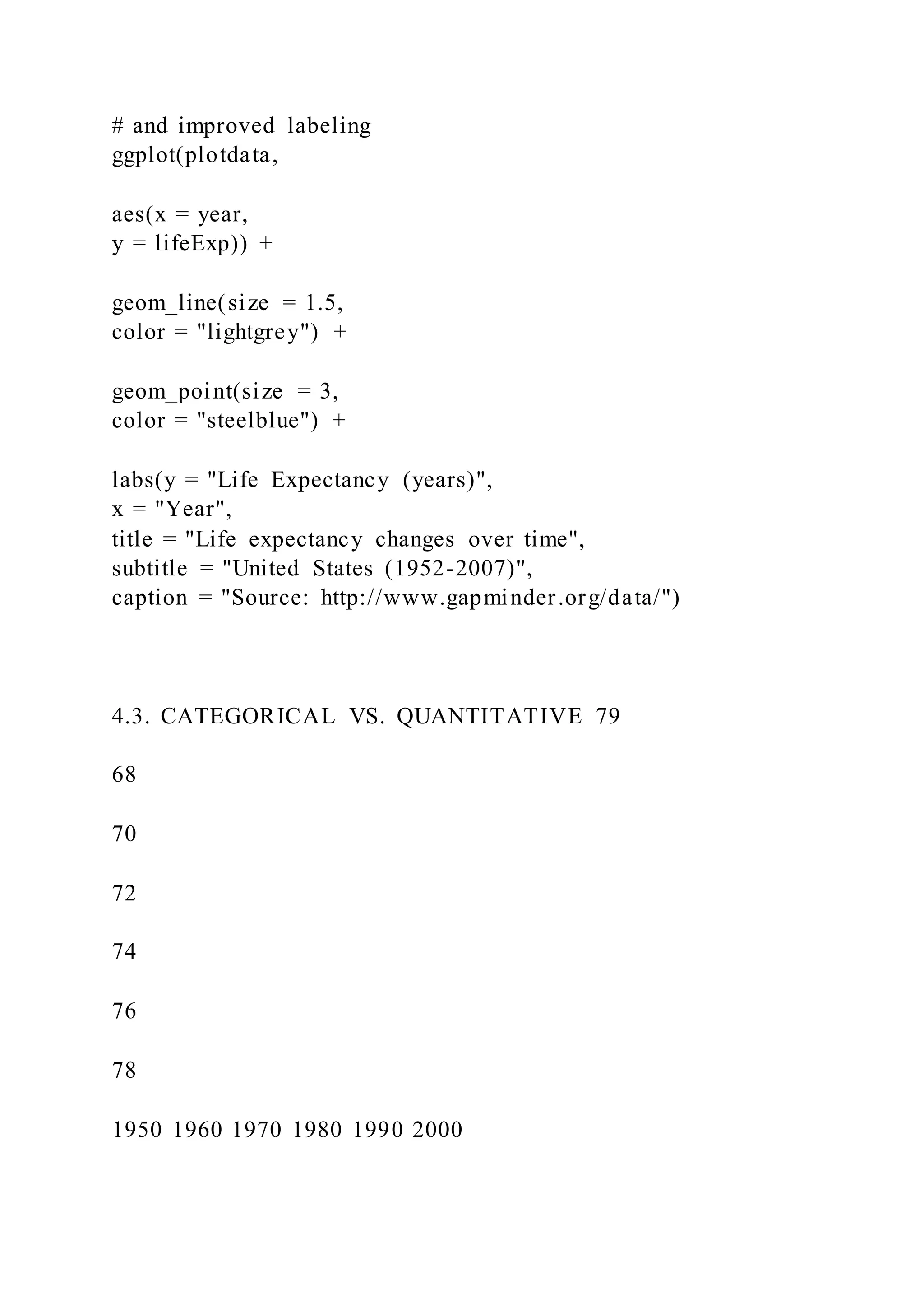
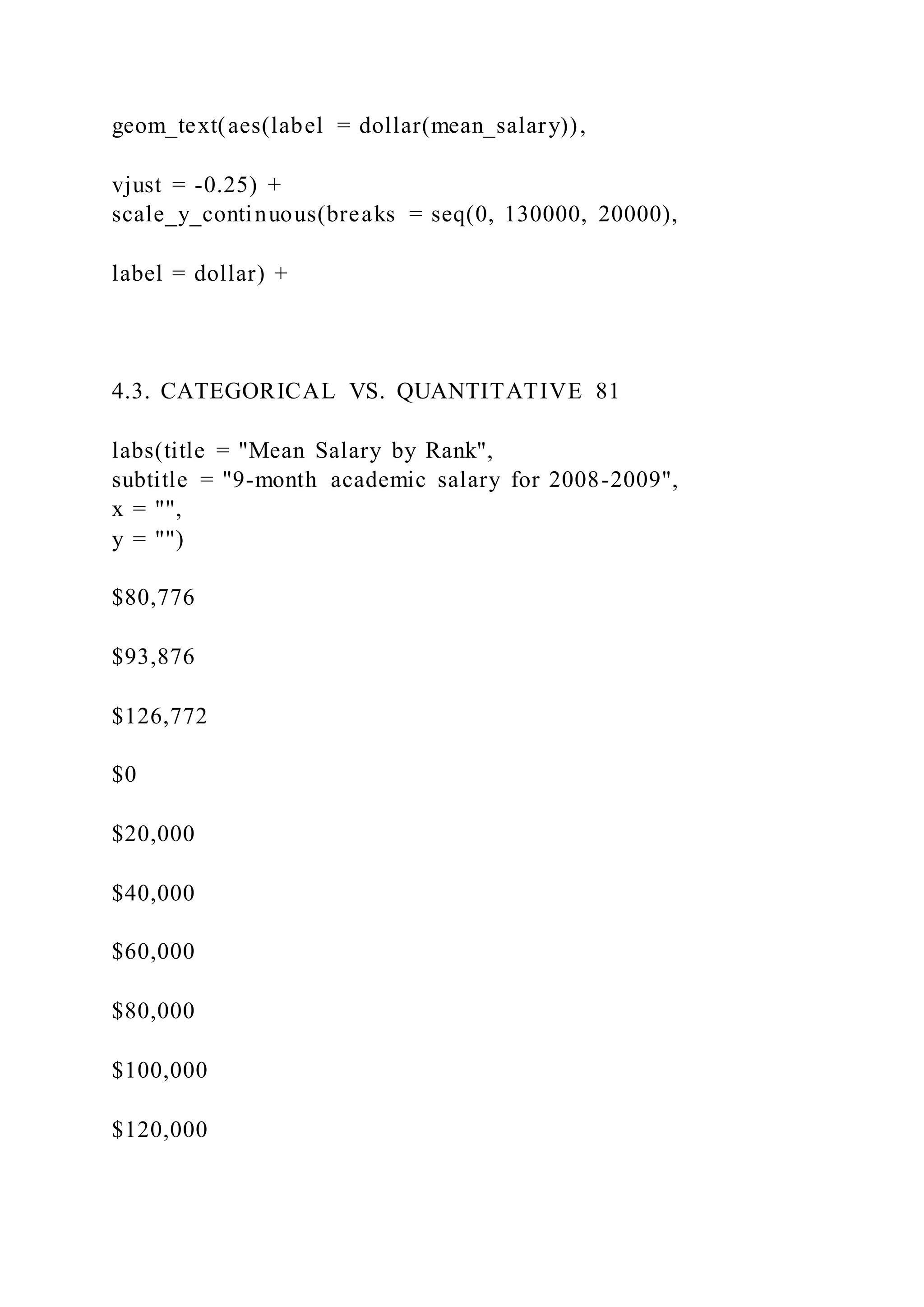
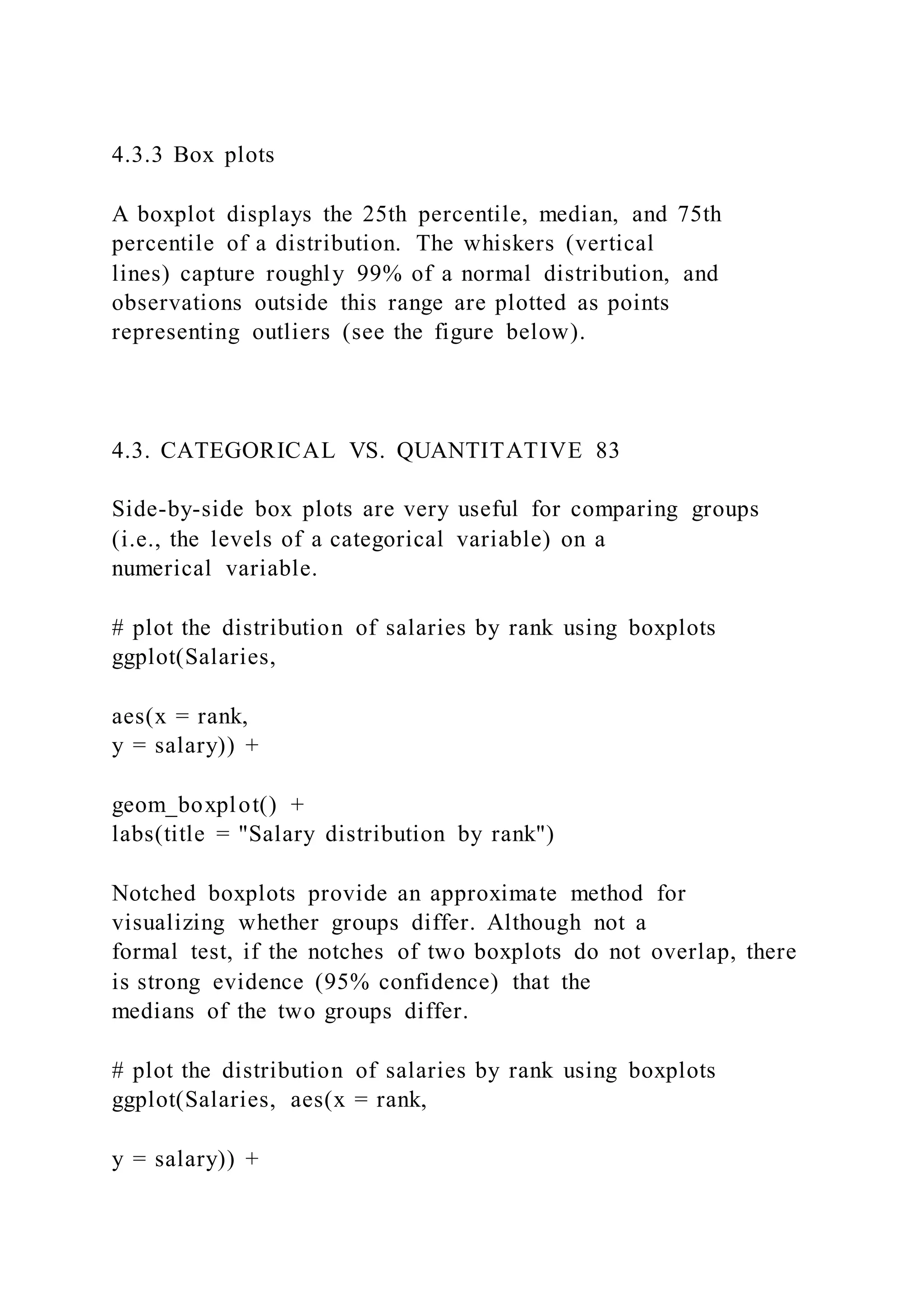
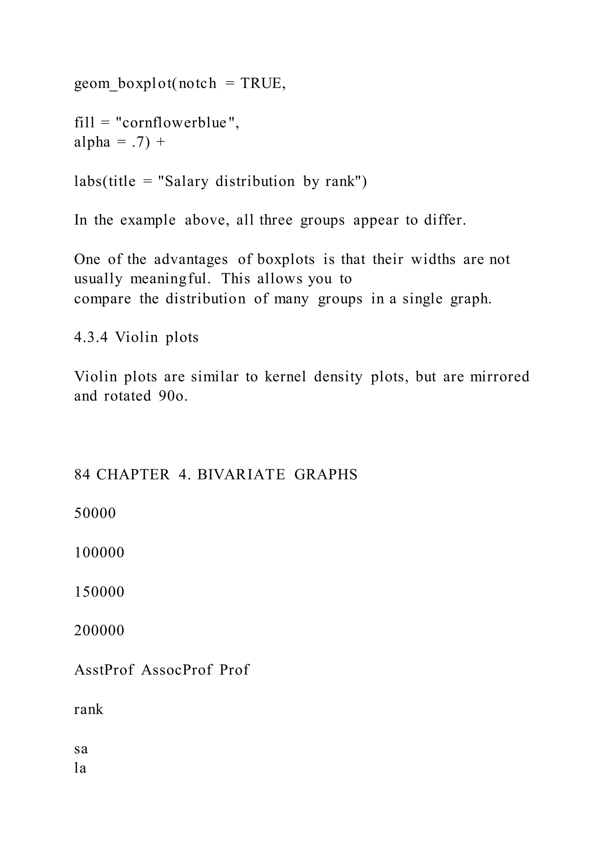
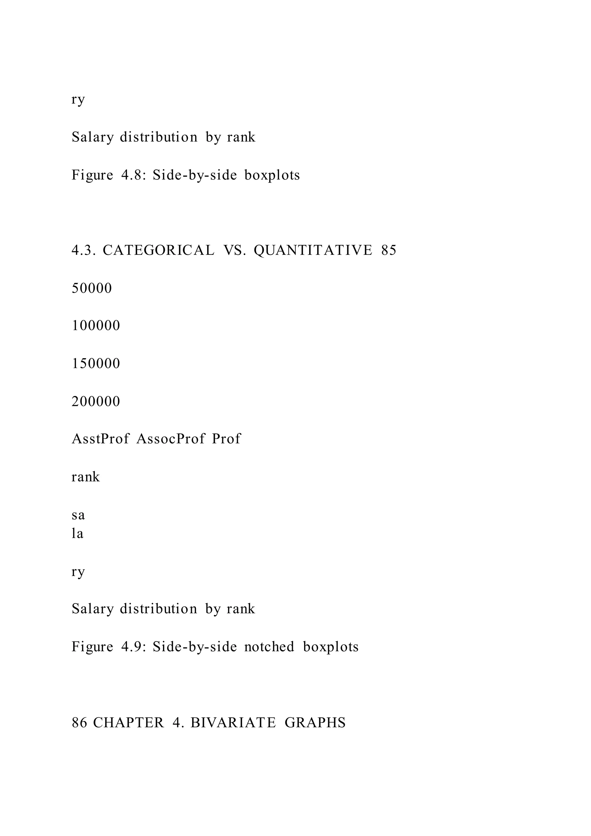
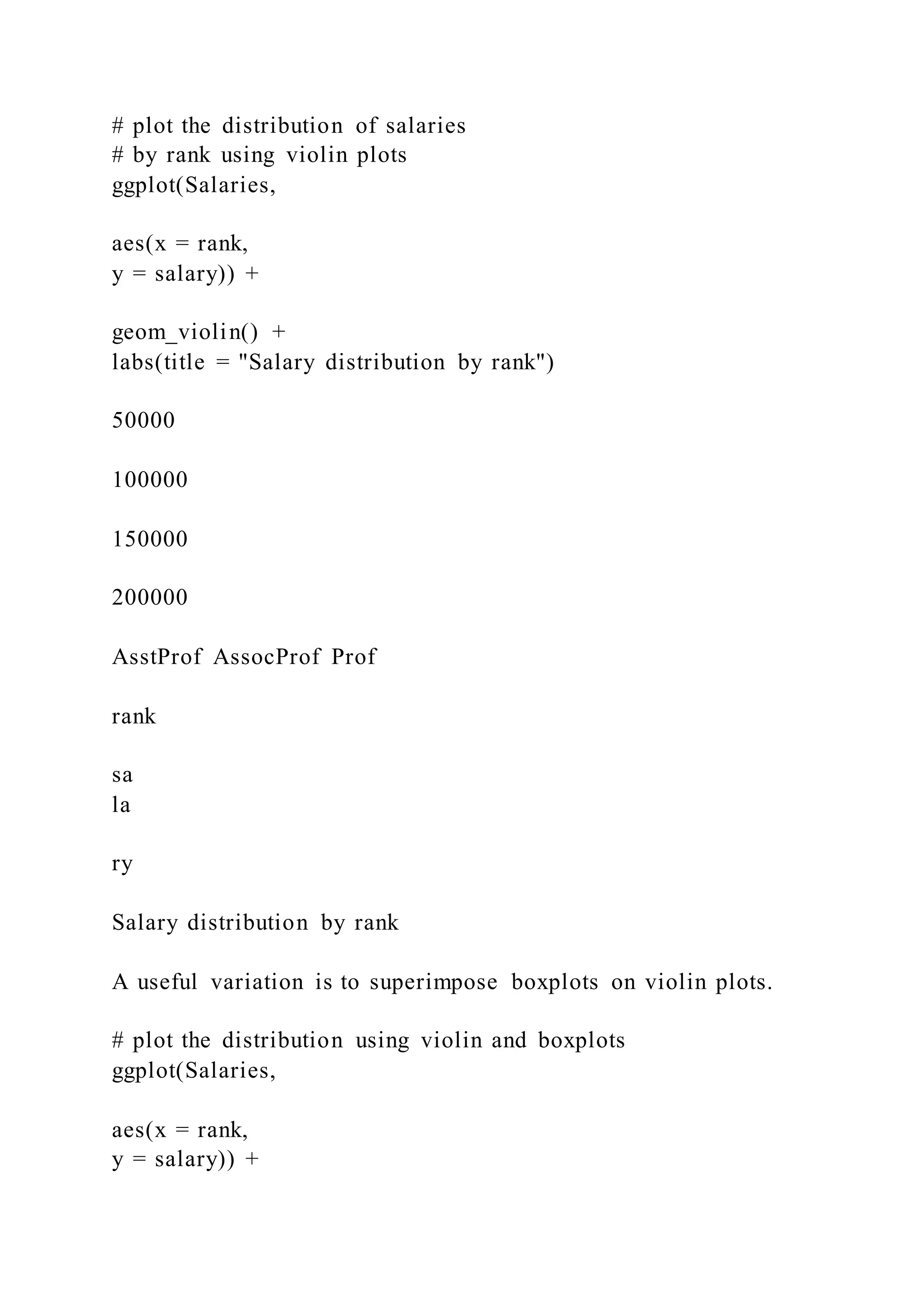
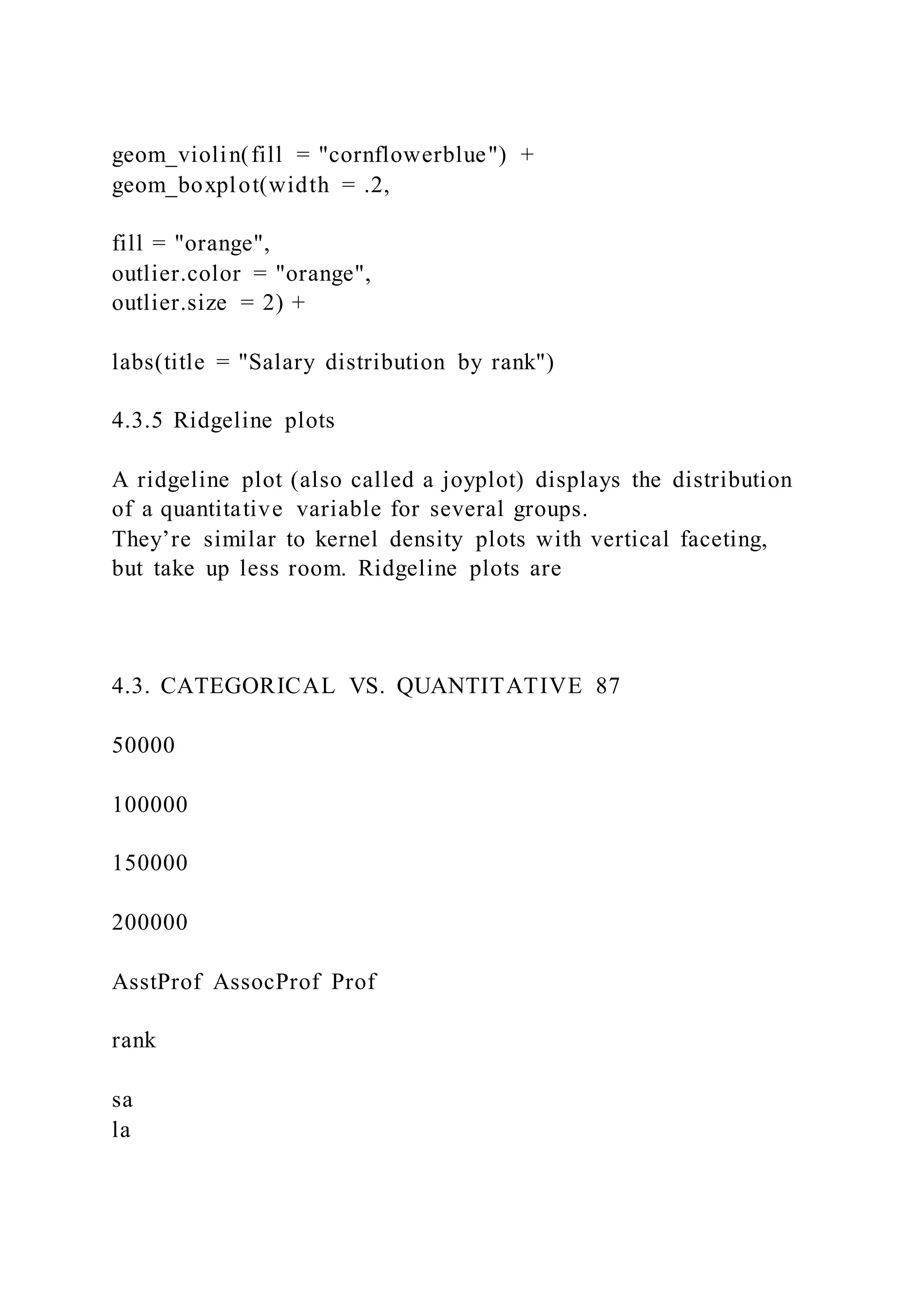
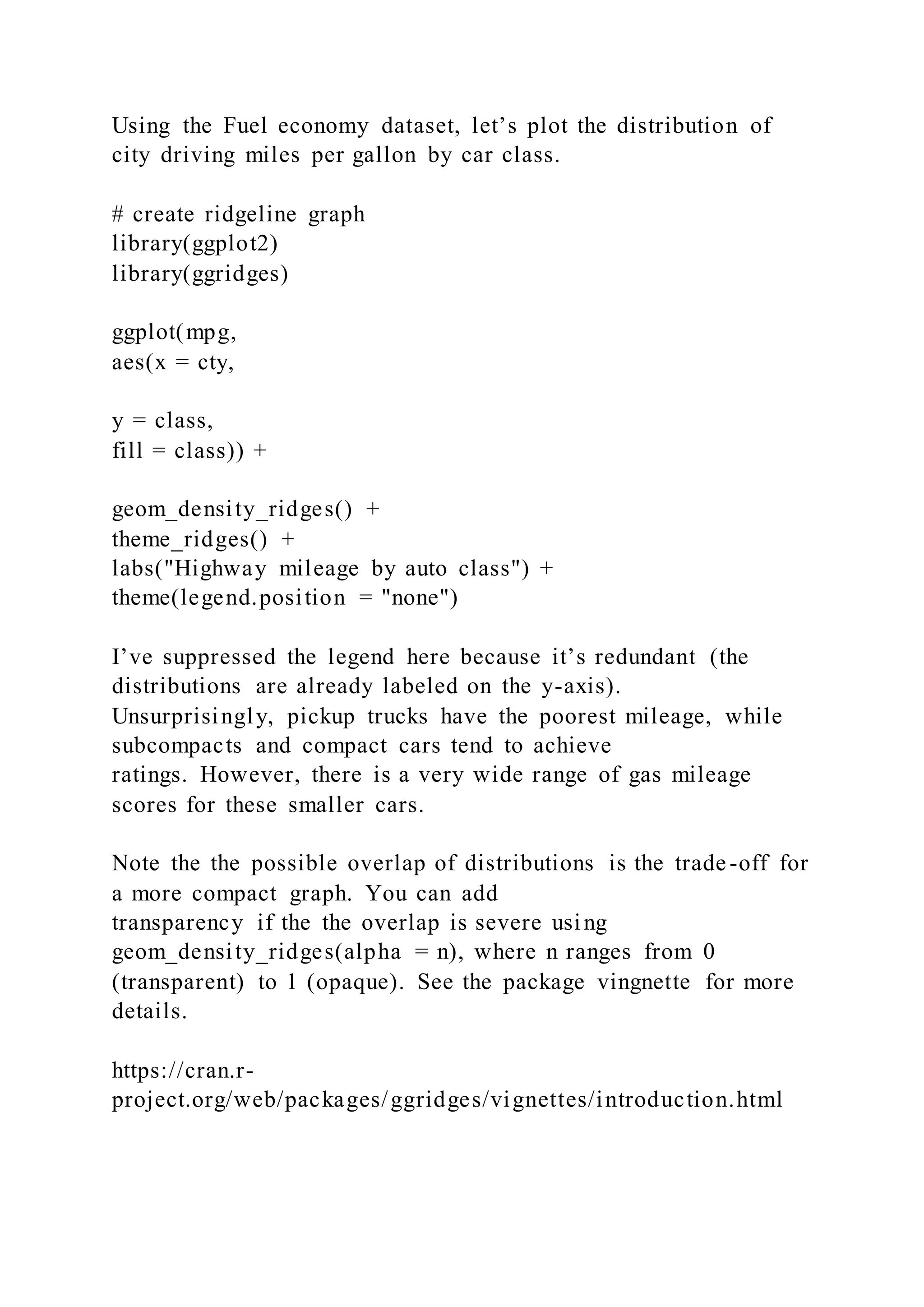
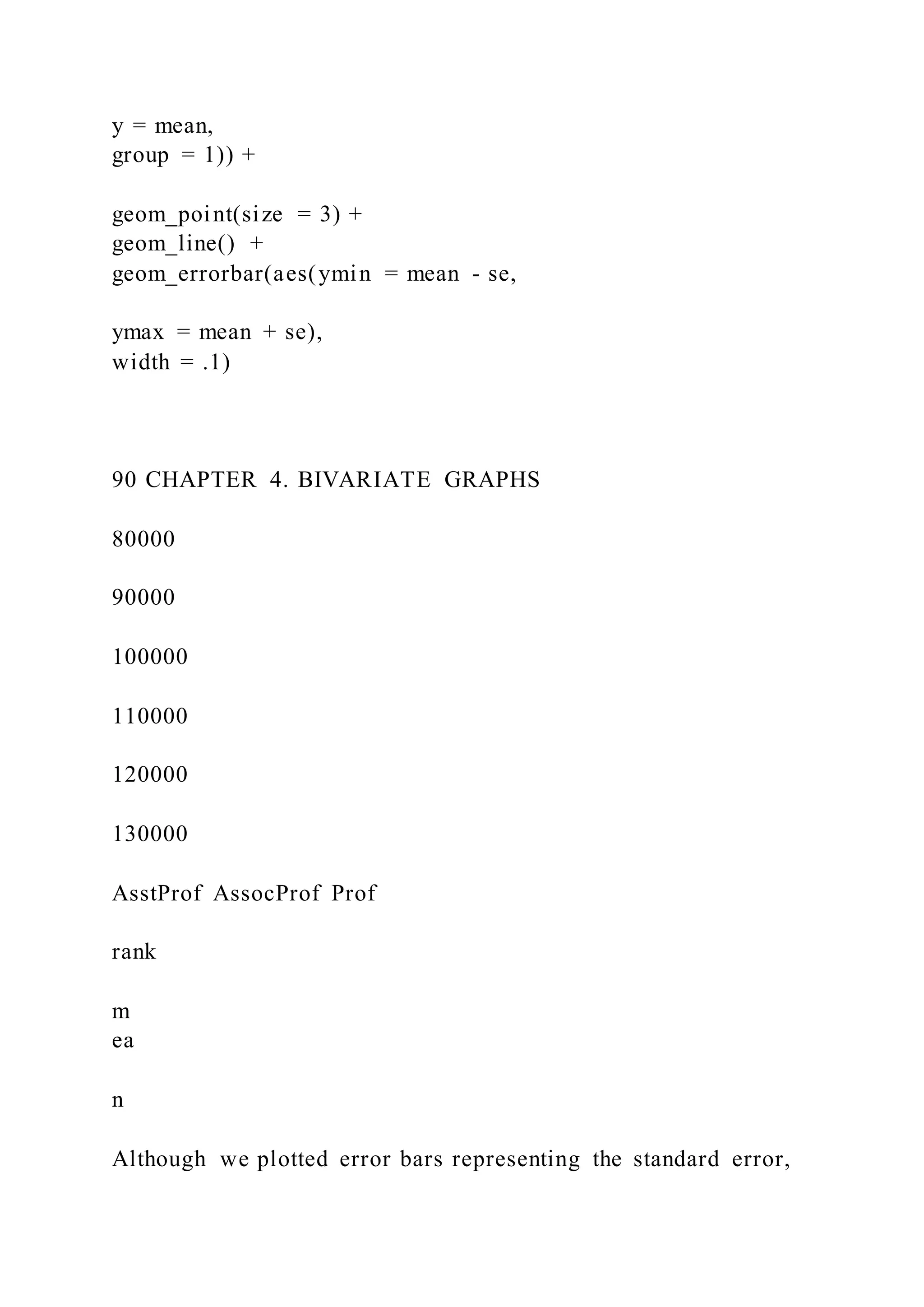
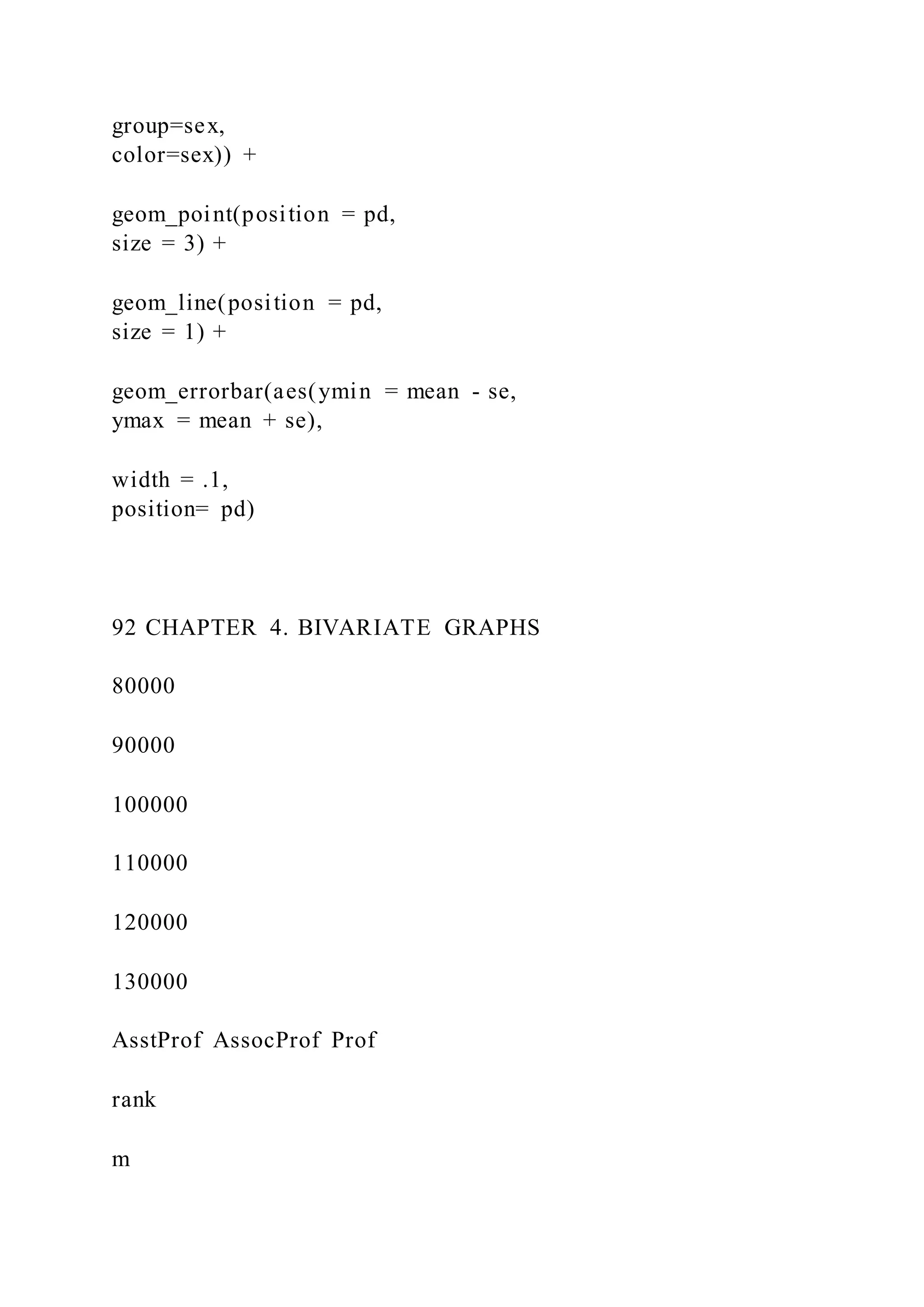
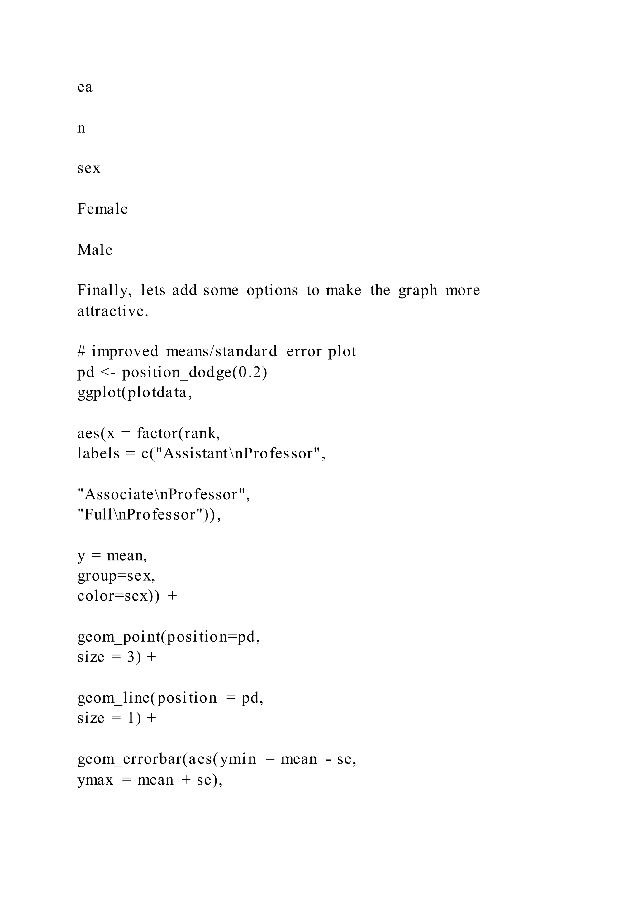
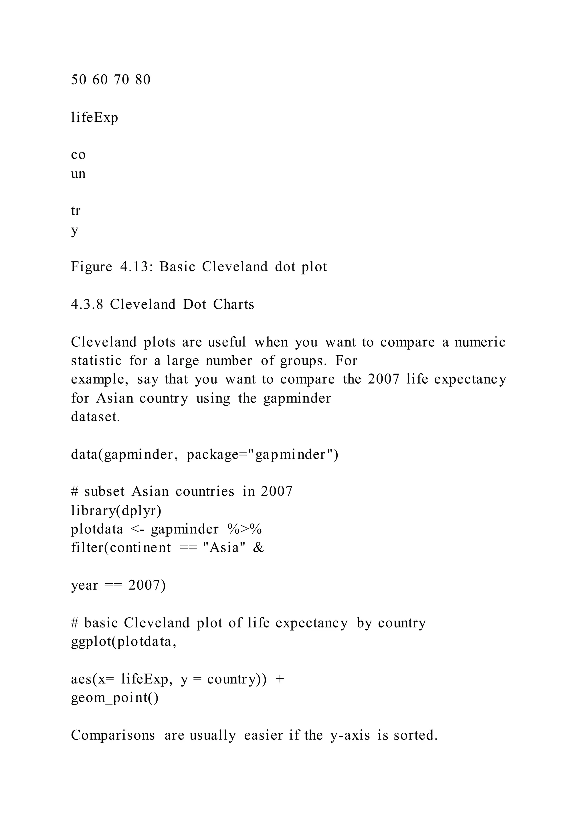
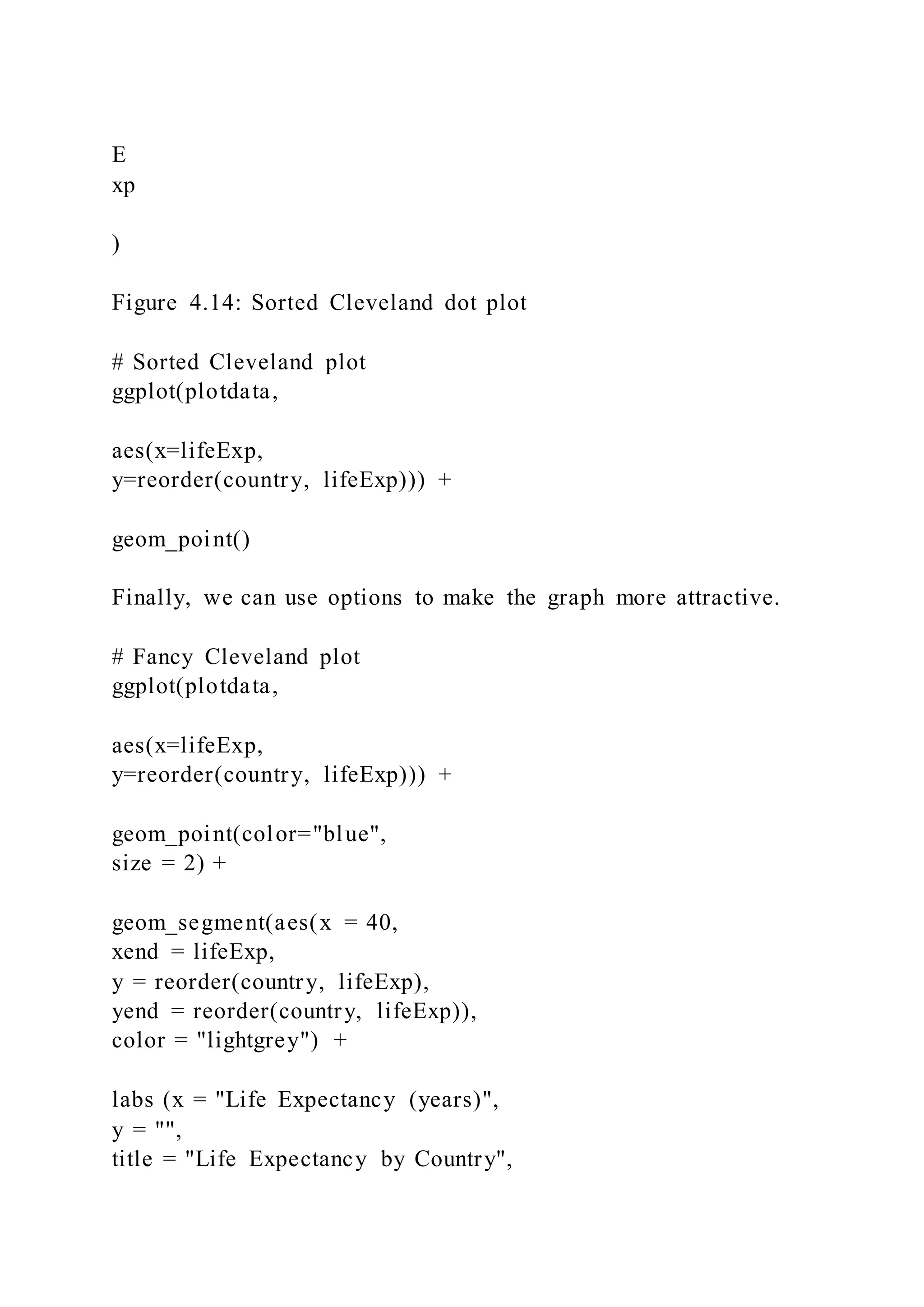
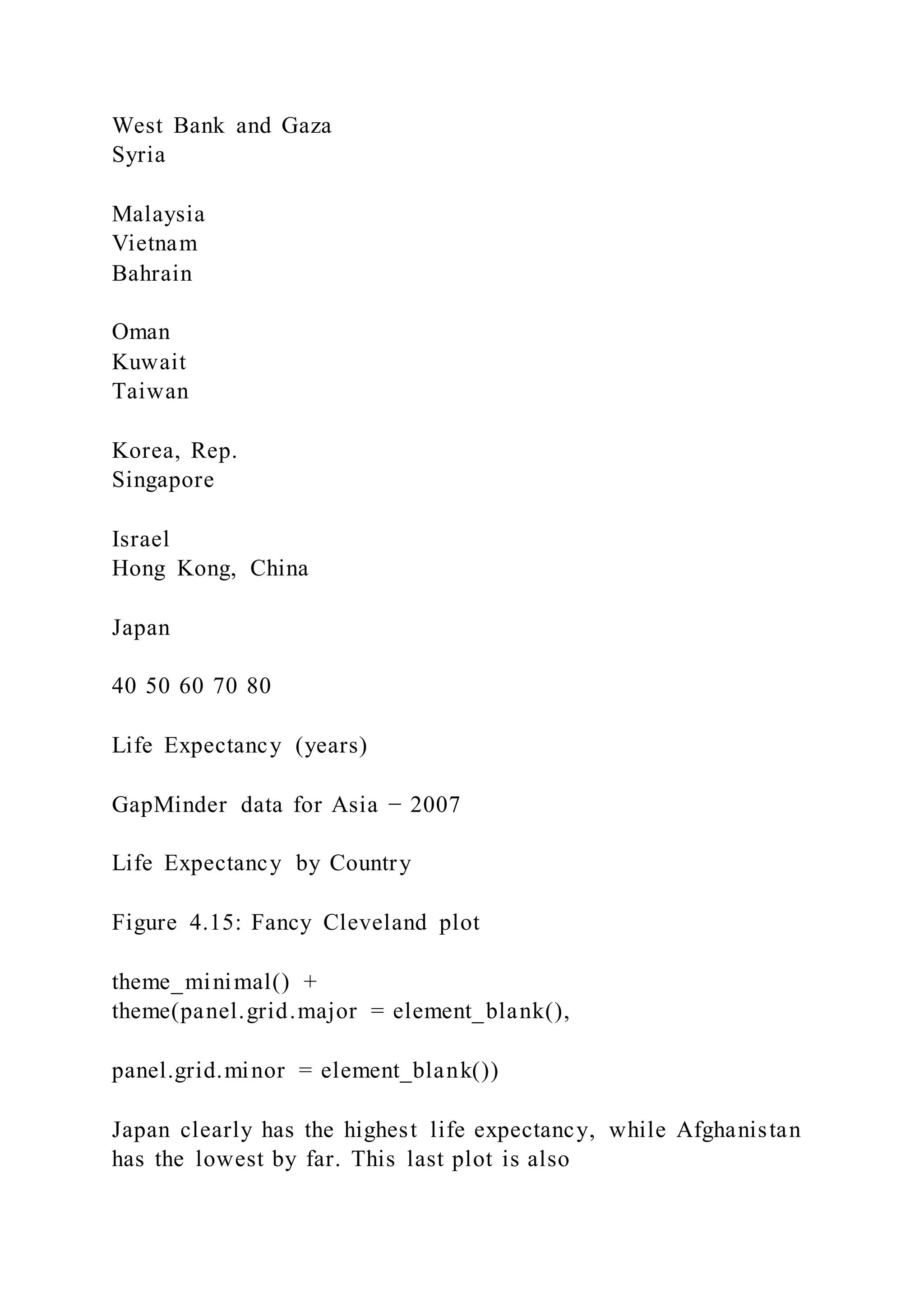
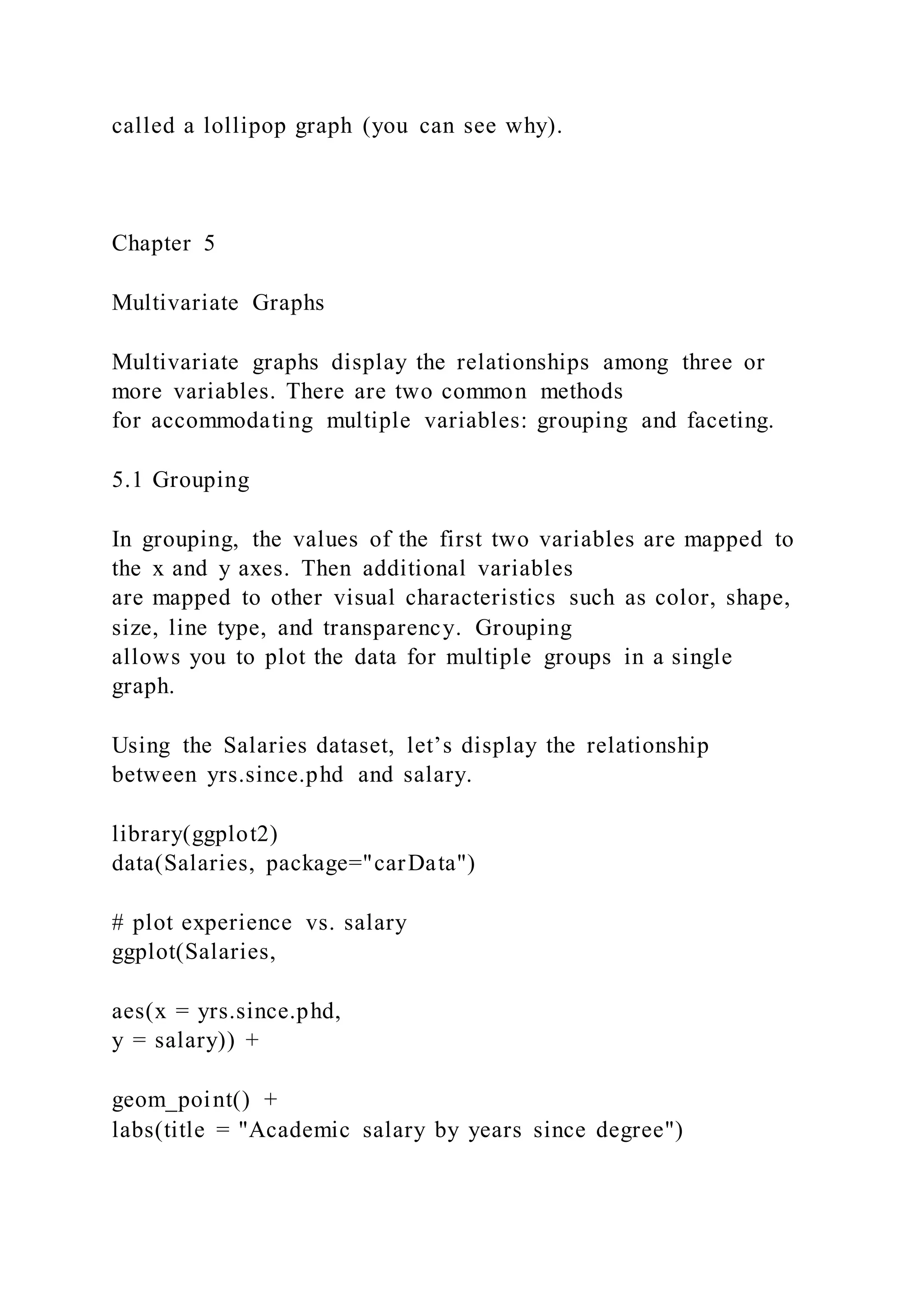
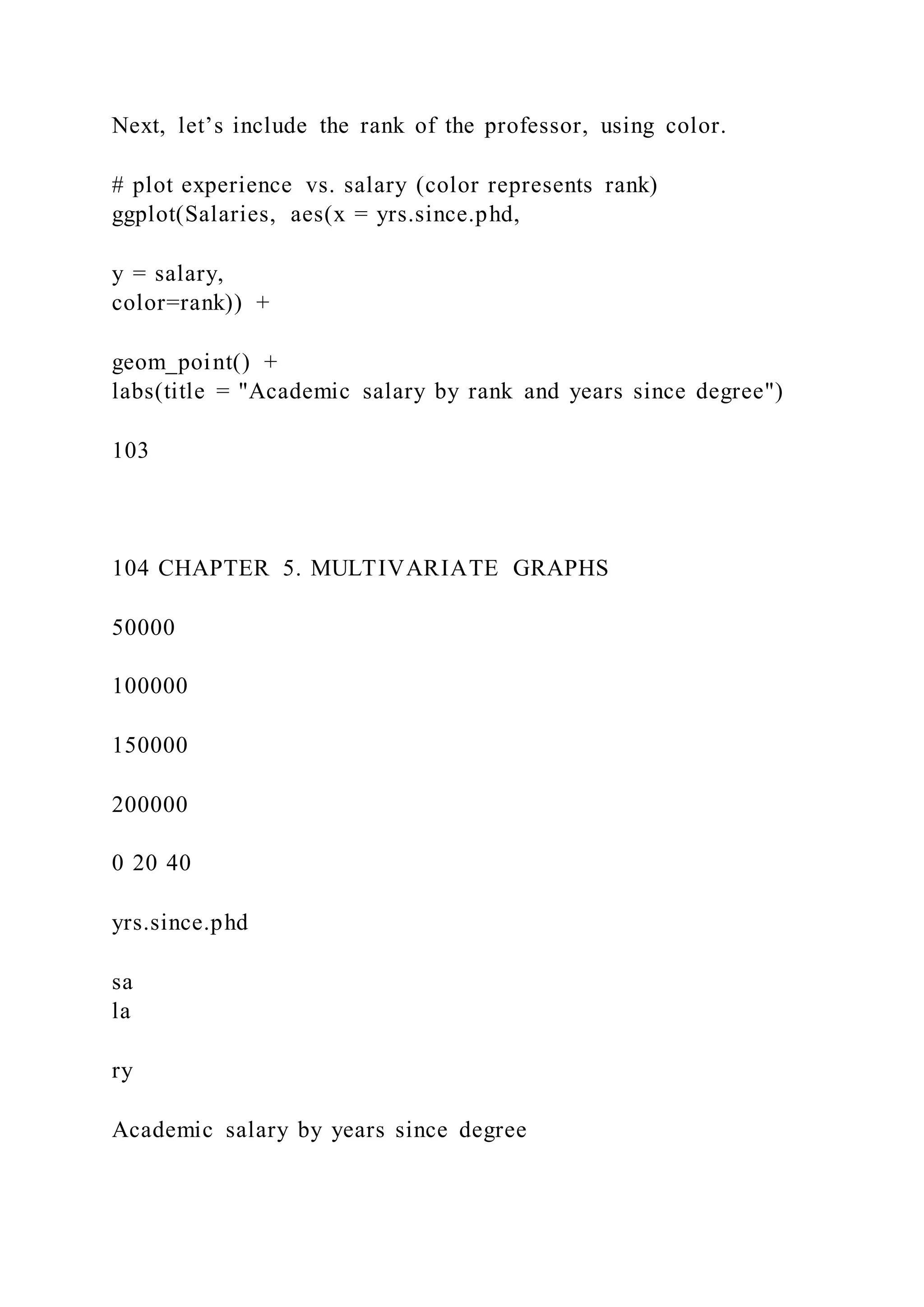
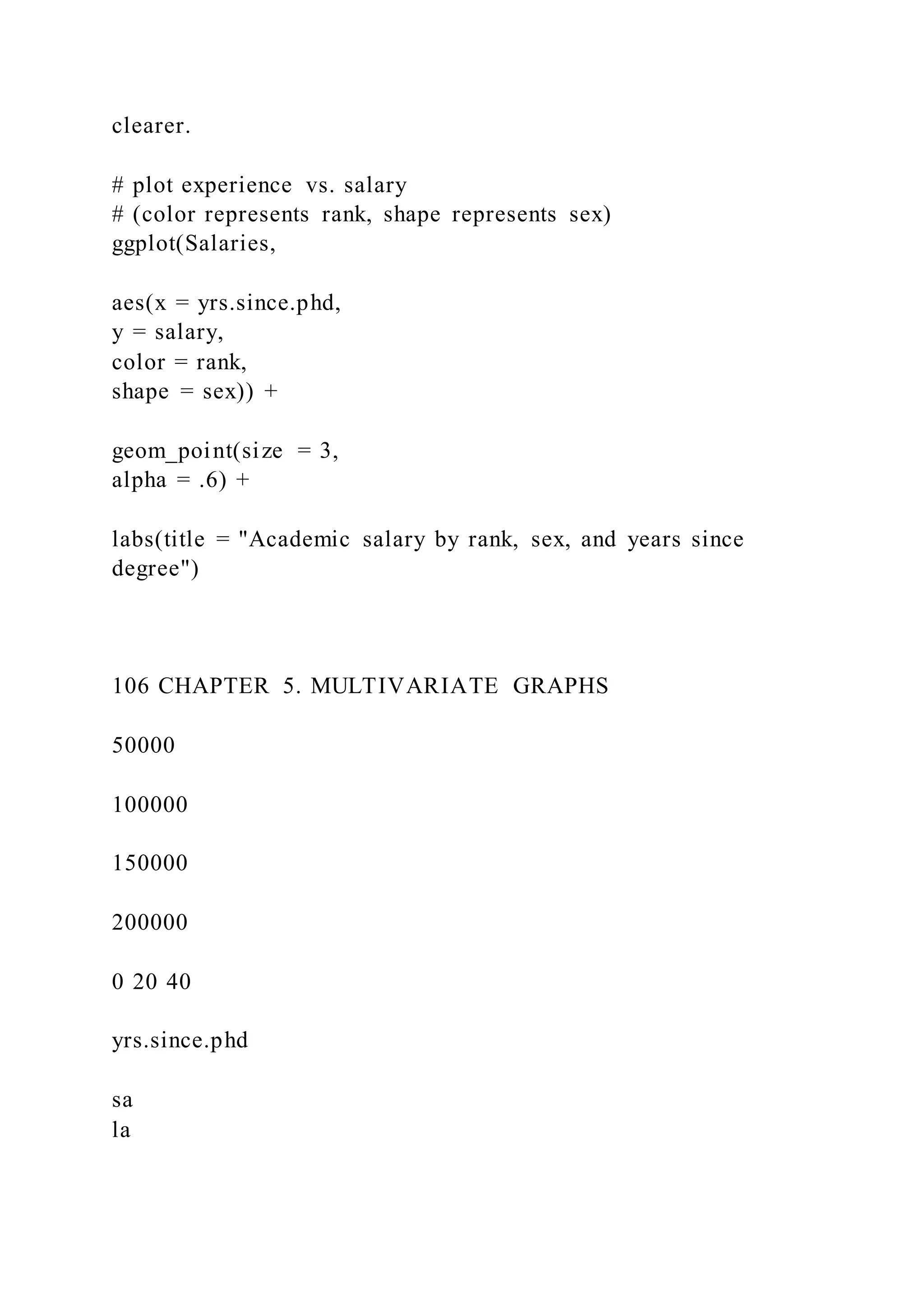
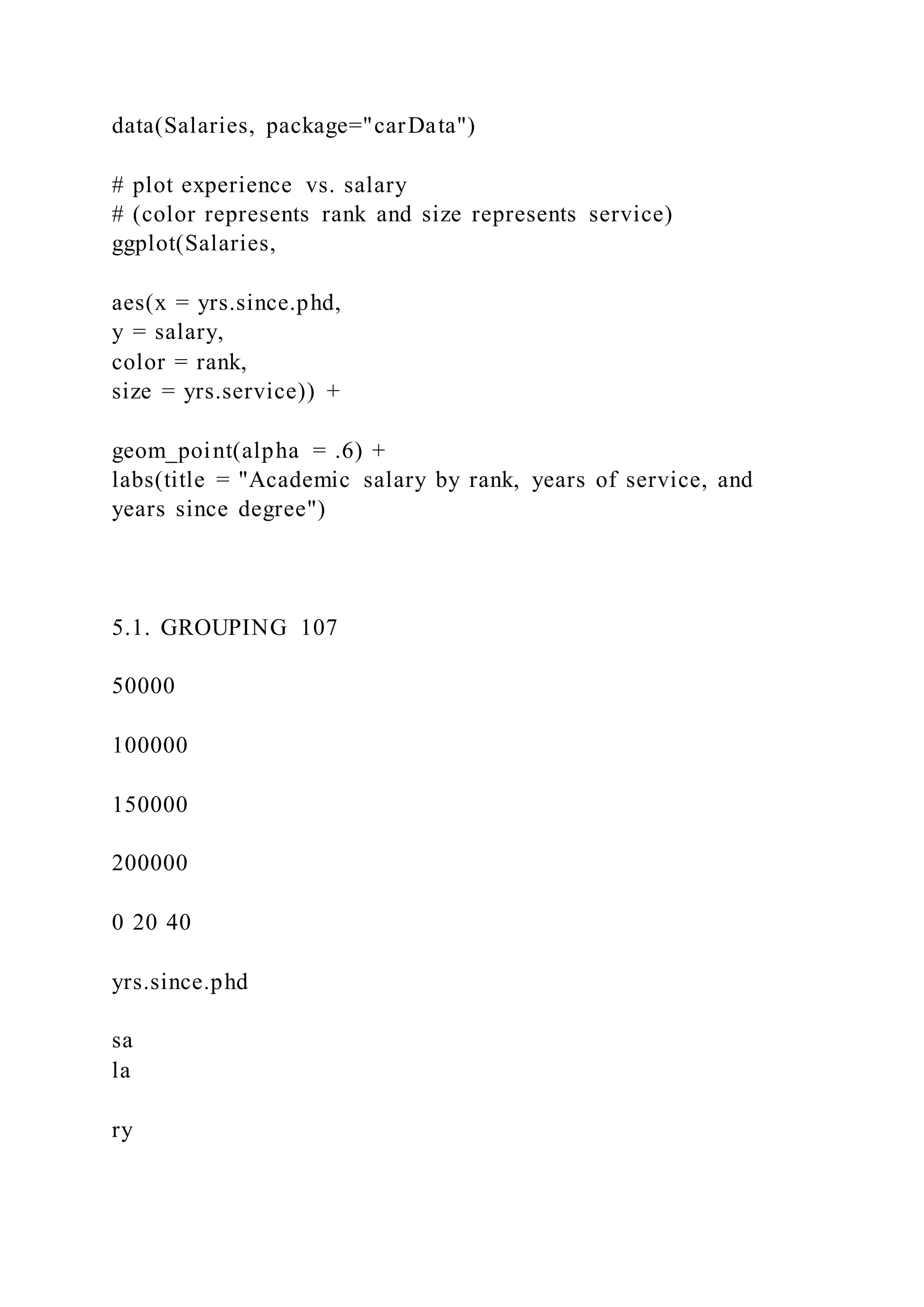
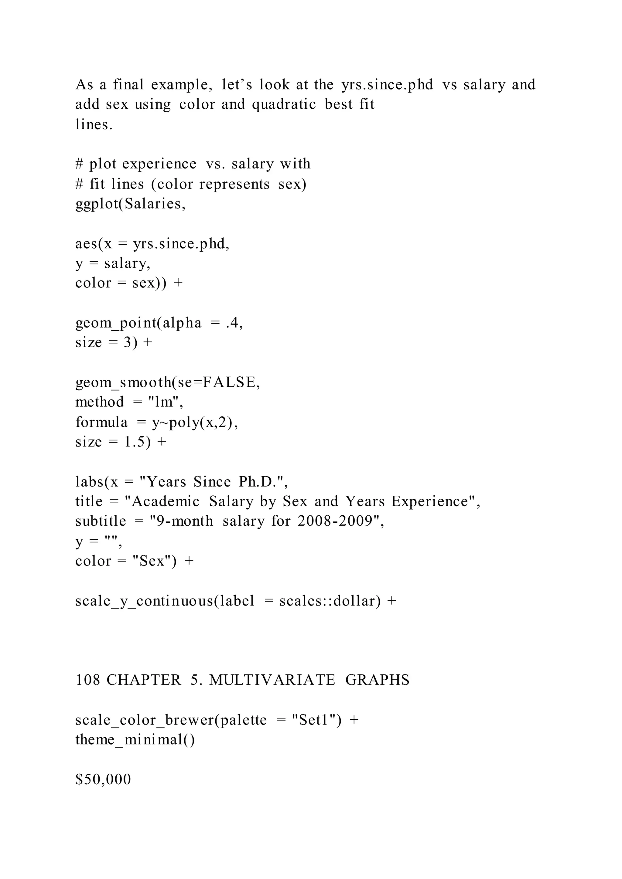
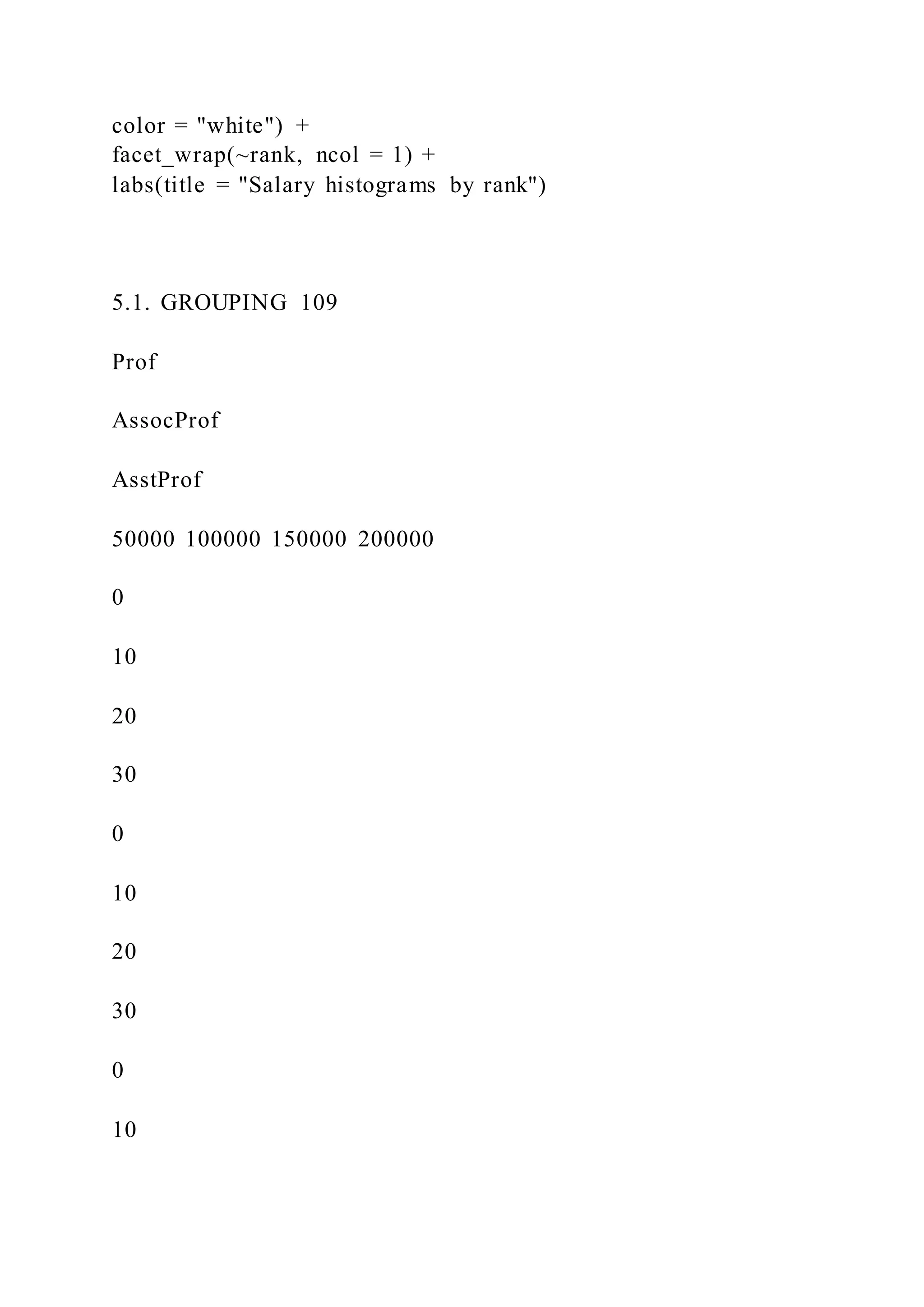
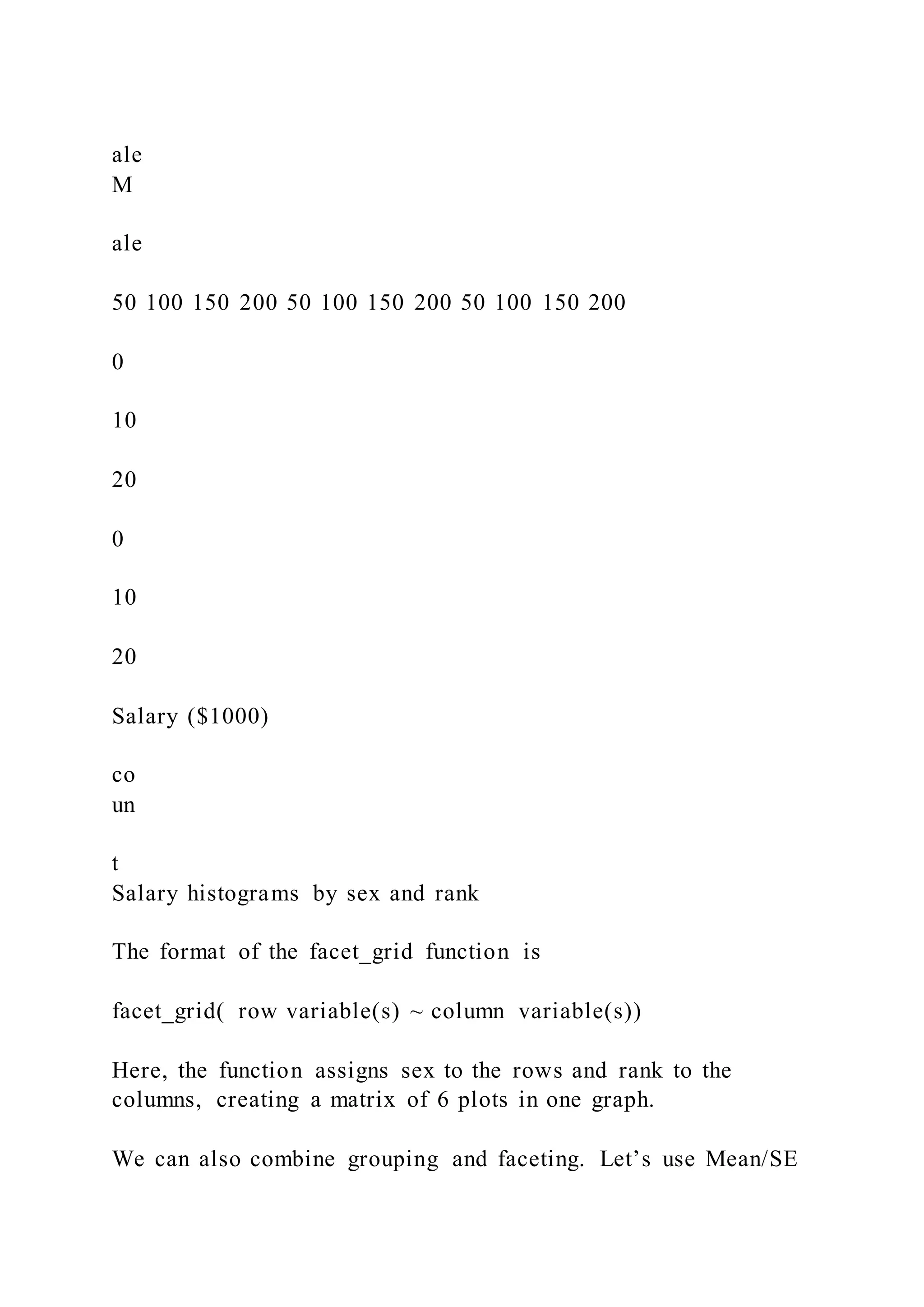
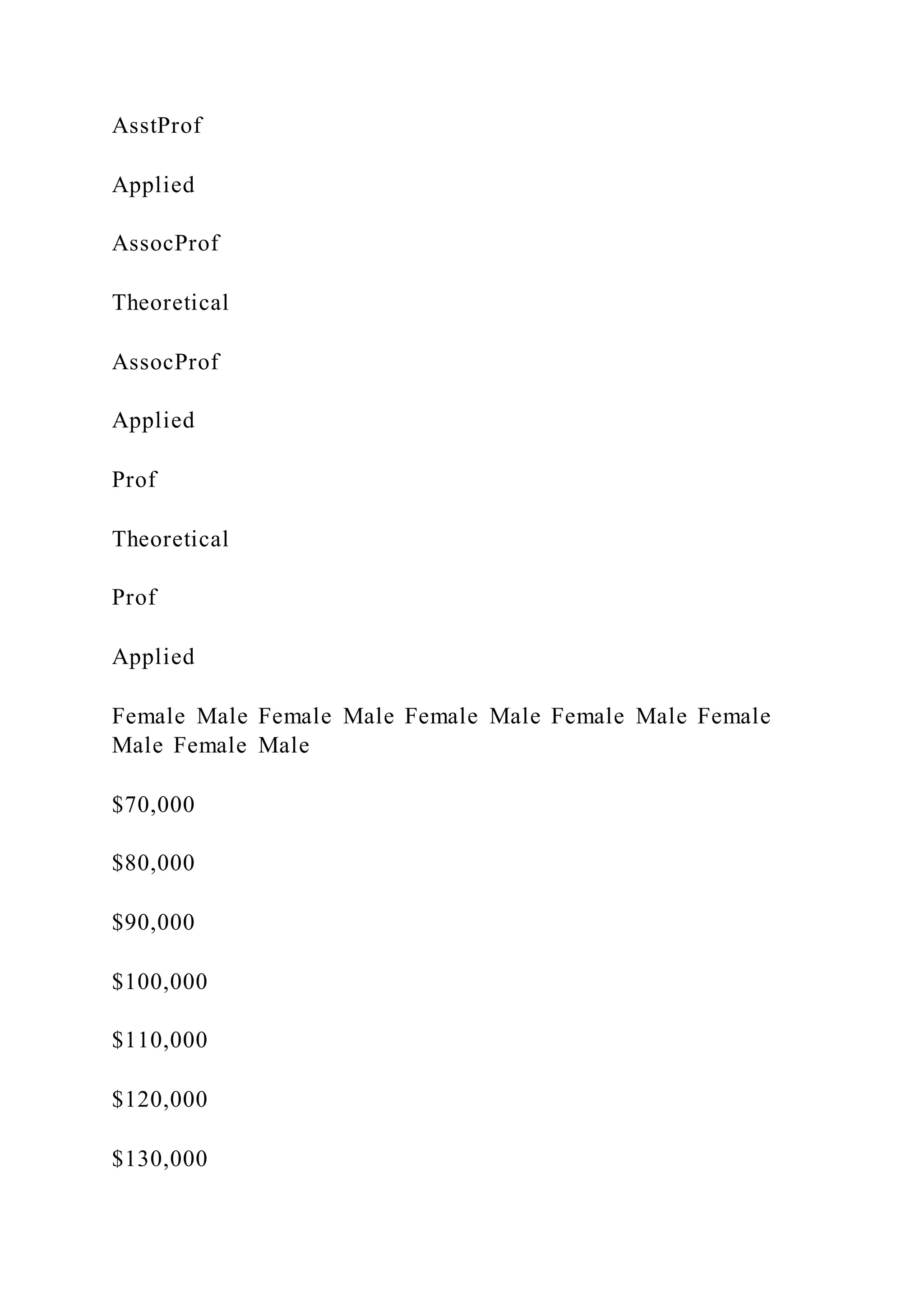
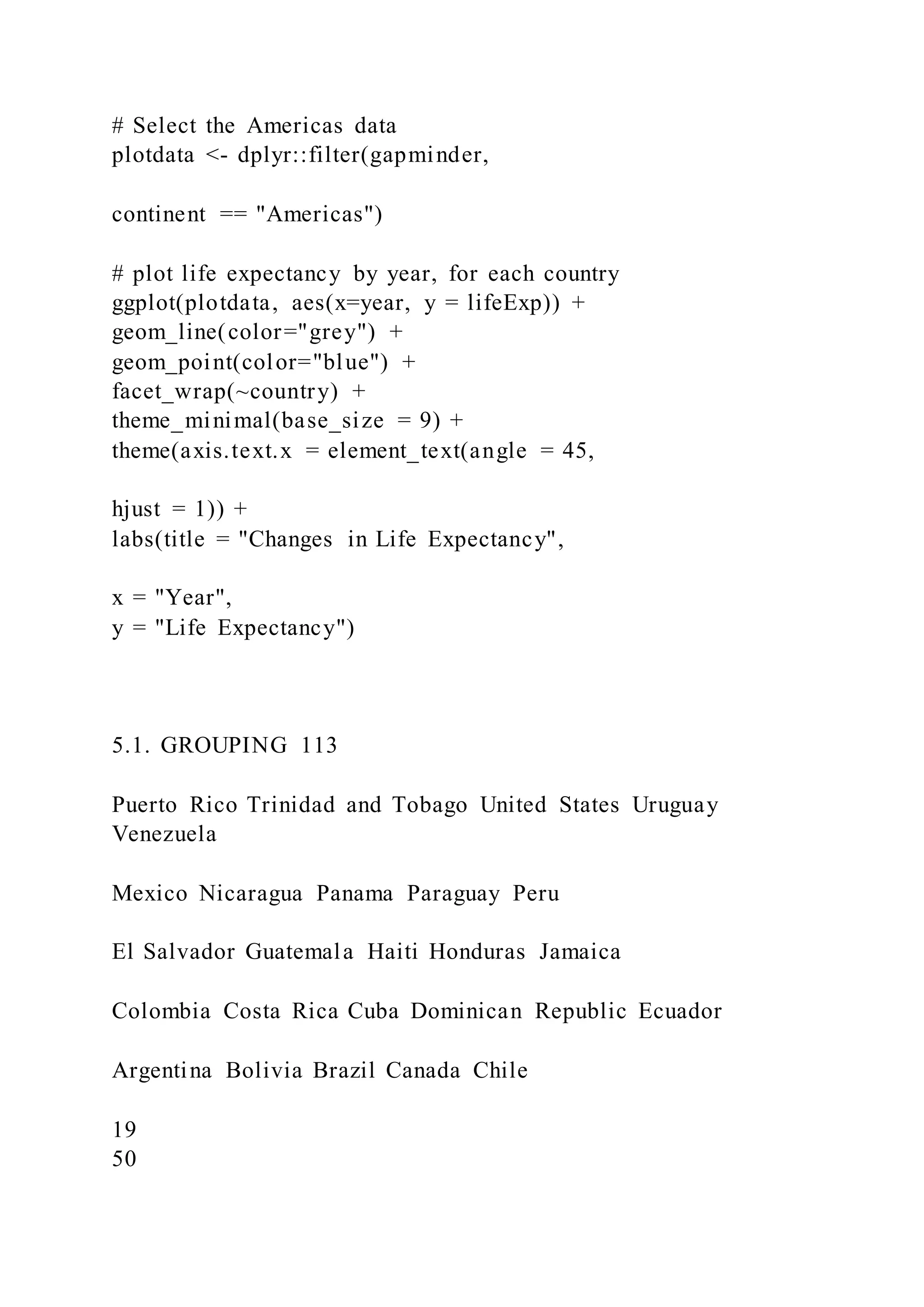
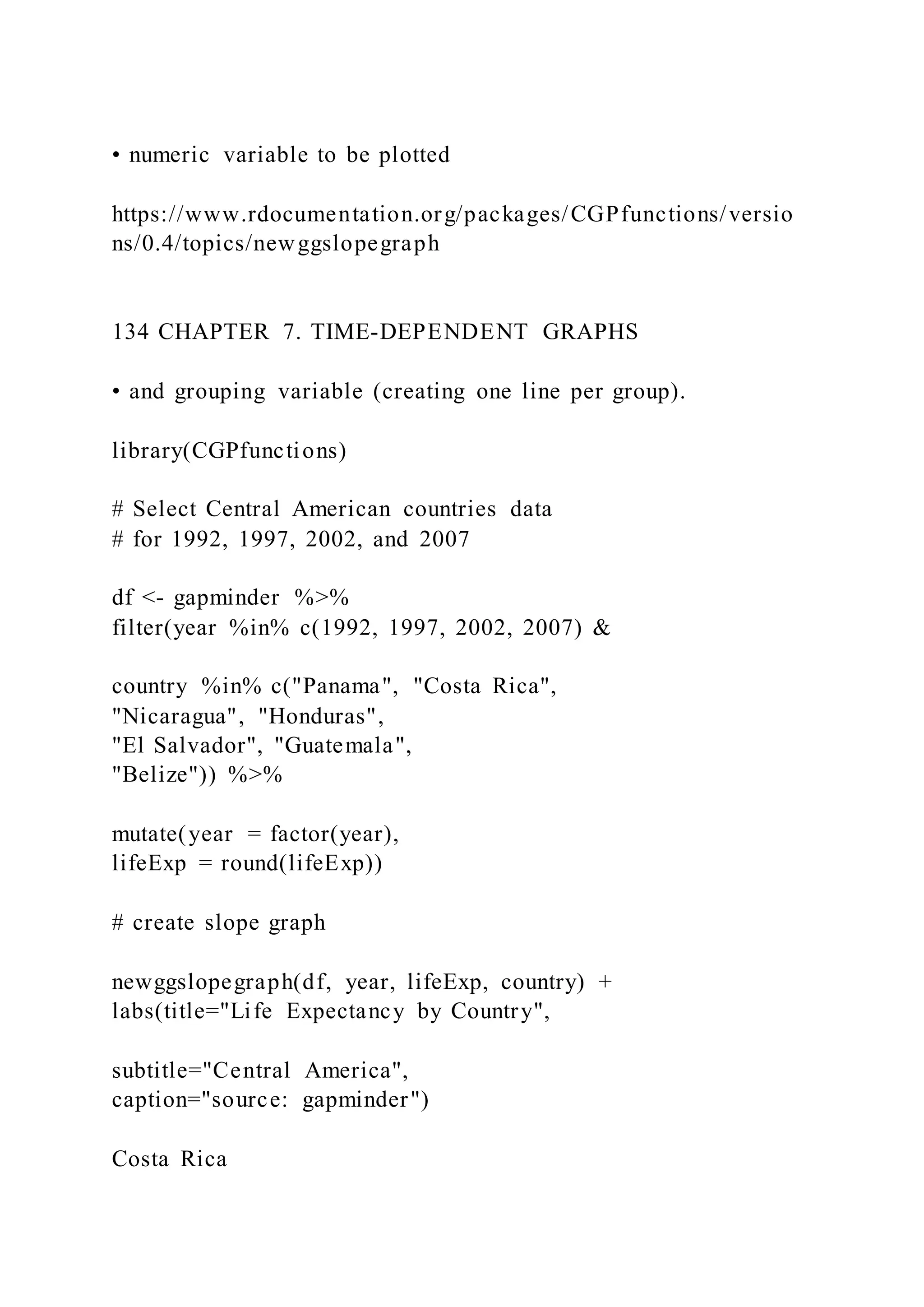
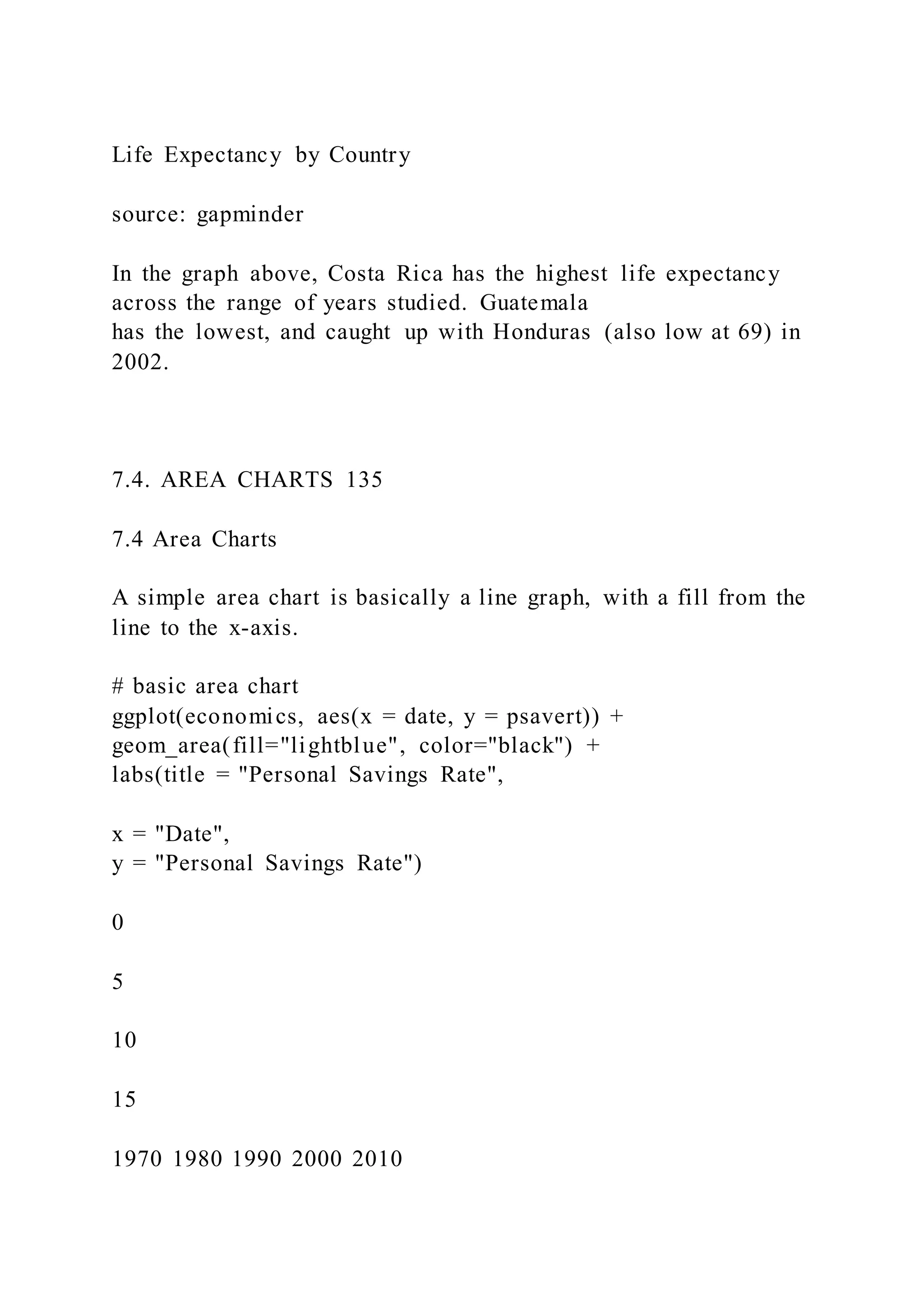
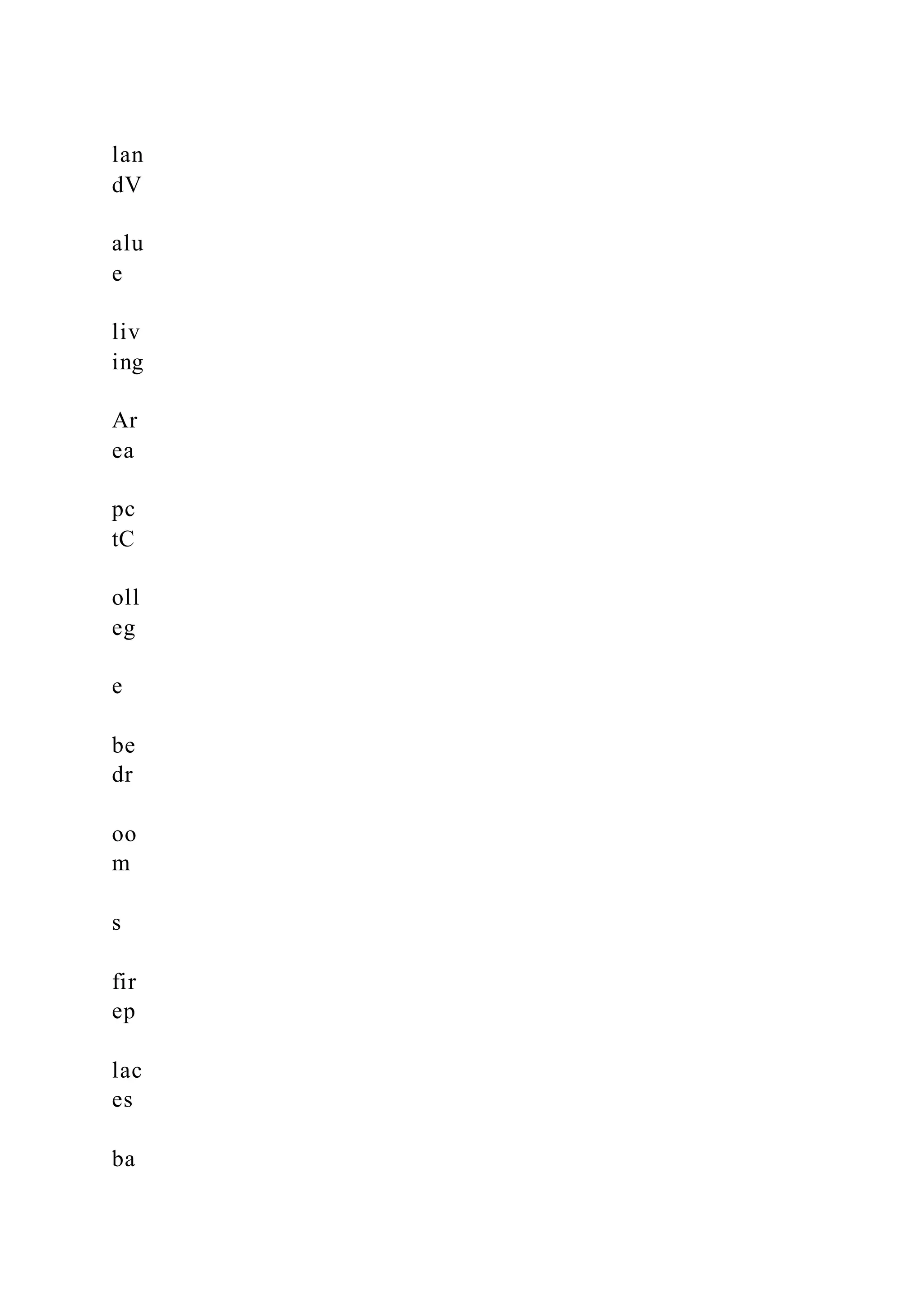
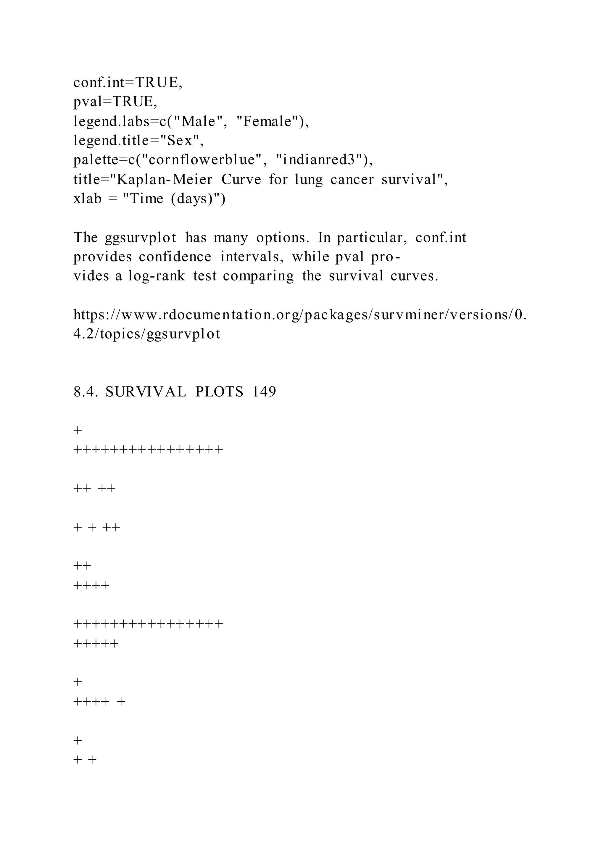
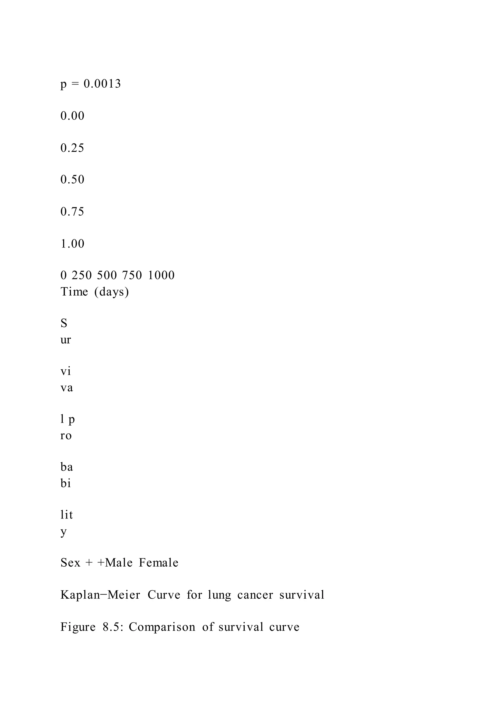
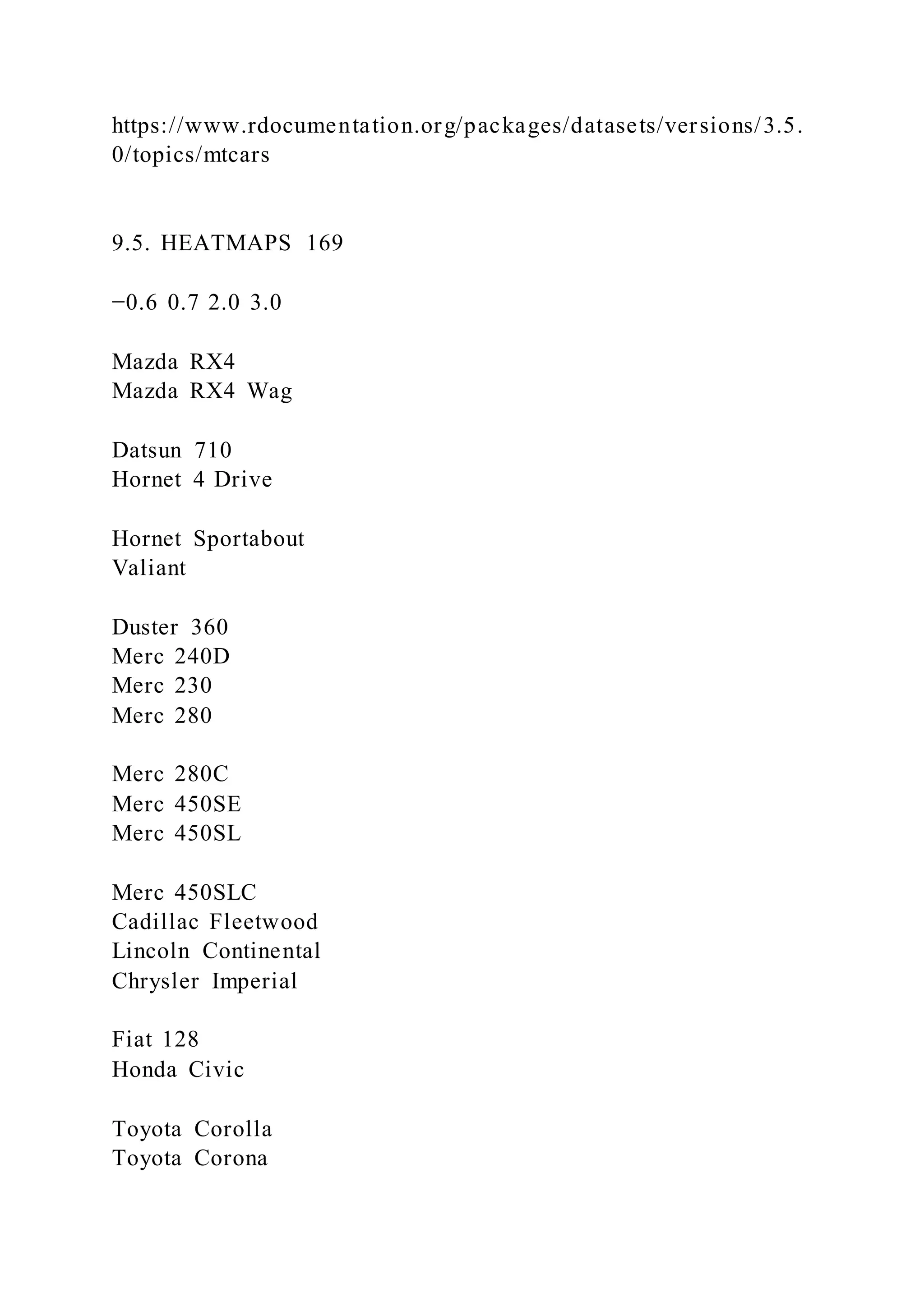
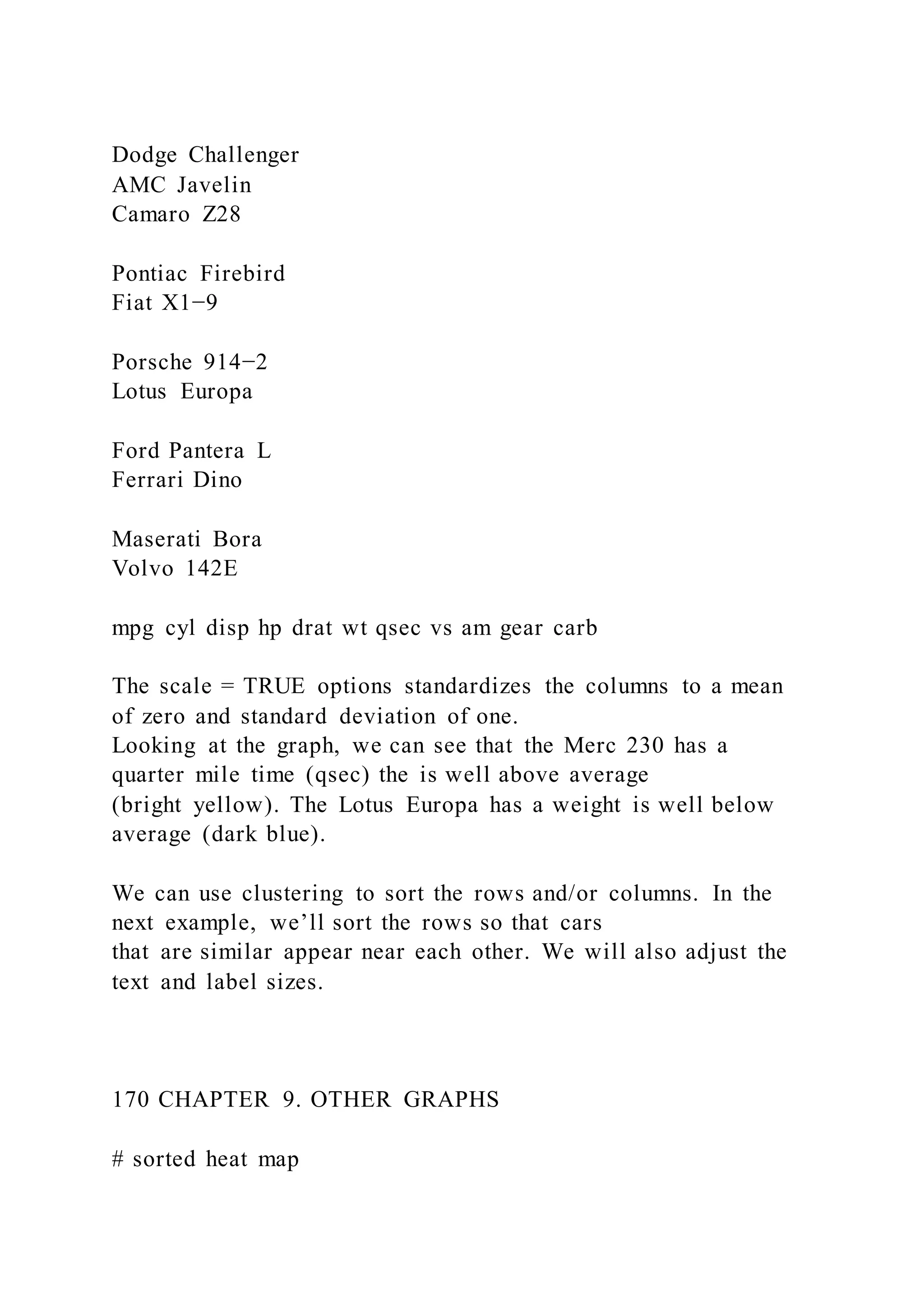
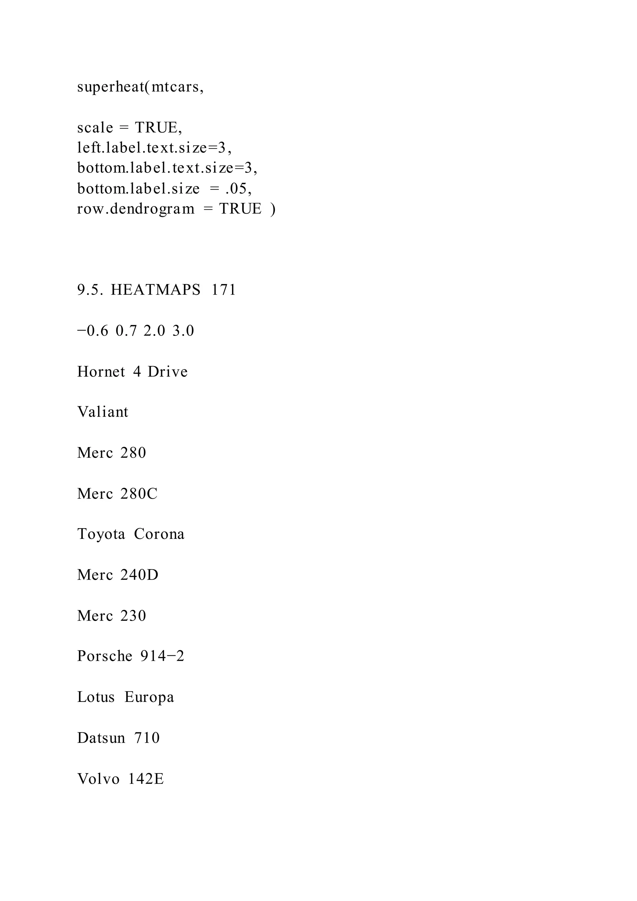
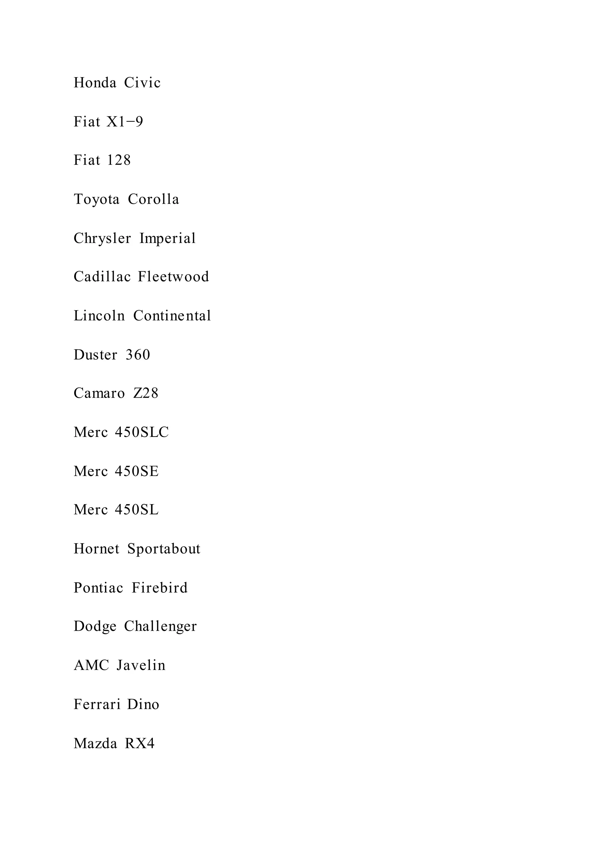
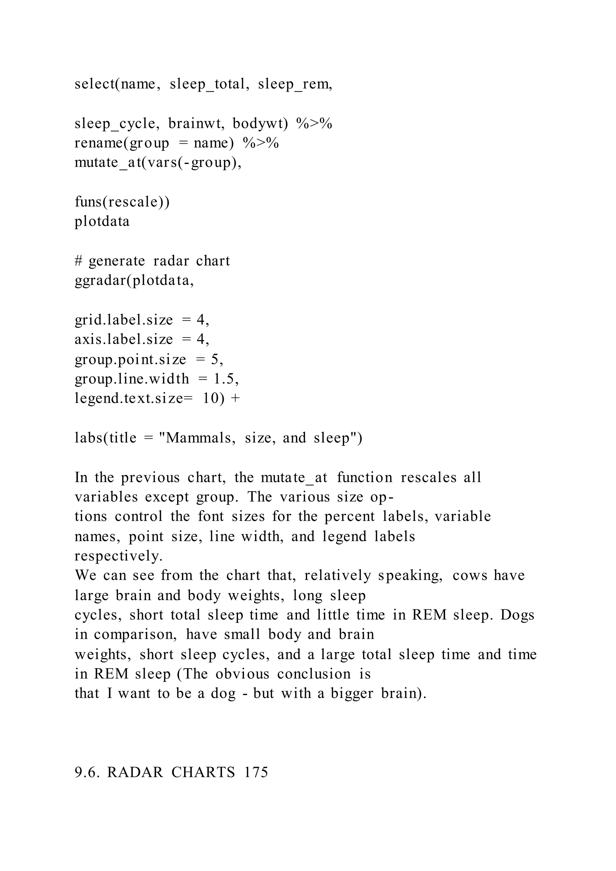
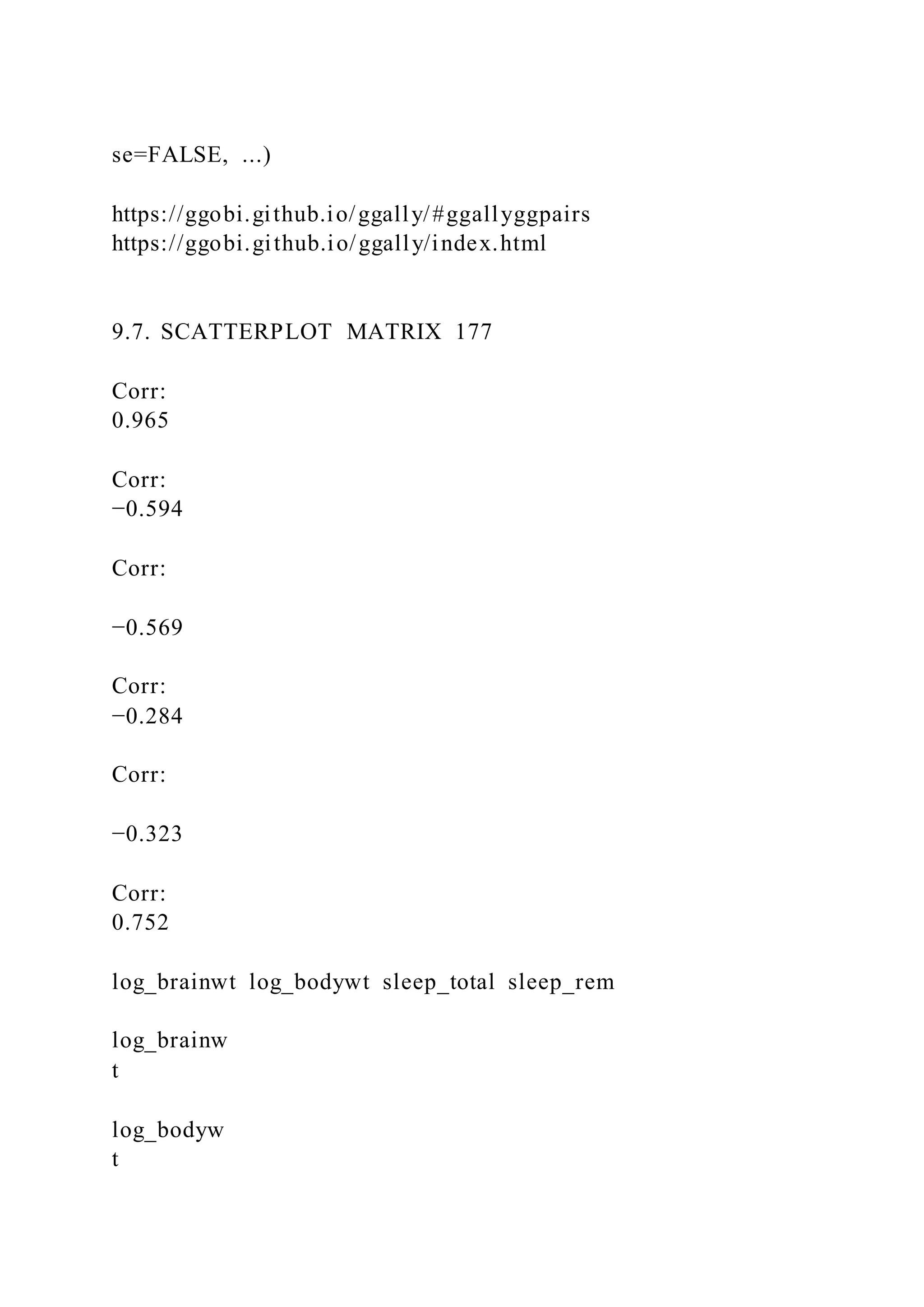
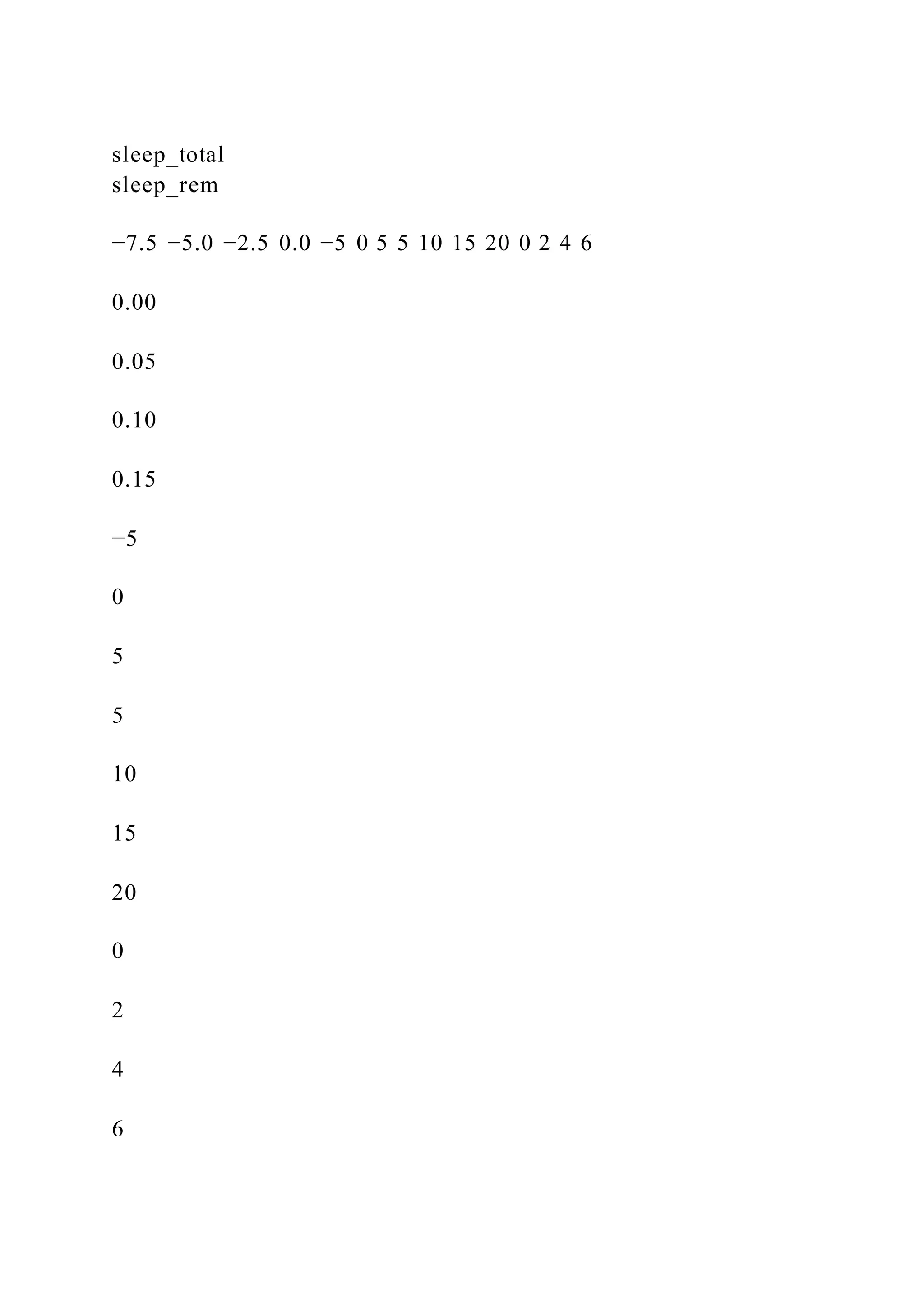
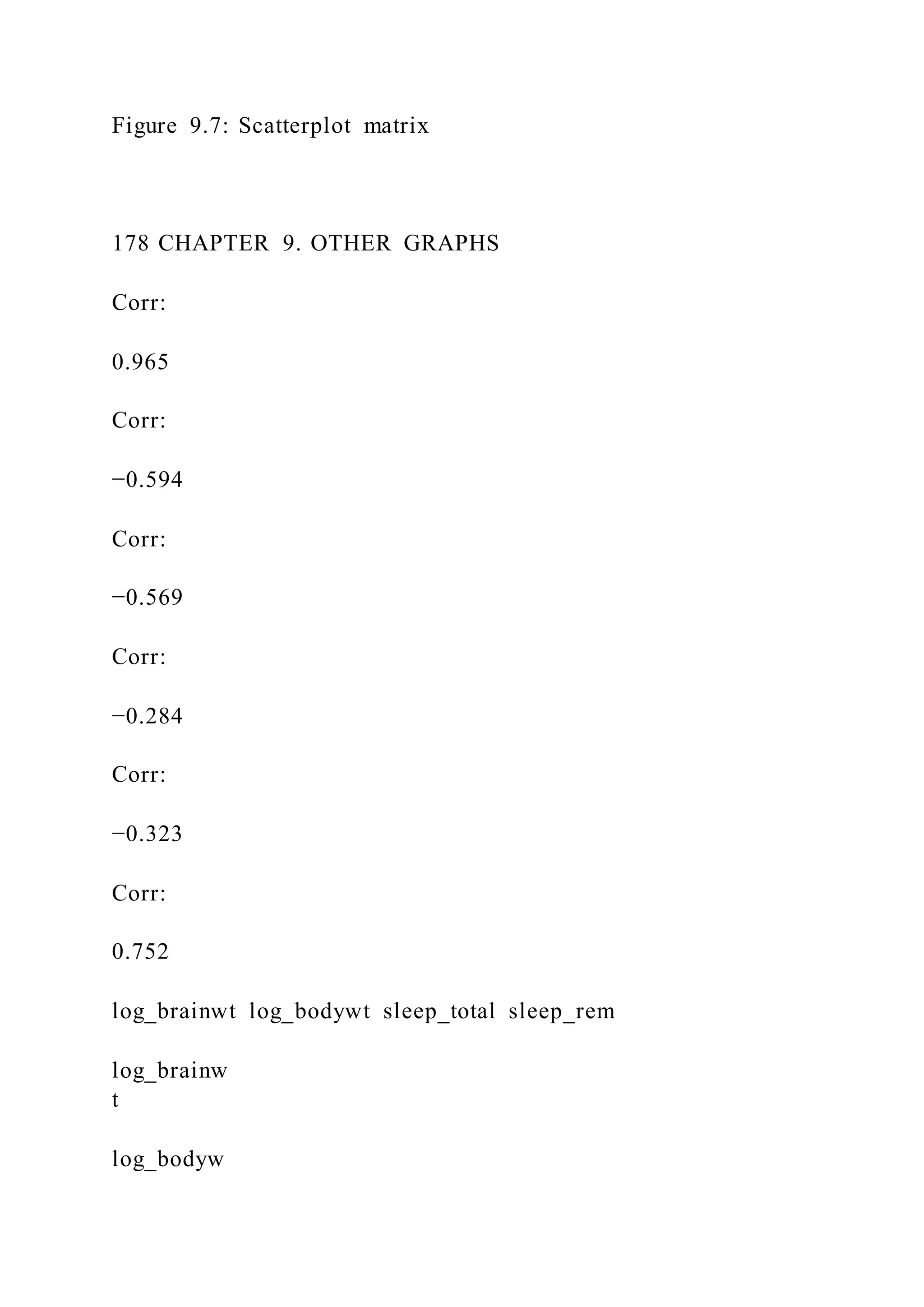
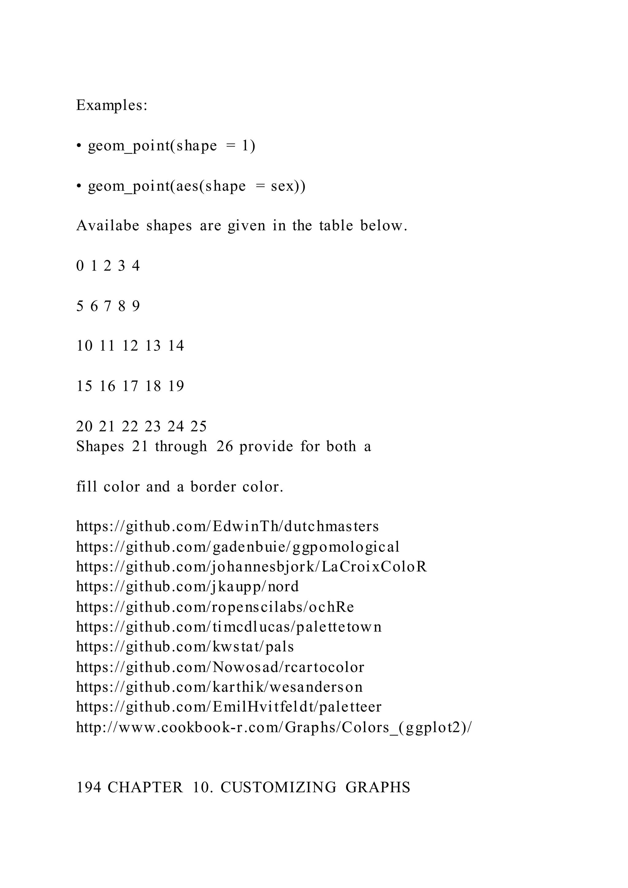
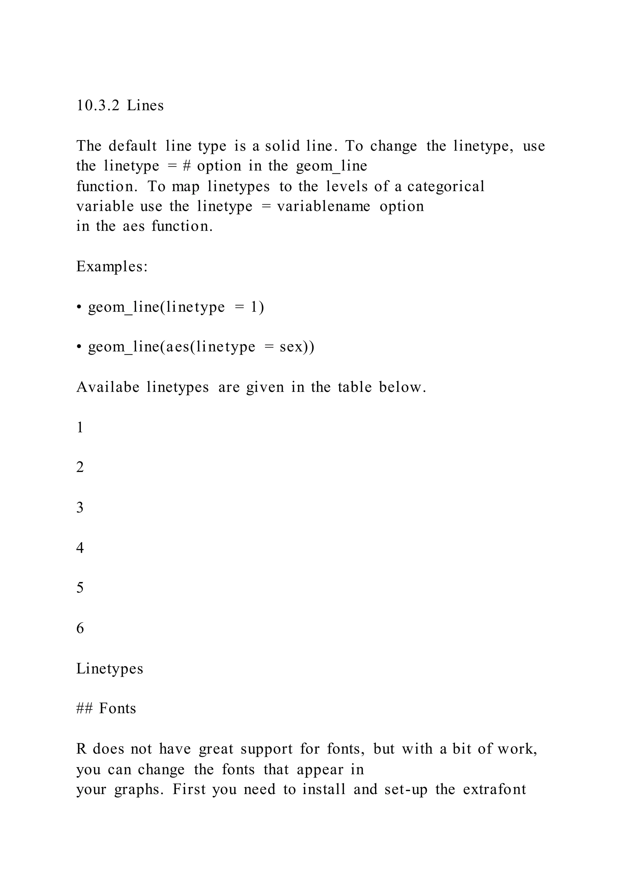
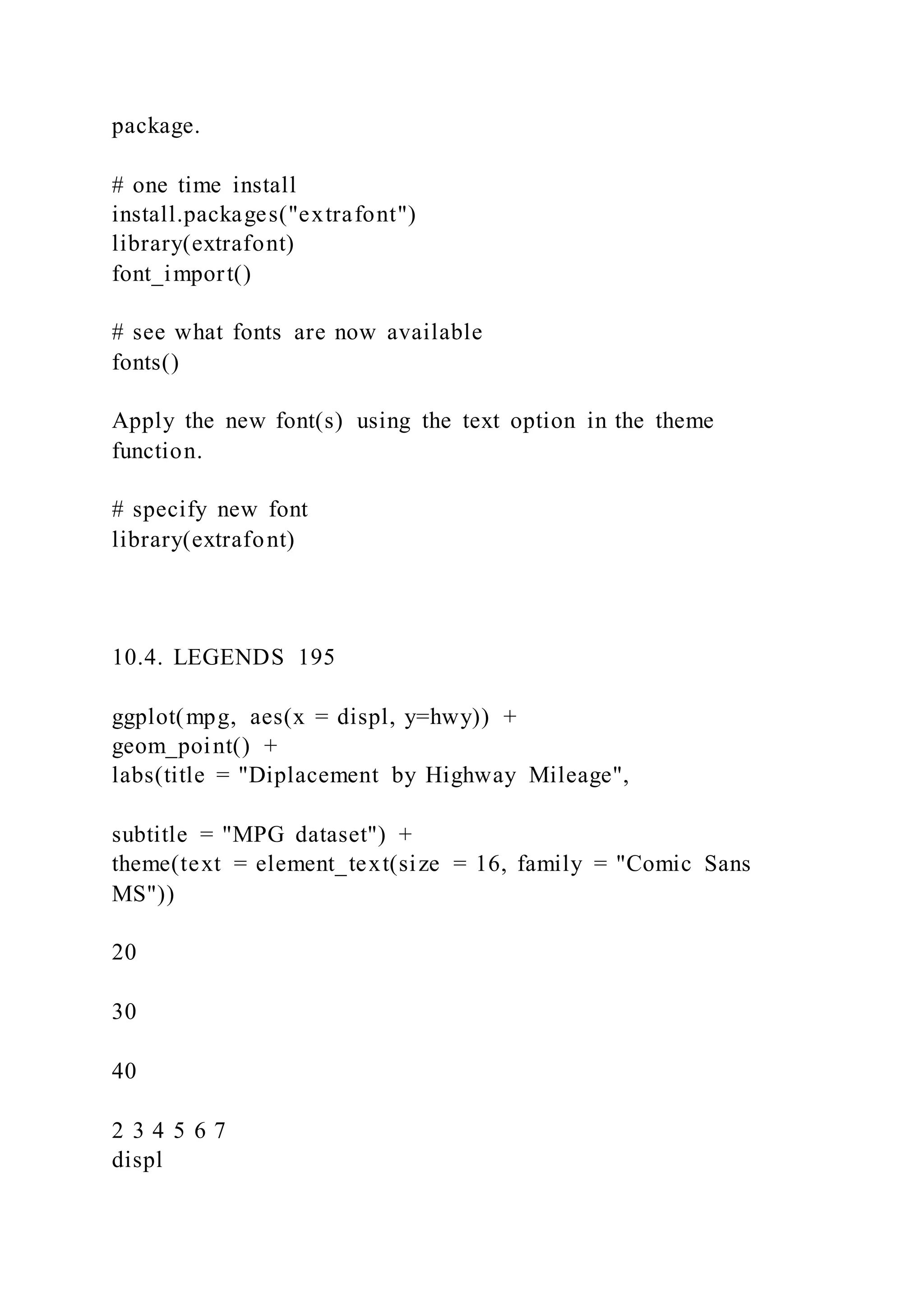
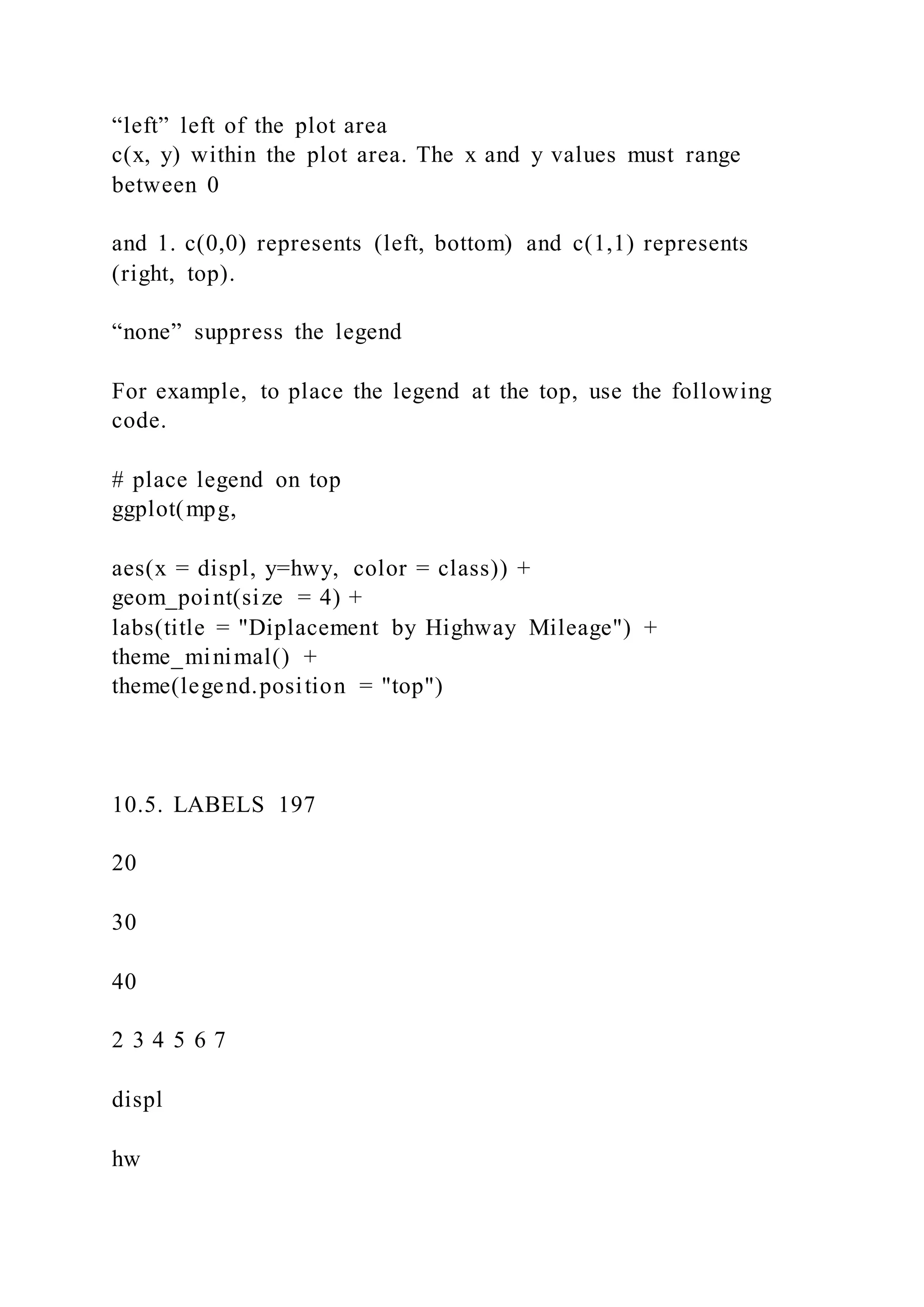
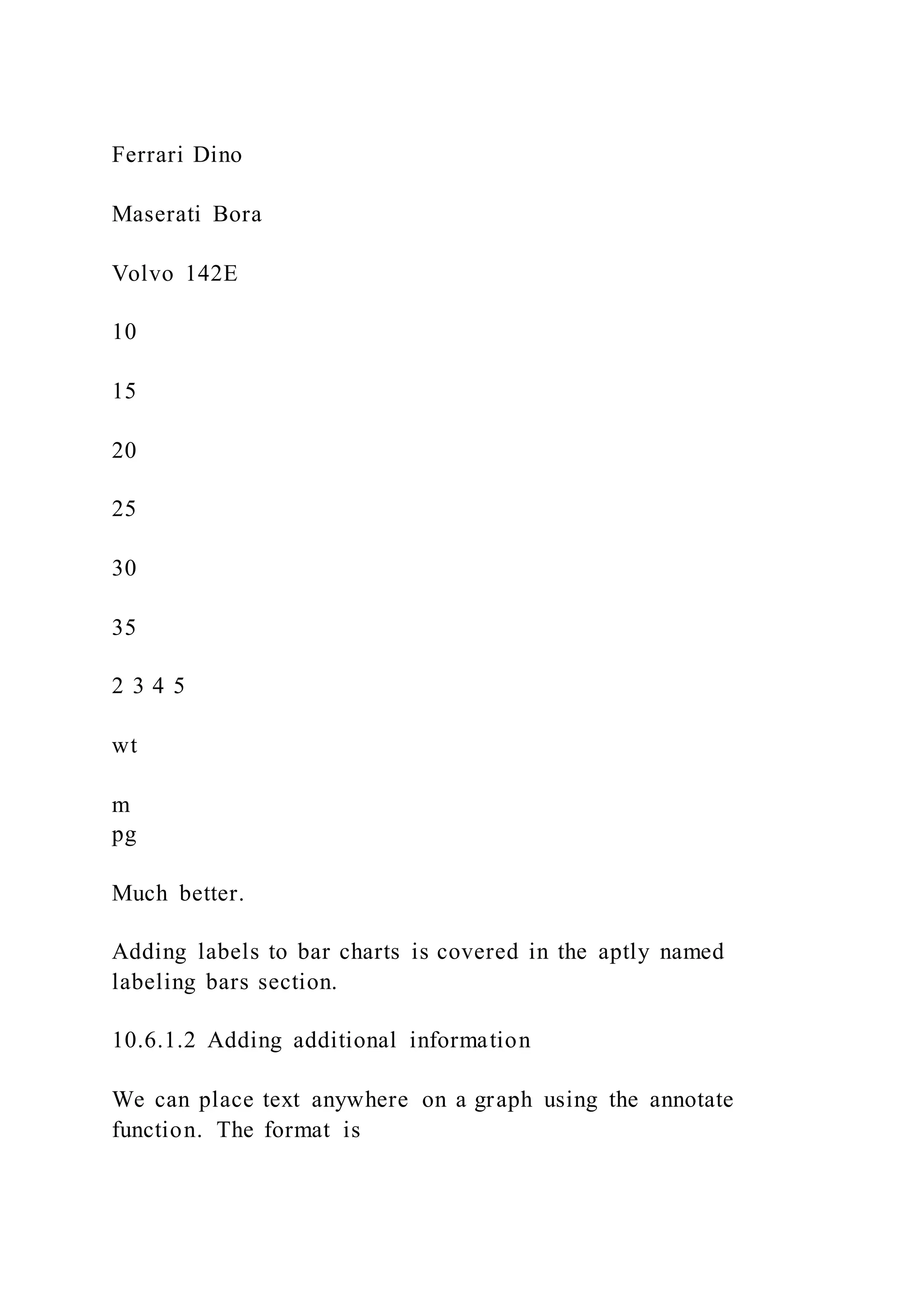
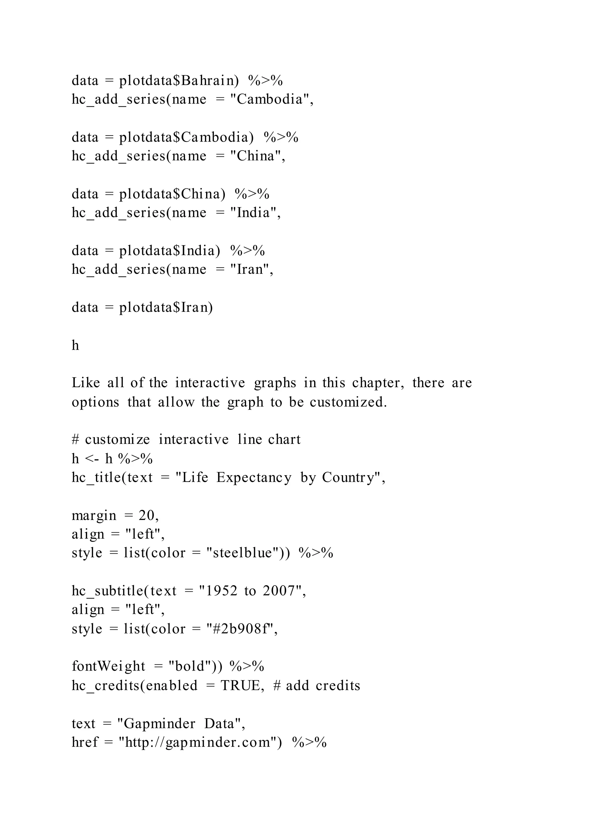
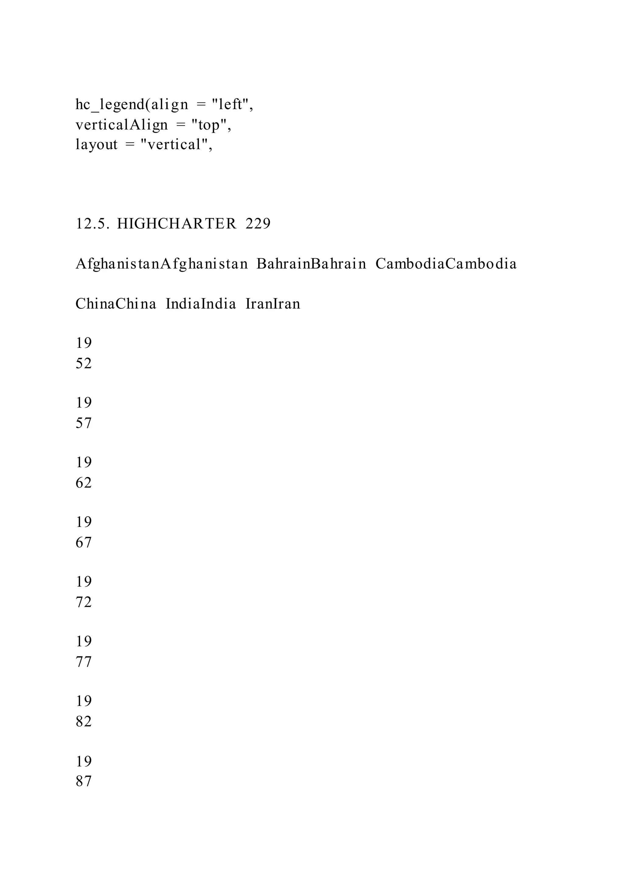
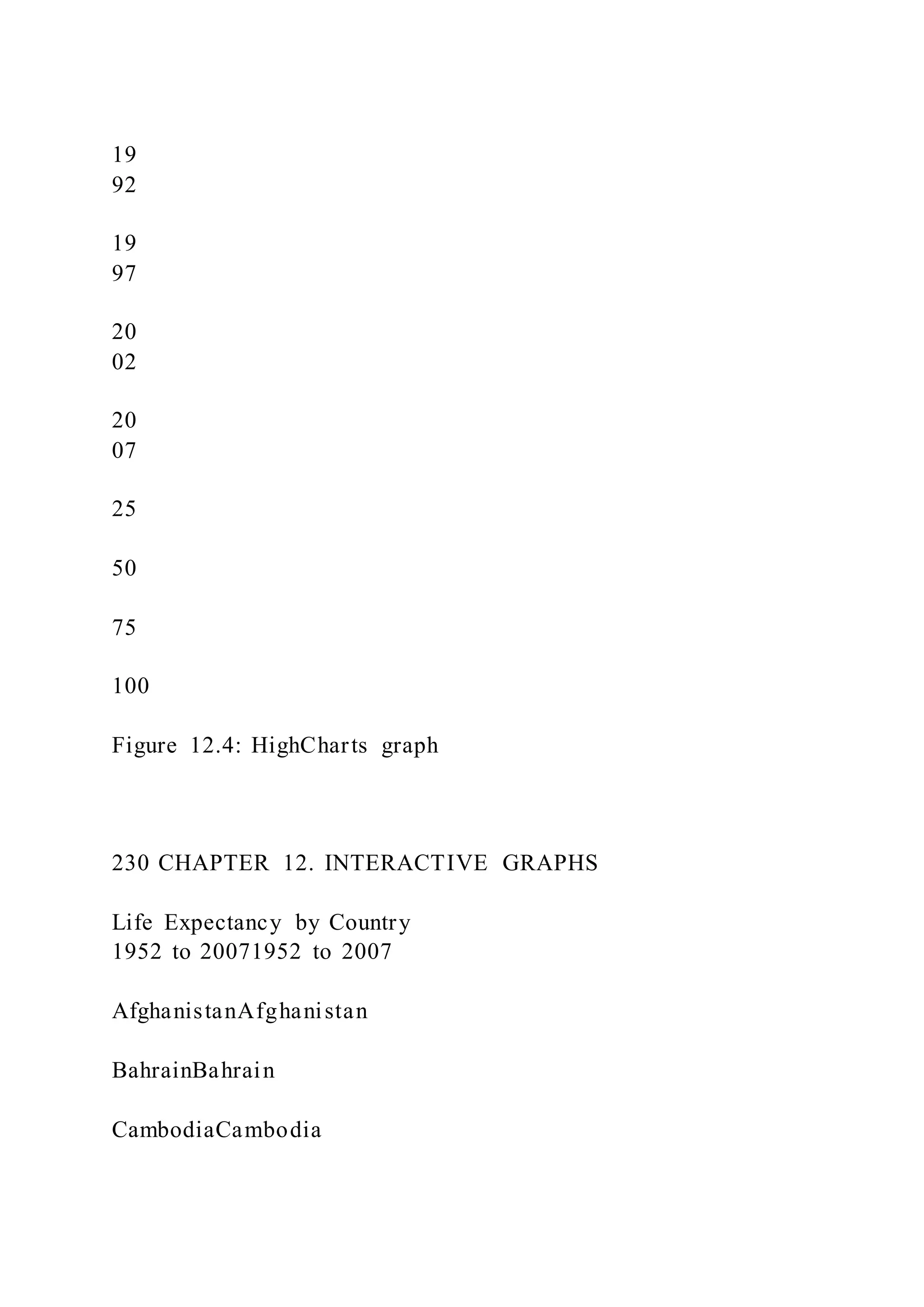
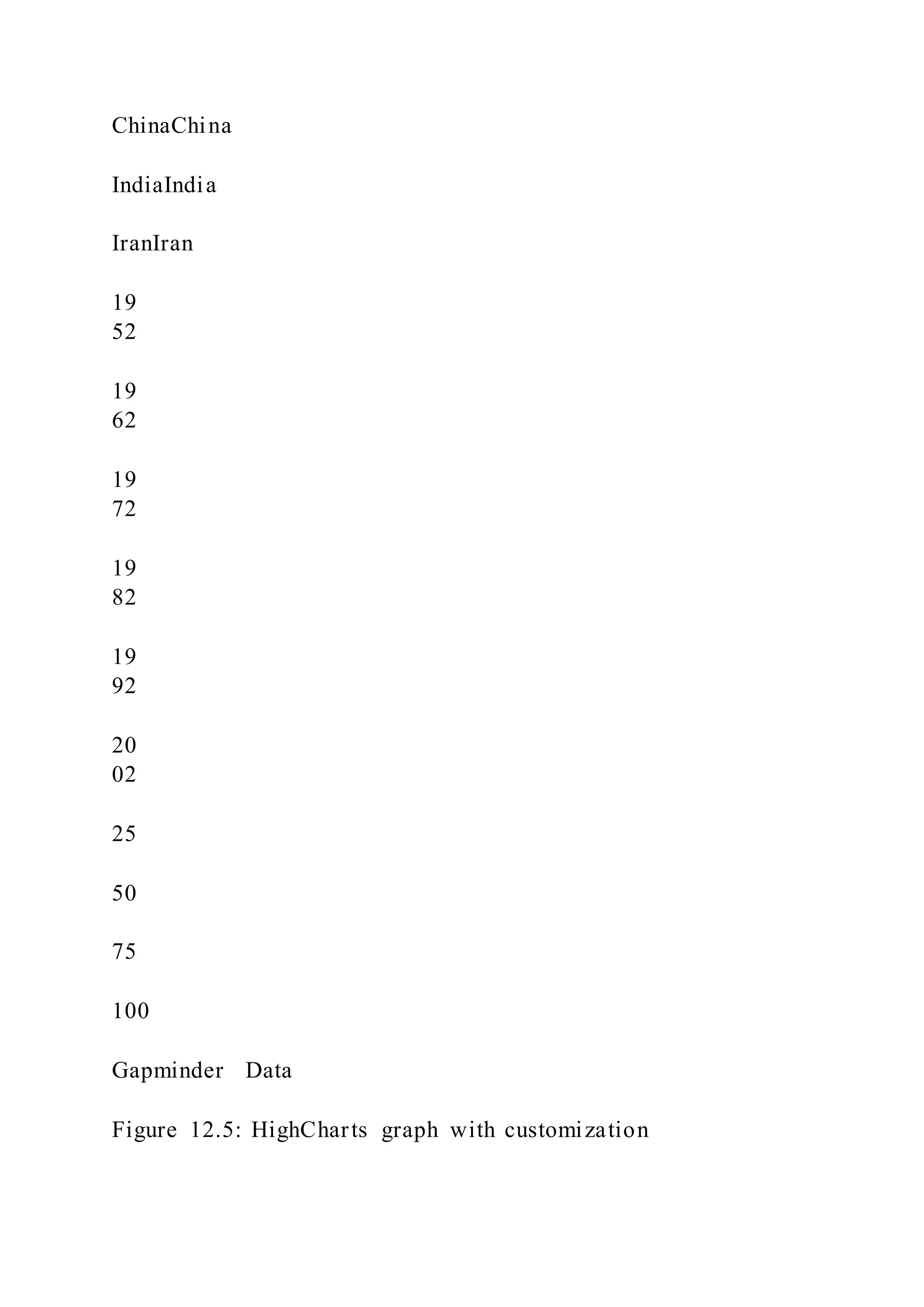
The document is a comprehensive guide on data visualization using R, including detailed sections on data preparation, the ggplot2 package, and various types of graphs. It covers univariate, bivariate, and multivariate graphs, as well as maps, statistical models, and customization techniques. Additionally, it provides best practices and advice for effective data visualization.


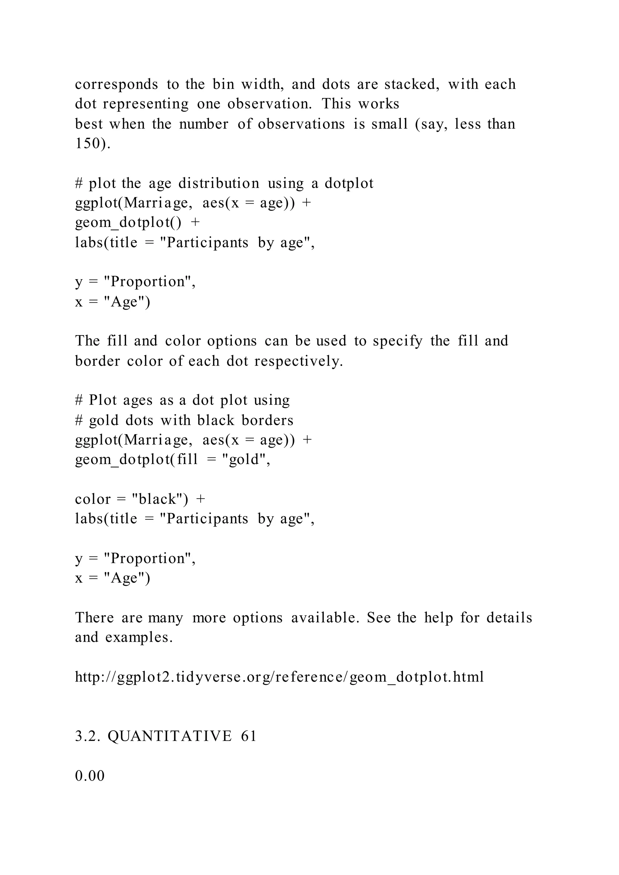
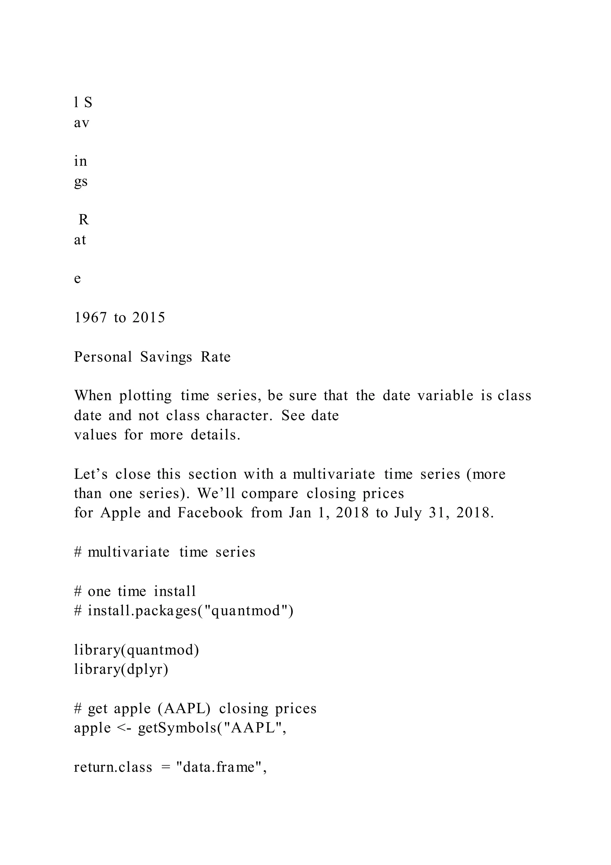
![Most of the examples in this book place the data and mapping
options in the ggplot function. Additionally,
the phrases data= and mapping= are omitted since the first
option always refers to data and the second
option always refers to mapping.
2.3 Graphs as objects
A ggplot2 graph can be saved as a named R object (like a data
frame), manipulated further, and then
printed or saved to disk.
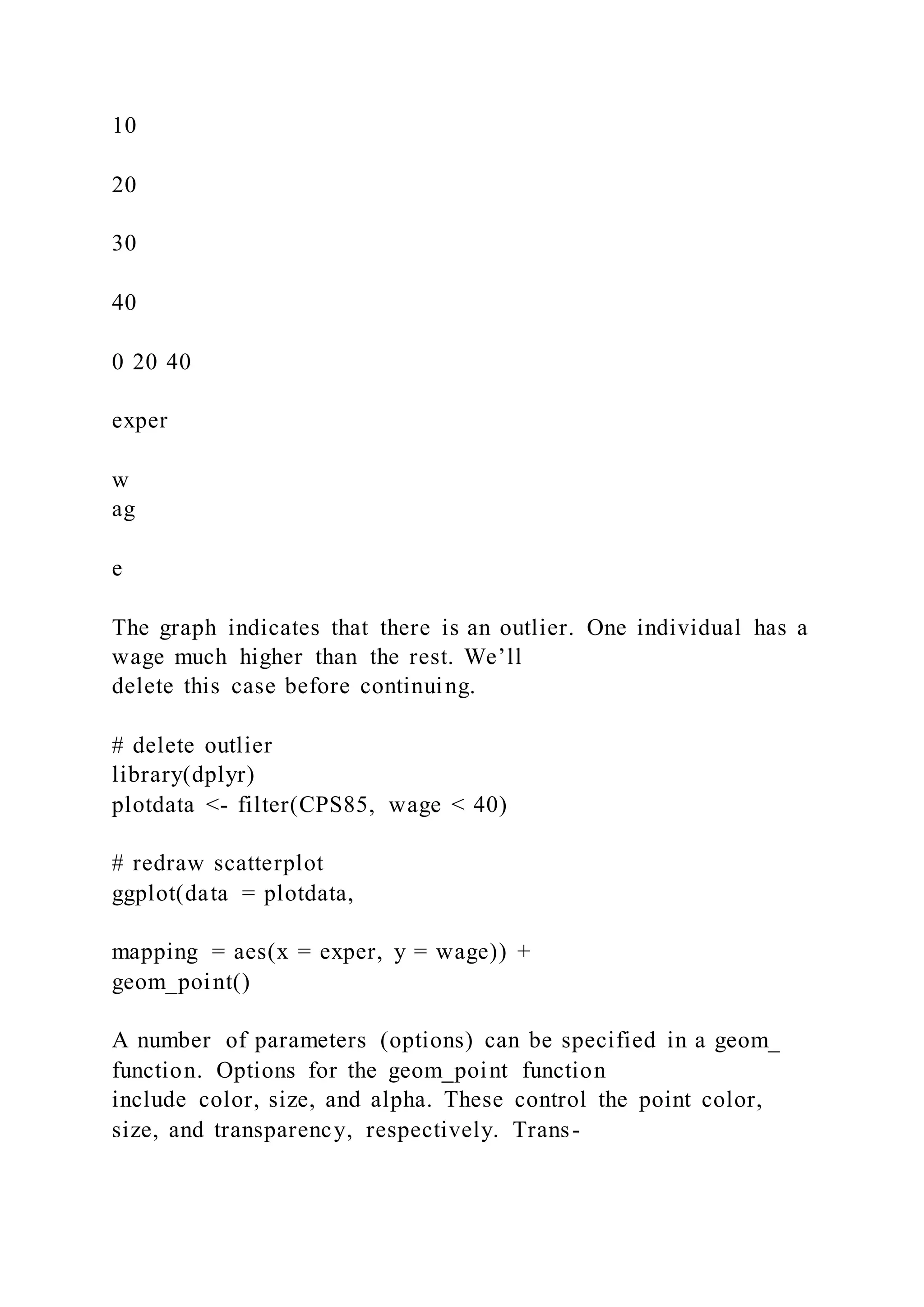
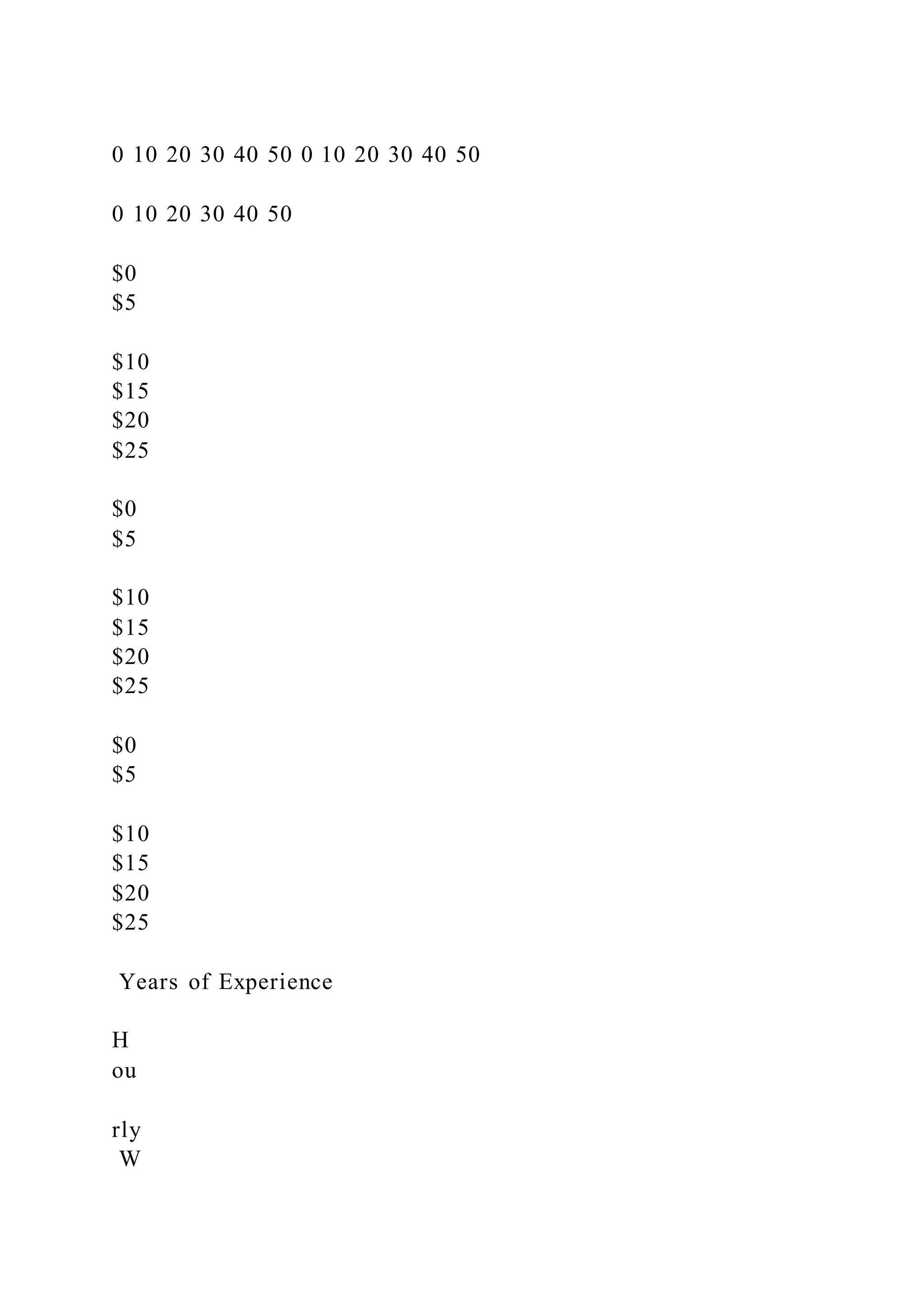
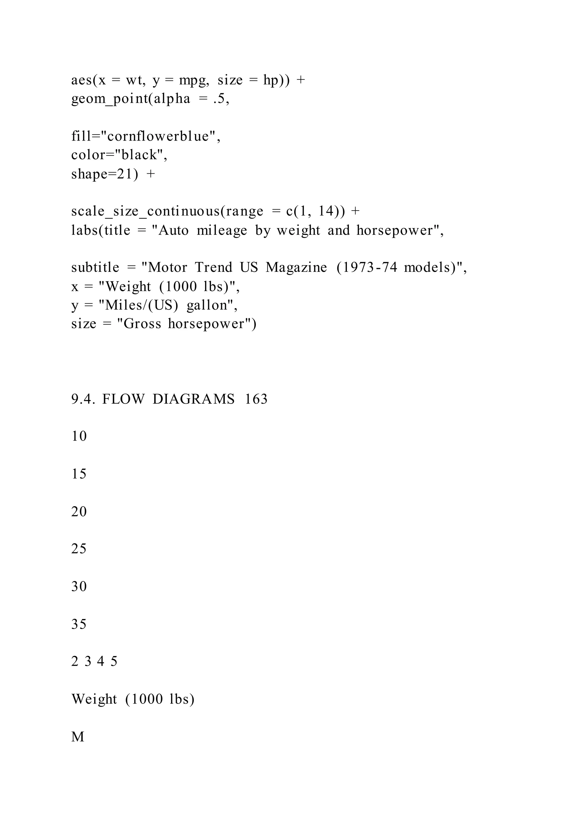
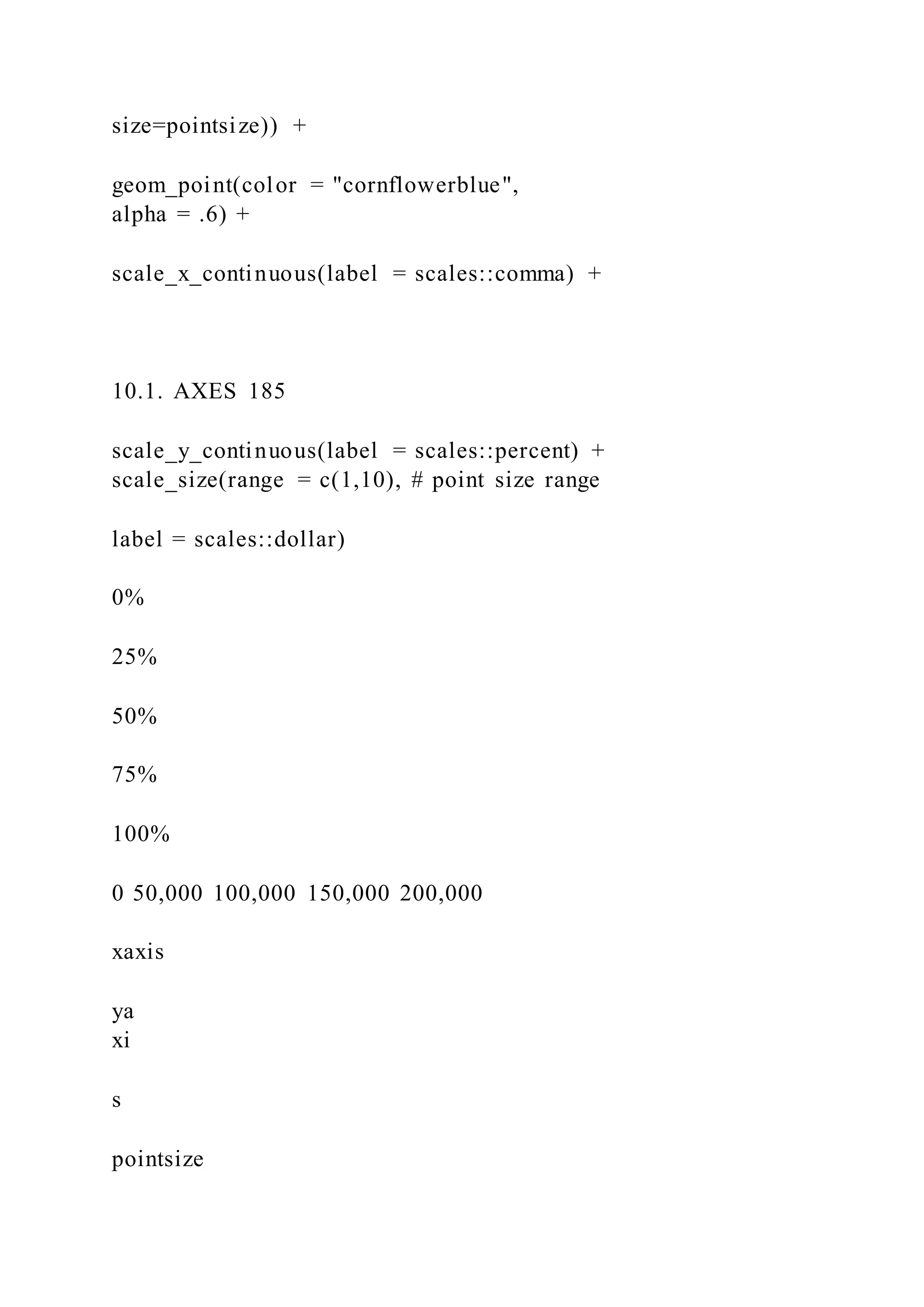
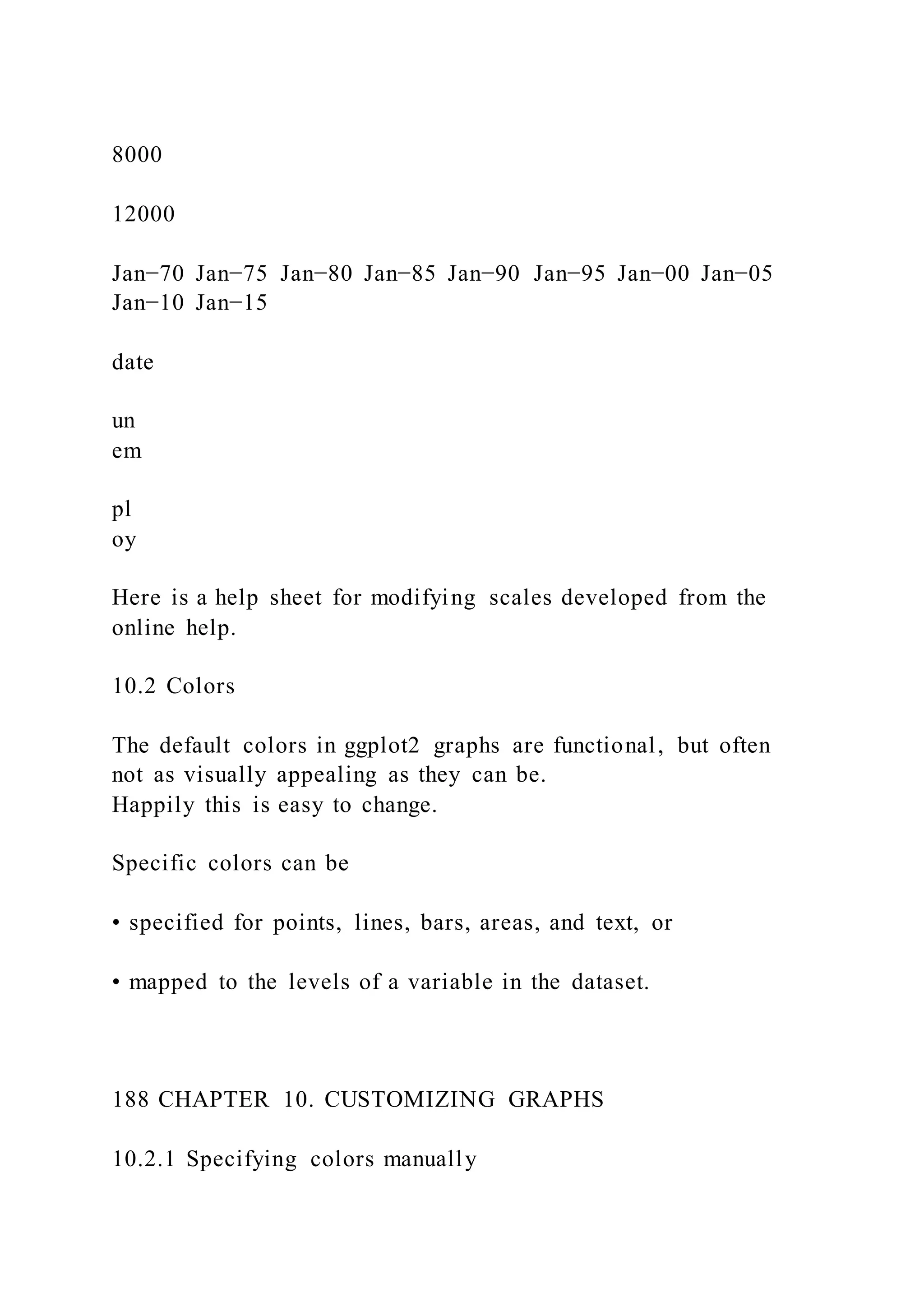
# prepare data
data(CPS85 , package = "mosaicData")
plotdata <- CPS85[CPS85$wage < 40,]
2.3. GRAPHS AS OBJECTS 33
# create scatterplot and save it
myplot <- ggplot(data = plotdata,
aes(x = exper, y = wage)) +
geom_point()
# print the graph
myplot
# make the points larger and blue
# then print the graph
myplot <- myplot + geom_point(size = 3, color = "blue")
myplot
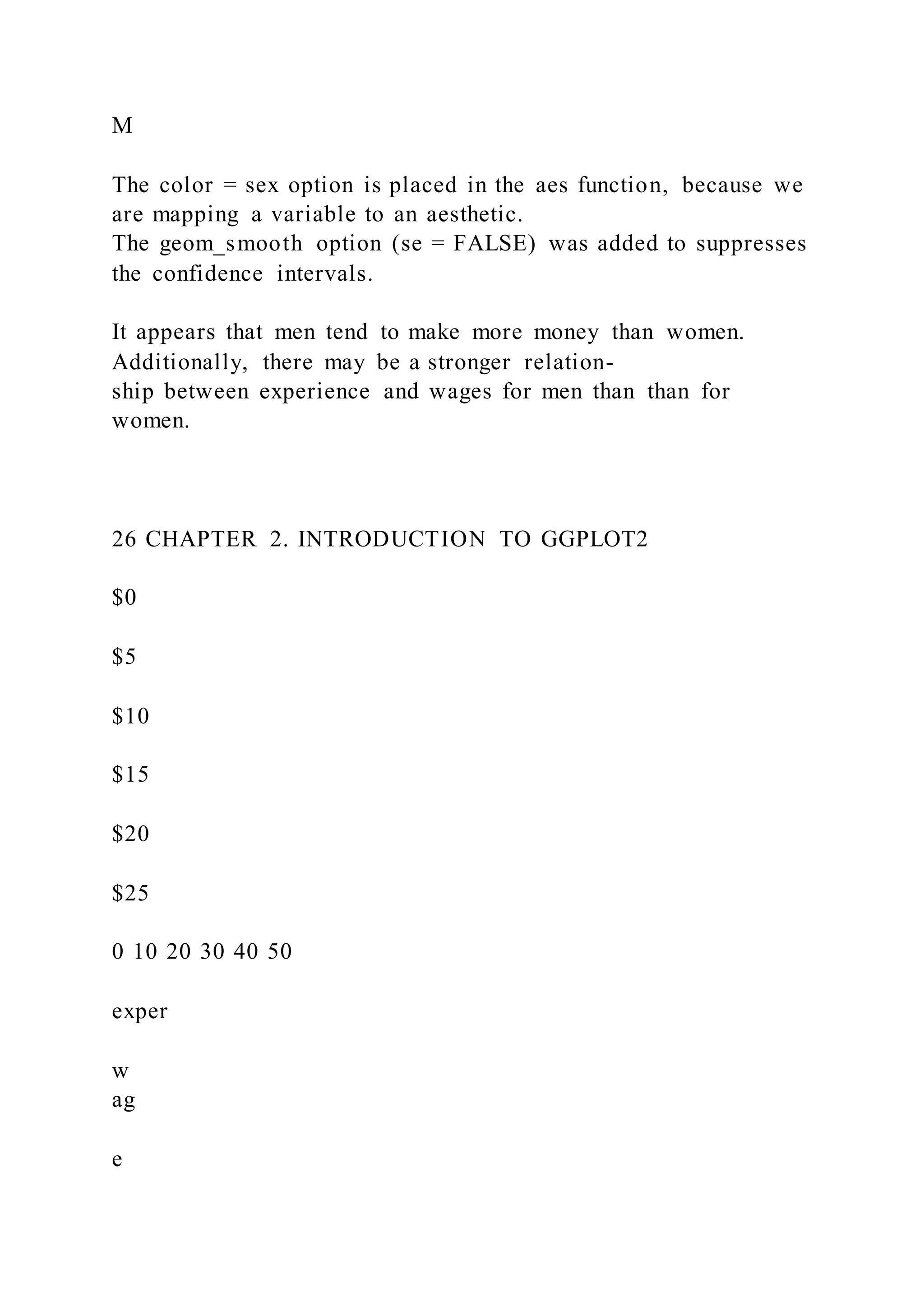
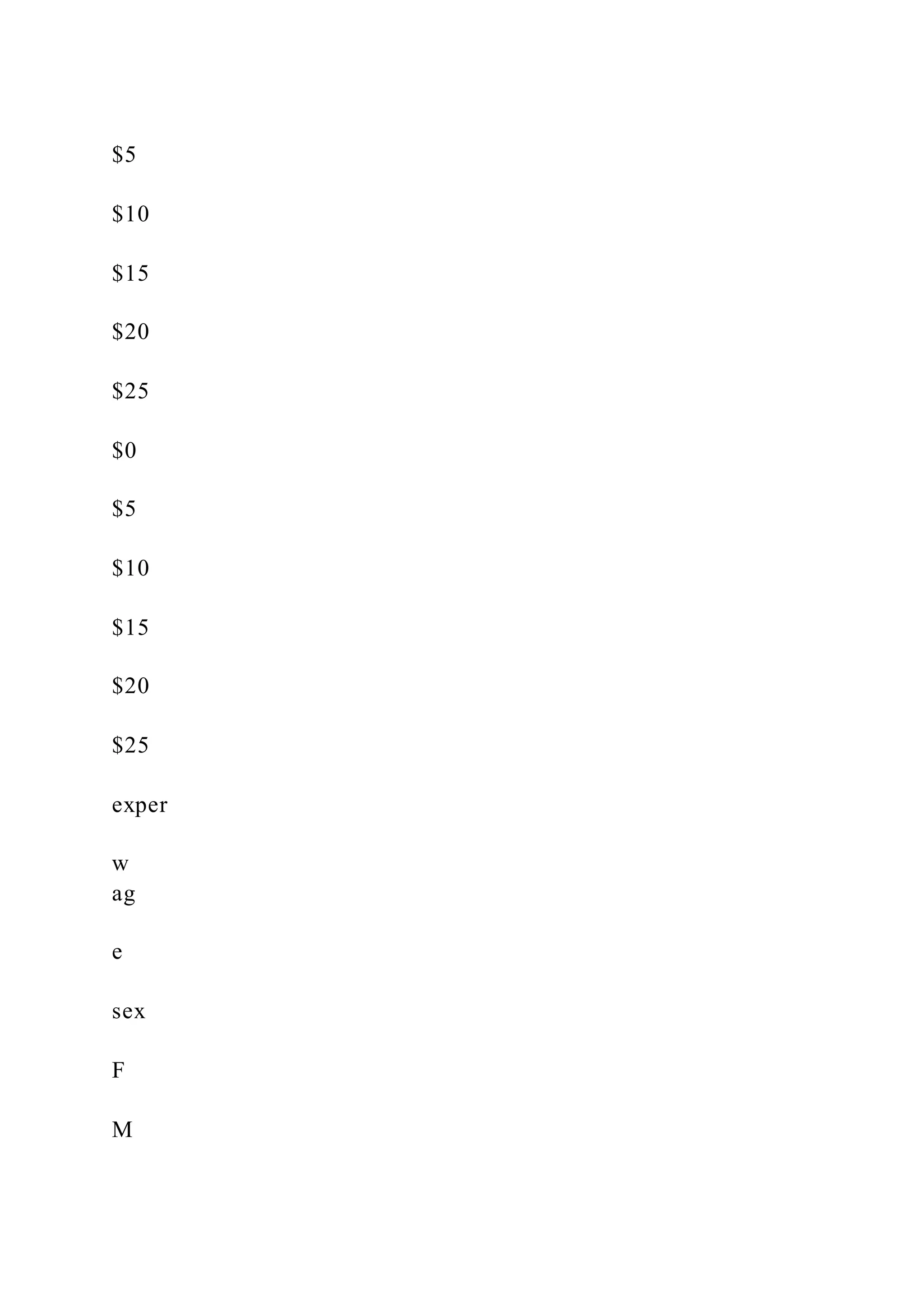
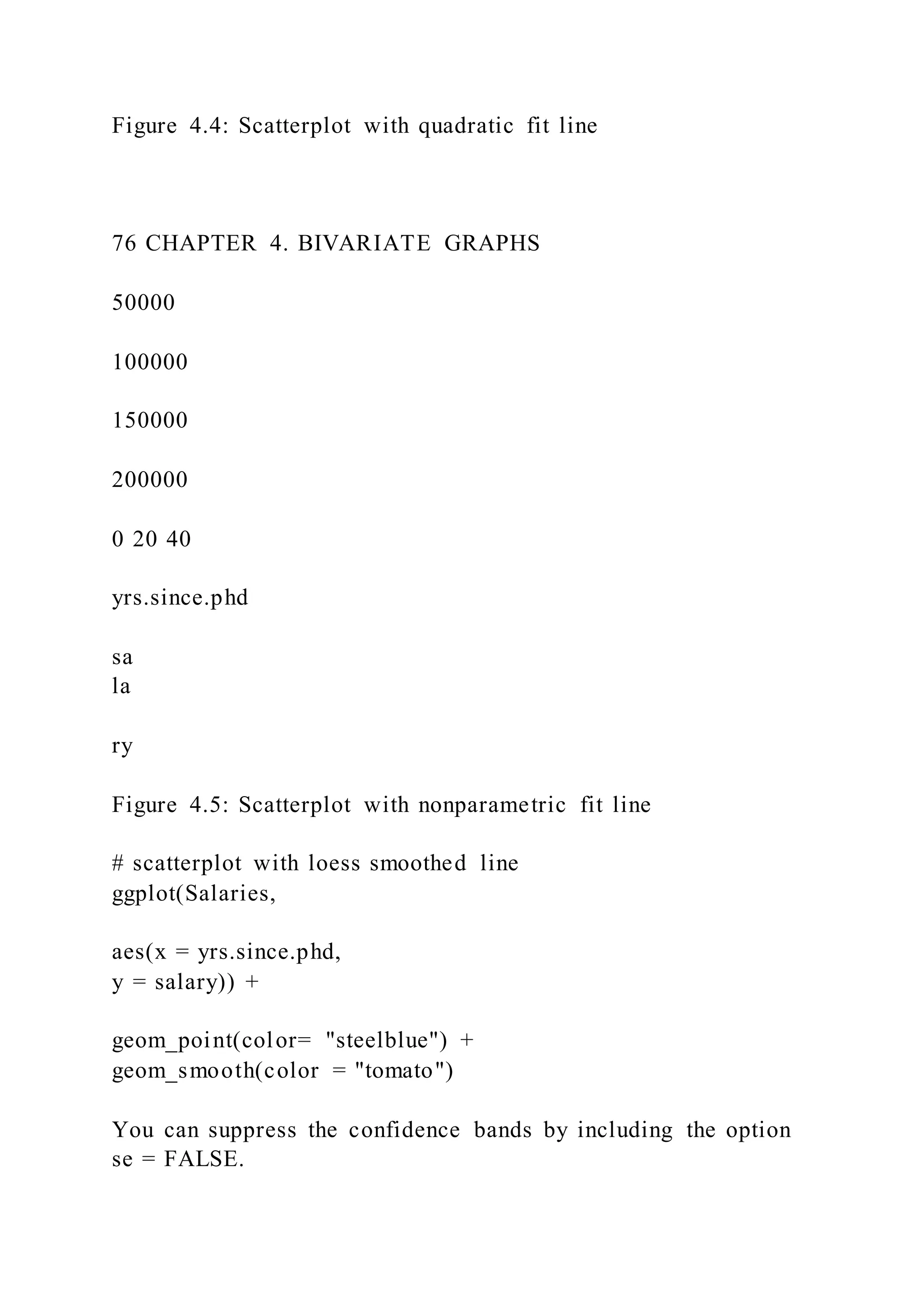
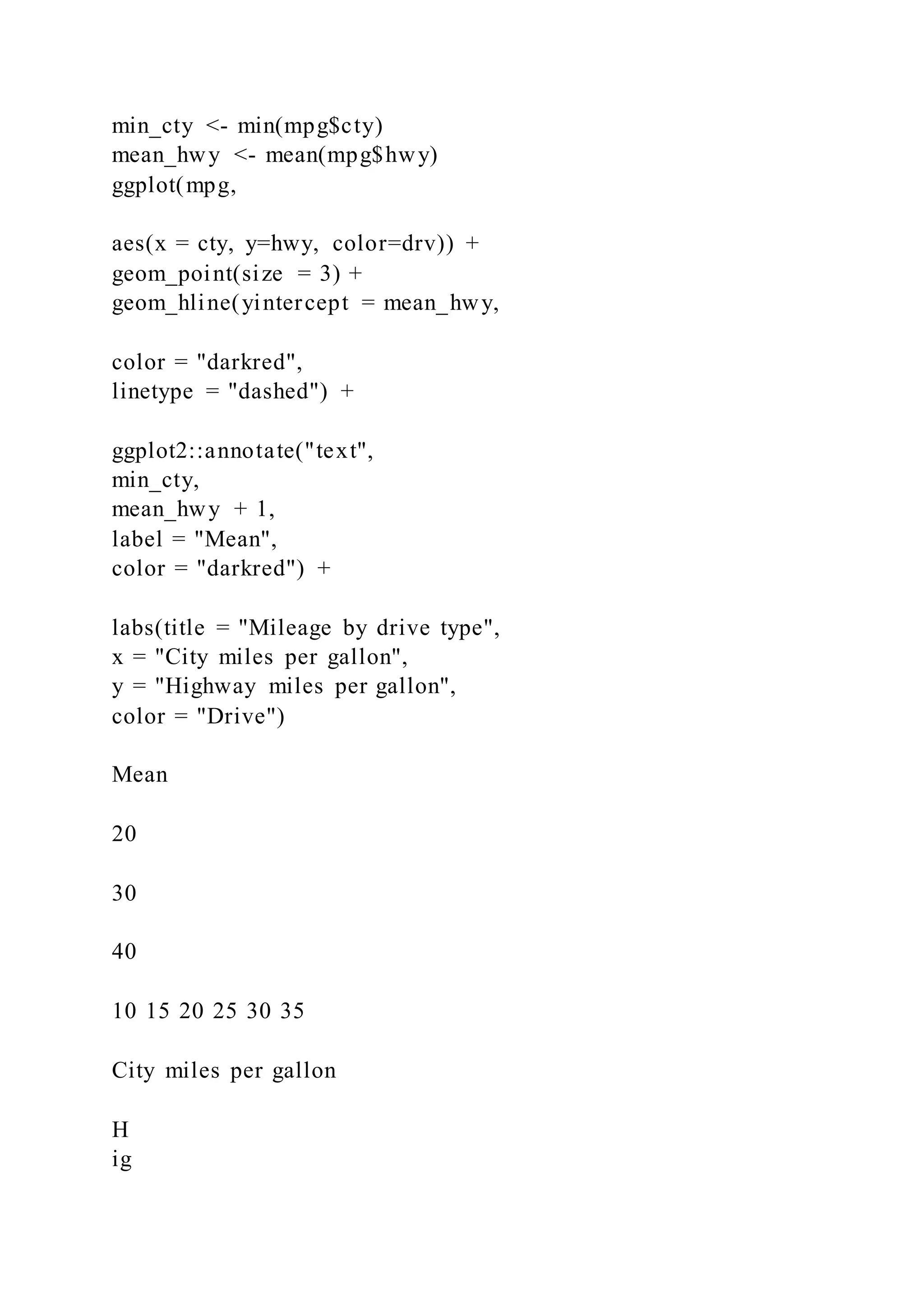
# print the graph with a title and line of best fit](https://image.slidesharecdn.com/datavisualizationwithrrobkabacoff2018-09-032-220921023726-e47a5f57/75/Data-Visualization-with-RRob-Kabacoff2018-09-032-47-2048.jpg)


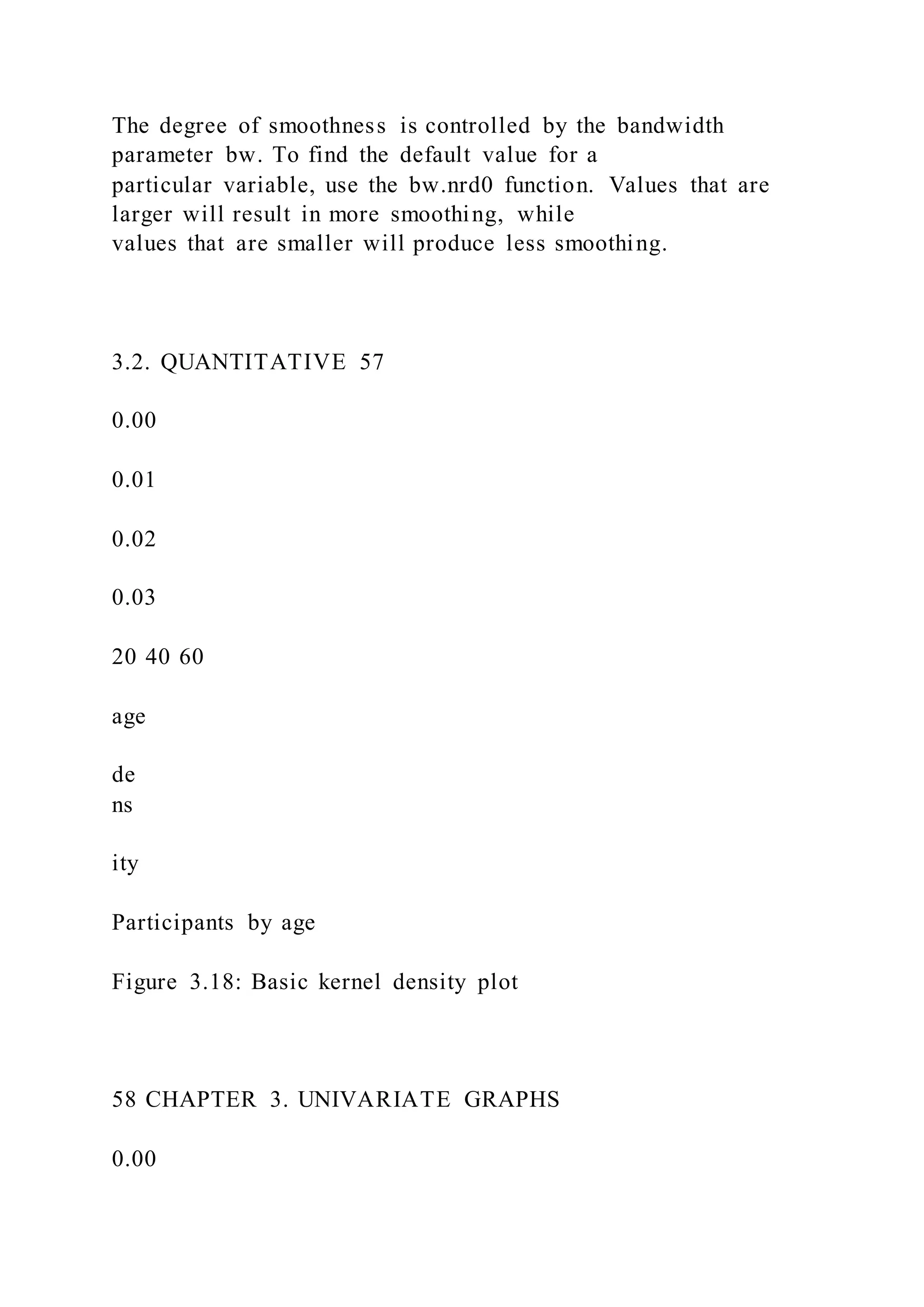
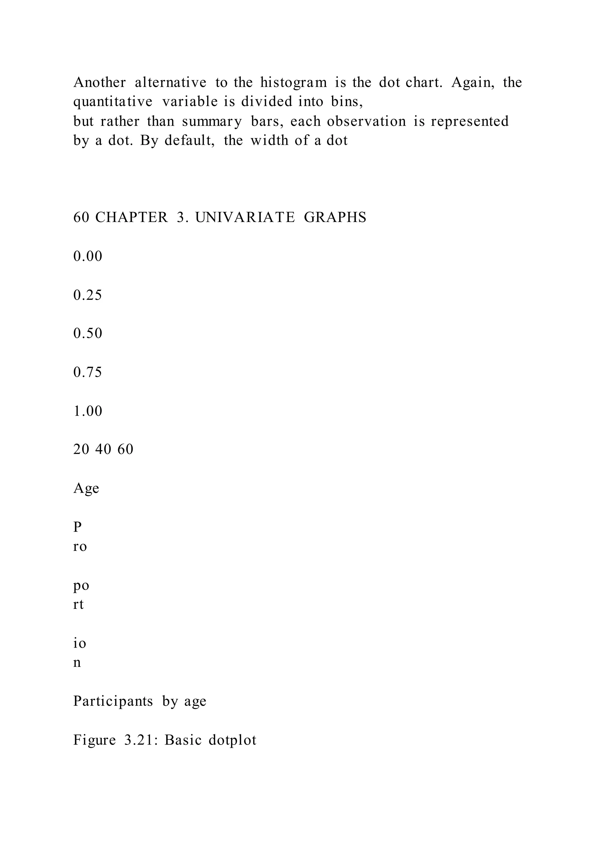
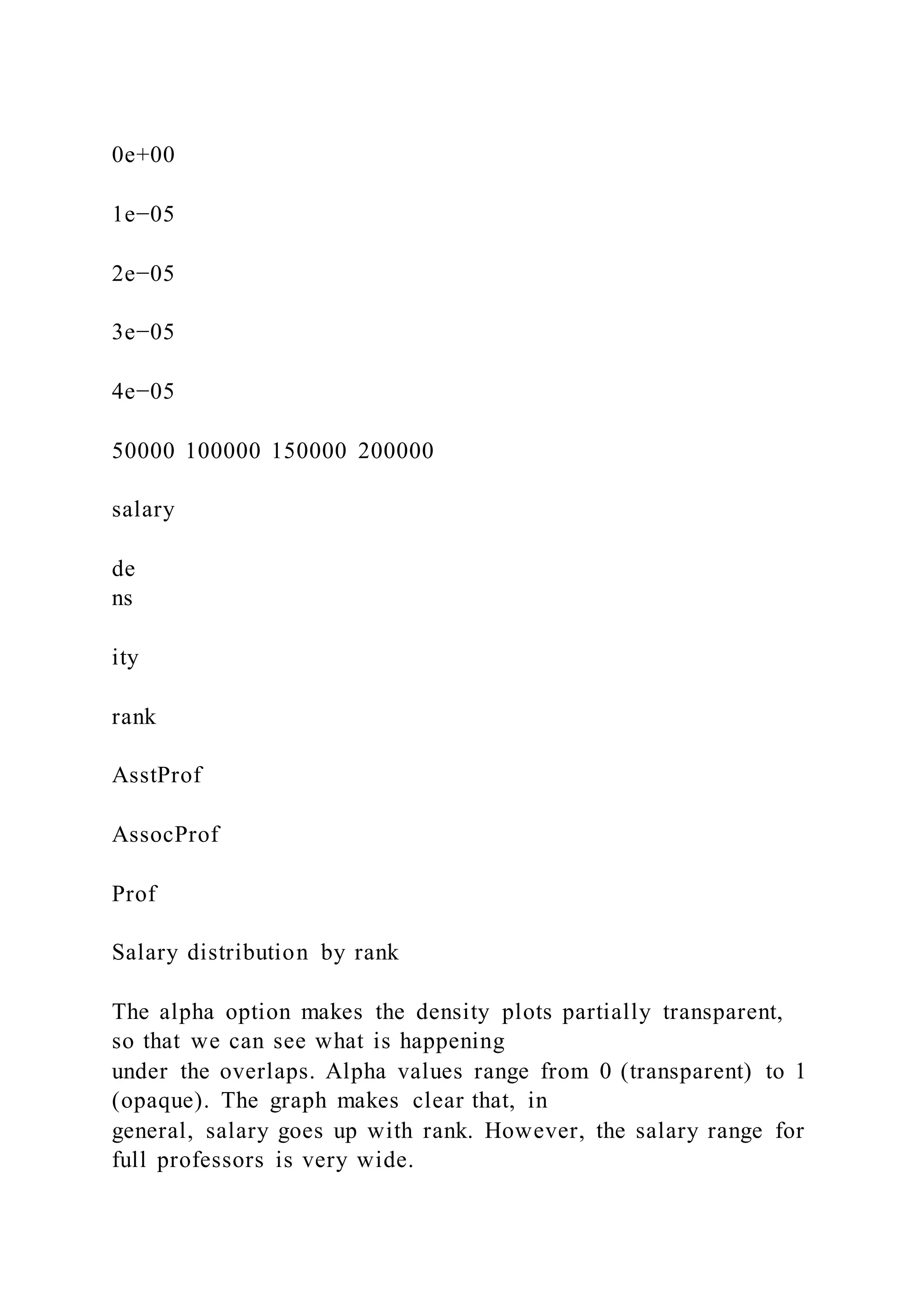
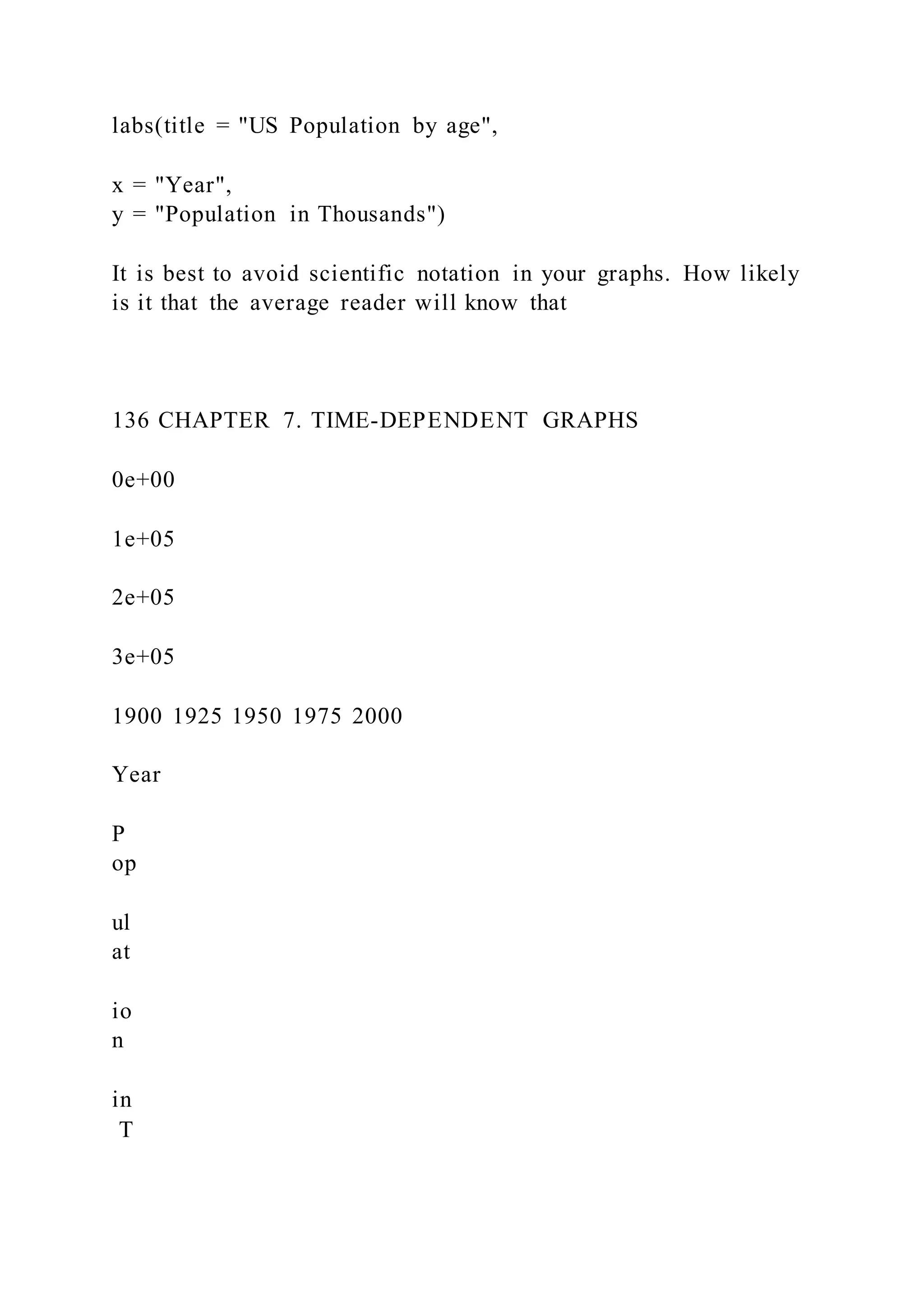
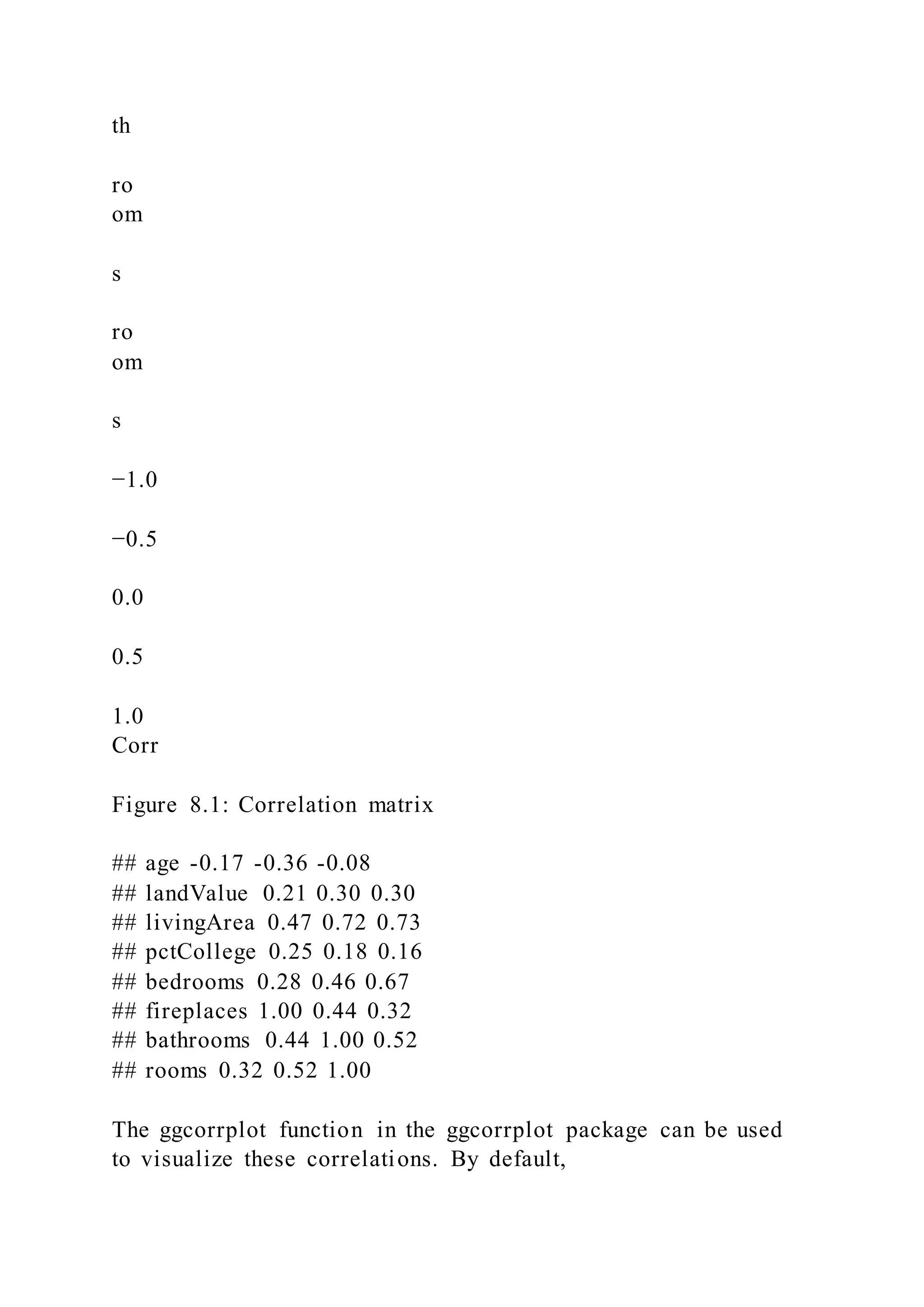
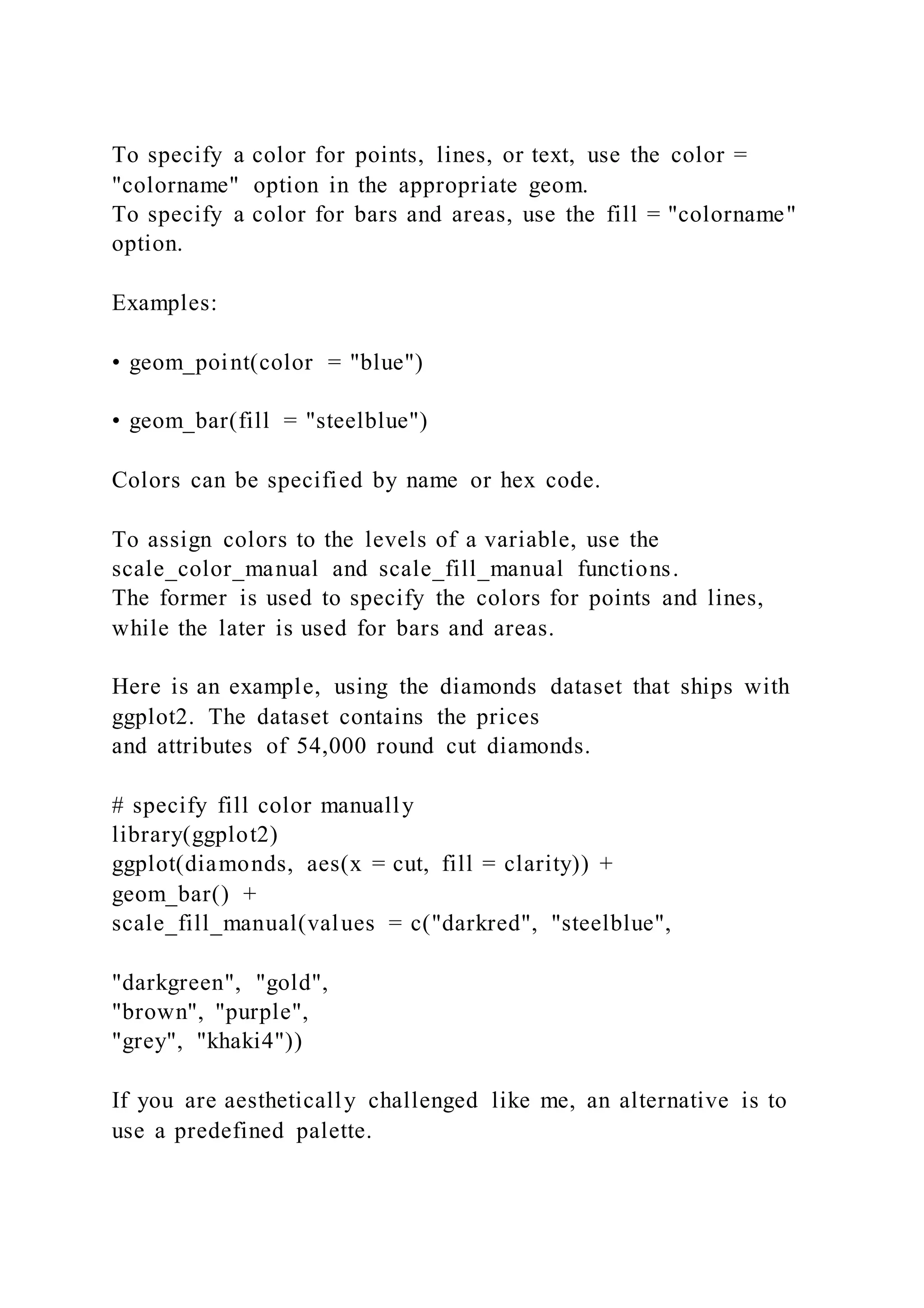
![de
ns
ity
bandwidth = 1
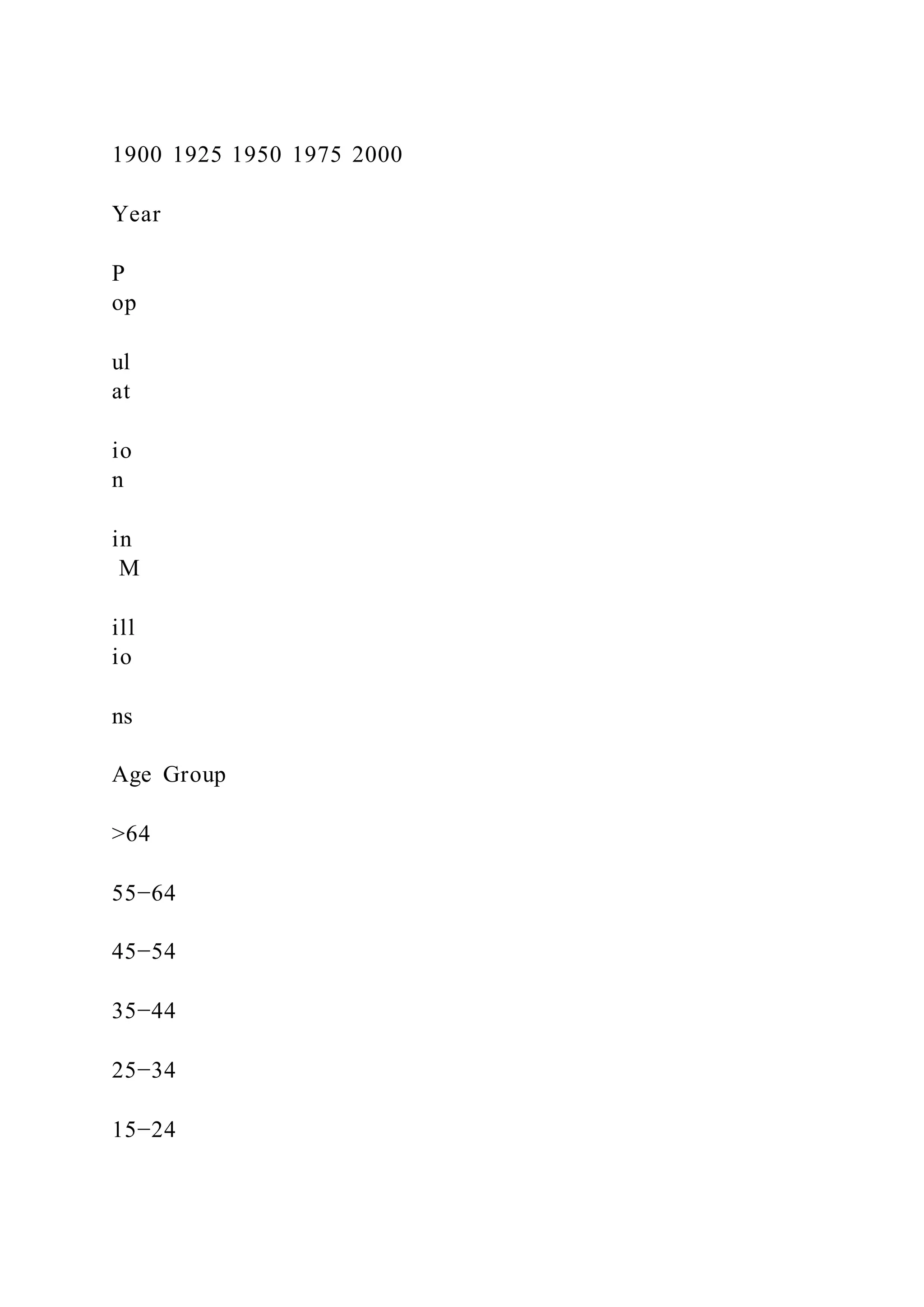
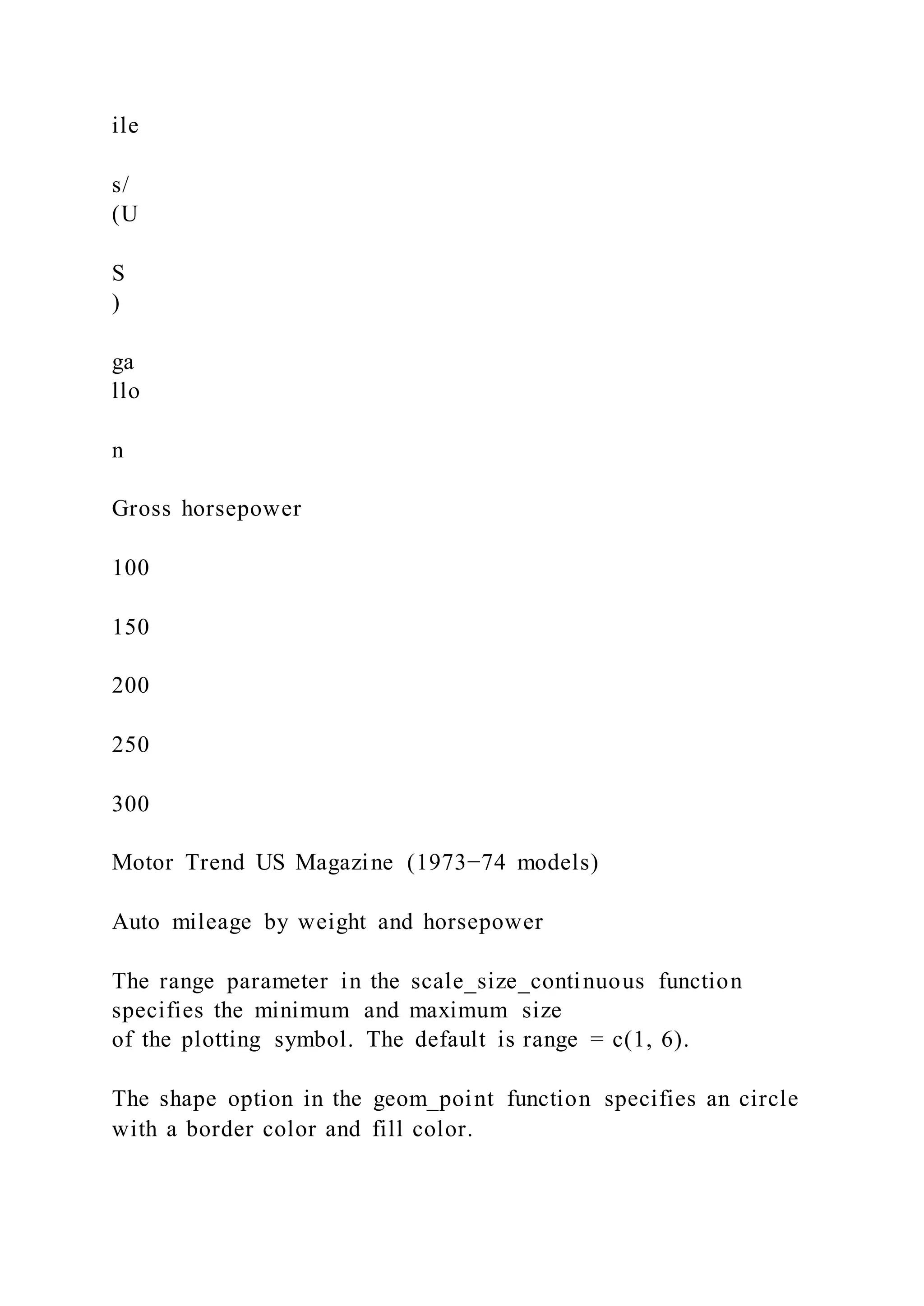
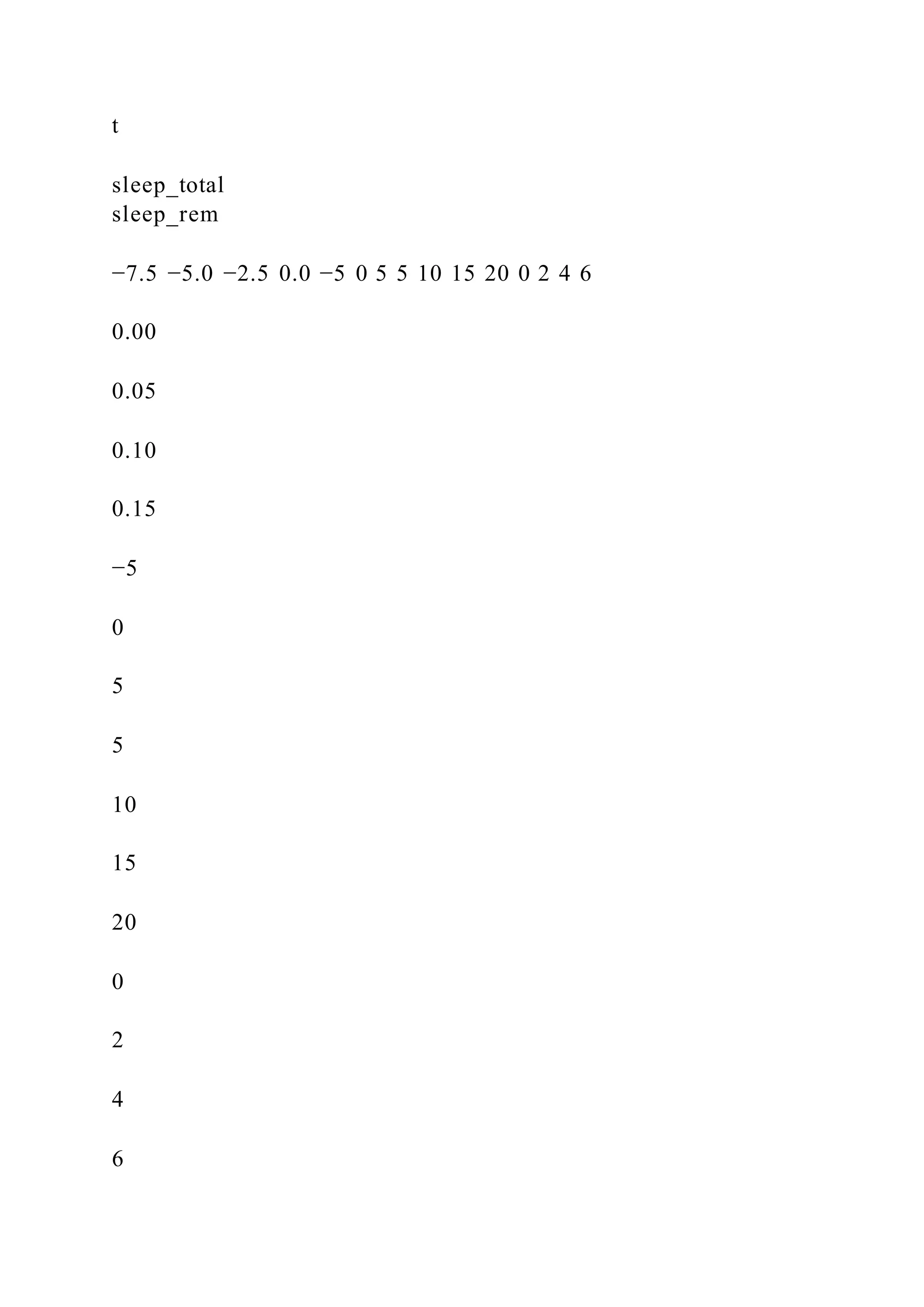
Participants by age
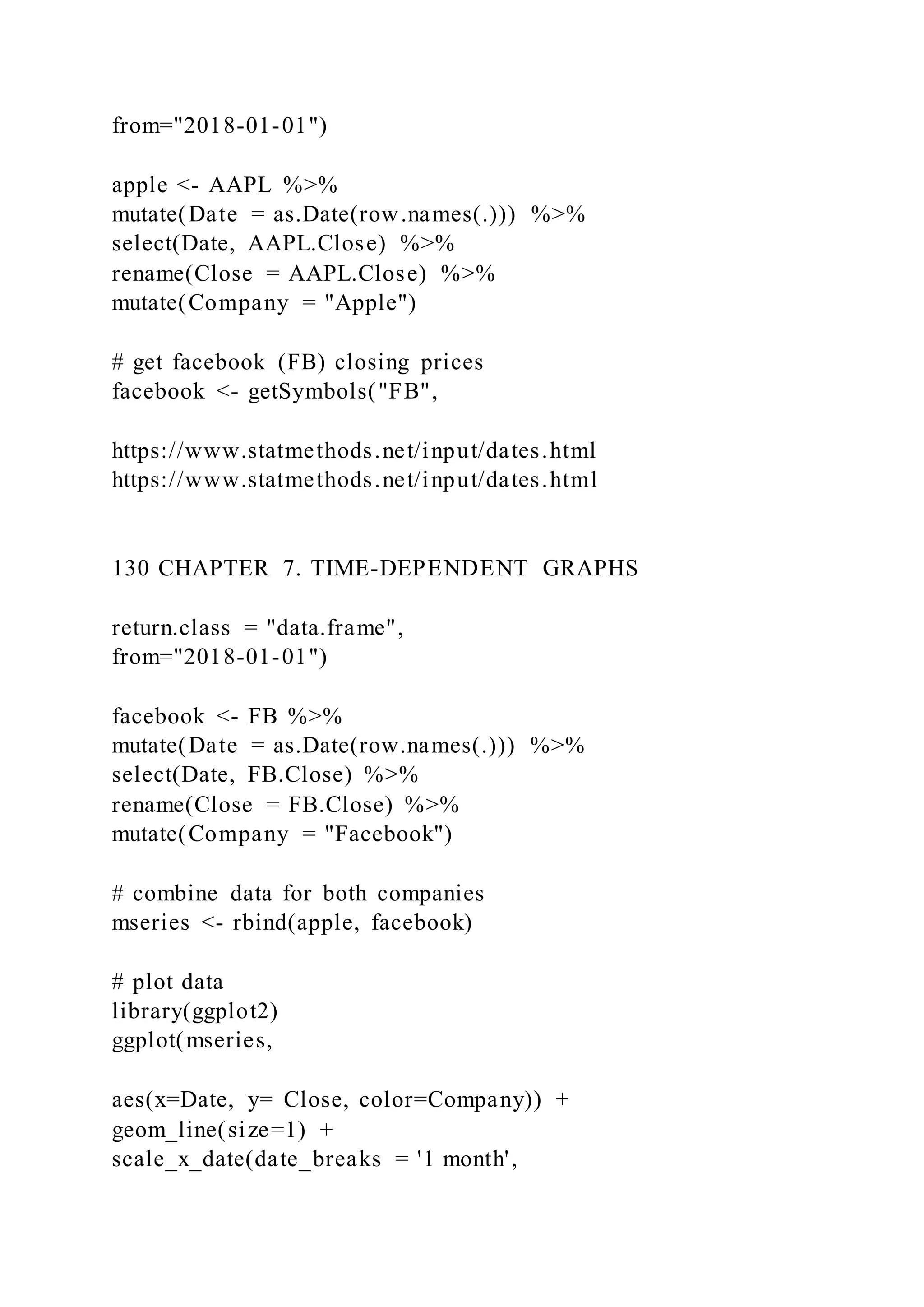
Figure 3.20: Kernel density plot with a specified bandwidth
# default bandwidth for the age variable
bw.nrd0(Marriage$age)
## [1] 5.181946
# Create a kernel density plot of age
ggplot(Marriage, aes(x = age)) +
geom_density(fill = "deepskyblue",
bw = 1) +
labs(title = "Participants by age",
subtitle = "bandwidth = 1")
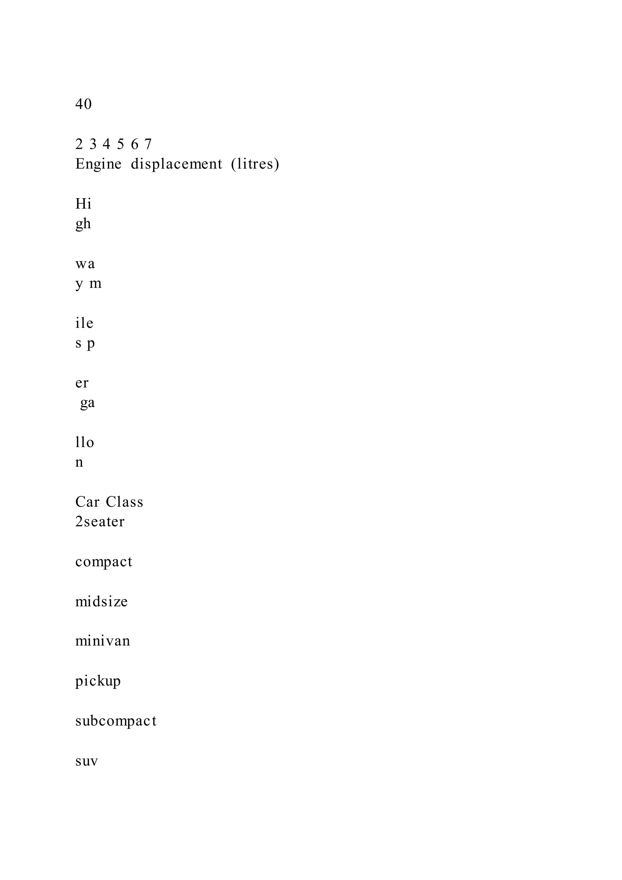
In this example, the default bandwidth for age is 5.18. Choosing
a value of 1 resulted in less smoothing and
more detail.
Kernel density plots allow you to easily see which scores are
most frequent and which are relatively rare.
However it can be difficult to explain the meaning of the y-axis
to a non-statistician. (But it will make you
look really smart at parties!)
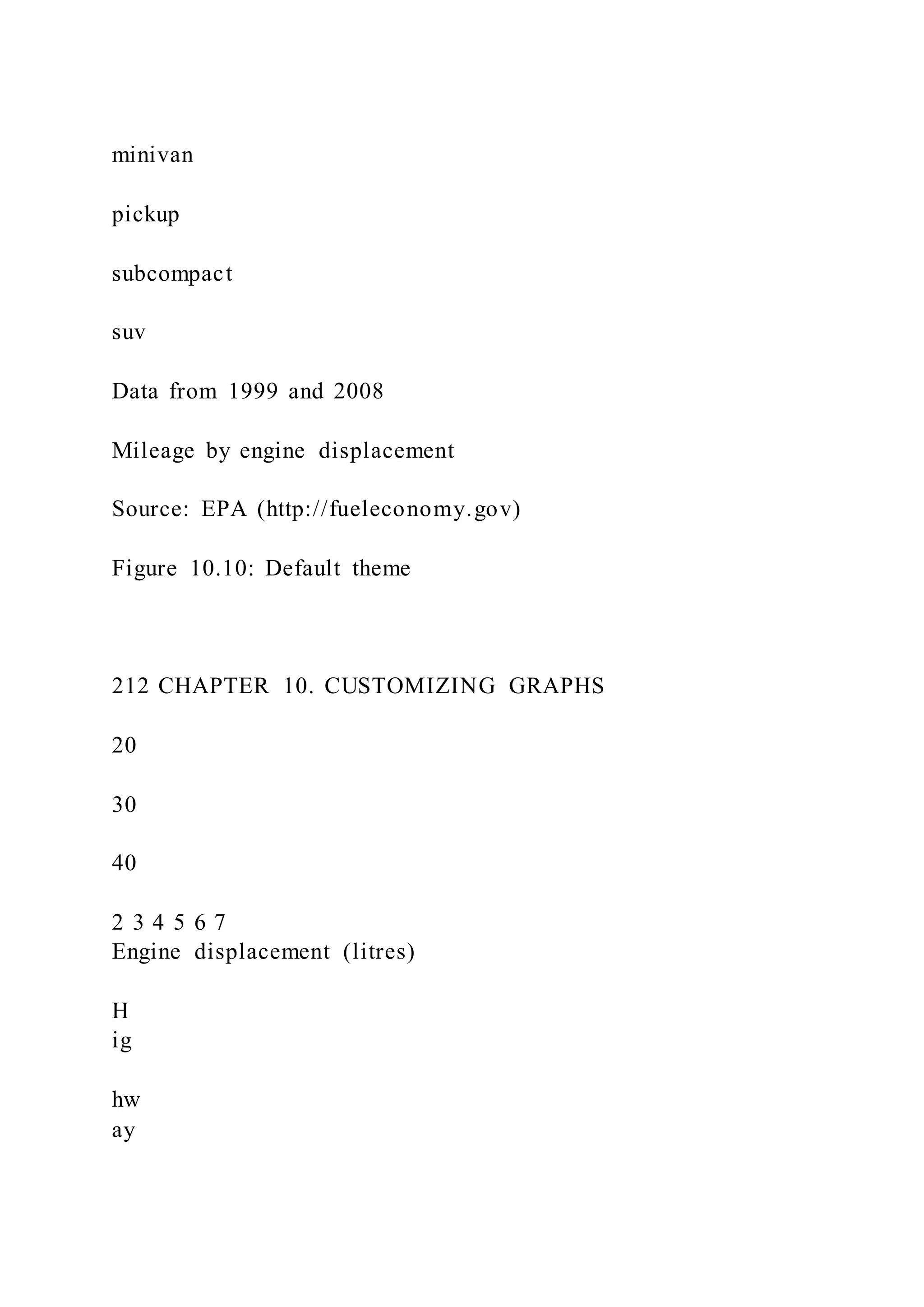
3.2.2 Dot Chart](https://image.slidesharecdn.com/datavisualizationwithrrobkabacoff2018-09-032-220921023726-e47a5f57/75/Data-Visualization-with-RRob-Kabacoff2018-09-032-80-2048.jpg)
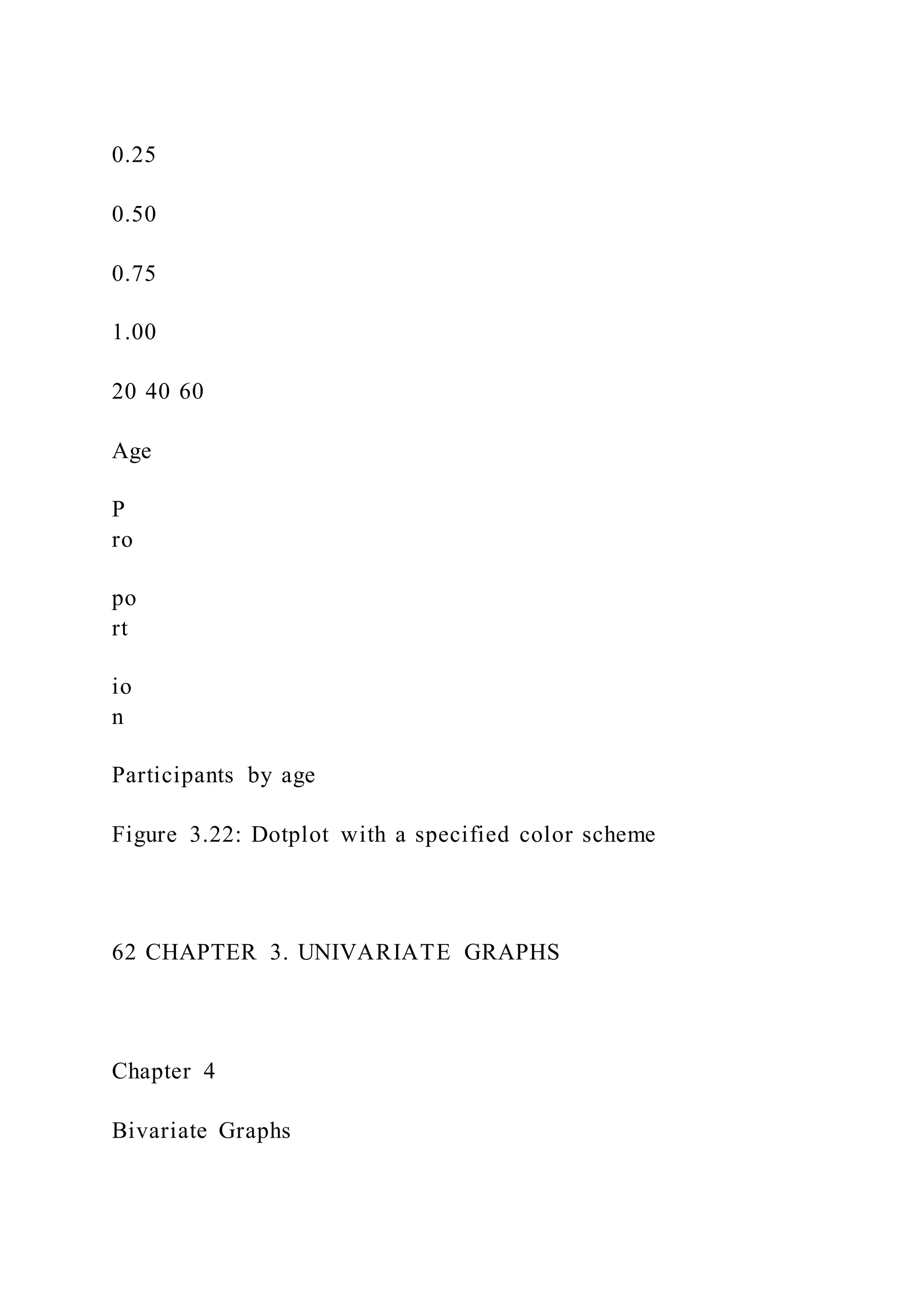


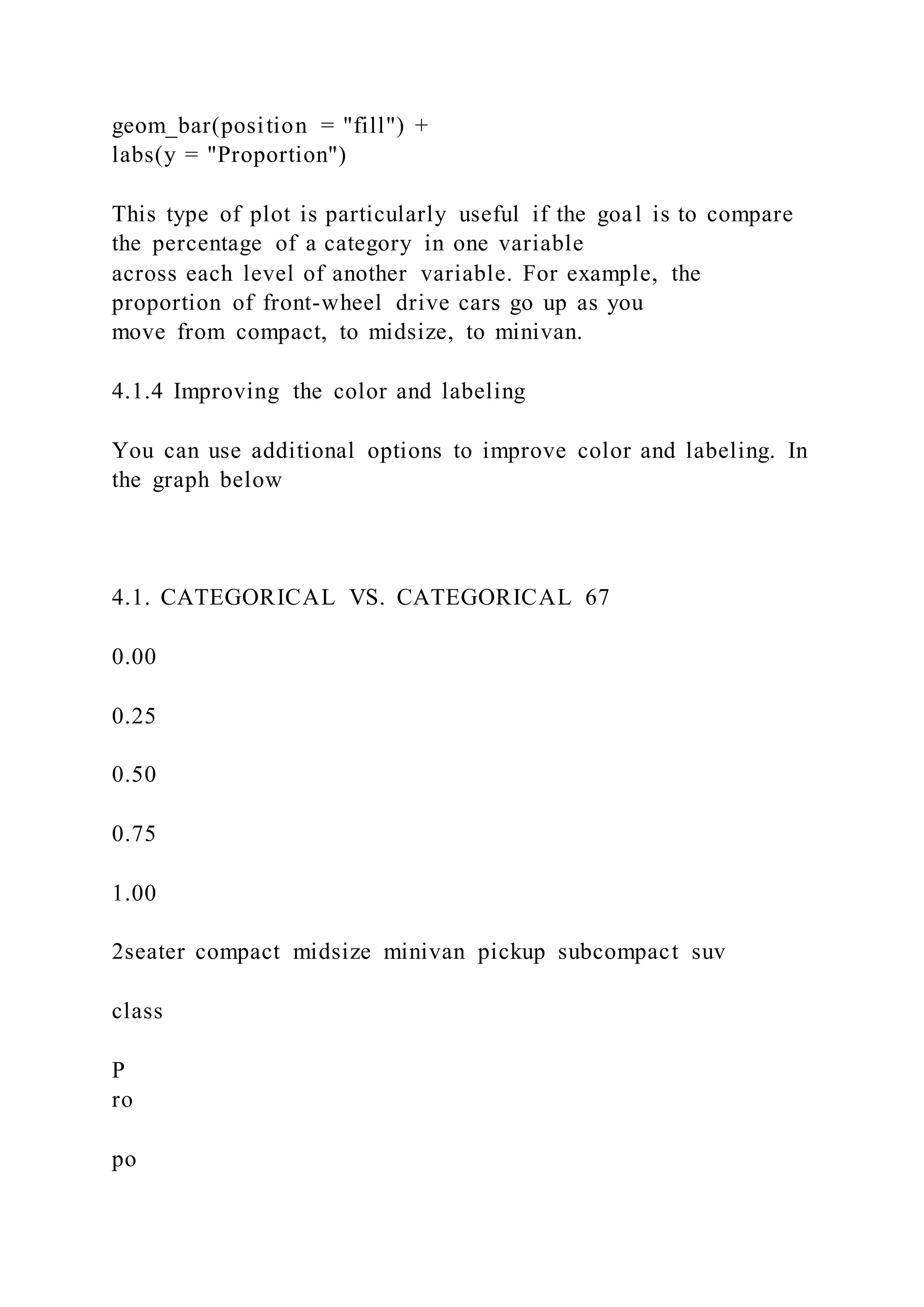

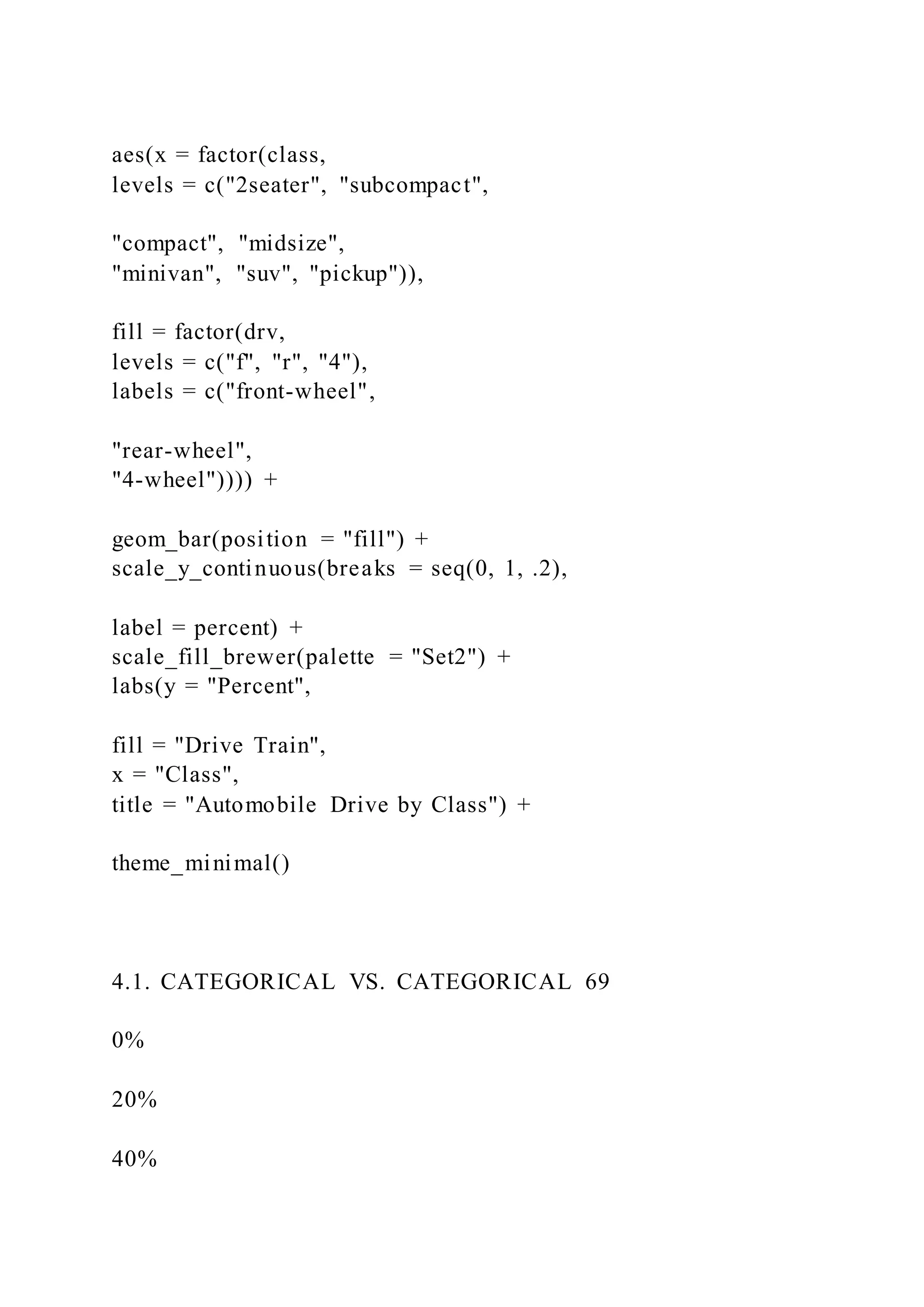
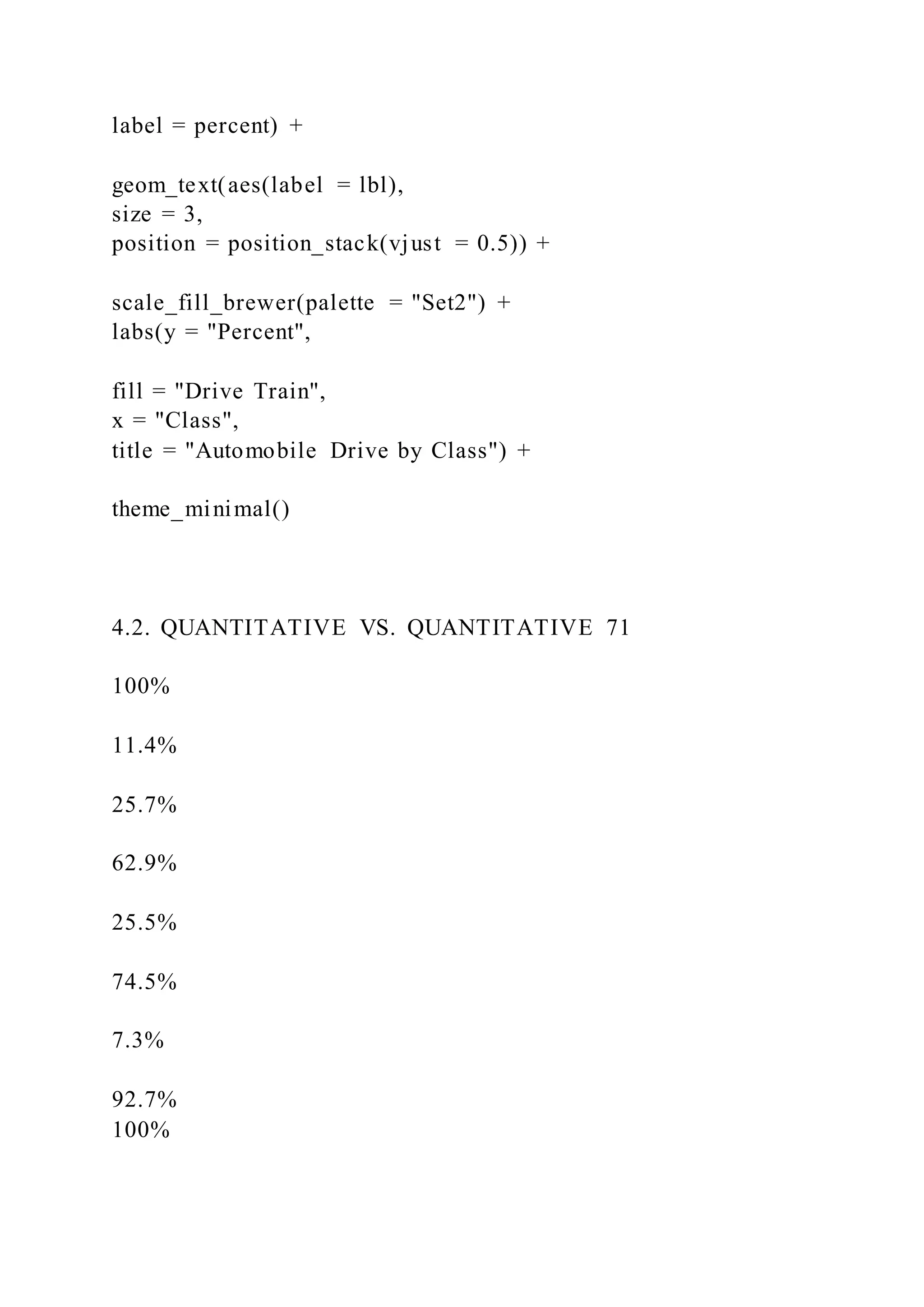
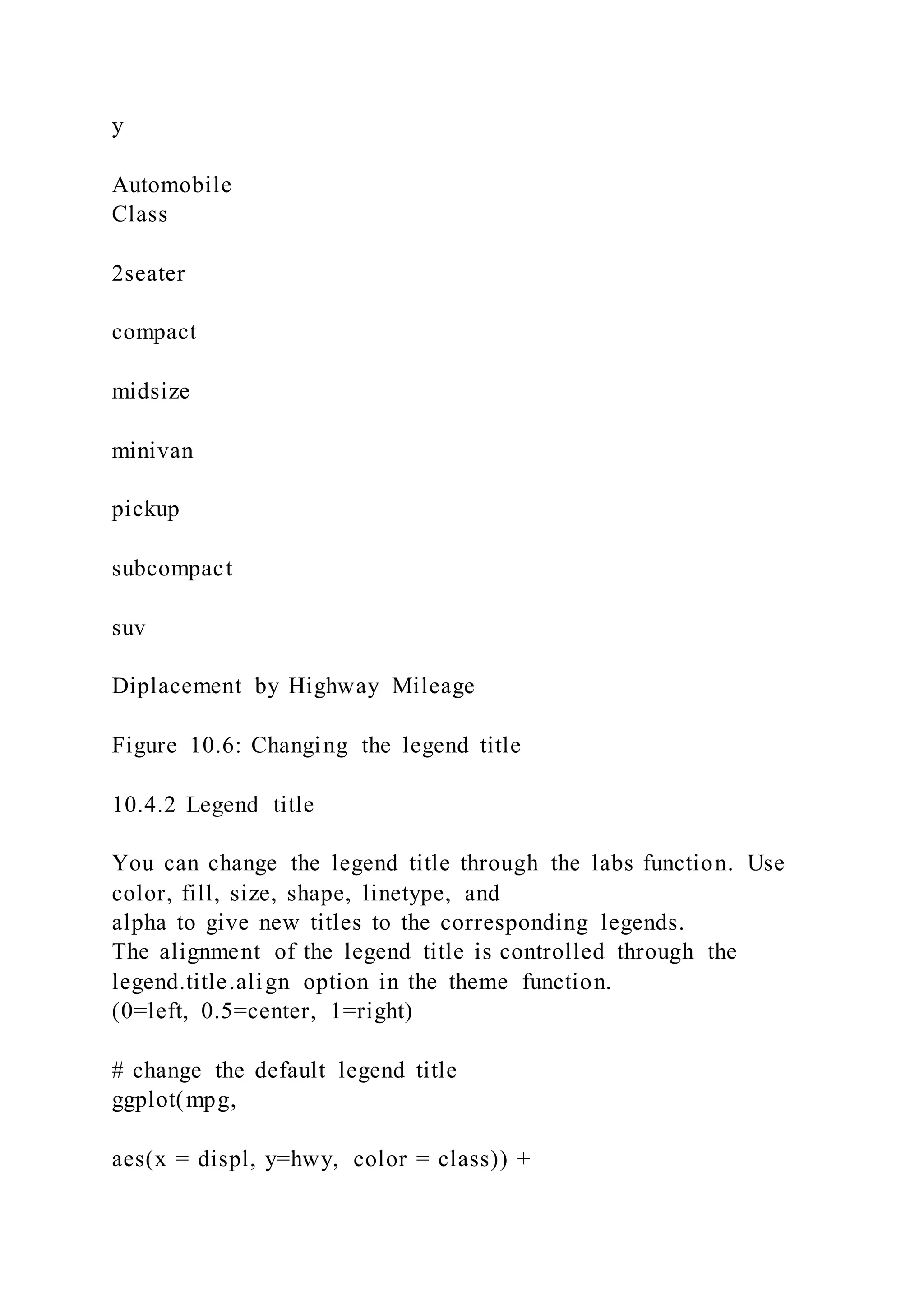
![levels = c("2seater", "subcompact",
"compact", "midsize",
"minivan", "suv", "pickup")
I placed the factor function within the ggplot function to
demonstrate that, if desired, you can change the
order of the categories and labels for the categories for a single
graph.
The other functions are discussed more fully in the section on
Customizing graphs.
Next, let’s add percent labels to each segment. First, we’ll
create a summary dataset that has the necessary
labels.
# create a summary dataset
library(dplyr)
plotdata <- mpg %>%
group_by(class, drv) %>%
summarize(n = n()) %>%
mutate(pct = n/sum(n),
lbl = scales::percent(pct))
plotdata
## # A tibble: 12 x 5
70 CHAPTER 4. BIVARIATE GRAPHS
## # Groups: class [7]
## class drv n pct lbl
## <chr> <chr> <int> <dbl> <chr>
## 1 2seater r 5 1.00 100%
## 2 compact 4 12 0.255 25.5%
## 3 compact f 35 0.745 74.5%](https://image.slidesharecdn.com/datavisualizationwithrrobkabacoff2018-09-032-220921023726-e47a5f57/75/Data-Visualization-with-RRob-Kabacoff2018-09-032-93-2048.jpg)


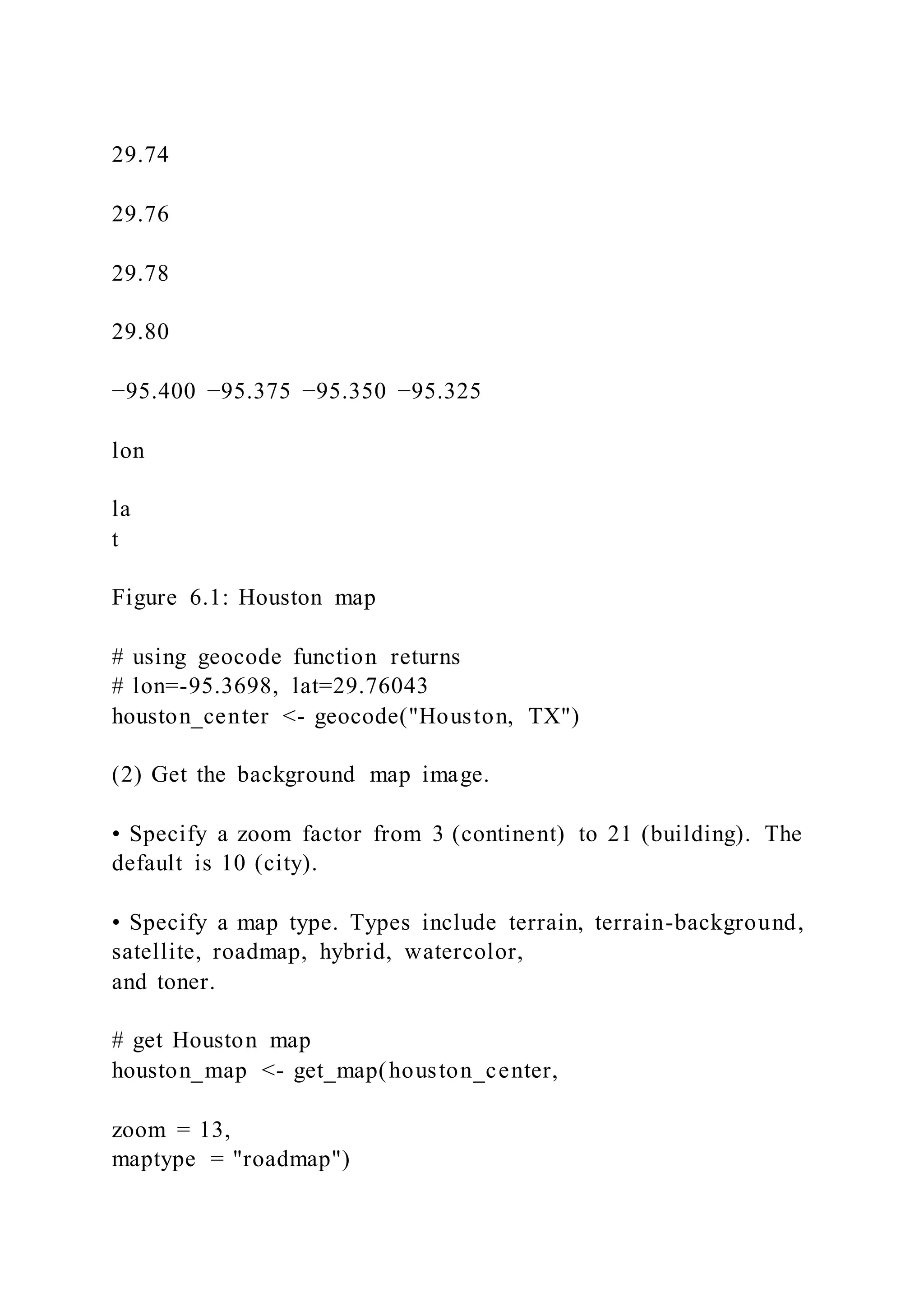
![There seems to be a concentration of rape reports in midtown.
To learn more about ggmap, see ggmap: Spatial Visualization
with ggplot2.
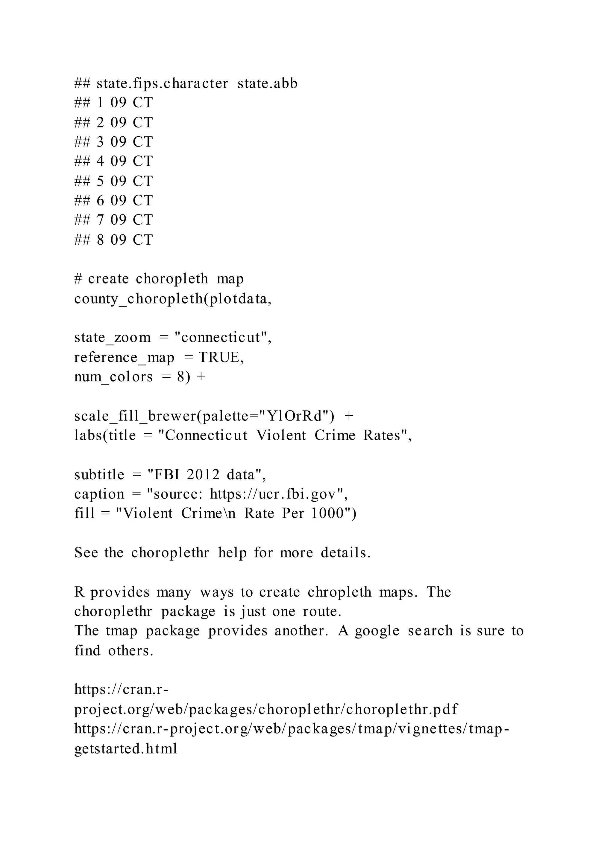
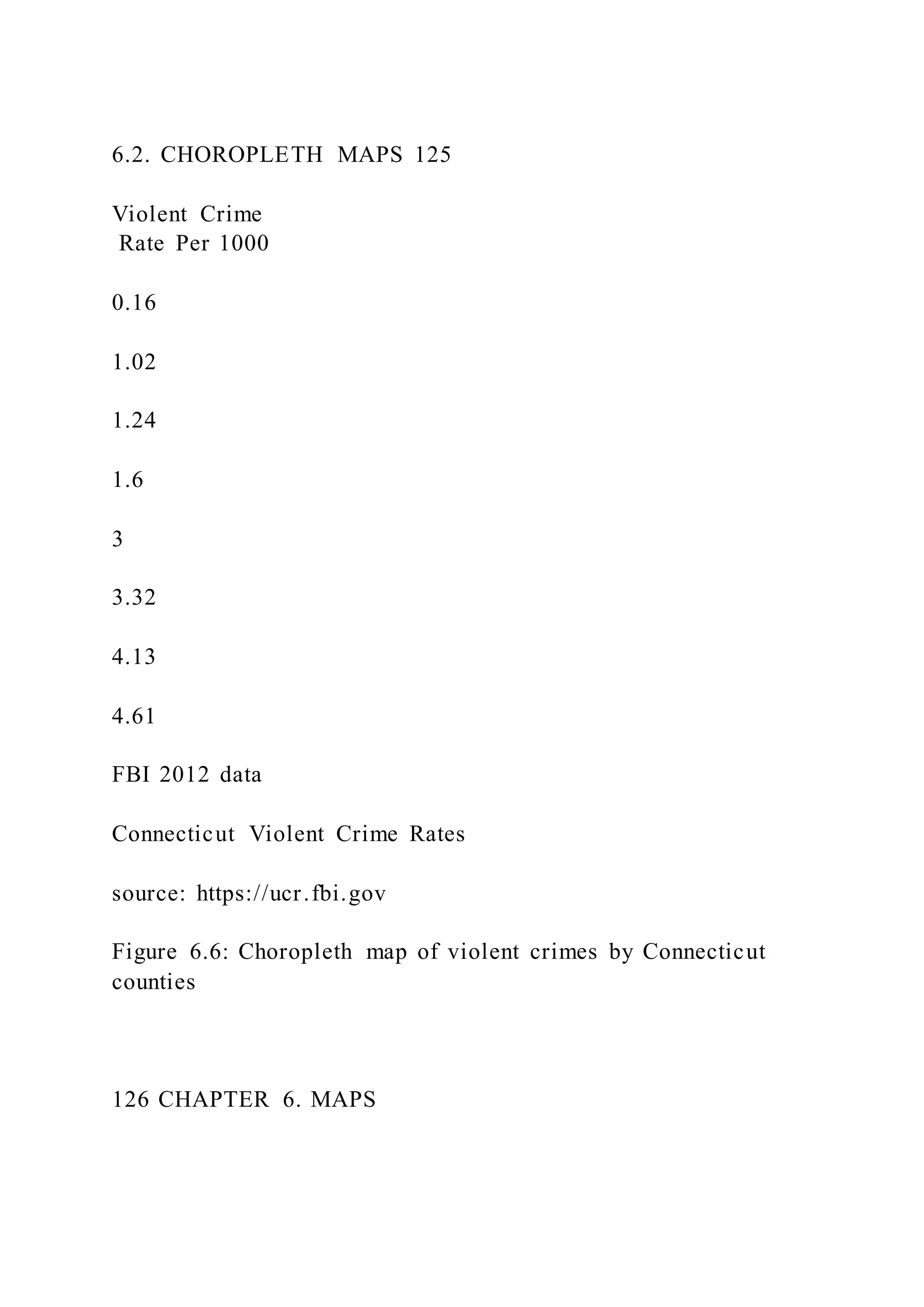
6.2 Choropleth maps
Choropleth maps use color or shading on predefined areas to
indicate average values of a numeric variable
in that area. In this section we’ll use the choroplethr package to
create maps that display information by
country, US state, and US county.
6.2.1 Data by country
Let’s create a world map and color the countries by life
expectancy using the 2007 gapminder data.
The choroplethr package has numerous functions that simplify
the task of creating a choropleth map. To
plot the life expectancy data, we’ll use the country_choropleth
function.
The function requires that the data frame to be plotted has a
column named region and a column named
value. Additionally, the entries in the region column must
exactly match how the entries are named in the
region column of the dataset country.map from the
choroplethrMaps package.
# view the first 12 region names in country.map
data(country.map, package = "choroplethrMaps")
head(unique(country.map$region), 12)
## [1] "afghanistan" "angola" "azerbaijan" "moldova"](https://image.slidesharecdn.com/datavisualizationwithrrobkabacoff2018-09-032-220921023726-e47a5f57/75/Data-Visualization-with-RRob-Kabacoff2018-09-032-171-2048.jpg)
!["madagascar"
## [6] "mexico" "macedonia" "mali" "myanmar" "montenegro"
## [11] "mongolia" "mozambique"
Note that the region entries are all lower case.
To continue, we need to make some edits to our gapminder
dataset. Specifically, we need to
1. select the 2007 data
2. rename the country variable to region
3. rename the lifeExp variable to value
4. recode region values to lower case
5. recode some region values to match the region values in the
country.map data frame. The recode func-
tion in the dplyr package take the form recode(variable,
oldvalue1 = newvalue1, oldvalue2 =
newvalue2, ...)
# prepare dataset
data(gapminder, package = "gapminder")
plotdata <- gapminder %>%
filter(year == 2007) %>%
rename(region = country,
value = lifeExp) %>%
mutate(region = tolower(region)) %>%
mutate(region = recode(region,
https://journal.r-project.org/archive/2013-1/kahle-wickham.pdf
https://www.rdocumentation.org/packages/choroplethr/versions/
3.6.1/topics/county_choropleth](https://image.slidesharecdn.com/datavisualizationwithrrobkabacoff2018-09-032-220921023726-e47a5f57/75/Data-Visualization-with-RRob-Kabacoff2018-09-032-172-2048.jpg)
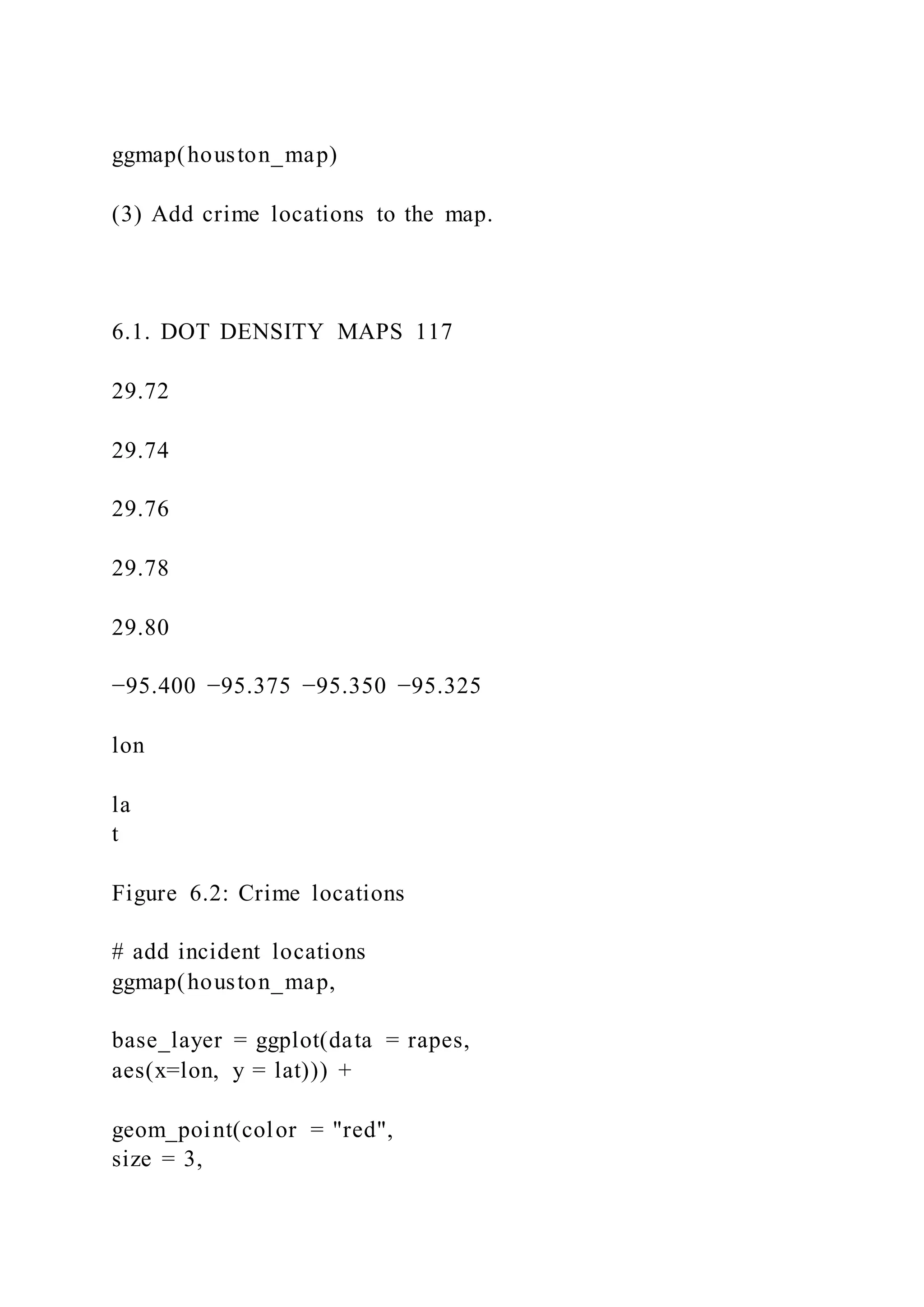
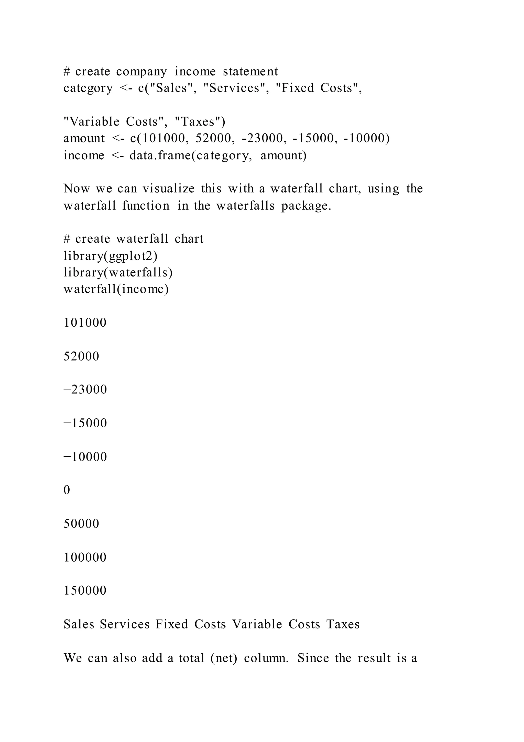
![120 CHAPTER 6. MAPS
[39.6 to 50.7)
[50.7 to 59.4)
[59.4 to 70.3)
[70.3 to 72.8)
[72.8 to 75.5)
[75.5 to 79.4)
[79.4 to 82.6]
NA
Figure 6.4: Choropleth map of life expectancy
"united states" = "united states of america",
"congo, dem. rep." = "democratic republic of the congo",
"congo, rep." = "republic of congo",
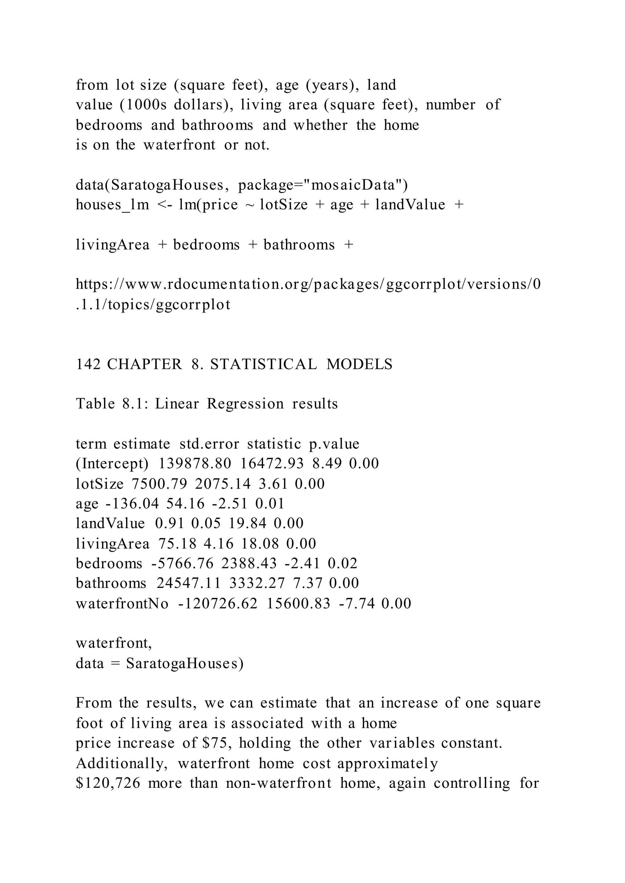
"korea, dem. rep." = "south korea",
"korea. rep." = "north korea",
"tanzania" = "united republic of tanzania",
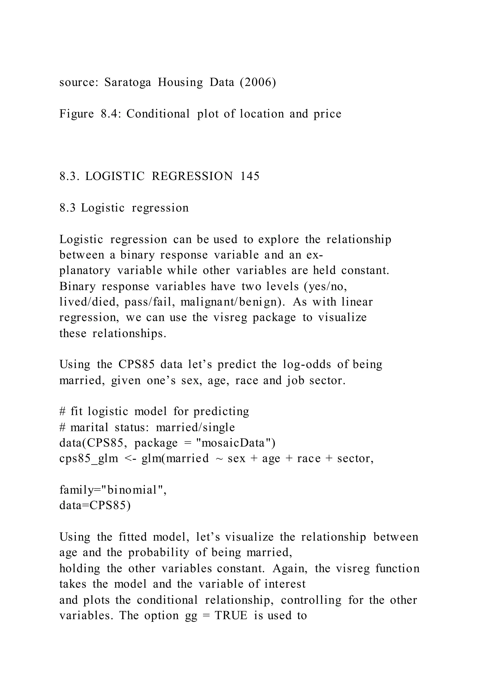
"serbia" = "republic of serbia",
"slovak republic" = "slovakia",
"yemen, rep." = "yemen"))
Now lets create the map.
library(choroplethr)
country_choropleth(plotdata)](https://image.slidesharecdn.com/datavisualizationwithrrobkabacoff2018-09-032-220921023726-e47a5f57/75/Data-Visualization-with-RRob-Kabacoff2018-09-032-173-2048.jpg)
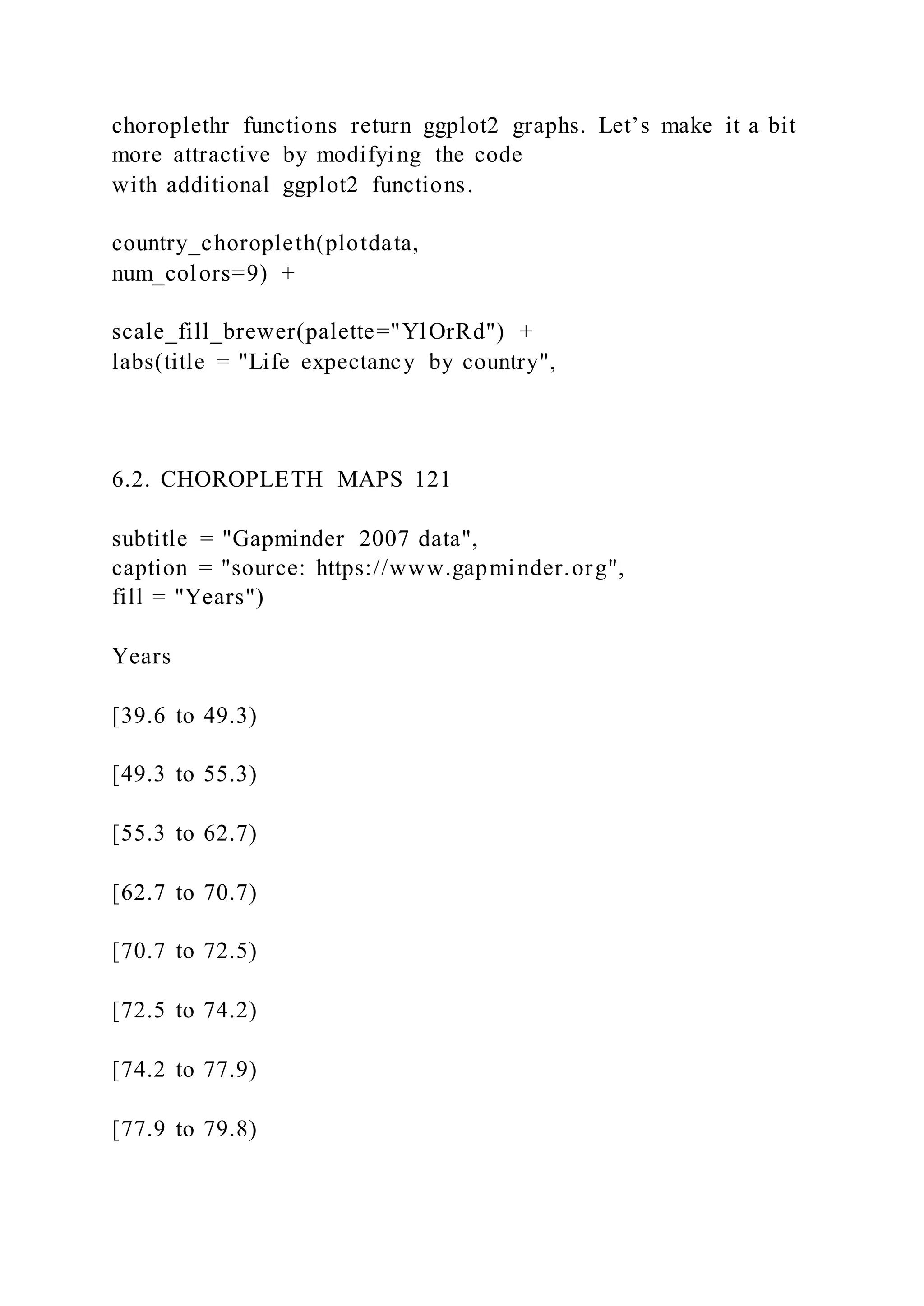
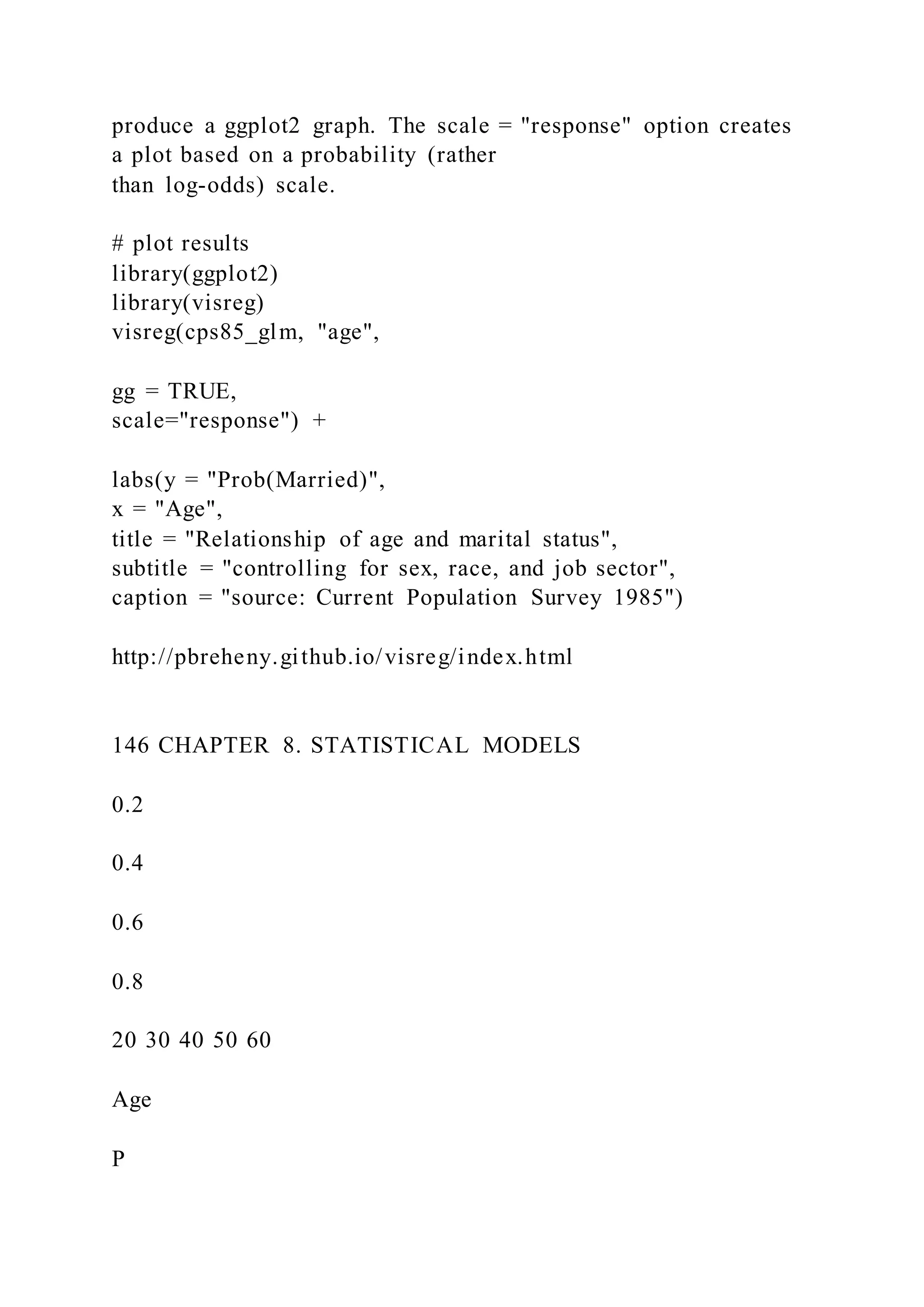
![[79.8 to 82.6]
NA
Gapminder 2007 data
Life expectancy by country
source: https://www.gapminder.org
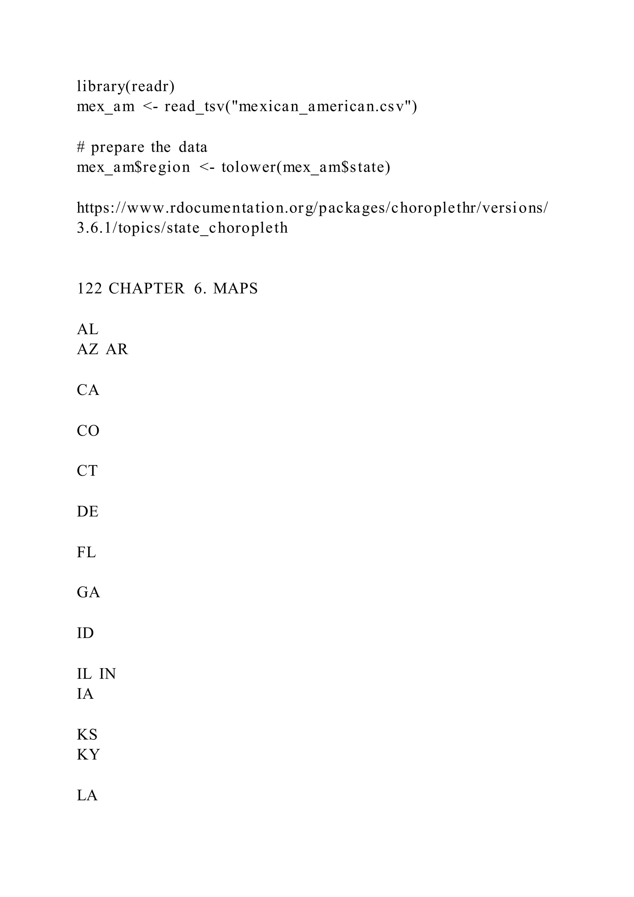
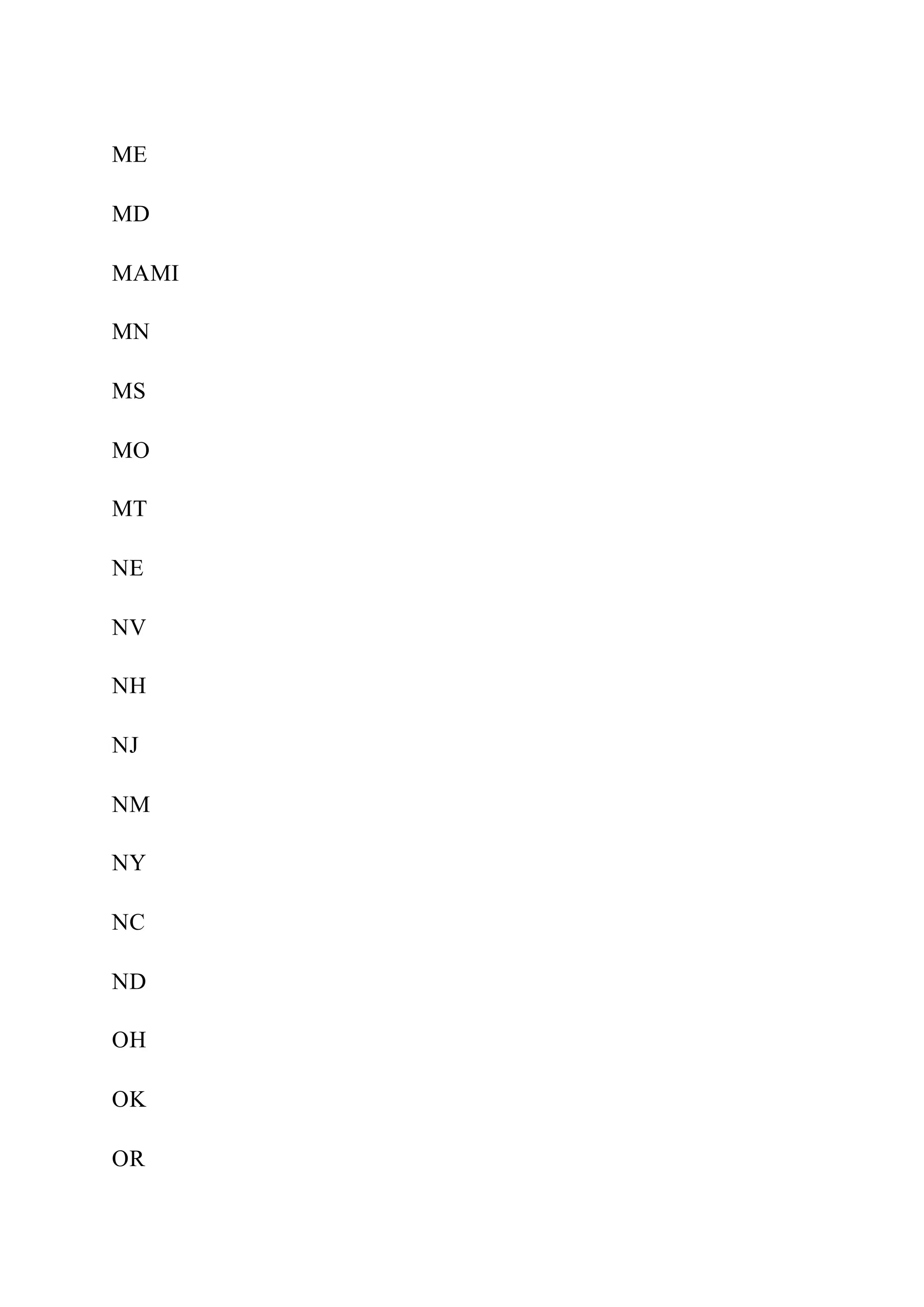
### Data by US state
For US data, the choroplethr package provides functions for
creating maps by county, state, zip code, and
census tract. Additionally, map regions can be labeled.
Let’s plot US states by Mexcian American popultion, using the
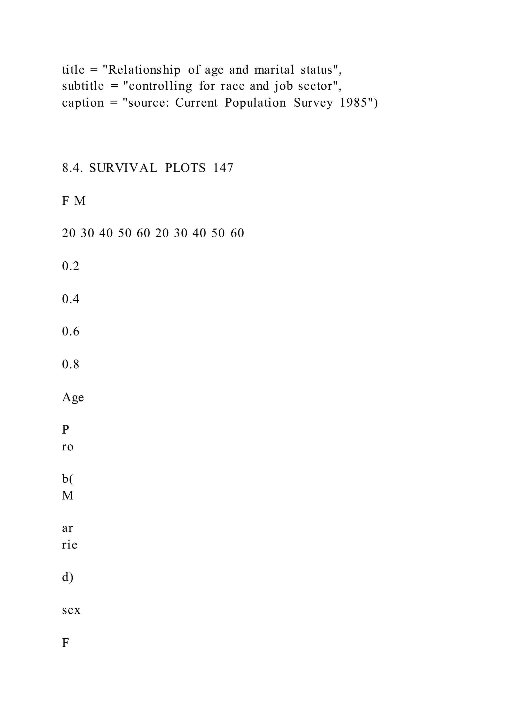
2010 Census.
To plot the population data, we’ll use the state_choropleth
function. The function requires that the data
frame to be plotted has a column named region to represent
state, and a column named value (the quantity
to be plotted). Additionally, the entries in the region column
must exactly match how the entries are named
in the region column of the dataset state.map from the
choroplethrMaps package.
The zoom = continental_us_states option will create a map that
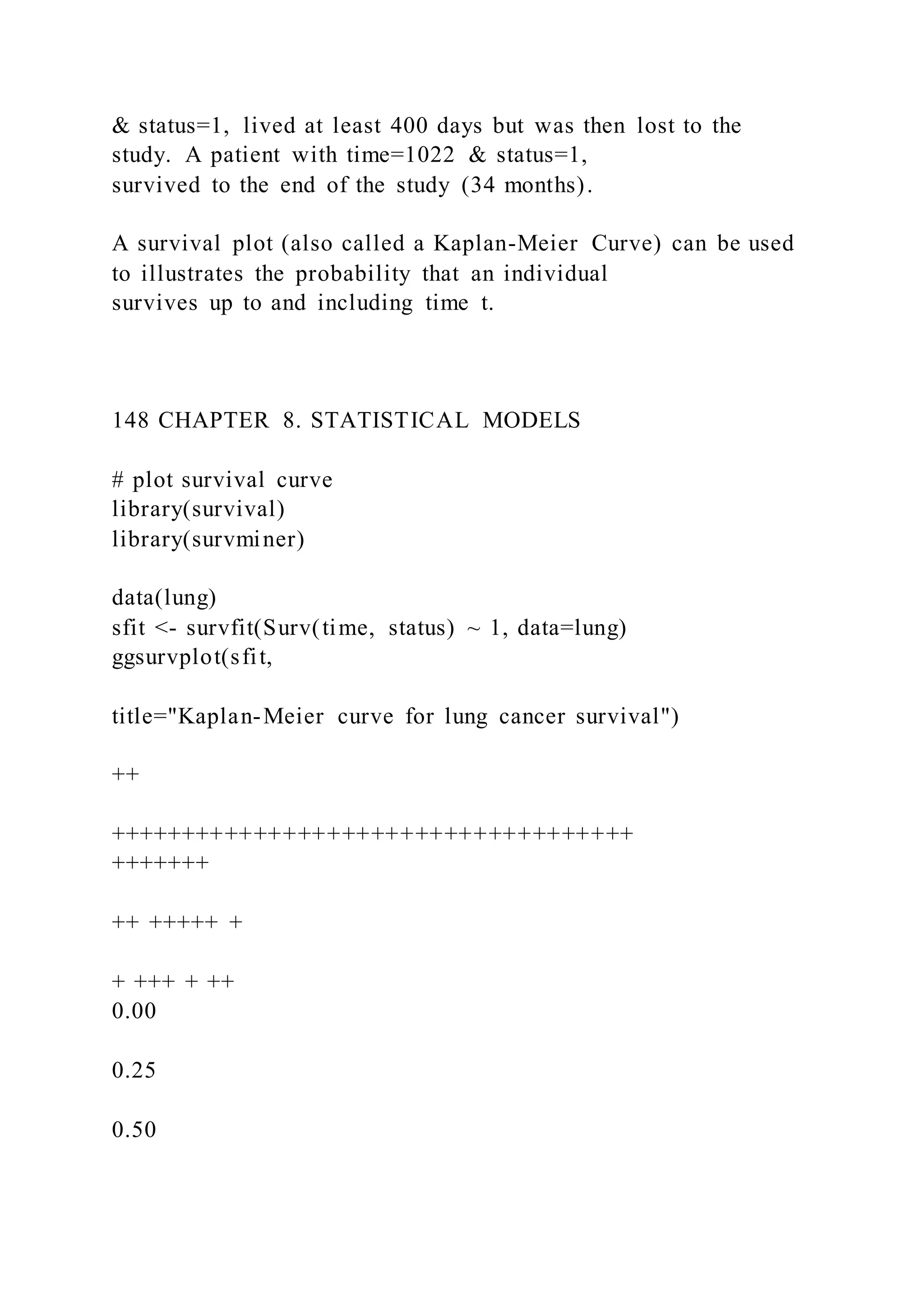
excludes Hawaii and Alaska.
library(ggplot2)
library(choroplethr)
data(continental_us_states)
# input the data](https://image.slidesharecdn.com/datavisualizationwithrrobkabacoff2018-09-032-220921023726-e47a5f57/75/Data-Visualization-with-RRob-Kabacoff2018-09-032-175-2048.jpg)
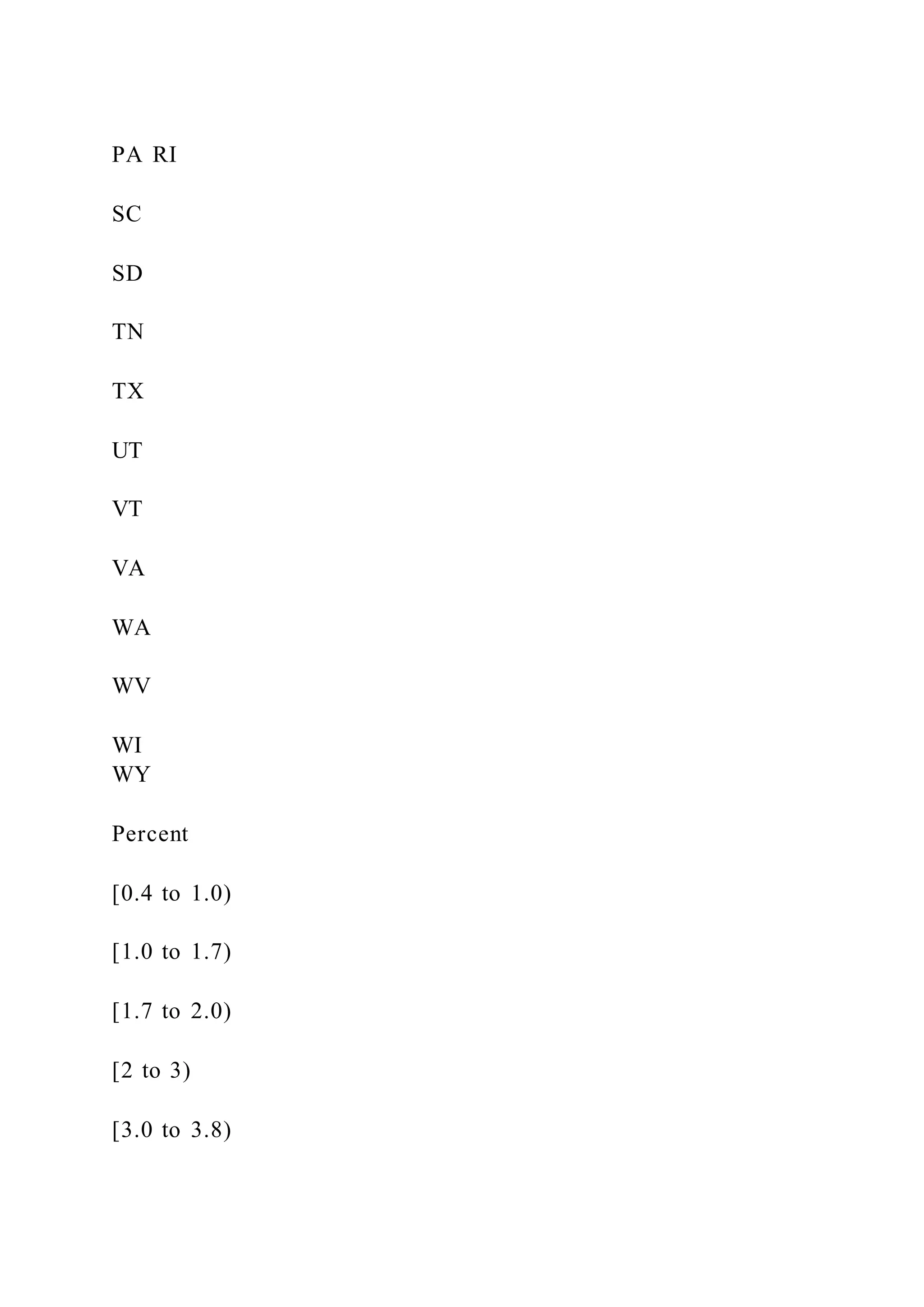
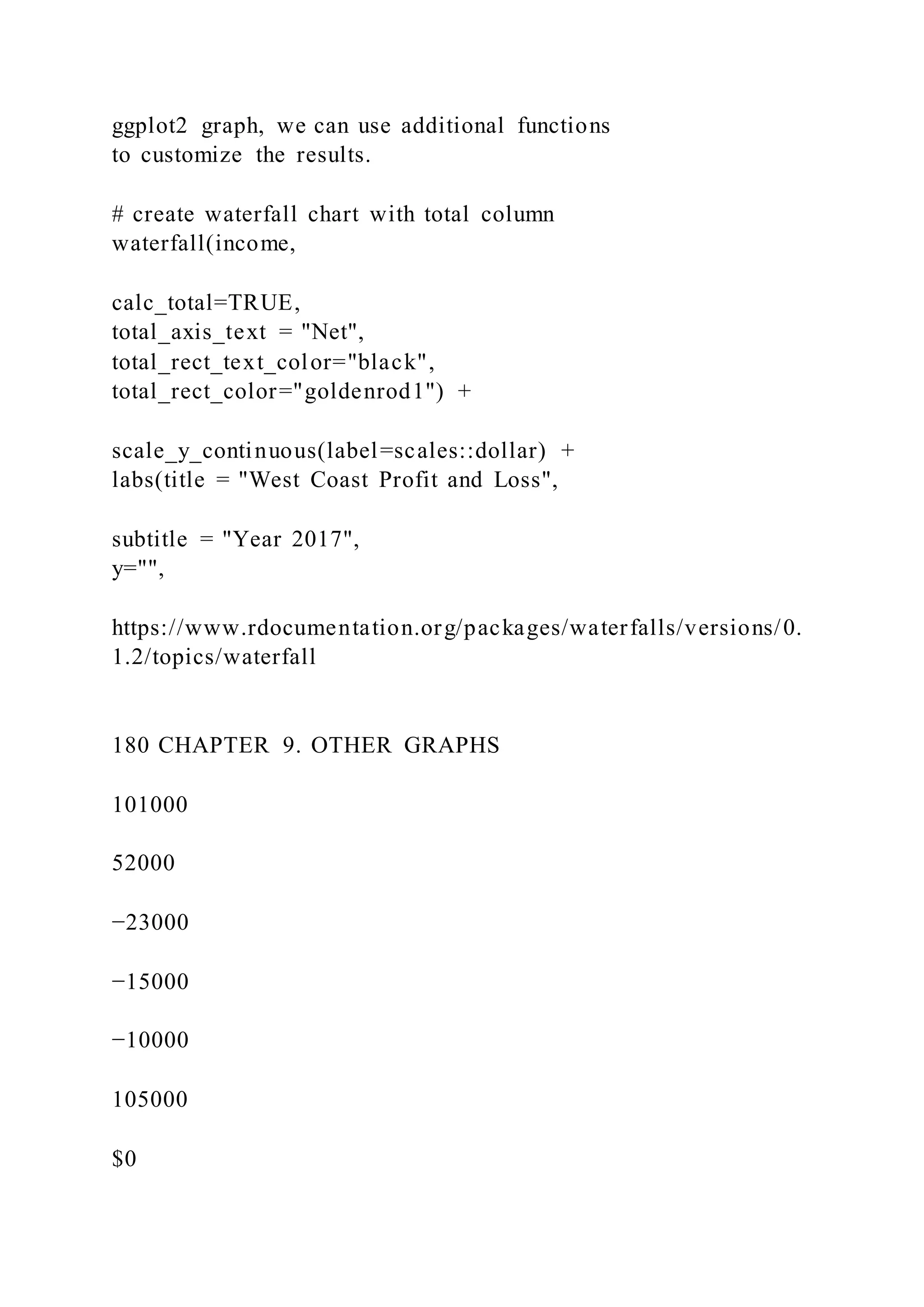
![[3.8 to 5.4)
[5.4 to 9.4)
[9.4 to 20.0)
[20.0 to 31.6]
2010 US Census
Mexican American Population
source:
https://en.wikipedia.org/wiki/List_of_U.S._states_b y_Hispanic_
and_Latino_population
Figure 6.5: Choropleth map of US States
mex_am$value <- mex_am$percent
# create the map
state_choropleth(mex_am,
num_colors=9,
zoom = continental_us_states) +
scale_fill_brewer(palette="YlOrBr") +
labs(title = "Mexican American Population",
subtitle = "2010 US Census",
caption = "source:
https://en.wikipedia.org/wiki/List_of_U.S._states_by_Hispanic_
and_Latino_population",
fill = "Percent")
6.2.2 Data by US county](https://image.slidesharecdn.com/datavisualizationwithrrobkabacoff2018-09-032-220921023726-e47a5f57/75/Data-Visualization-with-RRob-Kabacoff2018-09-032-179-2048.jpg)


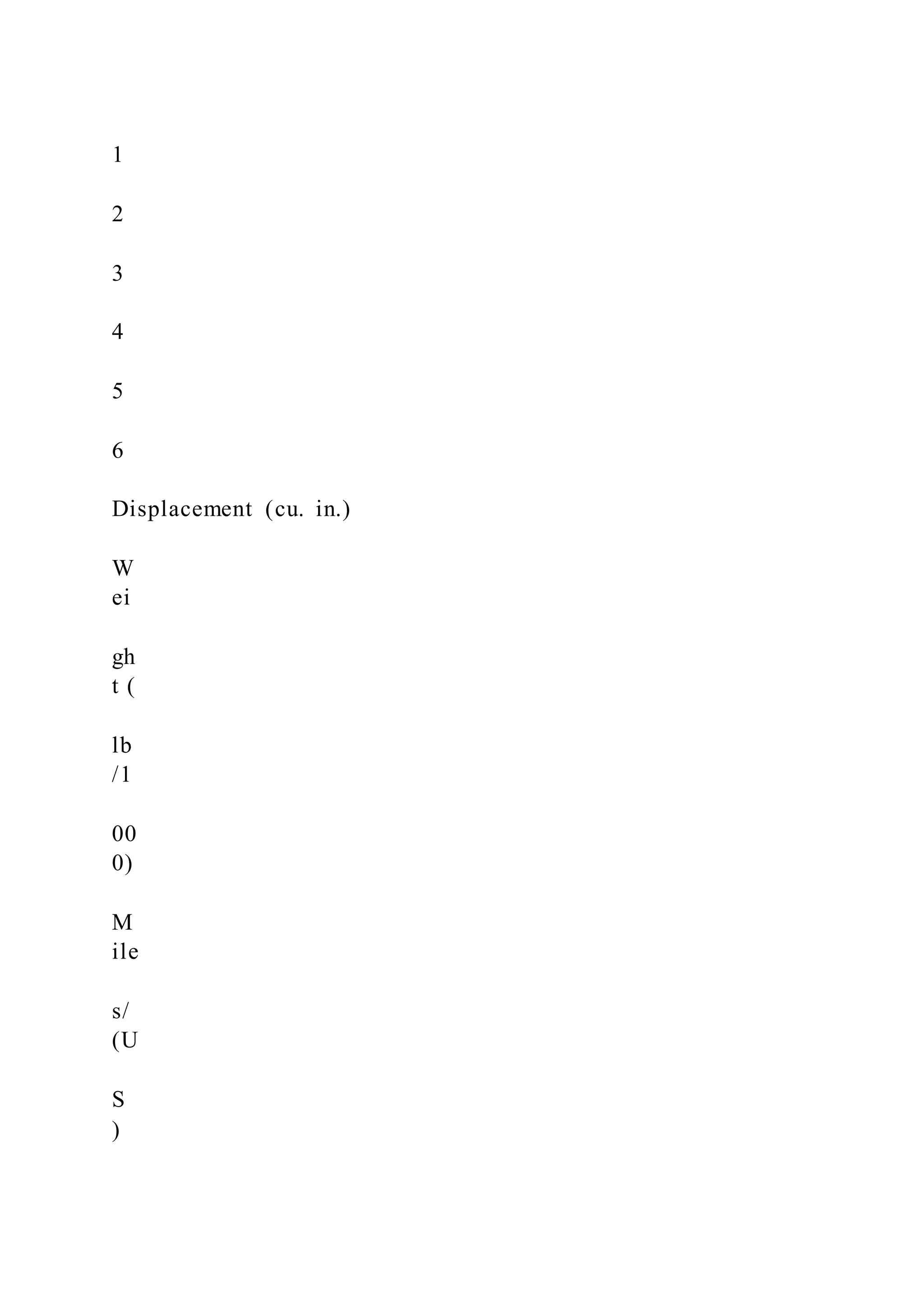
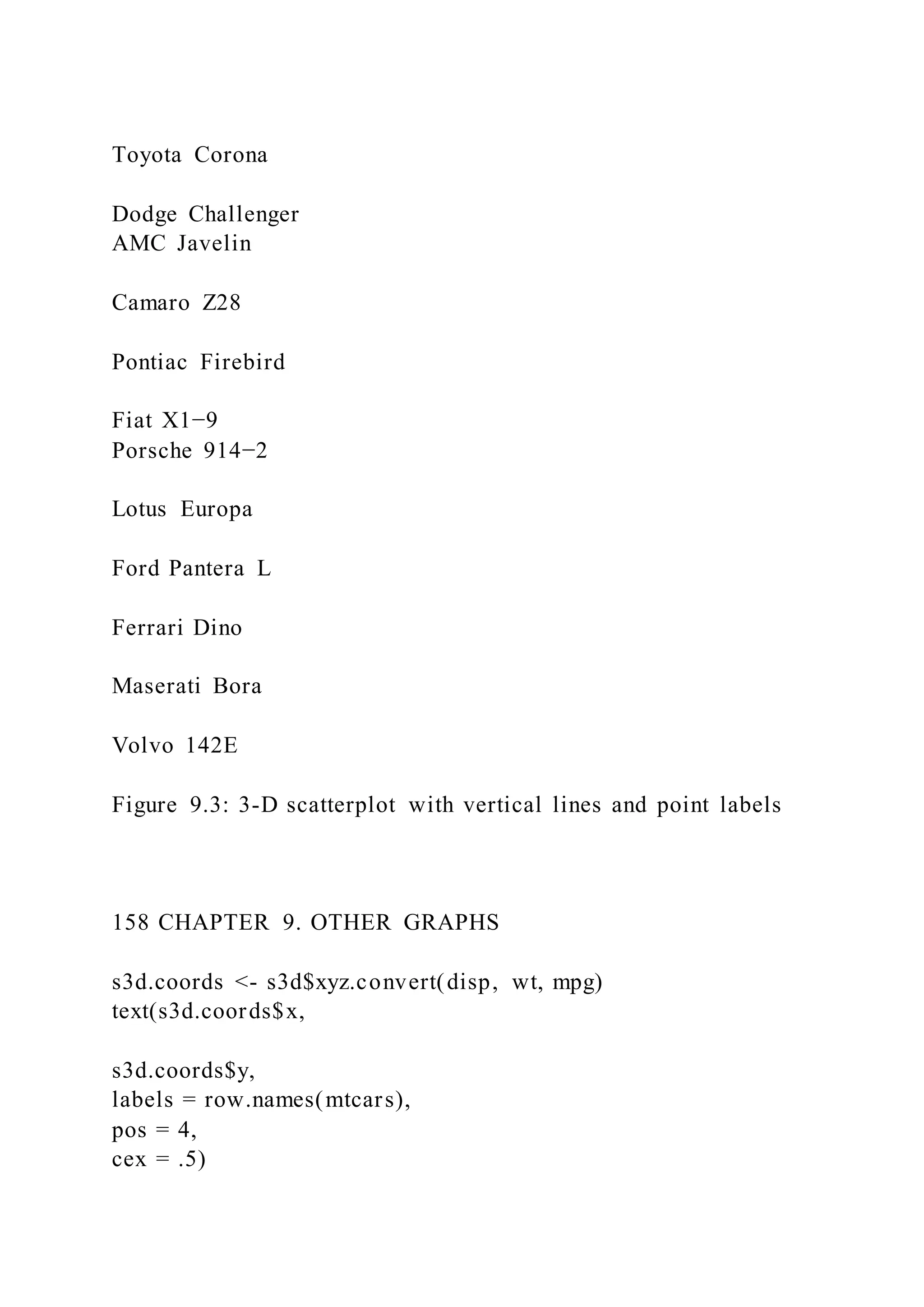
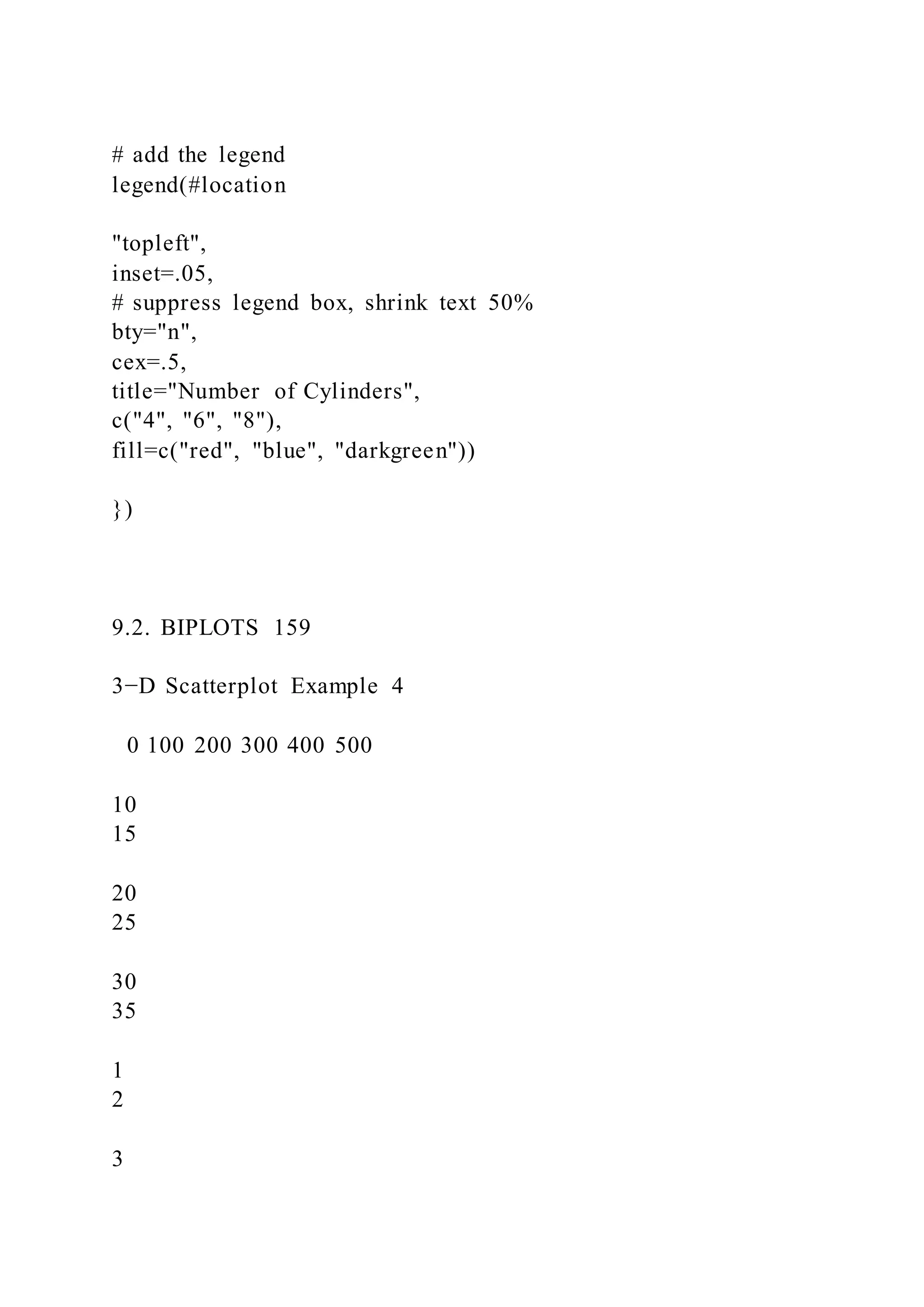
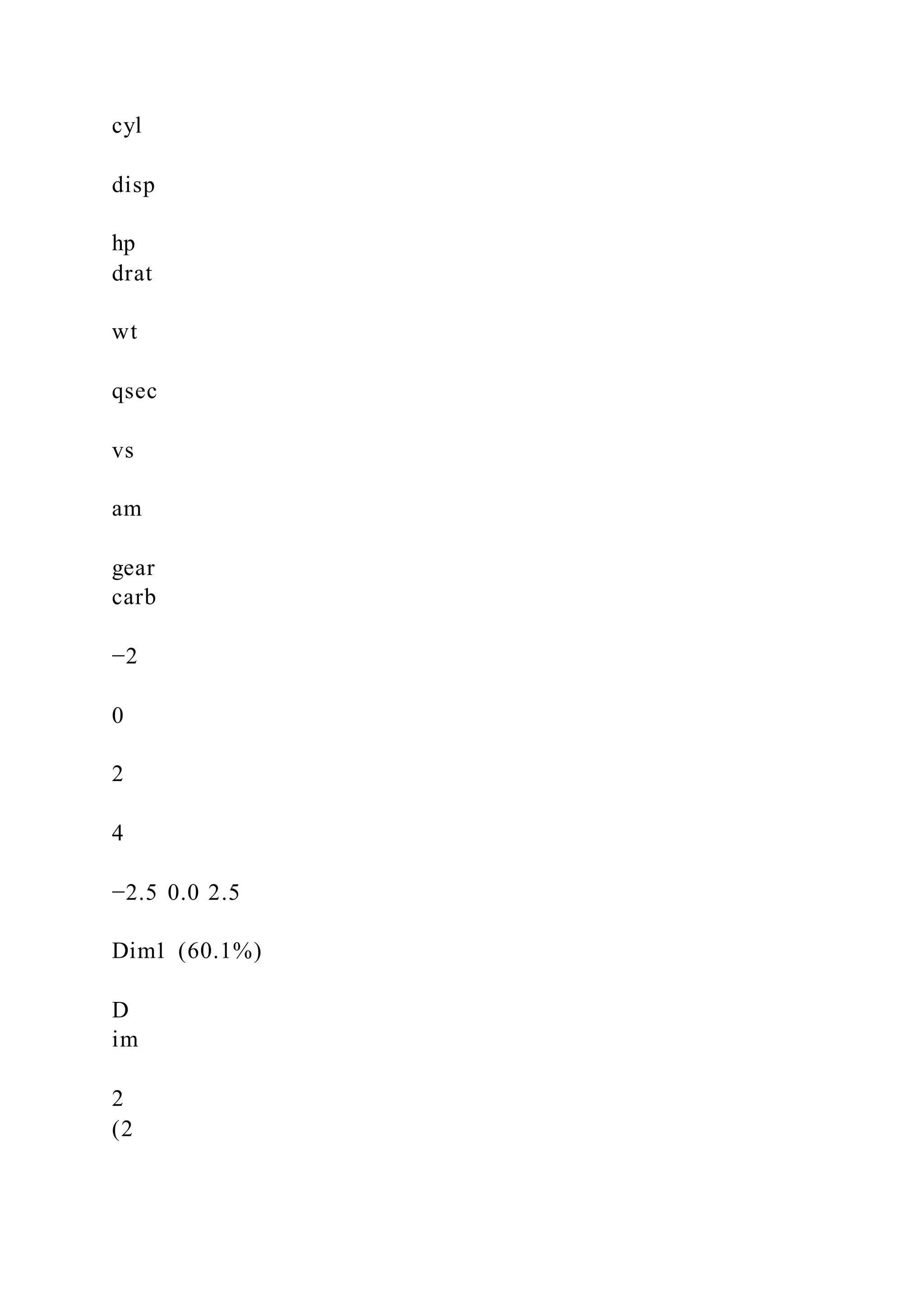
![mtcars$pcolor[mtcars$cyl == 4] <- "red"
mtcars$pcolor[mtcars$cyl == 6] <- "blue"
mtcars$pcolor[mtcars$cyl == 8] <- "darkgreen"
with(mtcars, {
s3d <- scatterplot3d(
x = disp,
y = wt,
z = mpg,
color = pcolor,
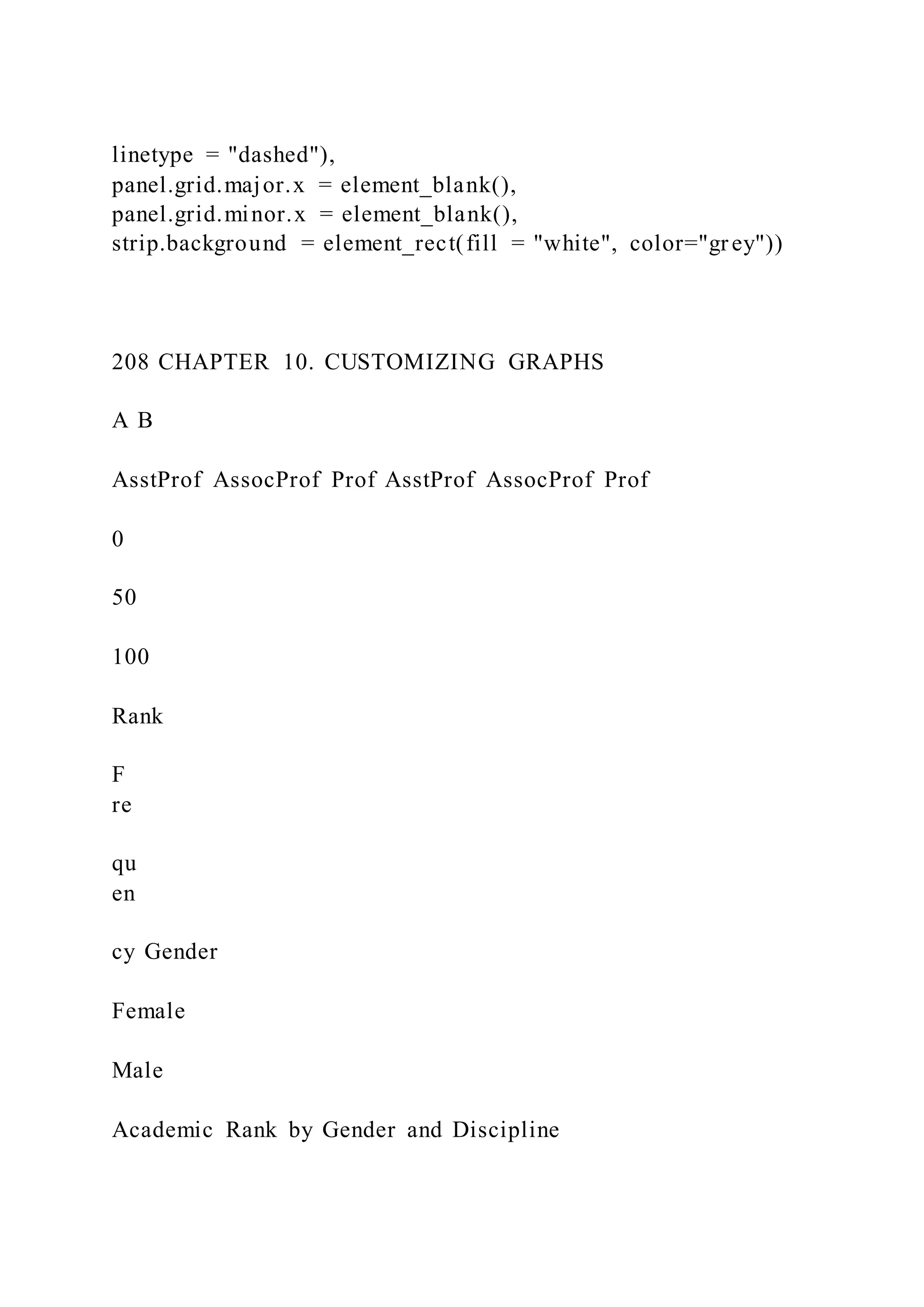
pch = 19,
type = "h",
lty.hplot = 2,
scale.y = .75,
main = "3-D Scatterplot Example 4",
xlab = "Displacement (cu. in.)",
ylab = "Weight (lb/1000)",
zlab = "Miles/(US) Gallon")
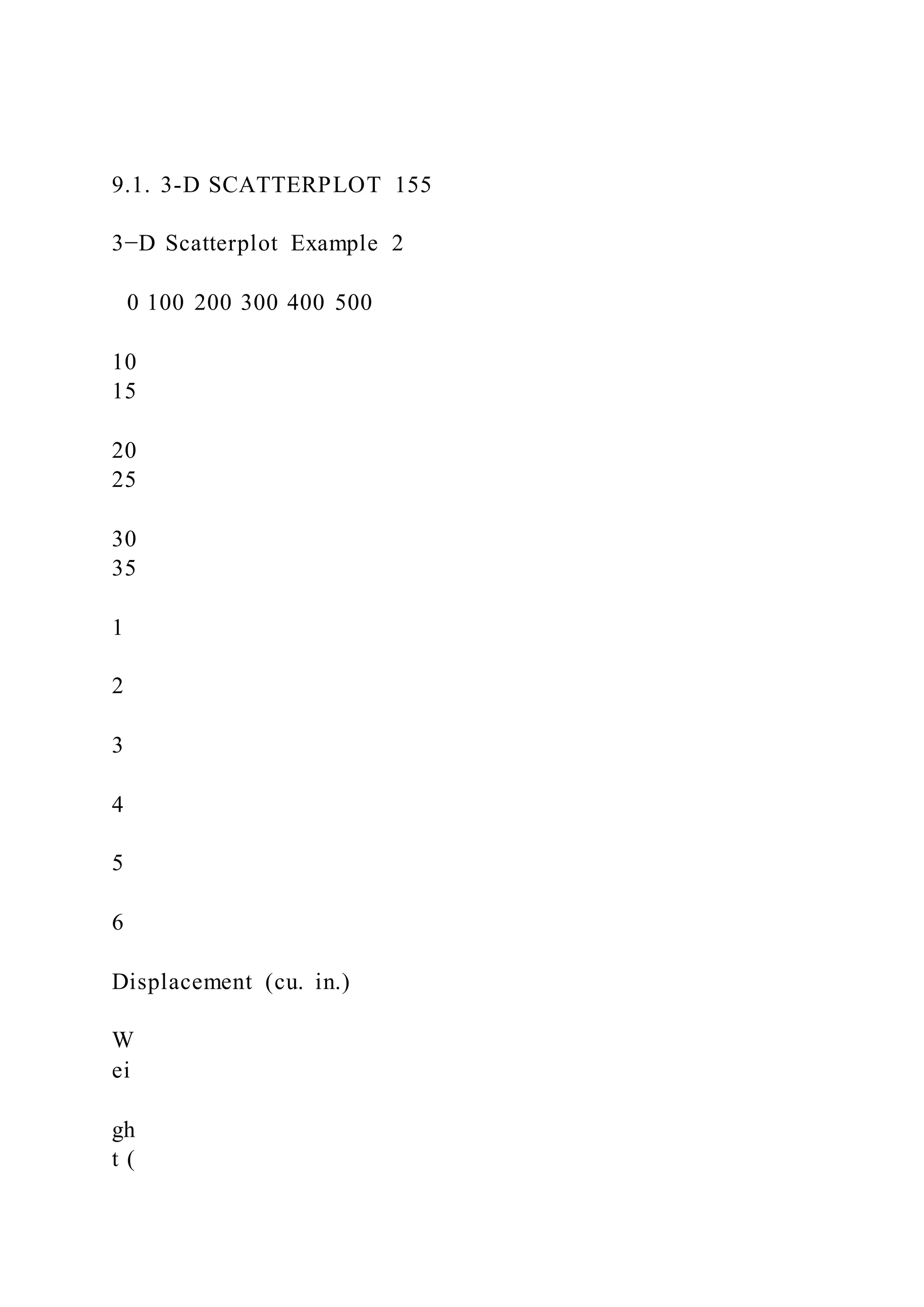
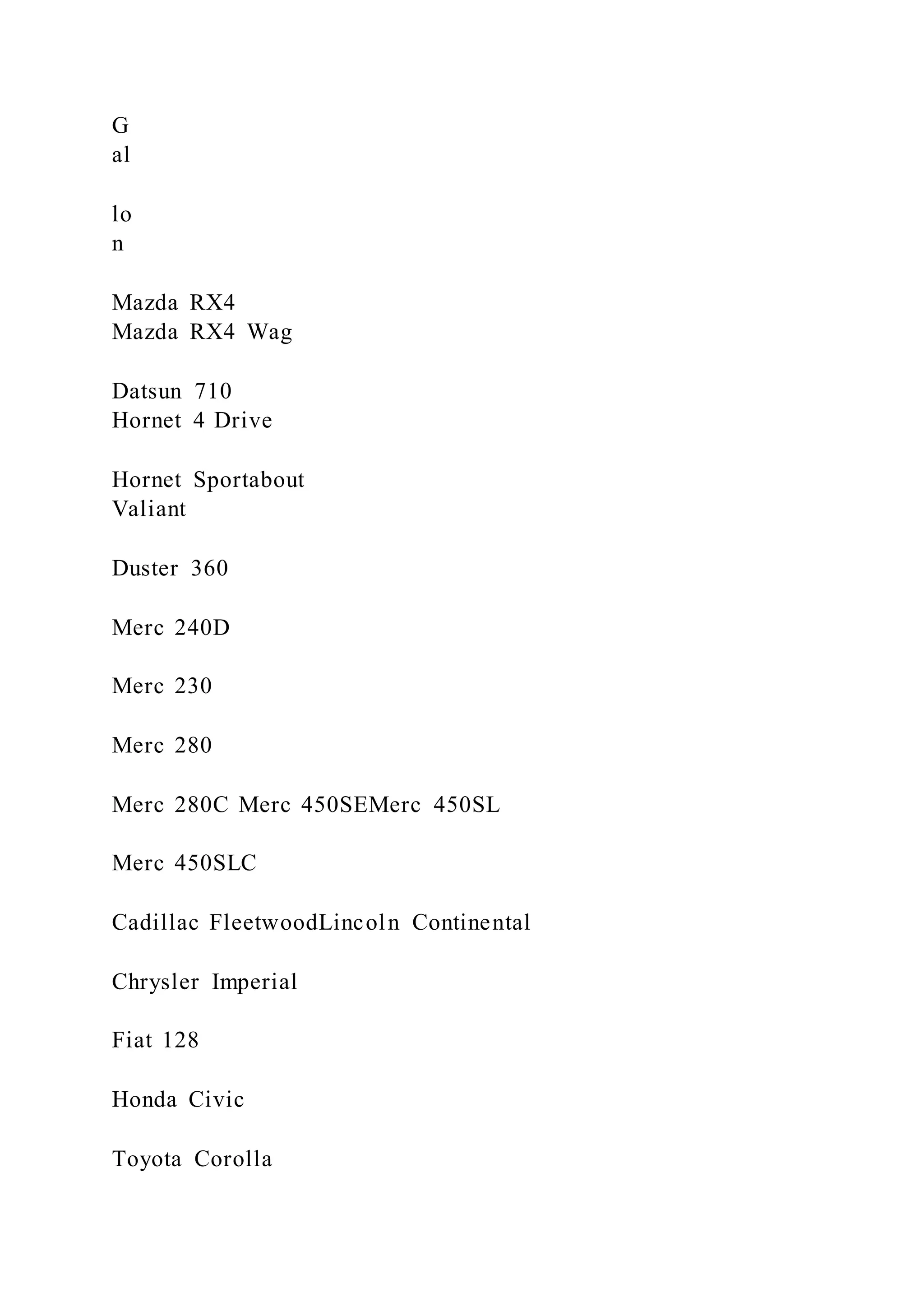
9.1. 3-D SCATTERPLOT 157
3−D Scatterplot Example 3
0 100 200 300 400 500
10
15
20
25
30
35](https://image.slidesharecdn.com/datavisualizationwithrrobkabacoff2018-09-032-220921023726-e47a5f57/75/Data-Visualization-with-RRob-Kabacoff2018-09-032-239-2048.jpg)


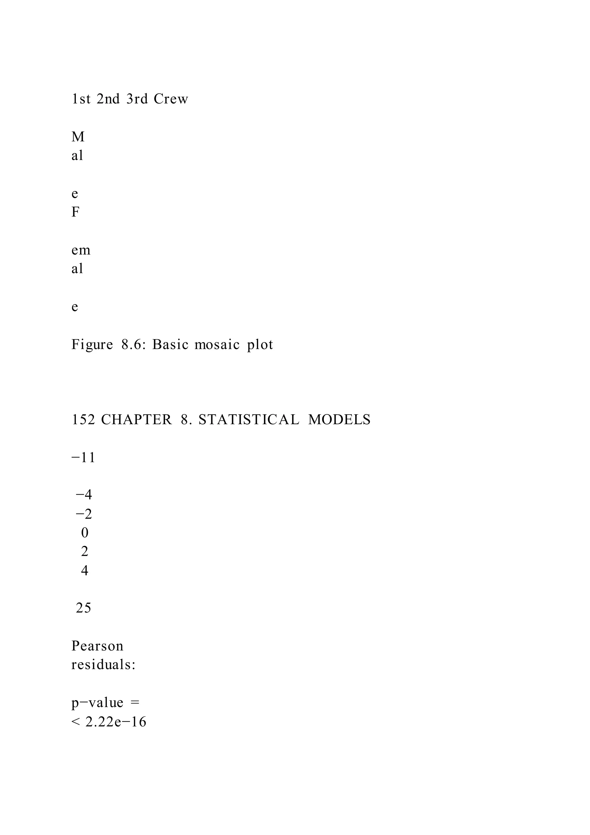
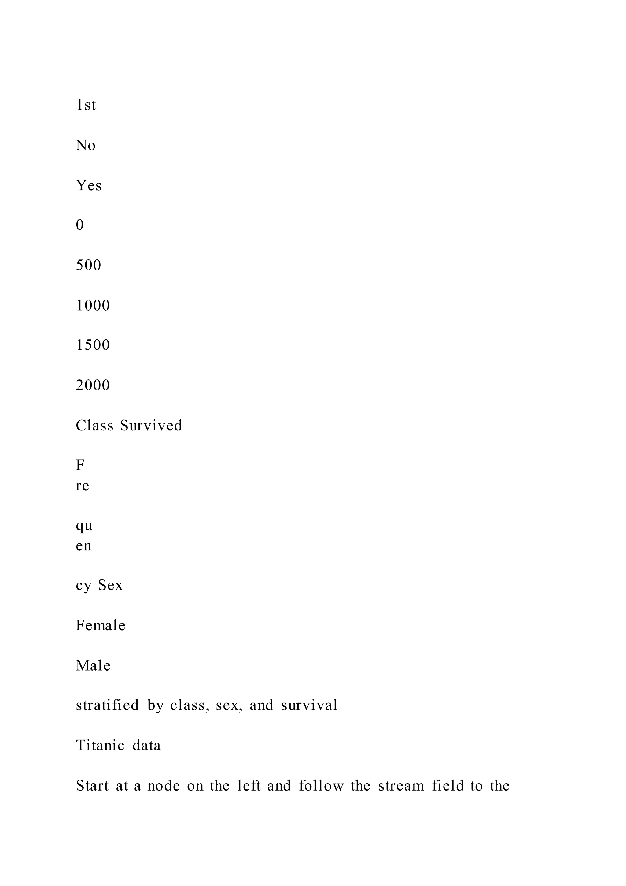
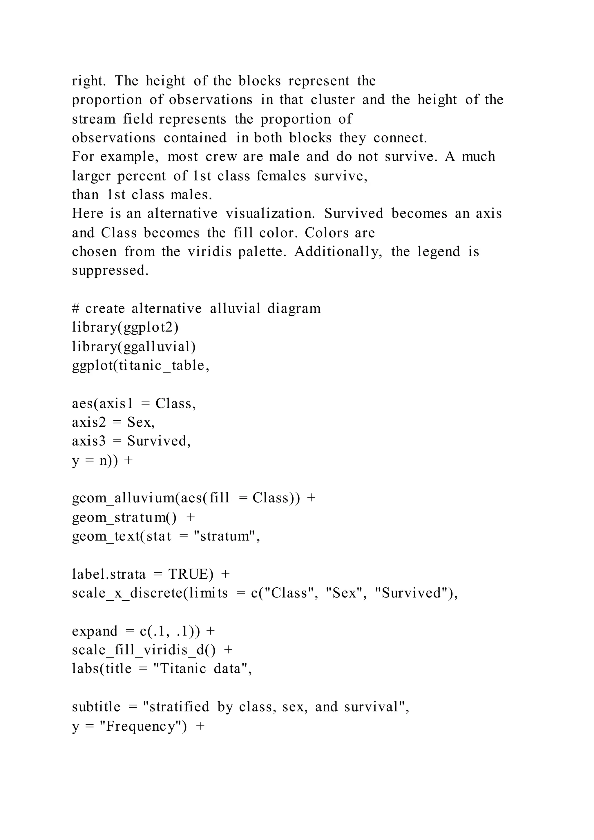
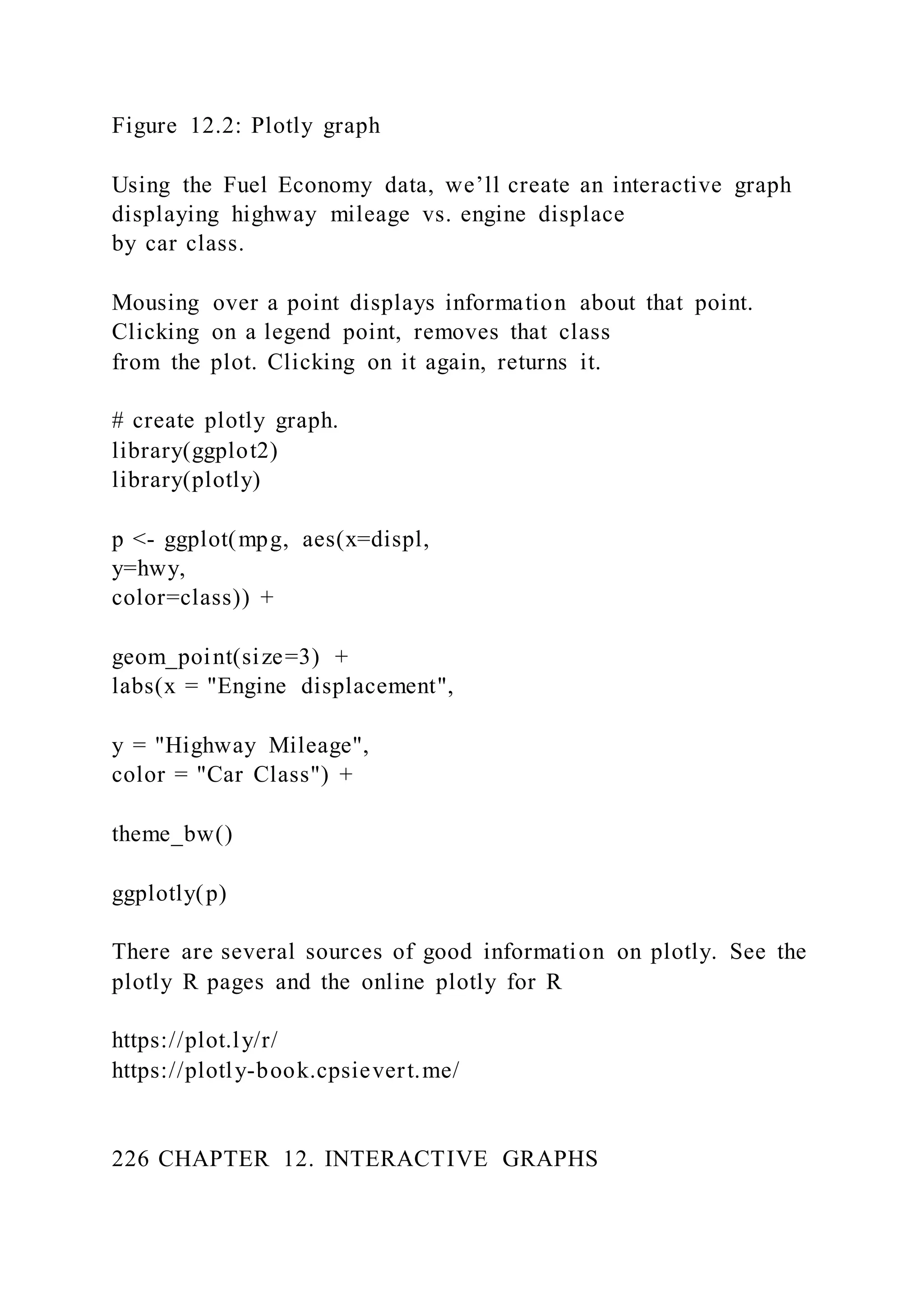
![let’s diagram the survival of Titanic
passengers, using the Titanic dataset.
Alluvial diagrams are created with ggalluvial package,
generating ggplot2 graphs.
# input data
library(readr)
titanic <- read_csv("titanic.csv")
# summarize data
library(dplyr)
https://github.com/corybrunson/ggalluvial/issues/11
166 CHAPTER 9. OTHER GRAPHS
titanic_table <- titanic %>%
group_by(Class, Sex, Survived) %>%
count()
titanic_table$Survived <- factor(titanic_table$Survived,
levels = c("Yes", "No"))
head(titanic_table)
## # A tibble: 6 x 4
## # Groups: Class, Sex, Survived [6]
## Class Sex Survived n
## <chr> <chr> <fct> <int>
## 1 1st Female No 4
## 2 1st Female Yes 141
## 3 1st Male No 118
## 4 1st Male Yes 62
## 5 2nd Female No 13](https://image.slidesharecdn.com/datavisualizationwithrrobkabacoff2018-09-032-220921023726-e47a5f57/75/Data-Visualization-with-RRob-Kabacoff2018-09-032-261-2048.jpg)


![[系列活動] Data exploration with modern R](https://cdn.slidesharecdn.com/ss_thumbnails/dataexplorationwithmodernr1221-161219044516-thumbnail.jpg?width=640&height=640&fit=bounds)


