Downloaded 15 times


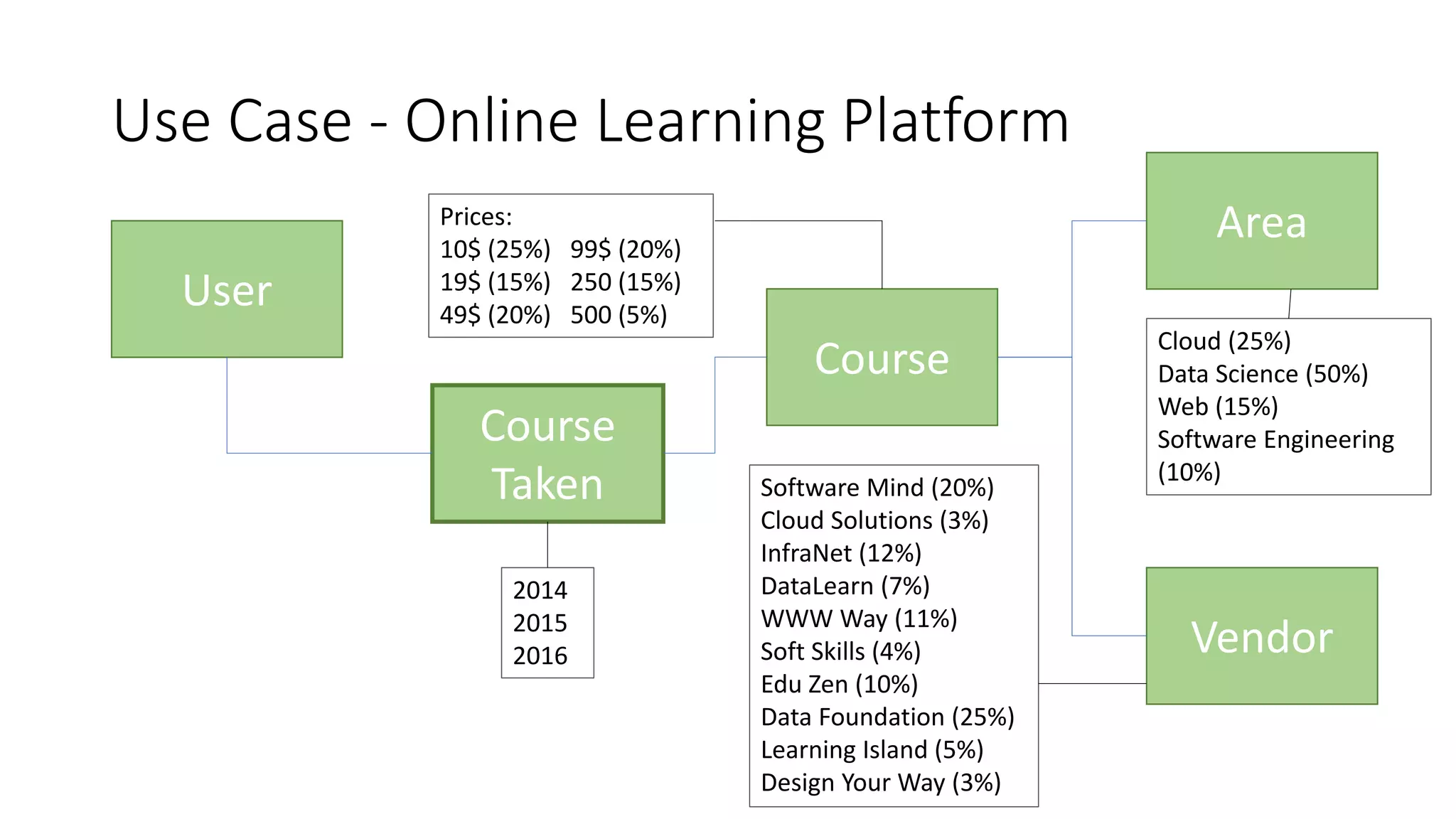
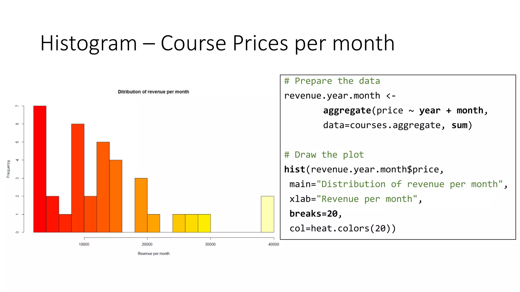
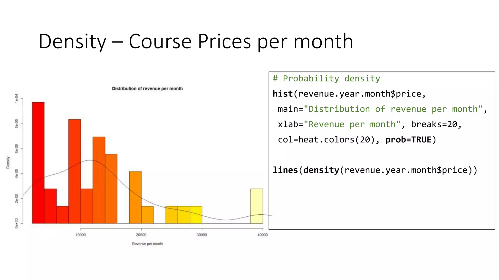
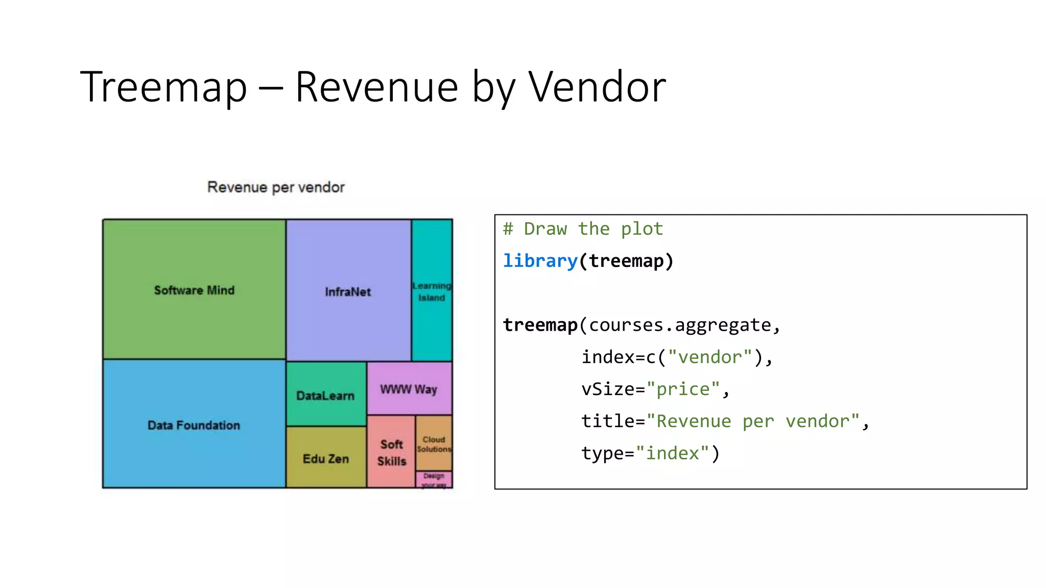
![courses.aggregate
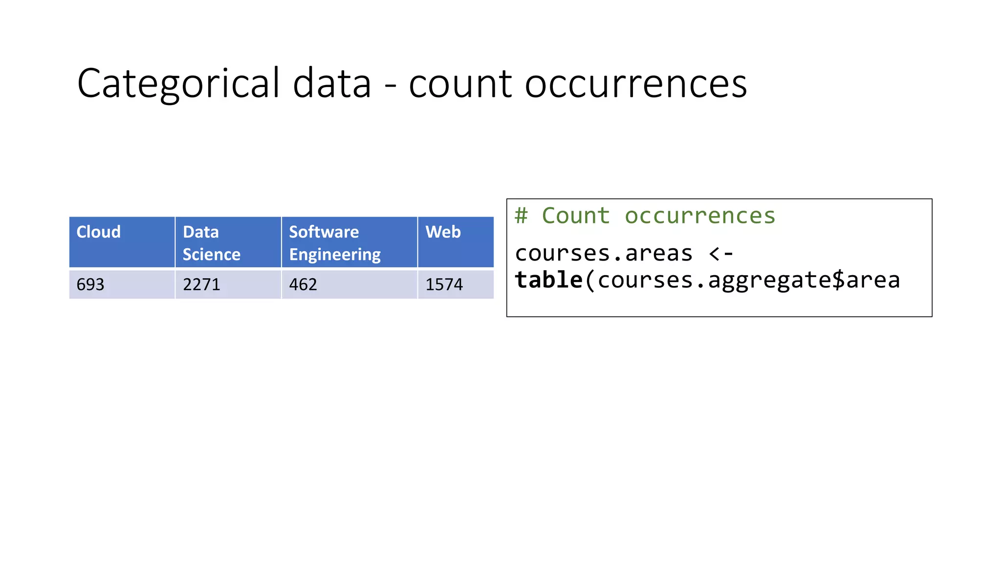
Name Area Vendor Year Month Price [$]
Perez, Lisa Data Science Data Foundation 2015 7 99
Tran, Janiro Software Engineering DataLearn 2016 2 10
Bajwa, John Cloud InfraNet 2015 9 250
Lindsey, Aaron Web Software Mind 2014 6 19
Cooper, Duncan Software Engineering Learning Island 2014 7 250
Grumbach, Alexander Web Design Your Way 2015 2 99](https://image.slidesharecdn.com/rvisualisation-170320203754/75/A-picture-speaks-a-thousand-words-Data-Visualisation-with-R-8-2048.jpg)
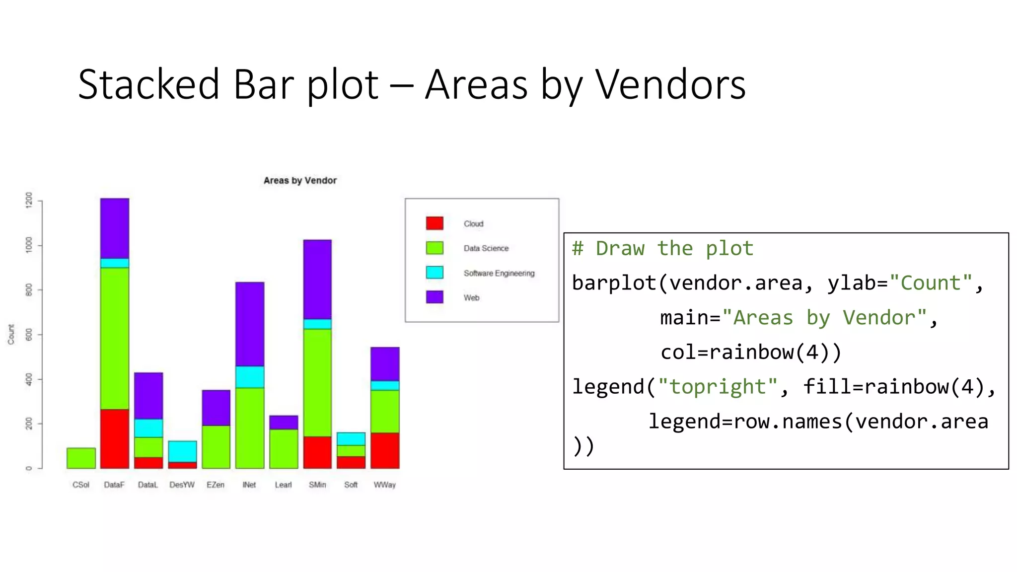
![Bar plot – Revenue per year
# Draw the plot
barplot(revenue.year$price,
names.arg =
revenue.year$year,
ylab="Count [$]",
main="Revenue per year")](https://image.slidesharecdn.com/rvisualisation-170320203754/75/A-picture-speaks-a-thousand-words-Data-Visualisation-with-R-20-2048.jpg)
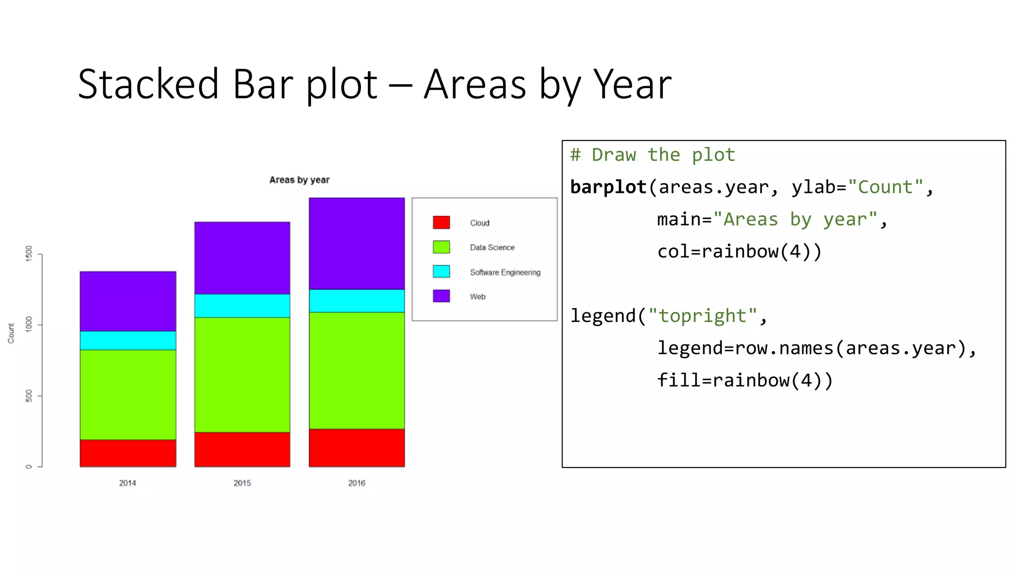
![Stacked Bar plot – Revenue by Year and Area
# Draw the plot
barplot(rya, col=rainbow(4),
ylab="Count [$]",
main="Revenue by Year & Area")
legend("topright", fill=rainbow(4),
legend=row.names(rya))](https://image.slidesharecdn.com/rvisualisation-170320203754/75/A-picture-speaks-a-thousand-words-Data-Visualisation-with-R-22-2048.jpg)
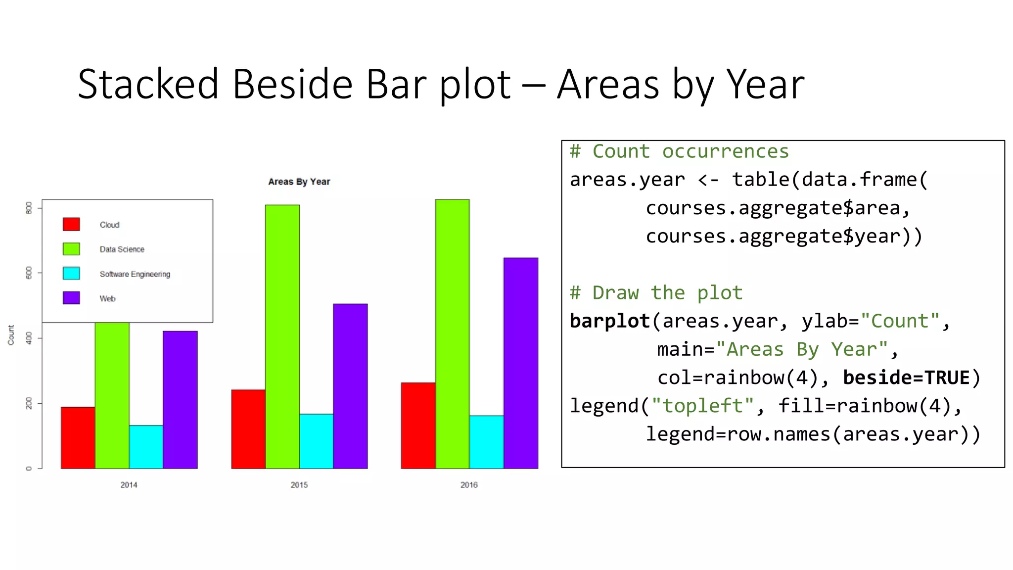
![Stacked Beside Bar plot – Areas Revenue by Year
# Draw the plot
barplot(rya, col=rainbow(4),
ylab="Count [$]",
main="Revenue by Year & Area",
beside=TRUE)
legend("topright", fill=rainbow(3),
legend=row.names(rya))](https://image.slidesharecdn.com/rvisualisation-170320203754/75/A-picture-speaks-a-thousand-words-Data-Visualisation-with-R-23-2048.jpg)

![Bar & line plot – Revenue by month
# Draw the plot
revenue.bar <- barplot(
revenue.month$price,
names.arg = labels ,
ylab="Revenue [$]",
main="2016 Revenue by month")
lines(x=revenue.bar,
y=revenue.month$units*100)
points(x=revenue.bar,
y=revenue.month$units*100)](https://image.slidesharecdn.com/rvisualisation-170320203754/75/A-picture-speaks-a-thousand-words-Data-Visualisation-with-R-29-2048.jpg)
![Line plot & trend – Revenue by month
# Draw the plot
months <- 1:12
plot(price ~ month, data=revenue.month,
xaxt="n", type="l",
ylab="Revenue [$]", xlab="",
main="Revenue in 2016")
axis(1, at=months, labels=labels)
# Display the trend
lines(c(1,12), c(25000, 12000), type="l",
lty=2, col="blue")
legend("topright", c("Revenue", "Trend"),
col=c("black", "blue"), lty=1:2)](https://image.slidesharecdn.com/rvisualisation-170320203754/75/A-picture-speaks-a-thousand-words-Data-Visualisation-with-R-30-2048.jpg)
![Line plot & trend – Revenue by Units
# Draw the plot
plot(price~units,
data=revenue.month,
xlab="Units",
ylab="Revenue [$]",
main="Revenue by Units in 2016")
lines(c(30, 380), c(3000, 35000),
type='l', lty=2, col="blue")
legend("topleft",
c("revenue/freq", "trend"),
col=c("black", "blue"),
lty=c(0,2), pch=c(21, -1))](https://image.slidesharecdn.com/rvisualisation-170320203754/75/A-picture-speaks-a-thousand-words-Data-Visualisation-with-R-31-2048.jpg)
![Line plot & trend – Revenue by Units
# Draw the plot
plot(price~units,
data=revenue.month.area,
xlab="Units",
ylab="Revenue [$]",
col=area,
main="Revenue by Units (All years)")
legend("topleft",
legend=levels(revenue.month.area$area),
col=1:length(
levels(revenue.month.area$area)),
pch=21, text.width = 30)](https://image.slidesharecdn.com/rvisualisation-170320203754/75/A-picture-speaks-a-thousand-words-Data-Visualisation-with-R-32-2048.jpg)

![Stacked Bar chart – base vs. lattice
barplot(rya, col=rainbow(4),
ylab="Count [$]",
main="Revenue by Year & Area")
legend("topright", fill=rainbow(4),
legend=row.names(rya))
barchart(Cloud + `Data Science` +
`Software Engineering` + Web ~ year
data=t(rya), auto.key=TRUE,
stack=TRUE, horizontal=FALSE,
ylab="Count [$]", main="Areas by Year")](https://image.slidesharecdn.com/rvisualisation-170320203754/75/A-picture-speaks-a-thousand-words-Data-Visualisation-with-R-34-2048.jpg)
![Stacked Bar chart – base vs. ggplot2
barplot(rya, col=rainbow(4),
ylab="Count [$]",
main="Revenue by Year & Area")
legend("topright", fill=rainbow(4),
legend=row.names(rya))
ggplot(revenue.year.area,
aes(x = year, y=price, fill = area)) +
geom_bar(stat = "identity") +
ggtitle("Revenue by Year & Area") +
ylab("Count [$]")](https://image.slidesharecdn.com/rvisualisation-170320203754/75/A-picture-speaks-a-thousand-words-Data-Visualisation-with-R-35-2048.jpg)
![Scatter plot – base vs. lattice
plot(price~units, data=revenue.month.area,
xlab="Units", ylab="Revenue [$]",
col=area,
main="Revenue by Units (All years)")
# And you need legend manually created
xyplot(price~units, data=revenue.month.area,
xlab="Units", ylab="Revenue [$]",
pch=19,
group = area,
auto.key = TRUE)](https://image.slidesharecdn.com/rvisualisation-170320203754/75/A-picture-speaks-a-thousand-words-Data-Visualisation-with-R-40-2048.jpg)
![Scatter plot – base vs. ggplot2
plot(price~units, data=revenue.month.area,
xlab="Units", ylab="Revenue [$]",
col=area,
main="Revenue by Units (All years)")
# And you need legend manually created
ggplot(revenue.month.area,
aes(x=units, y=price)) +
geom_point(aes(col=area)) +
ggtitle("Revenue by Units (All years)") +
ylab("Revenue [$]") + xlab("Units")](https://image.slidesharecdn.com/rvisualisation-170320203754/75/A-picture-speaks-a-thousand-words-Data-Visualisation-with-R-41-2048.jpg)
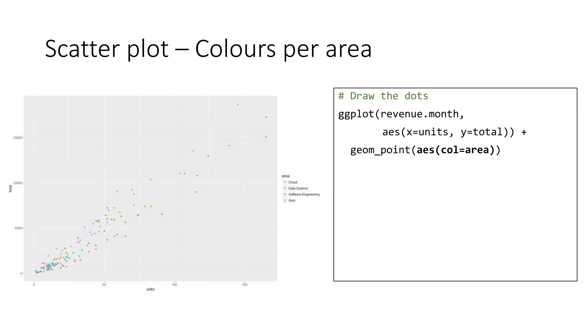
![Scatter plot – Labels
# Draw the dots
ggplot(revenue.month,
aes(x=units, y=total)) +
geom_point(aes(col=area)) +
ggtitle("Revenue by Units (All years)") +
ylab("Revenue [$]") +
xlab("Units")](https://image.slidesharecdn.com/rvisualisation-170320203754/75/A-picture-speaks-a-thousand-words-Data-Visualisation-with-R-45-2048.jpg)
![Scatter plot – Dots’ size
# Draw the dots
ggplot(revenue.month,
aes(x=units, y=total)) +
geom_point(aes(col=area, size=dltotal)) +
ggtitle("Revenue by Units (All years)") +
ylab("Revenue [$]") +
xlab("Units")](https://image.slidesharecdn.com/rvisualisation-170320203754/75/A-picture-speaks-a-thousand-words-Data-Visualisation-with-R-46-2048.jpg)
![Scatter plot – Lines
# Draw the dots
ggplot(revenue.month,
aes(x=units, y=total)) +
geom_point(aes(col=area)) +
geom_line() +
ggtitle("Revenue by Units (All years)") +
ylab("Revenue [$]") +
xlab("Units")](https://image.slidesharecdn.com/rvisualisation-170320203754/75/A-picture-speaks-a-thousand-words-Data-Visualisation-with-R-47-2048.jpg)
![Scatter plot – ab line
# Draw the dots
ggplot(revenue.month,
aes(x=units, y=total)) +
geom_point(aes(col=area)) +
geom_abline(intercept = 0, slope = 110) +
ggtitle("Revenue by Units (All years)") +
ylab("Revenue [$]") +
xlab("Units")](https://image.slidesharecdn.com/rvisualisation-170320203754/75/A-picture-speaks-a-thousand-words-Data-Visualisation-with-R-48-2048.jpg)
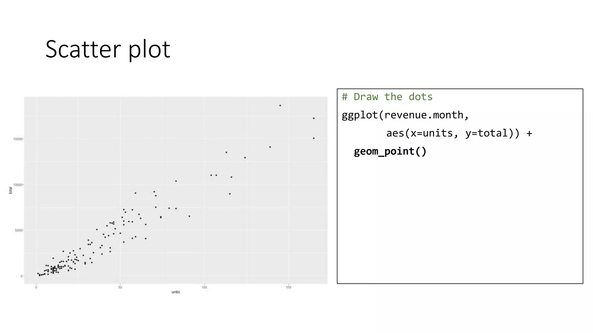
![Scatter plot – smooth line
# Draw the dots
ggplot(revenue.month,
aes(x=units, y=total)) +
geom_point(aes(col=area)) +
stat_smooth() +
ggtitle("Revenue by Units (All years)") +
ylab("Revenue [$]") +
xlab("Units")](https://image.slidesharecdn.com/rvisualisation-170320203754/75/A-picture-speaks-a-thousand-words-Data-Visualisation-with-R-49-2048.jpg)
![Scatter plot – smooth line
# Draw the dots
ggplot(revenue.month,
aes(x=units, y=total)) +
geom_point(aes(col=area)) +
stat_smooth() +
ggtitle("Revenue by Units (All years)") +
ylab("Revenue [$]") +
xlab("Units") +
theme(legend.title=element_text(
colour="chocolate", size=16,
face="bold"))](https://image.slidesharecdn.com/rvisualisation-170320203754/75/A-picture-speaks-a-thousand-words-Data-Visualisation-with-R-50-2048.jpg)
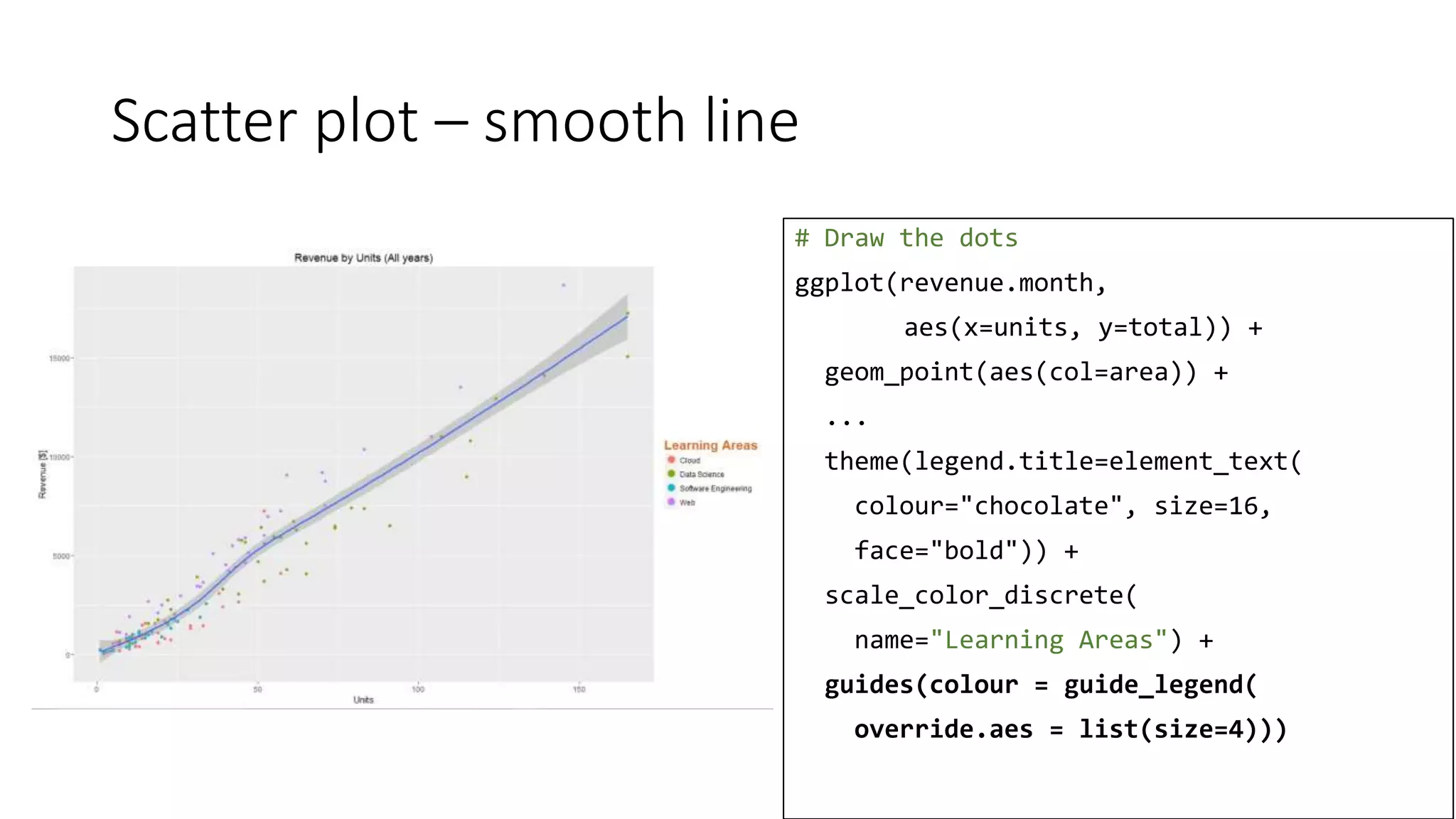
![Scatter plot – smooth line
# Draw the dots
ggplot(revenue.month,
aes(x=units, y=total)) +
geom_point(aes(col=area)) +
stat_smooth() +
ggtitle("Revenue by Units (All years)") +
ylab("Revenue [$]") +
xlab("Units") +
theme(legend.title=element_text(
colour="chocolate", size=16,
face="bold")) +
scale_color_discrete(
name="Learning Areas")](https://image.slidesharecdn.com/rvisualisation-170320203754/75/A-picture-speaks-a-thousand-words-Data-Visualisation-with-R-51-2048.jpg)
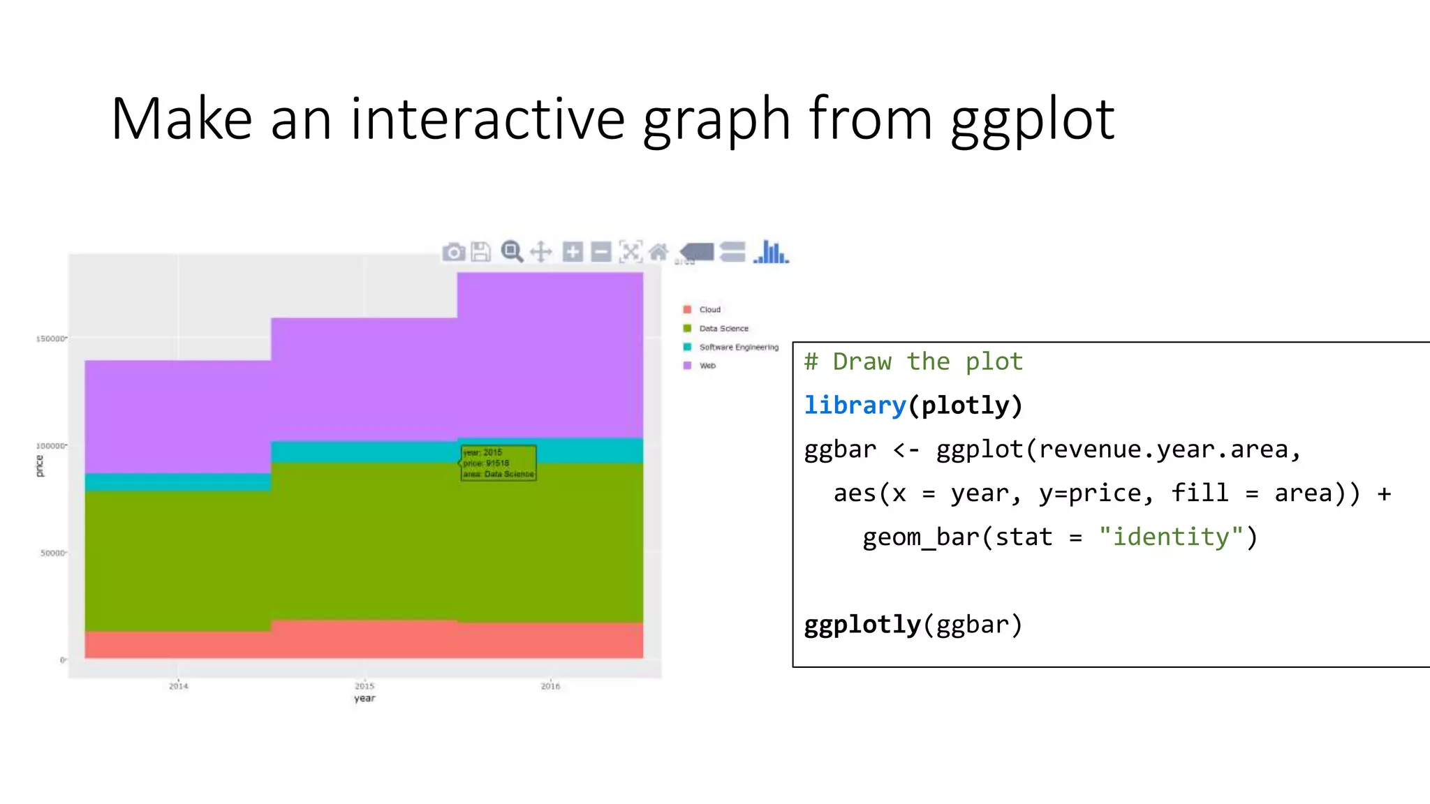
![plotly - Interactive graphs
# Draw the plot
library(plotly)
plot_ly(revenue.month.vendor,
x=~units, y=~total, mode="markers",
color = ~factor(area),
size=~dltotal/1000,
text=~paste("Units:",
units, "</br>Revenue", total,
"</br>DataLearn cut:", dltotal),
hoverinfo="text", type="scatter") %>%
layout(title="Revenue per vendor",
xaxis=list(title="Units"),
yaxis=list(title="Revenue [$]"))](https://image.slidesharecdn.com/rvisualisation-170320203754/75/A-picture-speaks-a-thousand-words-Data-Visualisation-with-R-56-2048.jpg)
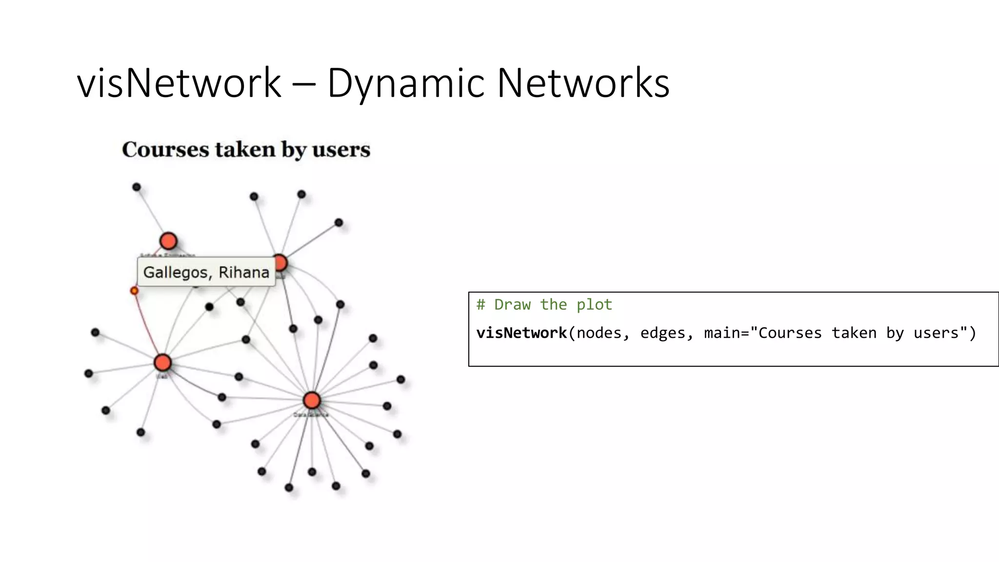
![igraph – Courses taken by Users
# Draw the plot
user.area <- data.frame(
user=courses.aggregate$name,
area=courses.aggregate$area)
user.area <- user.area[
sample(1:500, 50, replace=FALSE),]
user.area <- aggregate(
cbind(user.area[0], width=1),
user.area, length)
# Build the graph
library(igraph)
user.area.graph <- graph.data.frame(
user.area, directed = FALSE,
vertices=vertices)
plot(user.area.graph, main="Courses taken by users")](https://image.slidesharecdn.com/rvisualisation-170320203754/75/A-picture-speaks-a-thousand-words-Data-Visualisation-with-R-59-2048.jpg)
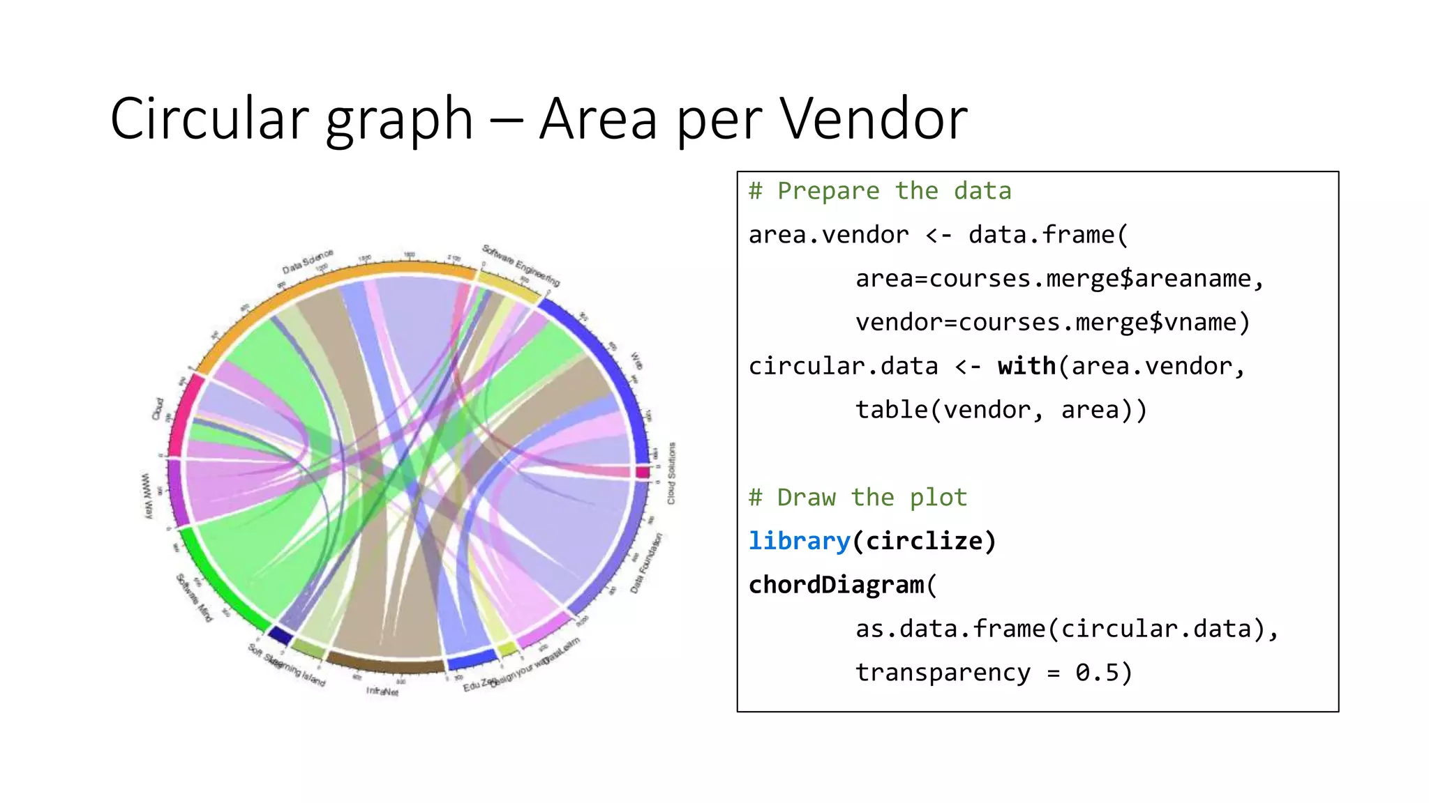
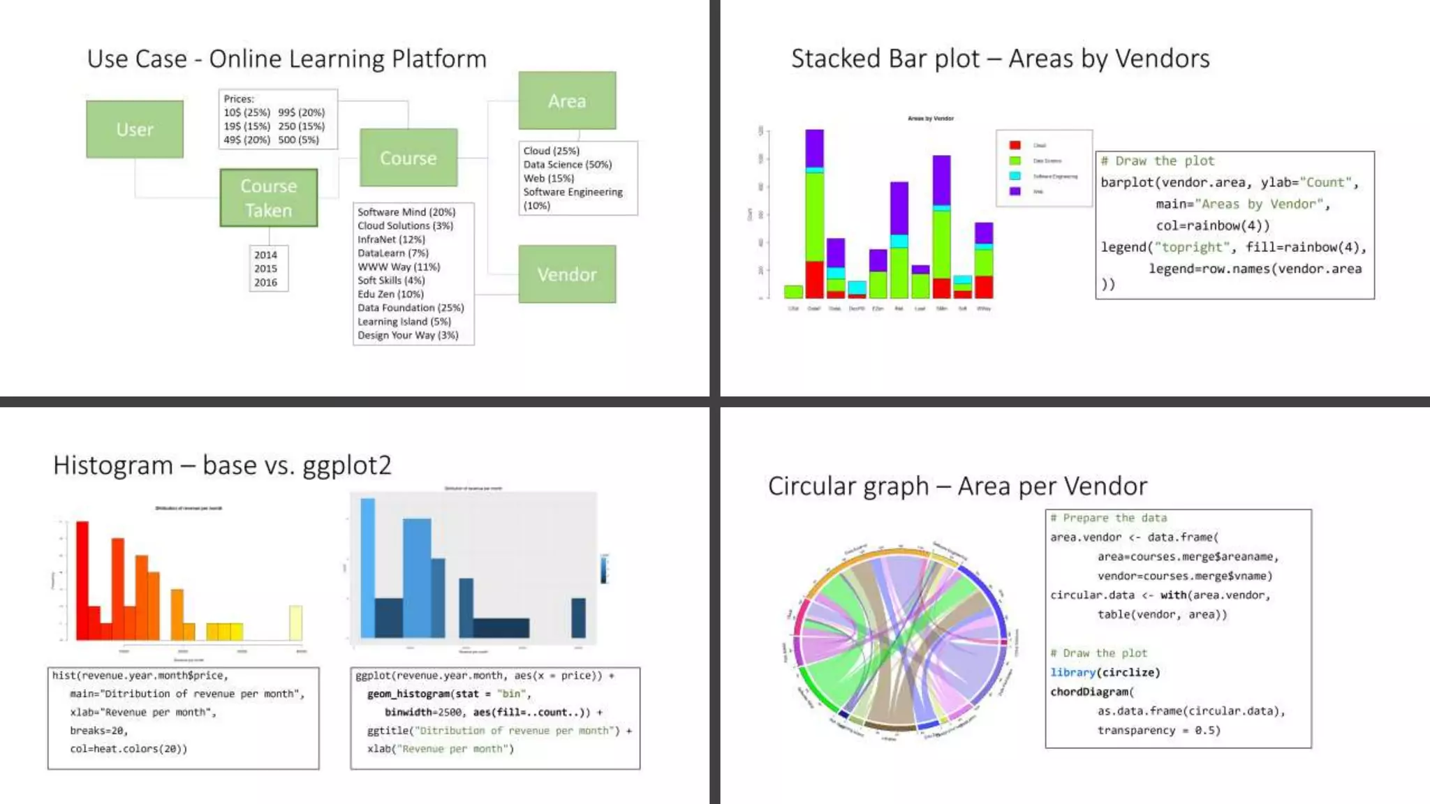


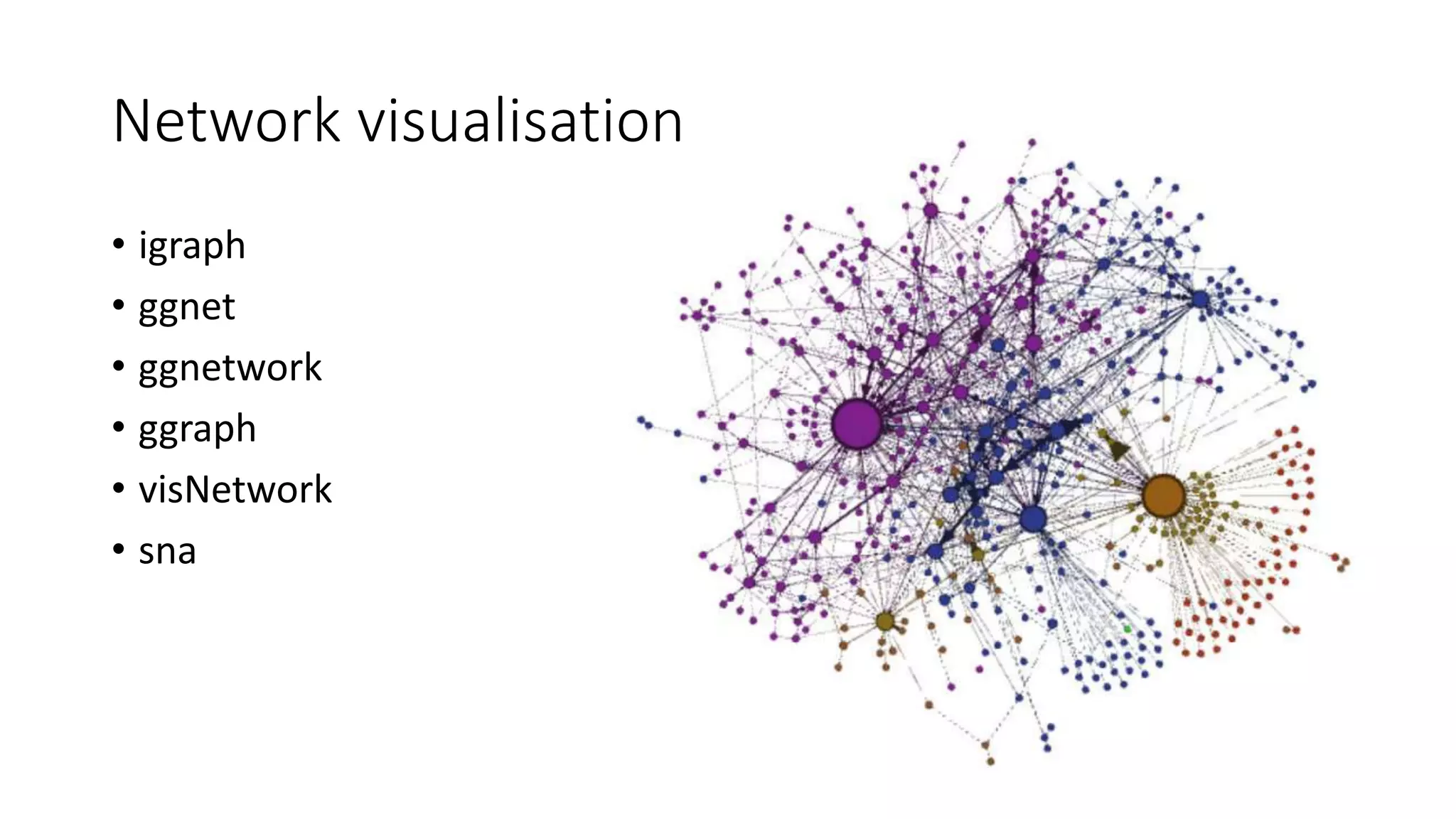
This document provides an overview of data visualization techniques using R. It discusses exploratory data analysis and the key elements. Various visualizations are demonstrated on a dataset of online course data including bar plots, histograms, scatter plots comparing base, lattice and ggplot2 packages. Additional techniques like treemaps, interactive graphs using plotly, and network visualizations using igraph and visNetwork are also covered.


![[DSC Europe 25] Andy Cotgreave - Nothing is new in analytics.pptx](https://cdn.slidesharecdn.com/ss_thumbnails/mba4vzcurvoh5lfrd5zw-6-251205194645-341bbbbe-thumbnail.jpg?width=640&height=640&fit=bounds)


![[DSC Europe 25] Goran Obradovic - The Rise of Sovereign AI: Building the Regi...](https://cdn.slidesharecdn.com/ss_thumbnails/7nw2xxixrxqdxvrb5wca-6-251205085714-ab09a2ac-thumbnail.jpg?width=640&height=640&fit=bounds)


![[DSC Europe 25] Max Talanov - Non digital NNs.pptx](https://cdn.slidesharecdn.com/ss_thumbnails/wif8tr3gtua74qvtopke-non-digital-nns-251205090438-26b0eea6-thumbnail.jpg?width=640&height=640&fit=bounds)

