Download to read offline
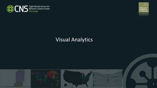
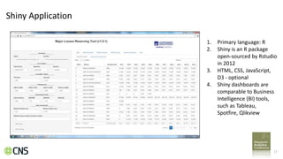
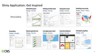
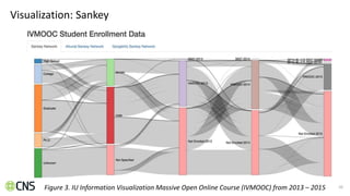
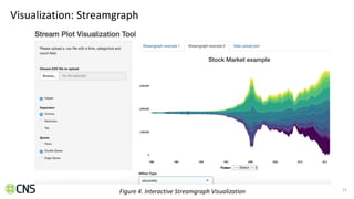
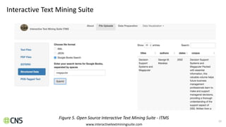
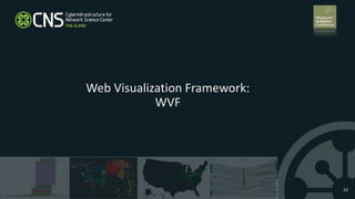
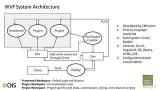

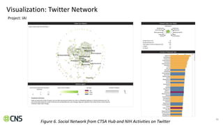
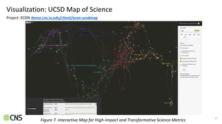
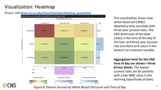
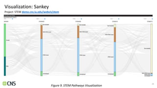
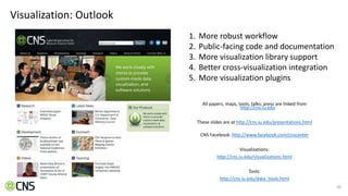


This document provides an overview of web visualization tools and frameworks for business intelligence and data visualization. It discusses reactive web frameworks, the Shiny application framework from RStudio, and the Web Visualization Framework (WVF) developed by the Cyberinfrastructure for Network Science Center. Examples of visualizations created with Shiny and WVF are presented, including Sankey diagrams, streamgraphs, heatmaps, and network maps. The document concludes by discussing the future outlook for WVF and promoting an online course on information visualization.


![Context Aware Harassment Detection in Social Media [Overview]](https://cdn.slidesharecdn.com/ss_thumbnails/harassment-short-v3-nov15-151119171214-lva1-app6891-thumbnail.jpg?width=640&height=640&fit=bounds)


![제 23회 보아즈(BOAZ) 빅데이터 컨퍼런스 - [MBOAX] : ABSA를 활용한 소비자 반응 분석 기반 운영 효율화 대시보드 설계](https://cdn.slidesharecdn.com/ss_thumbnails/3-1boaz23rdconferencemboax-260203102709-9d519923-thumbnail.jpg?width=640&height=640&fit=bounds)


