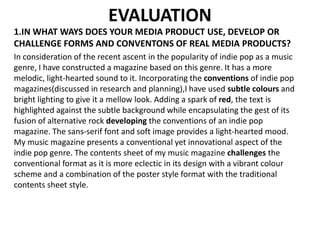
1. EVALUATION
1.IN WHAT WAYS DOES YOUR MEDIA PRODUCT USE, DEVELOP OR
CHALLENGE FORMS AND CONVENTONS OF REAL MEDIA PRODUCTS?
In consideration of the recent ascent in the popularity of indie pop as a music
genre, I have constructed a magazine based on this genre. It has a more
melodic, light-hearted sound to it. Incorporating the conventions of indie pop
magazines(discussed in research and planning),I have used subtle colours and
bright lighting to give it a mellow look. Adding a spark of red, the text is
highlighted against the subtle background while encapsulating the gest of its
fusion of alternative rock developing the conventions of an indie pop
magazine. The sans-serif font and soft image provides a light-hearted mood.
My music magazine presents a conventional yet innovational aspect of the
indie pop genre. The contents sheet of my music magazine challenges the
conventional format as it is more eclectic in its design with a vibrant colour
scheme and a combination of the poster style format with the traditional
contents sheet style.
2. Subtle colors are
used adhering
to the indie pop
genre.
The taglines
are written in
red to attract
the audience
attention.
A young female
model is
photographed as
the young
audience is
targeted.
Free give-away
to attract the
audience.
3. 2.HOW DOES YOUR MEDIA PRODUCT REPRESENT PARTICULAR SOCIAL
GROUPS?
Indie pop in its essence is associated with youth. With a target audience of
fourteen to twenty-five, elements of youth are incorporated in the magazine. The
spark of red along with the soft yet engaging image, is used to highlight the
youthful aspect. The catchy taglines and short phrases along with the orange
turned corner on the magazine cover gives an attractive and youthful feel to it.
The masthead and the other text is highlighted against the subtle background by
adding using bright colours. Serif fonts are used to make their heading bolder and
more appealing to the fleeting eye. Youthful elements are instilled in the
magazine to highlight the essence of the indie pop genre.
4. 3. WHO WOULD BE THE AUDIENCE FOR YOUR MEDIA PRODUCT?
The target audience considering the genre and content of the
magazine is the youth. People from the age of fourteen to twenty-five
are targeted by the magazine as the surveys (shown in the research)
show that music magazines are usually bought and liked by this age
group. It appeals to the mass audience due to its genre.
15-25
25-30
35-
40
Liking of the music magazine by
different age groups
5. 4. WHAT KIND OF MEDIA INSTITUTONS MIGHT DISTRIBUTE
YOUR MEDIA PRODUCT AND WHY?
1.The Bauer Media Group, the distributors of ‘Kerrang’
magazine are well know for their promotion of new
talent so I presume them to be the potential
distributors for my magazine. Being a well established
media house , they will have the required resources
and thus willingness to publish my magazine.
2. The Glitch Mag is a digital music magazine based
on the indie pop genre so it is likely to distribute and
promote my magazine digitally. The genre and the
target audience of my magazine and the Glitch Mag
being the same makes it possible for my magazine to
be distributed by the Glitch Mag.
6. 5. HOW DID YOU ATTRACT/ADDRESS YOUR AUDIENCE?
My media product attracts the audience by using the following:
1.a young female model 2.a colourful theme
3.eye-catching fonts and text
4.a free give-away
5.interesting contents
7. 6.WHAT HAVE YOU LEARNT ABOUT TECHNOLOGIES FROM THE
PROCESS OF CONSTRUCTING THIS PRODUCT?
In designing my AS media coursework, I learnt a lot about the
technologies which I was not familiar with earlier. The
cropping, editing, designing and organization of information I learnt
from this coursework is valuable to me in consideration to my A-levels
media studies course. It helped me portray my imaginations and ideas
to create my media product.
8. 7.LOOKING BACK AT YOUR PRELIMNARY TASK,WHAT DO YOU
FEEL YOU HAVE LEARNED IN THE PROGRESSION OF IT TO THE
FULL PRODUCT?
Working the course of the media coursework, I saw my media skills develop
at every step of the preliminary task. A better understanding of the camera
work and light angles enabled me to improve the fundamental part of a
magazine, the image. I learned that the right combination of fonts and a
suitable colour scheme is essential for the magazine to become eye-catching
and from text being submerged by the photo in the school magazine, I
developed my skill to highlight the text against the image by using a
contrasting font colour and adding drop shadow to the text.
In a nutshell, from working on the school magazine to working on the music
magazine, I was able to learn a lot of media technicalities and sharpen my
editing and designing skills.
9. Above is the timeline of my progression from the ancillary task to the final music magazine which
clearly shows the development of my editing techniques and media sensibilities. From the basic
photo cropping to the experimentation with media techniques like editing in Adobe Photoshop
(turning the corner of my final music magazine), I grew as a media student. In constructing my
final music magazine, I made a music magazine cover based on the jazz genre but shifted my
focus to an entirely new genre, the Indie Pop as I felt I knew more about the genre and
would be able to contribute more to my magazine and would
use the experience gained from making one magazine to
produce the final one with even better editing and
presentation.