
Recommended
More Related Content
What's hot
What's hot (20)
Viewers also liked
Viewers also liked (20)
Similar to Digipak analysis 2 adele
Similar to Digipak analysis 2 adele (20)
Recently uploaded
Recently uploaded (20)
Digipak analysis 2 adele
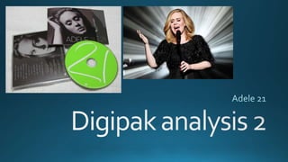
- 2. This cover denotes a simple close up image of Adele's face. This instantly shows the artist, a face that people recognise, aids the interest levels of the digipak.The picture denotes filters that have given the front cover a black and white effect. The dark colours are very defined. This connotes power, strength and strong emotion. Connoting the artist character is exceptional and the album is very impressive regarding its music.The image presents Adele looking stern, serious but also a sense of sorrow. This provided the cover a element of superiority, it connotes professionalism and makes it look class. Therefore many target audiences may be interested in this album. This digipak has its album title located in the bottom right corner, its colours contrast that of the background image as white and green.This enables to title to appear clear on the image ,standing out of a shelf.The green In the word 21 is the only colour used that’s not Black and white, making it unique.This therefore holds significance in relation to the bands identification.This front cover appears very clean, simple yet effective. It connotes elegance and organisation possibly suggesting the similarities to herself.
- 3. The back cover denotes another close up shot of Adele's face, connoting continuity across the digipak.This image has Adele's eyes open whereas on the back they are closed. This suggests the audience is opening her universe the more they explore the digipak. She is staring out the of image at you, creating a sense of nerve but also she is offering the songs displayed to you.The dark background is over layed by the white track list. Small in size but appears clear because of the contrast in colour.The track list has a simple format, centred text that follows the numbers down vertically. eitherside of the frame we have the folded parts of the digipak. They fit with the rest of the design and have a simple layout, the digipak title and CD classification. In small text the rights and reserves, credits etc are found at the bottom of the image along with the barcode.This part of the digipak is crucial but the least interesting to the public, hence its been tucked at the bottom in small print compared to the track list and image which is much bigger.
- 4. This is the Digipak disc. Firstly to note this CD has a bright green Base colour.This also happens to be the most vibrant and colourful part of the whole digipak. Suggesting its going to be exciting and should be given it’s the part that holds music. ‘21’ is carved into the disc that covers the perimeter, in a font that conveys a handwritten approach.This makes the product personal and unique to the buyer. Gives people reason to think that the disc has been personally handled by Adele herself making it feel more special to the public.The disc is very straight forward but sill quite elegant and not cluttered. It follows the continuity of the digipak. Some very small text can be seen below the album title which I understand refers to rights and ownership.This is insignificant and thus barley noticeable on the disc.