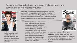
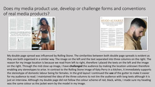
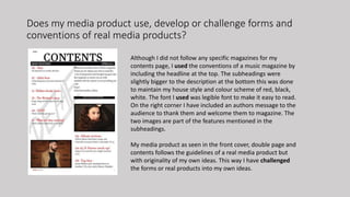
Dubai Call Girls O528786472 Diabolic Call Girls In Dubai
Question 1 completed
1. AS MEDIA EVALUATION
Q1: In what ways does your media product use, develop or challenge
forms and conventions of real media products?
2. THE TASK:
Our task was to create a high standard music magazine. After I completed the tasks, in which
they consisted of a lot of research and analysis of conventional and unconventional codes
and conventions of different sub-genre magazines, I had to decide on the genre of my own
magazine which was Hip Hop. This enabled me to widen my knowledge of a magazine front
cover, double page and contents page in which it was very useful during my production.
Once the preliminary task was completed and my knowledge expanded, I started planning
carefully for my media product as it had to meet the requirements of my target audience as
well as genre. Lastly we evaluated our product to measure our success and whether our
product matched our primary and secondary data as well as proposal.
3. Front cover music magazines which I have analysed as well as
chose to follow the conventions of:
4. Does my media product use, develop or challenge forms and
conventions of real media products?
Paper magazine Dezae magazine (my product)
My front cover main image was influenced a lot by PAPER magazine issue of Zayn. It is a music magazine targeted
at both males and females. I have used the smoke effect in my front cover as it connotes sexiness, masculinity
and power. Although this is conventionally going to attract females, males may also want to find out more about
this particular genre to better themselves as mainstreamers. Although my model does not have direct mode of
address, through the intertextual reference there is a powerful effect on the audience.
5. Does my media product use, develop or challenge forms and
conventions of real media products?
I have used the masthead conventionally at the top, and
have made it the largest text as it is the first thing the
audience read/see. I have challenged the idea of an image
anchoring onto the masthead by using a mid close up image
allowing the audience to see both the masthead and the
image.
Both magazines have similar house
styles as both magazines consist of
the colour scheme of red, black,
white. I have chosen to use the same
colour scheme as it maintains
consistency of house style and looks
neat, the use of these colours catch
the audience’s attention as red is
bright in comparison to the black
clothing and text. Red connotes
determination and passion, whereas
black is dark and serious.
Rolling Stone has used
dark bold lines to
separate the cover lines
on the left but not on the
right as it is the main
cover line.
In comparison to Rolling Stone, I have
developed the idea of the bold lines and
included them on both sides of my magazine,
this has been done to separate my cover lines
as my main cover line is positioned at the
bottom.
6. Does my media product use, develop or challenge forms and conventions
of real media products?
My double page spread was influenced by Rolling Stone. The similarities between both double page spreads is evident as
they are both organised in a similar way. The image on the left and the text separated into three columns on the right. The
reason for my image location is because we read from left to right, therefore I placed the texts on the left and the image
on the right. Through the mid close up image, I have challenged the audience by making the location unknown therefore
enabling any stereotypes to arise. In contrast to the Rolling Stone image of Katy Perry in a kitchen, it immediately supports
the stereotype of domestic labour being for females. In the grid layout I continued the use of the gutter to make it easier
for my audience to read. I maintained the idea of the three columns to not tire the audience with long texts although it is
just an interview. Although my double page did not follow the colour scheme of red, black, white, I made sure my heading
was the same colour as the jacket worn by the model in my image.
7. Does my media product use, develop or challenge forms and
conventions of real media products?
Although I did not follow any specific magazines for my
contents page, I used the conventions of a music magazine by
including the headline at the top. The subheadings were
slightly bigger to the description at the bottom this was done
to maintain my house style and colour scheme of red, black,
white. The font I used was legible font to make it easy to read.
On the right corner I have included an authors message to the
audience to thank them and welcome them to magazine. The
two images are part of the features mentioned in the
subheadings.
My media product as seen in the front cover, double page and
contents follows the guidelines of a real media product but
with originality of my own ideas. This way I have challenged
the forms or real products into my own ideas.