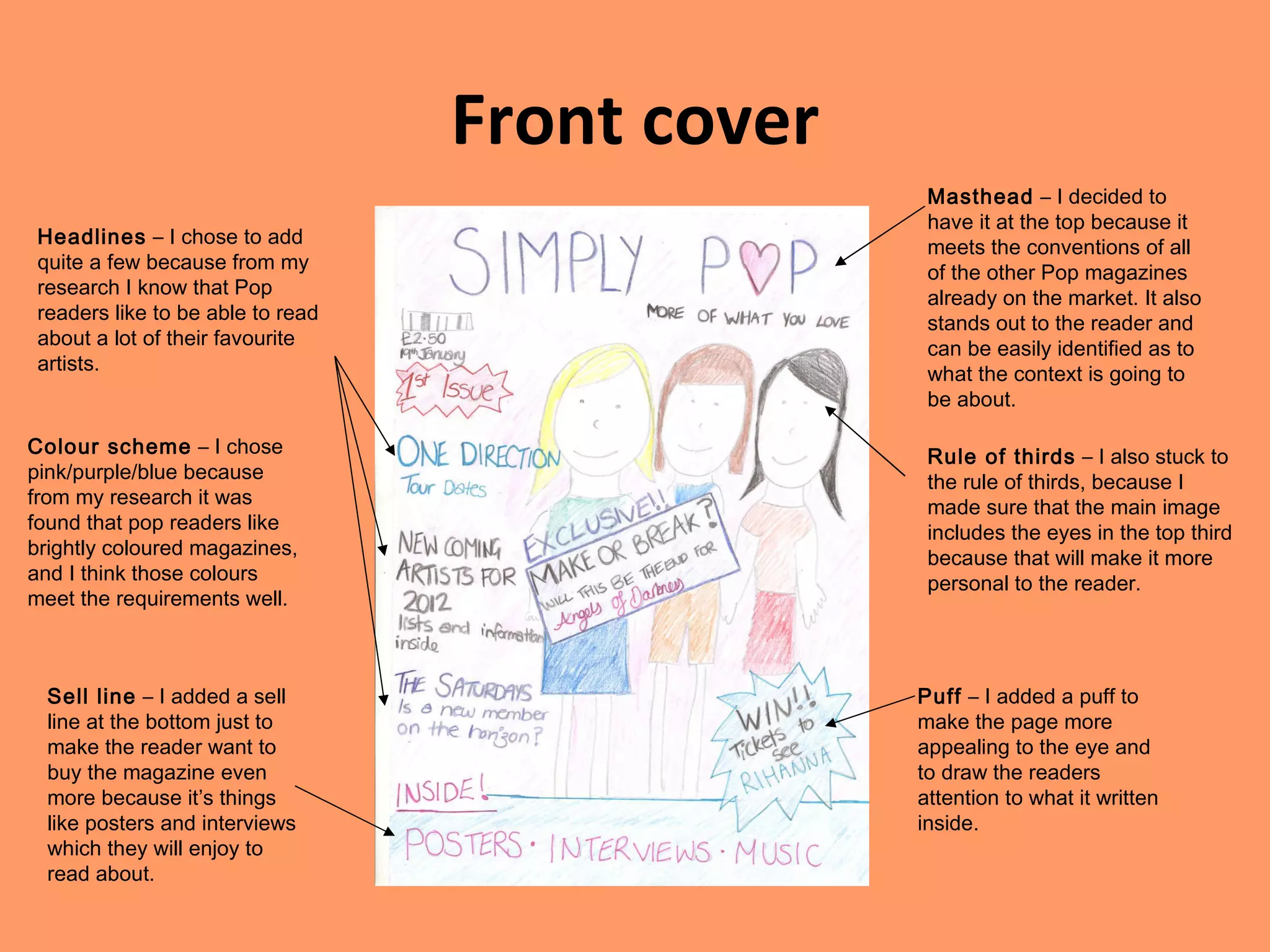
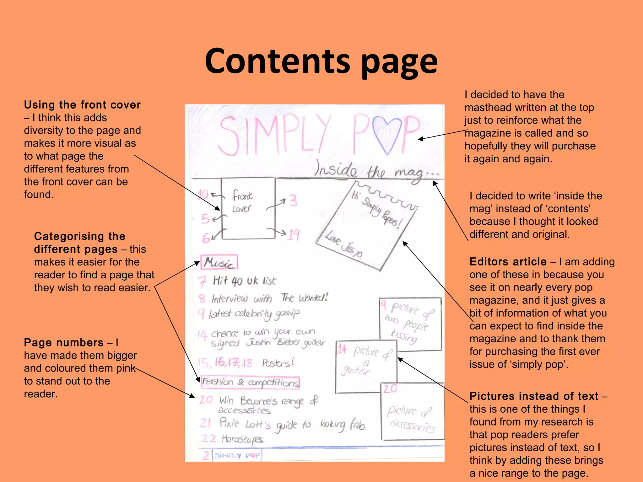
Drafts of my Pop Magazine Jessica Thorpe
Front cover Masthead  – I decided to have it at the top because it meets the conventions of all of the other Pop magazines already on the market. It also stands out to the reader and can be easily identified as to what the context is going to be about. Headlines  – I chose to add quite a few because from my research I know that Pop readers like to be able to read about a lot of their favourite artists. Rule of thirds  – I also stuck to the rule of thirds, because I made sure that the main image includes the eyes in the top third because that will make it more personal to the reader.  Puff  – I added a puff to make the page more appealing to the eye and to draw the readers attention to what it written inside. Colour scheme  – I chose pink/purple/blue because from my research it was found that pop readers like brightly coloured magazines, and I think those colours meet the requirements well. Sell line  – I added a sell line at the bottom just to make the reader want to buy the magazine even more because it’s things like posters and interviews which they will enjoy to read about.
Contents page I decided to have the masthead written at the top just to reinforce what the magazine is called and so hopefully they will purchase it again and again. I decided to write ‘inside the mag’ instead of ‘contents’ because I thought it looked different and original. Editors article  – I am adding one of these in because you see it on nearly every pop magazine, and it just gives a bit of information of what you can expect to find inside the magazine and to thank them for purchasing the first ever issue of ‘simply pop’. Using the front cover  – I think this adds diversity to the page and makes it more visual as to what page the different features from the front cover can be found. Categorising the different pages  – this makes it easier for the reader to find a page that they wish to read easier. Page numbers  – I have made them bigger and coloured them pink to stand out to the reader. Pictures instead of text  – this is one of the things I found from my research is that pop readers prefer pictures instead of text, so I think by adding these brings a nice range to the page.
Double page spread Large title  – by making this a rhetorical question intrigues the reader and will make them want to read the article. Pictures  – this just gives a more visual affect that backs up the article. Page numbers  – this a convention for all magazines and my one is no different.

Drafts of my pop magazine

  • 1.
    Drafts of myPop Magazine Jessica Thorpe
  • 2.
    Front cover Masthead – I decided to have it at the top because it meets the conventions of all of the other Pop magazines already on the market. It also stands out to the reader and can be easily identified as to what the context is going to be about. Headlines – I chose to add quite a few because from my research I know that Pop readers like to be able to read about a lot of their favourite artists. Rule of thirds – I also stuck to the rule of thirds, because I made sure that the main image includes the eyes in the top third because that will make it more personal to the reader. Puff – I added a puff to make the page more appealing to the eye and to draw the readers attention to what it written inside. Colour scheme – I chose pink/purple/blue because from my research it was found that pop readers like brightly coloured magazines, and I think those colours meet the requirements well. Sell line – I added a sell line at the bottom just to make the reader want to buy the magazine even more because it’s things like posters and interviews which they will enjoy to read about.
  • 3.
    Contents page Idecided to have the masthead written at the top just to reinforce what the magazine is called and so hopefully they will purchase it again and again. I decided to write ‘inside the mag’ instead of ‘contents’ because I thought it looked different and original. Editors article – I am adding one of these in because you see it on nearly every pop magazine, and it just gives a bit of information of what you can expect to find inside the magazine and to thank them for purchasing the first ever issue of ‘simply pop’. Using the front cover – I think this adds diversity to the page and makes it more visual as to what page the different features from the front cover can be found. Categorising the different pages – this makes it easier for the reader to find a page that they wish to read easier. Page numbers – I have made them bigger and coloured them pink to stand out to the reader. Pictures instead of text – this is one of the things I found from my research is that pop readers prefer pictures instead of text, so I think by adding these brings a nice range to the page.
  • 4.
    Double page spreadLarge title – by making this a rhetorical question intrigues the reader and will make them want to read the article. Pictures – this just gives a more visual affect that backs up the article. Page numbers – this a convention for all magazines and my one is no different.