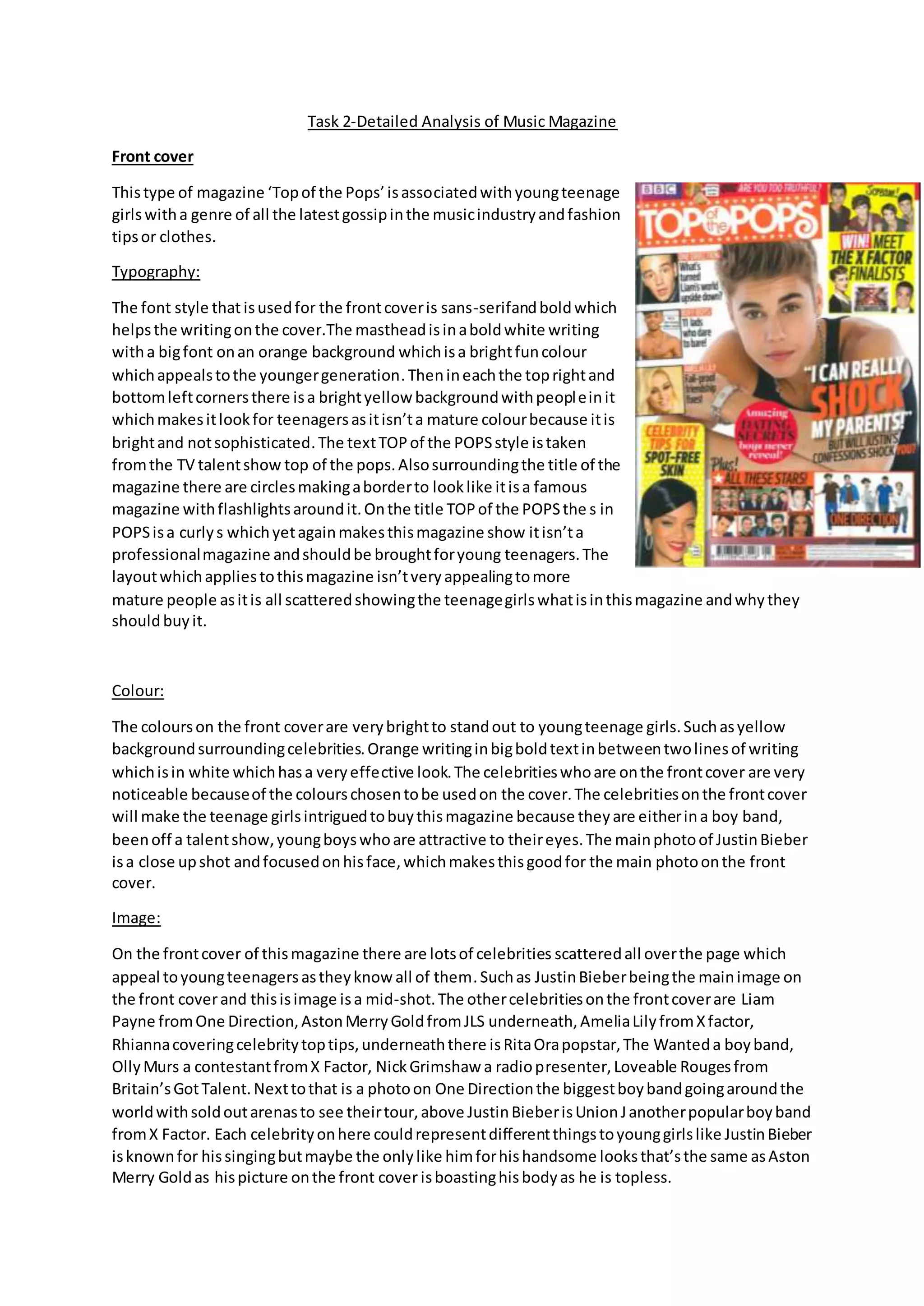
Task 2-Detailed Analysis of Music Magazine
Front cover
Thistype of magazine ‘Topof the Pops’isassociatedwithyoungteenage
girlswitha genre of all the latestgossipinthe musicindustryandfashion
tipsor clothes.
Typography:
The font style that isusedfor the frontcoveris sans-serifandboldwhich
helpsthe writingonthe cover.The mastheadisinaboldwhite writing
witha bigfont onan orange background whichisa brightfuncolour
whichappealstothe youngergeneration.Thenineachthe toprightand
bottomleftcornersthere isa brightyellow backgroundwithpeopleinit
whichmakesitlookfor teenagersasitisn’ta mature colourbecause itis
brightand notsophisticated.The textTOPof the POPSstyle istaken
fromthe TV talentshow top of the pops.Alsosurroundingthe title of the
magazine there are circlesmakingaborderto looklike itisa famous
magazine withflashlightsaroundit.Onthe title TOPof the POPSthe s in
POPSisa curlys whichyetagainmakesthismagazine show itisn’ta
professionalmagazine andshouldbe broughtforyoung teenagers.The
layoutwhichappliestothismagazine isn’tveryappealingtomore
mature people asitis all scatteredshowingthe teenagegirlswhatisinthismagazine andwhythey
shouldbuyit.
Colour:
The colourson the front coverare verybrightto standout to youngteenage girls.Suchasyellow
backgroundsurroundingcelebrities.Orange writinginbigboldtextinbetweentwolinesof writing
whichisin white whichhasa veryeffective look.The celebritieswhoare onthe frontcover are very
noticeable becauseof the colourschosentobe usedon the cover.The celebritiesonthe frontcover
will make the teenage girlsintriguedtobuythismagazine because theyare eitherina boy band,
beenoff a talentshow,youngboyswhoare attractive to theireyes.The mainphotoof JustinBieber
isa close upshot andfocusedonhisface,whichmakesthisgoodfor the main photoonthe front
cover.
Image:
On the frontcover of thismagazine there are lotsof celebrities scatteredall overthe page which
appeal toyoungteenagersastheyknowall of them.Suchas JustinBieberbeingthe mainimage on
the front coverand thisisimage isa mid-shot.The othercelebritiesonthe frontcoverare Liam
Payne fromOne Direction,AstonMerryGoldfromJLS underneath,AmeliaLilyfromXfactor,
Rhiannacoveringcelebritytoptips,underneaththere isRitaOrapopstar,The Wanteda boyband,
OllyMurs a contestantfromX Factor, NickGrimshaw a radiopresenter,Loveable Rougesfrom
Britain’sGotTalent.Nexttothat is a photoon One Directionthe biggestboybandgoingaroundthe
worldwithsoldoutarenasto see theirtour,above JustinBieberisUnionJanotherpopularboyband
fromX Factor. Each celebrityonhere couldrepresentdifferentthingstoyounggirlslike JustinBieber
isknownfor hissingingbutmaybe the onlylike himforhishandsome looksthat’sthe same asAston
Merry Goldas hispicture onthe front cover isboastinghisbodyas he is topless.
Language of mode address
On the frontcover withall the picturesthere are storylinesabove nearlyeachone whichsuggest
that thismagazine isgoingtobe full of differentstorylines. The frontcoverof the magazine is
convenientforapopmagazine because ithasall the latestcelebritiesontheirwhichproduce pop
musicinthe charts.The language usedisverysimple withnocomplexwordswhichadvertiseseven
more to teenagersastheydon’twantto come home froma day at school and reada very
intellectual magazine.
Layout
The front coverhas a varietyof differentthingsthatare goingto be in thismagazine.The layoutis
packedtightlytogetherandthere isn’t’alotof backgroundapart from the backgroundarea
surroundingJustinBieberhoweverthisiscoveredwithtextfromthe otherpicturessurroundedon
the front page.
Contentspage
The contentpage tellsthe readerwhattheywill see inthismagazineandif there are any
competitionsandquizzesinthe magazine orif theyare givingyouanythingfree suchaspostersand
stickersor anybeautyproducts.
Typography:
In the contentpage the mast headiswrittenina serif fontwhichisclearfor
the readersto see especially onahot pinkbackgroundwhichindicatesthis
magazine isforgirls.Where the otherinformationisstateditisjusta plain
oldblackwritingona white backgroundhoweversome of the textis
highlightedbyayellowcolourwhichisahappycolour as itrepresentsthe
sunwhichmakeseveryone inagoodmoodbut alsoan unprofessional
colourfor a magazine. Inthe contentpage there isthe front cover
screenshotandnexttothat are annotationsof page numbersarrowedtoa
certainpart on the frontcover. The numbersare ina hotpinklike the
backgroundforthe masthead whichisa veryfeminismcoloursothisisideal
for a youngteenage girl magazine toread.
Colour:
In the contentpage there are a mixture of coloursrangedsuchas yellow,lightpink,hot pink,black
and white whichmakesitveryeye catchingandexcitingforteenagerstolookat.Whenthe articles
are writtenthatiswrittenina blackcolour to show it’stheirbiggestarticlesfeaturesinthe
magazine.The page numberswrittennexttothe frontcoveron a white backgroundare very
effectiveasthisisalsowrittenina boldtextwhichmakesitclearwhat page somethingison.
Image:
In the contentpage there are hardlynowhere asmany imagesonhere comparedtothe front cover
whichisbetteras youcan see whatislocatedinthe magazine.There are photosof clotheswiththe
boldpinkpage numberssurroundingthemwhichletsusknow youwill be seeingaclothespage
while reading.Anotherimage inthe contentpage isanotherphotoof the biggestboybandOne
Directionwhichisalwaysawinnerwithgirlsalsoitisa mid-shotof themwhich show more to their
faces.
Language of mode address:
In the contentpage the writingisinformal suchas itsays celebsinsteadof celebritieswhichisa
wordteenagerswouldsayandnot adults.Anotherwaythe contentpage isinformal isinsteadof
sayingwe love boystheyhave puta heart emoticonforthe wordlove.
Layout
The layoutin the contentpage ismore organisedthanthe frontcoverhoweverthere are thingsstill
overlappingobjects.Forexample the photoof One Directioninthe circle atthe bottomof the page
goeson topof bothof the white backgroundbox where the contentpagesare.
Double page spread
In the double page spreadthere iswritingonthe lefthandside of the page andon the right hand
side of the page there is a whole bodyphotoof youngteen role model.
Typography:
In the double spreadpage the headline isina boldfontwithone line inared textandthe other ina
blacktext.On the lefthandside butreachingthe righthandside as thisisthe mainstoryline which
needstobe noticeable.Withthe wayitisset out you have all the writingtogo withthe mainstory
on the lefthandside inparagraphs howeverthese paragraphsare the biggestwhichisanother
reasonwhythismagazine isforteenagers.Onthe righthand side the onlythingthere isaphotoof
JustinBieber
Colour:
On the double contentpage there isawhite backgroundonbothpageswhichis plainsothe cover
line inthe redand blackfontis eye catchingbecause of the backgroundcolourchosenforthe double
spreadpage.Withthe colour scheme they have stucktored and blackwritingwhichisprofessional
as it showsconsistency.
Image:
On the double contentpage there are onlytwoimagesone onthe lefthandside andone on the
righthand side.Onthe lefthandside there isa photoof JustinBieberandSelenaGomezwhoare
boyfriendandgirlfriendwhichisbangonin the top part of the page inthe middle.Onthe righthand
side of the page the image of JustinBieberisawhole page photoof himposingona chair the
teenage girlswill love.
Language of mode address:
In the double contentpage the language isall gossipchatandconversationwhichiswhythis
magazine istargetedata teenage audience.
Layout
On the double contentpage the layoutisclearerthanthe restof the magazine because it isa double
spreadpage the leftside of the page has beenusedforinformationaboutthe article withlotsof
differentsectionsshownbydifferentparagraphs.Onthe righthandside of the page there isa photo
of JustinBieberwhothe article isabout onthe lefthandside sothisis a nice layoutandnothingis
scatteredonthe page unlike the contentand frontcoverof the magazine.

Task 2

  • 1.
    Task 2-Detailed Analysisof Music Magazine Front cover Thistype of magazine ‘Topof the Pops’isassociatedwithyoungteenage girlswitha genre of all the latestgossipinthe musicindustryandfashion tipsor clothes. Typography: The font style that isusedfor the frontcoveris sans-serifandboldwhich helpsthe writingonthe cover.The mastheadisinaboldwhite writing witha bigfont onan orange background whichisa brightfuncolour whichappealstothe youngergeneration.Thenineachthe toprightand bottomleftcornersthere isa brightyellow backgroundwithpeopleinit whichmakesitlookfor teenagersasitisn’ta mature colourbecause itis brightand notsophisticated.The textTOPof the POPSstyle istaken fromthe TV talentshow top of the pops.Alsosurroundingthe title of the magazine there are circlesmakingaborderto looklike itisa famous magazine withflashlightsaroundit.Onthe title TOPof the POPSthe s in POPSisa curlys whichyetagainmakesthismagazine show itisn’ta professionalmagazine andshouldbe broughtforyoung teenagers.The layoutwhichappliestothismagazine isn’tveryappealingtomore mature people asitis all scatteredshowingthe teenagegirlswhatisinthismagazine andwhythey shouldbuyit. Colour: The colourson the front coverare verybrightto standout to youngteenage girls.Suchasyellow backgroundsurroundingcelebrities.Orange writinginbigboldtextinbetweentwolinesof writing whichisin white whichhasa veryeffective look.The celebritieswhoare onthe frontcover are very noticeable becauseof the colourschosentobe usedon the cover.The celebritiesonthe frontcover will make the teenage girlsintriguedtobuythismagazine because theyare eitherina boy band, beenoff a talentshow,youngboyswhoare attractive to theireyes.The mainphotoof JustinBieber isa close upshot andfocusedonhisface,whichmakesthisgoodfor the main photoonthe front cover. Image: On the frontcover of thismagazine there are lotsof celebrities scatteredall overthe page which appeal toyoungteenagersastheyknowall of them.Suchas JustinBieberbeingthe mainimage on the front coverand thisisimage isa mid-shot.The othercelebritiesonthe frontcoverare Liam Payne fromOne Direction,AstonMerryGoldfromJLS underneath,AmeliaLilyfromXfactor, Rhiannacoveringcelebritytoptips,underneaththere isRitaOrapopstar,The Wanteda boyband, OllyMurs a contestantfromX Factor, NickGrimshaw a radiopresenter,Loveable Rougesfrom Britain’sGotTalent.Nexttothat is a photoon One Directionthe biggestboybandgoingaroundthe worldwithsoldoutarenasto see theirtour,above JustinBieberisUnionJanotherpopularboyband fromX Factor. Each celebrityonhere couldrepresentdifferentthingstoyounggirlslike JustinBieber isknownfor hissingingbutmaybe the onlylike himforhishandsome looksthat’sthe same asAston Merry Goldas hispicture onthe front cover isboastinghisbodyas he is topless.
  • 2.
    Language of modeaddress On the frontcover withall the picturesthere are storylinesabove nearlyeachone whichsuggest that thismagazine isgoingtobe full of differentstorylines. The frontcoverof the magazine is convenientforapopmagazine because ithasall the latestcelebritiesontheirwhichproduce pop musicinthe charts.The language usedisverysimple withnocomplexwordswhichadvertiseseven more to teenagersastheydon’twantto come home froma day at school and reada very intellectual magazine. Layout The front coverhas a varietyof differentthingsthatare goingto be in thismagazine.The layoutis packedtightlytogetherandthere isn’t’alotof backgroundapart from the backgroundarea surroundingJustinBieberhoweverthisiscoveredwithtextfromthe otherpicturessurroundedon the front page. Contentspage The contentpage tellsthe readerwhattheywill see inthismagazineandif there are any competitionsandquizzesinthe magazine orif theyare givingyouanythingfree suchaspostersand stickersor anybeautyproducts. Typography: In the contentpage the mast headiswrittenina serif fontwhichisclearfor the readersto see especially onahot pinkbackgroundwhichindicatesthis magazine isforgirls.Where the otherinformationisstateditisjusta plain oldblackwritingona white backgroundhoweversome of the textis highlightedbyayellowcolourwhichisahappycolour as itrepresentsthe sunwhichmakeseveryone inagoodmoodbut alsoan unprofessional colourfor a magazine. Inthe contentpage there isthe front cover screenshotandnexttothat are annotationsof page numbersarrowedtoa certainpart on the frontcover. The numbersare ina hotpinklike the backgroundforthe masthead whichisa veryfeminismcoloursothisisideal for a youngteenage girl magazine toread. Colour: In the contentpage there are a mixture of coloursrangedsuchas yellow,lightpink,hot pink,black and white whichmakesitveryeye catchingandexcitingforteenagerstolookat.Whenthe articles are writtenthatiswrittenina blackcolour to show it’stheirbiggestarticlesfeaturesinthe magazine.The page numberswrittennexttothe frontcoveron a white backgroundare very effectiveasthisisalsowrittenina boldtextwhichmakesitclearwhat page somethingison. Image: In the contentpage there are hardlynowhere asmany imagesonhere comparedtothe front cover whichisbetteras youcan see whatislocatedinthe magazine.There are photosof clotheswiththe boldpinkpage numberssurroundingthemwhichletsusknow youwill be seeingaclothespage while reading.Anotherimage inthe contentpage isanotherphotoof the biggestboybandOne
  • 3.
    Directionwhichisalwaysawinnerwithgirlsalsoitisa mid-shotof themwhichshow more to their faces. Language of mode address: In the contentpage the writingisinformal suchas itsays celebsinsteadof celebritieswhichisa wordteenagerswouldsayandnot adults.Anotherwaythe contentpage isinformal isinsteadof sayingwe love boystheyhave puta heart emoticonforthe wordlove. Layout The layoutin the contentpage ismore organisedthanthe frontcoverhoweverthere are thingsstill overlappingobjects.Forexample the photoof One Directioninthe circle atthe bottomof the page goeson topof bothof the white backgroundbox where the contentpagesare. Double page spread In the double page spreadthere iswritingonthe lefthandside of the page andon the right hand side of the page there is a whole bodyphotoof youngteen role model. Typography: In the double spreadpage the headline isina boldfontwithone line inared textandthe other ina blacktext.On the lefthandside butreachingthe righthandside as thisisthe mainstoryline which needstobe noticeable.Withthe wayitisset out you have all the writingtogo withthe mainstory on the lefthandside inparagraphs howeverthese paragraphsare the biggestwhichisanother reasonwhythismagazine isforteenagers.Onthe righthand side the onlythingthere isaphotoof JustinBieber
  • 4.
    Colour: On the doublecontentpage there isawhite backgroundonbothpageswhichis plainsothe cover line inthe redand blackfontis eye catchingbecause of the backgroundcolourchosenforthe double spreadpage.Withthe colour scheme they have stucktored and blackwritingwhichisprofessional as it showsconsistency. Image: On the double contentpage there are onlytwoimagesone onthe lefthandside andone on the righthand side.Onthe lefthandside there isa photoof JustinBieberandSelenaGomezwhoare boyfriendandgirlfriendwhichisbangonin the top part of the page inthe middle.Onthe righthand side of the page the image of JustinBieberisawhole page photoof himposingona chair the teenage girlswill love. Language of mode address: In the double contentpage the language isall gossipchatandconversationwhichiswhythis magazine istargetedata teenage audience. Layout On the double contentpage the layoutisclearerthanthe restof the magazine because it isa double spreadpage the leftside of the page has beenusedforinformationaboutthe article withlotsof differentsectionsshownbydifferentparagraphs.Onthe righthandside of the page there isa photo of JustinBieberwhothe article isabout onthe lefthandside sothisis a nice layoutandnothingis scatteredonthe page unlike the contentand frontcoverof the magazine.