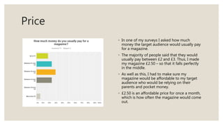
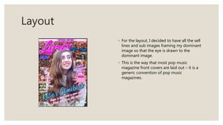
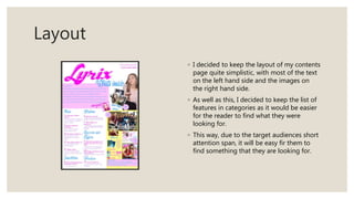
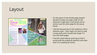
HOW DID YOU
ATTRACT/ADDRESS
YOUR AUDIENCE?
Question 5
Target Audience
◦ The target audience for my pop music magazine consists of girls ages 11-13 year olds.
◦ However, my magazine not only needs to appeal to the target audience, it also needs to meet
the approval of the parents of the target audience. This is due to the fact that if it does not meet
the approval of the parents then they might not allow their children to purchase the magazine.
◦ I have done my best to make sure that the magazine is clean cut and appealing to the target
audience so that they will want to buy and read it. I have done this through the use of language
and register, fonts, colours, clothes, makeup and features/offers in the magazine – that are
featured on the front cover as the front cover is the first thing that the audience see’s. Meaning
that it has to grab the audience’s attention instantly.
◦ I have done research into existing magazines and how they have attracted their audience and I
have adapted the results so that they will work for my magazine.
Colour Scheme
◦ The colour scheme played a part in attracting my
target audience.
◦ Unlike most of the existing pop magazines, I
decided against using a lot of bright colours and
decided to focus on pastel colours instead. This
means that my magazine will stand out against the
competition – and will draw the target audience to
it.
◦ The main colours I decided to use were pink, purple,
blue and yellow. As each colour has different
connotations and meanings.
◦ Pastel colours are, also, very aesthetically pleasing
to look at and so the target audience will be more
likely to pick up the magazine again as opposed to
other magazines that have used harsh, bright
colours to try and attract the target audience.
Colour Scheme
◦ Pink has connotations of femininity, sweetness,
romance and playfulness. Pink is a popular colour
amongst teenage girls especially and will therefore
attract them to my magazine. As well as this, pink is
a typical colour associated with pop music as it is a
bubbly, fun colour much like the type of music that
comes with the pop genre.
◦ Purple has connotations of calmness, peace, royalty
and creativity. This gives the magazine an air of
classiness and will make the audience feel content
and calm when reading it. Like pink, purple is a
popular colour among the target audience and so
will attract them to the magazine.
◦ Blue has connotations of trust, intelligence and
loyalty. However, unlike pink and purple, blue is
stereotypically considered to be a ‘boys colour’ –
therefore in including it in my magazine it will break
down social and gender expectations, letting girls
know that they are of course allowed to like
‘masculine things’. It will, also, attract girls who
consider it wrong or weak to like the colour pink.
◦ Yellow has connotations of joy, happiness and
cheerfulness. This means that the audience will feel
a sense of happiness with my magazine and will
associate my magazine with positivity – meaning
that they will be more likely to want to pink it up
and read the next issues. l
Language and Register
◦ I have used appropriate language and register the
most in my editors note on my contents page and
in my article on my double page spread.
◦ The editors note in addressed with ‘Hi Readers,’
giving a friendly and informal tone to the editors
note – meaning that the audience will feel
comfortable reading it.
◦ I have used an abbreviation of ‘gossip’ (goss) in the
editors note as well, as this will give the impression
of friendliness and informality. This is the type of
language that the target audience would use when
texting their friends.
◦ The use of the exaggerated oh in Hell-OH just adds
to the style of speaking and texting that the target
audience would be used to – making the whole
thing more relatable.
Language and Register
◦ The fact that the editors note appears to be
signed – makes it seem friendlier and more
personal to the readers. As if they are friends
with the editor.
◦ The ‘x’ at the end of the editors not does the
same as a lot of teenage girls will end their
texts to their friends with an ‘x’. Again, this
adds to the friendliness and personalisation
of the editors note – making the readers feel
that the editor really does care.
◦ The fact that the sentences don’t make
complete sense adds to the air of informality,
and reads the way a text message between
friends would.
◦ The article on the double page spread
contains a lot of slang and abbreviations such
as BTW, BF and GF (standing for By The Way,
Boyfriend and Girlfriend).
◦ The article is, also, quite short due to the fact
that the attention span of young teenagers is
not very long and a long article would
probably not keep them very interested. The
amount of colloquial language in the article
will, also, help make the article easier to read
for the target audience. The short paragraphs
will help with that too.
Language and Register
◦ The model is making eye contact with the audience
in the dominant image on the contents page –
forming a direct mode of address with them. In
doing this the model is forming a relationship with
the audience making them more likely to read the
article about her.
◦ The fact that the model appears to be blowing a
kiss to the audience makes the relationship
between them feel more personal and friendly.
◦ The fact that the two models in the sub images on
the double page spread are making eye contact
with the audience, will make the audience feel more
involved in their lives and therefore more invested
in the article.
Features
◦ I added a plug to the front cover, saying that you could win
a personalised Snapchat filter for 24 hours, to attract people
to the magazine. I decided to use Snapchat as apart of the
competition as Snapchat is one of the most popular social
media apps – with the filters being the most famous part of
the app.
◦ I decided to include a freebie in the form of ‘3 Huge
Stowaways Posters’ as a lot of teenage girls will have their
bedrooms covered in posters of boybands so therefore they
will be drawn to magazines with free posters.
◦ As well as this, I included a plug of ‘30% off New Look’ as
New Look is a popular shop among young people and their
clothes are quite affordable – but with 30% off they would
be even cheaper. This will attract fans of the shop to the
magazine.
◦ Also, I have included ‘Real Life Stories’, ‘Special Edition’ and
‘Posters’ in a big outstanding font so that it will grab the
audiences attention and make them more likely to buy the
magazine.
Fonts
◦ I have used a number of different fonts on
the front cover of my magazine to give an
organised chaotic appearance. Each of the
different fonts will grab the audience’s
attention.
◦ I have tried to use as many girly fonts as
possible to fit in with the theme of pop
music for my target audience of girls aged
11-13.
◦ As well as this, I have used bolder fonts for
the plugs so that the audience’s attention
is drawn to it.
Price
◦ In one of my surveys I asked how much
money the target audience would usually pay
for a magazine.
◦ The majority of people said that they would
usually pay between £2 and £3. Thus, I made
my magazine £2.50 – so that it falls perfectly
in the middle.
◦ As well as this, I had to make sure my
magazine would be affordable to my target
audience who would be relying on their
parents and pocket money.
◦ £2.50 is an affordable price for once a month,
which is how often the magazine would come
out.
Layout
◦ For the layout, I decided to have all the sell
lines and sub images framing my dominant
image so that the eye is drawn to the
dominant image.
◦ This is the way that most pop music
magazine front covers are laid out – it is a
generic convention of pop music
magazines.
Layout
◦ I decided to keep the layout of my contents
page quite simplistic, with most of the text
on the left hand side and the images on
the right hand side.
◦ As well as this, I decided to keep the list of
features in categories as it would be easier
for the reader to find what they were
looking for.
◦ This way, due to the target audiences short
attention span, it will be easy fir them to
find something that they are looking for.
Layout
◦ For the layout of the double page spread I
decided to keep one page solely for the
dominant image (plus a pull quote and an
anchor) and the other page for the actual
article.
◦ I did this because due to the audience’s short
attention span – they might not want to read
a long article and it would look longer if it
was over both pages.
◦ I had the article title be quite big so that it
would grab the audiences attention and draw
them in to reading the article.

Question 5

  • 1.
  • 3.
    Target Audience ◦ Thetarget audience for my pop music magazine consists of girls ages 11-13 year olds. ◦ However, my magazine not only needs to appeal to the target audience, it also needs to meet the approval of the parents of the target audience. This is due to the fact that if it does not meet the approval of the parents then they might not allow their children to purchase the magazine. ◦ I have done my best to make sure that the magazine is clean cut and appealing to the target audience so that they will want to buy and read it. I have done this through the use of language and register, fonts, colours, clothes, makeup and features/offers in the magazine – that are featured on the front cover as the front cover is the first thing that the audience see’s. Meaning that it has to grab the audience’s attention instantly. ◦ I have done research into existing magazines and how they have attracted their audience and I have adapted the results so that they will work for my magazine.
  • 4.
    Colour Scheme ◦ Thecolour scheme played a part in attracting my target audience. ◦ Unlike most of the existing pop magazines, I decided against using a lot of bright colours and decided to focus on pastel colours instead. This means that my magazine will stand out against the competition – and will draw the target audience to it. ◦ The main colours I decided to use were pink, purple, blue and yellow. As each colour has different connotations and meanings. ◦ Pastel colours are, also, very aesthetically pleasing to look at and so the target audience will be more likely to pick up the magazine again as opposed to other magazines that have used harsh, bright colours to try and attract the target audience.
  • 5.
    Colour Scheme ◦ Pinkhas connotations of femininity, sweetness, romance and playfulness. Pink is a popular colour amongst teenage girls especially and will therefore attract them to my magazine. As well as this, pink is a typical colour associated with pop music as it is a bubbly, fun colour much like the type of music that comes with the pop genre. ◦ Purple has connotations of calmness, peace, royalty and creativity. This gives the magazine an air of classiness and will make the audience feel content and calm when reading it. Like pink, purple is a popular colour among the target audience and so will attract them to the magazine. ◦ Blue has connotations of trust, intelligence and loyalty. However, unlike pink and purple, blue is stereotypically considered to be a ‘boys colour’ – therefore in including it in my magazine it will break down social and gender expectations, letting girls know that they are of course allowed to like ‘masculine things’. It will, also, attract girls who consider it wrong or weak to like the colour pink. ◦ Yellow has connotations of joy, happiness and cheerfulness. This means that the audience will feel a sense of happiness with my magazine and will associate my magazine with positivity – meaning that they will be more likely to want to pink it up and read the next issues. l
  • 6.
    Language and Register ◦I have used appropriate language and register the most in my editors note on my contents page and in my article on my double page spread. ◦ The editors note in addressed with ‘Hi Readers,’ giving a friendly and informal tone to the editors note – meaning that the audience will feel comfortable reading it. ◦ I have used an abbreviation of ‘gossip’ (goss) in the editors note as well, as this will give the impression of friendliness and informality. This is the type of language that the target audience would use when texting their friends. ◦ The use of the exaggerated oh in Hell-OH just adds to the style of speaking and texting that the target audience would be used to – making the whole thing more relatable.
  • 7.
    Language and Register ◦The fact that the editors note appears to be signed – makes it seem friendlier and more personal to the readers. As if they are friends with the editor. ◦ The ‘x’ at the end of the editors not does the same as a lot of teenage girls will end their texts to their friends with an ‘x’. Again, this adds to the friendliness and personalisation of the editors note – making the readers feel that the editor really does care. ◦ The fact that the sentences don’t make complete sense adds to the air of informality, and reads the way a text message between friends would. ◦ The article on the double page spread contains a lot of slang and abbreviations such as BTW, BF and GF (standing for By The Way, Boyfriend and Girlfriend). ◦ The article is, also, quite short due to the fact that the attention span of young teenagers is not very long and a long article would probably not keep them very interested. The amount of colloquial language in the article will, also, help make the article easier to read for the target audience. The short paragraphs will help with that too.
  • 8.
    Language and Register ◦The model is making eye contact with the audience in the dominant image on the contents page – forming a direct mode of address with them. In doing this the model is forming a relationship with the audience making them more likely to read the article about her. ◦ The fact that the model appears to be blowing a kiss to the audience makes the relationship between them feel more personal and friendly. ◦ The fact that the two models in the sub images on the double page spread are making eye contact with the audience, will make the audience feel more involved in their lives and therefore more invested in the article.
  • 9.
    Features ◦ I addeda plug to the front cover, saying that you could win a personalised Snapchat filter for 24 hours, to attract people to the magazine. I decided to use Snapchat as apart of the competition as Snapchat is one of the most popular social media apps – with the filters being the most famous part of the app. ◦ I decided to include a freebie in the form of ‘3 Huge Stowaways Posters’ as a lot of teenage girls will have their bedrooms covered in posters of boybands so therefore they will be drawn to magazines with free posters. ◦ As well as this, I included a plug of ‘30% off New Look’ as New Look is a popular shop among young people and their clothes are quite affordable – but with 30% off they would be even cheaper. This will attract fans of the shop to the magazine. ◦ Also, I have included ‘Real Life Stories’, ‘Special Edition’ and ‘Posters’ in a big outstanding font so that it will grab the audiences attention and make them more likely to buy the magazine.
  • 10.
    Fonts ◦ I haveused a number of different fonts on the front cover of my magazine to give an organised chaotic appearance. Each of the different fonts will grab the audience’s attention. ◦ I have tried to use as many girly fonts as possible to fit in with the theme of pop music for my target audience of girls aged 11-13. ◦ As well as this, I have used bolder fonts for the plugs so that the audience’s attention is drawn to it.
  • 11.
    Price ◦ In oneof my surveys I asked how much money the target audience would usually pay for a magazine. ◦ The majority of people said that they would usually pay between £2 and £3. Thus, I made my magazine £2.50 – so that it falls perfectly in the middle. ◦ As well as this, I had to make sure my magazine would be affordable to my target audience who would be relying on their parents and pocket money. ◦ £2.50 is an affordable price for once a month, which is how often the magazine would come out.
  • 12.
    Layout ◦ For thelayout, I decided to have all the sell lines and sub images framing my dominant image so that the eye is drawn to the dominant image. ◦ This is the way that most pop music magazine front covers are laid out – it is a generic convention of pop music magazines.
  • 13.
    Layout ◦ I decidedto keep the layout of my contents page quite simplistic, with most of the text on the left hand side and the images on the right hand side. ◦ As well as this, I decided to keep the list of features in categories as it would be easier for the reader to find what they were looking for. ◦ This way, due to the target audiences short attention span, it will be easy fir them to find something that they are looking for.
  • 14.
    Layout ◦ For thelayout of the double page spread I decided to keep one page solely for the dominant image (plus a pull quote and an anchor) and the other page for the actual article. ◦ I did this because due to the audience’s short attention span – they might not want to read a long article and it would look longer if it was over both pages. ◦ I had the article title be quite big so that it would grab the audiences attention and draw them in to reading the article.