The document summarizes how the student's media product uses conventions of real music magazines. It includes:
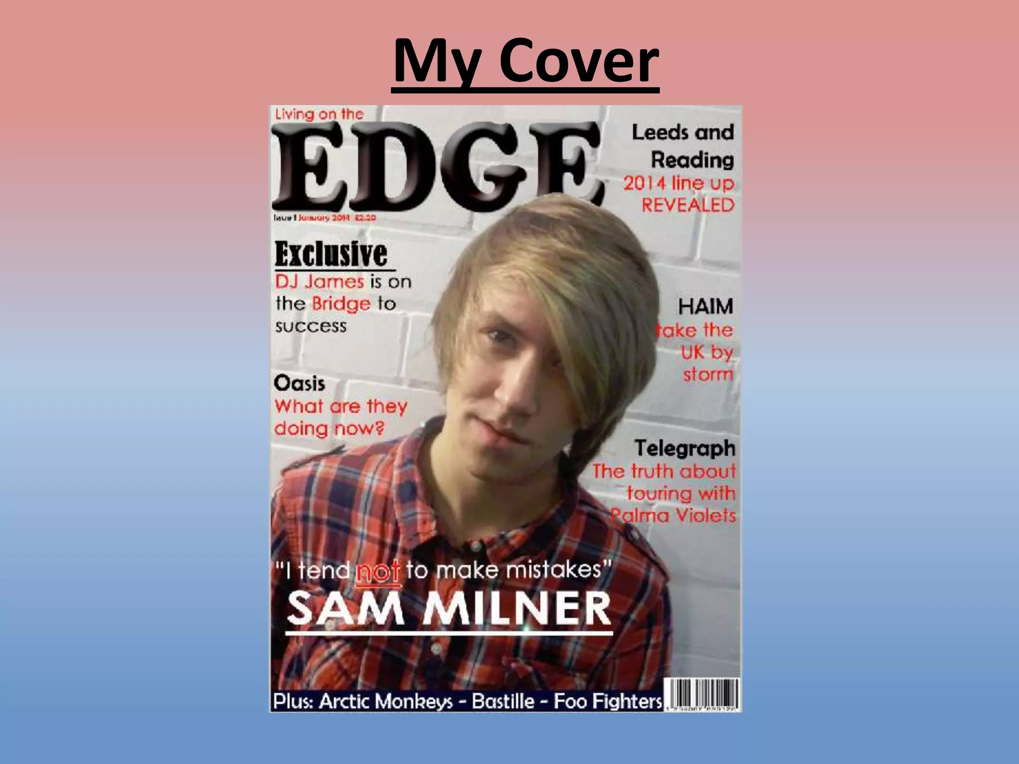
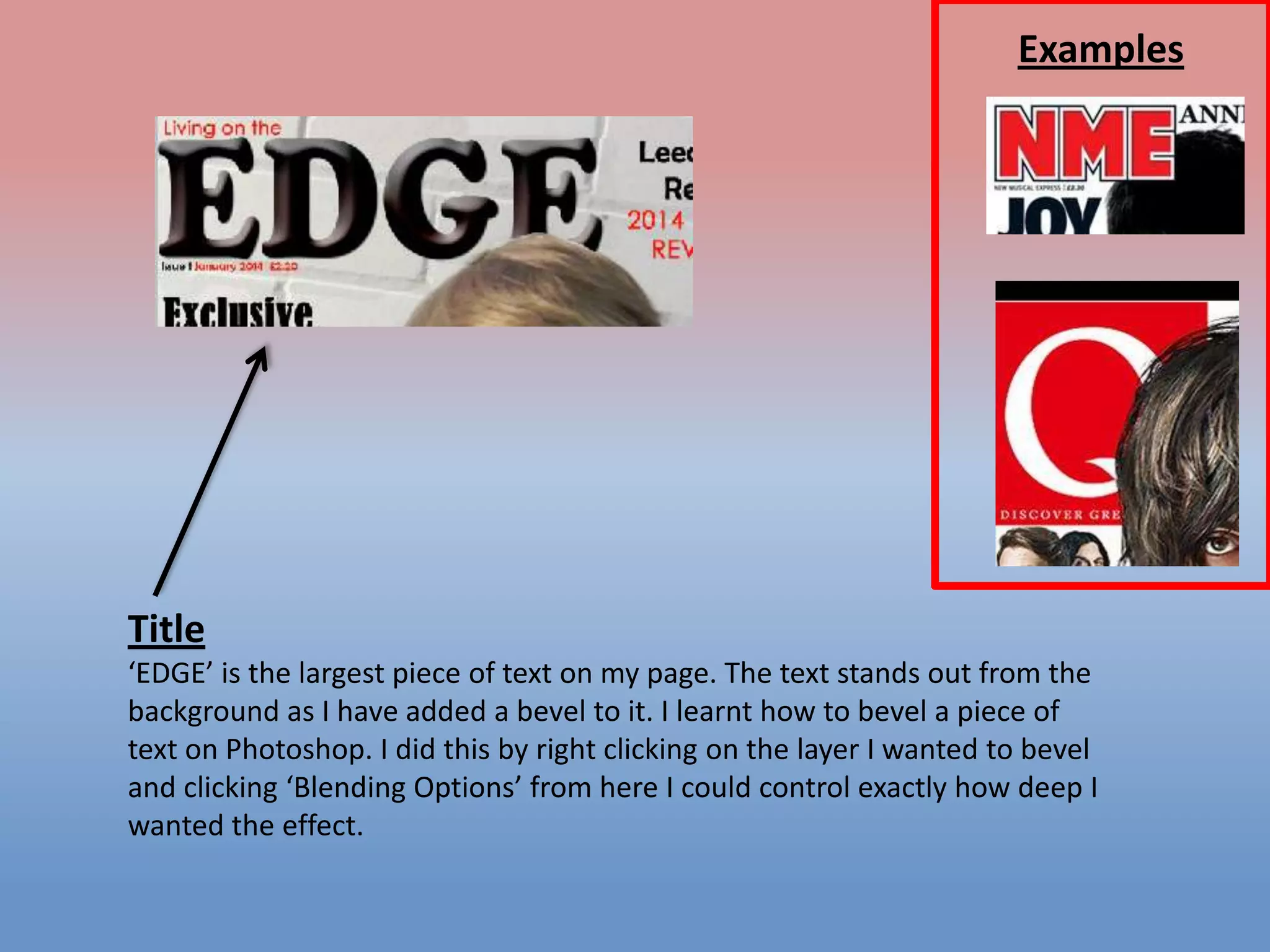
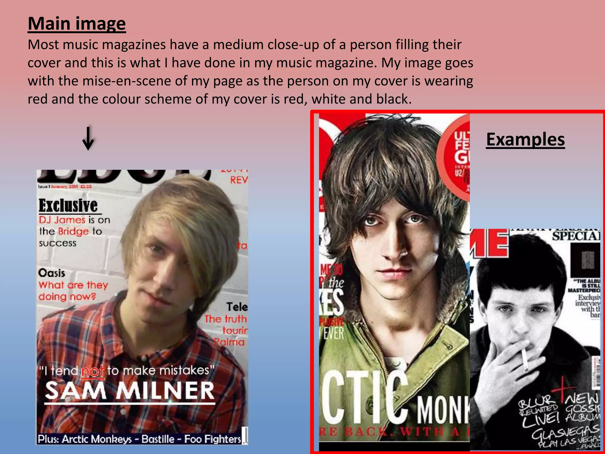
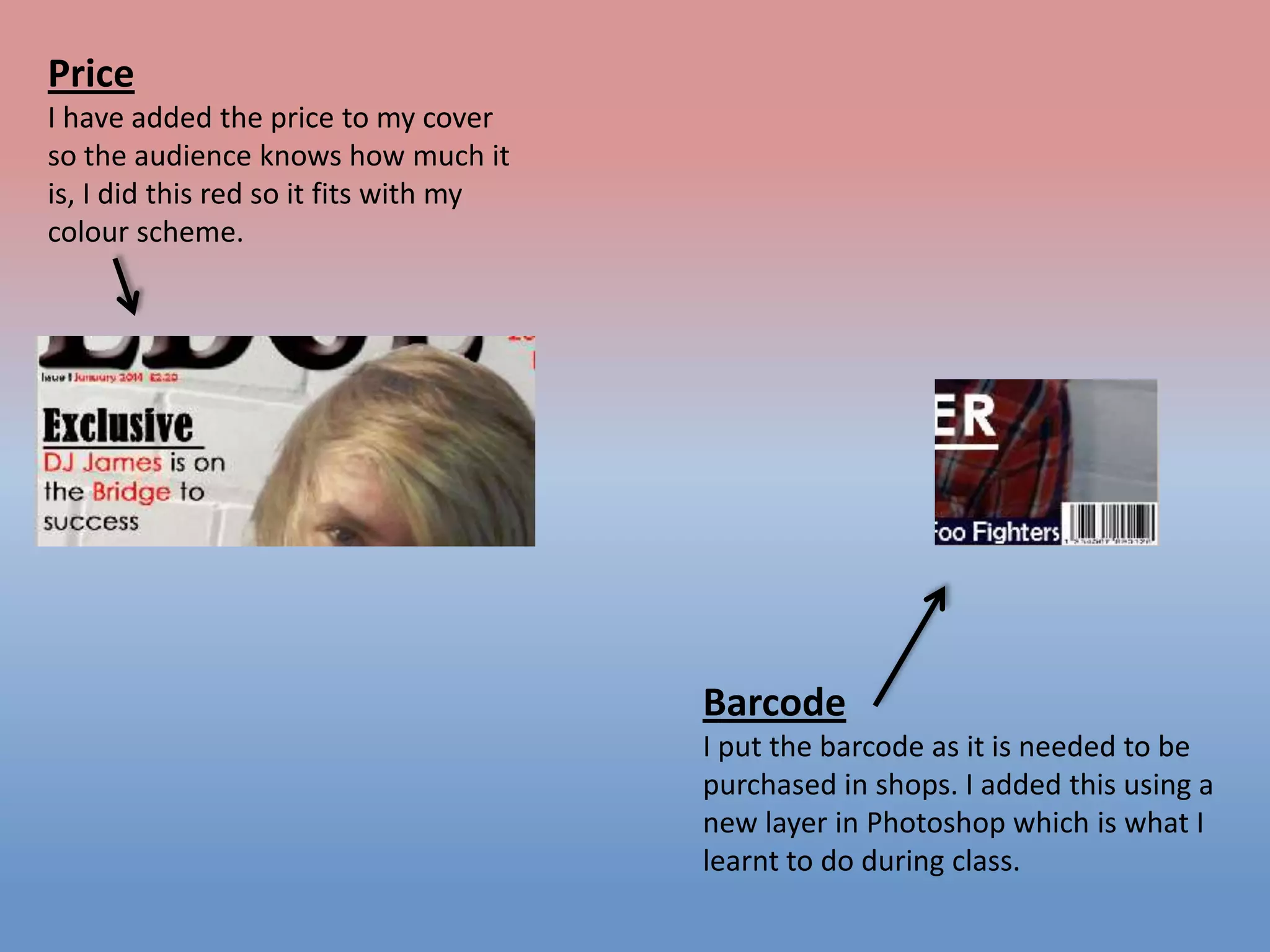
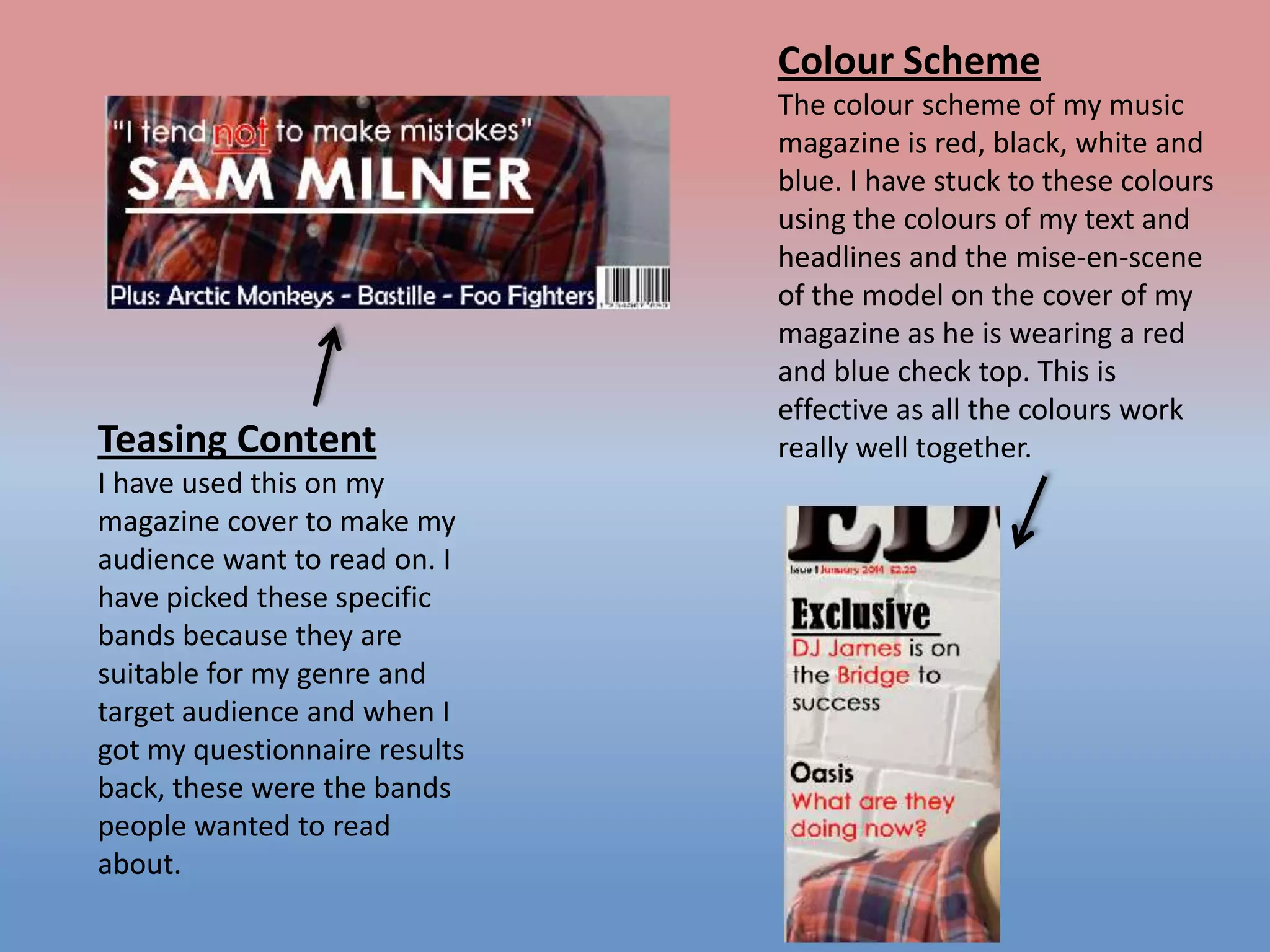
1) A cover with the magazine title beveled and a close-up image of a model wearing red, white, and black to match the color scheme.
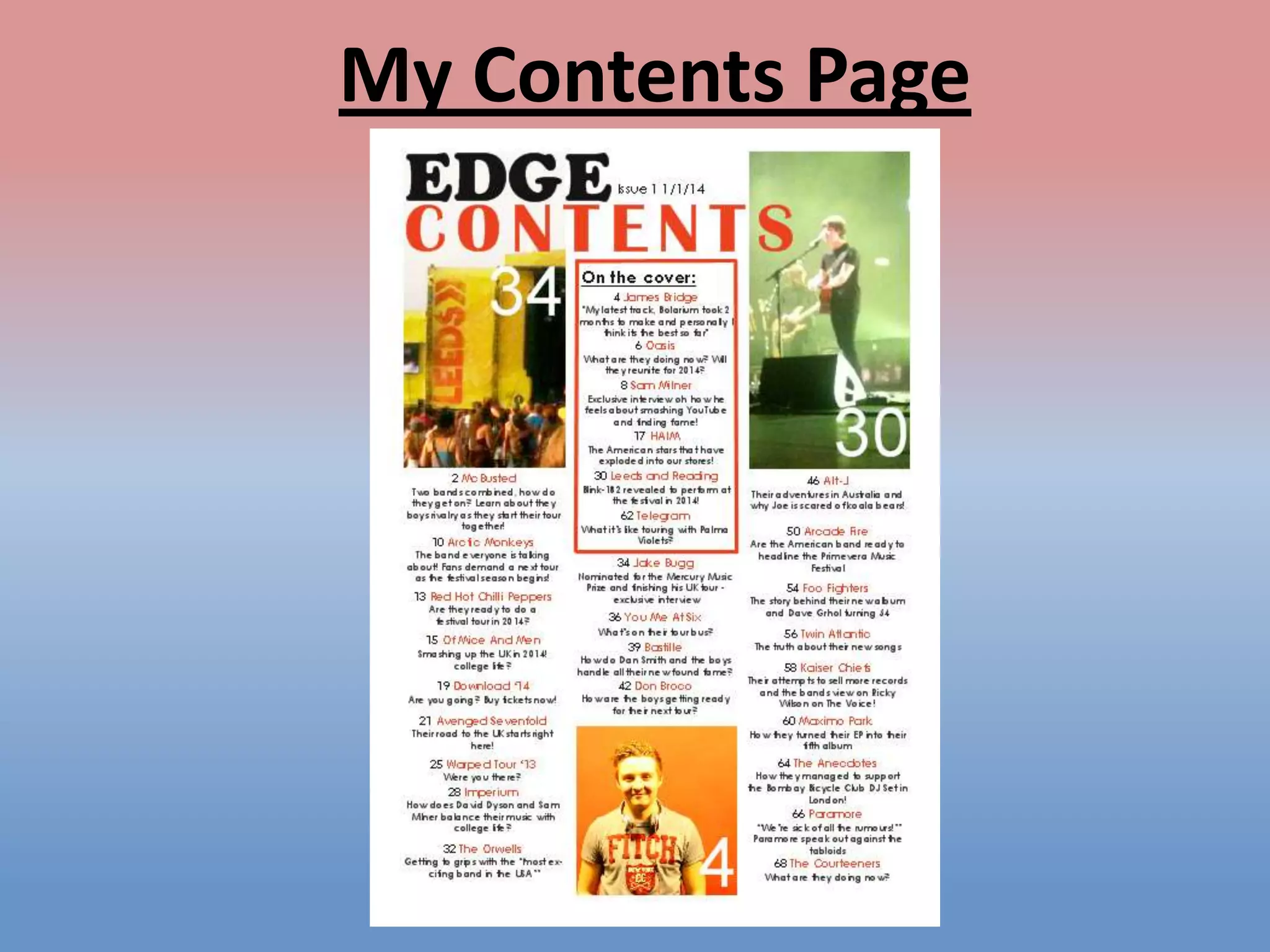
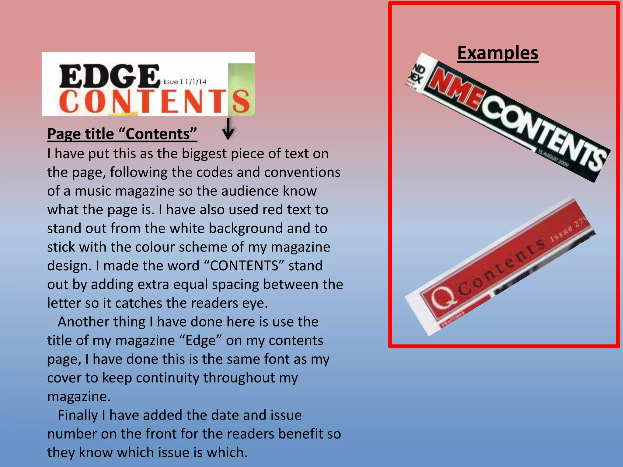
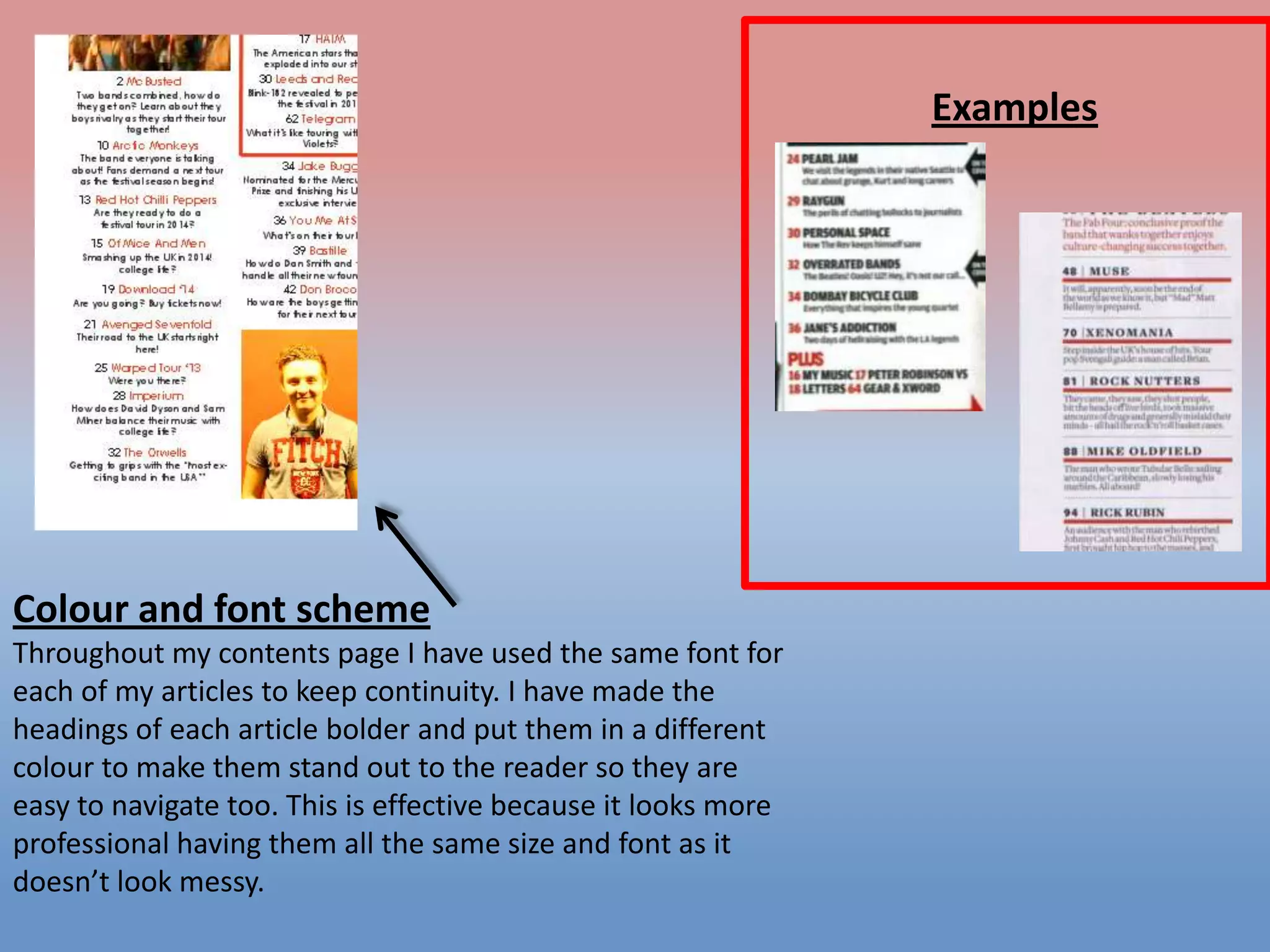
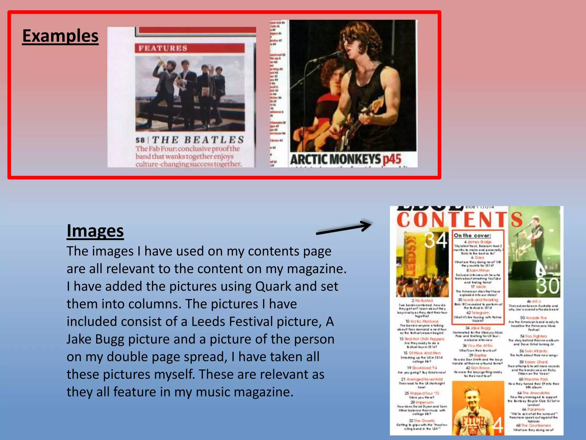
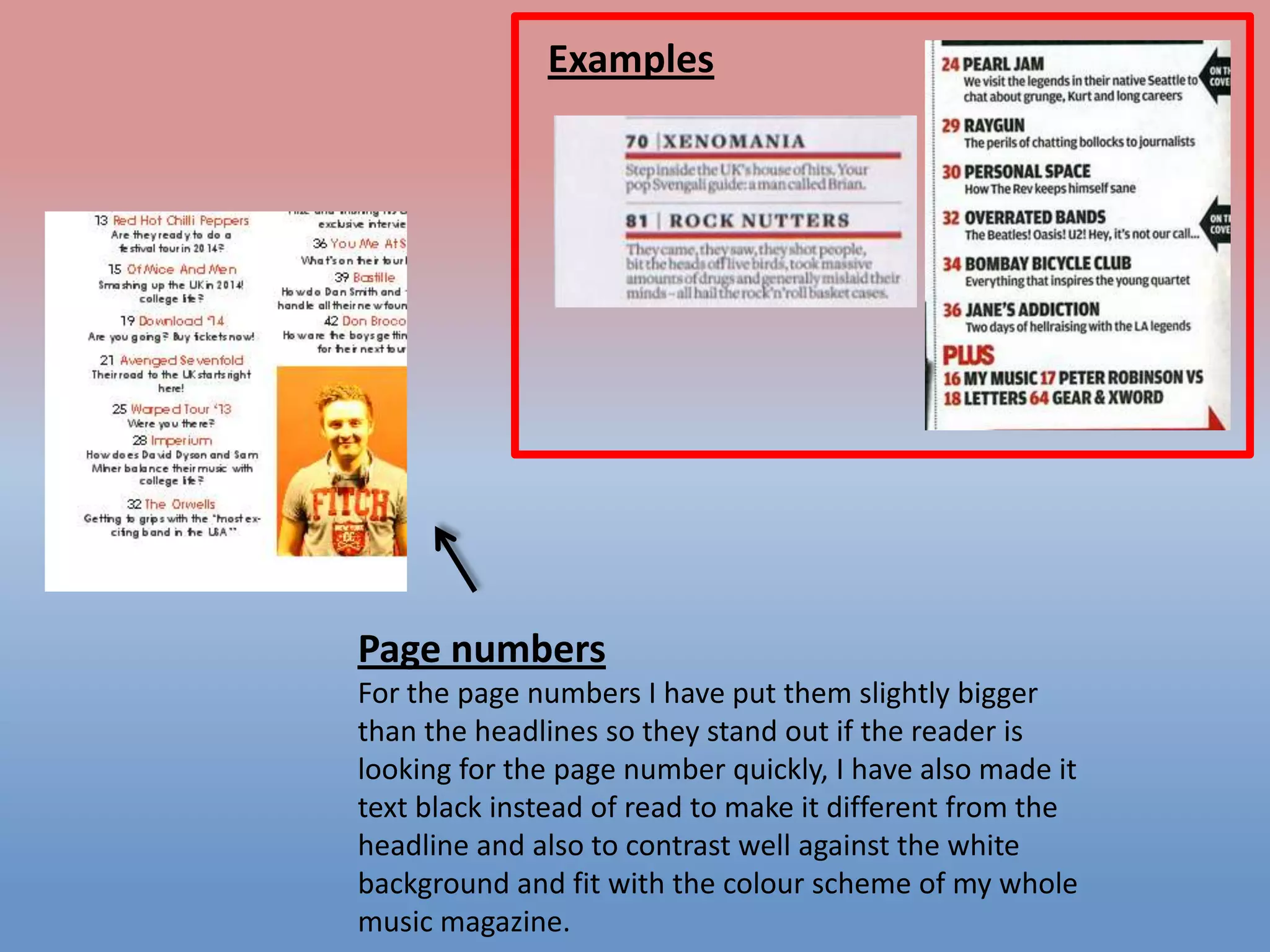
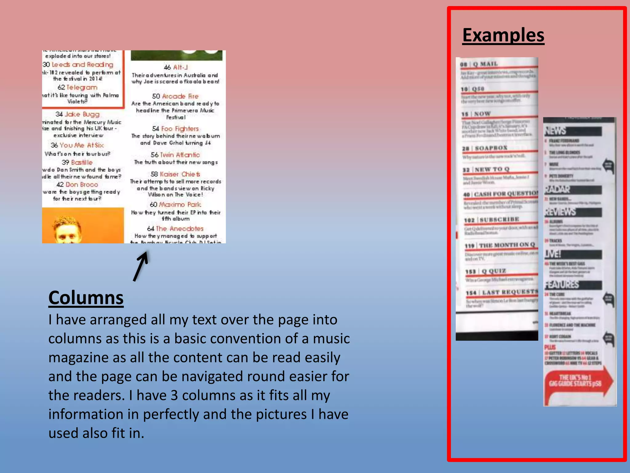
2) A contents page with the title and page numbers in red to stand out, images relevant to articles, and consistent fonts and bold headings to navigate sections.
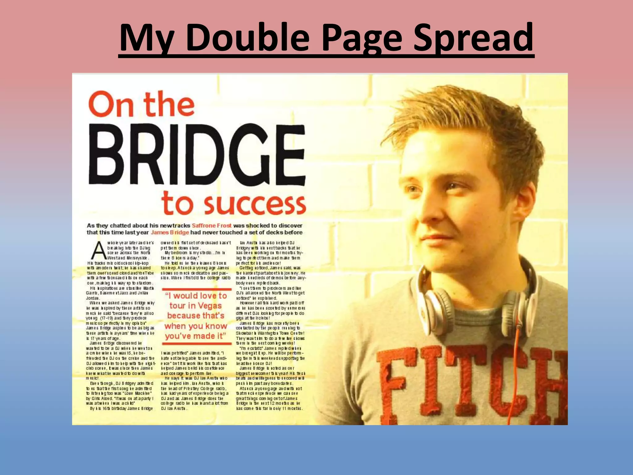
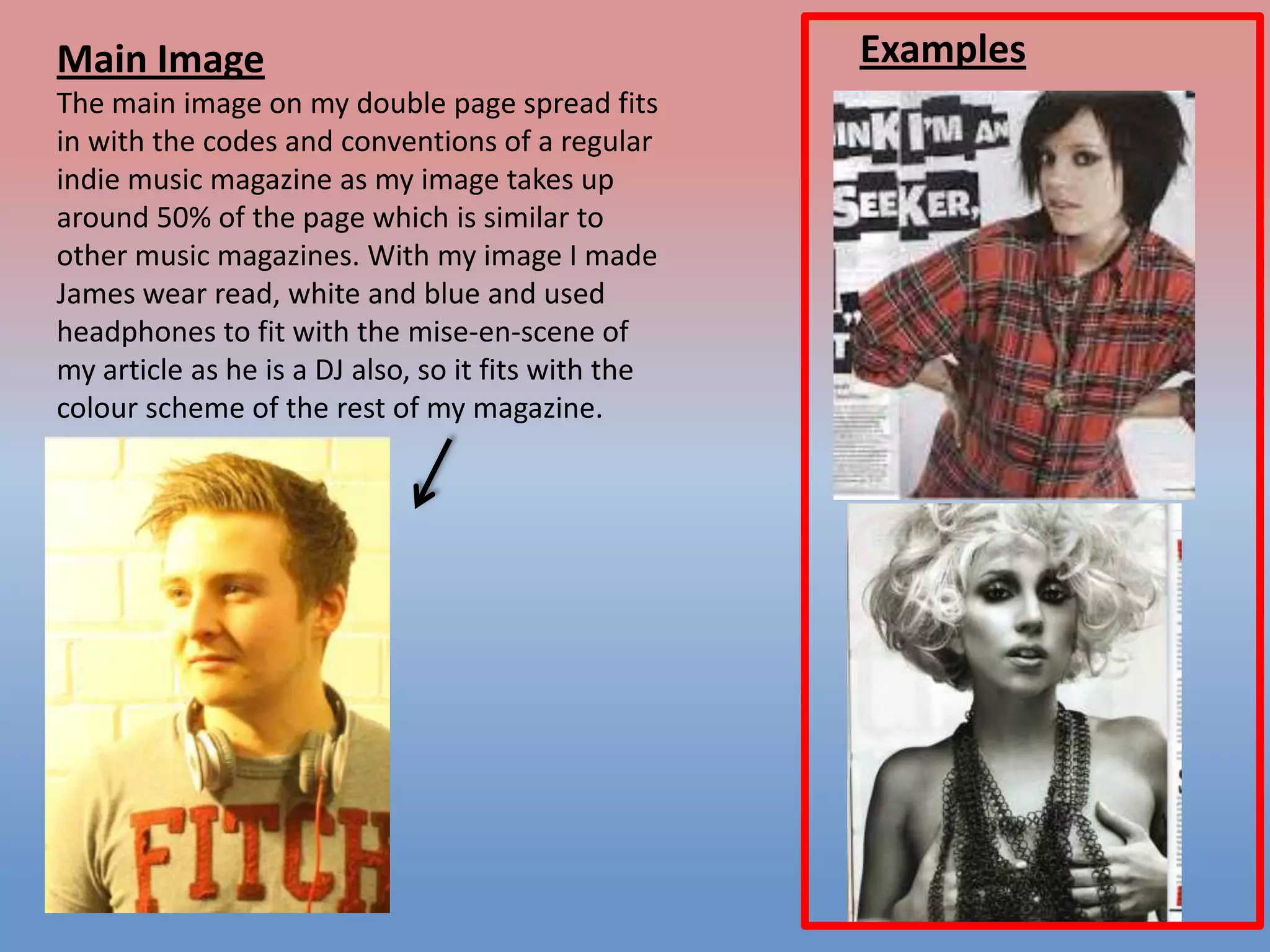
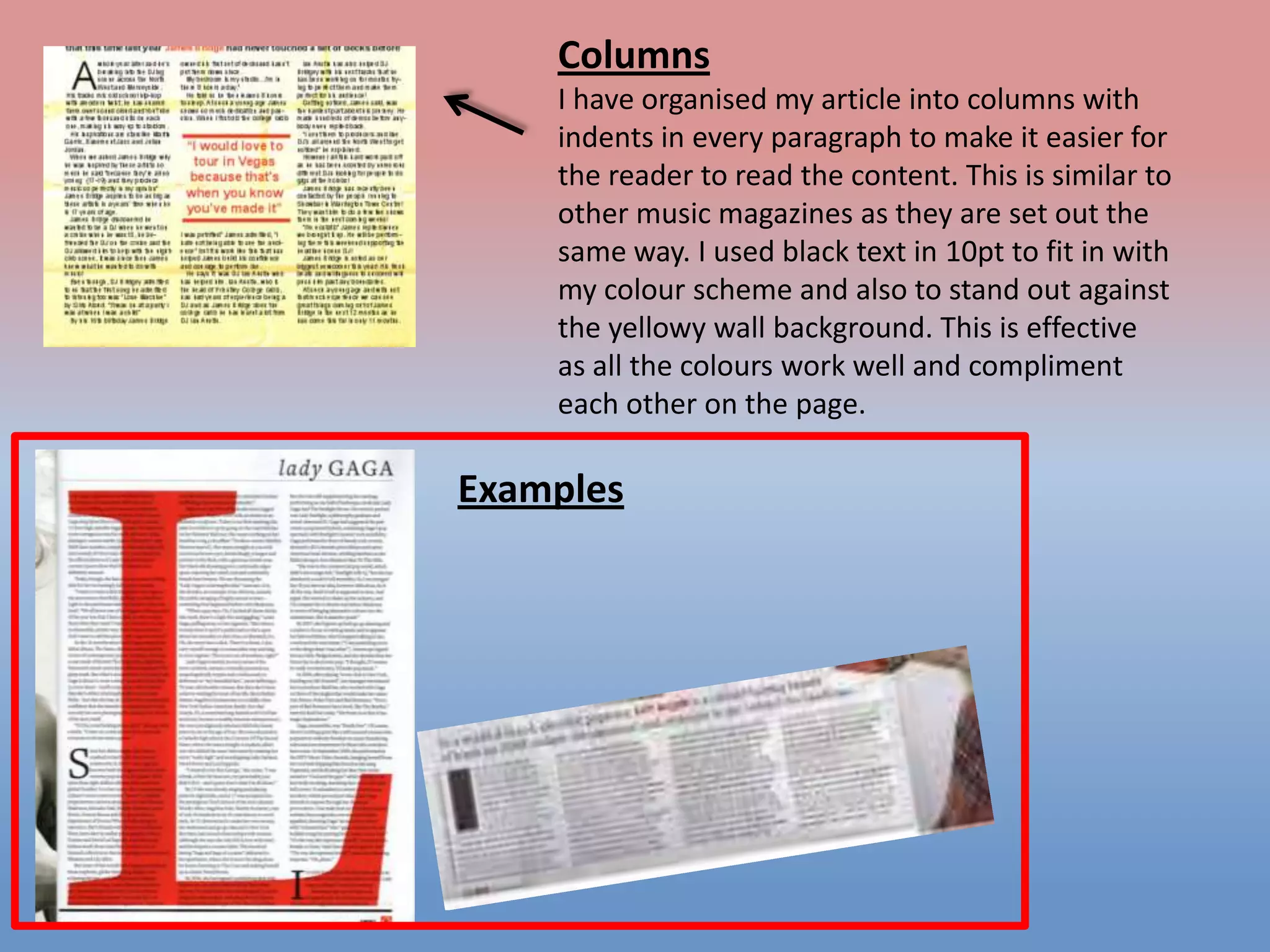
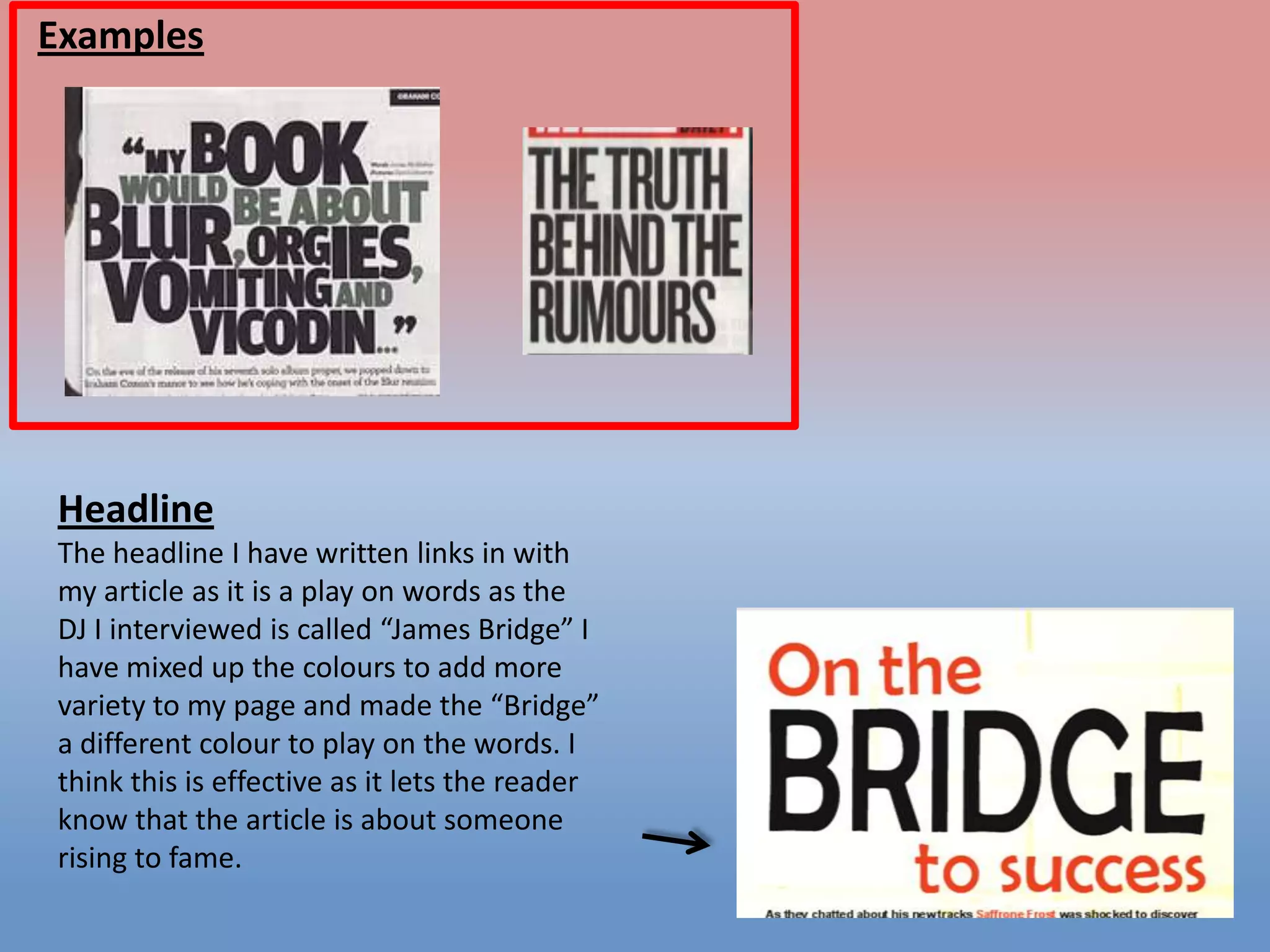
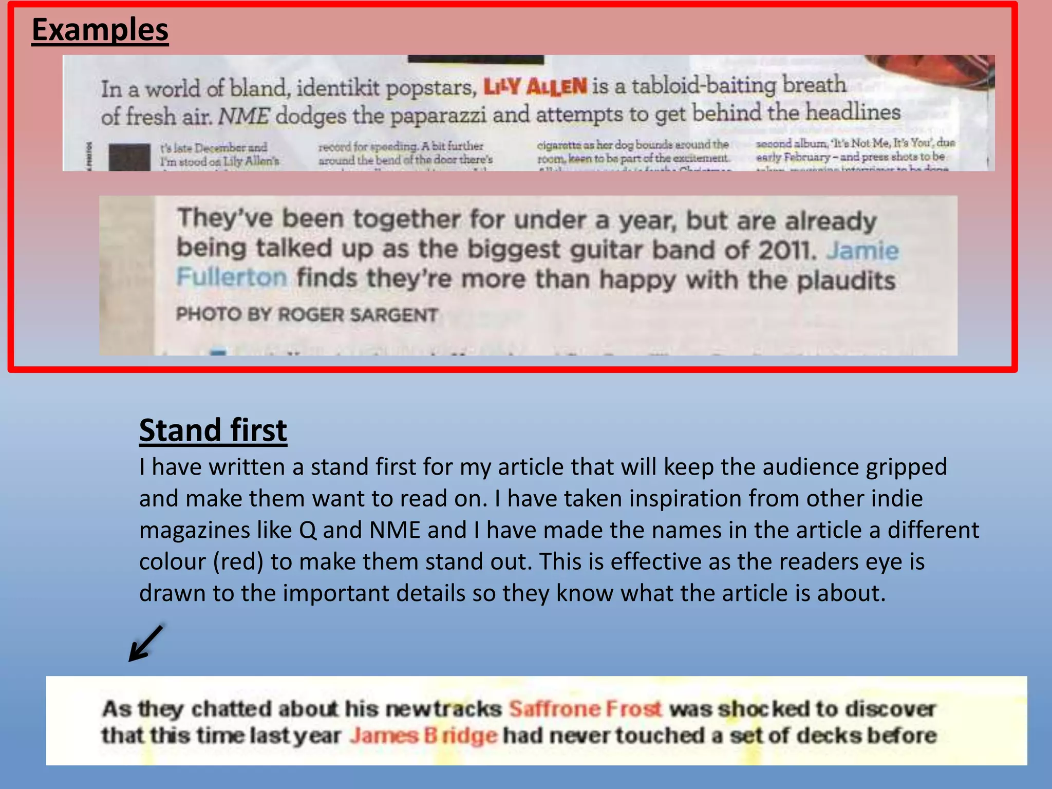
3) A double-page article spread with a large image taking half the page, columns to organize text easily, and a headline using different colors to draw attention.