The document discusses genre conventions for magazine design. It provides examples from existing magazines and describes how the student incorporated genre conventions in their own magazine design. Specifically, it discusses using bold titles, fonts suited for the genre, images of models that fit genre expectations, and layout of cover lines and contents pages similar to other magazines. The student aimed to create a magazine that would be recognizable to the genre while also adding their own creative touches.
The Legacy of Breton In A New Age by Master Terrance LindallBBaez1
Brave Destiny 2003 for the Future for Technocratic Surrealmageddon Destiny for Andre Breton Legacy in Agenda 21 Technocratic Great Reset for Prison Planet Earth Galactica! The Prophecy of the Surreal Blasphemous Desires from the Paradise Lost Governments!
2137ad Merindol Colony Interiors where refugee try to build a seemengly norm...luforfor
This are the interiors of the Merindol Colony in 2137ad after the Climate Change Collapse and the Apocalipse Wars. Merindol is a small Colony in the Italian Alps where there are around 4000 humans. The Colony values mainly around meritocracy and selection by effort.
thGAP - BAbyss in Moderno!! Transgenic Human Germline Alternatives ProjectMarc Dusseiller Dusjagr
thGAP - Transgenic Human Germline Alternatives Project, presents an evening of input lectures, discussions and a performative workshop on artistic interventions for future scenarios of human genetic and inheritable modifications.
To begin our lecturers, Marc Dusseiller aka "dusjagr" and Rodrigo Martin Iglesias, will give an overview of their transdisciplinary practices, including the history of hackteria, a global network for sharing knowledge to involve artists in hands-on and Do-It-With-Others (DIWO) working with the lifesciences, and reflections on future scenarios from the 8-bit computer games of the 80ies to current real-world endeavous of genetically modifiying the human species.
We will then follow up with discussions and hands-on experiments on working with embryos, ovums, gametes, genetic materials from code to slime, in a creative and playful workshop setup, where all paticipant can collaborate on artistic interventions into the germline of a post-human future.
Explore the multifaceted world of Muntadher Saleh, an Iraqi polymath renowned for his expertise in visual art, writing, design, and pharmacy. This SlideShare delves into his innovative contributions across various disciplines, showcasing his unique ability to blend traditional themes with modern aesthetics. Learn about his impactful artworks, thought-provoking literary pieces, and his vision as a Neo-Pop artist dedicated to raising awareness about Iraq's cultural heritage. Discover why Muntadher Saleh is celebrated as "The Last Polymath" and how his multidisciplinary talents continue to inspire and influence.
2137ad - Characters that live in Merindol and are at the center of main storiesluforfor
Kurgan is a russian expatriate that is secretly in love with Sonia Contado. Henry is a british soldier that took refuge in Merindol Colony in 2137ad. He is the lover of Sonia Contado.
The perfect Sundabet Slot mudah menang Promo new member Animated PDF for your conversation. Discover and Share the best GIFs on Tenor
Admin Ramah Cantik Aktif 24 Jam Nonstop siap melayani pemain member Sundabet login via apk sundabet rtp daftar slot gacor daftar
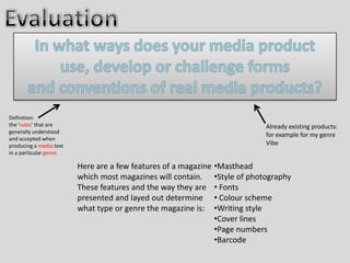
1. Definition:
the ‘rules’ that are Already existing products:
generally understood
for example for my genre
and accepted when
producing a media text Vibe
in a particular genre.
Here are a few features of a magazine •Masthead
which most magazines will contain. •Style of photography
These features and the way they are • Fonts
presented and layed out determine • Colour scheme
what type or genre the magazine is: •Writing style
•Cover lines
•Page numbers
•Barcode
2. The small text either
above or beneath the
title states the date
and issue/volume
number. This is found
A mention of Existing product on many magazines
some artists or and is an extra helpful
popular features detail. Although this
within the text is small and
magazine subtle, the colour of it
interests the allows it to bounce
viewer and and contrast against
encourages artists the background.
existing fans to My version
purchase the
product. Using Photoshop and
However, the more specific the lasso
mentioning on magnetic tool meant that I
the existing could cut my models head
product goes over out and paste it again to
the title which i be in front of the title this
felt created technique was used a lot
distraction from A dominating title horizontal at the top of the page is
in the existing products I
the title and lost featured in both magazines. The bold and large structure
saw and I was inspired and
in strength so I drew attention and allowed a identification to the magazine
wanted to interpret this
didn't interpret so in future the magazine will be recognized. Each letter is
idea within mine. I felt this
this within my presented as capitals to add power and represent the
tool made my magazine
product. culture. The gradient red and black colour is themed for the
look more professional
existing magazine, so I chose a colour to suit my magazine
better quality.
which connoted strength and the genre.
3. For my genre I had to have a specific character that
was suitable. My idea of a petite but tall women
with an amount of body showing, with long
hair, showing abit of attitude came from existing
products, as the regular occurrence of this
description became apparent in vibe magazine.
The location of the images were against a plain
backround with light bouncing on the background
making the figure look bright. This idea was
constructed by experimenting with a number of
Nicky Minaj photos in series, each were different
which looked imaginative. I reconstructed these
images with my own model posing in unusual
ways. The stance and positions were strong which
was noticeable in the existing product to the left.
A strong stance with arm action and facial
expressions full of attitude.
Existing product
Existing product The images above were produced to
This picture as well as being be a feature of the contents page but
the background is also the not the main focus so I reduced the
main focus. The image above size of each one down, this was so
looks to be taken within a the contents on the left stood out
studio and is very structured. and the reader would be clear as to
For a contents page I felt this exactly what was in the magazine
was my preferred option in a and with the page numbers would
studio, a more photo shoot find it easily enough. However, the
approach with lighting and images being vertical looked tedious
positioning. so I angled each photo to add
creativity.
4. The font of the title of each magazine is extremely large and bold.
This allows people to pay attention to the title and begin to Existing products
recognise the magazine. Also, the title are in capitals and one colour
emphasising greatly the importance of it.
The mention of the front cover artist is a feature that is visible on many magazines. For
example Lil Wayne featured on the existing products magazine. This text is a bold font
however, usually a smaller size than the title so confusion is not made as to what is the
title. I chose a font from the internet website DAFONT to present my featuring artist. This
allowed me to download fonts that were specific to my genre. The font I chose was sharp
and clean to represent the culture.
Again for headlines I used DAFONT, this meant my headlines were simple but
stood out. Like the existing product my text was again in capitals to emphasis the
features. I felt the fonts I used for the front cover were modern and
stylish, which is what most magazines aim to achieve.
My contents page font was clear and easy to read. The sub heading text was larger than
the description of what's in the magazine. This was so the writing was effectively
presented. However, the existing product was relatively similar with a simple font so
the text was legible with sub heading that stand out more. I feel mine looks more
quirky with contrasting colours to show more important sections instead of just black
and white that could come across slightly tedious.
Beginning with the font of the introduction and its bold structure
presents a visibly striking and noticeable sentence. Followed by the
article in a sharp font to be read with ease. The existing products font
shows many comparisons. Such as the article font being neat and easily
visible. The important and bold writing presented in the middle is like the
introduction of my magazine. The boldness shows the relevance of the
quote and draws attention. Both magazine font is in black so the text
stands our and bounces of the pale coloured background.
5. Existing product
Both contents pages have a colour scheme
representing what I thought looked classy and suave
like. The dark and slightly gradiented background is
more subtle on my magazine however, I feel like
both backgrounds highlight the images and writing
on top. The golden colour of my images connotes a
stylish look and adds quality to the page. The
red, white and black text are block colours that
worked well and looked striking on the page this
differed from the existing product as that just had
black text which I found to plain for mine but suited
Toward the beginning of the process we collaged the existing product.
pictures that represented our genre when looking
at the whole image I saw many vibrant colours.
These colours were from graffiti and artistic looking
photographs. For my double page I wanted to
interpret many colours. So within my photography I
found a location with colourful graffiti. It made my
page look artistic and bright. The for the larger
writing I used a sharp red to state the writing and
connote passion for the genre. This technique of
bright colours was used for the front cover aswell.
6. Existing product
The existing products quotation is a
relatively long and detailed one which
was unusual to see as other existing
products keep there quotations short
and snappy. Contrasting against this I
chose to keep my quotation sharp and
Both of the articles were fairly long memorable. Also, the majority of hip
with writing styles which are similar. hop artists quotations are snappy to
They both include slightly informal feel realistic, also they seem to be very
quotes from the artist to connote a passionately expressed to represent
stereotypical hip hop artist and attracts the way they feel about their music.
younger age audience who understand
the slang. However, both articles are
Existing product
constructed using the third person
referring to the artist as his name or
‘he’. This makes the article slightly
more formal and detailed so more
information is in a short space.
7. Few word cover lines allow the readers to have a brief Existing product
insight to the contents of the magazine. The more
intriguing the cover line the more your pulled into the
magazine. The cover lines are normally a smaller size
text that the masthead and add information or detail
to the magazine. They tend to still stand out by using
capitals and a contrasting colour to the background. I
chose to capitalise my words as well for them to be
eye catching. Also, they looked better in capitals when
an outer glow setting was added.
A cover line of the artists name is featured in both
these cases horizontal across the page and creates a
professional look. They are suddenly noticed and
can be very catchy. The existing products cover line
involve two contrasting colours which has a 2d
effect to add to the impact. Whereas my cover line
has a drop shadow with some depth behind it to
bounce of the page and look 3d.
A single line across the top of the page with a mentioning of artists
or events is a regular occurrence on many music magazines.
Normally the actual text is a different colour to the background and
is subtle but effective. I interpreted this technique within mine to
comment on a range of artists to attract a bigger audience.
8. Page numbers are a good
guidance to the pages featured
in the contents. There
understandable in the existing
After previously saying bar codes on the front product however, have to be
page looked tacky when analysing existing searched for as the font lacks
products I was still hesitant to put one on size and could be unclear to
however, I began to feel it looked in place some readers. However, the
when vertical on my magazine. As I saws this page references are bold and
technique on a existing xxl magazine. I placed Existing therefore stand out from the
it in the bottom right corner to fill space and product rest of the writing. My product
not interrupt the rest of the magazine. I also was slightly different with the
reduced the size of it as much as I could, so it page numbers at the end of the
did its job but wasn’t noticeable and stories, this was where there
overcrowding at all. was more space to have the
writing extra large and
emphasised greatly so there
was no mistake or confusion.
Also, page numbers were in
white to allow it to add to the
Existing product drama and be highlighted.