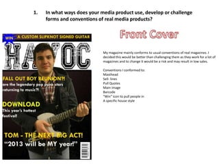
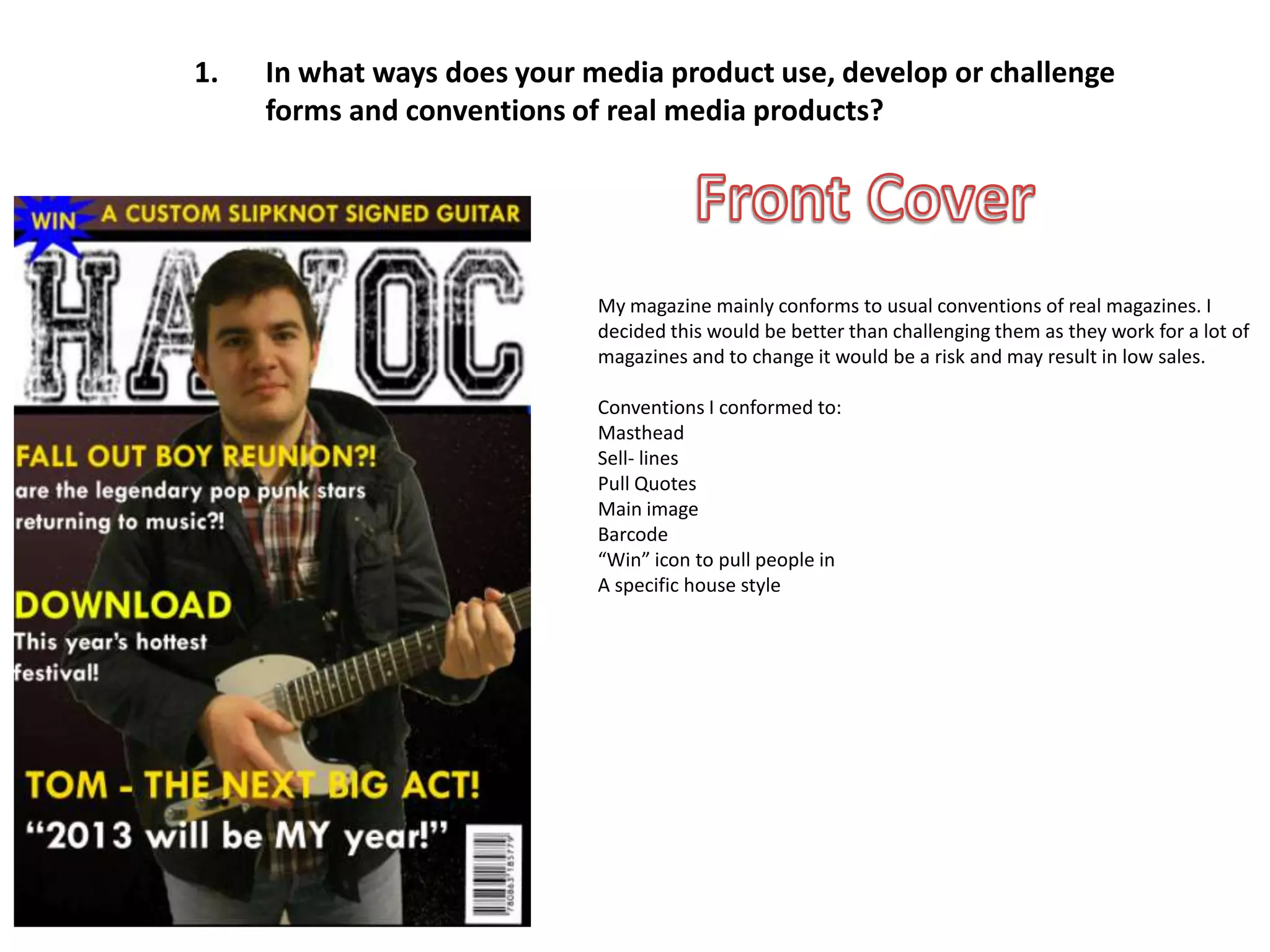
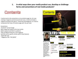
The media product uses many conventions of real magazines, such as the masthead, sell lines, pull quotes, barcodes, and a "win" icon. The contents page also follows conventions like listing the "Contents" at the top, featuring a main image relating to the cover story, including the editor's letter, and titles/subtitles of articles. However, one double page spread was made to look more unconventional with a slanted diagonal line separating the image and article. The article also uses an interview format with questions in red and answers in black. Continuity is created through consistent colors, images and styles.
1. 1. In what ways does your media product use, develop or challenge
forms and conventions of real media products?
My magazine mainly conforms to usual conventions of real magazines. I
decided this would be better than challenging them as they work for a lot of
magazines and to change it would be a risk and may result in low sales.
Conventions I conformed to:
Masthead
Sell- lines
Pull Quotes
Main image
Barcode
“Win” icon to pull people in
A specific house style
2. 1. In what ways does your media product use, develop or challenge
forms and conventions of real media products?
I mainly stuck to the conventions on my contents page too. As I was
creating a magazine centred around rock music, I tried to emulate a
magazine already of this genre. I chose Kerrang! Magazine, so I tried to
incorporate their style of contents page with my own style.
Conventions:
“Contents” at top of page
Main image that relates to the main article
Editor’s picture and letter to audience
Titles of different features in the magazine
Sub titles of the specific articles within these features
“Subscribe” box
“-Magazine Title- THIS WEEK”
3. 1. In what ways does your media product use, develop or challenge
forms and conventions of real media products?
For my double page I also used yellow for
spread, I tried to half the title and the
make it look different pull quote. This sticks
and unconventional, with my house style
as rock music is on the front cover
sometimes seen like and contents,
this. To do this I creating a sense of
created my own continuity within my
divide between the magazine. My main
image and article by image is the same
adding a slanted from the cover to
diagonal line. This is show that this is the
different from the big article advertised
usual convention of a on the cover as this is
page for each meant to be about a
separated by the new artist, so people
divide of the pages may not be sure of
only. For the article, what he looks like. I
rather than just an did this to stop
article in which confusion within the
somebody will write reader. I used a close
about the artist, I up shot under the
used more of an article of the guitar as
interview technique, it is mentioned in the
with the questions interview, so it is only
asked by the writer logical to place the
in the red, and the image there. It also
answers in black. gives a better visual
to the page.