SlideShare a Scribd company logo
1 of 13
IN WHAT WAYS DOES YOUR MEDIA PRODUCT
                        USE, DEVELOP OR CHALLENGE FORMS OF
                        CONVENTIONS OF REAL MEDIA PRODUCTS?
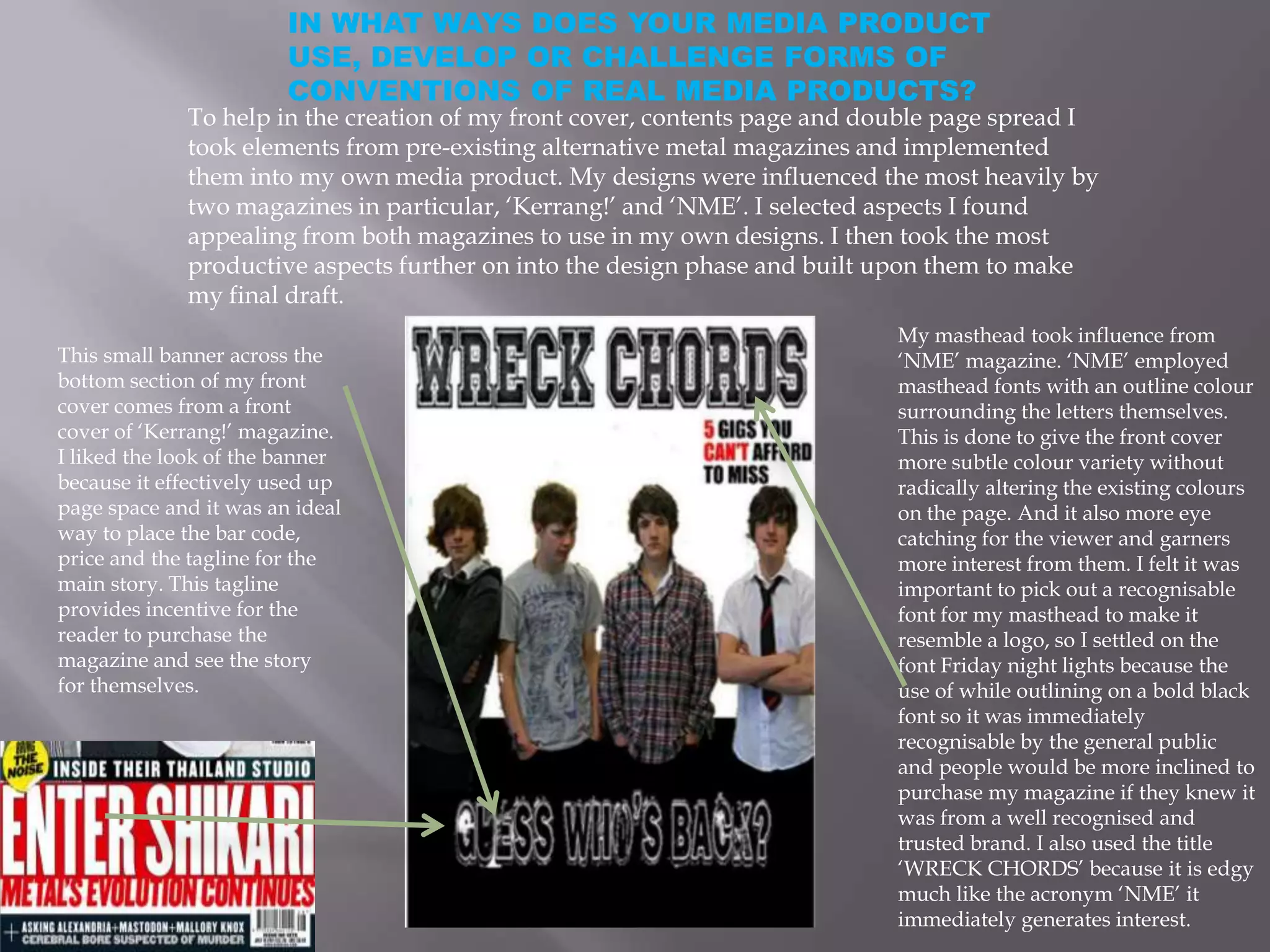
             To help in the creation of my front cover, contents page and double page spread I
             took elements from pre-existing alternative metal magazines and implemented
             them into my own media product. My designs were influenced the most heavily by
             two magazines in particular, ‘Kerrang!’ and ‘NME’. I selected aspects I found
             appealing from both magazines to use in my own designs. I then took the most
             productive aspects further on into the design phase and built upon them to make
             my final draft.
                                                                            My masthead took influence from
This small banner across the                                                ‘NME’ magazine. ‘NME’ employed
bottom section of my front                                                  masthead fonts with an outline colour
cover comes from a front                                                    surrounding the letters themselves.
cover of ‘Kerrang!’ magazine.                                               This is done to give the front cover
I liked the look of the banner                                              more subtle colour variety without
because it effectively used up                                              radically altering the existing colours
page space and it was an ideal                                              on the page. And it also more eye
way to place the bar code,                                                  catching for the viewer and garners
price and the tagline for the                                               more interest from them. I felt it was
main story. This tagline                                                    important to pick out a recognisable
provides incentive for the                                                  font for my masthead to make it
reader to purchase the                                                      resemble a logo, so I settled on the
magazine and see the story                                                  font Friday night lights because the
for themselves.                                                             use of while outlining on a bold black
                                                                            font so it was immediately
                                                                            recognisable by the general public
                                                                            and people would be more inclined to
                                                                            purchase my magazine if they knew it
                                                                            was from a well recognised and
                                                                            trusted brand. I also used the title
                                                                            ‘WRECK CHORDS’ because it is edgy
                                                                            much like the acronym ‘NME’ it
                                                                            immediately generates interest.
IN WHAT WAYS DOES YOUR MEDIA
                                    PRODUCT USE, DEVELOP OR
                                    CHALLENGE FORMS OF
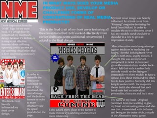
                                    CONVENTIONS OF REAL MEDIAMy front cover image was heavily
                                    PRODUCTS?                influenced by a front cover from
                                                             ‘Kerrang!’ magazine featuring the
I took inspiration from the
‘NME’ logo for my mast                                                                      band Enter Shikari. In order to
                                  This is the final draft of my front cover featuring all   emulate the style of the front cover I
head. It’s design heavily
                                  the conventions that I felt worked effectively from       had my models stand shoulder to
influenced my mastheads
design because it’s technique     earlier drafts and some additional conventions I          shoulder in a row to give an
is simple yet effective,          added to the final design.                                impression of unity.
inverse colour outlining
opposing colour creates an                                                                   Most alternative metal magazines go
eye catching visual effect that                                                             against tradition by replacing the
is both engrossing and easily                                                               happy, cheerful looking front cover
recognisable.                                                                               models with stoic, angsty models. I
                                                                                            thought this was an important
                                                                                            component to factor in, however
                                                                                            given the context of my models back-
                                                                                            story I felt that such a melancholy
                                                                                            attitude would not be fitting so I
                       In order to                                                          instructed two of my models to have a
                       resemble the                                                         serious look about them and the other
                       front cover                                                          two to look positive. Not only did this
                       increased the                                                        keep in context with the magazine
                       size of the                                                          theme but it also showed that each
                       masthead, the                                                        band mate had an individual
                       central image                                                        personality, character and back story.
                       and the bottom
                       banner in order                                                      The name of my band ‘Dropout
This front cover
                       to more                                                              'stemmed from me wanting to give
heavily
                       effectively use                                                      my band an interesting name and also
influenced my
                       the space         I also added more plugs to the banner to           one that is associated with defiance
front cover
                       provided on the   make it more eye-catching and to attract           and being on the outer circle, a staple
design.
                       page.             more interesting.                                  of the Alternative metal genre.
IN WHAT WAYS DOES YOUR MEDIA
                             PRODUCT USE, DEVELOP OR
                             CHALLENGE FORMS OF
                             CONVENTIONS OF REAL MEDIA
                             PRODUCTS?


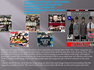
These are five magazine front covers which I drew inspiration and design ideas from. All of these magazines are
from the same genre as my magazine and I drew conventions from them because they were all group shots. All of
the front covers have group shots and they all have a banner going across the bottom of the page with taglines
and plugs. I copied this convention into my front cover because I felt it was a useful and very effective tool to use.
There is a main central image which will help people chose the magazine and will draw attention to the main
story.
I slightly altered the lay out so that the image plugs are above the main image instead of surrounding it like the
magazine examples I posted. The reason behind this was too more effectively use the canvas space provided.
HOW DOES YOUR MEDIA PRODUCT
                             REPRESENT PARTICULAR SOCIAL
                             GROUPS?


The magazines I used to help me create my own media product were all aimed at an older teenage
demographic, this is because people aged 14-20 are maturing and discovering there own styles and particular
music tastes, as they explore there own likes and dislikes they will become more interested in sampling
different genres and buying products affiliated with the bands they like.

The genre I have chosen, Alternative metal is a popular genre amongst this audience because they can
identify with it’s rebellious nature and self expressive ideas.

My colour scheme shows that the magazine is bold, gritty and very edgy in it’s themes, these are all traits
fans of Alternative metal look for in there products. Dark colours are contrasted with blue, red and white
because my survey found that these colours were popular amogst alternative metal fans and they also
convey emotional states associated with the music this genre produces. The use of overly bright colours
would ruin the appearance off the magazine and it would put fans off purchasing it.

It is important that the main image of any music magazine make it clear what genre they are trying to
convey. To coincide with this outlook I specified that my models wear little known brands for the photo
shoot to emphasize that they are going against the social norm, and one of my models went for a formal yet
casual appearance with a plain white shirt and black tie to show that whilst he is stylish he is also nonchalant
and doesn’t take interest in others opinions or dress codes. I feel that self-expression and a disregard to what
is currently trendy epitomises the alternative-metal Genre and my models clothing choices reflected this very
well.
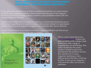
WHAT KIND OF MEDIA INSTITUTION MIGHT
                  DISTRIBUTE YOUR PRODUCT AND WHY?

In my opinion, the institution most likely to publish and distribute my media product
would be music magazine publishers, there would be an attraction to the magazine
because it is aimed at a teenage audience as this is a wide, profitable market with a lot
of opportunities for diversity.

I feel the main problem that my magazine could face would be that because the genre I
tackle in my magazine is more geared towards a niche market instead of a mass market
product, and because my magazine is slightly less marketable they may be deterred.

I looked on the internet to try and find potential magazine publishers and also too see
which genre of music magazine was most in demand.

                                                                           This is a print screen taken from
                                                                           www.musicmags.com it shows the
                                                                           entire portfolio of the website which
                                                                           proves how wide a range of
                                                                           magazine they are distributing. This
                                                                           makes me feel that the media
                                                                           product I created would not be
                                                                           purchased by the publisher because
                                                                           they already have so many
                                                                           magazines spanning so many
                                                                           different genres that they would not
                                                                           be likely to pick up my magazine. I
                                                                           will search for other, less exclusive
                                                                           publishers
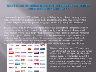
I have knowledge about IPC media from my media lessons and I knew that they were a
publisher that may be interested in my media product because they have so many other
genres of magazines that they publish, ranging from hair and beauty to automobiles.

IPC also seems to be a very successful publisher which is something I am interested in for
my media product because I want it to be published by a well known, well recognised
brand because it would give my product an easier chance of success if the public recognise
the already popular publisher. IPC has another well known music magazine known as
NME, however that magazine deals with other genres whilst my magazine deals with
exclusively with the alternative metal genre so they would be interested because my
magazine is an exclusive one that would be popular amongst an already popular genre.

                                                This is a print screen from IPCmedia.com
                                                which shows just how many different genres
                                                of magazine IPC media publish, the wide
                                                range of genres is what makes me want to
                                                choose this publisher because if worst comes
                                                to worst and my magazine fares poorly then
                                                they will not make a loss because they have
                                                many other magazine titles to fall back on.
WHO WOULD BE THE
                                AUDIENCE FOR YOUR MEDIA
                                PRODUCT?

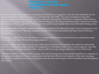
From my research on the alternative metal genre I found that two magazines were the most identifiable for my
genre and audience. These two magazines were ‘Kerrang’ and ‘NME’. It is easy to recognise a magazines
intended audience based on it’s colour scheme, front cover and articles, ‘Kerrang’ is a magazine aimed at heavy
metal fans and it has a large red logo with cracks running up it, the colour represents anger or blood and it makes
the magazine stand out against the other magazines, and the cracks signify loud noises and earth shaking sound.

My research made me want to make my media product based on the alternative metal/ heavy metal genre. I was
influence most heavily by ‘Kerrang’ magazine because I felt it best encapsulated the heavy metal/alternative
metal genre.

By naming my band ‘Dropout’ I felt that it was a unique name but also an ideal name for an alternative metal/
heavy metal band, this will attract my target audience.

I used the colours, black, grey and red as my main colours because it best emulates the metal look, these dark,
monotone colours immediately identify the magazine as an alternative metal/ heavy metal magazine. Also, the
white background complements the other colours on the front page and gives the front cover a better look.

I feel that my choice of colour scheme, images, font styles and page layout immediately identifies my magazine as
belonging to the alternative/heavy metal genre. I also feel that will attract the majority of the older vteeenage
demographic whether they are fans of the genre or not because of the employ ment of rebellious and bold taglines
and slogans.
HOW DID YOU
                         ATTRACT/ADRESS YOUR
                         AUDIENCE?

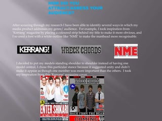
After scouring through my research I have been able to identify several ways in which my
media product addresses my genre/ audience. For example, I took inspiration from
‘Kerrang’ magazine by placing a coloured strip behind my title to make it more obvious, and
I so used a font with a white outline like ‘NME’ to make the masthead more recognisable.


  I decided to put my models standing shoulder to shoulder instead of having one
  model central, I chose this particular stance because it suggested unity and didn’t
  make it appear as though one member was more important than the others. I took
  my inspiration from this ‘Kerrang’ magazine cover.
HOW DID YOU ATTRACT/ADRESS
                          YOUR AUDIENCE?
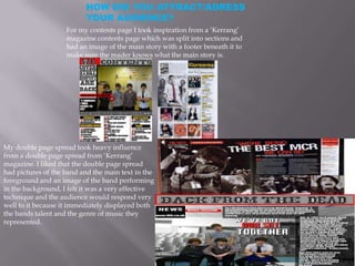
                    For my contents page I took inspiration from a ‘Kerrang’
                    magazine contents page which was split into sections and
                    had an image of the main story with a footer beneath it to
                    make sure the reader knows what the main story is.


My double page spread took heavy influence
from a double page spread from ‘Kerrang’
magazine. I liked that the double page spread
had pictures of the band and the main text in the
foreground and an image of the band performing
in the background, I felt it was a very effective
technique and the audience would respond very
well to it because it immediately displayed both
the bands talent and the genre of music they
represented.
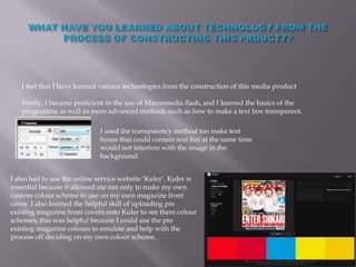
I feel that I have learned various technologies from the construction of this media product

   Firstly, I became proficient in the use of Macromedia flash, and I learned the basics of the
   programme as well as more advanced methods such as how to make a text box transparent.

                             I used the transparency method too make text
                             boxes that could contain text but at the same time
                             would not interfere with the image in the
                             background.


I also had to use the online service website ‘Kuler’. Kuler is
essential because it allowed me not only to make my own
custom colour scheme to use on my own magazine front
cover. I also learned the helpful skill of uploading pre
existing magazine front covers onto Kuler to see there colour
schemes, this was helpful because I could use the pre
existing magazine colours to emulate and help with the
process off deciding on my own colour scheme.
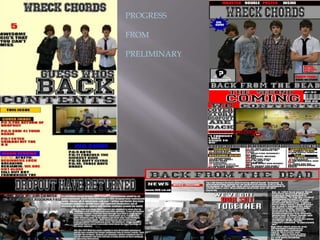
PROGRESS

FROM

PRELIMINARY
LOOKING BACK AT YOUR PRELIMINARY TASK, WHAT DO YOU THINK YOU
HAVE LEARED FROM IT IN THE PROGRESSION TO FULL PRODUCT?
The first major thing I have learned from my media work is the importance of proper time
management and pre planning. I think that from my preliminary task I have discovered various
important pieces of information about my chosen genre, as well as music magazines in general and
I have tried to emulate there design choices as best I can. In my preliminary work I drafted the early
designs as quickly as was possible and did not pay a lot of attention to detail or other magazine
designs, I learned through peer analysis what I should make my front cover, contents page and
double page spread look like.

The early preliminary drafts were easy to create and took very little time, however as I progressed I
had to devote more time and effort into the creation of my media product. I felt I devoted too much
time towards my front cover and somewhat neglected my contents page and double page spread.
Overall I feel my time management skills were improved from the preliminary as I devoted more
time and effort into all of my work during it’s final stages of completion.

I also feel that my use of Macromedia Fireworks has improved. At first during my preliminaries I
had only to use the most basic of Fireworks tools such as importing an image and changing the
canvas colour. For my preliminary I began to experiment with the more advanced tools of fireworks
such as the transparency selector, the smooth edge tool, the fill section and the conversion of a
fireworks file to a JPEG. However, I do not feel I became as proficient on the programme as I could
have been and I also feel I wasted valuable time getting to grips with the programme and it’s
intricacies. But, on the whole I feel I am more knowledgeable of Macromedia Fireworks now than I
have ever been.

I feel that my overall ability has improved from my preliminary designs and I personally can notice
improvements in my final designs when compared to my preliminaries. I feel the preliminary tasks
were important because they allowed me to use my ideas and then receive feedback from my peers
and perfect my designs.

Overall I am pleased about how my final media product worked out.
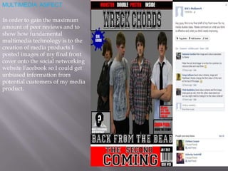
MULTIMEDIA ASPECT

In order to gain the maximum
amount of peer reviews and to
show how fundamental
multimedia technology is to the
creation of media products I
posted images of my final front
cover onto the social networking
website Facebook so I could get
unbiased information from
potential customers of my media
product.

More Related Content

What's hot

Evaluation media
Evaluation    mediaEvaluation    media
Evaluation mediaparkin1
 
In what ways does your media product use, develop or challenge forms and conv...
In what ways does your media product use, develop or challenge forms and conv...In what ways does your media product use, develop or challenge forms and conv...
In what ways does your media product use, develop or challenge forms and conv...sarah533
 
Magazine Evaluation
Magazine EvaluationMagazine Evaluation
Magazine Evaluationriamedia
 
Danielle Rippengill
Danielle RippengillDanielle Rippengill
Danielle Rippengillrikhudson
 
Question 1 evaluation
Question 1   evaluationQuestion 1   evaluation
Question 1 evaluationasmedia
 
Media Evaluation
Media EvaluationMedia Evaluation
Media Evaluationrebeccatp45
 
Xm magazine evaluation
Xm magazine evaluationXm magazine evaluation
Xm magazine evaluationKieran Raza
 
Magazines
MagazinesMagazines
Magazinesdapaz93
 
Music magazine evaluation
Music magazine evaluationMusic magazine evaluation
Music magazine evaluationchloewelshprior
 
As media evaluation
As media evaluationAs media evaluation
As media evaluationAishaC
 
Analysing & Evaluating a Magazine
Analysing & Evaluating a  MagazineAnalysing & Evaluating a  Magazine
Analysing & Evaluating a MagazineShayne Quiseo
 

What's hot (17)

Evaluation media
Evaluation    mediaEvaluation    media
Evaluation media
 
In what ways does your media product use, develop or challenge forms and conv...
In what ways does your media product use, develop or challenge forms and conv...In what ways does your media product use, develop or challenge forms and conv...
In what ways does your media product use, develop or challenge forms and conv...
 
Question 5
Question 5Question 5
Question 5
 
Magazine Evaluation
Magazine EvaluationMagazine Evaluation
Magazine Evaluation
 
Drafts
DraftsDrafts
Drafts
 
Danielle Rippengill
Danielle RippengillDanielle Rippengill
Danielle Rippengill
 
Question 1 evaluation
Question 1   evaluationQuestion 1   evaluation
Question 1 evaluation
 
Magazine Analysis
Magazine AnalysisMagazine Analysis
Magazine Analysis
 
Media Evaluation
Media EvaluationMedia Evaluation
Media Evaluation
 
Xm magazine evaluation
Xm magazine evaluationXm magazine evaluation
Xm magazine evaluation
 
Magazines
MagazinesMagazines
Magazines
 
Textual analysis
Textual analysisTextual analysis
Textual analysis
 
Music magazine evaluation
Music magazine evaluationMusic magazine evaluation
Music magazine evaluation
 
As media evaluation
As media evaluationAs media evaluation
As media evaluation
 
Analysing & Evaluating a Magazine
Analysing & Evaluating a  MagazineAnalysing & Evaluating a  Magazine
Analysing & Evaluating a Magazine
 
Evaluation
EvaluationEvaluation
Evaluation
 
Evaluation Q5
Evaluation Q5Evaluation Q5
Evaluation Q5
 

Viewers also liked

Codecs(donald)
Codecs(donald)Codecs(donald)
Codecs(donald)Don_7
 
Seminário estrutura da matéria
Seminário   estrutura da matériaSeminário   estrutura da matéria
Seminário estrutura da matériaMarcelo Dantas
 
Getting Started on Twitter: Communities and Conversations
Getting Started on Twitter: Communities and ConversationsGetting Started on Twitter: Communities and Conversations
Getting Started on Twitter: Communities and ConversationsSpencer Keralis
 
Cellulosic Textile Fibres _ A Review_Hämäläinen Anu
Cellulosic Textile Fibres _ A Review_Hämäläinen AnuCellulosic Textile Fibres _ A Review_Hämäläinen Anu
Cellulosic Textile Fibres _ A Review_Hämäläinen AnuAnu Hämäläinen
 
Requisitos de trabajo ilustración de moda 1 2013
Requisitos de trabajo ilustración de moda 1 2013Requisitos de trabajo ilustración de moda 1 2013
Requisitos de trabajo ilustración de moda 1 2013ilustracioneucd
 
FAMILY OFFICES SEE LEGITIMACY IN SECURITIZED BITCOIN INVESTMENTS
FAMILY OFFICES SEE LEGITIMACY IN SECURITIZED BITCOIN INVESTMENTSFAMILY OFFICES SEE LEGITIMACY IN SECURITIZED BITCOIN INVESTMENTS
FAMILY OFFICES SEE LEGITIMACY IN SECURITIZED BITCOIN INVESTMENTSSteven Rhyner
 
Online Fundraising Workshop - Belmopan 2016
Online Fundraising Workshop - Belmopan 2016Online Fundraising Workshop - Belmopan 2016
Online Fundraising Workshop - Belmopan 2016GlobalGiving
 
Búsqueda bibliográfica en base de datos internacional
Búsqueda bibliográfica en base de datos internacional Búsqueda bibliográfica en base de datos internacional
Búsqueda bibliográfica en base de datos internacional paulamoreslopezfando
 
мовлен. розв. ранн. в Power point (2)
мовлен. розв. ранн. в Power point (2)мовлен. розв. ранн. в Power point (2)
мовлен. розв. ранн. в Power point (2)kdnz-22
 
Citco Industry Spotlight - Spring 2016 - GM
Citco Industry Spotlight - Spring 2016 - GMCitco Industry Spotlight - Spring 2016 - GM
Citco Industry Spotlight - Spring 2016 - GMGio Maso
 
Zaznavni procesi in Čutila; Perception and Sensation
Zaznavni procesi in Čutila; Perception and SensationZaznavni procesi in Čutila; Perception and Sensation
Zaznavni procesi in Čutila; Perception and SensationDr. Daša Dasha Grajfoner
 

Viewers also liked (18)

Codecs(donald)
Codecs(donald)Codecs(donald)
Codecs(donald)
 
Enero 2016
Enero 2016Enero 2016
Enero 2016
 
O texto poetico2 (1)
O texto poetico2 (1)O texto poetico2 (1)
O texto poetico2 (1)
 
Comprensores
ComprensoresComprensores
Comprensores
 
Seminário estrutura da matéria
Seminário   estrutura da matériaSeminário   estrutura da matéria
Seminário estrutura da matéria
 
Getting Started on Twitter: Communities and Conversations
Getting Started on Twitter: Communities and ConversationsGetting Started on Twitter: Communities and Conversations
Getting Started on Twitter: Communities and Conversations
 
Cellulosic Textile Fibres _ A Review_Hämäläinen Anu
Cellulosic Textile Fibres _ A Review_Hämäläinen AnuCellulosic Textile Fibres _ A Review_Hämäläinen Anu
Cellulosic Textile Fibres _ A Review_Hämäläinen Anu
 
Багдатов Методы автоматического выявления плагиата в текстах компьютерных про...
Багдатов Методы автоматического выявления плагиата в текстах компьютерных про...Багдатов Методы автоматического выявления плагиата в текстах компьютерных про...
Багдатов Методы автоматического выявления плагиата в текстах компьютерных про...
 
Requisitos de trabajo ilustración de moda 1 2013
Requisitos de trabajo ilustración de moda 1 2013Requisitos de trabajo ilustración de moda 1 2013
Requisitos de trabajo ilustración de moda 1 2013
 
NCBC Gulfport Volunteer List
NCBC Gulfport Volunteer ListNCBC Gulfport Volunteer List
NCBC Gulfport Volunteer List
 
FAMILY OFFICES SEE LEGITIMACY IN SECURITIZED BITCOIN INVESTMENTS
FAMILY OFFICES SEE LEGITIMACY IN SECURITIZED BITCOIN INVESTMENTSFAMILY OFFICES SEE LEGITIMACY IN SECURITIZED BITCOIN INVESTMENTS
FAMILY OFFICES SEE LEGITIMACY IN SECURITIZED BITCOIN INVESTMENTS
 
Online Fundraising Workshop - Belmopan 2016
Online Fundraising Workshop - Belmopan 2016Online Fundraising Workshop - Belmopan 2016
Online Fundraising Workshop - Belmopan 2016
 
David L
David LDavid L
David L
 
Búsqueda bibliográfica en base de datos internacional
Búsqueda bibliográfica en base de datos internacional Búsqueda bibliográfica en base de datos internacional
Búsqueda bibliográfica en base de datos internacional
 
Character profiles
Character profilesCharacter profiles
Character profiles
 
мовлен. розв. ранн. в Power point (2)
мовлен. розв. ранн. в Power point (2)мовлен. розв. ранн. в Power point (2)
мовлен. розв. ранн. в Power point (2)
 
Citco Industry Spotlight - Spring 2016 - GM
Citco Industry Spotlight - Spring 2016 - GMCitco Industry Spotlight - Spring 2016 - GM
Citco Industry Spotlight - Spring 2016 - GM
 
Zaznavni procesi in Čutila; Perception and Sensation
Zaznavni procesi in Čutila; Perception and SensationZaznavni procesi in Čutila; Perception and Sensation
Zaznavni procesi in Čutila; Perception and Sensation
 

Similar to Media product

Evaluation of My Music Magazine
Evaluation of My Music MagazineEvaluation of My Music Magazine
Evaluation of My Music Magazineozgealtinok
 
Evaluation of My Music Magazine
Evaluation of My Music MagazineEvaluation of My Music Magazine
Evaluation of My Music Magazineozgealtinok
 
Media question 1 (1)
Media question 1 (1)Media question 1 (1)
Media question 1 (1)FayeVictoria
 
Evaluation-Q5
Evaluation-Q5Evaluation-Q5
Evaluation-Q5giran_11
 
Evaluationformeadianew
EvaluationformeadianewEvaluationformeadianew
Evaluationformeadianew6rojo
 
Evaluation Q1
Evaluation Q1Evaluation Q1
Evaluation Q1joedeer
 
Conventions of a Children’s Magazine
Conventions of a Children’s MagazineConventions of a Children’s Magazine
Conventions of a Children’s MagazineRobyn Prattis
 
Media studies evaluation
Media studies evaluationMedia studies evaluation
Media studies evaluationGreen1406
 
Question 1 covention
Question 1 coventionQuestion 1 covention
Question 1 coventionemma-steer123
 
Ancillary stages (better2)
Ancillary stages (better2)Ancillary stages (better2)
Ancillary stages (better2)laurencelees94
 
Question 1 - Evaluation
Question 1 - EvaluationQuestion 1 - Evaluation
Question 1 - EvaluationKaylee1234
 
Music magazine cover and contents analysis
Music magazine cover and contents analysisMusic magazine cover and contents analysis
Music magazine cover and contents analysiskimberleysarahsmart
 
Part 1 questions 1,2,3,4
Part 1 questions 1,2,3,4Part 1 questions 1,2,3,4
Part 1 questions 1,2,3,4rohayshayley
 
Question 1 (Improved)
Question 1 (Improved)Question 1 (Improved)
Question 1 (Improved)James Reeson
 

Similar to Media product (20)

Evaluation of My Music Magazine
Evaluation of My Music MagazineEvaluation of My Music Magazine
Evaluation of My Music Magazine
 
Evaluation of My Music Magazine
Evaluation of My Music MagazineEvaluation of My Music Magazine
Evaluation of My Music Magazine
 
Media question 1 (1)
Media question 1 (1)Media question 1 (1)
Media question 1 (1)
 
Evaluation-Q5
Evaluation-Q5Evaluation-Q5
Evaluation-Q5
 
Main task evaluation
Main task evaluationMain task evaluation
Main task evaluation
 
Evaluationformeadianew
EvaluationformeadianewEvaluationformeadianew
Evaluationformeadianew
 
Evaluation Q1
Evaluation Q1Evaluation Q1
Evaluation Q1
 
Conventions of a Children’s Magazine
Conventions of a Children’s MagazineConventions of a Children’s Magazine
Conventions of a Children’s Magazine
 
Media studies evaluation
Media studies evaluationMedia studies evaluation
Media studies evaluation
 
Eval 1
Eval 1Eval 1
Eval 1
 
Question 1 covention
Question 1 coventionQuestion 1 covention
Question 1 covention
 
Ancillary stages (better2)
Ancillary stages (better2)Ancillary stages (better2)
Ancillary stages (better2)
 
Evaluation q1
Evaluation q1Evaluation q1
Evaluation q1
 
Question 1 - Evaluation
Question 1 - EvaluationQuestion 1 - Evaluation
Question 1 - Evaluation
 
Music magazine cover and contents analysis
Music magazine cover and contents analysisMusic magazine cover and contents analysis
Music magazine cover and contents analysis
 
Evaluation
EvaluationEvaluation
Evaluation
 
Evaluation
EvaluationEvaluation
Evaluation
 
Part 1 questions 1,2,3,4
Part 1 questions 1,2,3,4Part 1 questions 1,2,3,4
Part 1 questions 1,2,3,4
 
Evaluation
EvaluationEvaluation
Evaluation
 
Question 1 (Improved)
Question 1 (Improved)Question 1 (Improved)
Question 1 (Improved)
 

More from Kristian69

Development stages of my digipak
Development stages of my digipakDevelopment stages of my digipak
Development stages of my digipakKristian69
 
Shooting schedule
Shooting scheduleShooting schedule
Shooting scheduleKristian69
 
Copyright letter
Copyright letterCopyright letter
Copyright letterKristian69
 
Shots of my a2 media studies camera
Shots of my a2  media studies cameraShots of my a2  media studies camera
Shots of my a2 media studies cameraKristian69
 
Wha makes a good music video
Wha makes a good music videoWha makes a good music video
Wha makes a good music videoKristian69
 
How old are you
How old are youHow old are you
How old are youKristian69
 
Auxiliary products
Auxiliary productsAuxiliary products
Auxiliary productsKristian69
 
Auxillary products
Auxillary productsAuxillary products
Auxillary productsKristian69
 
Music video genre conventions
Music video genre conventionsMusic video genre conventions
Music video genre conventionsKristian69
 

More from Kristian69 (20)

Adobe
AdobeAdobe
Adobe
 
Digipak final
Digipak finalDigipak final
Digipak final
 
Digipak final
Digipak finalDigipak final
Digipak final
 
Development stages of my digipak
Development stages of my digipakDevelopment stages of my digipak
Development stages of my digipak
 
Put on blog
Put on blogPut on blog
Put on blog
 
Analysis of
Analysis ofAnalysis of
Analysis of
 
Shooting schedule
Shooting scheduleShooting schedule
Shooting schedule
 
Copyright letter
Copyright letterCopyright letter
Copyright letter
 
Props
PropsProps
Props
 
Shots of my a2 media studies camera
Shots of my a2  media studies cameraShots of my a2  media studies camera
Shots of my a2 media studies camera
 
Whaddyathink
WhaddyathinkWhaddyathink
Whaddyathink
 
Wha makes a good music video
Wha makes a good music videoWha makes a good music video
Wha makes a good music video
 
How old are you
How old are youHow old are you
How old are you
 
Auxiliary products
Auxiliary productsAuxiliary products
Auxiliary products
 
Auxillary products
Auxillary productsAuxillary products
Auxillary products
 
Inspirationjj
InspirationjjInspirationjj
Inspirationjj
 
Inspirationjj
InspirationjjInspirationjj
Inspirationjj
 
Inspiration
InspirationInspiration
Inspiration
 
Moodboard
MoodboardMoodboard
Moodboard
 
Music video genre conventions
Music video genre conventionsMusic video genre conventions
Music video genre conventions
 

Recently uploaded

Gen AI in Business - Global Trends Report 2024.pdf
Gen AI in Business - Global Trends Report 2024.pdfGen AI in Business - Global Trends Report 2024.pdf
Gen AI in Business - Global Trends Report 2024.pdfAddepto
 
AI as an Interface for Commercial Buildings
AI as an Interface for Commercial BuildingsAI as an Interface for Commercial Buildings
AI as an Interface for Commercial BuildingsMemoori
 
Tech-Forward - Achieving Business Readiness For Copilot in Microsoft 365
Tech-Forward - Achieving Business Readiness For Copilot in Microsoft 365Tech-Forward - Achieving Business Readiness For Copilot in Microsoft 365
Tech-Forward - Achieving Business Readiness For Copilot in Microsoft 3652toLead Limited
 
Integration and Automation in Practice: CI/CD in Mule Integration and Automat...
Integration and Automation in Practice: CI/CD in Mule Integration and Automat...Integration and Automation in Practice: CI/CD in Mule Integration and Automat...
Integration and Automation in Practice: CI/CD in Mule Integration and Automat...Patryk Bandurski
 
Ensuring Technical Readiness For Copilot in Microsoft 365
Ensuring Technical Readiness For Copilot in Microsoft 365Ensuring Technical Readiness For Copilot in Microsoft 365
Ensuring Technical Readiness For Copilot in Microsoft 3652toLead Limited
 
Powerpoint exploring the locations used in television show Time Clash
Powerpoint exploring the locations used in television show Time ClashPowerpoint exploring the locations used in television show Time Clash
Powerpoint exploring the locations used in television show Time Clashcharlottematthew16
 
My Hashitalk Indonesia April 2024 Presentation
My Hashitalk Indonesia April 2024 PresentationMy Hashitalk Indonesia April 2024 Presentation
My Hashitalk Indonesia April 2024 PresentationRidwan Fadjar
 
APIForce Zurich 5 April Automation LPDG
APIForce Zurich 5 April  Automation LPDGAPIForce Zurich 5 April  Automation LPDG
APIForce Zurich 5 April Automation LPDGMarianaLemus7
 
SQL Database Design For Developers at php[tek] 2024
SQL Database Design For Developers at php[tek] 2024SQL Database Design For Developers at php[tek] 2024
SQL Database Design For Developers at php[tek] 2024Scott Keck-Warren
 
Commit 2024 - Secret Management made easy
Commit 2024 - Secret Management made easyCommit 2024 - Secret Management made easy
Commit 2024 - Secret Management made easyAlfredo García Lavilla
 
Human Factors of XR: Using Human Factors to Design XR Systems
Human Factors of XR: Using Human Factors to Design XR SystemsHuman Factors of XR: Using Human Factors to Design XR Systems
Human Factors of XR: Using Human Factors to Design XR SystemsMark Billinghurst
 
Install Stable Diffusion in windows machine
Install Stable Diffusion in windows machineInstall Stable Diffusion in windows machine
Install Stable Diffusion in windows machinePadma Pradeep
 
Kotlin Multiplatform & Compose Multiplatform - Starter kit for pragmatics
Kotlin Multiplatform & Compose Multiplatform - Starter kit for pragmaticsKotlin Multiplatform & Compose Multiplatform - Starter kit for pragmatics
Kotlin Multiplatform & Compose Multiplatform - Starter kit for pragmaticscarlostorres15106
 
"Subclassing and Composition – A Pythonic Tour of Trade-Offs", Hynek Schlawack
"Subclassing and Composition – A Pythonic Tour of Trade-Offs", Hynek Schlawack"Subclassing and Composition – A Pythonic Tour of Trade-Offs", Hynek Schlawack
"Subclassing and Composition – A Pythonic Tour of Trade-Offs", Hynek SchlawackFwdays
 
Story boards and shot lists for my a level piece
Story boards and shot lists for my a level pieceStory boards and shot lists for my a level piece
Story boards and shot lists for my a level piececharlottematthew16
 
Pigging Solutions in Pet Food Manufacturing
Pigging Solutions in Pet Food ManufacturingPigging Solutions in Pet Food Manufacturing
Pigging Solutions in Pet Food ManufacturingPigging Solutions
 
Unleash Your Potential - Namagunga Girls Coding Club
Unleash Your Potential - Namagunga Girls Coding ClubUnleash Your Potential - Namagunga Girls Coding Club
Unleash Your Potential - Namagunga Girls Coding ClubKalema Edgar
 
Automating Business Process via MuleSoft Composer | Bangalore MuleSoft Meetup...
Automating Business Process via MuleSoft Composer | Bangalore MuleSoft Meetup...Automating Business Process via MuleSoft Composer | Bangalore MuleSoft Meetup...
Automating Business Process via MuleSoft Composer | Bangalore MuleSoft Meetup...shyamraj55
 

Recently uploaded (20)

Gen AI in Business - Global Trends Report 2024.pdf
Gen AI in Business - Global Trends Report 2024.pdfGen AI in Business - Global Trends Report 2024.pdf
Gen AI in Business - Global Trends Report 2024.pdf
 
AI as an Interface for Commercial Buildings
AI as an Interface for Commercial BuildingsAI as an Interface for Commercial Buildings
AI as an Interface for Commercial Buildings
 
Tech-Forward - Achieving Business Readiness For Copilot in Microsoft 365
Tech-Forward - Achieving Business Readiness For Copilot in Microsoft 365Tech-Forward - Achieving Business Readiness For Copilot in Microsoft 365
Tech-Forward - Achieving Business Readiness For Copilot in Microsoft 365
 
Integration and Automation in Practice: CI/CD in Mule Integration and Automat...
Integration and Automation in Practice: CI/CD in Mule Integration and Automat...Integration and Automation in Practice: CI/CD in Mule Integration and Automat...
Integration and Automation in Practice: CI/CD in Mule Integration and Automat...
 
Ensuring Technical Readiness For Copilot in Microsoft 365
Ensuring Technical Readiness For Copilot in Microsoft 365Ensuring Technical Readiness For Copilot in Microsoft 365
Ensuring Technical Readiness For Copilot in Microsoft 365
 
Powerpoint exploring the locations used in television show Time Clash
Powerpoint exploring the locations used in television show Time ClashPowerpoint exploring the locations used in television show Time Clash
Powerpoint exploring the locations used in television show Time Clash
 
My Hashitalk Indonesia April 2024 Presentation
My Hashitalk Indonesia April 2024 PresentationMy Hashitalk Indonesia April 2024 Presentation
My Hashitalk Indonesia April 2024 Presentation
 
APIForce Zurich 5 April Automation LPDG
APIForce Zurich 5 April  Automation LPDGAPIForce Zurich 5 April  Automation LPDG
APIForce Zurich 5 April Automation LPDG
 
DMCC Future of Trade Web3 - Special Edition
DMCC Future of Trade Web3 - Special EditionDMCC Future of Trade Web3 - Special Edition
DMCC Future of Trade Web3 - Special Edition
 
SQL Database Design For Developers at php[tek] 2024
SQL Database Design For Developers at php[tek] 2024SQL Database Design For Developers at php[tek] 2024
SQL Database Design For Developers at php[tek] 2024
 
Commit 2024 - Secret Management made easy
Commit 2024 - Secret Management made easyCommit 2024 - Secret Management made easy
Commit 2024 - Secret Management made easy
 
Human Factors of XR: Using Human Factors to Design XR Systems
Human Factors of XR: Using Human Factors to Design XR SystemsHuman Factors of XR: Using Human Factors to Design XR Systems
Human Factors of XR: Using Human Factors to Design XR Systems
 
Install Stable Diffusion in windows machine
Install Stable Diffusion in windows machineInstall Stable Diffusion in windows machine
Install Stable Diffusion in windows machine
 
Kotlin Multiplatform & Compose Multiplatform - Starter kit for pragmatics
Kotlin Multiplatform & Compose Multiplatform - Starter kit for pragmaticsKotlin Multiplatform & Compose Multiplatform - Starter kit for pragmatics
Kotlin Multiplatform & Compose Multiplatform - Starter kit for pragmatics
 
Hot Sexy call girls in Panjabi Bagh 🔝 9953056974 🔝 Delhi escort Service
Hot Sexy call girls in Panjabi Bagh 🔝 9953056974 🔝 Delhi escort ServiceHot Sexy call girls in Panjabi Bagh 🔝 9953056974 🔝 Delhi escort Service
Hot Sexy call girls in Panjabi Bagh 🔝 9953056974 🔝 Delhi escort Service
 
"Subclassing and Composition – A Pythonic Tour of Trade-Offs", Hynek Schlawack
"Subclassing and Composition – A Pythonic Tour of Trade-Offs", Hynek Schlawack"Subclassing and Composition – A Pythonic Tour of Trade-Offs", Hynek Schlawack
"Subclassing and Composition – A Pythonic Tour of Trade-Offs", Hynek Schlawack
 
Story boards and shot lists for my a level piece
Story boards and shot lists for my a level pieceStory boards and shot lists for my a level piece
Story boards and shot lists for my a level piece
 
Pigging Solutions in Pet Food Manufacturing
Pigging Solutions in Pet Food ManufacturingPigging Solutions in Pet Food Manufacturing
Pigging Solutions in Pet Food Manufacturing
 
Unleash Your Potential - Namagunga Girls Coding Club
Unleash Your Potential - Namagunga Girls Coding ClubUnleash Your Potential - Namagunga Girls Coding Club
Unleash Your Potential - Namagunga Girls Coding Club
 
Automating Business Process via MuleSoft Composer | Bangalore MuleSoft Meetup...
Automating Business Process via MuleSoft Composer | Bangalore MuleSoft Meetup...Automating Business Process via MuleSoft Composer | Bangalore MuleSoft Meetup...
Automating Business Process via MuleSoft Composer | Bangalore MuleSoft Meetup...
 

Media product

  • 1. IN WHAT WAYS DOES YOUR MEDIA PRODUCT USE, DEVELOP OR CHALLENGE FORMS OF CONVENTIONS OF REAL MEDIA PRODUCTS? To help in the creation of my front cover, contents page and double page spread I took elements from pre-existing alternative metal magazines and implemented them into my own media product. My designs were influenced the most heavily by two magazines in particular, ‘Kerrang!’ and ‘NME’. I selected aspects I found appealing from both magazines to use in my own designs. I then took the most productive aspects further on into the design phase and built upon them to make my final draft. My masthead took influence from This small banner across the ‘NME’ magazine. ‘NME’ employed bottom section of my front masthead fonts with an outline colour cover comes from a front surrounding the letters themselves. cover of ‘Kerrang!’ magazine. This is done to give the front cover I liked the look of the banner more subtle colour variety without because it effectively used up radically altering the existing colours page space and it was an ideal on the page. And it also more eye way to place the bar code, catching for the viewer and garners price and the tagline for the more interest from them. I felt it was main story. This tagline important to pick out a recognisable provides incentive for the font for my masthead to make it reader to purchase the resemble a logo, so I settled on the magazine and see the story font Friday night lights because the for themselves. use of while outlining on a bold black font so it was immediately recognisable by the general public and people would be more inclined to purchase my magazine if they knew it was from a well recognised and trusted brand. I also used the title ‘WRECK CHORDS’ because it is edgy much like the acronym ‘NME’ it immediately generates interest.
  • 2. IN WHAT WAYS DOES YOUR MEDIA PRODUCT USE, DEVELOP OR CHALLENGE FORMS OF CONVENTIONS OF REAL MEDIAMy front cover image was heavily PRODUCTS? influenced by a front cover from ‘Kerrang!’ magazine featuring the I took inspiration from the ‘NME’ logo for my mast band Enter Shikari. In order to This is the final draft of my front cover featuring all emulate the style of the front cover I head. It’s design heavily the conventions that I felt worked effectively from had my models stand shoulder to influenced my mastheads design because it’s technique earlier drafts and some additional conventions I shoulder in a row to give an is simple yet effective, added to the final design. impression of unity. inverse colour outlining opposing colour creates an Most alternative metal magazines go eye catching visual effect that against tradition by replacing the is both engrossing and easily happy, cheerful looking front cover recognisable. models with stoic, angsty models. I thought this was an important component to factor in, however given the context of my models back- story I felt that such a melancholy attitude would not be fitting so I In order to instructed two of my models to have a resemble the serious look about them and the other front cover two to look positive. Not only did this increased the keep in context with the magazine size of the theme but it also showed that each masthead, the band mate had an individual central image personality, character and back story. and the bottom banner in order The name of my band ‘Dropout This front cover to more 'stemmed from me wanting to give heavily effectively use my band an interesting name and also influenced my the space I also added more plugs to the banner to one that is associated with defiance front cover provided on the make it more eye-catching and to attract and being on the outer circle, a staple design. page. more interesting. of the Alternative metal genre.
  • 3. IN WHAT WAYS DOES YOUR MEDIA PRODUCT USE, DEVELOP OR CHALLENGE FORMS OF CONVENTIONS OF REAL MEDIA PRODUCTS? These are five magazine front covers which I drew inspiration and design ideas from. All of these magazines are from the same genre as my magazine and I drew conventions from them because they were all group shots. All of the front covers have group shots and they all have a banner going across the bottom of the page with taglines and plugs. I copied this convention into my front cover because I felt it was a useful and very effective tool to use. There is a main central image which will help people chose the magazine and will draw attention to the main story. I slightly altered the lay out so that the image plugs are above the main image instead of surrounding it like the magazine examples I posted. The reason behind this was too more effectively use the canvas space provided.
  • 4. HOW DOES YOUR MEDIA PRODUCT REPRESENT PARTICULAR SOCIAL GROUPS? The magazines I used to help me create my own media product were all aimed at an older teenage demographic, this is because people aged 14-20 are maturing and discovering there own styles and particular music tastes, as they explore there own likes and dislikes they will become more interested in sampling different genres and buying products affiliated with the bands they like. The genre I have chosen, Alternative metal is a popular genre amongst this audience because they can identify with it’s rebellious nature and self expressive ideas. My colour scheme shows that the magazine is bold, gritty and very edgy in it’s themes, these are all traits fans of Alternative metal look for in there products. Dark colours are contrasted with blue, red and white because my survey found that these colours were popular amogst alternative metal fans and they also convey emotional states associated with the music this genre produces. The use of overly bright colours would ruin the appearance off the magazine and it would put fans off purchasing it. It is important that the main image of any music magazine make it clear what genre they are trying to convey. To coincide with this outlook I specified that my models wear little known brands for the photo shoot to emphasize that they are going against the social norm, and one of my models went for a formal yet casual appearance with a plain white shirt and black tie to show that whilst he is stylish he is also nonchalant and doesn’t take interest in others opinions or dress codes. I feel that self-expression and a disregard to what is currently trendy epitomises the alternative-metal Genre and my models clothing choices reflected this very well.
  • 5. WHAT KIND OF MEDIA INSTITUTION MIGHT DISTRIBUTE YOUR PRODUCT AND WHY? In my opinion, the institution most likely to publish and distribute my media product would be music magazine publishers, there would be an attraction to the magazine because it is aimed at a teenage audience as this is a wide, profitable market with a lot of opportunities for diversity. I feel the main problem that my magazine could face would be that because the genre I tackle in my magazine is more geared towards a niche market instead of a mass market product, and because my magazine is slightly less marketable they may be deterred. I looked on the internet to try and find potential magazine publishers and also too see which genre of music magazine was most in demand. This is a print screen taken from www.musicmags.com it shows the entire portfolio of the website which proves how wide a range of magazine they are distributing. This makes me feel that the media product I created would not be purchased by the publisher because they already have so many magazines spanning so many different genres that they would not be likely to pick up my magazine. I will search for other, less exclusive publishers
  • 6. I have knowledge about IPC media from my media lessons and I knew that they were a publisher that may be interested in my media product because they have so many other genres of magazines that they publish, ranging from hair and beauty to automobiles. IPC also seems to be a very successful publisher which is something I am interested in for my media product because I want it to be published by a well known, well recognised brand because it would give my product an easier chance of success if the public recognise the already popular publisher. IPC has another well known music magazine known as NME, however that magazine deals with other genres whilst my magazine deals with exclusively with the alternative metal genre so they would be interested because my magazine is an exclusive one that would be popular amongst an already popular genre. This is a print screen from IPCmedia.com which shows just how many different genres of magazine IPC media publish, the wide range of genres is what makes me want to choose this publisher because if worst comes to worst and my magazine fares poorly then they will not make a loss because they have many other magazine titles to fall back on.
  • 7. WHO WOULD BE THE AUDIENCE FOR YOUR MEDIA PRODUCT? From my research on the alternative metal genre I found that two magazines were the most identifiable for my genre and audience. These two magazines were ‘Kerrang’ and ‘NME’. It is easy to recognise a magazines intended audience based on it’s colour scheme, front cover and articles, ‘Kerrang’ is a magazine aimed at heavy metal fans and it has a large red logo with cracks running up it, the colour represents anger or blood and it makes the magazine stand out against the other magazines, and the cracks signify loud noises and earth shaking sound. My research made me want to make my media product based on the alternative metal/ heavy metal genre. I was influence most heavily by ‘Kerrang’ magazine because I felt it best encapsulated the heavy metal/alternative metal genre. By naming my band ‘Dropout’ I felt that it was a unique name but also an ideal name for an alternative metal/ heavy metal band, this will attract my target audience. I used the colours, black, grey and red as my main colours because it best emulates the metal look, these dark, monotone colours immediately identify the magazine as an alternative metal/ heavy metal magazine. Also, the white background complements the other colours on the front page and gives the front cover a better look. I feel that my choice of colour scheme, images, font styles and page layout immediately identifies my magazine as belonging to the alternative/heavy metal genre. I also feel that will attract the majority of the older vteeenage demographic whether they are fans of the genre or not because of the employ ment of rebellious and bold taglines and slogans.
  • 8. HOW DID YOU ATTRACT/ADRESS YOUR AUDIENCE? After scouring through my research I have been able to identify several ways in which my media product addresses my genre/ audience. For example, I took inspiration from ‘Kerrang’ magazine by placing a coloured strip behind my title to make it more obvious, and I so used a font with a white outline like ‘NME’ to make the masthead more recognisable. I decided to put my models standing shoulder to shoulder instead of having one model central, I chose this particular stance because it suggested unity and didn’t make it appear as though one member was more important than the others. I took my inspiration from this ‘Kerrang’ magazine cover.
  • 9. HOW DID YOU ATTRACT/ADRESS YOUR AUDIENCE? For my contents page I took inspiration from a ‘Kerrang’ magazine contents page which was split into sections and had an image of the main story with a footer beneath it to make sure the reader knows what the main story is. My double page spread took heavy influence from a double page spread from ‘Kerrang’ magazine. I liked that the double page spread had pictures of the band and the main text in the foreground and an image of the band performing in the background, I felt it was a very effective technique and the audience would respond very well to it because it immediately displayed both the bands talent and the genre of music they represented.
  • 10. I feel that I have learned various technologies from the construction of this media product Firstly, I became proficient in the use of Macromedia flash, and I learned the basics of the programme as well as more advanced methods such as how to make a text box transparent. I used the transparency method too make text boxes that could contain text but at the same time would not interfere with the image in the background. I also had to use the online service website ‘Kuler’. Kuler is essential because it allowed me not only to make my own custom colour scheme to use on my own magazine front cover. I also learned the helpful skill of uploading pre existing magazine front covers onto Kuler to see there colour schemes, this was helpful because I could use the pre existing magazine colours to emulate and help with the process off deciding on my own colour scheme.
  • 12. LOOKING BACK AT YOUR PRELIMINARY TASK, WHAT DO YOU THINK YOU HAVE LEARED FROM IT IN THE PROGRESSION TO FULL PRODUCT? The first major thing I have learned from my media work is the importance of proper time management and pre planning. I think that from my preliminary task I have discovered various important pieces of information about my chosen genre, as well as music magazines in general and I have tried to emulate there design choices as best I can. In my preliminary work I drafted the early designs as quickly as was possible and did not pay a lot of attention to detail or other magazine designs, I learned through peer analysis what I should make my front cover, contents page and double page spread look like. The early preliminary drafts were easy to create and took very little time, however as I progressed I had to devote more time and effort into the creation of my media product. I felt I devoted too much time towards my front cover and somewhat neglected my contents page and double page spread. Overall I feel my time management skills were improved from the preliminary as I devoted more time and effort into all of my work during it’s final stages of completion. I also feel that my use of Macromedia Fireworks has improved. At first during my preliminaries I had only to use the most basic of Fireworks tools such as importing an image and changing the canvas colour. For my preliminary I began to experiment with the more advanced tools of fireworks such as the transparency selector, the smooth edge tool, the fill section and the conversion of a fireworks file to a JPEG. However, I do not feel I became as proficient on the programme as I could have been and I also feel I wasted valuable time getting to grips with the programme and it’s intricacies. But, on the whole I feel I am more knowledgeable of Macromedia Fireworks now than I have ever been. I feel that my overall ability has improved from my preliminary designs and I personally can notice improvements in my final designs when compared to my preliminaries. I feel the preliminary tasks were important because they allowed me to use my ideas and then receive feedback from my peers and perfect my designs. Overall I am pleased about how my final media product worked out.
  • 13. MULTIMEDIA ASPECT In order to gain the maximum amount of peer reviews and to show how fundamental multimedia technology is to the creation of media products I posted images of my final front cover onto the social networking website Facebook so I could get unbiased information from potential customers of my media product.