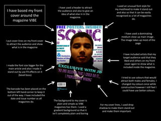
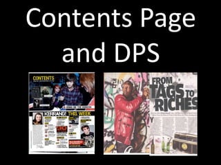
This document summarizes the key elements of the magazine front cover, contents page, and double page spread (DPS) that was created, along with how it represents social groups and its target audience.
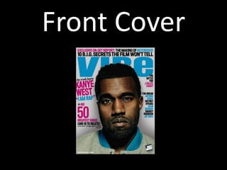
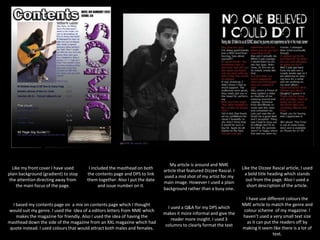
The front cover uses an unusual masthead font, dominant central image, and cover lines/article teasers. The contents page mixes conventions from other magazines and uses color consistently. The DPS features an informal artist interview formatted across three columns.
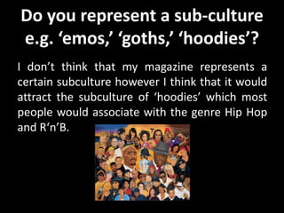
While the magazine does not explicitly represent a subculture like "emos" or "goths", it would appeal most to the "hoodies" subculture interested in hip hop and R&B. It aims to consider issues of gender, age, and ethnicity through inclusive