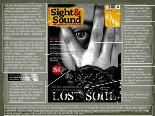
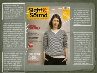
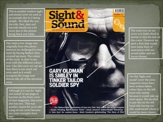
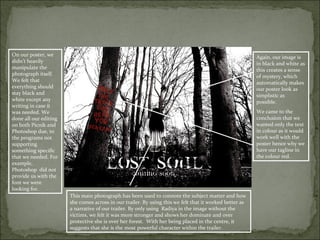
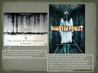
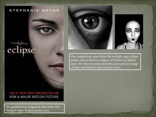
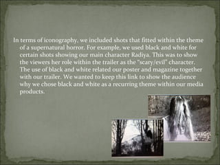
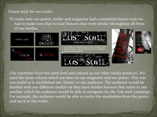
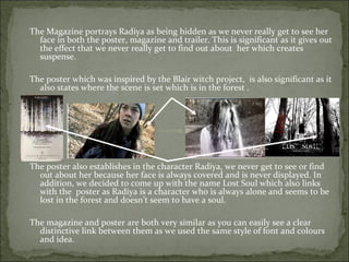
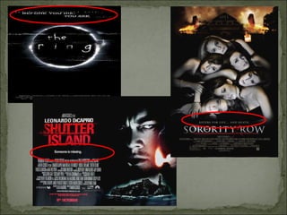
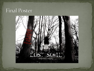
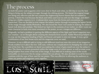
SlideShare a Scribd company logo
1 of 51
BRNC – A2 Media Evaluation
           Lost Soul
1. In what ways does your media
 product use, develop or challenge
 forms and conventions of real
 media products?
We have challenged the typical Sight
and Sound conventions by using a                                                                                     This indicates that it is a
different masthead in comparison to                                                                                  new issue that will be
the typical conventional mastheads                                                                                   coming out soon, visible
used on other magazine covers. This                                                                                  by the barcode and date
masthead shows modernity within the                                                                                  shown.
‘Sight and Sound’ front covers. We
went for one of the modern front cover
labels as it matches with our poster.                                                                               We used a black and
The colour we used was mainly red and                                                                               white image as it stands
black allowing the label to stand out                                                                               out more as it has more
more.                                                                                                               of a horror concept in
                                                                                                                    comparison to bright
For this part of the magazine, we used                                                                              colours. The actor
our own knowledge of the horror film                                                                                connotes mystery which
genre, to our advantage. Kim Newman                                                                                 is presented through the
is a man that Sight and Sound readers                                                                               eye where we have
would recognise. Using typical                                                                                      incorporated a ghostly
language for this magazine cover                                                                                    figure into Radiya’s eyes.
relates to forms and conventions of                                                                                 We got this from the
Sight and Sound. Kim Newman,                                                                                        Twilight saga novel.
accomplished writer of the horror
genre would write for a magazine like
                                                                                                                    Media text usually
this.
                                                                                                                    mentions the main
                                                                                                                    characters in the film. We
                                                                                                                    decided to make it relate to
                                                                                                                    the type of genre our trailer
     A close up was used as the main                                                                                would fit in.
    image for our cover. This is
    dominate on any other cover of
    Sight and Sound; this is common
    depending on the type of film                                                                                   Main title which usually
    and the image that is more                                                                                      has a tag line on some
    suitable for it.                                                                                                covers.


 Our group wanted a modern layout with a typical magazine convention, as we thought this would be best in order to make our magazine
 cover look realistic. When doing this we made sure we did not go against the typical ‘sight and sound’ convention as we felt that this image
 suited the typical ‘sight and sound’ convention that is more likely to be seen.
This modern sight and
 sound cover we can see that
 a simple modern layout has
 been used. This is visible in    We wanted our cover
 the title, font, date and        to be simple but not
 barcode compared to the          too plain we used this
 normal covers we are             as an example as it is
 familiar with.                   very simple. This cover
                                  is a conventional ‘sight
                                  and sound’ due to its
Looking at the colour of the      simplicity.
cover in general we can see
that they are clear to see. We
used similar colours to this
cover and also added the grey
colour in our text the reason
                                  The main difference with
for not wanting to use the
                                  our magazine and this
colour red as much is because
                                  magazine is our image
we felt as a group that it will
                                  being a close up and this
stand out more than our
                                  one being a mid shot of
image. We replaced the colour
                                  someone. The reason for
red with grey so that it would
                                  us wanting to use a close
stay within the colour scheme.
                                  up is because it relates to
                                  our trailer when we get a
                                  close up of Radiya who is
 It is very rare for ‘Sight and   haunting the other
 sound’ to use pugs or            characters. We used the
 banners on the front cover       long shot in our poster
 of their magazine, but on        where she is posing in
 this cover are shown one         the woods where
 that is being used. The          everything takes place.
 reason for us adding a pug
 on our cover is due to it
 making our cover stand
 more.
This is another modern sight
  and sound cover we used as
  an example due to it being
  simple. We liked the way
  the title, font, date and
  barcode stands out a lot
  more due to the picture           The main text on our
  being black and white.            cover is in bold which is
                                    similar to this the text on
                                    this cover. However we
Our main cover image was            used a font that would
originally from this photo          have some form of
however we challenged it even       association with our
more by having Radiya’s face        actual trailer and our
covered up more. The colour         horror theme.
of the cover is clear to see
even with the different colour
text. Like this cover we can see
that there is not much red
texts used as it would
juxtapose the image and            On this ‘Sight and
almost take all of the attention   sound’ cover the extra
away.                              magazine issues have
                                   been written below
  Although it is rare for ‘Sight   rather than on the left
  and sound’ to use pugs or        hand side mainly
  banners on the front cover       because it would take up
  of their magazine, this cover    more space. We decided
  also has one. This was           to put this on the left
  another reason for us to add     hand side having our
  a pug on our cover because       title underneath where it
  our main examples have           would be more clearer.
  one.
On our poster, we                                                                                        Again, our image is
didn’t heavily                                                                                           in black and white as
manipulate the                                                                                           this creates a sense
photograph itself.                                                                                       of mystery, which
We felt that                                                                                             automatically makes
everything should                                                                                        our poster look as
stay black and                                                                                           simplistic as
white except any                                                                                         possible.
writing in case it
was needed. We                                                                                           We came to the
done all our editing                                                                                     conclusion that we
on both Picnik and                                                                                       wanted only the text
Photoshop due, to                                                                                        in colour as it would
the programs not                                                                                         work well with the
supporting                                                                                               poster hence why we
something specific                                                                                       have our tagline in
that we needed. For                                                                                      the colour red.
example,
Photoshop did not
provide us with the
font we were
looking for.
                       This main photograph has been used to connote the subject matter and how
                       she comes across in our trailer. By using this we felt that it worked better as
                       a narrative of our trailer. By only using Radiya in the image without the
                       victims, we felt it was more stronger and shows her dominate and over
                       protective she is over her forest. With her being placed in the centre, it
                       suggests that she is the most powerful character within the trailer.
The idea of our Lost Soul poster came from the
poster of the “Blare Witch Project” with the
lighting and the trees of the poster.            We also used the inspiration of the “Haunted
                                                 Forest” poster with both the position of the
                                                 possessed girl in the centre of the poster and then
                                                 with ours – Radiya is at the centre of the poster.
                                                 Additionally, we were also inspired by the tag line of
                                                 “only the trees can hear you scream” and decided to
                                                 also include that in our poster.
Our inspiration came from the twilight saga eclipse
                                        poster where there is a figure of Edward in Bella’s
                                        eyes. We then incorporated this and used an image
                                        of Jade and faded it into Radiya’s eyes.


We grabbed our magazine idea from The
Twilight Saga: Eclipse book cover.
In our trailer, we were able to develop and challenge the typical forms and conventions of a typical
     horror genre trailer by many factors:
Firstly, we started to research what our target audience was and what story was about. Various
     Youtube clips and previous films inspired the ideas that we eventually came up with in the
     end. For example, we used an idea from the American sitcom Pretty Little Liars. We were
     interested by the storyline from this TV show; a mysterious person stalking a group of friends.
     The Blair Witch Project inspired our style of film making, as a documentary style of a hand-
     held camera was used. It also added to our ideas to base our trailer within a forest, having
     each character shown to be scared within each shot. This fuelled our narrative, as we wanted
     many typical horror elements such as a haunted place, torture, running, revenge etc. We used
     characters which included the vulnerable character, the villain, and the followers. Our
     research in the forms and conventions of horror films helped our knowledge in the creation of
     our teaser trailer.
We also had typical iconography in our trailer through the use of costumes and props i.e. our main
    “villain” was wearing a white dress with bloody stains, connoting that she is wearing the same
    clothes that she was murdered in. We, the four friends wore casual outfits to make our
    audience believe that it was unexpected. Our clothing choices also related to our target
    audience, giving the viewers a sense of empathy for our characters. This is a feature used
    within horror films that have a teenage cast.
Following the conventions of a trailer, we had to mix and change all of
  our shots and put them in the mixed order, therefore not having
  continuity. This was to ensure that the shots did not follow each other
  in the correct order as this would not have been a typical conventional
  trailer. The order in which we put all of our shots also played a big
  part to our trailer. All throughout the trailer the shots are quite fast
  cut/paced, although towards the end of the trailer we decided to
  fasten up the shots in order to build suspense and save the last shot of
  the trailer to the end. With this being done, we are drawing attention
  to the audience who would want to see more of what happened so
  that they could then understand the shots.
In terms of iconography, we included shots that fitted within the theme
   of a supernatural horror. For example, we used black and white for
   certain shots showing our main character Radiya. This was to show
   the viewers her role within the trailer as the “scary/evil” character.
   The use of black and white related our poster and magazine together
   with our trailer. We wanted to keep this link to show the audience
   why we chose black and white as a recurring theme within our media
   products.
In addition, at the end shot of the trailer of Radiya, we added the edit called ‘invert’. We
   found this by playing around with the technology to find different styles which could
   help match some typical conventions of horror. The invert effect is similar to The Blair
   Witch Project poster style; it presents the audience with a ghostly, mystery effect which
   is what our trailer focuses on.
Non-diegetic sound is anything heard but does not naturally belong In the environment.
  We placed a non-diegetic sound in the beginning of the trailer to create a typical creepy
  eerie sound which is usually found in horror films. The non-diegetic sound this helped
  the trailer to flow and build tension and suspense. Added to this, half way through our
  teaser trailer, we added our own whispers to the soundtrack. This was to create an
  additional eerie atmosphere for our shots within the trailer. The whispers related to the
  sense of paranoia for our characters, as if the main “evil” character was saying it herself.
  This was inspired by the recent A Nightmare On Elm Street film trailer, which used
  children’s singing voices as the base of the soundtrack. For that trailer it created a
  creepy atmosphere – something that we were trying to create with the whispers.
Overall, we think our trailer uses the conventions of horror trailers very effectively in order
  to frighten the audience and also adding a suspense filled atmosphere. However we also
  develop these conventions in order to create a modern, found-footage style that will
  appeal to our chosen target audience of the horror film genre.
2. How effective is the
combination of your main
  product and ancillary
         texts?
All three of our media products have the same consistent style and this is mainly demonstrated through
    the use of font and colour, for example we chose the colour theme of red black and white with both
    our poster and magazine but also with the inter-titles of our trailer.

All three products clearly link and show the same style, this was done by showing the same main
    character (Radiya) in our magazine, poster and trailer. The reason for us doing this was so that the
    audience would be able to recognise and familiarise themselves with Radiya so that they could feel
    part of the trailer and personally attached to her as they are seeing different sides, images and traits
    of her.


As a group, we decided how we wanted both our magazine cover to look like, although we didn’t know
   whether we wanted our magazine cover to be an Empire magazine or a Sight & Sound magazine.
   However with the colour scheme, image and storyline we thought that the magazine best suited a
   Sight & Sound magazine.
Our products have the same representative elements for example the black and white background , the
   red coloured font to emphasise any danger or curse and the colour white for the writing. The red is
   used to connote and emphasise on danger, curse and mystery. For example red is used on the poster
   tagline “only the trees can hear you scream” and on the a “curse” on the inter-titles in the trailer.
Our intertitles for our movie trailer
House-style for our trailer
To make sure our poster, trailer and magazine had a consistent house-style we
  had to make sure that we had features that were similar throughout all three
  of our medias.


                                Our poster and magazine both have a consistent font
                                style and colour scheme which help link our different
                                media products together.


Our intertitles have the same font and colours as our other media products. We
used the same colours which are seen on our magazine and our poster. This was
successful as it established our ‘theme’ to our audience. The audience would be
familiar with our different media’s as they have similar features that relate to one
another which the audience would be able to recognise for the ‘lost soul’ campaign.
For example, the audience would be able to notice the similarities from the poster
and see it in the trailer.
All three of our media products have a clear link between them and show that they are all from
    the same film.
There are various links between the products and these include;
   The colours – black and white, red in both the magazine and poster
   The poster is subtle and does not give away too much to the audience, this is similar to the
    magazine as there is not much on display but the front of Radiya’s face. Additionally, this is
    comparable to the trailer as we also see a close up of Radiya’s face/eye at the end
   We used the same main character, mainly to show a link and not to give anything away about
    the film and who is going to be starring in it. This is why we chose to not show Radiya’s full
    face to the audience so they have a suspense feeling about who she may be or what she may
    be about.
   Both the poster and magazine are in black and white with the same lost soul font In white at
    the bottom of the page.
The teaser trailer grabs the audience’s attention and teases them with the
  suspense of the storyline. The trailer shows key shots that puts the story into
  perspective and also uses the three main act structure by first of all laying out
  the premises of the story, in our case by establishing that four friends have a
  day out and enter a forest which they do not know is cursed. Secondly by
  driving the story further, having a dramatic climax, again in our case by
  knowing that the forest is now cursed and now the young girl who died in the
  forest is going to haunt us. Lastly having a visual montage of powerful and
  emotional moments of the film which is where we had a voice over of
  whispers and fast pasted shots of us slowly getting tortured.
The trailer links in with both the magazine and poster as it used the same main
  character and also the use of the black, white and red inter-titles in the trailer
  gives the same atmosphere as the other two products, all three always linking
  back to Radiya.
The use of black and white in the poster and magazine was also done to create a
  misty eerie atmosphere.
The Magazine portrays Radiya as being hidden as we never really get to see her
  face in both the poster, magazine and trailer. This is significant as it gives out
  the effect that we never really get to find out about her which creates
  suspense.

The poster which was inspired by the Blair witch project, is also significant as it
  also states where the scene is set which is in the forest .


The poster also establishes in the character Radiya, we never get to see or find
  out about her because her face is always covered and is never displayed. In
  addition, we decided to come up with the name Lost Soul which also links
  with the poster as Radiya is a character who is always alone and seems to be
  lost in the forest and doesn’t seem to have a soul.

The magazine and poster are both very similar as you can easily see a clear
  distinctive link between them as we used the same style of font and colours
  and idea.
3. What have you learned from your audience
  feedback?
Trailer Feedback
For our audience feedback we got some sixth form students to view our
  trailer, they were between the ages between 16-18 and also to the
  media department teachers.
The reason that we selected this specific sample group is because they
  are our main target audience. Horror films are specifically for
  teenagers and young adults.
For this reason we thought it would be more suitable to get feedback
  from these specific types of audiences that match our real target
  audiences, as they are the audiences we are trying to attract. The
  reason for picking media and film teachers to give us feedback on our
  trailer is because we see them as having a level of critical perspective
  where they would be able to judge our trailer the way the judges
  would.
We also went the extra mile to select both male and females to watch
  the trailer it would be biased if we got one type of audience.
Trailer Feedback Cont..
 The trailer was thought out really well, although it
  had some confusion in the beginning but made sense
  after. Charlie – 16
 The trailer wasn’t really my style but I think it was
  alright. However, I personally wouldn’t go and watch
  the film if it came out. – Mr Lall
Poster Feedback
For our poster feedback we got a few sixth former students to take a look
  at our poster. The ages of the students were between the ages 16-18
  and also to the media department teachers.
The reason that we selected this specific sample group is because they
  are our main target audience. Horror films are specifically for
  teenagers and young adults.
For this reason we thought it would be more suitable to get feedback
  from these specific types of audiences that match our real target
  audiences, as they are the audiences we are trying to attract. The
  reason for picking media and film teachers to give us feedback on our
  poster is because we see them as having a level of critical perspective
  where they would be able to judge our trailer the way the judges
  would.
We also went the extra mile to select both male and females to watch
  the trailer it would be biased if we got one type of audience.
Poster Feedback Cont..
I think the image on the poster is very strong and the
   effects used matched really well with film type and
   the black and white effects made the image look even
   better in my opinion. – Crystal 18

I really liked the poster as it has a very strong sense of
   eeriness when looking at it. You can tell that the
   group has worked so well to make sure there is a link
   with the poster and trailer. – Mrs Farnsworth
Magazine Feedback
For our magazine feedback we got some sixth form students to take a
  look at our magazine, they were between the ages between 16-18 and
  also to the media department teachers.
The reason that we selected this specific sample group is because they
  are our main target audience. Horror films are specifically for
  teenagers and young adults.
For this reason we thought it would be more suitable to get feedback
  from these specific types of audiences that match our real target
  audiences, as they are the audiences we are trying to attract. The
  reason for picking media and film teachers to give us feedback on our
  trailer is because we see them as having a level of critical perspective
  where they would be able to judge our trailer the way the judges
  would.
We also went the extra mile to select both male and females to look at
  our magazine as it would be biased if we got one type of audience.
Magazine Feedback Cont..
 I really liked the magazine, I thought it followed all
  the forms and conventions of a typical horror
  magazine. The black and white effects also worked
  very well for me: Laura – 16
 I think the image on the poster is very strong and the
  effects used matched really well with film type and
  the black and white effects made the image look even
  better in my opinion: Adam – 18
1. Would you class our trailer as a horror?
2. Did you enjoy the trailer?
3. Do you believe that we portrayed our story line
   correctly?
4. What would you rate it on a scale of 1-10. (1 being bad
   10)
5. Was it easy to identify the characters and their roles?
6. What age would you classify this film?
7. Would you see this film in the cinema?
8. Do you think our trailer, poster and magazine all had
   an effective correlation with each other?
We handed our questionnaire to ten students around the age of sixteen to
 eighteen who fit in our target audience range. After analysing the results we
 found that our target audience was precise as they said they would watch it
 when released.


3. 9 out of 10 students said they would class the film as a horror.
4. 8 out of 10 students said they enjoyed the trailer.
5. 8 out of 10 students said our storyline was plotted correctly.
6. 9 out of 10 students rated our trailer on a scale between seven and nine.
7. 7 out of 10 students said it was fairly easy to identify the characters according
  to their roles.
8. Most of them had answered that they would classify the film at a 12A or 15.
9. 10 out of 10 students answered ‘Yes’, to seeing the film in the cinema
10. 8 out of 10 students said that the poster, magazine and trailer linked very well.
 “The storyline was typical of a teen horror but it felt like I
    could relate to it”. – Sandra 17
   “It felt like it didn’t make sense but the ending made it
    easier to understand as it was building up tension”. –
    Nathan - 18
   “I really liked the fast pace idea, especially at the end but I
    felt that the film wouldn’t be as interesting when watching
    it if it didn’t have the montage”. – Bridget 16
   “I really liked the trailer, I think the lighting, colour and
    music all worked well together”. – Jack 17
   “ I liked the trailer, but I think the trailer would have been
    better if all of it was in black and white”. – Laura 18
Analysis of feedback
 From the understanding of our feedback we
  understood that there was some form of confusion in
  the opening shot of our trailer where Radiya was
  watching the four girls in the forest. Overall, the rest
  of the feedback we received on the trailer, magazine
  and poster was positive as our audience said that
  there were strong correlation with either our
  magazine or poster with our trailer.
 In light of our feedback we would change the opening
  part of our trailer where it caused a lot of confusion to
  our audiences. However, there is nothing else we
  would change in our trailer, magazine or poster.
4. How did you use media technologies in the
  construction and research, planning and
  evaluation stages?
Before we began to create our ideas for our final piece we had to research into the
    horror genre and look at different trailers and posters. When beginning our research
    we viewed the school’s blog (www.warrencomprehensivemedia.blogspot.com) and
    looked at previous work to give us ideas and to make sure we knew what to do and
    what not to do. We mainly used the internet to research different horror trailers
    through Google and YouTube. On YouTube we were able to pause and write notes to
    what was conventional of a typical horror teaser trailer. It was easier for us to Google
    search for poster ideas. We found different ideas of many ‘teen’ style horrors which
    helped us decide on our final poster. Although, whilst researching we had to make sure
    we noted down typical conventions of a trailer so don’t end up making an opening. We
    noticed that the full theatrical trailers and teaser trailers were different to each other so
    we concluded on how to layout our trailer and mark it out to make sure it looked like a
    teaser trailer. Researching posters and magazine covers on the internet and through
    browsing magazines enabled us to see a different variety of styles which would help us
    create our own idea for both media’s.

.
Research cont…
  By using the website www.comingsoon.net we saw the full campaign for a particular movie
  which helped us to create a ‘house-style’ for our movie so it the poster, magazine cover and
  trailer related to one another. We watched some horror movies such as Blair Witch Project
  which influenced our final idea for our teaser trailer. YouTube was helpful as we were
  offered with both full theatrical trailers and teaser trailers but we found comingsoon.net far
  more useful as it offered us the full campaign so we could see how the media platforms
  would relate. We watched teaser trailers for films such as ‘insidious’. ‘paranormal activity
  3’, ‘sorority row’, ‘the grudge 2’ and many more. By watching these trailers we knew what
  our trailer had to contain such as inter titles, jumps, non-diagetic sounds and so on. This
  further additional research helped us because it allowed us to correctly follow the typical
  forms and conventions to a horror trailer. We noticed that the posters related to the trailer
  through the style of fonts, colours and characters. It was consistent in all three different
  media’s so we knew we had to create our house style so our trailer, poster and magazine
  cover related
To plan for our teaser trailer we needed a basic idea. After the in depth research
  on the internet and using other resources we had our idea created. By typing
  in keywords into Google it helped us see a variety of trailers, posters and
  magazines. We used ‘YouTube’ to analyse trailers and write notes and paused
  the videos in order to plan our trailer whilst using conventions. We used the
  school’s intranet for posters to analyse and then looked at previous trailers
  and analysed what we typical conventions we could use in ours. We kept
  updating our blogger throughout our editing stage and made sure we followed
  our original plan.

When planning, the internet helped us gain a clearer understanding in what had
 to be achieved in order for our trailer to be a teaser rather than a theatrical
 trailer. By watching these trailers online using YouTube we were able to
 understand what was essential to help create our trailer. This helped us before
 we could begin constructing our trailer as we were able to understand the key
 elements to a teaser trailer. Before we could initially start the planning we
 used comingsoon.net to help us give ideas which would help contribute to our
 piece. After analysing a few campaigns of different horror movies from the
 website we were able to begin to plan our trailer effectively due to our
 knowledge on horror teaser trailers.
To construct our trailer we used the software Adobe Premiere 6.5 to edit and create
  our teaser trailer. When using the software it was fairly easy as we had previously
  used it in our A/S task. We noticed that it was more difficult than expected as we
  couldn’t put our shots into sequence and had to put them in different places
  which helped create the ‘suspense’ and make the audience intrigued enough to
  watch the full movie. When editing we noticed that some shots were difficult and
  couldn’t be used as the sound wasn’t clear enough as we faced difficulties with
  wind. It was mostly during the voice over section where we fixed the problem by
  placing a soundtrack over the top and quietening the main sound by playing
  around with the volume levels. Another issue was that we un-bonded the video
  from the sound because we used different shots with sound from other clips. At
  first this was wasn’t a problem but further in the editing stage it became difficult if
  we needed to insert more clips and move the current ones on the timeline.
In a/s we never experimented much on the software so we was unaware how to deal with the
    problem when our sound was distorted from the original clip. However, during this process
    we became familiar and improved on our editing skills which helped finish our teaser trailer.
    Toward the end of the trailer we also selected a sound clip of a scream from another shot and
    reversed it and sped it up to lead to our ‘jump’ finale. This was different for us as we used the
    software and took full advantage of what it offers to help our final product. Our trailer begins
    with the opening shot of the four friends in the forest which then leads on to many other
    shots with intertitles in between telling the story. There are voiceovers used, black and white
    shots and then a montage sequence leading you to the jump finale. In order for our trailer to
    make sense we had to follow our plan and know what shots needed to be placed where in the
    trailer. Many of our shots weren’t filmed in order so it took a long process to carefully select
    the correct shots and place them in the correct sequence order. We then had to cut certain
    shots for Radiya’s sequence when the voice over occurs was cut from longer shots and then
    edited black and white. For the montage, we cut and sped many of the shots to give the
    audience the intensity they were facing.
During our teaser trailer we wanted to create a typical horror suspense at the end of
  the trailer. For us to create this we inserted our clip and then searched and
  experimented with the effects on the software. We tried many different effects but
  found the ‘invert’ effect. In order to create our flickered inverted clip we placed
  two inverts onto the clip and then changed the levels and when the invert would
  play on top of the original clip. The scene of the eye, flickers from the effect back
  to the original which is what we wanted our final finish to be. This is something
  we learned during making our teaser trailer as we never experimented during A/S.
  We used different techniques such as increasing the speed on our shots such as
  the fast paced montage to increase the tension and then the running sequences.
  We then used the ‘fade’ edit on some of our longer shots such as the girls in the
  forest and then the sequence of Radiya scratching the names into the trees.
During our sequence of Radiya scratching the names into the forest we used a black
  and white effect on the shots. We did this because it was consistent throughout
  our other media’s that whenever the main character was visible she was black and
  white. For example, the magazine cover she is in the black and white effect just
  like on the poster. During the build up in our trailer, we used multiple shots to
  create our montage. During the montage we placed our inter-titles which helped
  explain the story better. For the montage we selected clips that were significant to
  use and un-bonded the video from the sound then deleted the sound that wasn’t
  needed. After placing specific shots of all the characters ‘attacks’ for the montage
  we tidied it up and sped some clips up to help create the finish. For the sound to
  match we repeated the section of whispers and chanting we recorded. Although
  there is wind which was originally a problem we fixed it by lowering the levels in
  the correct places. After we added echo and reverb onto our sound that was placed
  during our montage. We used this to add more of a typical horror convention of
  whispers into our trailer to give the sound the final finish to the section.
In the production work of our poster and magazine, we used 2 different types of editing software;
    Adobe Photoshop and the editing website ‘Picnik’. Both editing programmes allowed us to use
    various kinds of editing techniques, which helped our poster and magazine link to our theme of
    trailer. To take the set of images, a digital SLR camera was used to capture the best possibilities of
    what was seen on set. Certain editing techniques worked better when using Adobe Photoshop, as
    we felt it allowed us to have more control over the lighting levels within the images. This linked us
    back to the Horror theme our trailer, which gave us the ideas in changing certain elements of each
    photo. Choosing Photoshop was the best software to use for our images because we had more
    options when making the image look ‘spooky’ in the emphasis on black and white. For example,
    using the ‘burn’ tool for adding depth and texture in our magazine image – or boosting the lighting
    of our poster to make it seem almost abstract.

We wanted to create a mysterious/frightening image for both our poster and magazine, but also
  thought that using two different types of images would help us keep our campaign connected,
  without using a repetitive style of photograph for each. On the other hand ‘Picnik’ allowed us to put
  the structure of our two medias together easily, when it came to adding elements such as text and
  pugs. This was an early problem that occurred, since we first decided to use Photoshop to create the
  layout of our magazine, and adding text to the poster. We found that Photoshop had limited
  resources of font styles, as we wanted something to relate more to the Horror/supernatural theme
  we were trying to portray throughout our campaign. Therefore ‘Picnik’ was a lot more straight
  forward in adding text and other elements to both our magazine and poster. We were much more
  familiar with ‘Picnik’, as we have used this website within our other media related subjects.
  Nevertheless, Photoshop helped us greatly in selecting certain things from another ‘Sight and Sound’
  magazine, and merging it onto our own. For example, the magazine title. Thus, both websites helped
  us in the construction of both our poster and magazine in different ways. They were both useful and
  effective in getting the creative end result we wanted.
These are the selection of photographs that were taken on the set of filming our trailer. We took the images
in landscape so we could fill up the frame with the surroundings that worked well with the subject. The
selected photograph is one that we collectively decided was the most visually appealing. The digital SLR
camera that was used had a built in ‘film grain’ effect on the camera. This was used to capture the image,
which lessened the time it would take to edit the image using any kind of software.
In the editing process of our poster, we added very little to the original image, as
    most of what was the important aspects of the image, were taken in the
    camera. Through Adobe Photoshop, the levels were changed to make the
    black and white effect stand out more potent than the original. The shadows
    and dark areas were highlighted better after this effect was added. This creates
    a mysterious and spooky look to the poster, displaying to the audience what
    kind of genre our trailer lies in.
We used Picnik to choose what style of text suited our trailer and poster. The
  website had a wide range of font styles that may be used in horror films today.
  We faced problems regarding what type of font we wanted to use for our
  poster. This was because we knew that once we had picked a certain font style,
  it would be used consistently. We wanted something modern, but something
  that could relate to the forms and conventions of horror films. The font
  chosen was called ‘all used up’; it had a ghostly effect when added to our
  poster image.
We chose the colour white for our poster title because it matched the colour tone
  that was presented in the image. It blended in with the background, but also
  the composition of the title made it easy for the viewer to read, compared to if
  it was positioned at the top.
In the process of choosing a catchy tag line
for our poster, we wanted to grab the
attention of our audience. This was because
in our previous research, we found that a
tagline has the affect of sticking in the viewers
mind. As this is a poster for a horror film, the
tagline has a purpose to scare the audience; it
was important to embrace this within our
poster.
We faced problems in deciding on colour and
style of font for our tagline. Also, there was a
debate on where the tagline should be placed
within the frame. In the end we decided on
placing the tag line onto the tree, to make it
seem as if it had been ‘etched in’ the tree
itself. We spent time creating this look, as we
wanted it to be authentic. In our trailer, there
was a sequence of shots that related to this:
the possessed girl writing the names of her
victims on trees. This gave a great link
between the trailer and our promotional
poster for our audience.
The editing website Picnik helped in the final
decision of choosing the colour red and the
style of font. Red contrasted with the white,
which was used for our poster title. It also
helped with connoting blood and danger
through to the viewer.
Here are the series of images that were taken on set of filming our trailer. Keeping in mind that
magazine cover’s are in portrait, each photograph reflects the aim in trying to make the same effect as
the poster has on the viewer. However, we thought that the background and positioning of the subject
was too easily related to the poster. In our research, we found that the covers of Sight and Sound
magazines are usually almost similar to the poster of film, but not the exact copy. This is why we used
the digital SLR camera to capture a different twist of our main character of our trailer.
•   As both the poster and magazine cover were shot in black and white, we felt that it was the best
    thing to bring out the subject stronger through the editing process. We found the original image
    not being very effective and did not connote the frightening/horror theme that we wanted to
    portray. I think this was because the black and white used was too soft over the image, and didn’t
    bring out a hidden mystery to it - it almost drew away from the forms and conventions we
    researched. Thus we decided to over expose the subject matter through increasing the lighter levels
    of the image through Adobe Photoshop. We also found the ‘burn’ tool useful in making the subject’s
    hands look dirty and unclean. This linked her back to the contents of our trailer; we didn’t want our
    main character to look even more unrelated to the poster, as our 2 images are different.
•   Originally, we had a problem in getting the different aspects of the Sight and Sound magazine onto
    our creation – as we thought about creating the elements from scratch. Adobe Photoshop helped us
    to crop out the magazine heading of Sight and Sound, and paste it onto our image. It was a great
    combination of our font house style and the magazine cover we used.
•   However, it was a difficult task in trying to add different sized text onto the cover of our magazine.
    Picnik enabled us to place the text with ease, without any complications in changing the colour and
    size of the font. But a problem we faced was making the colour of grey stand out over the subject’s
    face. The theme of colours presented within the image were of a dark nature, as well as some areas
    being brighter than some of the rest of the image. It was difficult in making some of the words
    noticeable; we overcome this by using 2 colours for one phrase. We also decided it would be best to
    continue with the type of font used for our poster. This was effective in allowing the audience to
    relate our poster and magazine cover together.
At the evaluation stage, ‘Microsoft Powerpoint’ is essential to us
in creating this presentation. It helped us to logically order the
information that we needed to show via the slides.


                                                   In order to
understand how we could improve next time we used the
internet to get feedback. By placing our trailer on social
networking sites such as Facebook, Twitter and YouTube we was
able to get a few responses and critical comments on our trailer.
By using these different media’s it enabled to take advantage of

More Related Content

What's hot

Media Evaluation
Media EvaluationMedia Evaluation
Media Evaluationrebeccatp45
 
Mock up and research changed
Mock up and research changedMock up and research changed
Mock up and research changedChezInspireMe
 
Film magazines annotations1
 Film magazines annotations1 Film magazines annotations1
Film magazines annotations1Lily_Taitia
 
Analysis powerpoint
Analysis powerpointAnalysis powerpoint
Analysis powerpointSam_jp
 
Existing Product Analysis
Existing Product AnalysisExisting Product Analysis
Existing Product Analysistamsinrwg
 
Annotations of my magazine showing conventions
Annotations of my magazine showing conventions Annotations of my magazine showing conventions
Annotations of my magazine showing conventions teague8200
 
Magazine double page spread analysis
Magazine double page spread analysisMagazine double page spread analysis
Magazine double page spread analysismattmosey1
 
Evaluation question 1
Evaluation question 1Evaluation question 1
Evaluation question 1AlexBegley
 
Research pt. 1
Research pt. 1Research pt. 1
Research pt. 1958212
 
Evaluation - Real Magazine Annotations of Conventions
Evaluation - Real Magazine Annotations of Conventions Evaluation - Real Magazine Annotations of Conventions
Evaluation - Real Magazine Annotations of Conventions teague8200
 
Analysis of nme
Analysis of nmeAnalysis of nme
Analysis of nmeasmediaf12
 
Analysis of nme
Analysis of nmeAnalysis of nme
Analysis of nmeasmediaf12
 
Analysis of nme
Analysis of nmeAnalysis of nme
Analysis of nmeasmediaf12
 
Analysing magazine front covers film 7
Analysing magazine front covers   film 7Analysing magazine front covers   film 7
Analysing magazine front covers film 7ShannenLeader
 
Music magazine analysiss
Music magazine analysissMusic magazine analysiss
Music magazine analysissreece1213
 
Pulse evaluation completed 27032013
Pulse evaluation completed 27032013Pulse evaluation completed 27032013
Pulse evaluation completed 27032013Danielleannenberg
 

What's hot (20)

Media Evaluation
Media EvaluationMedia Evaluation
Media Evaluation
 
Mock up and research changed
Mock up and research changedMock up and research changed
Mock up and research changed
 
Film magazines annotations1
 Film magazines annotations1 Film magazines annotations1
Film magazines annotations1
 
Analysis powerpoint
Analysis powerpointAnalysis powerpoint
Analysis powerpoint
 
Existing Product Analysis
Existing Product AnalysisExisting Product Analysis
Existing Product Analysis
 
Annotations of my magazine showing conventions
Annotations of my magazine showing conventions Annotations of my magazine showing conventions
Annotations of my magazine showing conventions
 
Evaluation part1
Evaluation part1Evaluation part1
Evaluation part1
 
Question 5
Question 5Question 5
Question 5
 
Magazine double page spread analysis
Magazine double page spread analysisMagazine double page spread analysis
Magazine double page spread analysis
 
DPS deconstruction
DPS deconstructionDPS deconstruction
DPS deconstruction
 
Evaluation question 1
Evaluation question 1Evaluation question 1
Evaluation question 1
 
Research pt. 1
Research pt. 1Research pt. 1
Research pt. 1
 
Evaluation - Real Magazine Annotations of Conventions
Evaluation - Real Magazine Annotations of Conventions Evaluation - Real Magazine Annotations of Conventions
Evaluation - Real Magazine Annotations of Conventions
 
Week 12
Week 12Week 12
Week 12
 
Analysis of nme
Analysis of nmeAnalysis of nme
Analysis of nme
 
Analysis of nme
Analysis of nmeAnalysis of nme
Analysis of nme
 
Analysis of nme
Analysis of nmeAnalysis of nme
Analysis of nme
 
Analysing magazine front covers film 7
Analysing magazine front covers   film 7Analysing magazine front covers   film 7
Analysing magazine front covers film 7
 
Music magazine analysiss
Music magazine analysissMusic magazine analysiss
Music magazine analysiss
 
Pulse evaluation completed 27032013
Pulse evaluation completed 27032013Pulse evaluation completed 27032013
Pulse evaluation completed 27032013
 

Viewers also liked

3a Maths in jobs for Italy meeting
3a Maths in jobs for Italy meeting3a Maths in jobs for Italy meeting
3a Maths in jobs for Italy meetingHolasová Alena
 
1 Move Week 4 October 2014
1 Move Week 4 October 20141 Move Week 4 October 2014
1 Move Week 4 October 2014Holasová Alena
 
Improving the Quality and Efficiency of Public Higher Education: Computer Sci...
Improving the Quality and Efficiency of Public Higher Education: Computer Sci...Improving the Quality and Efficiency of Public Higher Education: Computer Sci...
Improving the Quality and Efficiency of Public Higher Education: Computer Sci...Gihan Wikramanayake
 
Calendário Eleitoral 2016
Calendário Eleitoral 2016Calendário Eleitoral 2016
Calendário Eleitoral 2016Paulo Veras
 
Trigger Credential 2010 Ch
Trigger Credential 2010 ChTrigger Credential 2010 Ch
Trigger Credential 2010 Chtilo_liang
 
Trigger Credential 2010 Ch
Trigger Credential 2010 ChTrigger Credential 2010 Ch
Trigger Credential 2010 Chtilo_liang
 
Recursos Ténicos y expresivos ejemplos
Recursos Ténicos y expresivos ejemplosRecursos Ténicos y expresivos ejemplos
Recursos Ténicos y expresivos ejemplosGrupo Catorce
 
Pesquisa CNM Carnaval 2016
Pesquisa CNM Carnaval 2016Pesquisa CNM Carnaval 2016
Pesquisa CNM Carnaval 2016Paulo Veras
 
Programa de governo - Priscila Krause 2016
Programa de governo - Priscila Krause 2016Programa de governo - Priscila Krause 2016
Programa de governo - Priscila Krause 2016Paulo Veras
 

Viewers also liked (16)

3a Maths in jobs for Italy meeting
3a Maths in jobs for Italy meeting3a Maths in jobs for Italy meeting
3a Maths in jobs for Italy meeting
 
1 Move Week 4 October 2014
1 Move Week 4 October 20141 Move Week 4 October 2014
1 Move Week 4 October 2014
 
A Common Wealth: Building Gulf-CIS ties
A Common Wealth: Building Gulf-CIS tiesA Common Wealth: Building Gulf-CIS ties
A Common Wealth: Building Gulf-CIS ties
 
Anexo IV y V
Anexo IV y VAnexo IV y V
Anexo IV y V
 
Improving the Quality and Efficiency of Public Higher Education: Computer Sci...
Improving the Quality and Efficiency of Public Higher Education: Computer Sci...Improving the Quality and Efficiency of Public Higher Education: Computer Sci...
Improving the Quality and Efficiency of Public Higher Education: Computer Sci...
 
Character Analysis
Character AnalysisCharacter Analysis
Character Analysis
 
Bright ideas, good jobs
Bright ideas, good jobsBright ideas, good jobs
Bright ideas, good jobs
 
Marca (1)
Marca (1)Marca (1)
Marca (1)
 
Calendário Eleitoral 2016
Calendário Eleitoral 2016Calendário Eleitoral 2016
Calendário Eleitoral 2016
 
Trigger Credential 2010 Ch
Trigger Credential 2010 ChTrigger Credential 2010 Ch
Trigger Credential 2010 Ch
 
Trigger Credential 2010 Ch
Trigger Credential 2010 ChTrigger Credential 2010 Ch
Trigger Credential 2010 Ch
 
04 campaña via publica
04 campaña via publica04 campaña via publica
04 campaña via publica
 
Recursos Ténicos y expresivos ejemplos
Recursos Ténicos y expresivos ejemplosRecursos Ténicos y expresivos ejemplos
Recursos Ténicos y expresivos ejemplos
 
Pesquisa CNM Carnaval 2016
Pesquisa CNM Carnaval 2016Pesquisa CNM Carnaval 2016
Pesquisa CNM Carnaval 2016
 
Programa de governo - Priscila Krause 2016
Programa de governo - Priscila Krause 2016Programa de governo - Priscila Krause 2016
Programa de governo - Priscila Krause 2016
 
Glucose
GlucoseGlucose
Glucose
 

Similar to BRNC Evaluation

Evaluaion question 2
Evaluaion question 2 Evaluaion question 2
Evaluaion question 2 evekingston
 
Evaluation question 2
Evaluation question 2Evaluation question 2
Evaluation question 2MaxTuson
 
Magazine anaylisis almost done
Magazine anaylisis almost doneMagazine anaylisis almost done
Magazine anaylisis almost doneravensinnott
 
Evaluation question 2
Evaluation question 2Evaluation question 2
Evaluation question 2MaxTuson
 
Collaga medaiii[1]
Collaga medaiii[1]Collaga medaiii[1]
Collaga medaiii[1]tono247
 
Evaluation Question 1
Evaluation Question 1 Evaluation Question 1
Evaluation Question 1 Molly Lyon
 
Evaluation question 2
Evaluation question 2Evaluation question 2
Evaluation question 2MaxTuson
 
Task 1 media evalution
Task 1 media evalutionTask 1 media evalution
Task 1 media evalutionMegan Harding
 
Task 1 media evalution
Task 1 media evalutionTask 1 media evalution
Task 1 media evalutionMegan Harding
 
Evaluation 1
Evaluation 1 Evaluation 1
Evaluation 1 euddin1
 
Research into film magazine front covers
Research into film magazine front coversResearch into film magazine front covers
Research into film magazine front coversRachell_94
 
Evaluation - Question One
Evaluation - Question OneEvaluation - Question One
Evaluation - Question OneMatthew Lakey
 
EVALUATION Q'S 1
EVALUATION Q'S 1EVALUATION Q'S 1
EVALUATION Q'S 1KerryMosh
 
Music magazine cover and contents analysis
Music magazine cover and contents analysisMusic magazine cover and contents analysis
Music magazine cover and contents analysiskimberleysarahsmart
 
Media evaluation q1 updated
Media evaluation   q1 updatedMedia evaluation   q1 updated
Media evaluation q1 updatedMM161195
 
Evaluation of my media productfin
Evaluation of my media productfinEvaluation of my media productfin
Evaluation of my media productfinOS1793
 

Similar to BRNC Evaluation (20)

C&T Evaluation
C&T EvaluationC&T Evaluation
C&T Evaluation
 
Week 12
Week 12Week 12
Week 12
 
Evaluaion question 2
Evaluaion question 2 Evaluaion question 2
Evaluaion question 2
 
Evaluation question 2
Evaluation question 2Evaluation question 2
Evaluation question 2
 
Magazine anaylisis almost done
Magazine anaylisis almost doneMagazine anaylisis almost done
Magazine anaylisis almost done
 
Evaluation question 2
Evaluation question 2Evaluation question 2
Evaluation question 2
 
Collaga medaiii[1]
Collaga medaiii[1]Collaga medaiii[1]
Collaga medaiii[1]
 
Evaluation Question 1
Evaluation Question 1 Evaluation Question 1
Evaluation Question 1
 
Evaluation question 2
Evaluation question 2Evaluation question 2
Evaluation question 2
 
Task 1 media evalution
Task 1 media evalutionTask 1 media evalution
Task 1 media evalution
 
Task 1 media evalution
Task 1 media evalutionTask 1 media evalution
Task 1 media evalution
 
Evaluation 1
Evaluation 1 Evaluation 1
Evaluation 1
 
Research into film magazine front covers
Research into film magazine front coversResearch into film magazine front covers
Research into film magazine front covers
 
Evaluation - Question One
Evaluation - Question OneEvaluation - Question One
Evaluation - Question One
 
EVALUATION Q'S 1
EVALUATION Q'S 1EVALUATION Q'S 1
EVALUATION Q'S 1
 
EVALUATION
EVALUATIONEVALUATION
EVALUATION
 
Music magazine cover and contents analysis
Music magazine cover and contents analysisMusic magazine cover and contents analysis
Music magazine cover and contents analysis
 
Media evaluation q1 updated
Media evaluation   q1 updatedMedia evaluation   q1 updated
Media evaluation q1 updated
 
Evaluation of my media productfin
Evaluation of my media productfinEvaluation of my media productfin
Evaluation of my media productfin
 
Evaluation 2
Evaluation 2Evaluation 2
Evaluation 2
 

More from Warren School (11)

question 1
question 1question 1
question 1
 
work question 1
work question 1work question 1
work question 1
 
Question 3
Question 3Question 3
Question 3
 
Question 4
Question 4Question 4
Question 4
 
SHD Evaluation
SHD EvaluationSHD Evaluation
SHD Evaluation
 
SEAR Evaluation
SEAR EvaluationSEAR Evaluation
SEAR Evaluation
 
CDJ Evaluation
CDJ EvaluationCDJ Evaluation
CDJ Evaluation
 
JASL Evaluation
JASL EvaluationJASL Evaluation
JASL Evaluation
 
JZ Evaluation
JZ EvaluationJZ Evaluation
JZ Evaluation
 
BBLK Evaluation
BBLK EvaluationBBLK Evaluation
BBLK Evaluation
 
CRAR Evaluation
CRAR EvaluationCRAR Evaluation
CRAR Evaluation
 

Recently uploaded

Presiding Officer Training module 2024 lok sabha elections
Presiding Officer Training module 2024 lok sabha electionsPresiding Officer Training module 2024 lok sabha elections
Presiding Officer Training module 2024 lok sabha electionsanshu789521
 
Separation of Lanthanides/ Lanthanides and Actinides
Separation of Lanthanides/ Lanthanides and ActinidesSeparation of Lanthanides/ Lanthanides and Actinides
Separation of Lanthanides/ Lanthanides and ActinidesFatimaKhan178732
 
Science 7 - LAND and SEA BREEZE and its Characteristics
Science 7 - LAND and SEA BREEZE and its CharacteristicsScience 7 - LAND and SEA BREEZE and its Characteristics
Science 7 - LAND and SEA BREEZE and its CharacteristicsKarinaGenton
 
Presentation by Andreas Schleicher Tackling the School Absenteeism Crisis 30 ...
Presentation by Andreas Schleicher Tackling the School Absenteeism Crisis 30 ...Presentation by Andreas Schleicher Tackling the School Absenteeism Crisis 30 ...
Presentation by Andreas Schleicher Tackling the School Absenteeism Crisis 30 ...EduSkills OECD
 
call girls in Kamla Market (DELHI) 🔝 >༒9953330565🔝 genuine Escort Service 🔝✔️✔️
call girls in Kamla Market (DELHI) 🔝 >༒9953330565🔝 genuine Escort Service 🔝✔️✔️call girls in Kamla Market (DELHI) 🔝 >༒9953330565🔝 genuine Escort Service 🔝✔️✔️
call girls in Kamla Market (DELHI) 🔝 >༒9953330565🔝 genuine Escort Service 🔝✔️✔️9953056974 Low Rate Call Girls In Saket, Delhi NCR
 
KSHARA STURA .pptx---KSHARA KARMA THERAPY (CAUSTIC THERAPY)————IMP.OF KSHARA ...
KSHARA STURA .pptx---KSHARA KARMA THERAPY (CAUSTIC THERAPY)————IMP.OF KSHARA ...KSHARA STURA .pptx---KSHARA KARMA THERAPY (CAUSTIC THERAPY)————IMP.OF KSHARA ...
KSHARA STURA .pptx---KSHARA KARMA THERAPY (CAUSTIC THERAPY)————IMP.OF KSHARA ...M56BOOKSTORE PRODUCT/SERVICE
 
Class 11 Legal Studies Ch-1 Concept of State .pdf
Class 11 Legal Studies Ch-1 Concept of State .pdfClass 11 Legal Studies Ch-1 Concept of State .pdf
Class 11 Legal Studies Ch-1 Concept of State .pdfakmcokerachita
 
BASLIQ CURRENT LOOKBOOK LOOKBOOK(1) (1).pdf
BASLIQ CURRENT LOOKBOOK  LOOKBOOK(1) (1).pdfBASLIQ CURRENT LOOKBOOK  LOOKBOOK(1) (1).pdf
BASLIQ CURRENT LOOKBOOK LOOKBOOK(1) (1).pdfSoniaTolstoy
 
Call Girls in Dwarka Mor Delhi Contact Us 9654467111
Call Girls in Dwarka Mor Delhi Contact Us 9654467111Call Girls in Dwarka Mor Delhi Contact Us 9654467111
Call Girls in Dwarka Mor Delhi Contact Us 9654467111Sapana Sha
 
The basics of sentences session 2pptx copy.pptx
The basics of sentences session 2pptx copy.pptxThe basics of sentences session 2pptx copy.pptx
The basics of sentences session 2pptx copy.pptxheathfieldcps1
 
MENTAL STATUS EXAMINATION format.docx
MENTAL     STATUS EXAMINATION format.docxMENTAL     STATUS EXAMINATION format.docx
MENTAL STATUS EXAMINATION format.docxPoojaSen20
 
Accessible design: Minimum effort, maximum impact
Accessible design: Minimum effort, maximum impactAccessible design: Minimum effort, maximum impact
Accessible design: Minimum effort, maximum impactdawncurless
 
Employee wellbeing at the workplace.pptx
Employee wellbeing at the workplace.pptxEmployee wellbeing at the workplace.pptx
Employee wellbeing at the workplace.pptxNirmalaLoungPoorunde1
 
Incoming and Outgoing Shipments in 1 STEP Using Odoo 17
Incoming and Outgoing Shipments in 1 STEP Using Odoo 17Incoming and Outgoing Shipments in 1 STEP Using Odoo 17
Incoming and Outgoing Shipments in 1 STEP Using Odoo 17Celine George
 
ECONOMIC CONTEXT - LONG FORM TV DRAMA - PPT
ECONOMIC CONTEXT - LONG FORM TV DRAMA - PPTECONOMIC CONTEXT - LONG FORM TV DRAMA - PPT
ECONOMIC CONTEXT - LONG FORM TV DRAMA - PPTiammrhaywood
 

Recently uploaded (20)

Presiding Officer Training module 2024 lok sabha elections
Presiding Officer Training module 2024 lok sabha electionsPresiding Officer Training module 2024 lok sabha elections
Presiding Officer Training module 2024 lok sabha elections
 
9953330565 Low Rate Call Girls In Rohini Delhi NCR
9953330565 Low Rate Call Girls In Rohini  Delhi NCR9953330565 Low Rate Call Girls In Rohini  Delhi NCR
9953330565 Low Rate Call Girls In Rohini Delhi NCR
 
Separation of Lanthanides/ Lanthanides and Actinides
Separation of Lanthanides/ Lanthanides and ActinidesSeparation of Lanthanides/ Lanthanides and Actinides
Separation of Lanthanides/ Lanthanides and Actinides
 
Science 7 - LAND and SEA BREEZE and its Characteristics
Science 7 - LAND and SEA BREEZE and its CharacteristicsScience 7 - LAND and SEA BREEZE and its Characteristics
Science 7 - LAND and SEA BREEZE and its Characteristics
 
Presentation by Andreas Schleicher Tackling the School Absenteeism Crisis 30 ...
Presentation by Andreas Schleicher Tackling the School Absenteeism Crisis 30 ...Presentation by Andreas Schleicher Tackling the School Absenteeism Crisis 30 ...
Presentation by Andreas Schleicher Tackling the School Absenteeism Crisis 30 ...
 
Model Call Girl in Tilak Nagar Delhi reach out to us at 🔝9953056974🔝
Model Call Girl in Tilak Nagar Delhi reach out to us at 🔝9953056974🔝Model Call Girl in Tilak Nagar Delhi reach out to us at 🔝9953056974🔝
Model Call Girl in Tilak Nagar Delhi reach out to us at 🔝9953056974🔝
 
call girls in Kamla Market (DELHI) 🔝 >༒9953330565🔝 genuine Escort Service 🔝✔️✔️
call girls in Kamla Market (DELHI) 🔝 >༒9953330565🔝 genuine Escort Service 🔝✔️✔️call girls in Kamla Market (DELHI) 🔝 >༒9953330565🔝 genuine Escort Service 🔝✔️✔️
call girls in Kamla Market (DELHI) 🔝 >༒9953330565🔝 genuine Escort Service 🔝✔️✔️
 
KSHARA STURA .pptx---KSHARA KARMA THERAPY (CAUSTIC THERAPY)————IMP.OF KSHARA ...
KSHARA STURA .pptx---KSHARA KARMA THERAPY (CAUSTIC THERAPY)————IMP.OF KSHARA ...KSHARA STURA .pptx---KSHARA KARMA THERAPY (CAUSTIC THERAPY)————IMP.OF KSHARA ...
KSHARA STURA .pptx---KSHARA KARMA THERAPY (CAUSTIC THERAPY)————IMP.OF KSHARA ...
 
Class 11 Legal Studies Ch-1 Concept of State .pdf
Class 11 Legal Studies Ch-1 Concept of State .pdfClass 11 Legal Studies Ch-1 Concept of State .pdf
Class 11 Legal Studies Ch-1 Concept of State .pdf
 
BASLIQ CURRENT LOOKBOOK LOOKBOOK(1) (1).pdf
BASLIQ CURRENT LOOKBOOK  LOOKBOOK(1) (1).pdfBASLIQ CURRENT LOOKBOOK  LOOKBOOK(1) (1).pdf
BASLIQ CURRENT LOOKBOOK LOOKBOOK(1) (1).pdf
 
Call Girls in Dwarka Mor Delhi Contact Us 9654467111
Call Girls in Dwarka Mor Delhi Contact Us 9654467111Call Girls in Dwarka Mor Delhi Contact Us 9654467111
Call Girls in Dwarka Mor Delhi Contact Us 9654467111
 
The basics of sentences session 2pptx copy.pptx
The basics of sentences session 2pptx copy.pptxThe basics of sentences session 2pptx copy.pptx
The basics of sentences session 2pptx copy.pptx
 
Model Call Girl in Bikash Puri Delhi reach out to us at 🔝9953056974🔝
Model Call Girl in Bikash Puri  Delhi reach out to us at 🔝9953056974🔝Model Call Girl in Bikash Puri  Delhi reach out to us at 🔝9953056974🔝
Model Call Girl in Bikash Puri Delhi reach out to us at 🔝9953056974🔝
 
MENTAL STATUS EXAMINATION format.docx
MENTAL     STATUS EXAMINATION format.docxMENTAL     STATUS EXAMINATION format.docx
MENTAL STATUS EXAMINATION format.docx
 
Accessible design: Minimum effort, maximum impact
Accessible design: Minimum effort, maximum impactAccessible design: Minimum effort, maximum impact
Accessible design: Minimum effort, maximum impact
 
Employee wellbeing at the workplace.pptx
Employee wellbeing at the workplace.pptxEmployee wellbeing at the workplace.pptx
Employee wellbeing at the workplace.pptx
 
Incoming and Outgoing Shipments in 1 STEP Using Odoo 17
Incoming and Outgoing Shipments in 1 STEP Using Odoo 17Incoming and Outgoing Shipments in 1 STEP Using Odoo 17
Incoming and Outgoing Shipments in 1 STEP Using Odoo 17
 
Staff of Color (SOC) Retention Efforts DDSD
Staff of Color (SOC) Retention Efforts DDSDStaff of Color (SOC) Retention Efforts DDSD
Staff of Color (SOC) Retention Efforts DDSD
 
ECONOMIC CONTEXT - LONG FORM TV DRAMA - PPT
ECONOMIC CONTEXT - LONG FORM TV DRAMA - PPTECONOMIC CONTEXT - LONG FORM TV DRAMA - PPT
ECONOMIC CONTEXT - LONG FORM TV DRAMA - PPT
 
Código Creativo y Arte de Software | Unidad 1
Código Creativo y Arte de Software | Unidad 1Código Creativo y Arte de Software | Unidad 1
Código Creativo y Arte de Software | Unidad 1
 

BRNC Evaluation

  • 1. BRNC – A2 Media Evaluation Lost Soul
  • 2. 1. In what ways does your media product use, develop or challenge forms and conventions of real media products?
  • 3. We have challenged the typical Sight and Sound conventions by using a This indicates that it is a different masthead in comparison to new issue that will be the typical conventional mastheads coming out soon, visible used on other magazine covers. This by the barcode and date masthead shows modernity within the shown. ‘Sight and Sound’ front covers. We went for one of the modern front cover labels as it matches with our poster. We used a black and The colour we used was mainly red and white image as it stands black allowing the label to stand out out more as it has more more. of a horror concept in comparison to bright For this part of the magazine, we used colours. The actor our own knowledge of the horror film connotes mystery which genre, to our advantage. Kim Newman is presented through the is a man that Sight and Sound readers eye where we have would recognise. Using typical incorporated a ghostly language for this magazine cover figure into Radiya’s eyes. relates to forms and conventions of We got this from the Sight and Sound. Kim Newman, Twilight saga novel. accomplished writer of the horror genre would write for a magazine like Media text usually this. mentions the main characters in the film. We decided to make it relate to the type of genre our trailer A close up was used as the main would fit in. image for our cover. This is dominate on any other cover of Sight and Sound; this is common depending on the type of film Main title which usually and the image that is more has a tag line on some suitable for it. covers. Our group wanted a modern layout with a typical magazine convention, as we thought this would be best in order to make our magazine cover look realistic. When doing this we made sure we did not go against the typical ‘sight and sound’ convention as we felt that this image suited the typical ‘sight and sound’ convention that is more likely to be seen.
  • 4. This modern sight and sound cover we can see that a simple modern layout has been used. This is visible in We wanted our cover the title, font, date and to be simple but not barcode compared to the too plain we used this normal covers we are as an example as it is familiar with. very simple. This cover is a conventional ‘sight and sound’ due to its Looking at the colour of the simplicity. cover in general we can see that they are clear to see. We used similar colours to this cover and also added the grey colour in our text the reason The main difference with for not wanting to use the our magazine and this colour red as much is because magazine is our image we felt as a group that it will being a close up and this stand out more than our one being a mid shot of image. We replaced the colour someone. The reason for red with grey so that it would us wanting to use a close stay within the colour scheme. up is because it relates to our trailer when we get a close up of Radiya who is It is very rare for ‘Sight and haunting the other sound’ to use pugs or characters. We used the banners on the front cover long shot in our poster of their magazine, but on where she is posing in this cover are shown one the woods where that is being used. The everything takes place. reason for us adding a pug on our cover is due to it making our cover stand more.
  • 5. This is another modern sight and sound cover we used as an example due to it being simple. We liked the way the title, font, date and barcode stands out a lot more due to the picture The main text on our being black and white. cover is in bold which is similar to this the text on this cover. However we Our main cover image was used a font that would originally from this photo have some form of however we challenged it even association with our more by having Radiya’s face actual trailer and our covered up more. The colour horror theme. of the cover is clear to see even with the different colour text. Like this cover we can see that there is not much red texts used as it would juxtapose the image and On this ‘Sight and almost take all of the attention sound’ cover the extra away. magazine issues have been written below Although it is rare for ‘Sight rather than on the left and sound’ to use pugs or hand side mainly banners on the front cover because it would take up of their magazine, this cover more space. We decided also has one. This was to put this on the left another reason for us to add hand side having our a pug on our cover because title underneath where it our main examples have would be more clearer. one.
  • 6. On our poster, we Again, our image is didn’t heavily in black and white as manipulate the this creates a sense photograph itself. of mystery, which We felt that automatically makes everything should our poster look as stay black and simplistic as white except any possible. writing in case it was needed. We We came to the done all our editing conclusion that we on both Picnik and wanted only the text Photoshop due, to in colour as it would the programs not work well with the supporting poster hence why we something specific have our tagline in that we needed. For the colour red. example, Photoshop did not provide us with the font we were looking for. This main photograph has been used to connote the subject matter and how she comes across in our trailer. By using this we felt that it worked better as a narrative of our trailer. By only using Radiya in the image without the victims, we felt it was more stronger and shows her dominate and over protective she is over her forest. With her being placed in the centre, it suggests that she is the most powerful character within the trailer.
  • 7. The idea of our Lost Soul poster came from the poster of the “Blare Witch Project” with the lighting and the trees of the poster. We also used the inspiration of the “Haunted Forest” poster with both the position of the possessed girl in the centre of the poster and then with ours – Radiya is at the centre of the poster. Additionally, we were also inspired by the tag line of “only the trees can hear you scream” and decided to also include that in our poster.
  • 8. Our inspiration came from the twilight saga eclipse poster where there is a figure of Edward in Bella’s eyes. We then incorporated this and used an image of Jade and faded it into Radiya’s eyes. We grabbed our magazine idea from The Twilight Saga: Eclipse book cover.
  • 9. In our trailer, we were able to develop and challenge the typical forms and conventions of a typical horror genre trailer by many factors: Firstly, we started to research what our target audience was and what story was about. Various Youtube clips and previous films inspired the ideas that we eventually came up with in the end. For example, we used an idea from the American sitcom Pretty Little Liars. We were interested by the storyline from this TV show; a mysterious person stalking a group of friends. The Blair Witch Project inspired our style of film making, as a documentary style of a hand- held camera was used. It also added to our ideas to base our trailer within a forest, having each character shown to be scared within each shot. This fuelled our narrative, as we wanted many typical horror elements such as a haunted place, torture, running, revenge etc. We used characters which included the vulnerable character, the villain, and the followers. Our research in the forms and conventions of horror films helped our knowledge in the creation of our teaser trailer. We also had typical iconography in our trailer through the use of costumes and props i.e. our main “villain” was wearing a white dress with bloody stains, connoting that she is wearing the same clothes that she was murdered in. We, the four friends wore casual outfits to make our audience believe that it was unexpected. Our clothing choices also related to our target audience, giving the viewers a sense of empathy for our characters. This is a feature used within horror films that have a teenage cast.
  • 10. Following the conventions of a trailer, we had to mix and change all of our shots and put them in the mixed order, therefore not having continuity. This was to ensure that the shots did not follow each other in the correct order as this would not have been a typical conventional trailer. The order in which we put all of our shots also played a big part to our trailer. All throughout the trailer the shots are quite fast cut/paced, although towards the end of the trailer we decided to fasten up the shots in order to build suspense and save the last shot of the trailer to the end. With this being done, we are drawing attention to the audience who would want to see more of what happened so that they could then understand the shots.
  • 11. In terms of iconography, we included shots that fitted within the theme of a supernatural horror. For example, we used black and white for certain shots showing our main character Radiya. This was to show the viewers her role within the trailer as the “scary/evil” character. The use of black and white related our poster and magazine together with our trailer. We wanted to keep this link to show the audience why we chose black and white as a recurring theme within our media products.
  • 12. In addition, at the end shot of the trailer of Radiya, we added the edit called ‘invert’. We found this by playing around with the technology to find different styles which could help match some typical conventions of horror. The invert effect is similar to The Blair Witch Project poster style; it presents the audience with a ghostly, mystery effect which is what our trailer focuses on. Non-diegetic sound is anything heard but does not naturally belong In the environment. We placed a non-diegetic sound in the beginning of the trailer to create a typical creepy eerie sound which is usually found in horror films. The non-diegetic sound this helped the trailer to flow and build tension and suspense. Added to this, half way through our teaser trailer, we added our own whispers to the soundtrack. This was to create an additional eerie atmosphere for our shots within the trailer. The whispers related to the sense of paranoia for our characters, as if the main “evil” character was saying it herself. This was inspired by the recent A Nightmare On Elm Street film trailer, which used children’s singing voices as the base of the soundtrack. For that trailer it created a creepy atmosphere – something that we were trying to create with the whispers. Overall, we think our trailer uses the conventions of horror trailers very effectively in order to frighten the audience and also adding a suspense filled atmosphere. However we also develop these conventions in order to create a modern, found-footage style that will appeal to our chosen target audience of the horror film genre.
  • 13. 2. How effective is the combination of your main product and ancillary texts?
  • 14. All three of our media products have the same consistent style and this is mainly demonstrated through the use of font and colour, for example we chose the colour theme of red black and white with both our poster and magazine but also with the inter-titles of our trailer. All three products clearly link and show the same style, this was done by showing the same main character (Radiya) in our magazine, poster and trailer. The reason for us doing this was so that the audience would be able to recognise and familiarise themselves with Radiya so that they could feel part of the trailer and personally attached to her as they are seeing different sides, images and traits of her. As a group, we decided how we wanted both our magazine cover to look like, although we didn’t know whether we wanted our magazine cover to be an Empire magazine or a Sight & Sound magazine. However with the colour scheme, image and storyline we thought that the magazine best suited a Sight & Sound magazine. Our products have the same representative elements for example the black and white background , the red coloured font to emphasise any danger or curse and the colour white for the writing. The red is used to connote and emphasise on danger, curse and mystery. For example red is used on the poster tagline “only the trees can hear you scream” and on the a “curse” on the inter-titles in the trailer.
  • 15. Our intertitles for our movie trailer
  • 16. House-style for our trailer To make sure our poster, trailer and magazine had a consistent house-style we had to make sure that we had features that were similar throughout all three of our medias. Our poster and magazine both have a consistent font style and colour scheme which help link our different media products together. Our intertitles have the same font and colours as our other media products. We used the same colours which are seen on our magazine and our poster. This was successful as it established our ‘theme’ to our audience. The audience would be familiar with our different media’s as they have similar features that relate to one another which the audience would be able to recognise for the ‘lost soul’ campaign. For example, the audience would be able to notice the similarities from the poster and see it in the trailer.
  • 17. All three of our media products have a clear link between them and show that they are all from the same film. There are various links between the products and these include;  The colours – black and white, red in both the magazine and poster  The poster is subtle and does not give away too much to the audience, this is similar to the magazine as there is not much on display but the front of Radiya’s face. Additionally, this is comparable to the trailer as we also see a close up of Radiya’s face/eye at the end  We used the same main character, mainly to show a link and not to give anything away about the film and who is going to be starring in it. This is why we chose to not show Radiya’s full face to the audience so they have a suspense feeling about who she may be or what she may be about.  Both the poster and magazine are in black and white with the same lost soul font In white at the bottom of the page.
  • 18. The teaser trailer grabs the audience’s attention and teases them with the suspense of the storyline. The trailer shows key shots that puts the story into perspective and also uses the three main act structure by first of all laying out the premises of the story, in our case by establishing that four friends have a day out and enter a forest which they do not know is cursed. Secondly by driving the story further, having a dramatic climax, again in our case by knowing that the forest is now cursed and now the young girl who died in the forest is going to haunt us. Lastly having a visual montage of powerful and emotional moments of the film which is where we had a voice over of whispers and fast pasted shots of us slowly getting tortured. The trailer links in with both the magazine and poster as it used the same main character and also the use of the black, white and red inter-titles in the trailer gives the same atmosphere as the other two products, all three always linking back to Radiya. The use of black and white in the poster and magazine was also done to create a misty eerie atmosphere.
  • 19. The Magazine portrays Radiya as being hidden as we never really get to see her face in both the poster, magazine and trailer. This is significant as it gives out the effect that we never really get to find out about her which creates suspense. The poster which was inspired by the Blair witch project, is also significant as it also states where the scene is set which is in the forest . The poster also establishes in the character Radiya, we never get to see or find out about her because her face is always covered and is never displayed. In addition, we decided to come up with the name Lost Soul which also links with the poster as Radiya is a character who is always alone and seems to be lost in the forest and doesn’t seem to have a soul. The magazine and poster are both very similar as you can easily see a clear distinctive link between them as we used the same style of font and colours and idea.
  • 20. 3. What have you learned from your audience feedback?
  • 21. Trailer Feedback For our audience feedback we got some sixth form students to view our trailer, they were between the ages between 16-18 and also to the media department teachers. The reason that we selected this specific sample group is because they are our main target audience. Horror films are specifically for teenagers and young adults. For this reason we thought it would be more suitable to get feedback from these specific types of audiences that match our real target audiences, as they are the audiences we are trying to attract. The reason for picking media and film teachers to give us feedback on our trailer is because we see them as having a level of critical perspective where they would be able to judge our trailer the way the judges would. We also went the extra mile to select both male and females to watch the trailer it would be biased if we got one type of audience.
  • 22. Trailer Feedback Cont..  The trailer was thought out really well, although it had some confusion in the beginning but made sense after. Charlie – 16  The trailer wasn’t really my style but I think it was alright. However, I personally wouldn’t go and watch the film if it came out. – Mr Lall
  • 23. Poster Feedback For our poster feedback we got a few sixth former students to take a look at our poster. The ages of the students were between the ages 16-18 and also to the media department teachers. The reason that we selected this specific sample group is because they are our main target audience. Horror films are specifically for teenagers and young adults. For this reason we thought it would be more suitable to get feedback from these specific types of audiences that match our real target audiences, as they are the audiences we are trying to attract. The reason for picking media and film teachers to give us feedback on our poster is because we see them as having a level of critical perspective where they would be able to judge our trailer the way the judges would. We also went the extra mile to select both male and females to watch the trailer it would be biased if we got one type of audience.
  • 24. Poster Feedback Cont.. I think the image on the poster is very strong and the effects used matched really well with film type and the black and white effects made the image look even better in my opinion. – Crystal 18 I really liked the poster as it has a very strong sense of eeriness when looking at it. You can tell that the group has worked so well to make sure there is a link with the poster and trailer. – Mrs Farnsworth
  • 25. Magazine Feedback For our magazine feedback we got some sixth form students to take a look at our magazine, they were between the ages between 16-18 and also to the media department teachers. The reason that we selected this specific sample group is because they are our main target audience. Horror films are specifically for teenagers and young adults. For this reason we thought it would be more suitable to get feedback from these specific types of audiences that match our real target audiences, as they are the audiences we are trying to attract. The reason for picking media and film teachers to give us feedback on our trailer is because we see them as having a level of critical perspective where they would be able to judge our trailer the way the judges would. We also went the extra mile to select both male and females to look at our magazine as it would be biased if we got one type of audience.
  • 26. Magazine Feedback Cont..  I really liked the magazine, I thought it followed all the forms and conventions of a typical horror magazine. The black and white effects also worked very well for me: Laura – 16  I think the image on the poster is very strong and the effects used matched really well with film type and the black and white effects made the image look even better in my opinion: Adam – 18
  • 27. 1. Would you class our trailer as a horror? 2. Did you enjoy the trailer? 3. Do you believe that we portrayed our story line correctly? 4. What would you rate it on a scale of 1-10. (1 being bad 10) 5. Was it easy to identify the characters and their roles? 6. What age would you classify this film? 7. Would you see this film in the cinema? 8. Do you think our trailer, poster and magazine all had an effective correlation with each other?
  • 28. We handed our questionnaire to ten students around the age of sixteen to eighteen who fit in our target audience range. After analysing the results we found that our target audience was precise as they said they would watch it when released. 3. 9 out of 10 students said they would class the film as a horror. 4. 8 out of 10 students said they enjoyed the trailer. 5. 8 out of 10 students said our storyline was plotted correctly. 6. 9 out of 10 students rated our trailer on a scale between seven and nine. 7. 7 out of 10 students said it was fairly easy to identify the characters according to their roles. 8. Most of them had answered that they would classify the film at a 12A or 15. 9. 10 out of 10 students answered ‘Yes’, to seeing the film in the cinema 10. 8 out of 10 students said that the poster, magazine and trailer linked very well.
  • 29.  “The storyline was typical of a teen horror but it felt like I could relate to it”. – Sandra 17  “It felt like it didn’t make sense but the ending made it easier to understand as it was building up tension”. – Nathan - 18  “I really liked the fast pace idea, especially at the end but I felt that the film wouldn’t be as interesting when watching it if it didn’t have the montage”. – Bridget 16  “I really liked the trailer, I think the lighting, colour and music all worked well together”. – Jack 17  “ I liked the trailer, but I think the trailer would have been better if all of it was in black and white”. – Laura 18
  • 30. Analysis of feedback  From the understanding of our feedback we understood that there was some form of confusion in the opening shot of our trailer where Radiya was watching the four girls in the forest. Overall, the rest of the feedback we received on the trailer, magazine and poster was positive as our audience said that there were strong correlation with either our magazine or poster with our trailer.  In light of our feedback we would change the opening part of our trailer where it caused a lot of confusion to our audiences. However, there is nothing else we would change in our trailer, magazine or poster.
  • 31. 4. How did you use media technologies in the construction and research, planning and evaluation stages?
  • 32. Before we began to create our ideas for our final piece we had to research into the horror genre and look at different trailers and posters. When beginning our research we viewed the school’s blog (www.warrencomprehensivemedia.blogspot.com) and looked at previous work to give us ideas and to make sure we knew what to do and what not to do. We mainly used the internet to research different horror trailers through Google and YouTube. On YouTube we were able to pause and write notes to what was conventional of a typical horror teaser trailer. It was easier for us to Google search for poster ideas. We found different ideas of many ‘teen’ style horrors which helped us decide on our final poster. Although, whilst researching we had to make sure we noted down typical conventions of a trailer so don’t end up making an opening. We noticed that the full theatrical trailers and teaser trailers were different to each other so we concluded on how to layout our trailer and mark it out to make sure it looked like a teaser trailer. Researching posters and magazine covers on the internet and through browsing magazines enabled us to see a different variety of styles which would help us create our own idea for both media’s. .
  • 33. Research cont… By using the website www.comingsoon.net we saw the full campaign for a particular movie which helped us to create a ‘house-style’ for our movie so it the poster, magazine cover and trailer related to one another. We watched some horror movies such as Blair Witch Project which influenced our final idea for our teaser trailer. YouTube was helpful as we were offered with both full theatrical trailers and teaser trailers but we found comingsoon.net far more useful as it offered us the full campaign so we could see how the media platforms would relate. We watched teaser trailers for films such as ‘insidious’. ‘paranormal activity 3’, ‘sorority row’, ‘the grudge 2’ and many more. By watching these trailers we knew what our trailer had to contain such as inter titles, jumps, non-diagetic sounds and so on. This further additional research helped us because it allowed us to correctly follow the typical forms and conventions to a horror trailer. We noticed that the posters related to the trailer through the style of fonts, colours and characters. It was consistent in all three different media’s so we knew we had to create our house style so our trailer, poster and magazine cover related
  • 34. To plan for our teaser trailer we needed a basic idea. After the in depth research on the internet and using other resources we had our idea created. By typing in keywords into Google it helped us see a variety of trailers, posters and magazines. We used ‘YouTube’ to analyse trailers and write notes and paused the videos in order to plan our trailer whilst using conventions. We used the school’s intranet for posters to analyse and then looked at previous trailers and analysed what we typical conventions we could use in ours. We kept updating our blogger throughout our editing stage and made sure we followed our original plan. When planning, the internet helped us gain a clearer understanding in what had to be achieved in order for our trailer to be a teaser rather than a theatrical trailer. By watching these trailers online using YouTube we were able to understand what was essential to help create our trailer. This helped us before we could begin constructing our trailer as we were able to understand the key elements to a teaser trailer. Before we could initially start the planning we used comingsoon.net to help us give ideas which would help contribute to our piece. After analysing a few campaigns of different horror movies from the website we were able to begin to plan our trailer effectively due to our knowledge on horror teaser trailers.
  • 35. To construct our trailer we used the software Adobe Premiere 6.5 to edit and create our teaser trailer. When using the software it was fairly easy as we had previously used it in our A/S task. We noticed that it was more difficult than expected as we couldn’t put our shots into sequence and had to put them in different places which helped create the ‘suspense’ and make the audience intrigued enough to watch the full movie. When editing we noticed that some shots were difficult and couldn’t be used as the sound wasn’t clear enough as we faced difficulties with wind. It was mostly during the voice over section where we fixed the problem by placing a soundtrack over the top and quietening the main sound by playing around with the volume levels. Another issue was that we un-bonded the video from the sound because we used different shots with sound from other clips. At first this was wasn’t a problem but further in the editing stage it became difficult if we needed to insert more clips and move the current ones on the timeline.
  • 36. In a/s we never experimented much on the software so we was unaware how to deal with the problem when our sound was distorted from the original clip. However, during this process we became familiar and improved on our editing skills which helped finish our teaser trailer. Toward the end of the trailer we also selected a sound clip of a scream from another shot and reversed it and sped it up to lead to our ‘jump’ finale. This was different for us as we used the software and took full advantage of what it offers to help our final product. Our trailer begins with the opening shot of the four friends in the forest which then leads on to many other shots with intertitles in between telling the story. There are voiceovers used, black and white shots and then a montage sequence leading you to the jump finale. In order for our trailer to make sense we had to follow our plan and know what shots needed to be placed where in the trailer. Many of our shots weren’t filmed in order so it took a long process to carefully select the correct shots and place them in the correct sequence order. We then had to cut certain shots for Radiya’s sequence when the voice over occurs was cut from longer shots and then edited black and white. For the montage, we cut and sped many of the shots to give the audience the intensity they were facing.
  • 37. During our teaser trailer we wanted to create a typical horror suspense at the end of the trailer. For us to create this we inserted our clip and then searched and experimented with the effects on the software. We tried many different effects but found the ‘invert’ effect. In order to create our flickered inverted clip we placed two inverts onto the clip and then changed the levels and when the invert would play on top of the original clip. The scene of the eye, flickers from the effect back to the original which is what we wanted our final finish to be. This is something we learned during making our teaser trailer as we never experimented during A/S. We used different techniques such as increasing the speed on our shots such as the fast paced montage to increase the tension and then the running sequences. We then used the ‘fade’ edit on some of our longer shots such as the girls in the forest and then the sequence of Radiya scratching the names into the trees.
  • 38. During our sequence of Radiya scratching the names into the forest we used a black and white effect on the shots. We did this because it was consistent throughout our other media’s that whenever the main character was visible she was black and white. For example, the magazine cover she is in the black and white effect just like on the poster. During the build up in our trailer, we used multiple shots to create our montage. During the montage we placed our inter-titles which helped explain the story better. For the montage we selected clips that were significant to use and un-bonded the video from the sound then deleted the sound that wasn’t needed. After placing specific shots of all the characters ‘attacks’ for the montage we tidied it up and sped some clips up to help create the finish. For the sound to match we repeated the section of whispers and chanting we recorded. Although there is wind which was originally a problem we fixed it by lowering the levels in the correct places. After we added echo and reverb onto our sound that was placed during our montage. We used this to add more of a typical horror convention of whispers into our trailer to give the sound the final finish to the section.
  • 39. In the production work of our poster and magazine, we used 2 different types of editing software; Adobe Photoshop and the editing website ‘Picnik’. Both editing programmes allowed us to use various kinds of editing techniques, which helped our poster and magazine link to our theme of trailer. To take the set of images, a digital SLR camera was used to capture the best possibilities of what was seen on set. Certain editing techniques worked better when using Adobe Photoshop, as we felt it allowed us to have more control over the lighting levels within the images. This linked us back to the Horror theme our trailer, which gave us the ideas in changing certain elements of each photo. Choosing Photoshop was the best software to use for our images because we had more options when making the image look ‘spooky’ in the emphasis on black and white. For example, using the ‘burn’ tool for adding depth and texture in our magazine image – or boosting the lighting of our poster to make it seem almost abstract. 
  • 40. We wanted to create a mysterious/frightening image for both our poster and magazine, but also thought that using two different types of images would help us keep our campaign connected, without using a repetitive style of photograph for each. On the other hand ‘Picnik’ allowed us to put the structure of our two medias together easily, when it came to adding elements such as text and pugs. This was an early problem that occurred, since we first decided to use Photoshop to create the layout of our magazine, and adding text to the poster. We found that Photoshop had limited resources of font styles, as we wanted something to relate more to the Horror/supernatural theme we were trying to portray throughout our campaign. Therefore ‘Picnik’ was a lot more straight forward in adding text and other elements to both our magazine and poster. We were much more familiar with ‘Picnik’, as we have used this website within our other media related subjects. Nevertheless, Photoshop helped us greatly in selecting certain things from another ‘Sight and Sound’ magazine, and merging it onto our own. For example, the magazine title. Thus, both websites helped us in the construction of both our poster and magazine in different ways. They were both useful and effective in getting the creative end result we wanted.
  • 41. These are the selection of photographs that were taken on the set of filming our trailer. We took the images in landscape so we could fill up the frame with the surroundings that worked well with the subject. The selected photograph is one that we collectively decided was the most visually appealing. The digital SLR camera that was used had a built in ‘film grain’ effect on the camera. This was used to capture the image, which lessened the time it would take to edit the image using any kind of software.
  • 42. In the editing process of our poster, we added very little to the original image, as most of what was the important aspects of the image, were taken in the camera. Through Adobe Photoshop, the levels were changed to make the black and white effect stand out more potent than the original. The shadows and dark areas were highlighted better after this effect was added. This creates a mysterious and spooky look to the poster, displaying to the audience what kind of genre our trailer lies in. We used Picnik to choose what style of text suited our trailer and poster. The website had a wide range of font styles that may be used in horror films today. We faced problems regarding what type of font we wanted to use for our poster. This was because we knew that once we had picked a certain font style, it would be used consistently. We wanted something modern, but something that could relate to the forms and conventions of horror films. The font chosen was called ‘all used up’; it had a ghostly effect when added to our poster image. We chose the colour white for our poster title because it matched the colour tone that was presented in the image. It blended in with the background, but also the composition of the title made it easy for the viewer to read, compared to if it was positioned at the top.
  • 43.
  • 44. In the process of choosing a catchy tag line for our poster, we wanted to grab the attention of our audience. This was because in our previous research, we found that a tagline has the affect of sticking in the viewers mind. As this is a poster for a horror film, the tagline has a purpose to scare the audience; it was important to embrace this within our poster. We faced problems in deciding on colour and style of font for our tagline. Also, there was a debate on where the tagline should be placed within the frame. In the end we decided on placing the tag line onto the tree, to make it seem as if it had been ‘etched in’ the tree itself. We spent time creating this look, as we wanted it to be authentic. In our trailer, there was a sequence of shots that related to this: the possessed girl writing the names of her victims on trees. This gave a great link between the trailer and our promotional poster for our audience. The editing website Picnik helped in the final decision of choosing the colour red and the style of font. Red contrasted with the white, which was used for our poster title. It also helped with connoting blood and danger through to the viewer.
  • 45.
  • 46.
  • 47. Here are the series of images that were taken on set of filming our trailer. Keeping in mind that magazine cover’s are in portrait, each photograph reflects the aim in trying to make the same effect as the poster has on the viewer. However, we thought that the background and positioning of the subject was too easily related to the poster. In our research, we found that the covers of Sight and Sound magazines are usually almost similar to the poster of film, but not the exact copy. This is why we used the digital SLR camera to capture a different twist of our main character of our trailer.
  • 48. As both the poster and magazine cover were shot in black and white, we felt that it was the best thing to bring out the subject stronger through the editing process. We found the original image not being very effective and did not connote the frightening/horror theme that we wanted to portray. I think this was because the black and white used was too soft over the image, and didn’t bring out a hidden mystery to it - it almost drew away from the forms and conventions we researched. Thus we decided to over expose the subject matter through increasing the lighter levels of the image through Adobe Photoshop. We also found the ‘burn’ tool useful in making the subject’s hands look dirty and unclean. This linked her back to the contents of our trailer; we didn’t want our main character to look even more unrelated to the poster, as our 2 images are different. • Originally, we had a problem in getting the different aspects of the Sight and Sound magazine onto our creation – as we thought about creating the elements from scratch. Adobe Photoshop helped us to crop out the magazine heading of Sight and Sound, and paste it onto our image. It was a great combination of our font house style and the magazine cover we used. • However, it was a difficult task in trying to add different sized text onto the cover of our magazine. Picnik enabled us to place the text with ease, without any complications in changing the colour and size of the font. But a problem we faced was making the colour of grey stand out over the subject’s face. The theme of colours presented within the image were of a dark nature, as well as some areas being brighter than some of the rest of the image. It was difficult in making some of the words noticeable; we overcome this by using 2 colours for one phrase. We also decided it would be best to continue with the type of font used for our poster. This was effective in allowing the audience to relate our poster and magazine cover together.
  • 49.
  • 50.
  • 51. At the evaluation stage, ‘Microsoft Powerpoint’ is essential to us in creating this presentation. It helped us to logically order the information that we needed to show via the slides. In order to understand how we could improve next time we used the internet to get feedback. By placing our trailer on social networking sites such as Facebook, Twitter and YouTube we was able to get a few responses and critical comments on our trailer. By using these different media’s it enabled to take advantage of