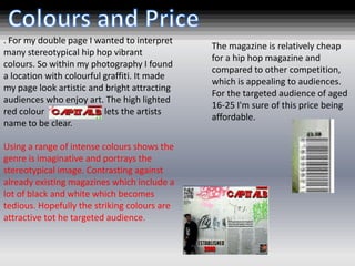
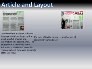
Attracting/Address:

Attracting and addressing your audience is all
about making your audience want to engage
with your media product and invest time and
(usually) money with it. Ways I did it:

Masthead
Cover lines
Photograph(s)
Colours
Price
Layout
Article
A mention of some artists or popular features within
                                               the magazine attracts the viewer, by making it
                                               visually clear and intriguing. People are in the
The masthead is very effective. It relates     present day want to keep up to date and stylish with
to my genre as the font is very bold and       the trend so cover lines mentioning some popular
stylish attracting the audience. The black     topics attract a large audience.
solid colour makes the masthead stand
out and bounce of the page , making it
visually clear for audience. Inserting the
image over part of the title makes the           A quote from the double page spread article
front cover look more professional and           creates a slight insight to the magazine .However,
attractive . Using capitals for the masthead     the full article has to be read to understand the
also high lighted name of the magazine           full story. The slight insight increases the tension
and connotes a well known competitive            and attracts the audience.
magazine that will be noticed.


                                                  Fashion is a very judged and popular topic these days so
                                                  a mentioning in visually clear writing grabs the audiences
                                                  attention and increases potential customers to purchase
                                                  it. Fashion also is what people want to keep on top of and
                                                  follow meaning the magazine is more likely to attract
                                                  customers.
I thought that it was important when               The image on this double
creating my magazine that it had a USP, a          page spread is intentionally
unique selling point, which would attract          attractive to both genders
my target audience and differentiate the           however, the page could be
magazine from other competitors. The USP           argued it attracts more
for my magazine is that photographs                males. The costume of the
within my magazine were suitable for both          male suitably stereotypes a
genders .                                          hip hop male and could
               My front cover included a           aspire and attract males to
               stereotypical male hip hop          dress similar.
               artist who connotes power and
               rebellion. The rebellion and       Contrasting against the
               attitude given off by the stance   front cover is a female
               of the model could be aspiring     model where her style
               and attractive to male readers.    could be inspirational to
               However, the power and             women and attractive to
               strength shown by the male         men. Also the adjustments
               model could be an attraction       made to the image allows
               and eye candy to females and       it to look gold a colour for
               could be an encouragement for      both genders and connotes
               females to purchase.               class.
. For my double page I wanted to interpret
                                              The magazine is relatively cheap
many stereotypical hip hop vibrant
                                              for a hip hop magazine and
colours. So within my photography I found
                                              compared to other competition,
a location with colourful graffiti. It made
                                              which is appealing to audiences.
my page look artistic and bright attracting
                                              For the targeted audience of aged
audiences who enjoy art. The high lighted
                                              16-25 I'm sure of this price being
red colour                lets the artists
                                              affordable.
name to be clear.

Using a range of intense colours shows the
genre is imaginative and portrays the
stereotypical image. Contrasting against
already existing magazines which include a
lot of black and white which becomes
tedious. Hopefully the striking colours are
attractive tot he targeted audience.
I addressed the audience in formal
language in my long length article The ratio of text to pictures is another way of
which was full of detail and         addressing your audience.
information on a specific artist. The
artist informal comments were
written as quotations to make the
readers feel as if they were personally
at the interview.

Attract and adress audience question 5

  • 1.
    Attracting/Address: Attracting and addressingyour audience is all about making your audience want to engage with your media product and invest time and (usually) money with it. Ways I did it: Masthead Cover lines Photograph(s) Colours Price Layout Article
  • 2.
    A mention ofsome artists or popular features within the magazine attracts the viewer, by making it visually clear and intriguing. People are in the The masthead is very effective. It relates present day want to keep up to date and stylish with to my genre as the font is very bold and the trend so cover lines mentioning some popular stylish attracting the audience. The black topics attract a large audience. solid colour makes the masthead stand out and bounce of the page , making it visually clear for audience. Inserting the image over part of the title makes the A quote from the double page spread article front cover look more professional and creates a slight insight to the magazine .However, attractive . Using capitals for the masthead the full article has to be read to understand the also high lighted name of the magazine full story. The slight insight increases the tension and connotes a well known competitive and attracts the audience. magazine that will be noticed. Fashion is a very judged and popular topic these days so a mentioning in visually clear writing grabs the audiences attention and increases potential customers to purchase it. Fashion also is what people want to keep on top of and follow meaning the magazine is more likely to attract customers.
  • 3.
    I thought thatit was important when The image on this double creating my magazine that it had a USP, a page spread is intentionally unique selling point, which would attract attractive to both genders my target audience and differentiate the however, the page could be magazine from other competitors. The USP argued it attracts more for my magazine is that photographs males. The costume of the within my magazine were suitable for both male suitably stereotypes a genders . hip hop male and could My front cover included a aspire and attract males to stereotypical male hip hop dress similar. artist who connotes power and rebellion. The rebellion and Contrasting against the attitude given off by the stance front cover is a female of the model could be aspiring model where her style and attractive to male readers. could be inspirational to However, the power and women and attractive to strength shown by the male men. Also the adjustments model could be an attraction made to the image allows and eye candy to females and it to look gold a colour for could be an encouragement for both genders and connotes females to purchase. class.
  • 4.
    . For mydouble page I wanted to interpret The magazine is relatively cheap many stereotypical hip hop vibrant for a hip hop magazine and colours. So within my photography I found compared to other competition, a location with colourful graffiti. It made which is appealing to audiences. my page look artistic and bright attracting For the targeted audience of aged audiences who enjoy art. The high lighted 16-25 I'm sure of this price being red colour lets the artists affordable. name to be clear. Using a range of intense colours shows the genre is imaginative and portrays the stereotypical image. Contrasting against already existing magazines which include a lot of black and white which becomes tedious. Hopefully the striking colours are attractive tot he targeted audience.
  • 5.
    I addressed theaudience in formal language in my long length article The ratio of text to pictures is another way of which was full of detail and addressing your audience. information on a specific artist. The artist informal comments were written as quotations to make the readers feel as if they were personally at the interview.