VIP Kolkata Call Girl Serampore 👉 8250192130 Available With Room
Magazine cover analysis mr borrill
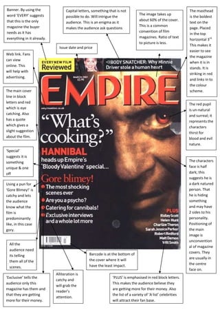
1. Banner. By using the Capital letters, something that is not The masthead
word ‘EVERY’ suggests The image takes up
possible to do. Will intrigue the is the boldest
that this is the only about 60% of the cover.
audience. This is an enigma as it text on the
magazine the buyer This is a common
makes the audience ask questions page. Placed
needs as it has convention of film
in the top
everything in it already. magazines. Ratio of text
horizontal 3rd.
to picture is less.
This makes it
Issue date and price
easier to see
Web link. Fans
the magazine
can view
when it is in
online. This
stands. It is
will help with
striking in red
advertising.
and links in to
the colour
The main cover scheme.
line in block
letters and red The red pupil
which is eye is un-natural
catching. Also and surreal; it
has a quote represents the
which gives a characters
slight suggestion thirst for
about the film. blood and evil
nature.
‘Special’
suggests it is
something The characters
unique & one face is half
off dark; this
suggests he is
Using a pun for a dark natured
‘Gore Blimey!’ is person. That
catchy and lets he is hiding
the audience something
know what the and may have
film is 2 sides to his
predominantly personality.
like, in this case Positioning of
gory. the main
image is
unconvention
All the
al of magazine
audience need
Barcode is at the bottom of covers. They
its telling
the cover where it will are usually in
them all of the
have the least impact. the centre
scenes.
face on.
Alliteration is
‘Exclusive’ tells the ‘PLUS’ is emphasised in red block letters.
catchy and
audience only this This makes the audience believe they
will grab the
magazine has them and are getting more for their money. Also
reader’s
that they are getting the list of a variety of ‘A list’ celebrities
attention.
more for their money. will attract their fan base.
2. Masthead is the boldest text on
The red stands out and is eye catching. It
the cover. It is also being
is located in the top horizontal 3rd. This The bold letters and
overlapped by the main image of
makes it easier to be seen when it is in exclamation mark give the
Robert Downey JR. This is because
magazine racks. effect that it is being
it is an established and well known
magazine therefore does not need shouted. Also it suggests
the whole name to be shown. that it is something you
Issue number, release ‘MUST’ do.
date and price
Image is
popping out
Freebies will of the
entice the polaroid.
buyer and This
encourage suggests his
them to get character
this magazine has some
as it if offering kind of
them dominance
something for in the film
nothing.
‘Worst’
Banner. The
nothing
yellow does
beats it. The
not stick to
audience
the colour
are getting
palette
more for
making it
their money
stand out.
Main cover USP. Robert
line in bold Downey JR
writing. has been in
‘Sherlock classic films
Holmes’ is a such as ‘Iron
film known Man’, ‘Due
worldwide. Date’ & ‘The
Name of the Avengers’.
film with a The cuts on
small tag line. his face
Gives an represent
indication of him as a
what the film fighter and
is about. suggest
some kind
Bar code The film reel lets us
of action
where it will ‘Special!’ suggests that only know what the
will happen
have least this magazine has it, magazine focuses on.
in the film.
impact on the therefore has more to offer
magazine than the other magazines.
cover.
3. No web link is shown. This
Masthead is
suggests such a well known Issue number and
boldest on the
magazine would not need as release date. However
page and placed
much advertising. there is no bar code
The image takes up in the top
shown. Could suggest
about 85% of the cover. horizontal 3rd
The text is overlapping. it is a fee magazine.
Cover line. making it easy
‘Preview’ to see when in
suggests that magazine racks.
it is something Also the light
not everyone blue could
has seen represent the
before. So the cold & heartless
audience murders that
think they are the character
getting what ‘Sweeney Todd’
other attempts.
magazines are
not offering. The use of
pale make-up
makes him
look ghost
like. His
Cover line. expression is
The red stands angry and hair
out as it is is wild making
contrasts with him look
the rest of the slightly
colour palette eccentric.
of blue, white
and grey.
Suggests they
are getting Established ‘A
things other list’ celebrity.
magazines Name in a bold
cannot offer. font making him
of more
importance than
all the other
celebrities listed
below. It also
tells the
audience what
the main Article
will be about.
‘PLUS’ leads the audience to
USP (unique selling point) Johnny
believe they are getting more
Depp is a well known actor and will
for their money. ‘Sweeney Todd’ is in blue so it
attract a female audience. However
is very versatile & has been in many stands out. Also it is a well
classic films. For example ‘Edward known classic so will
Scissor hands’, ‘Pirates of the encourage fans of that musical
Caribbean’ & ‘The Tourist’. to buy the magazine.