1) The front cover of the pop music magazine analyzes uses bright pink and red colors along with images of popular artists like Justin Bieber to target their young female audience and promote a fun lifestyle.
2) The NME magazine cover uses bold pink colors and the image of Rihanna to attract readers' attention while addressing their older teen audience in standard English.
3) The Billboard magazine cover features pop artist Miley Cyrus prominently to draw viewers in and inform them of stories across various music genres in a professionally laid out design.
The document analyzes the design elements and conventions used on the cover of a magazine. Key elements include:
1) The masthead is large and bold to grab attention, positioned in the top third as is typical.
2) The main cover line and image dominate the page, with the line positioned above to maintain prominence over the image.
3) Additional lines like the date, skyline, and buzz words are used to inform readers of content and attract potential buyers.
The document provides an analysis of the design elements of a dance music magazine cover and contents pages, including:
- The cover uses bright pink, white and black colours to target a younger audience for dance music. Bright colours make it stand out from other magazines.
- Photography on the cover and contents shows artists in a studio or posing casually to portray the dance music genre.
- Layout has a 50/50 text to image ratio to provide information to encourage sales while retaining a visual focus appropriate for the intended readers.
- Fonts, graphics and design elements like slanted text give the magazine an edgy, fun look fitting for its dance music audience.
This document discusses and analyzes the cover of a Lady Gaga issue of Billboard magazine. Key aspects analyzed include the color scheme, positioning of Lady Gaga, and how cover lines are used. It also reflects on design choices and how they impact whether the cover will attract readers.
The document provides an analysis of the design elements of different magazine covers and how they attract their target audiences. It discusses aspects like the masthead, main image, model credit, cover lines, colors, typefaces, photography lighting, and design principles used. Key points made include that bright colors like yellow and pink attract younger audiences; revealing images and celebrities appeal to both female and male readers; and formal layouts but informal language can target both adults and teenagers.
The document provides an analysis of NME Music Magazine's Dizzee Rascal edition from 2009. It examines the front cover design including the main image of Dizzee Rascal, use of colors and fonts, and placement of elements. It also analyzes the contents page layout, a double page article spread, and concludes with background information about NME magazine. The document conducts a thorough visual and textual analysis of key magazine pages and elements to understand how they are designed to attract NME's target audience of 16-25 year old music fans.
The document summarizes a magazine cover featuring Jennifer Lopez. Key details include:
- Jennifer Lopez is the main cover image in the center, drawing readers in with her direct gaze.
- The masthead and cover lines are in red and other colors, coordinating with Lopez's red dress.
- The layout follows the rule of thirds, with cover lines on the left, image center, and right.
- The target audience is affluent, fashion-interested women seeking inspiration from Lopez.
This document provides details about the layout and design of magazine covers and contents pages. Key points include:
1) Magazine covers typically feature a large masthead at the top, prominent images, bold text highlighting the main artist or article, and small text or symbols indicating additional contents.
2) Contents pages list the major articles and features with accompanying images and page numbers, and include additional sections for minor items, advertisements, and issue details.
3) Design elements like fonts, formatting, coloring, and positioning are used intentionally across covers and contents to guide the eye, emphasize key information, and create a consistent brand identity and style.
Magazine Photography Analysis and Research selinargyrou
This document analyzes magazine front cover photographs from different music magazines. It summarizes the key elements of each photograph and how they effectively represent the magazine's brand and target audience. The photographs use bright colors, futuristic or playful themes, and creative poses or styles to catch readers' attention while reflecting the type of music and content featured in the magazine.
The magazine cover features a young female model with unusual makeup and a spider on her face that grabs the reader's attention. The masthead is placed horizontally but regular readers will still recognize the magazine. A clear color scheme is used throughout the cover that matches different elements. The choice of model represents the magazine's youthful and quirky nature.
The document summarizes how the magazine addressed its target audience through various design elements. The masthead uses the word "CULT" to attract those interested in hip hop music. Coverlines like "man of the year" appeal more to male readers. Primary colors like red, white, and black are used to attract both female and male readers without gender bias. Images and text are balanced to engage readers who prefer looking at images over reading. The £1.99 price point was chosen based on audience research showing most would pay £1-2.
The layout and design of the magazine cover aims to attract readers through bold headlines and images. Notable features include a shattered masterhead suggesting a rock magazine, prominent placement of the lead singer to generate interest, and use of gold and white to convey luxury. Taglines about music celebrities aim to intrigue readers into learning more. Overall, the cover is designed to quickly inform readers of the main stories and attract potential buyers through visual elements and provocative text.
The document is a media studies evaluation of a magazine front cover project. It summarizes how the student researched real magazine formats and drew inspiration from publications like Vogue and Q magazine. The front cover design challenges conventions by using unconventional fonts and layouts while maintaining realism through elements like barcode and price. The target audience is described as young music fans interested in new and independent artists.
The summary provides an overview of the key elements and layout of the magazine cover:
1) The masthead is in white on a red background to stand out, and covers the central image of 50 Cent who is the main selling point.
2) Other artists featured are plugged on the sides and cover lines tease stories about 50 Cent and the magazine's 20th anniversary.
3) The layout places the masthead, skyline, and central image prominently with additional information on the sides to not overcrowd the page.
The masthead for the magazine 'Q' is in white lettering on a red background in the top left third of the magazine cover. It establishes the magazine brand. The main cover image is of Coldplay frontman Chris Martin, whose arm links through the Q logo. The cover lines are written as if directly on the page to seem more personal. The background relates to Coldplay's tour theme to appeal to fans. Key details like the date and barcode are clearly displayed for readers.
The document analyzes the design features of magazine covers, contents pages, and double page spreads. It compares the design of an existing music magazine, NME, to a hypothetical new music magazine the author has created. Some key conventions analyzed include use of color schemes, prominent images, headlines and subheadings, and background designs. The author notes how their hypothetical magazine both develops and challenges some conventions of real music magazines.
The document summarizes the design elements of a music magazine content page. Large images and quotes are used under each musician to draw the reader in. Different fonts and layouts create an individual feel reflecting the intended indie audience. Bright colors highlight important information like the subscription box to increase readership. Overall, the design emphasizes musicians' images and grabs attention to feature important artists and articles.
The document provides analysis of magazine cover and content page design elements. It discusses how various visual elements are used to attract readers' attention and convey information about the musicians featured. Large images and a bold color scheme are used to draw the eye. Musician names and most important text are in red to make them stand out. Photograph placement and sizing are designed to associate images with corresponding articles. Font styles, eye contact and clothing choices in images aim to reflect musicians' personas and appeal to the intended audience. Overall the document examines how visual design strategically communicates information and brands to engage readers.
1) The document provides details on the layout, images, and text used on the cover of a magazine featuring Lana Del Rey. It analyzes design elements like the masthead, cover title, main image placement, and price/date text size.
2) Key aspects summarized include the simplistic background layout representing the magazine's style, Lana Del Rey's image in the center to identify her as the main topic, and the obscured masthead/pricing to possibly indicate a more expensive magazine.
3) Additional sections like "plug" and "secondary lead" are described in terms of using attention-grabbing words to entice readers and provide more content value for the cost.
The document discusses the layout and design elements of magazine covers. Key elements include the logo, masthead, skyline, cover lines, barcode, price, and main image. The logo and masthead identify the magazine brand for readers. Cover lines are used to promote stories inside and attract audiences. Imagery and text are tailored to the target genre and audience. Pricing and barcode information is placed strategically to not interfere with the overall design.
The magazine cover uses a simple layout with a medium shot of two artists facing away from each other to imply rivalry in the music industry. Red is prominently used to connote the rock genre. Questions are asked under subheadings to encourage reading the articles. The masthead is bright yellow to catch the eye, and the main image overlaps it for regular readers.
The magazine cover uses bold blue and pink colors to attract both male and female readers. The main image is of Kanye West looking directly at the camera against a dull background to draw attention. Lighting is used to make the image and text stand out while creating a mysterious mood. Cover lines in pink, blue, and black down the right side advertise the magazine's contents while following the formal house style.
This document annotates three magazine covers and contents pages. The annotations provide insight into the purpose and importance of different design elements on magazine covers and contents pages, such as the masthead, date/price, main image, kickers, and selling lines. Elements like the masthead, main image, and kickers are designed to attract readers' attention and encourage them to read or purchase the magazine. Smaller or less prominent text like the date/price is meant to de-emphasize cost and prioritize the magazine's content. Color, font, and layout choices also communicate messages that appeal to the magazine's target audience.
Analysis of music magazines front coversmarwasaroya
The document analyzes two music magazine covers from the magazine Vibe.
[1] The first cover features Lil Wayne. Its bold colors, large images, and cramped text create an aggressive style befitting hip hop. Lil Wayne's tattoos, outfit, and body language project masculinity and power.
[2] The second cover features Trey Songz. Its classy organization focuses attention on Trey Songz' powerful gaze. Both covers employ eye-catching colors and prominent artists to attract audiences. Overall, the analysis shows how magazine design reflects the represented music genres.
The Rolling Stones magazine has a simple pink masthead written in a sans serif font. The main image is of Rihanna looking directly at the camera with a calm expression. The large pink heading "Rihanna" has a quote from her in matching pink. The layout uses minimal text and images while focusing on the color pink.
Research into music magazines front cover analysis05bealeros
The document summarizes and analyzes the front cover of the NME music magazine featuring Rihanna. Key points include:
- The large pink masthead and font make the title eye-catching and tie into the pink and black color scheme.
- The headline in the center of the page above Rihanna's full-page image draws the viewer's eyes to identify her.
- The target audience is identified as females aged 16-25 based on Rihanna's age and the bright pink color.
- Elements like the puffs, barcode, and price placement follow magazine conventions while the full-page image stands out.
Both magazines have bright color schemes including oranges and pinks. They use sans serif fonts throughout and have clearly displayed cover stories in the bottom left corner. The layout uses a route of the eye technique to guide the reader through the key information.
The magazine cover uses provocative imagery and bold colors to attract its target audience. A photo of a mysterious woman biting her finger draws the eyes of male readers. Red and white are prominently featured in the masthead and text to pop against the dark background. The design is intended to attract music fans by highlighting artists and genres in large, contrasting text.
This document provides a summary of magazine covers and contents pages across different genres. Key conventions used across magazines include mastheads to identify the publication, dates to indicate issue, cover lines and images to advertise main stories, and contents pages organized into sections. Color schemes, fonts, and layouts are tailored to match the intended genre and audience. Interactive elements like competitions and subscription offers are also included to encourage readership.
Analysing nme dizzee cover prep for blog pptPotterM2
The document analyzes the front cover of the September 2009 issue of NME magazine featuring Dizzee Rascal. It summarizes the key design elements of the masthead, header, sell lines, main image, background, pull quote, and footer. It then discusses the target audience as music fans interested in genres like rap and indie music, likely male and in their teenage years from a middle-class family. The last section provides additional context about NME magazine's history and target demographics.
This document lists different types of magazines and provides examples of magazine covers to analyze their target audiences. There are magazines focused on rock/indie (Kerrang), pop (Top of the Pops), country (Country Music), and R&B (Vibe). Magazine covers are analyzed based on visual elements like dominant images, colors, fonts, and language to infer the intended target demographic of younger vs older and male vs female audiences. Key aspects like cover images, headlines, and freebies are designed to appeal to fans of particular music genres and artists.
Analysing nme dizzee cover prep for blog pptPotterM2
The document provides an analysis of the front covers of three different music magazines: NME, Billboard, and SPIN. For each cover, key elements like the masthead, images, text, and layout are described. The target audiences for each magazine are also analyzed. NME targets teenagers and young adults interested in genres like rap and indie music. Billboard aims for teenagers to young adult females interested in mainstream chart music. SPIN's audience includes a wide range of music fans but skews slightly male between the ages of 22-34.
The front cover of NME magazine from September 2009 features Dizzee Rascal to appeal to its target youth audience interested in genres like hip hop and pop rock. The bright red masthead and graffiti background aim to attract fans of Dizzee Rascal and urban music. A pull quote from Dizzee Rascal promotes the main article to entice readers. At £2.20, the magazine is affordable for its target audience of 25 year olds in social classes C1 to E. The magazine has shifted from exclusively rock music to also feature hip hop in line with changes in popular music genres and tastes of its younger readership.
This magazine cover uses bright colors and images of popular celebrities and bands to attract its target young female audience. Most of the cover is taken up by a large central image of a boy band, with additional pictures and banners advertising exclusive interviews and features inside. The contents page is similarly colorful and image-heavy, using pictures and bold fonts to clearly guide readers to find their favorite articles and celebrities within the magazine.
Front cover analysis
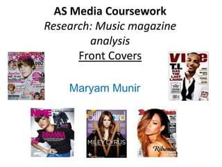
 3 – top of the popsasmediac12
The document provides information about the front cover of the magazine "Top Of The Pops". The summary is as follows:
[1] The main image on the cover is of singer Tulisa which will attract readers interested in her interview.
[2] The masthead spans the top of the cover in purple bubbly writing.
[3] The main cover line promotes Tulisa's "cheekiest interview ever" in large yellow text to grab attention.
Analysing nme dizzee cover prep for blog ppt (1)fianalasmediae12
The document analyzes the front cover of the NME magazine from September 2009 featuring Dizzee Rascal. It discusses various design elements of the cover including the bold red masthead which grabs attention, the colorful background representing hip hop music, and the large image of Dizzee Rascal making direct eye contact with the viewer. The target audience is identified as primarily male teens and young adults interested in hip hop and urban music. Methods used to attract this audience include featuring a celebrity like Dizzee Rascal that appeals to his fans, and using a pull quote to engage readers.
This magazine is targeted at teenage girls aged 11-14 who enjoy pop music, celebrities, and fashion. It features interviews and gossip about popular boy bands and female artists. The magazine uses bright colors, bold fonts, and informal language to appeal to its young female readership. Images of celebrities, quizzes, posters, and opportunities to win prizes also aim to attract teenage girls interested in pop culture.
Analysis of music magazine contents & dpsmarwasaroya
The document analyzes the contents pages of two music magazines - Vibe and XXL. Both magazines use large prominent images and minimal text on their contents pages. Vibe uses darker backgrounds and colors for male artists to convey dominance, while brighter colors are used for female artists. XXL also employs bold images and a simple color scheme of red, black, and white to make the images and text easily visible. The structure and layout of the contents pages across the two magazines are similar in emphasizing large images over text to immediately grab readers' attention.
The magazine cover targets a female audience aged 20-30. The main image features a woman posing in simple clothing to portray an attainable lifestyle. Pink fonts and colors are used throughout to appeal to stereotypical female interests. Celebrity images and alliterative text are intended to draw readers in with promises of inside stories. The price is displayed discreetly as magazines are an expensive product.
The document analyzes the front covers of two music magazines - NME and Q magazine.
For NME, the summary is that it targets 16-24 year olds interested in rock and indie music. The Amy Winehouse cover image is analyzed as being quite sexualized but effective at drawing readers in. The design uses bold red and black colors consistent with the rock genre.
For Q magazine, the target audience is older adults aged 25-40 interested in various music genres. The Take That cover image appeals more to women. The mature design uses black, white, red and gold colors with tidy layout and fonts appealing to older readers. Both covers effectively use design principles to guide readers' eyes to key elements.
The document discusses conventions used in pop music magazines. It analyzes conventions seen on magazine covers, contents pages, and double page spreads. Key conventions included are mastheads, coverlines, pull quotes, standfirsts, kickers, main images, and use of bold colors. The creator of the document incorporated these conventions into their own mock magazine to make it look professional and appeal to the target audience.
Q Magazine is a monthly British music publication that has been published since 1986. It targets mature music lovers aged over 25 who enjoy all genres of music. The front cover of the March 2019 issue features a close-up image of singer Florence Welch with a shocked expression. Inside, a double-page spread profiles Florence Welch sitting provocatively on an American flag with the headline "Florence Welch's got the love." The article is organized into columns with a drop cap opening and captions identifying the artist.
This magazine analyzes the cover designs of several popular music magazines. The covers use eye-catching colors, images, and text to attract their target audiences. Featured artists are prominently displayed to draw readers' interest. Provocative photos paired with personal details about the artists help promote connection with fans. Overall the magazines employ clever marketing techniques through their visual designs and content to appeal to younger audiences interested in music and celebrity culture.
The document analyzes the front cover of the magazine "Vibe". It discusses several conventions used in the layout and design of the cover:
1. The masthead, font, and branding remain consistent to maintain the magazine's identity and familiarity for readers.
2. Popular artists are featured prominently to attract readers interested in their music.
3. Important information like the main headline and price are strategically placed based on where the eye is drawn.
This document summarizes the key elements of a magazine cover. The cover features singer Jay Sean as the central image. It aims to attract its target Asian audience by featuring a well-known British-Asian singer. Bold colors and illustrations are used to catch the eye of readers. Call-out text promotes a chance to win signed CDs and encourages readers to learn more inside.
The document analyzes the front cover of the music magazine "Top of the Pops". The cover uses pink colors and fonts to appeal to its target audience of teenage girls. It prominently features Cher to advertise her article. Additional artists are shown to demonstrate the magazine focuses on pop music. The layout emphasizes images over text to keep the attention of its young readers.
This document contains a mock magazine layout with various pages including a masthead, front cover, contents page, and double page article spread. The masthead introduces the magazine name "PULSE" and motto. The front cover features an image and headline to grab attention. The contents page lists the stories and gives an overview of what to expect each month to appeal to a young audience. The double page spread focuses on an artist interview to introduce a new musician through images, a brief bio, and Q&A section using an informal tone.
The document provides an evaluation of the author's media product, an AS music magazine. It discusses several aspects of constructing the magazine, including how it challenges conventions, represents social groups, potential distribution partners, target audience, and technologies learned. The author reflects on improvements from a preliminary task, such as better instruction of models, additional cover text, and improved color scheme contrast.
This document provides details for filming scenes from the movie Mean Girls, including a phone conversation scene, a scene where girls admit what they don't like about each other, and a scene where Regina gets hit by a bus. It lists props needed and outlines scripts for the phone conversation and bus scenes. The phone conversation involves three girls, Karen, Gretchen, and Regina, discussing hanging out and what others say about them. The bus scene has Cady and Regina arguing before Regina is hit by the bus, to which Cady reacts with excitement.
The document discusses the development of a double page spread (DPS) for a magazine. The author selects two images featuring a model wearing bright colors and posing in a youthful, appealing way to attract young girl readers. Captions and pull quotes from the model are included to draw readers into learning more about overcoming challenges. The final DPS is designed to engage its young audience using bright colors, a central image, and enticing text.
The document considers three potential locations for a photo shoot for a music magazine. Location 1 is the author's own home, which has advantages of no transportation needed and full control over the environment, but disadvantages of not being ideal and having limited space. Location 2 is a large, quiet college area with easy transportation but plain scenery. Location 3 is a town area near the college that is quiet, sophisticated looking, and has props that can enhance the photos while still being conveniently located. After assessing the pros and cons, the author decides to use Location 3 for the shoot.
This mood board document contains visual planning for a media project, displaying different fonts and font styles in various sizes and placements to experiment with typography. It also features blocks of different colors arranged in different patterns to explore color schemes and combinations for the project. The mood board uses typography and color experimentation to help plan the visual style and tone of a media piece.
This mood board document contains planning for an AS Media coursework project created by Maryam Munir. It features repeated words related to font and type styles as well as swatches of different colors intended to convey a mood or theme for the planned project. The board explores font and color options to help direct the visual design.
The document describes the development of a contents page for a magazine, showing initial mock designs and layouts that were referenced, and photos that were included. It then shows the final contents page that was produced after adding all the desired text and images based on research from analyzing another magazine's contents page for layout techniques.
The document contains a collage of magazine advertisements and posters. There are headlines throughout as well as images of celebrities and products. The collage includes ads and posters from different time periods as styles and designs vary widely.
The document considers three potential locations for a photo shoot for a music magazine. Location 1 is the document author's house, which is convenient but not ideal and has limited space. Location 2 is a large, quiet college area but has a plain background and muddy conditions if it rains. Location 3 is a town area near the college that has a sophisticated professional look, props, and angles to work with while posing the model, making it the best choice despite some risks of interruptions.
The document summarizes the planning for a photo shoot location in Henley town. The location offers benches and other props that can be used in shots. While the town is busy, the crowds can be controlled and will provide unique photos. Traffic poses a potential risk that must be monitored. The lighting conditions are suitable. Parking and transportation are available near the location, which is otherwise suitable for the production.
The document provides an analysis of a location for a photo shoot at Henley College. The location is described as a quiet, private area with plenty of space. There are no rubbish or hazards present. Permission is not needed to use the location. The only equipment needed is a camera and props. Lighting conditions are suitable. Several interesting shot compositions are identified using different elements in the area like a brick wall and gates. As it is an outdoor location, there is no electricity needed. The location is suitable for production due to its quiet and undisturbed nature with various elements that can be incorporated into the shots.
The document provides a location recce report for a photography shoot at Henley College. The location is a quiet, private area with plenty of space that will allow for different shots. There are no rubbish or hazards present. As a college student, no additional permission is needed to film. Only a camera and props are required for equipment. The location offers opportunities for interesting shots against the brick wall, with the model sitting or standing in various areas. Transport and electricity are non-issues for the outdoor space. In conclusion, the location is deemed suitable for the production.
Maryam Munir plans to conduct a photo shoot at her house for her media coursework. She notes that her house provides a quiet space without trespassers. She will need to inform her family to avoid interruptions. While her house offers convenience, the room is smaller than ideal for a pop music magazine shoot. Therefore, she determines her house is not the most suitable location.
The document discusses different types of shots that could be used for a photo shoot, including close-up shots, medium shots, establishing shots, and low-angle shots. A close-up shot of the model would be used for the front cover to attract attention and make the model seem famous. A medium shot showing what the model is wearing could also be used for the front and double page spreads. An establishing shot would provide context for readers of the double page spread by showing what the model looks like. A low-angle shot of the model would make them seem powerful and important to entice readers to learn more.
This document appears to be records from a student named Maryam Munir related to media coursework planning. It involves emails that were sent to models, likely in relation to a school project for a media class. The document seems to be notes or a log of correspondence with models for a coursework assignment.
This mood board focuses on fonts and colors for a media coursework project. A variety of fonts are displayed without labels to consider font styles and sizes. A collage of different colors is also included without organization to consider a range of color options.
This mood board focuses on fonts and colors for a media coursework project. A variety of fonts are displayed in different sizes and styles to explore typographic options. A range of colors are also presented to consider for the visual aesthetic and tone of the project.
1. The document is a magazine article that features posters and images of various pop stars and bands.
2. It includes posters and photos of artists like One Direction, Harry Styles, Rihanna, and Cheryl Cole along with descriptions and quotes related to their music careers.
3. The article utilizes a collage format by placing many images alongside brief text snippets to highlight and celebrate popular culture icons.
Flat Plan- Top of the Pops document contains posters and images from various artists laid out in a grid format with captions. The document provides high level information about posters from artists such as Louis, One Direction, Richard Wisker, and District 3 in 3 sentences or less.
The Uses and Gratifications theory examines what audiences do with media rather than how media affects audiences. It considers audiences as active in choosing and using media to fulfill certain needs. The theory proposes that individuals may use media for diversion to escape problems, for personal relationships by interacting with others through media, and for personal identity by learning who they are through the content they engage with. Individuals may also use media for surveillance or to gather information.
This document summarizes four major music magazine institutions in the UK: Bauer Media Group, IPC Media, EMAP, and Future PLC. It describes when each company was established, the types of magazines they produce, whether those magazines target niche audiences or mainstream audiences, and their overall success and reach. The document concludes by stating that Bauer Media Group would be the best publisher for a new pop music magazine due to their large audience reach and history of successful pop music magazines.
2. Masthead- Top of the Pops. Has website as well,
Genre is pop music magazine which means wider
as the pop artists on the FC tell audience.
us this. Use of pink and red Central Image- Main
colours tells us audience is image is easy to spot.
young girls. Bright colours tell Young girls are aware of
us that the magazine promotes who he is. Artist is
a fun lifestyle for girls. represented as popular
with girls which attracts
Cover line- main
readers.
story is about
Justin Beiber Plugs- give us info
getting bullied. about other stories in
Pull quote- said by the magazine.
Beiber himself to Anchorage to assist
make us want to the stories as well.
read more. Makes it easier to
follow.
Mode of address is Use of the love hearts
colloquial as audience is tells us that the
young girls. This makes it audience are young
easier tor them to girls.
understand what is said as Teaser- persuades reader to
the language is easy and find out more and read the
simple. magazine.
3. Puff aims to persuade Central Image- Covers
Masthead- NME readers to buy the most of the FC. Grey
Use of the bold pink magazine as it has a rare background makes image
colours for main special edition cover. stand out. Rihanna
writing attracts represented as cool,
readers attention to young & edgy to draw
important parts first audience in.
which tempts them Genre- indie/rock but
to find out more. Rihanna changes this
edition to a hip-hop
Cover Line- genre.
informs us of
what the main Pull quote- Placed in
stories are so the middle of the FC
that readers are which draws our
persuaded to attention to it. We
buy the want to find out more
magazine. about what Rihanna is
talking about.
Mode of address is
standard English as
With the Central Image, plain background and
audience are older teens. only a small amount of writing on the cover
Makes sure that it is easier the magazine represents itself as simple and
for audience to understand cool. It looks attractive, therefore its audience
everything. of both boys and girls will buy the magazine.
4. Genre- Covers all genre of
music due to it being a
Billboard magazine. Genres
Buzz word Masthead is slightly
include Pop, R&B/Hip-hop,
‘Don’t Miss’ covered up by central
rock etc.
which gets the image which tells us that
readers full everybody is aware of the
attention title of the magazine due
to its popularity.
Plugs- four plugs on
either side on Central Image- Pop
Central Image which artist Miley Cyrus.
give us info about Covers most of the FC
smaller stories which shows how
within magazine. important she is. We
are instantly drawn to
her, and then the
Cover Line- gives
information around
us information
her.
about the main
story in the Layout of the FC is professional as
magazine. Tempts plugs and central image etc are Mode of address is
readers to read laid out orderly. Everything is easy standard English. Clear and
more. to see. This promotes a cool and simple English makes
simple lifestyle just like the FC. audience comfortable.
5. Genre- R&B and hip-hop. Mode of address is standard
Central Image informs us English. Easy for audience to Masthead VIBE is not
of the genre of the understand what is said. fully shown due to
magazine. the central image.
Audience are young boys Tells us that audience
and girls (majority boys) are aware of what it
who are into R&B and is called anyway. Red
hip-hop music. colour makes it stand
out.
Central Image- American
Cover Line-
hip hop artist T.I.
informs
Represented as cool, good
audience of the
looking and rich due to
main story.
clothing. Even though
Different colour
clothing matches with the
for the name T.I.
background, T.I still stands
which makes it
out which draws our
stand out.
attention to him.
Bold colours used with the white
background make everything stand Plugs- info about smaller
out more to attract audience. stories. Easy to find out
Lifestyle promoted is a cool and what else is feature in the
young one due to the style of the magazine.
FC itself.
6. Masthead is covered
Mode of address is standard by central image
English. Easy for audience to which tells us that
Central Image-
understand what it said. everyone is aware of
Rihanna which tells
us that the genre of the name of the
this magazine is hip- magazine due to its
hop with rock. She is popularity. Red colour
represented as makes it stand out
young, wild and sexy. from rest of the FC.
Audience is made up
of older boys and the Plugs- 3 plugs on the
image tells us this as side each inform
Rihanna is posing for audience of other
boys which attracts stories in the magazine.
their attention to this Gives audience more
edition. info which helps them
decide whether to buy
magazine or not.
FC tells us that the lifestyle
of this magazine is a wild
one due to the example of Cover Line tells us main
Rihanna being used. Black, story is about Rihanna and
red and white colours her love life. Tempts the
show a edgy style. audience to read more.