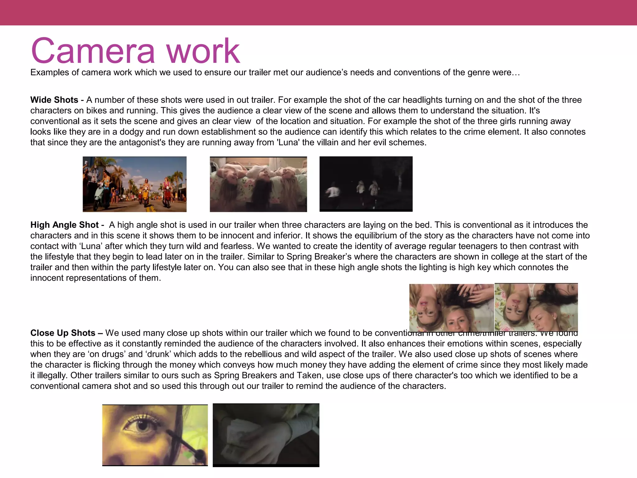
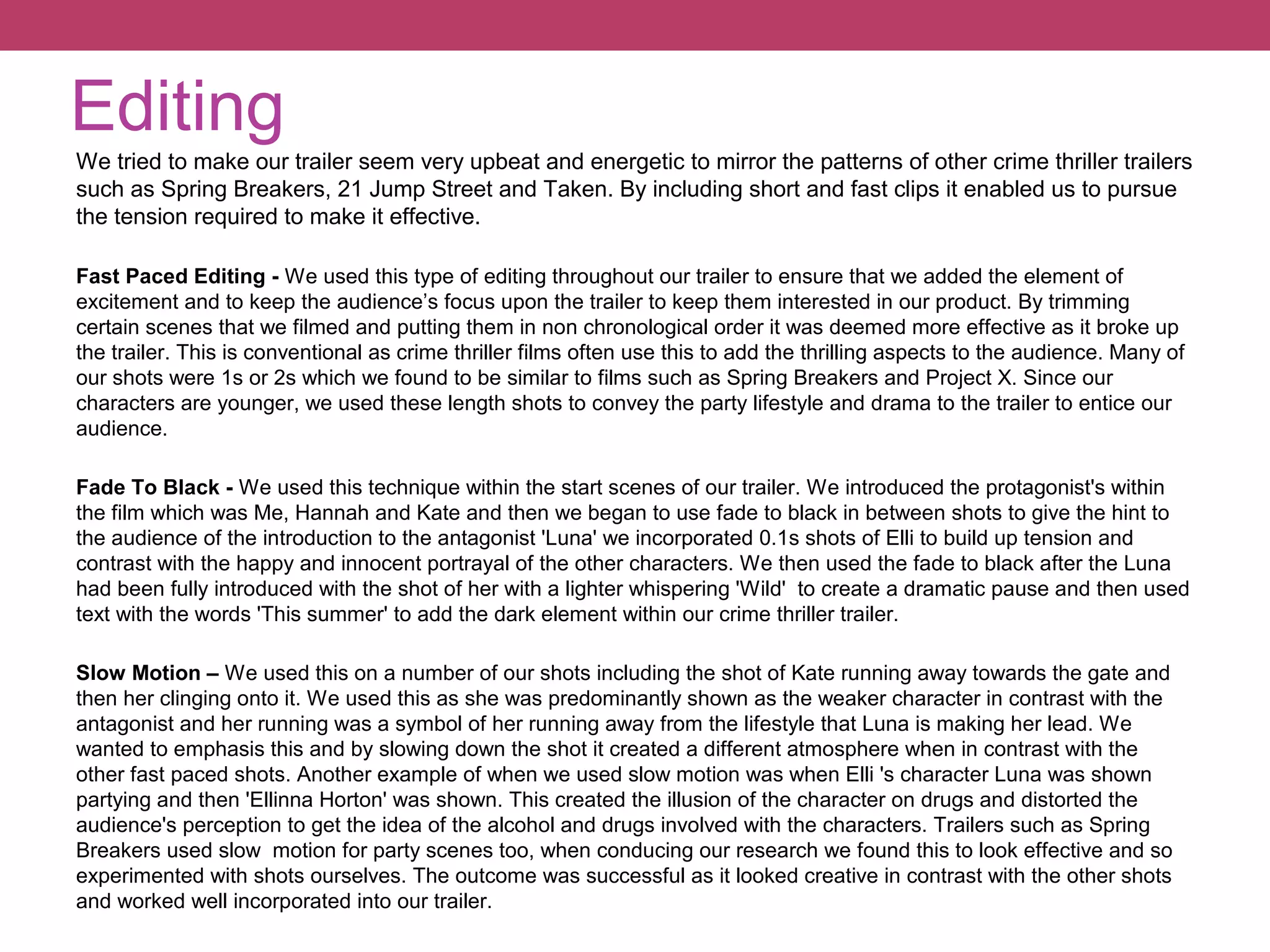
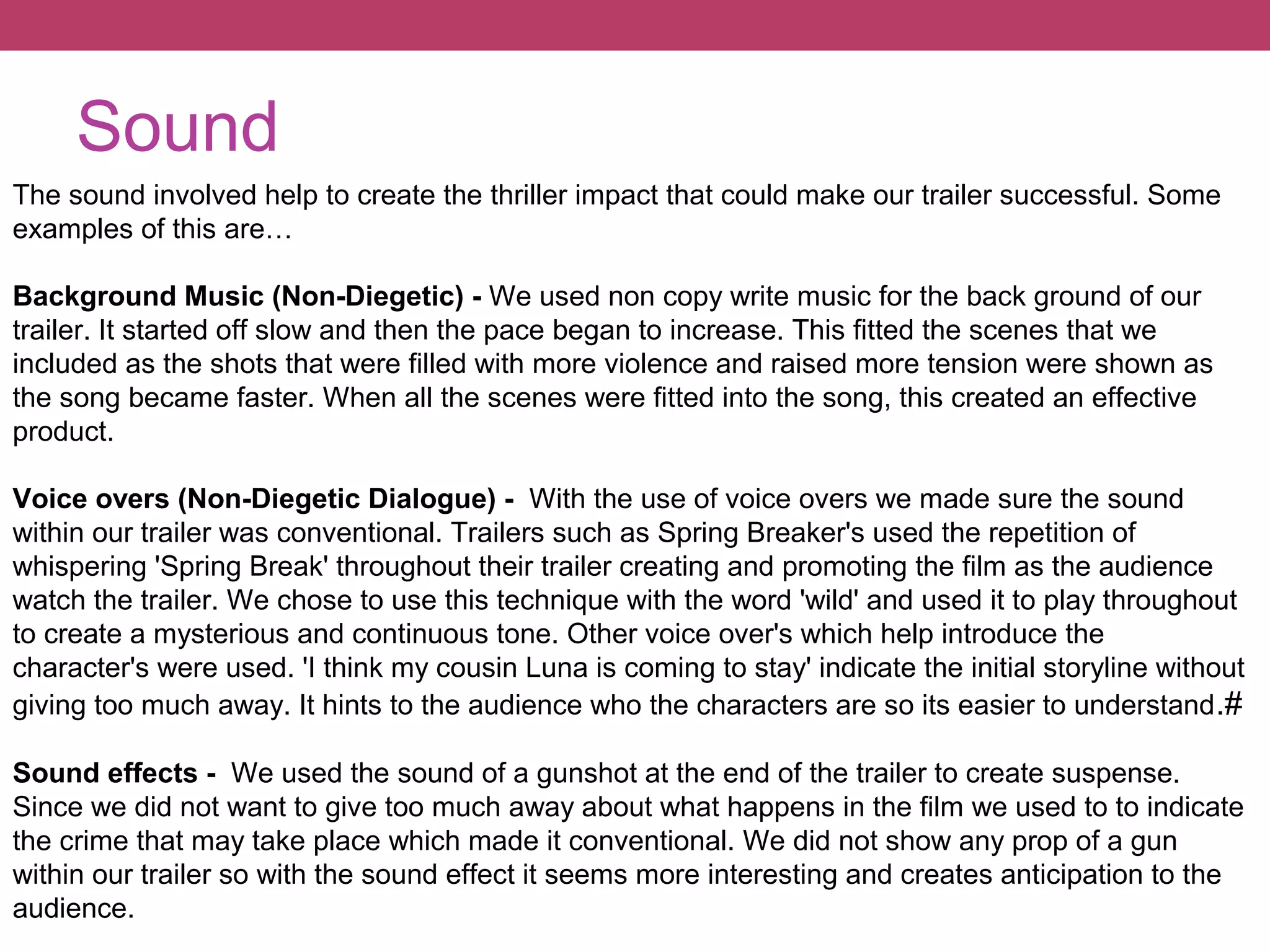
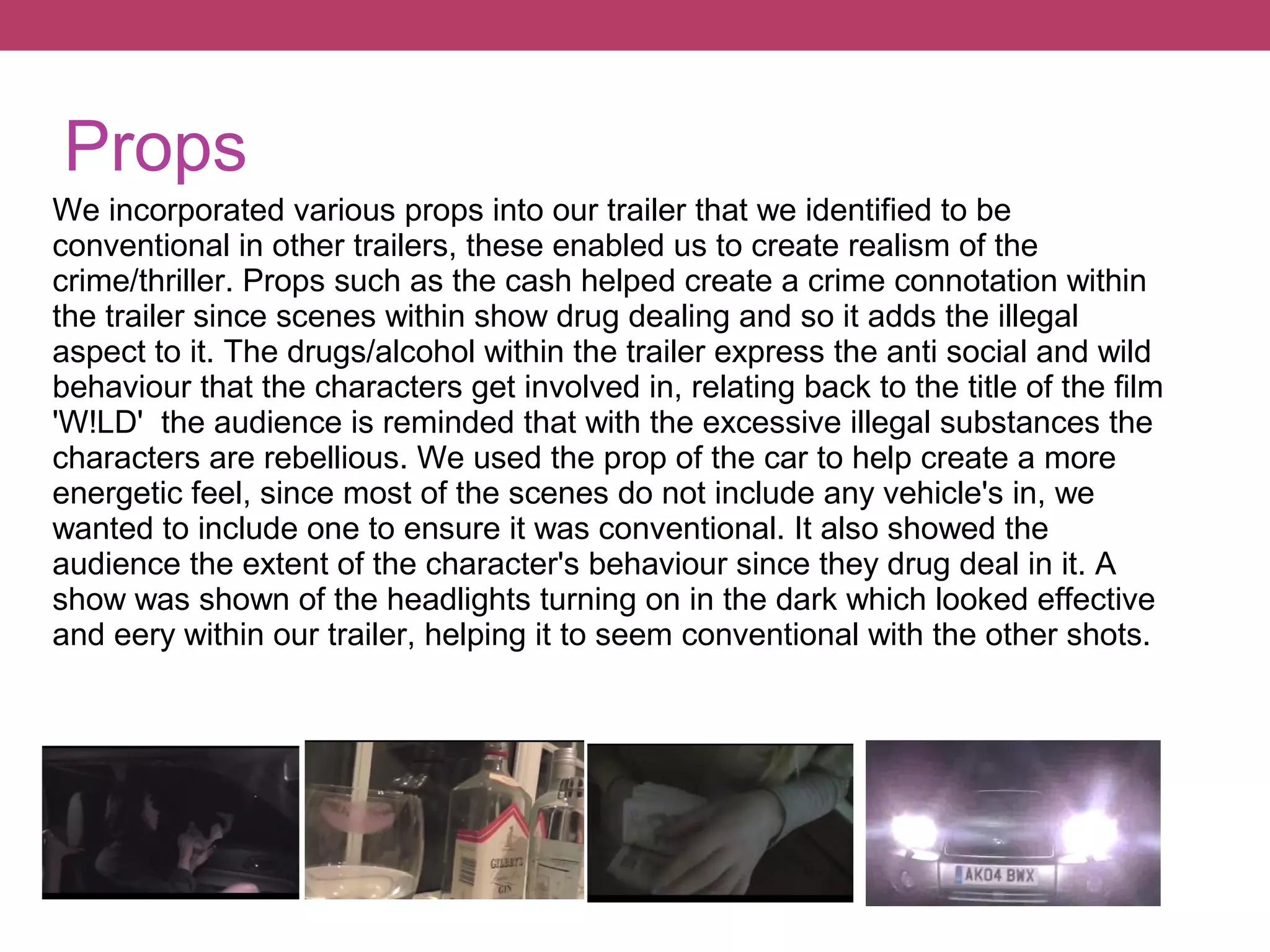
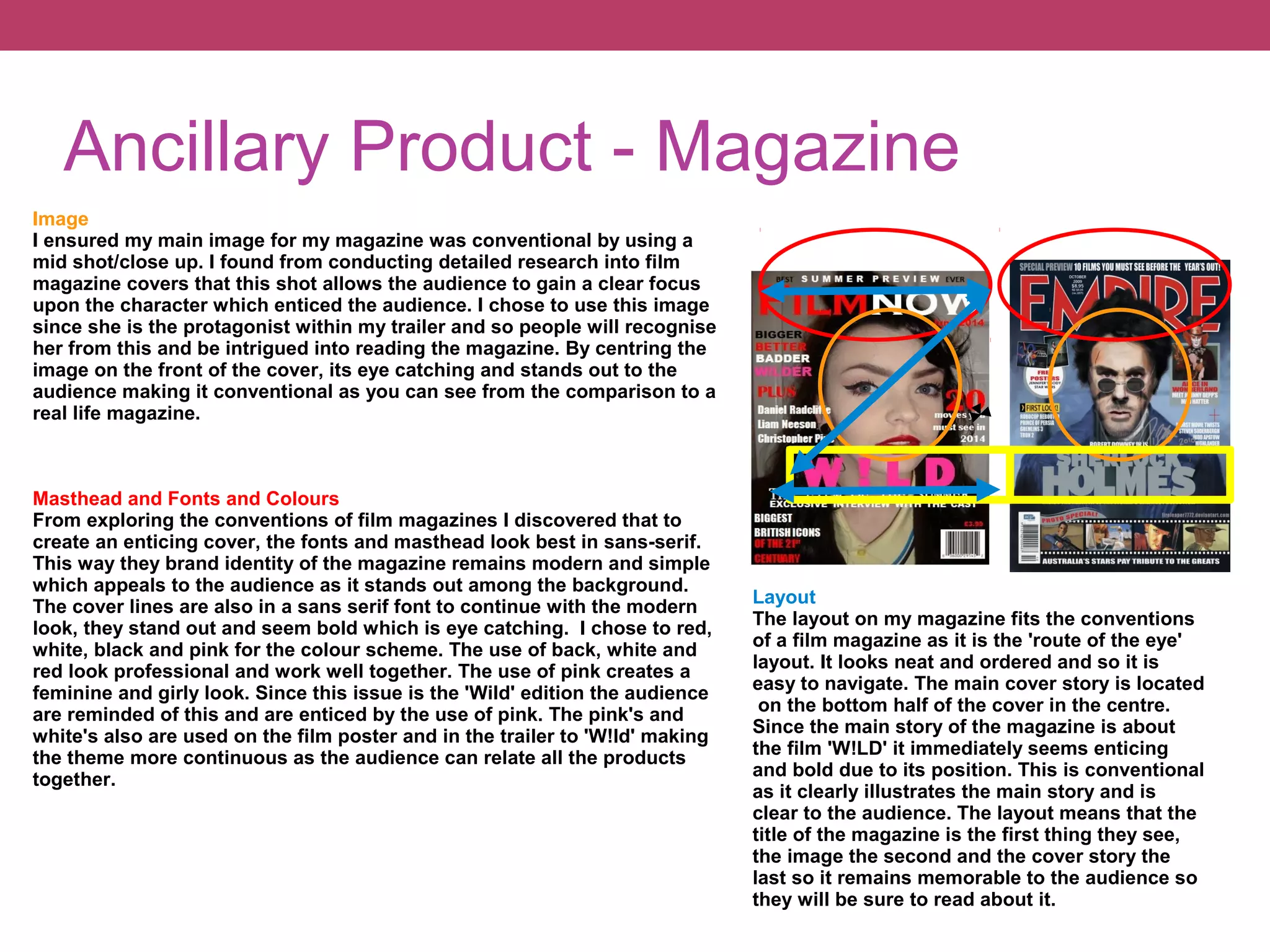
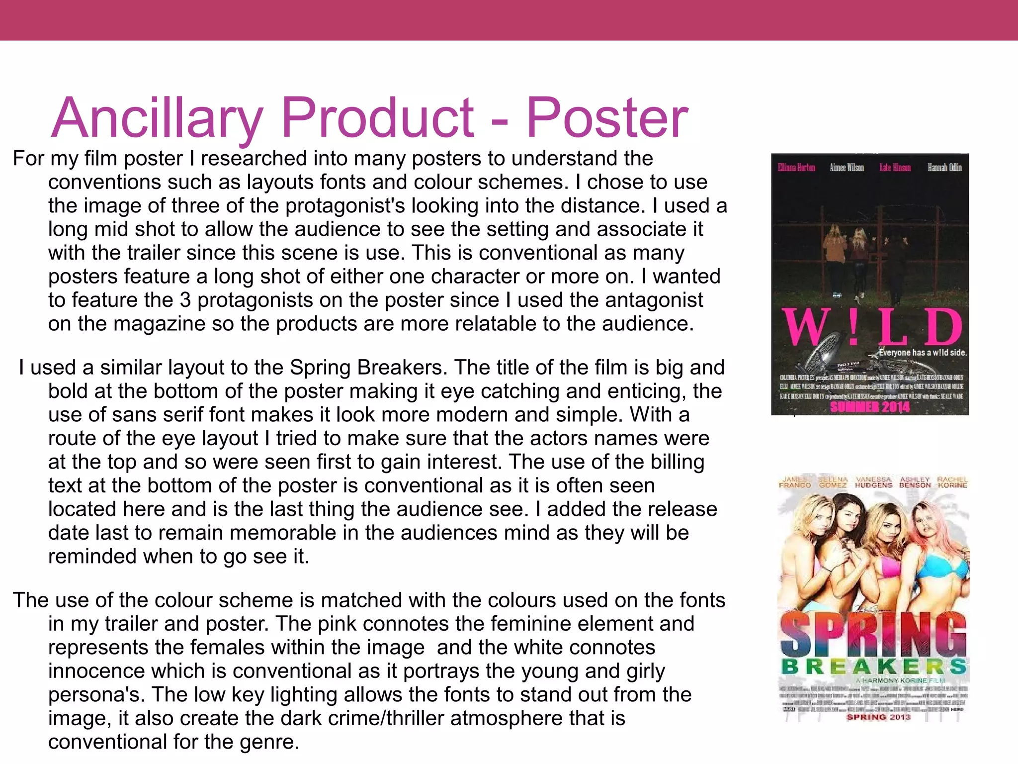
The document discusses the conventions used in creating a crime/thriller film trailer and ancillary products like a magazine and poster. It analyzes how conventions of genre, form, characters, camera work, editing, sound, props, and layout were incorporated from research on similar media. Conventions like fast pacing, voiceovers, close-ups, and naming actors were used in the trailer. The magazine cover featured a close-up shot, sans-serif fonts/layout, and related colors. The poster employed a mid-shot, similar fonts/layout, and matched the trailer's color scheme.