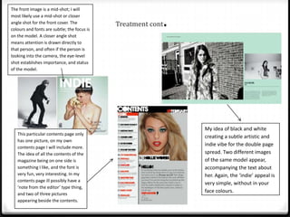
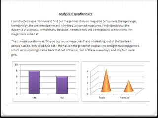
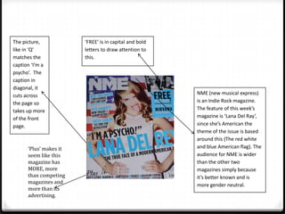
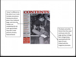
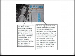
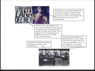
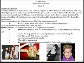
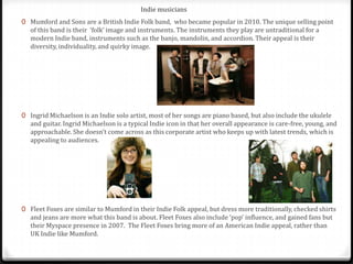
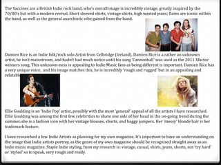
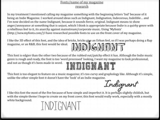
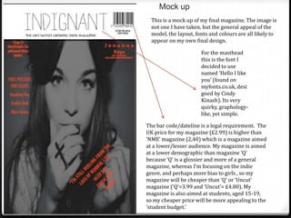
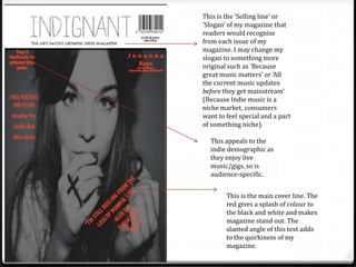
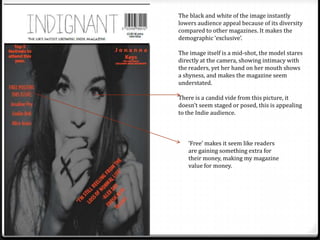
This document provides details about a student's media coursework project to design magazine pages for a new music magazine. It includes research conducted on existing magazines, indie music genres and artists, fonts, and the writing style for a double-page feature article. The student has chosen to create pages for an indie music magazine called "Indignant." Research covered magazine layouts, covers, contents pages, and photo styles. The treatment describes planned photoshoots and designs for the front cover, contents page, and double-page spread featuring an upcoming female indie artist.
This document provides an analysis of a 3 double page media spread from a magazine.
1) The spread features articles on famous R&B artists Rihanna and Solange Knowles through close up photos and descriptive text. Key details like hairstyles and outfits are highlighted to attract female readers.
2) Catchy titles like "What's My Name" and "Forget Her Sister" are used to intrigue readers and make the spreads seem like gossip. Photos of the artists are prominently displayed to draw the eye.
3) Color, font, sizing and placement of images and text are carefully designed to maximize attention and encourage reading. Strong colors like red, black and yellow contrast
Magazine Photography Analysis and Research selinargyrou
This document analyzes magazine front cover photographs from different music magazines. It summarizes the key elements of each photograph and how they effectively represent the magazine's brand and target audience. The photographs use bright colors, futuristic or playful themes, and creative poses or styles to catch readers' attention while reflecting the type of music and content featured in the magazine.
The Rolling Stones magazine has a simple pink masthead written in a sans serif font. The main image is of Rihanna looking directly at the camera with a calm expression. The large pink heading "Rihanna" has a quote from her in matching pink. The layout uses minimal text and images while focusing on the color pink.
The magazine cover uses a simple layout with a medium shot of two artists facing away from each other to imply rivalry in the music industry. Red is prominently used to connote the rock genre. Questions are asked under subheadings to encourage reading the articles. The masthead is bright yellow to catch the eye, and the main image overlaps it for regular readers.
Music magazine anaylsis for double page spreadAidan_Penzo
The main image spans two pages showing the artist reaching out to capture audience attention. The text is laid out with the image in the middle and writing around it, using floating quotes to link the image and text. The writing style tells the artist's story in a narrative format incorporating their quotes. The genre portrayed matches the artist's quirky personality and explosive music style. The double page spread effectively promotes the upcoming artist through its appealing layout and in-depth profile.
This document discusses and analyzes the cover of a Lady Gaga issue of Billboard magazine. Key aspects analyzed include the color scheme, positioning of Lady Gaga, and how cover lines are used. It also reflects on design choices and how they impact whether the cover will attract readers.
The document discusses the design choices made for the magazine "Vinyl". It uses a three-color scheme of black, white, and purple. The cover uses three fonts but additional fonts are used inside. Photographs with old-style frames indicate an interest in retro photography. The target audience is described as teenage girls based on the feminine photography, fonts, and color scheme used. The magazine aims to represent indie music styles through the featured bands, fashion content, and photography style.
The document analyzes the design elements and conventions used on the cover of a magazine. Key elements include:
1) The masthead is large and bold to grab attention, positioned in the top third as is typical.
2) The main cover line and image dominate the page, with the line positioned above to maintain prominence over the image.
3) Additional lines like the date, skyline, and buzz words are used to inform readers of content and attract potential buyers.
The document provides details on how the magazine cover and contents were designed to attract both male and female indie music fans as the target audience. Key design elements included using neutral red, black and white colors; easy to read fonts; a mix of male and female artists on the cover and in images; and natural, non-sexualized photos appealing to indie stereotypes of individualism and non-conformity. The coverlines, freebies and competitions were aimed at grabbing attention, while pull-quotes and standfirsts were used to entice readers into the articles.
This document provides details about the layout and design of magazine covers and contents pages. Key points include:
1) Magazine covers typically feature a large masthead at the top, prominent images, bold text highlighting the main artist or article, and small text or symbols indicating additional contents.
2) Contents pages list the major articles and features with accompanying images and page numbers, and include additional sections for minor items, advertisements, and issue details.
3) Design elements like fonts, formatting, coloring, and positioning are used intentionally across covers and contents to guide the eye, emphasize key information, and create a consistent brand identity and style.
The magazine cover features a young female model with unusual makeup and a spider on her face that grabs the reader's attention. The masthead is placed horizontally but regular readers will still recognize the magazine. A clear color scheme is used throughout the cover that matches different elements. The choice of model represents the magazine's youthful and quirky nature.
Vibe is a magazine focused on R&B and hip-hop music, launched in 1993 by Quincy Jones. While it shut down print production in 2009, it was purchased by a private equity firm and continues online. The magazine features artists and entertainers predominantly from the hip-hop world. Its target audience is between ages 18-34, especially those interested in hip-hop culture.
The document analyzes the design features of magazine covers, contents pages, and double page spreads. It compares the design of an existing music magazine, NME, to a hypothetical new music magazine the author has created. Some key conventions analyzed include use of color schemes, prominent images, headlines and subheadings, and background designs. The author notes how their hypothetical magazine both develops and challenges some conventions of real music magazines.
The document provides an analysis of the design elements of different magazine covers and how they attract their target audiences. It discusses aspects like the masthead, main image, model credit, cover lines, colors, typefaces, photography lighting, and design principles used. Key points made include that bright colors like yellow and pink attract younger audiences; revealing images and celebrities appeal to both female and male readers; and formal layouts but informal language can target both adults and teenagers.
The document summarizes a magazine cover featuring Jennifer Lopez. Key details include:
- Jennifer Lopez is the main cover image in the center, drawing readers in with her direct gaze.
- The masthead and cover lines are in red and other colors, coordinating with Lopez's red dress.
- The layout follows the rule of thirds, with cover lines on the left, image center, and right.
- The target audience is affluent, fashion-interested women seeking inspiration from Lopez.
The document analyzes two double page spreads from NME Magazine.
The first spread features artist Dizzee Rascal and analyzes elements like the main image, captions, headings, color scheme, and background. The written article discusses Dizzee Rascal's career over the past year.
The second spread features artist Florence from Florence and the Machine and also analyzes elements such as the main image, captions, headings, color scheme, and background. The written article covers Florence's rising fame and success in the music industry.
Both spreads showcase the artists and provide concise updates on their recent work in a formal journalistic style through images, design elements, and short column articles.
The document provides an analysis of NME Music Magazine's Dizzee Rascal edition from 2009. It examines the front cover design including the main image of Dizzee Rascal, use of colors and fonts, and placement of elements. It also analyzes the contents page layout, a double page article spread, and concludes with background information about NME magazine. The document conducts a thorough visual and textual analysis of key magazine pages and elements to understand how they are designed to attract NME's target audience of 16-25 year old music fans.
The document analyzes and compares the double page spreads from Q Magazine and NME Magazine.
The Q Magazine spread features Adele with a sophisticated black and white image and focuses on her achievements over the past year. It targets older audiences who listen to Adele's music.
The NME Magazine spread features Nicki Minaj with a bold, colorful pink image representing her pop music. It uses a lively design with different text sections and quotes to engage younger, female readers who are fans of Minaj.
The spreads show how magazine layout, images, colors and text are tailored to attract different target audiences for the featured artists.
The double-page spread features a large central image of two artists, Alex Turner and Miles Kane. Red, black and white are the dominant colors used throughout to reflect the rock theme.
The typography is bold and large to emphasize the genre of music magazine. Headlines are in all capital letters to draw attention. The content and additional images on the pages relate to the featured artists, creating cohesion and targeting their audience.
The representation of Turner and Kane in the main image is that they know their craft through their confident yet intriguing facial expressions and eye contact with the viewer. This draws the reader in to learn more about the artists.
The document provides an in-depth analysis of the layout, images, and design elements used in magazine spreads featuring Lady Gaga, Adele, and Nicki Minaj. For Lady Gaga, the large portrait emphasizes her importance, while her intense facial expression and styling convey a "bad girl" image. For Adele, her more casual pose and lack of eye contact break conventions to portray her as unique. Nicki Minaj's animal print clothing and jewelry reflect her wild personality, and her direct gaze implies she is an open artist.
This document discusses how the media product, a magazine, represents particular social groups through its design elements. The magazine aims to represent both the indie and pop genres by incorporating vintage and modern styles. It uses a jukebox as its masthead to connect to both subcultures. Color schemes of red and purple are used to symbolize the genres. Images and articles portray teenagers having fun and express dominant social norms. Fonts, layouts, and other visual elements aim to appeal to both genres while maintaining a scrapbook style.
This article profiles British rapper Dizzie Rascal and his recent success. It describes the scene before his photo shoot for NME magazine, where he arrives with an entourage. The article then discusses Dizzie's winning numerous awards in the past year, including awards from GQ, NME and MOBOs. By providing details about both Dizzie's personality and his professional accomplishments, the article gives readers insight into his rise in the music industry.
Both magazines have bright color schemes including oranges and pinks. They use sans serif fonts throughout and have clearly displayed cover stories in the bottom left corner. The layout uses a route of the eye technique to guide the reader through the key information.
The document analyzes the design elements of an NME magazine cover featuring Jay-Z. It summarizes that the cover is designed to draw attention to Jay-Z through the placement of elements. The masthead uses a large, blocky font in red to stand out. Kickers on the cover relate to Jay-Z and use his logo font in red. The language and terms used on the cover appeal to indie music fans and associate the magazine with rebellion through music. Black, red, and white are prominently used to connote rebellion and the music genre. Jay-Z is prominently featured as the main model, looking directly at the reader while wearing black glasses in line with his musical heritage.
The document summarizes the layout, typography, images, language and evaluation of magazine covers and pages about music artists. It describes the fonts, colors and positioning used on covers and pages about Florence and the Machine and Lady Gaga. Red, black and white are prominent colors which appeal to different genres and demographics. Images of the artists are prominently featured and their styles represented. Feminine fonts are used for articles about women artists to represent their gender. The layouts follow the natural flow of reading and use large fonts and colors to draw attention to the artists and articles.
This article provides a behind-the-scenes look at rapper Dizzie Rascal's photo shoot with NME magazine. It describes his arrival with entourage and discusses his successful past year, having won several awards including from GQ and NME. The article aims to give readers insight into his personality through informal descriptions of the shoot atmosphere and his interactions, appealing to its audience through an intimate tone that balances humor with celebrating his music career achievements.
This document discusses how the author's media product uses and challenges conventions of a real magazine genre. It provides examples of how different elements of the magazine follow or subvert expectations. The contents page uses a black and white color scheme and paragraph from the editor to indicate it focuses on indie music. The double page spread features a model dressed in darker indie-style clothing with an indirect gaze, challenging stereotypes. Technical elements like fonts and placement of images are designed to be modern and appeal to a young audience. Symbolic codes like clothing and gaze are used on the cover and spread to convey moodiness rather than following conventions.
The document discusses the conventions and codes used in the media product of an indie music magazine. It uses technical codes like fonts, layout, and images as well as symbolic codes like posing of subjects and color schemes to identify the magazine's genre and challenge stereotypes. The cover features indie artists to attract readers interested in that genre. The black and white color scheme and lack of color on the contents page further signals the indie genre. However, a double page spread subverts expectations by posing the artist with an indirect gaze rather than a direct smile at the camera as seen in other magazines. Overall, the document examines how the magazine's forms and styles develop and challenge conventions to effectively represent its target indie music audience.
The double page spread features an interview with singer Lily Allen. The main image shows Allen in a red tartan shirt, with dark makeup and short dark hair, looking directly at the camera. A quote from Allen is used as the title for the spread, using different sized letters to emphasize her state of mind. The introduction highlights Allen's name in red. The article is written in a simple font, with the first letter in bold to mark the start of the piece.
The double page spread features an interview with singer Lily Allen, using a bold and irregular font for her introductory quote to emphasize her personality. A mid-shot image of Allen stands facing the camera in dark makeup and hair that contrasts with her pale skin, reflecting her strong presence. Brief text introduces Allen in red to stand out and catch the reader's eye before the main article begins in a simple font.
This document summarizes and analyzes the layout, design elements, and effectiveness of two music magazine double page spreads. For NME, it notes the bold colorful titles and image that stand out and make it eye-catching. For Q, it comments on the bold titles and image but judges the NME spread more effective overall. Both spreads are deemed good for their music genre.
Front cover analysis 3 – top of the popsasmediac12
The document provides information about the front cover of the magazine "Top Of The Pops". The summary is as follows:
[1] The main image on the cover is of singer Tulisa which will attract readers interested in her interview.
[2] The masthead spans the top of the cover in purple bubbly writing.
[3] The main cover line promotes Tulisa's "cheekiest interview ever" in large yellow text to grab attention.
This document lists different types of magazines and provides examples of magazine covers to analyze their target audiences. There are magazines focused on rock/indie (Kerrang), pop (Top of the Pops), country (Country Music), and R&B (Vibe). Magazine covers are analyzed based on visual elements like dominant images, colors, fonts, and language to infer the intended target demographic of younger vs older and male vs female audiences. Key aspects like cover images, headlines, and freebies are designed to appeal to fans of particular music genres and artists.
The document describes the process of selecting images and designing the layout for an indie music magazine. It discusses deliberating over which photos to use for the cover and features to establish the right aesthetic. Considerable effort was put into editing the cover image and ensuring variety among the small feature photos. Descriptions of the magazine masthead, selling points, interviews, festivals content, and features aim to appeal to an indie demographic.
Paije Hannaghan aims to create a weekly music magazine targeting 16-25 year olds, particularly females. The magazine will have a pop/indie/R&B genre influence from Q magazine. Colors like teal and red were chosen to represent qualities like unique, exciting, and energizing. Sample pages include a profile of a typical reader, cover images of a friend modeling as an indie artist, and layout ideas that feature large images and ads.
The document provides details on planning an indie music magazine, including:
1) The magazine will have a comical style with a red, white, light blue, and black color scheme. The target audience is 16-25 year old males.
2) The cover image will feature a boy band. Interior images will include bands in natural settings.
3) Content will focus on indie music news and reviews, appealing to fans through an informal tone. Consistent branding aims to build audience familiarity.
The contents page uses a space theme color scheme of yellow text on black background to match the magazine's genre. It provides preview images and brief summaries of the magazine's articles to entice readers while also listing the issue number, date, and page numbers for article locations. The layout is simple and straightforward, drawing attention to exclusive interviews and larger artist images to highlight key content without providing all details upfront.
The document analyzes and summarizes the contents pages of various music magazines, including NME, Q Magazine, and Vibe Magazine. It discusses design elements like logos, images, fonts, and color schemes used and how they create brand identity and appeal to target audiences. Conventions like featured articles, date of issue, and band indexes are described. Imagery and headlines are analyzed for how they relate to and promote the main stories.
The document summarizes the front covers of two music magazines - Vibe and NME. For Vibe, it notes the simple layout featuring an image of smiling artist T.I. linked to the main headline. It comments on the hidden masthead, unique color scheme, and conventions used. For NME, it highlights the seductive image of Florence linked to the headline, more complex layout providing previews, and use of red and white colors linking to the masthead. The writer expresses wanting to incorporate effective images, unique color schemes, and playful yet professional designs like these magazines for their own music magazine cover.
This magazine analysis document provides details on the layout and design conventions of several magazines.
The NME magazine cover follows conventions like having celebrity images and eye-catching text and fonts. Details are given on the layout of contents pages, including use of colors, images and fonts to draw readers in.
The magazine for young girls uses pink colors and designs inspired by a girl's bedroom to appeal to its target audience. Article formats include photos, games, and drop caps to make the content fun and accessible.
Magazine reviews feature star ratings and illustrations to complement music and DVD coverage. Conventions like headlines, credits and column designs are described.
The Macabees are featured in the article. They are an indie/rock band from London that will attract a young audience interested in that genre of music. The language used in the article is informal and casual to be accessible to a wide readership. Bright colors like orange and blue are used in the design which relates to the band's grungy rock and roll style. Images appear to be candid shots from concerts and portray the band as fun and playful.
The double page spread features the indie rock band The Macabees in NME Magazine. A variety of informal, candid photos from gigs and backstage are used. The main image on the left page shows the band looking disinterested. Smaller polaroid-style images spill onto the opposite page to connect the two. Bold orange and blue colors are used throughout in a grungy style befitting the band. Mixing fonts maintain clarity while overlapping text elements enhance cohesion. The informal, colorful presentation targets NME's young, creative readership interested in indie music.
The document provides details on the design of an indie/rock music magazine cover and contents page. Key elements included are:
1) The masthead is in an edgy font and overlaps the main image to make a statement. Splashes from the masthead indicate carelessness.
2) The main image is a closeup of a female artist to have them "take over" the cover. Artist name and coverlines are transparently overlaid.
3) Red is used for alertness and is a popular indie/rock color. A flash shape adds intrigue.
4) The contents page features multiple images and captions. The masthead and editors note add professionalism. A pull quote
The document provides an analysis of magazine covers, contents pages, and double page spreads from various music and fashion magazines. Key points summarized:
1. Magazine covers are analyzed for color palette, font, image composition and how they represent the musical genre. Simplistic color schemes with 3-4 colors are most suitable for music magazines.
2. Contents pages organize information through section headers and discreet text listings. Images can attract readers if they take up 1/3 of the page.
3. Double page spreads examined layout, color palette, title/quote placement, and how photos represent the musical artist. Larger center images with minimal surrounding text look most like music magazine style.
The document provides details on planning an indie music magazine targeted at 16-25 year old males. It discusses setting the price at £2.50-£3.50 for 100 pages to be affordable for the target audience. The magazine will have a comical style with red, white, light blue and black colors. Content will focus on indie/rock music genres and include pictures of boy bands playing instruments. The cover will feature a large picture of a boy band and list content. Interior pages will follow the color scheme with titles, images and content bullets.
The document describes the process of creating a magazine cover, contents page, article layout, and questionnaire for a music magazine. Key details include using a female model on the cover to appeal to a broader audience than typical rock magazines. Color schemes, images, and fonts are chosen to represent the rock/alternative genre. Feedback from a questionnaire informed the content sections and artists featured. Overall the magazine aims to challenge conventions while appealing to its target 16-20 year old audience.
The font used on an advertising poster is important as it can complement or detract from the accompanying image. For the magazine posters examined, the font color is similar to the background so it is subtle yet coordinates with the poster theme. The large font size does not disturb the images because of its color. The selected font should be simple yet not look unprofessional, and only certain fonts are available in InDesign. Several font options are considered for a magazine ad targeting a younger audience, with Bernard MT Condensed selected for its quirky circular style that is less corporate and more colloquial.
The font used on an advertising poster is important as it can complement or detract from the visual image. For the magazine posters examined, the font color blended subtly with the background so as not to distract from the image while still being noticeable. The large but light-colored font allowed the image to take prominence without interruption. When selecting a font for her own magazine poster, the author considered fonts that were simple yet appealing to her younger target audience without looking unprofessional or corporate. A circular font style was chosen that had a quirky edge without the filling effects that could interrupt the visuals.
This document outlines the production schedule for a music video from October to February, including:
1) Obtaining permission from the artist and a studio recorded track of the song in early October.
2) Storyboarding and treatment in mid-October followed by test shoots with different cameras.
3) Location permission, cast releases, and equipment planning in late October.
4) Filming performance aspects of the song in November and stop motion animation in December while editing begins in January.
5) The project is finalized in February with packaging and deliverables uploaded to a blog.
This document provides equipment, props, cast, location, and shot lists for a music video. It details that a Panasonic and Lumix camera will be used, with a tripod for quality shots. A reflector will illuminate outdoor shots at the beach location. Props include the artist's guitar and the filmmaker's car. Only the artist and filmmaker will be featured to keep it simple. Shooting locations are Swanage beach, inside the car, and house interiors. The shot list outlines various shots conveying the artist's emotions over losing his love, including establishing, close-up, mid, and long shots.
The document is a production crew list for a music video. It shows that the producer, writer, director, sound mixer, director of photography, costume/makeup designer, caterer, editor, and stills photographer are all the same person, listed as "Myself". Ollie Walker is credited as the composer and is one of two people cast in the video along with the producer, and permission has been obtained from Ollie and his father for his involvement.
The video risk assessment form summarizes potential hazards for filming a music video at various outdoor locations. It identifies risks of filming at Swanage Pier/Beach such as falling from the pier or strong tides. Risks of filming inside a car include speeding and improper seatbelt use. Filming inside a house poses no additional risks. Overall risks were rated as low and further safety actions were not required for the beach or car locations.
The schedule outlines the production timeline for a music promo video, DVD/CD cover, and magazine advert from October to May. Key dates include obtaining permissions in early October, storyboarding and treatments by mid-October, test filming in late October, principal filming between late October and mid-December, editing from February to March, final edits by late March, and deadlines at the end of April and early May. Research and evaluations will be documented on a blog throughout the process.
This document provides equipment, props, cast, location and shot lists for a music video. The primary equipment includes a Panasonic DMC-L10 camera and a Mino Flip camera, with a tripod for stable shots. Props include the artist's guitar and the filmmaker's car. The cast is limited to the artist and filmmaker portraying his lost love. Shooting will take place at Swanage beach, in the filmmaker's car, and at his house. The shot list outlines various shots including close-ups, establishing shots, and shots conveying the artist-love relationship story over the course of the video.
The advertisement promotes Metallica as the "Kings of Heavy" metal through dark imagery and intense eye contact that represents their heavy, controversial music. The band members are dressed in dark clothes and stare dominantly at the camera, creating a relationship with fans of their genre. In contrast, Mumford and Sons are promoted as bringing a folk-inspired "American Revolution" with a vintage, natural aesthetic that presents them as easy-listening "English Gents" leading their success internationally. Their advertisement features the band smiling in the countryside with their instruments to match their folk appeal.
The Digipak for Rihanna's album "Loud" prominently features an extreme close-up of the artist to promote brand recognition. Red is a central color motif relating to Rihanna's passionate persona. The music video for the single "Only Girl in the World" influenced the Digipak design with its close-ups and nature shots. Colbie Calliat's "Breakthrough" Digipak features candid photos of the folk artist in natural settings, conveying her down-to-earth style through vintage design elements and simple color palette.
The April issue of Indignant magazine focuses on new music talents, with a cover story interview of 19-year old singer Ariella Ada who has found success after uploading her first video to YouTube a year ago and is now signed to a major record label, where she discusses her musical inspirations including Ellie Goulding and hopes to continue growing her career internationally in the coming year. The issue also features interviews with up-and-coming artists Jake DeRand and actress/pianist Josie Mills.
The document appears to be the April issue of a UK music magazine called "Indignant" which focuses on new indie music talents, including a cover interview with 19-year old singer Ariella Ada who discusses being signed to a major record label while still a teenager and where she hopes to be professionally in a year. The issue also features interviews with up-and-coming artists Jake DeRand and Josie Mills, festival news, song recommendations, and posters for Fleet Foxes and The Vaccines.
The document discusses editing a magazine cover and contents page to improve quality. The original black and white cover photo was replaced with a color photo edited in Photoshop for better quality. Font colors and layouts were also adjusted to match a 1970s vintage theme. Exposure, offset, and gamma corrections were applied to the new cover photo to enhance lighting effects and focus on specific areas like lips. Overall the edits aimed to create a magazine that better fit the intended 1970s retro style and demographic.
The document discusses the album cover for The Script's "Science and Faith" album. It summarizes:
1) The album cover shows a male and female hand joined together, representing the joining of science and faith as well as men and women in creation.
2) The aged, worn background page continues the theme of faith and religion, perhaps alluding to biblical scriptures, while also representing science through gridded charts.
3) The album title and cover art generate a theme associating the band with the combination of science and faith.
The Smiths were an influential alternative rock band formed in the UK in 1982. Their 1985 album "Meat is Murder" was largely self-produced, with singer Morrissey heavily involved in all aspects of production and choosing the controversial album artwork. The artwork featured a black and white image of a soldier with the words "Meat is Murder" airbrushed onto his helmet, representing Morrissey's strong opposition to slaughtering animals for meat and making a bold comparison to war.
The document discusses three music videos and analyzes whether they are examples of concept, narrative, or performance videos. The first video about bouncing balls traveling down a street is described as highly conceptual with no distracting performance or narrative elements. The second video solely focuses on a band's live rehearsal performance without an audience to create intimacy. The third video tells the narrative of a relationship ending through the duet performance of the song's artists portraying the characters in the lyrics, blending narrative and conceptual elements.
3. The brief
0 The brief, set by the OCR exam board, was to design
the front page, the double-page spread, and the
contents page of a new upcoming music magazine. We
could choose the genre, all models featuring in the
magazine, the name of the magazine etc…we must
produce a research/planning page, and finally an
evaluation.
0 The first task is an unmarked preliminary project,
which must the cover page and page of contents for an
upcoming 'school magazine’, this is shown on next two
slides.
4. Preliminary Project
FRONT COVER: I created my preliminary
project using Adobe ‘InDesign’ as this
programmed allows me to manipulate
fonts/images onto each other which is
necessary for a magazine. I also created my
‘Mock up’ magazine on the same
programme. The green contrasting with the
sepia pictures gives a vintage effect and
could also represent the age-long tradition
of ‘Sixth Form’. The Fonts I used are in
contrasting colours to the picture so they
can be seen. The picture represents a happy,
united feel to the school.
PAGE OF CONTENT: The page of content features a
summary of articles/interviews appearing in the issue of
the magazine. It may also include preview pictures to
gain interest levels of readers.
5. Treatment (initial
idea of my
project)
0 For my 2012 coursework I will be constructing the front cover, contents page and a double page spread for a
new music magazine. I have chosen the genre of Indie, simply because it’s the magazine I’d be most inclined to
buy, and the one I will therefore get the best research out of.
0 As an initial idea for my magazine I will photograph three ‘upcoming indie musicians’. Two of which will be
girls, and the other a boy/girl duo. For the front cover of the magazine, I will have a close up shot of a
girl, subtly edited, smiling and staring directly into the camera. The model on the front will also feature in the
double page spread. The photographs of the other two will feature in the contents page to show variation and
more diversity within the Indie Music genre.
0 The location for the double page spread will be outside, perhaps with nature, to coincide with the quirky and
free-spirited theme of my magazine, possible shots will be a model playing the guitar outside around
tree’s/fields. The front cover will be shot inside, against a clear background, possibly white (black and white
theme) as I want the front page to be minimalistic but eye-catching. Since the pictures on the contents page
will be close up shots, the location for these are less important, but will most likely to be shot in a
studio/indoor location.
0 The double page spread will be about a new British upcoming female artist. Her look will be
youthful, current, and ‘Indie’, focusing on her image as a role model to young people, being in her late teens
herself.
0 Just as an initial idea for my magazine, I have researched into the magazine ‘Indie’ (The independent style
magazine). Although the magazine is not a music magazine, the image is very relevant to the idea in mind for
my music magazine. It has a very young feel, and perhaps appeals more to the female demographic more so
than the male. But as long as I’m aware of appealing more to girls than boys in my magazine, I can use this to
my advantage and be creating a product for an audience in mind. I have come up with some rough name ideas
for my magazine, the idea that the name of the magazine has the first three letters ‘Ind’:
Indignant, Indignation, Indecorous, Indelible etc…
6. The front image is a mid-shot; I will
most likely use a mid-shot or closer
angle shot for the front cover. The
colours and fonts are subtle; the focus is
Treatment cont .
on the model. A closer angle shot
means attention is drawn directly to
that person, and often if the person is
looking into the camera, the eye-level
shot establishes importance, and status
of the model.
My idea of black and white
This particular contents page only
creating a subtle artistic and
has one picture, on my own
contents page I will include more.
indie vibe for the double page
The idea of all the contents of the spread. Two different images
magazine being on one side is of the same model appear,
something I like, and the font is accompanying the text about
very fun, very interesting. In my her. Again, the ‘indie’ appeal is
contents page ill possibly have a
very simple, without in your
‘note from the editor’ type thing,
and two of three pictures
face colours.
appearing beside the contents.
7.
8.
9.
10.
11.
12.
13. The bubble across the top
The model of this issue is Research into existing magazines ‘140 songs you must
‘Lana Del Rey’ , An American download now!’ Uses
‘Indie pop’ artist, is made up alternating background and
here to be ironic (the font colours. It is effectively
rhetorical caption ‘Why so advertising the artists of
bloody good?’) and also to these crucial songs, and
draw attention. Though her teasing the reader to buy the
dress is plain, her long dark magazine and download the
hair is the main focus to the songs.
cover, as well as the blood
fall down her face. The advert for ’26
festivals that will blow
your minds’ is in a yellow
The title of the
bubble partially covering
magazine is
the model, this means it
red. Against
is easily visible, and
the
becomes a main factor on
background, th
the magazine. Music
e simple ‘Q’ in
festivals are very popular
the red box is The featuring story to this magazine ‘Lana Del
for Indie music, and
made Rey’ is in a noticeably different font to the
therefor the Indie
dominant and others, and also a different colour. The font is
demographic.
a centre focus. bigger than any other on the cover, and the
quirky writing which looks maybe scribbled or
hand-drawn adds to the ‘Indie’ and ‘Young’
appeal to Lana Del Rey.
14. The picture, ‘FREE’ is in capital and bold
like in ‘Q’ letters to draw attention to
matches the this.
caption ‘I’m a
psycho’. The
caption in
diagonal, it
cuts across NME (new musical express)
the page so is an Indie Rock magazine.
takes up more The feature of this week’s
of the front magazine is ‘Lana Del Ray’,
page. since she’s American the
theme of the issue is based
around this (The red white
‘Plus’ makes it and blue American flag). The
seem like this audience for NME is wider
magazine has than the other two
MORE, more magazines simply because
than competing it’s better known and is
magazines and
more gender neutral.
more than its
advertising.
15. The red title works incredibly
well because it is especially
bold against the black and
white colour scheme.
UNCUT has a specific
clientele, it’s aimed at
The black and white works
men aged 25-45, hence
here because the faces of
the Beatles are on the
‘The Beatles’ still stand
front, as they were from
out, the picture has been
around this era, and
enhanced, but the black
hence the black and white
and white work for a
picture to tie-in with the
simple theme.
vintage theme. Artists of
the same calibre have also
featured in UNCUT such
as David Bowie,
Morrissey, John Lennon
etc.
16. This picture is bigger than ‘Plus’ makes it seem like
the others, so though not more value for your money.
the ‘cover’ or ‘feature’ Also, the simpler layout
story, its importance in and lack of exuberant fonts
the issue is made known and shapes makes you
by the picture being think this magazine is for a
larger, and the smaller audience than ‘Q’
accompanying quotation. or ‘Uncut’.
All contents
pages seem to
use a number Advertising a
scheme; this subscription to the
highlights the magazine. In my own
page number magazine I may
where each include this, and also
story will include an
feature. It also advertisement for
organises the smart phone
page. It also apps/online copies of
features the magazine to keep
pictures of each up to date with
artist included audiences and
in this technology.
issue, almost as
a teaser.
17. This magazine, like
‘Uncut’ repeats the
theme of red and white
that was seen on the
‘140 songs to download contents page, this
now’ is advertisement for keeps continuity and
the involved artists that will gives a more
most likely be of the indie professional feel to the
genre because that’s the magazine.
genre of the magazine. Once
someone has downloaded
the songs they may be more The close up picture of
tempted to purchase the cover feature ‘Lana Del
magazine again. Ray’ gives a sex
appeal, and also an
intimacy with the artist.
The picture dominates the
page, because she is this
issues double page
spread. I may use a close
up picture of the cover
story in the contents page
myself, to offer
variation, and also a
‘connection’ with the
audience.
18. ‘Uncut’ is different to
the other to as it only
includes one picture.
Having one picture
gives a less cluttered
page, and since the
readers are
established (25-45
male age bracket) The black and white
they don’t need theme from the cover
pictures of every continues onto this
featured band. page, giving a vintage
feel, vintage being
associated with the
type of music
(indie/rock) this
magazine promotes.
19.
20.
21. Iconic Indie
Musicians/Audience
research
Indie music- research
Indie became known in the UK around the 1980’s, it’s a genre of Alternative Rock, with influences from punk,
folk and grunge music. Indie music is rather a ‘Niche’ genre, with a specific audience and a stereotype, which
accompanies this audience. Best known Indie artists in the UK are: Arctic Monkeys, Oasis, Radiohead, The
Vaccines, Fleet Foxes, Mumford and Sons, Ingrid Michaelson, Ellie Goulding, Damien Rice, The Kooks, The
wombats etc.
Characteristics of an Indie Music Consumer (The Indie music demographic)
• Dress in Skinny jeans, band t-shirts, vests, cardigans, baggy jumpers,
retro/vintage clothing, plimsolls, dolly shoes, flip flops.
Aged between 15-25 (my magazine aimed at 15-19 year olds (students)
• Attend music festivals such as Glastonbury, Reading…as well as regularly attending
Gigs.
• Shop at Topshop, Charity shops, Vintage Shops, H&M, Online shopping etc
• Free time spent; With friends, at parties
• More likely to smokedrink socially
• Take pride in appearance
• Take influence from celebrities such as Alexa Chung and Henry Holland.
22. Indie musicians
0 Mumford and Sons are a British Indie Folk band, who became popular in 2010. The unique selling point
of this band is their ‘folk’ image and instruments. The instruments they play are untraditional for a
modern Indie band, instruments such as the banjo, mandolin, and accordion. Their appeal is their
diversity, individuality, and quirky image.
0 Ingrid Michaelson is an Indie solo artist, most of her songs are piano based, but also include the ukulele
and guitar. Ingrid Michaelson is a typical Indie icon in that her overall appearance is care-free, young, and
approachable. She doesn’t come across as this corporate artist who keeps up with latest trends, which is
appealing to audiences.
0 Fleet Foxes are similar to Mumford in their Indie Folk appeal, but dress more traditionally, checked shirts
and jeans are more what this band is about. Fleet Foxes also include ‘pop’ influence, and gained fans but
their Myspace presence in 2007. The Fleet Foxes bring more of an American Indie appeal, rather than
UK Indie like Mumford.
23. The Vaccines are a British Indie rock band, who’s overall image is incredibly vintage, greatly inspired by the
70/80’s but with a modern revival. Short sleeved shirts, vintage shirts, high wasted jeans; flares are iconic within
the band, as well as the general anarchistic vibe gained from the band.
Damien Rice is an Indie folk/rock solo Artist from Celbridge (Ireland). Damien Rice is a rather an unknown
artist, he isn’t mainstream, and hadn’t had much notice until his song ‘Cannonball’ was used as the 2011 Xfactor
winners song. This unknown-ness is appealing to Indie Music fans as being different is important. Damien Rice has
a very unique voice, and his image matches this, he is incredibly ‘rough and rugged’ but in an appealing and
relatable way.
Ellie Goulding is an ‘Indie Pop’ artist, possibly with the most ‘general’ appeal of all the artists I have researched.
Ellie Goulding was among the first few celebrities to shave one side of her head in the on-going trend during the
summer, she is a fashion icon with her vintage blouses, shorts, and baggy jumpers. Her ‘messy’ blonde hair is her
trademark feature.
I have researched a few Indie Artists as planning for my own magazine. It’s important to have an understanding on
the image that Indie artists portray, as the genre of my own magazine should be recognised straight away as an
Indie music magazine. Staple Indie styling, from my research is: vintage, casual, shirts, jeans, shorts, not ‘try hard’
or ‘styled’ so to speak, very rough and ready.
24. Fonts/name of my magazine
research
In my treatment I mentioned calling my magazine something with the beginning letters ‘Ind’ because of it
being an Indie Magazine. I worked around ideas such as Indignant, Indignation, Indecorous, Indelible… and
I’ve now decided on the name Indignant, because it sounds fierce, original. Indignant means to show
anger/annoyance at something that is unjust, which I think is appropriate because Indie is a quirky genre with
a rebellious feel to it, its anarchy against mainstream/corporate music. Using ‘Myfonts’
(http://new.myfonts.com/) I have researched possible fonts to use on the front cover of my magazine.
I like the 3D effect of this font, and the idea of bricks, bricks give an Urban feel, so if I was perhaps doing a Rap
magazine, or an R&B, this font would be ideal.
This font is edgier than the other two because of the rubbed out/patchy effect it has. Although the Indie music
genre is rough and ready, the font is too ‘word processed’ looking, I want my magazine to look professional,
and not as though it’s been made in word.
This font is too elegant to feature on a music magazine; it’s too curvy and graphology like. Although it’s simple,
unlike the other simple font it doesn’t have the ‘look’ of an Indie magazine.
I like this font the most of the five because of how simple and imperfect it. It is perhaps slightly childish, but
with the simple theme I hope to create on my front cover, this font would really work, especially with a mostly
white background.
25. Research into the writing style of a double-page spread article
0 Q
0 “She looks demonic standing here in her white slip dress and prom queen crown, blood running
down her forehead, staring into the camera. Her expression switches by the frame from looking
either like she’s mourning someone or about to knife them. She photographs like a model, which is
to say the camera accentuates the deep pools of her eyes and the epic pout of her lips. During a
break in the Q cover shoot in this West London photo studio, Lana Del Ray walks over to a
computer screen that is projecting back each picture of her taken. The one on screen now is an
extreme close-up of her face: on it her mascara is streaked and her crown askew. She appears
bruised and broken. “That,” she says, pointing an extravagantly nailed finger at the screen, “that’s
my life.” “Until she posted her self-made clip for a haunting torch song called Video Games onto
YouTube last May, Lana Del Ray was almost entirely unknown.”
0 The format of this ‘Q’ double page spread is descriptive, and comes across honestly, in a
colloquial appealing way as though we are with the interviewer or know her personally.
The text is the opener to the interview, and it then goes into show and question and
answer type format with Lana Del Ray eg. “Have you had notion of what made people so
respond to Video Games?” and her answer is then shown “I know that it’s a beautiful song
and I sing it really low which might set it apart. …” The picture that accompanies the
double page spread is haunting, and complicated, which reflects perhaps the genre of ‘Q’,
as it is obviously aimed for an elder demographic because of it’s more brutal appeal, this
is obviously not aimed at young children
26. 0 NME
0 “Popularity algorithms and comment board snark can go whistle: if the weight of expectation
carries any significance, then Lana Del Ray is the biggest artist on the planet right now. “
0 “The week before she releases her official debut album, ‘Born to Die’, it’s the biggest selling pre-sale
record of 2012 on Amazon UK---selling twice as many copies as Leonard Cohen’s ‘Old Idea’s’ (Also
out January 30th) at Number Two---and according to HMV’s Gennaro Castaldo, it will be number
One a week on Sunday.”
0 NME is for a less wide and more specific audience than ‘Q’, this is made immediately clear
by the less glossy pages, and the less extravagant pictures. The writing format is more
personal than ‘Q’, maybe because of the lesser audience than ‘Q’ or ‘Uncut’.
0 Uncut
0 “Between 1960 and ’62, THE BEATLES played more than 300 nights in Hamburg, being schooled in
the holy mysteries of rock’n’roll. There are pills, girls and fights, but mostly there is “music, music,
music” and the company of remarkable characters: the English Little Richard, a protective ex-
boxer, and a charismatic singer who will enlist them as his backing band. Fifty years after The
Beatles arrived at the Star-Club, Uncut discovers the full story of their apprenticeship and
wonders---did Hamburg see the most exciting part of their career?”
0 Uncut is obviously for an older demographic and most likely males, because statistically
men prefer Indie Rock. The writing in the opening paragraph is supposed to excite
audiences, but is only appealing to those who were around at this era, as they’ll
understand the references to “’62” and “Little Richard”.
27. 0 In my own magazine, since it’s aimed at a relatively young audience (16-early twenties) the
writing needs to be young, hip, and colloquial…so of all the magazines, probably the most like ‘Q’
magazine’s upfront appeal.
0 I have began writing my double page spread article for my own magazine ‘Indignant’, I begin with
a detailed description of Ariella Ad(the name of my ‘indie musician’), and will then move onto a
question and answer part:
0 Ariella Ada, or ‘Az’ as she’s known professionally, sits opposite me at an intimate table in the
Rosetta Hotel in Bristol. Her pistachio-shaped green-blue eyes seem to smile as she openly
tells me of her Hebrew heritage, and her secret obsession with Scrabble…of this not
technically part of the interview, but wonderful to learn anyway. She’s animated as she
reminisces the first video she uploaded to YouTube, and how a year later she never expected
to be signed to a mass record label, be voted ‘The UK’s under 21 new talent’ or to have 2012’s
fastest growing single with ‘Stepping stones and a yellow rose’. When I begin to ask her
questions, she sits forward and gives me her complete attention, a stern expression of
concentration that says she’s giving me nothing short of the real Ariella.
28. Mock up
This is a mock up of my final magazine. The image is
not one I have taken, but the general appeal of the
model, the layout, fonts and colours are all likely to
appear on my own final design.
For the masthead
this is the font I
decided to use
named ‘Hello I like
you’ (found on
myfonts.co.uk, desi
gned by Cindy
Kinash). Its very
quirky, graphology-
like, yet simple.
The bar code/dateline is a legal requirement. The
UK price for my magazine (£2.99) is higher than
‘NME’ magazine (2,40) which is a magazine aimed
at a lower/lesser audience. My magazine is aimed
at a lower demographic than magazine ‘Q’
because ‘Q’ is a glossier and more of a general
magazine, whereas I’m focusing on the indie
genre, and perhaps more bias to girls , so my
magazine will be cheaper than ‘Q’ or ‘Uncut’
magazine (‘Q’=3.99 and ‘Uncut’= £4.80). My
magazine is also aimed at students, aged 15-19,
so my cheaper price will be more appealing to the
‘student budget.’
29. This is the ‘Selling line’ or
‘Slogan’ of my magazine that
readers would recognise
from each issue of my
magazine. I may change my
slogan to something more
original such as ‘Because
great music matters’ or ‘All
the current music updates
before they get mainstream’
(Because Indie music is a
niche market, consumers
want to feel special and a part
of something niche).
This appeals to the
indie demographic as
they enjoy live
music/gigs, so is
audience-specific.
This is the main cover line. The
red gives a splash of colour to
the black and white and makes
magazine stand out. The
slanted angle of this text adds
to the quirkiness of my
magazine.
30. The black and white of the image instantly
lowers audience appeal because of its diversity
compared to other magazines. It makes the
demographic ‘exclusive’.
The image itself is a mid-shot, the model stares
directly at the camera, showing intimacy with
the readers, yet her hand on her mouth shows
a shyness, and makes the magazine seem
understated.
There is a candid vide from this picture, it
doesn’t seem staged or posed, this is appealing
to the Indie audience.
‘Free’ makes it seem like readers
are gaining something extra for
their money, making my magazine
value for money.