This document summarizes what the author learned from creating a school magazine preliminary task and progressing to a full music magazine product.
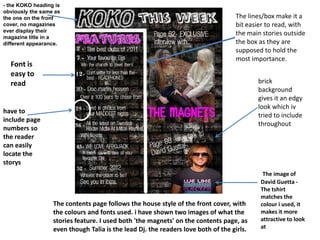
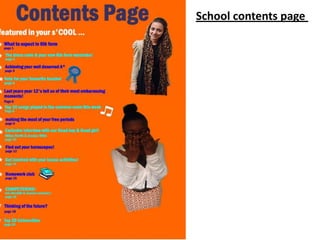
The author notes that images were a weakness in the school magazine but were improved for the music magazine by using well-focused, appropriate images that related to stories. Fonts and text were also improved by choosing "cool" and "edgy" styles rather than childish fonts for the school task. Overall, the progression helped the author learn how to create higher quality images and design elements for a professional-looking magazine product.