This document provides a detailed analysis of the typography, layout, color, images, language, and conventions used in a music magazine cover and contents page. For the cover: the typography uses different font sizes to highlight the main story; the layout follows the eye's path and leaves space; bright colors attract readers, especially younger ones; the main image is of popular artist Justin Bieber. For the contents page: the typography is small to fit more but uses serif and sans serif fonts; the layout also follows the eye's path and uses the left column for charts; color contrasts but links to the cover; images showcase artists in the issue. Both follow conventions like using the left column and masthead prominently.
2024.06.01 Introducing a competency framework for languag learning materials ...Sandy Millin
http://sandymillin.wordpress.com/iateflwebinar2024
Published classroom materials form the basis of syllabuses, drive teacher professional development, and have a potentially huge influence on learners, teachers and education systems. All teachers also create their own materials, whether a few sentences on a blackboard, a highly-structured fully-realised online course, or anything in between. Despite this, the knowledge and skills needed to create effective language learning materials are rarely part of teacher training, and are mostly learnt by trial and error.
Knowledge and skills frameworks, generally called competency frameworks, for ELT teachers, trainers and managers have existed for a few years now. However, until I created one for my MA dissertation, there wasn’t one drawing together what we need to know and do to be able to effectively produce language learning materials.
This webinar will introduce you to my framework, highlighting the key competencies I identified from my research. It will also show how anybody involved in language teaching (any language, not just English!), teacher training, managing schools or developing language learning materials can benefit from using the framework.
Model Attribute Check Company Auto PropertyCeline George
In Odoo, the multi-company feature allows you to manage multiple companies within a single Odoo database instance. Each company can have its own configurations while still sharing common resources such as products, customers, and suppliers.
The Art Pastor's Guide to Sabbath | Steve ThomasonSteve Thomason
What is the purpose of the Sabbath Law in the Torah. It is interesting to compare how the context of the law shifts from Exodus to Deuteronomy. Who gets to rest, and why?
Instructions for Submissions thorugh G- Classroom.pptxJheel Barad
This presentation provides a briefing on how to upload submissions and documents in Google Classroom. It was prepared as part of an orientation for new Sainik School in-service teacher trainees. As a training officer, my goal is to ensure that you are comfortable and proficient with this essential tool for managing assignments and fostering student engagement.
How to Create Map Views in the Odoo 17 ERPCeline George
The map views are useful for providing a geographical representation of data. They allow users to visualize and analyze the data in a more intuitive manner.
How to Split Bills in the Odoo 17 POS ModuleCeline George
Bills have a main role in point of sale procedure. It will help to track sales, handling payments and giving receipts to customers. Bill splitting also has an important role in POS. For example, If some friends come together for dinner and if they want to divide the bill then it is possible by POS bill splitting. This slide will show how to split bills in odoo 17 POS.
Students, digital devices and success - Andreas Schleicher - 27 May 2024..pptxEduSkills OECD
Andreas Schleicher presents at the OECD webinar ‘Digital devices in schools: detrimental distraction or secret to success?’ on 27 May 2024. The presentation was based on findings from PISA 2022 results and the webinar helped launch the PISA in Focus ‘Managing screen time: How to protect and equip students against distraction’ https://www.oecd-ilibrary.org/education/managing-screen-time_7c225af4-en and the OECD Education Policy Perspective ‘Students, digital devices and success’ can be found here - https://oe.cd/il/5yV
The Roman Empire A Historical Colossus.pdfkaushalkr1407
The Roman Empire, a vast and enduring power, stands as one of history's most remarkable civilizations, leaving an indelible imprint on the world. It emerged from the Roman Republic, transitioning into an imperial powerhouse under the leadership of Augustus Caesar in 27 BCE. This transformation marked the beginning of an era defined by unprecedented territorial expansion, architectural marvels, and profound cultural influence.
The empire's roots lie in the city of Rome, founded, according to legend, by Romulus in 753 BCE. Over centuries, Rome evolved from a small settlement to a formidable republic, characterized by a complex political system with elected officials and checks on power. However, internal strife, class conflicts, and military ambitions paved the way for the end of the Republic. Julius Caesar’s dictatorship and subsequent assassination in 44 BCE created a power vacuum, leading to a civil war. Octavian, later Augustus, emerged victorious, heralding the Roman Empire’s birth.
Under Augustus, the empire experienced the Pax Romana, a 200-year period of relative peace and stability. Augustus reformed the military, established efficient administrative systems, and initiated grand construction projects. The empire's borders expanded, encompassing territories from Britain to Egypt and from Spain to the Euphrates. Roman legions, renowned for their discipline and engineering prowess, secured and maintained these vast territories, building roads, fortifications, and cities that facilitated control and integration.
The Roman Empire’s society was hierarchical, with a rigid class system. At the top were the patricians, wealthy elites who held significant political power. Below them were the plebeians, free citizens with limited political influence, and the vast numbers of slaves who formed the backbone of the economy. The family unit was central, governed by the paterfamilias, the male head who held absolute authority.
Culturally, the Romans were eclectic, absorbing and adapting elements from the civilizations they encountered, particularly the Greeks. Roman art, literature, and philosophy reflected this synthesis, creating a rich cultural tapestry. Latin, the Roman language, became the lingua franca of the Western world, influencing numerous modern languages.
Roman architecture and engineering achievements were monumental. They perfected the arch, vault, and dome, constructing enduring structures like the Colosseum, Pantheon, and aqueducts. These engineering marvels not only showcased Roman ingenuity but also served practical purposes, from public entertainment to water supply.
1.4 modern child centered education - mahatma gandhi-2.pptx
Detailed analysis of music magazine
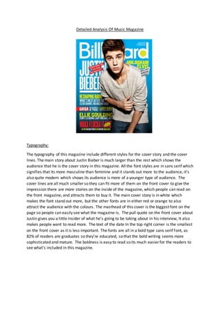
1. Detailed Analysis Of Music Magazine
Typography:
The typography of this magazine include different styles for the cover story and the cover
lines. The main story about Justin Bieber is much larger than the rest which shows the
audience that he is the cover story in this magazine. All the font styles are in sans serif which
signifies that its more masculine than feminine and it stands out more to the audience, it’s
also quite modern which shows its audience is more of a younger type of audience. The
cover lines are all much smaller so they can fit more of them on the front cover to give the
impression there are more stories on the inside of the magazine, which people can read on
the front magazine, and attracts them to buy it. The main cover story is in white which
makes the font stand out more, but the other fonts are in either red or orange to also
attract the audience with the colours. The masthead of this cover is the biggest font on the
page so people can easily see what the magazine is. The pull quote on the front cover about
Justin gives you a little insider of what he’s going to be taking about in his interview, It also
makes people want to read more. The text of the date In the top right corner is the smallest
on the front cover as it is less important. The fonts are all in a bold type sans serif font, as
82% of readers are graduates so they’re educated, so that the bold writing seems more
sophisticated and mature. The boldness is easy to read so its much easier for the readers to
see what’s included in this magazine.
2. Layout:
The layout of this magazine follows the route of the eye as firstly you look at the primary
optical area then go down to looking at the left third and the terminal area then end up
looking at the bottom right hand corner, this is conventional for a music magazine. This
magazine is also quite ordered to show that it’s quite neat and it’s not all squashed together
which sometimes can be really off-putting, this is conventional for a pop magazine as it is
not all over the place and looking unproffesional. This shows a detailed enough amount of
stories what are on the inside of this magazine. All the cover lines are in the left third which
is conventional for a music magazine as it is a key area of the page so more people will focus
on that. The main image of the celebrity is used in the layout as he is moved in front of all
the text which is also conventional for a music magazine as now he is the key area in this
magazine. As you can see in this example
below, the route of the eye is used so you can
also clearly see the main image on the cover,
of Justin, this is also so the audience can see
who the main story will be on and can clearly
see who it is.
Colour:
This magazine is a colourful front page, which
attracts more people to it, especially the
younger audience because younger people
like bright colours. The bright colours connote
happiness and pop, which is going to be
conventional considering it is a pop magazine.
The blue background stands out as it is the
brightest colour on the page and it also
contrasts to the other colours of the text on
the cover. The white masthead stands out and it also grabs people’s attention. The text
background to the pull quote is red which signifies passion which also contrasts with the
blue background and the white text within it. The mid shot of the artist on the front cover
stands out to the other colours on the page as the colours of his clothes are quite plain and
normal, this is conventional for a pop magazine as it is not too over the top clothes and is
just simple. The masthead is in white and it shows it’s more sophisticated and just look
smarter. There is also a limited amount of colours on this page, blue, yellow, white and red
which makes it stand out even more, and look better otherwise it will look a bit too much
and too cluttered. The colours go well with the main image which makes it stand out as a
whole this is conventional for a pop magazine as the colours should all be funky and go well
together.
Images
The main image on this magazine makes it stand out, as it’s a new young popular celebrity,
that many people will want to read about and hear new stories about them, especially
3. younger females as he is a good looking person, this is also conventional for a music pop
magazine genre because people want to read about new popular artists. It’s a mid-shot so it
looks more professional and it is conventional. The text also fits around Justin which is also
typical for a magazine cover, as it makes the whole magazine look better and not too
cluttered. The way Justin is dressed also makes the magazine target at a younger audience
as it is quite fashionable and in trend. He is also hunching over in this image which makes
him seem cooler, which could also attract a younger target audience, it also connects to the
theme of the magazine as it’s quite chilled and cool. Justin’s facial expression in this image
shows it’s going to be a passionate story and that the way he is pouting can also draw
attention of younger girls, as they see Justin as an icon and would want to buy this and read
about him. The only feature of mise-en-scene in this magazine is the piece of chain
jewlerrey around Justin’s neck. This connotes that he is quite fashionable and the way he
has hold of it makes him seem like a bit of a ‘gangster’, it also tells the audience that he’s
quite ‘fresh’. Also the main image goes over the masthead of this magazine which signifies
importance and also its dominance, it shows the audience that Justin will be the main piece
and an important part in this magazine, It also shows us that the magazine is very popular
and people will recognise it anyway, this is conventional for a pop magazine as the main
image will be big and go over the mast head. The serious facial expression shows that he
wants to maybe be treated like more of an adult and be more serious about his music,
which maybe he wasn’t before.
Language
The language of this magazine has a friendly tone to it. The language is informal which is
typical and conventional for a music magazine as it is easier to understand for the younger
audience. It easily portrays it as a music magazine. The pull quote ‘Everything I do, I do to be
the greatest’ makes the main story interesting and makes the audience want to read it. The
mode of address for billboard is quite informal, to appeal to the younger audience.
Conventions
One convention of this magazine is that the left third is filled with information. Another
convention is that the masthead is big and bold which attracts the audience as they can tell
which magazine it is, also the main image of Justin Bieber is going over the masthead, this is
also conventional for billboard magazine. There are also a wide range of colours across the
magazine which is conventional for a pop magazine as It is supposed to be colourful and
attractive. The layout is using the route of the eye which is also conventional for a pop
magazine as you can clearly see and read all of the captions.
-
4. Typography
The typography on this contents page is all small so you can fit more text onto the page so
there is more information for the audience. There is a mixture of serif and sans serif fonts In
this to attract male and female audience, as serif fonts are more feminine and sans serif
fonts are more masculine. They use the serif fonts for the captions of the sections, for
example, ‘FEATURES’, and ‘MUSIC’. These are also bigger so you know what you’re reading
and it grabs your attention the first time you look at the page. ‘CONTENTS’ at the top is to
clearly display what this page contains, so it’s easier to locate the different sections and
different pages. This magazine also clearly display the music and the charts on the left third
of this page, because its aimed at younger audience who like new popular music, which
billboard includes. They’ve also split the typography into a lot of sections so it not too much
to read and its not too cluttered on the one page.
Layout
The layout of this contents page is using the route of the eye, which is conventional for a
music magazine. This contents page is quite ordered so its easier and clearer to read, this is
also quite sophisticated which will appeal to the more educated and sophisticated audience.
It is also using the left third which is conventional for music magazine, billboard uses this
section to show the top music charts which will appeal to the target audience as they will be
5. interested in new popular music, which is what this will tell you about. The photos are also
laid out on this neatly and ordered, which makes the page look better as a whole.
Colour
The colour of this contents page is quite plain, it’s got strips of bright colours (pink/blue) to
contrast with the main grey/white colour. The ‘CONTENTS’ at the top of the page is in black
which stands out and catches your eye. Some of the text is also in blue this shows the
audience that some of that text is more important than the plain black text. It also links in
with the colours of the front cover, which is conventional.
Images
There is a range of images on the contents page, this is just to show some of the popular
artists that will feature in this magazine, which will draw attention from the audience. The
medium long shot of the main image is to show you her body language, which is fun, as she
looks like she’s jumping in the air. She is also wearing dark clothes, which contrasts to the
white background and maybe goes with the music she sings? It also goes with the whole
vibe of the magazine, which isn’t too colourful. The other 3 images under the masthead is
conventional for billboard magazine as they are some of the artists that feature in this.
magazine. There are also various artists in the contents which appeal to a larger audience,
for example there are female artists, male artists, and groups, which can appeal to many
different people.
Language
The language in this is quite informal. It is also using quite short snappy language in this
which will attract to the younger audience as they wouldn’t want to read a lot. ‘MILEY
STRIKES BACK’ is using quite an aggressive tone to it, this is also quite an interesting caption
as people will be interested and want to find out more.
Conventions
One of the conventions in this contents page is the use of the left third, as there is normally
one, which includes the music on the charts which the audience (who are into music) will be
into. You will also have the smaller images at the top of the magazine, to show the audience
what’s in this issue this is also conventional and relates to the stories on the inside of the
magazine. The colours on this contents page are also conventional for a pop magazine as it
uses a range of colours appealing to both males and females who read this magazine. There
are also columns and article heading which are conventional for a contents page of a
magazine.
6. Typography
All the typography is in serif, which is more informal and is also easier to read. There is also
a kicker in this piece of text, the ‘A’ which signifies the start of a sentence, is also breaks the
page up and draws the eye in. The headline and the stand first are much bigger than the rest
of the text, which catches the audience’s eye and to show that it’s going to be an important
part in this piece of text, the stand first is also acting as a ‘pull quote’ and therefore adding
more information and an insider of what’s going to be in this article. The rest of the text is
quite small as it is a full article about Katy Perry, and they want to fit more text onto the
page so it is more informative.
Layout
The layout is quite basic but also typical for a double page spread. All the text is in sections
which is quite conventional for a double page spread, this is so that you can fit more on a
page and that it looks formal and is quite ordered. Also on one side of the pages there is a
big image which grabs the audience’s attention and showing them who the articles about.
Colour
All the texts are in black which is standard and contrasts with the background which is easier
to read. The colour is also quite contemporary and modern which can attract the younger
audience. Katy Perry’s lipstick is bright red which is quite vibrant and sexual, this can also
attract the male audience. The brightness is coming in from behind makes Katy Perry stand
out more.
7. Images
The main image on this is of a popular singer, Katy Perry, which many people would be
interested in reading about. Her body language is quite sexy and sensual which will also
attract the male audience. Her facial expression is quite tense and quite aggressive which
also makes her to seem more sexual. Her clothes are quite revealing, which, again will
appeal to the male audience and grab their attention. Also the clothes are quite fashionable
which will attract the female audience. Her hair is blowing in the wind which makes her
stand out more, and blends in with the whole image.
Language
By the language on this double page spread, you can tell it’s aimed at a younger target
audience, as it says ‘I took mushrooms as a daft punk show’ which is associated with
drugs/violence which will make the audience more interested, it’s also in quite a formal
tone which will be aimed at the more sophisticated target audience.
Conventions
One convention of this is that half the page is filled with an image, which all double page
spreads will have. Also the headline and the stand first are in the middle of all the text which
is conventional, and it also makes the page look better as it gives you a little insider and
attracts more of the audience. It is also conventional to have a kicker (the A) in a double
page spread, which makes it more appealing and draws the eye into the page. It’s
conventional to have all the text in columns for the double page spread as it is easier to see
and read.