Analysis
•
0 likes•146 views

The document discusses the design and layout of several music magazines, including Billboard, NME, Kerrang, Q Magazine, and Rolling Stone. It analyzes elements like the use of photographs, colors, font, and organization of content to understand how each magazine conveys its brand and targets a specific audience. Key points made include that Billboard appears neat and consistent across issues to appeal to teenagers and young adults, while NME uses bolder graphics and styles to engage punk fans. The layouts aim to guide readers efficiently to find content while reflecting the magazine's musical genre through visual cues.

Recommended
More Related Content
What's hot
What's hot (20)
Viewers also liked
Viewers also liked (18)
Similar to Analysis
Similar to Analysis (20)
More from Samar Maqbool
Recently uploaded
Recently uploaded (20)
Analysis
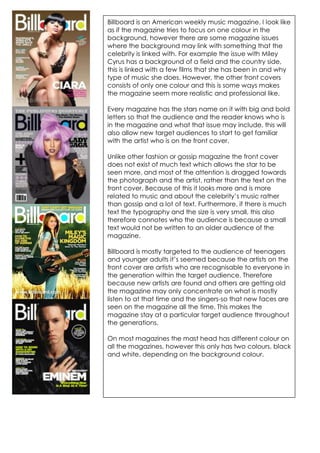
- 1. Billboard is an American weekly music magazine. I look like as if the magazine tries to focus on one colour in the background, however there are some magazine issues where the background may link with something that the celebrity is linked with. For example the issue with Miley Cyrus has a background of a field and the country side, this is linked with a few films that she has been in and why type of music she does. However, the other front covers consists of only one colour and this is some ways makes the magazine seem more realistic and professional like. Every magazine has the stars name on it with big and bold letters so that the audience and the reader knows who is in the magazine and what that issue may include, this will also allow new target audiences to start to get familiar with the artist who is on the front cover. Unlike other fashion or gossip magazine the front cover does not exist of much text which allows the star to be seen more, and most of the attention is dragged towards the photograph and the artist, rather than the text on the front cover. Because of this it looks more and is more related to music and about the celebrity’s music rather than gossip and a lot of text. Furthermore, if there is much text the typography and the size is very small, this also therefore connotes who the audience is because a small text would not be written to an older audience of the magazine. Billboard is mostly targeted to the audience of teenagers and younger adults it’s seemed because the artists on the front cover are artists who are recognisable to everyone in the generation within the target audience. Therefore because new artists are found and others are getting old the magazine may only concentrate on what is mostly listen to at that time and the singers-so that new faces are seen on the magazine all the time. This makes the magazine stay at a particular target audience throughout the generations. On most magazines the mast head has different colour on all the magazines, however this only has two colours, black and white, depending on the background colour.
- 2. Vibe really does have different styles and layouts; the graphology is different on every issue. Some issues has a very old fashioned look and layout-even though they are not old but the Ciara and the Eminem issue looks like most modern out of the four. The Rihanna front cover is very plain and has nearly no puffs at all. Because if this all the attention is dragged to her and the medium close up of her. The mast head has the same typography font. On the other hand the colour is different and on the Eminem issue the mast head has a more metallic and model touch to it where as the other magazine issues only has one colour. There type of techniques can make the company and the whole magazine seem a bit messy whereas for example the Billboard magazine looks very neat and well thought through as all the issues and magazine front covers has a similar and recognisable layout style.
- 3. In the 1970s NME became the best-selling British music magazine. The magazine layout and graphology seems to be a very punk rock and funky style, with bold and strong colors like red, blue, yellow and black. There colors are strongly contrasted which attracts the target audience and eye catches their attention. There is a lot of action and details going on, on the magazine. However every magazine contains of a big photograph of a music star and then around it some quotes (Lily Allen). NME focuses on a main typography to be a bit bolder and bigger than other texts so that what the editor may think is the most appealing to the audience in that issue is then publishes the biggest. Because of the amount of graphics everywhere, on the front cover, the audience does not know where to start looking. In some ways this could be quite good. On the other hand, for some or most audience seems to prefer the neater layout style rather than the messy and bold styles.
- 4. The billboards contents page has a plain white background. It does show the page numbers and categories to enable the audience to know where in the magazine that story or news is. This will same time for the audience to find and read which will make them more happy if the magazine is neat and easy to follow, to find what they are looking for. Even though the background colour is white, the images around it do not make it boring to look at. They use a colour of light blue-this connotes a fresh look and the colour is appealing to both males and females. Also the magazine has a No1 chart on the left hand side. This really makes the magazine unique as music fans can see what is in the chart and maybe listen to new songs which are there that they have never heard before. This will help the artist to create an even stronger repetition. I think that the chart is good to have. However, I would not have the chart on he contents page. I would have the chart as a separate double page spread with some reviews and comments about it. Just to add a bit more entertainment to the magazine.
- 5. Even if you do not know what magazine this is you will directly understand that this is a rock magazine. This is the fact that the images and typography is the way it is. For example, the font of the text has a more style of older men. The photos of OzzyOzborn at the bottom and the photos around it, looks like a scrap book and as if the magazine is collected. Also in the classic rock there does not seem to have any numbers on the pages and the categories text. The red colour makes the contents page really stand out, this could be because if there are new readers and they are flicking through the magazine in a shop they may want the audience to read and see what the magazine contains before putting the magazine away again.
- 6. The Kerrang contents page has a lot of images maybe to fit as much text and content information as possible. The categories are highlighted and even the numbers to really make them stand out and to be clear what and where the information is. As there is text to show categories there are also images which makes the magazine seems to be aimed at a younger audience as well as a older. Because there is categories and the fact that they are highlighted, makes it easy for the reader to be able to read and follow the contents page to find where the news and information is. The target audience for this would probably be towards the teenage age between 13-17 year olds. Due to the amount of photos and the contents.
- 7. The NME magazine has a shows allot of information about the contents and the magazine. There is even a small column of different bands that are in this magazine, and page numbers of where you can find them. The categories are easy and neat put out. The contents page is neater than the front cover of the NME magazine. The magazine used a lot of yellow and red on their front cover of the magazine as well as the contains page containing this. They even have a band index.
- 8. Rolling Stones use of graphology is quite affective. It has a very big photo of Paul and a small amount of text by his arm which is following his outline and pattern. This could be an introduction into the other double page spread on the other side of the page or this could just be a more advertisement of a new album or of him. This could be to fans that has been buying the Rolling Stones from the start and has therefore been able to follow his stories and his career. The text elements communicate the meaning to the reader. The reason for this is that it shows that this is an old famous musician who was in the beetles and it is a big thing for the magazine and it shows that it is important to the magazine. Therefore, they have done so that Paul has a whole Q Magazine photograph of only him and a small text page with a has a lay out that would attract the female audience. From teenagers to middle aged just to add detail. women. The font of the text is a normal typeface that would often be seen in magazines. The reason for this is so that it is easy to read and looks more sophisticated and professional and if there would be a handwritten style on the font. The big image is really up in your face and is what therefore drags the audience to read about the story. The double page spread is quite gothic and dark. The photo being on only one side of the page makes this stand out and therefore is more important than the text. The colours are black, white and red and gold. Thin s punk colours and position that they are in will in a way enable and hint to the readers what the magazine article is going to be all about. The topic of the article seems to be about their reuniting and the image looks like they are happy to be reunited together. The tone in the ‘friend reunited’ makes the article and the whole gothic style look a bit friendlier and that they do appreciate another. This will make the fans of this band become even more happy because the finely tone is coming though. Billboard seems to be very neat on both their front cover, contents page and the double page spread. The page is split into half with one side containing an image of a famous RnB singer Usher and the other is the interview that took part with him. Even though Usher may be aimed at men, in this aspect the magazine and the interview would probably be aimed at females. With the small text and trying to fit all the information onto one side of the magazine will make the magazine represent and be aimed at a more younger adults and older teens target audience.