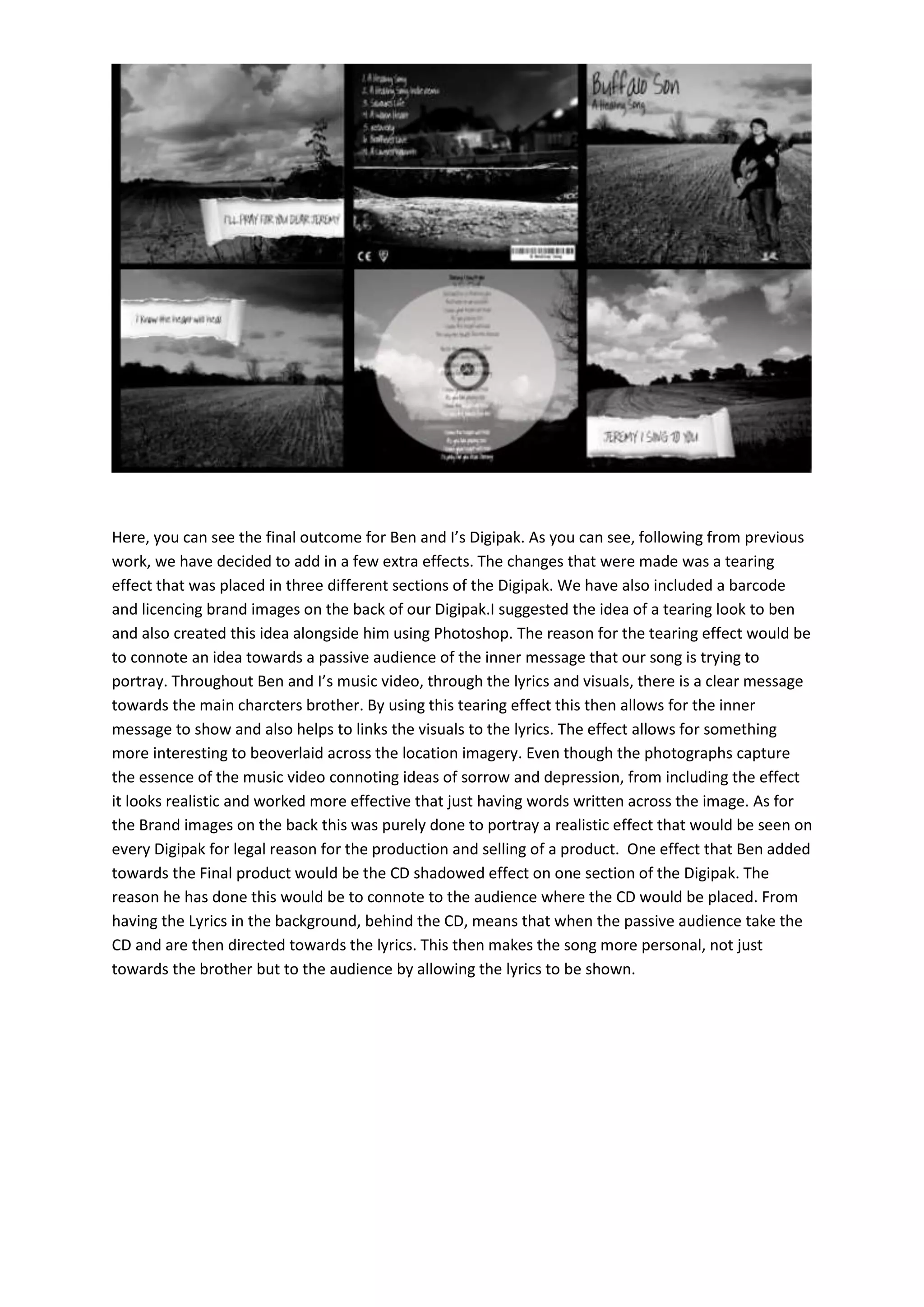
This document describes changes made to a Digipak design for a song. A tearing effect was added to three sections to convey the inner message about sorrow and depression portrayed in the song's lyrics and music video. A barcode and branding images were also included on the back page to make the design look like a realistic commercial product. A shadow effect under one section indicates where the CD would be placed and helps direct the audience to the lyrics to make the song's message more personal to them.