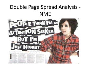
The double page spread features an image of Lily Allen that stands out against the white background. The byline credits the author or photographer. The main heading in a newspaper style font dominates two thirds of the page to catch readers' attention about the Lily Allen article. Additional details like the page numbers, masthead, and date are in the bottom left corner. The article is divided into four columns of around 75-100 words each to make it easier to read.
2. ANALYSIS OF ARTICLES- DOUBLE PAGE SPREAD
CAPTION
MISE-EN-SCENE
The caption says Lily Allen at the top so that it is easy to locate in the magazine. MAIN IMAGE
The mise-en-scene
of this double page The main image
spread is a white takes over the one
background that side of the double
makes Lily Allen page spread. The
stand out against image is less
with her checked dominant against
shirt on and dark the newspaper style
black hair. font heading . The
image is a mid shot
of Lily Allen.
BYLINE
The byline shows
credit for author or
photographer. MAIN HEADING
The main heading
dominates two thirds
SUB HEADING of the page. The
The subheading newspaper style font
introduces the reader relates the heading to
to the article and what what the article is
the Lily Allen article is about. This is done in a
about. subtle but effective
way which stands out
on the page.
PAGE NUMBER/ NME MASTHEAD/ DATE DROPS CAP FOUR COLUMNS
The page numbers, NME masthead and date The black drops cap at the The four columns that the article has been
are all situated on the bottom left of the page. start of the first paragraph written in make the article easier to read as
This is used to show the target audience what takes over nine lines and there is about 75 -100 words in each column so
page the articles are on . stands out on the page. that it is not just a whole page of writing.
3. The article itself is about the criticism that Lily
Allen receives and what people think of her as a
person on a whole.
The main heading/headline “PEOPLE THINK I’M
ATTENTION SEEKING BUT I’M JUST HONEST” is
quite dramatic because they want it to catch the
readers attention. By making the heading the size
of two thirds of the page the heading stands out.
The style of the article is very friendly and chatty .
This style makes the audience feel like they are
actually there at the photo- shoot and feel like
they are part of the whole interview with the
audience.
The article is written in to four columns with
approximately 75 – 100 words in each column so
that it is easier to read. If there was too many
words on the page then this may turn away the
reader from actually reading the article and
causing them to skip the pages and not read it.