Magazine research-Contents page and Double Page Spread
•Download as PPTX, PDF•
0 likes•139 views


Recommended
More Related Content
What's hot
What's hot (17)
Viewers also liked
Similar to Magazine research-Contents page and Double Page Spread
Similar to Magazine research-Contents page and Double Page Spread (20)
More from Harriet Thompson
More from Harriet Thompson (8)
Recently uploaded
Recently uploaded (20)
Magazine research-Contents page and Double Page Spread
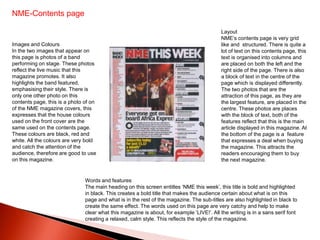
- 1. NME-Contents page Layout NME’s contents page is very grid Images and Colours like and structured. There is quite a In the two images that appear on lot of text on this contents page, this this page is photos of a band text is organised into columns and performing on stage. These photos are placed on both the left and the reflect the live music that this right side of the page. There is also magazine promotes. It also a block of text in the centre of the highlights the band featured, page which is displayed differently. emphasising their style. There is The two photos that are the only one other photo on this attraction of this page, as they are contents page, this is a photo of on the largest feature, are placed in the of the NME magazine covers, this centre. These photos are places expresses that the house colours with the block of text, both of the used on the front cover are the features reflect that this is the main same used on the contents page. article displayed in this magazine. At These colours are black, red and the bottom of the page is a feature white. All the colours are very bold that expresses a deal when buying and catch the attention of the the magazine. This attracts the audience, therefore are good to use readers encouraging them to buy on this magazine. the next magazine. Words and features The main heading on this screen entitles ‘NME this week’, this title is bold and highlighted in black. This creates a bold title that makes the audience certain about what is on this page and what is in the rest of the magazine. The sub-titles are also highlighted in black to create the same effect. The words used on this page are very catchy and help to make clear what this magazine is about, for example ‘LIVE!’. All the writing is in a sans serif font creating a relaxed, calm style. This reflects the style of the magazine.
- 2. NME-Double page spread On this double page spread the photo is places on one of the two pages, this photo is very posed, appears to be taken at a professional photo shoot which was taken specifically for this article. I believe this clear image is trying to reflect the lighter side of Lily Allen, the artist pictured, as well as reinforcing her iconic image. This image has an direct mode of address, therefore attracting /engaging the audience, encouraging them to read the article. Lily's clothing is quite stereotypical for an Indie/Rock girl but red, black and white is for a male and female audience. The main title of this magazine is a quote given by Lily Allen during her interview. This quote is displayed with white, sans serif text that is highlighted in a bold black colour. This use of colour allows it to stand out from the white, clear background. They use a font that portrays a dark, mysterious side but still reflects a relaxes style. This quote is very bold, capturing all the readers attention, again encouraging them to read the article, this is an example of a pull quote. This double page spread has text which is layed out as an article instead of an interview, this, I believe creates a more impersonal article although is a more formal way of laying out the text. It appears to be a lot more wordy though, which I believe dis-attracts the audience.
- 3. Top of the pops-contents page Layout Images and colours This page is dominated by the five There are quite a few of images placed on boxes that contain the text which this magazine cover, the main image being expresses what is inside the the front cover. This allows us to see clearly magazine, these boxes are places where the featured articles are placed within fairly roughly over the page. They are the magazine, as well as emphasising what is placed in columns although they are featured inside the magazine. There are a placed at very slight angles, creating few other images of some pop artists a slightly less structured look. The reflecting again what is in the magazine, titles of the boxes are placed in there encouraging the readers to read on. It also own smaller box which is places over emphasises the genre Pop which this the other boxes, creating more magazine focuses on because they are pop attraction on them. The images are aritists. then dotted around the text, some are The colours used are the general house placed inside the boxes while others colours that are used throughout this are placed completely out of the box, magazine, these are pink, purple and white. this creates a more relaxed view/style They are all very bright and ‘girly colours attracting a younger audience. The attracting a young, female audience. main attraction is on the image of the front cover, because it is placed away from all the other boxes, photos. Around this photo is the large page numbers which create an easy, relaxed style. Words and language The main heading on this magazine is titled ‘Inside the mag’, this is very simple and clear. The font is sans serif and the colour is white on a bright pink background, this creates a simple, exclamatory piece of writing that is bold and attractive. The font also portrays a hand writing style, creating a much more personal feel., informal style. All the titles are explanative and are very expressive creating a clear page that a younger audience can relate to. The use of ‘Wins and offers’ attracts a wider audience, as it allows the audience to get involved and engaged with the magazine.
- 4. Top of the pops-Double page spread There is one main image on this page spread of the artist feature, ‘Justin Bieber’. This image is placed in the centre of the two pages and is the main attraction. It is the largest feature on the two pages and is very bold and bright, with the rich colour in which he is portrayed standing out from all the other colours used. This is a posed photograph that has been taken during a photo shoot. The background is plain/ simple allowing the pop artist to stand out. There is a direct mode of address for this photo engaging the audience and encouraging them to read the article. There a couple other smaller images which appear to be close up shots of part of this artist, adding greater detail within these pages, plus there is one with him with no top on, attracting the female audience. The text in the pink boxes is expressed in an in-formal ‘chatty manner, creating a more personal article. They use quotes from the artist to create interest within the article and to attract the female audience, encouraging them to read on. They use quotes from some of his fans to portray his features, this engages the audience making them feel involved and engaged. It really attracts the younger female audience, especially as there ages are presented. On these page they use the mian house colours just like they have done on the contents page, these are pink, purple, white and black. They are all very bright and bold attracting the audience. At the top of the page, the title is reflected within the same colour scheme and font as the front cover. This is often conventional within pop magazines however on some occasions it isn’t