Salford City College Eccles Centre AS Media Studies Foundation Portfolio Colour
1. Salford City College
Eccles Centre
AS Media Studies
Foundation Portfolio
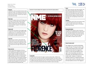
Colour
Masthead Comment on how the design of the magazine cover attracts the target audience: 2 text colours have been used- black and white. They
Top left corner. This is unusual but it sets out a clear don’t clash on the page as they are two different
layout that is visible. The masthead has been turned colours completely. Apart from the red on her hair,
white from its usual colour red because a red colour there are not many bright colours used. The white
would clash with the hair. The white colour makes it glow on the artist’s face fits in with the text colour. I
seem special and unique. would say that this magazine is aimed at women as
the colours look more appealing to females rather
than males.
Main image
Centre of the magazine, takes up the full page- good Typefaces
use of space. The artist looks innocent and pure- All the typefaces used are clear and somewhat simple
relates to the white text colour. Photo editing to read. This makes the front cover simple and
software has been used to create the image of a appealing to adults. The text style is a mix between
clean and ‘adult-like’ magazine. It has been aimed serif and sans serif font.
at older people.
Model credit Photography lighting
Bold and black at the bottom of the magazine page. The image has been edited to create a natural but
It is black so it is clear on her white clothing- also to unnatural look. It is glowing which fits in with the text
symbolise purity. It is in capital letters and is the style. The image has been lit from the front and the
darkest thing on the page. It symbolises power but back so there is no shadows, this also fits in with the
also simplicity in the way it has been set out. magazines ‘pure’ look. It makes the image look
almost angelic as this glow creates this feel.
Cover lines
They are set out in columns- neat and tidy. Also
indicates that this is for an older audience. Simple
to read and it is all spelt out in capital letters- bold.
They are also on the side of the magazine so they Design Principles Used?
don’t interrupt the main image in the centre of the
page. This magazine has used the Guttenberg
Design Principle- The logo has been used
Main cover line in the primary optical area so the reader
‘Florence’ big and bold spreading ¾ of the way instantly knows what this magazine is.
across the page. This is a different to the rest of the There is a cover line that follows to the
text. It means that the page isn’t all the same- it
right in the strong fallow area which is
changes it slightly- once again this adds to this
pages uniqueness. The black on the white clothing read easily, the weak fallow area has the
House Style model credit- however it is bold and
emphasises the black colour so it is made clearly
The logo is set at the top left of this page, it is bold and clearly visible. 2 different text
visible. The black colour could symbolise something therefore stands out. Finally the terminal
colours have been used- black and white; primarily white though. Very simple to read as
darker to the main image- it is juxtaposed and this
the colours are not confusing, they are two completely different colours so they don’t clash. area has been used for a barcode as this is
can make the reader more entitled to read it. Finally
this black colour may appeal to an older audience
6-7 different font types have been used. This is a lot to be used but they all work together. the least looked at area on the magazine.
They are a mix of sans serif and serif but they are still able to make it look simple.
ad this could be why it has also been used.