(Dipika) Call Girls in Bangur ! 8250192130 ₹2999 Only and Free Hotel Delivery...
Magazine deconstruction.
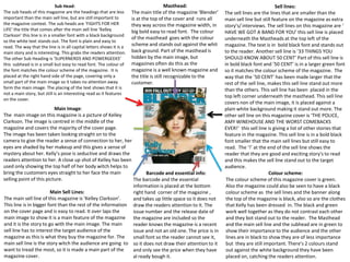
1. Sub Head: Masthead: Sell lines:
The sub heads of this magazine are the headings that are less The main title of the magazine ‘Blender’ The sell lines are the lines that are smaller than the
important than the main sell line, but are still important to is at the top of the cover and runs all main sell line but still feature on the magazine as extra
the magazine context. The sub heads are ‘FIGHTS FOR HER they way across the magazine width, in story's/ interviews. The sell lines on this magazine are ‘
LIFE’ the title that comes after the main sell line ‘Kelley big bold easy to read font. The colour HAVE WE GOT A BAND FOR YOU’ this sell line is placed
Clarkson’ this line is in a smaller font with a black background
of the masthead goes with the colour underneath the Mastheads at the top left of the
so the white text stands out. The font is plain and easy to
read. The way that the line is in all capital letters shows it is a
scheme and stands out against the whit magazine. The text is in bold black font and stands out
main story and is interesting. This grabs the readers attention. back ground. Part of the masthead is to the reader. Another sell line is ’33 THINGS YOU
The other Sub Heading is ‘SUPERNERDS AND POWERGEEKS’ hidden by the main image, but SHOULD KNOW ABOUT 50 CENT’ Part of this sell line is
this subhead is in a small but easy to read font. The colour of magazines often do this as the in bold black font and ’50 CENT’ is in a larger green font
the font matches the colour scheme of the magazine. It is magazine is a well known magazine and so it matches the colour scheme of the magazine. The
placed at the right hand side of the page, covering only a the title is still recognizable to the way that the ’50 CENT’ has been made larger that the
small part of the main image so it takes no attention away customer. rest of the sell line, makes this sell line stand out more
form the main image. The placing of the text shows that it is than the others. This sell line has been placed in the
not a main story, but still is an interesting read as it features
top left corner underneath the masthead. This sell line
on the cover.
covers non of the main image, it is placed against a
Main Image: plain white background making it stand out more. The
The main image on this magazine is a picture of Kelley other sell line on this magazine cover is ‘THE POLICE,
Clarkson. The image is centred in the middle of the AMY WINEHOUSE AND THE WORST COMEBACKS
magazine and covers the majority of the cover page. EVER!’ this sell line is giving a list of other stories that
The image has been taken looking straight on to the feature in the magazine. This sell line is in a bold black
camera to give the reader a sense of connection to her, her font smaller that the main sell lines but still easy to
eyes are shaded by her makeup and this gives a sense of read. The ‘!’ at the end of the sell line shows the
mystery about her. Kelly’s pose is seductive and draws the reader that they are good and exciting story's to read
readers attention to her. A close up shot of Kelley has been and this makes the sell line stand out to the target
used only showing the top half of her body witch helps to audience.
bring the customers eyes straight to her face the main Barcode and essential info: Colour scheme:
selling point of this picture. The barcode and the essential The colour scheme of this magazine cover is green.
information is placed at the bottom Also the magazine could also be seen to have a black
Main Sell Lines: right hand corner of the magazine , colour scheme as the sell lines and the banner along
The main sell line of this magazine is ‘Kelley Clarkson’. and takes up little space so it does not the top of the magazine is black, also so are the clothes
This line is in bigger font than the rest of the information draw the readers attention to it. The that Kelly has been dressed in. The black and green
on the cover page and is easy to read. It over laps the issue number and the release date of work well together as they do not contrast each other
main image to show it is a main feature of the magazine the magazine are included so the and they bot stand out to the reader. The Masthead
and it is the story to go with the main image. The main reader knows the magazine is a recent and the main sell line and the subhead are in green to
sell line has to interest the target audience of the issue and not an old one. The price is in show their importance to the audience and the other
magazine as this is what they buy the magazine for. The small font so the reader cannot see it, lines are in black to show they are of less importance
main sell line is the story witch the audience are going to so it does not draw their attention to it but they are still important. There's 2 colours stand
want to tread the most, so it is made a main part of the and only see the price when they have out against the white background they have been
magazine cover. al ready bough it. placed on, catching the readers attention.
2. Masthead:
Sub Head: The mast head for this magazine is the magazines name ‘top of the
The Sub head for this magazine is ‘Who's Ready pops’. This mast head is placed at the top of the page and stretches
To Date a Fan?’ . The sub heading is in a pink across the width of the magazine, in big bold font that stands out. The
background box and the font is white font and name of the magazine has its own font so it can be recognised from
stands out against the back ground. The sub other magazines. The masthead of this magazine is mostly hidden
heading is under the main sell line to show that it behind the main image, but is still recognizable. The way that the title
is the story/ interview that goes with the main had no capital letters could show that the magazines main audience is
selling line. children/Teenagers as it is easy to read.
Main Sell line: Colour scheme:
the main sell line for this magazine is ‘THE The colour scheme of this magazine
WANTED!’. This sell line stands out against all
other lines as it has a yellow background
cover is pink and white. This could show
surrounding it . The font is in big pink bold that the intended audience is teenage
letters so it is easy to read and also eye girls. The magazine has a white
catching. The main sell line is placed over the background and most of the text is in
top of the mail image to show it goes with pink. The white background help all of
the image.
the other parts of the magazine cover
stand out e.g. the main image stands out
against the white background.
Main Image:
The main image of this magazine is of ‘THE
WANTED’ . The image is placed just off
centred of the magazine cropping out part Sell lines:
of one of the members of the band. The The sell lines are the lines that are smaller
main image is a long shot of the band, but than the main sell line but still feature on
the bottom half of the image is covered by the magazine as extra story's/ interviews.
smaller images on the magazine. The sell lines on this magazine are ’65 style
The band are arranged into a position so all Barcode and essential info: essentials to buy now’ ‘personality or
of their faces can be seen, looking straight The barcode and the essential information is looks?’ these lines are set a way from the
on to the camera giving a direct connection placed at the bottom right hand corner of the main image and the main selling point of
with the reader. Their faecal expression are magazine , and takes up little space so it does
just smiling, this could also show the this magazine by being placed at the left
not draw the readers attention to it. The issue
audience is for children as it is a plain and hand side so they are still visible but do not
number and the release date of the magazine
simple look. are included so the reader knows the magazine take to much space and so they do not take
is a recent issue and not an old one. any attention from the main selling point.
3. Masthead:
Sub Head: Sell lines:
The mast head for this magazine is the
The Sub head for this magazine is ‘The soul The sell lines are the lines that are
magazines name ‘MOJO’. This mast head is
and heartache’ the title that comes after smaller than the main sell line but still
placed at the top of the page and stretches
the main sell line it is in a smaller font and is feature on the magazine as extra
across the width of the magazine, in big story's/ interviews. The sell lines on this
black so the text stands out. It is under the
black bold font so that stands out. Some of magazine are ‘THE ULTAMIT REVIEW OF
main sell line so the target audience know
this Masthead is hidden behind the main THE YEAR!’ This line is in black writing
that the 2 are associated with each other.
image, but is still readable and recognizable. to math the colour theme and it stands
The colour of the font matches the colour
The font for the masthead matches the out, but also it is placed at the right
scheme of the magazine.
majority of the font used for the rest of the hand side of the magazine under the
magazine so it catches peoples eyes. masthead, so it does not get as much
attention as the main sell line.
Main Sell line:
the main sell line for this magazine is ‘AMY
WINEHOUSE’ . This line stretches over the width of Main Image:
the magazine through the middle so it is the main The main image of this magazine is
focus of the magazine to the viewer. The text is in of ‘Amy Winehouse’. The image
gold writing and stands out against the whit shows Amy standing straight ion to
background it is placed on. the camera. One hand on her hip to
Colour scheme: show she is in charge. The image is
The colour scheme of this in black and white witch works well
magazine cover is gold, black and with the white background. The
white. magazine has a white image is in the centre of the
background and all of the text is magazine and is a medium shot of
white and gold. The white Amy. The way the image is cantered
background makes all of the other Barcode and essential info: shows that Amy's interview id the
features of the magazine cover The barcode and the essential information is main feature of this magazine and
stand out e.g. the main image placed at the bottom right hand corner of the its all about her.
stands out against the white magazine , and takes up little space so it does not
background as the image is mostly draw the readers attention to it. The issue
black with a little bit white.. number and the release date of the magazine are
included so the reader knows the magazine is a
recent issue and not an old one.