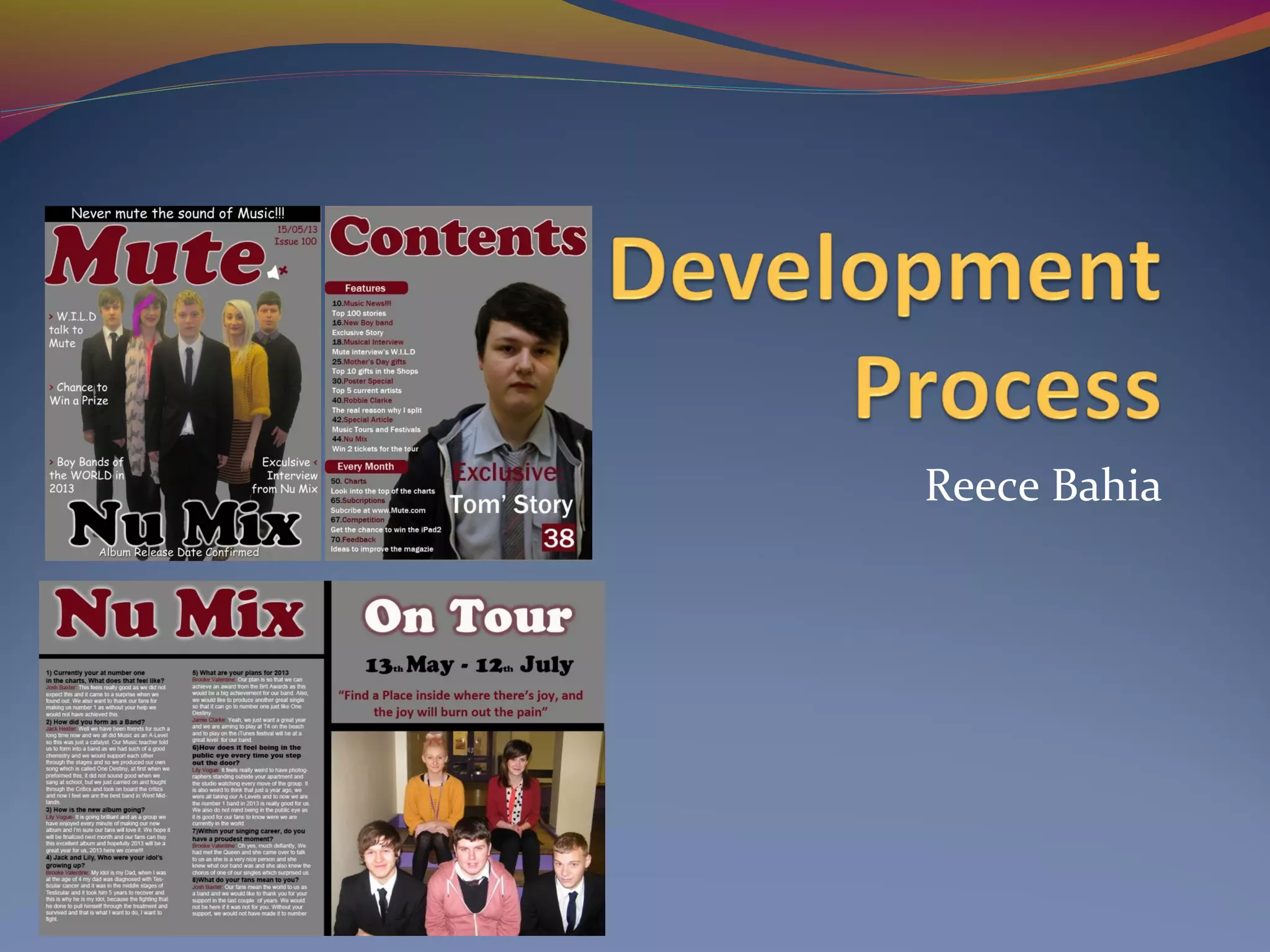
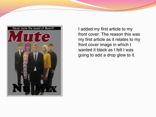
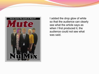
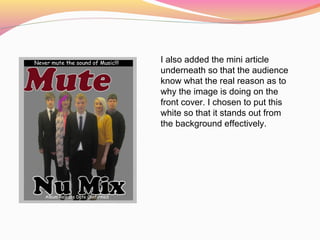
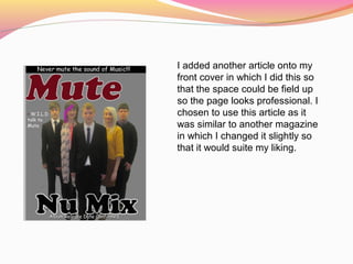
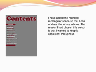
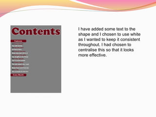
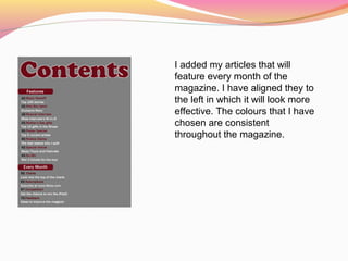
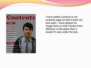
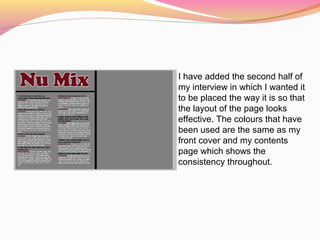
The document describes the process of designing a magazine cover and layout in Adobe Photoshop. Key details include:
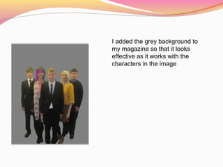
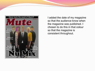
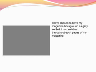
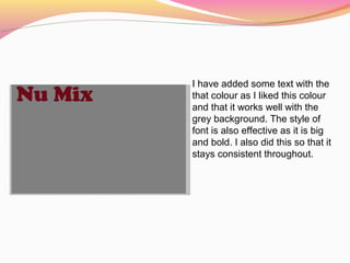
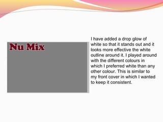
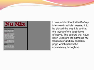
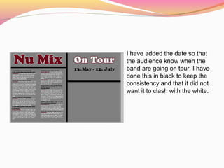
- A grey background color was selected and used throughout for consistency.
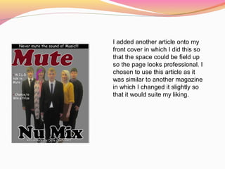
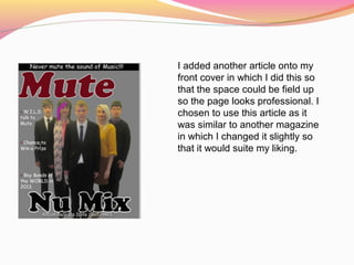
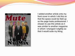
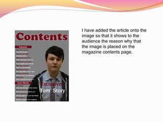
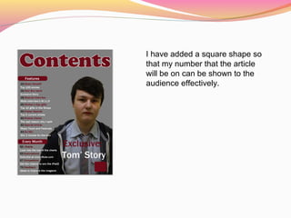
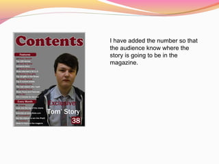
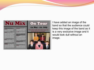
- Articles, text, images and other elements were added and formatted on various pages like the cover, contents page and article pages.
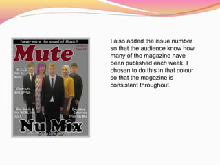
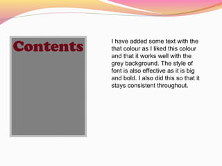
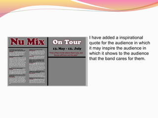
- Colors, fonts, positioning and styling of elements were deliberately chosen to achieve an aesthetically pleasing and professionally designed end product.
- Consistency of visual elements like colors, fonts and styling across pages was an important consideration.


![Final%20 magazine%20–%20double%20page%20spread[2]](https://cdn.slidesharecdn.com/ss_thumbnails/final20magazine2020double20page20spread2-120511045804-phpapp02-thumbnail.jpg?width=640&height=640&fit=bounds)


