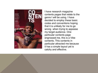
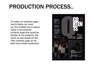
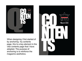
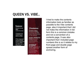
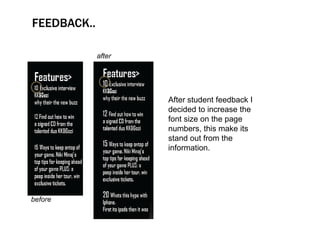
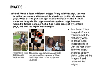
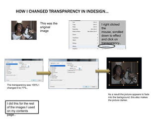
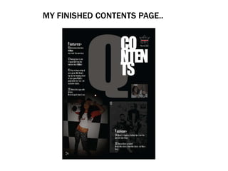
I have research magazine
contents pages that relate to the
genre I will be using. I have
decided to employ these basic
codes and conventions hoping
that it is unlikely for me to go
wrong when trying to appease
my target audience. One
particular contents page
engrossed me, this is a Vibe
contents. This contents in
particular attracted me because
it has a simple layout yet is
catchy and effective.
PRODUCTION PROCESS..

To make my contents page I
had to follow my mock
up, this enabled me to layout
make a conventional
contents page that would be
familiar to my audience. My
mock up was based on the
Vibe contents page as we
both have similar audiences .
When designing I first started of
by anchoring my contents
page, this Is a key element in the
vibe contents page that I have
adopted. The purpose of
anchoring is to reinforce the
magazine aesthetics.
QUEEN VS. VIBE..
                   I tried to make the contents
                   information look as familiar as
                   possible to the Vibe contents
                   page, also it important that I did
                   not make the information in list
                   form this is a common mistake
                   and not a convention of a
                   contents page. It was also
                   important that I included page
                   numbers this is so it relates to my
                   front page and double page
                   spread another form of
                   anchoring.
FEEDBACK..

             after


                     After student feedback I
                     decided to increase the
                     font size on the page
                     numbers, this make its
                     stand out from the
                     information.


before
IMAGES…
I decided to use at least 3 different images for my contents page, this was
    to entice my reader and because it is a basic convention of a contents
    page. When deciding what images I wanted I knew I wanted it to link
    somehow to my double page spread and my front page; however I
    wanted to further reinforce the hip-hop music aspect of my contents
    page, this lead me to pick these images..
                                                               • I anchored these
                                                                 images to form a
                                                                 cohesion with the
                                                                 rest of my work.
                                                               • To make these
                                                                 images blend in
                                                                 with the rest of my
                                                                 contents page, I
   This images links This image links toThis images links to     changed opacity
   to the double     my genre and has my genre and has           which darkened the
   page spread.      music equipment. music equipment.
                     i.e. stereo
                                                                 images. Also I
                                                                 darkened the
                                                                 edges.
HOW I CHANGED TRANSPARENCY IN INDESIGN...

                              This was the   I right clicked
                              original       the
                              image          mouse, scrolled
                                             down to effect
                                             and click on
                                             transparency..


The transparency was 100% I
changed it to 77%..

                                                 As a result the picture appears to fade
                                                 into the background, this also makes
                                                 the picture darker.
I did this for the rest
of the images I used
on my contents
page..
MY FINISHED CONTENTS PAGE..

Production log

  • 2.
    I have researchmagazine contents pages that relate to the genre I will be using. I have decided to employ these basic codes and conventions hoping that it is unlikely for me to go wrong when trying to appease my target audience. One particular contents page engrossed me, this is a Vibe contents. This contents in particular attracted me because it has a simple layout yet is catchy and effective.
  • 3.
    PRODUCTION PROCESS.. To makemy contents page I had to follow my mock up, this enabled me to layout make a conventional contents page that would be familiar to my audience. My mock up was based on the Vibe contents page as we both have similar audiences .
  • 4.
    When designing Ifirst started of by anchoring my contents page, this Is a key element in the vibe contents page that I have adopted. The purpose of anchoring is to reinforce the magazine aesthetics.
  • 5.
    QUEEN VS. VIBE.. I tried to make the contents information look as familiar as possible to the Vibe contents page, also it important that I did not make the information in list form this is a common mistake and not a convention of a contents page. It was also important that I included page numbers this is so it relates to my front page and double page spread another form of anchoring.
  • 6.
    FEEDBACK.. after After student feedback I decided to increase the font size on the page numbers, this make its stand out from the information. before
  • 7.
    IMAGES… I decided touse at least 3 different images for my contents page, this was to entice my reader and because it is a basic convention of a contents page. When deciding what images I wanted I knew I wanted it to link somehow to my double page spread and my front page; however I wanted to further reinforce the hip-hop music aspect of my contents page, this lead me to pick these images.. • I anchored these images to form a cohesion with the rest of my work. • To make these images blend in with the rest of my contents page, I This images links This image links toThis images links to changed opacity to the double my genre and has my genre and has which darkened the page spread. music equipment. music equipment. i.e. stereo images. Also I darkened the edges.
  • 8.
    HOW I CHANGEDTRANSPARENCY IN INDESIGN... This was the I right clicked original the image mouse, scrolled down to effect and click on transparency.. The transparency was 100% I changed it to 77%.. As a result the picture appears to fade into the background, this also makes the picture darker. I did this for the rest of the images I used on my contents page..
  • 9.