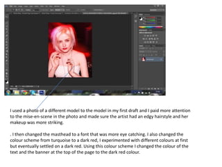
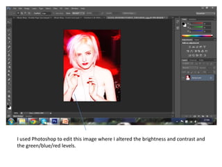
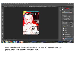
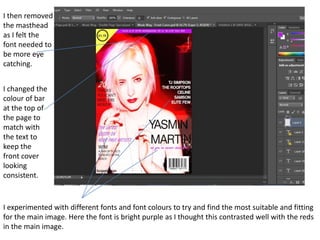
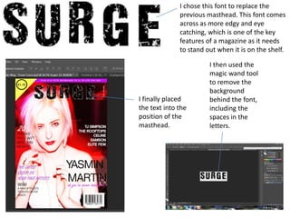
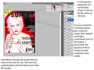
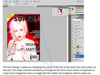
The document describes changes made to a magazine cover design. The designer updated the main image to feature a model with edgier hairstyle and makeup. They changed the font and color scheme to be more eye-catching, experimenting with different reds before settling on a dark red. Additional edits included altering the brightness and colors of the main image in Photoshop and updating fonts and layout elements to improve consistency and make the cover stand out.
2. I used a photo of a different model to the model in my first draft and I paid more attention
to the mise-en-scene in the photo and made sure the artist had an edgy hairstyle and her
makeup was more striking.
. I then changed the masthead to a font that was more eye catching. I also changed the
colour scheme from turquoise to a dark red, I experimented with different colours at first
but eventually settled on a dark red. Using this colour scheme I changed the colour of the
text and the banner at the top of the page to the dark red colour.
3. I used Photoshop to edit this image where I altered the brightness and contrast and
the green/blue/red levels.
4. Here, you can see the new main image of the main artist underneath the
previous text and layout from my first draft.
5. I then removed
the masthead
as I felt the
font needed to
be more eye
catching.
I changed the
colour of bar
at the top of
the page to
match with
the text to
keep the
front cover
looking
consistent.
I experimented with different fonts and font colours to try and find the most suitable and fitting
for the main image. Here the font is bright purple as I thought this contrasted well with the reds
in the main image.
6. I chose this font to replace the
previous masthead. This font comes
across as more edgy and eye
catching, which is one of the key
features of a magazine as it needs
to stand out when it is on the shelf.
I then used the
magic wand tool
to remove the
background
I finally placed behind the font,
the text into the including the
position of the spaces in the
masthead. letters.
7. I removed the
purple bar as I
wanted the
colour of this to
be the same as
the text.
To ensure that the
masthead stood
out, using the
shape tool I placed
rectangles
underneath each of
the letters. I
decreased the
opacity of these
shapes so they
would be more
subtle.
I decided to change the purple font on
some of the text to red, I felt that this
worked better with the front cover than
the purple.
8. The final change I made was changing the colour of the bar at the top to the same colour as
the text. This helps maintain consistency throughout the front cover, which is important as
major music magazines have an image that the reader will recognise week in week out.