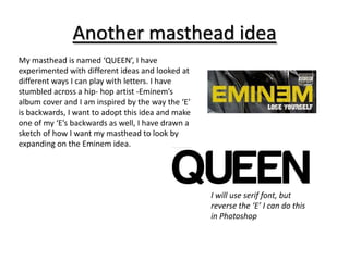
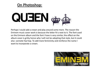
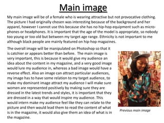
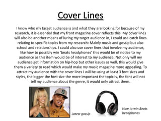
Music Magazine Front Cover
   Statement of Intent
Masthead
After careful but brief analysis of hip-hop magazines I have noticed that magazines tend to be aimed
mainly at men with the secondary audience being women. When women are placed on hip-hop
magazines, most of the time they are dressed provocatively, this is not a very good example to a
younger generation, I aim to create a magazine to inspire my young female hip-hop audience.
I have found a magazine that demonstrates what I am against (see bellow) This magazine is called
‘King’. Although King magazine features only women, they seem to only be projected in a sexy and
provocative light, this is to attract the magazines male audience.

                                 The masthead on this magazine is called ‘The women of
                                 King’ this again supports my theory that this magazine
                                 makes women seem in-superior to men. Never-the-less
                                 this is a successful magazine, I aim to make a similar
                                 magazine, however I am mainly going to change the
                                 audience.
Masthead

The name of my front cover will be called
‘QUEEN’ I have called my magazine this
because the name straight away empowers
women, which is my main aim along with
presenting a hip-hop magazine. According
to my research of hip-hip magazines the
preliminary audience base is mainly men
aged between 17- 45, I especially looked at
a hip-hop magazines that are successful and
male based, this lead me to look at ‘KING’
magazine; from this I was inspired to         King Magazine masthead
subvert the generic convention.
My masthead will be place at the upper left corner of my magazine, in
      my research this is where it was placed, I aim for my magazine
  masthead to be catchy and different; it is important that it is because
this is how my audience would recognise my magazine. I have looked at
 the website dafont and have looked at different font ideas and styles; I
  have looked at italics or serif fonts especially, this is because to me it
   connotes sophistication and it looks very feminine compared to the
‘KING’ sans serif font which is more masculine. However due to student
criticism I have realised that unless this is bevelled it does no really look
   catchy or stand out, especially since I have decided on a plain block
         colour such as black or gold, as I want to keep it simple.

                 Masthead ideas:


                                                        Black or gold
                                                        masthead
       Italic sans serif font                           colour
These fonts are all serif and my ideas for a
masthead, however it wouldn't really stand out
against an image and to me its is not bold or catchy
enough to be adapted to be made into a masthead.
Another masthead idea
My masthead is named ‘QUEEN’, I have
experimented with different ideas and looked at
different ways I can play with letters. I have
stumbled across a hip- hop artist -Eminem’s
album cover and I am inspired by the way the ‘E’
is backwards, I want to adopt this idea and make
one of my ‘E’s backwards as well, I have drawn a
sketch of how I want my masthead to look by
expanding on the Eminem idea.


                                                   I will use serif font, but
                                                   reverse the ‘E’ I can do this
                                                   in Photoshop
On Photoshop:


Perhaps I could add a crown and play around some more. The reason the
Eminem music cover work is because the letter N is next to it. The font used
on the Eminem album and the font I have is very similar, the effect on the
album cover is gritty hence why I will not be adopting that style, but it could
also connote hip-hop. To add more femininity and reinforce the name I
want to incorporate a crown.
Main image
My main image will be of a female who is wearing attractive but not provocative clothing.
The picture I had originally chosen was interesting because of the background and her
apparel, however I cannot use this because she has no hip-hop equipment such as micro-
phones or headphones. It is important that the age of the model is appropriate, so nobody
too young or too old but between my target age range. Ethnicity is not important to me
although black people are mainly featured on hip-hop magazines.
The overall image will be manipulated on Photoshop so that it
is catchier or appears better than before. The main image is
very important, this is because it would give my audience an
idea about the content in my magazine, and a very good image
would lure my audience in, whereas a bad image would have a
reverse effect. Also an image can attract particular audiences,
my image has to have some relation to my target audience, to
make my dominant image attract my audience I will make sure
women are represented positively by making sure they are
dressed in the latest trends and styles, it is important that they
are dressed in a way that would inspire my audience. This
would intern make my audience feel like they can relate to the
picture and then would lead them to read the content of what
                                                                     Previous main image
is in the magazine, it would also give them an idea of what is in
the magazine.
Cover Lines
  I know who my target audience is and what they are looking for because of my
 research, it is essential that my front magazine cover reflects this. My cover lines
will also be another means of luring my target audience in, I could use catch lines
   relating to specific topics from my research: Mainly music and gossip but also
  school and relationships. I could also use cover lines that involve my audience,
     like how to possibly win ‘beats headphones’ this would be of notice to my
    audience as this item would be of interest to my audience. Not only will my
   audience get information on hip-hop but other issues as well, this would give
them a variety to read which would make my music magazine more appealing. To
  attract my audience with the cover lines I will be using at least 3 font sizes and
  styles, the bigger the font size the more important the topic is, the font will not
            tell my audience about the genre, it would only attract them.


                                                                     How to win Beats
                                    Latest gossip                    headphones
Cover Lines
                                                                This cover line includes 2 font sizes
                                                                along with two colours, this works
                                                                effectively because it shows the
                                                                importance of the cover line and
                                                                emphasises the ‘shocking’ sex scandals,
                                                                I will uses a variety of font sizes to
                                                                attract my audience and signify
                                                                importance of a cover line.


                                                                 A list form of different artists is
                                                                 displayed. I want to use this because it
                                                                 would broaden my target audience and
                                                                 advertise who will be featured in my
                                                                 magazine.


                                                                 This is an effective cover line because it
                                                                 is big bold bright and red. I am very fond
                                                                 of this cover line because colloquial
                                                                 language is used which directly and only
                                                                 understood by the target audience. I can
                                                                 use a colloquial term that would make
                                                                 my magazine appear more genuine.


I will be a lining my cover lines on the left hand side of my
magazine page. The colour scheme here is bright and
attractive I want my colour scheme to be distinctive also.
Perhaps colours like red could be used, this is a bold and
vibrant colour that is very attractive.

Statement of intent front page

  • 1.
    Music Magazine FrontCover Statement of Intent
  • 2.
    Masthead After careful butbrief analysis of hip-hop magazines I have noticed that magazines tend to be aimed mainly at men with the secondary audience being women. When women are placed on hip-hop magazines, most of the time they are dressed provocatively, this is not a very good example to a younger generation, I aim to create a magazine to inspire my young female hip-hop audience. I have found a magazine that demonstrates what I am against (see bellow) This magazine is called ‘King’. Although King magazine features only women, they seem to only be projected in a sexy and provocative light, this is to attract the magazines male audience. The masthead on this magazine is called ‘The women of King’ this again supports my theory that this magazine makes women seem in-superior to men. Never-the-less this is a successful magazine, I aim to make a similar magazine, however I am mainly going to change the audience.
  • 3.
    Masthead The name ofmy front cover will be called ‘QUEEN’ I have called my magazine this because the name straight away empowers women, which is my main aim along with presenting a hip-hop magazine. According to my research of hip-hip magazines the preliminary audience base is mainly men aged between 17- 45, I especially looked at a hip-hop magazines that are successful and male based, this lead me to look at ‘KING’ magazine; from this I was inspired to King Magazine masthead subvert the generic convention.
  • 4.
    My masthead willbe place at the upper left corner of my magazine, in my research this is where it was placed, I aim for my magazine masthead to be catchy and different; it is important that it is because this is how my audience would recognise my magazine. I have looked at the website dafont and have looked at different font ideas and styles; I have looked at italics or serif fonts especially, this is because to me it connotes sophistication and it looks very feminine compared to the ‘KING’ sans serif font which is more masculine. However due to student criticism I have realised that unless this is bevelled it does no really look catchy or stand out, especially since I have decided on a plain block colour such as black or gold, as I want to keep it simple. Masthead ideas: Black or gold masthead Italic sans serif font colour
  • 5.
    These fonts areall serif and my ideas for a masthead, however it wouldn't really stand out against an image and to me its is not bold or catchy enough to be adapted to be made into a masthead.
  • 6.
    Another masthead idea Mymasthead is named ‘QUEEN’, I have experimented with different ideas and looked at different ways I can play with letters. I have stumbled across a hip- hop artist -Eminem’s album cover and I am inspired by the way the ‘E’ is backwards, I want to adopt this idea and make one of my ‘E’s backwards as well, I have drawn a sketch of how I want my masthead to look by expanding on the Eminem idea. I will use serif font, but reverse the ‘E’ I can do this in Photoshop
  • 7.
    On Photoshop: Perhaps Icould add a crown and play around some more. The reason the Eminem music cover work is because the letter N is next to it. The font used on the Eminem album and the font I have is very similar, the effect on the album cover is gritty hence why I will not be adopting that style, but it could also connote hip-hop. To add more femininity and reinforce the name I want to incorporate a crown.
  • 8.
    Main image My mainimage will be of a female who is wearing attractive but not provocative clothing. The picture I had originally chosen was interesting because of the background and her apparel, however I cannot use this because she has no hip-hop equipment such as micro- phones or headphones. It is important that the age of the model is appropriate, so nobody too young or too old but between my target age range. Ethnicity is not important to me although black people are mainly featured on hip-hop magazines. The overall image will be manipulated on Photoshop so that it is catchier or appears better than before. The main image is very important, this is because it would give my audience an idea about the content in my magazine, and a very good image would lure my audience in, whereas a bad image would have a reverse effect. Also an image can attract particular audiences, my image has to have some relation to my target audience, to make my dominant image attract my audience I will make sure women are represented positively by making sure they are dressed in the latest trends and styles, it is important that they are dressed in a way that would inspire my audience. This would intern make my audience feel like they can relate to the picture and then would lead them to read the content of what Previous main image is in the magazine, it would also give them an idea of what is in the magazine.
  • 9.
    Cover Lines I know who my target audience is and what they are looking for because of my research, it is essential that my front magazine cover reflects this. My cover lines will also be another means of luring my target audience in, I could use catch lines relating to specific topics from my research: Mainly music and gossip but also school and relationships. I could also use cover lines that involve my audience, like how to possibly win ‘beats headphones’ this would be of notice to my audience as this item would be of interest to my audience. Not only will my audience get information on hip-hop but other issues as well, this would give them a variety to read which would make my music magazine more appealing. To attract my audience with the cover lines I will be using at least 3 font sizes and styles, the bigger the font size the more important the topic is, the font will not tell my audience about the genre, it would only attract them. How to win Beats Latest gossip headphones
  • 10.
    Cover Lines This cover line includes 2 font sizes along with two colours, this works effectively because it shows the importance of the cover line and emphasises the ‘shocking’ sex scandals, I will uses a variety of font sizes to attract my audience and signify importance of a cover line. A list form of different artists is displayed. I want to use this because it would broaden my target audience and advertise who will be featured in my magazine. This is an effective cover line because it is big bold bright and red. I am very fond of this cover line because colloquial language is used which directly and only understood by the target audience. I can use a colloquial term that would make my magazine appear more genuine. I will be a lining my cover lines on the left hand side of my magazine page. The colour scheme here is bright and attractive I want my colour scheme to be distinctive also. Perhaps colours like red could be used, this is a bold and vibrant colour that is very attractive.