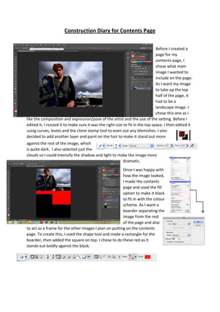
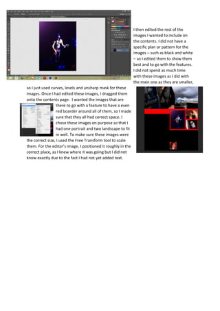
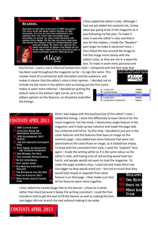
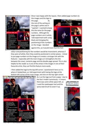
The document describes the process of creating a contents page for a magazine. It details how the creator chose a landscape image to take up half the page, then edited it and added layers to make it more dramatic. Boarders were added to frame other images. Additional images were edited and placed on the page along with an editor's note and feature listings. Page numbers and a logo were finally added to complete the contents page layout.
This document summarizes the process of designing the front cover of a construction diary. The designer selected an image of a model that had a plain background. They edited the image in Photoshop to adjust tones and colors and remove blemishes. The image was then cut out and placed on the cover page. Straplines were added along the top and side, and the logo, insert, and coverlines of text were positioned throughout the cover. Care was taken to balance the layout and ensure the main elements stood out clearly.
The document summarizes the process of designing a double-page magazine spread. It describes altering the document dimensions to double the width, adding guidelines and consistency elements from other pages. An main image was created by combining two photos - a forest background and an edited model photo pasted on top. Text elements like the title, caption and article were then added. Minor tweaks were made to enhance the overall design.
The document provides instructions for adding a grid overlay in Photoshop to help align elements on a page. The grid allows you to ensure text and images are straight and positioned properly. Adding a grid makes the layout look more professional compared to unaligned elements.
The document provides instructions for creating a magazine layout in Photoshop. It describes adding a grid for alignment, selecting fonts and images, arranging layers, and providing formatting like headlines, captions and page numbers to make the magazine look professional. The goal is to organize content on the front cover and contents page to effectively showcase stories and entertain readers.
Draft 1 summarizes the editorial pillars and layout for a magazine contents page. It discusses using a bold font for the pillars to catch attention, and a collage layout for the table of contents using relevant images. Draft 2 further develops the layout by making the frames appear hung with string for a 3D effect, and adding musical notes to represent the magazine's content.
The document discusses how the magazine cover and interior pages were designed to attract the target audience. Key points include:
- The cover uses bold, feminine colors and a friendly main image to catch readers' eyes. Focus groups confirmed these design choices appealed to the target demographic.
- Interior pages also employ rule of thirds layout, consistency in house style and color scheme, and many images to engage readers as focus groups desired.
- Features like contests, pull quotes, and sections on music, fashion and gossip would interest the audience. Informal language and an exclusive interview further attract readers.
- Overall the document emphasizes how feedback from focus groups informed design choices to make the magazine visually appealing and relevant to its
The document provides instructions for adding a grid overlay in Photoshop to help align elements on the page. The grid allows you to ensure text and images are straight and positioned properly. Without a grid, it would not look professional to have unaligned elements.
The document provides instructions for adding a grid overlay in Photoshop to help align elements on a page. The grid allows you to ensure text and images are straight and positioned properly. It notes that having unaligned elements would be unprofessional. It describes how to access the grid view option in Photoshop.
The document provides instructions for adding a grid in Photoshop when viewing and selecting the grid option. The grid allows you to align work and ensure it is straight. It then discusses pasting text and an image into a Photoshop document and positioning the image behind the text.
The document describes the process of designing a magazine cover in Photoshop and InDesign. Key steps include:
1. Editing a cover photo in Photoshop to enhance contrast, brightness, and skin tone.
2. Placing the edited photo and masthead font onto an InDesign document, adjusting sizes using tools.
3. Adding additional design elements like issue details, article titles and descriptions, pricing, and logos.
4. Iteratively adjusting layout and design until the final magazine cover is achieved.
The document describes the student's music magazine project, noting how they used conventions like bold titles and central images on the cover similar to other music magazines. The student challenged some conventions by using a medium close-up image and including an editor's letter, which is uncommon for music magazines. Feedback from questionnaires helped the student tailor the magazine to their target teenage audience interested in different music genres.
The document discusses the student's music magazine media product and how it uses and challenges conventions of real music magazines. The student used similar conventions to real magazines for the cover design, such as a bold title in the center and a central image. However, the central image is of a student rather than a famous person. The contents page challenges conventions by including an editor's letter, which is uncommon for music magazines. Throughout the product, the student aimed to represent mainstream audiences of both genders and all ages and musical interests, rather than a particular social group. The student believes Q, Bauer Media or Kerrang would be suitable media institutions to distribute the magazine as they produce magazines for broad music audiences.
The document describes the process taken to design the front cover of a magazine in InDesign. Key steps included:
1. Editing a photo in Photoshop to enhance it for the cover, then placing it in InDesign to fill the cover.
2. Selecting a font inspired by the genre and pasting it onto the cover as the masthead.
3. Adding additional text elements like the issue date, an exclusive interview title and details, and descriptions of inside articles.
4. Formatting the additional text elements with styles, sizes, colors and italics to make them stand out.
5. Including a barcode and price to make the cover look professional and like
The document provides a development diary of creating a magazine front cover and contents page in Photoshop. Key steps include:
1) Inserting a background image and cropping out white space to isolate the magazine name.
2) Cropping a model from a photo and adjusting her size on the front cover.
3) Adding coverlines, a barcode, strapline and other design elements to complete the front cover.
4) Changing fonts and layouts and adding images and pull quotes to create the contents page.
5) Editing photos using effects like sepia tone and cropping to feature in the magazine.
The document provides instructions for adding a grid in Photoshop to help align elements on a page. Selecting "View" then "Show" and choosing "Grid" will make a grid appear over the background to aid in positioning text and images straight. The grid allows ensuring work is straight and professionally presented without misaligned elements.
The document discusses technologies learned from creating a magazine product. It describes using Photoshop to edit images and layers for the cover, InDesign to layout a double page spread, and Fireworks to create and add a logo to an image. Overall it indicates learning how to effectively edit images, organize pages, and integrate different programs to assemble the final magazine product.
The document discusses how the magazine cover and articles were designed to attract and address the target audience.
[1] Bold colors, large images, and eye-catching headlines were used throughout to grab readers' attention. [2] Feminine tones and themes appealing to women, such as celebrating female country artists, were also incorporated. [3] The layout aims to be accessible with consistent styling and a mix of serious and lighthearted content tailored to the interests of music fans.
The document summarizes the steps taken to design a magazine front cover, contents page, and double-page article spread in Photoshop and QuarkXPress. Key steps included editing photos, selecting and arranging elements, adding banners, text, and graphics. Challenges involved refining selection edges, fitting elements on pages, and wrapping text around objects. Consistent colors and fonts were used to tie the design elements together across pages.
Both the Blender magazine cover and the student's cover use similar conventions such as overlapping the dominant image over the title and using fading backgrounds. The student's cover also uses headings down the side in the same font as the Blender cover.
The student's contents page and the Q magazine contents page both use a large dominant image on one side of a double page spread with contents listed down the side and page numbers on the images. However, the Q contents looks more busy and eye-catching.
The Madonna article page and student's article page both use a large dominant image on one side of a double page spread with the artist's name as the bold headline. The student included a quote from the interview on the
The document summarizes the process of designing the front cover and contents page for a magazine. Key steps include selecting and editing an image for the front cover, arranging the band members, and adding text and design elements. For the contents page, boxes and lists were added to organize the content sections. Photos and captions were also included to fill empty space. The double page spread features the cover image with text overlaid to introduce an interview feature.
The document outlines the process of creating a Hong Kong tourism website. It discusses selecting themes, editing photos, creating individual pages for different shopping categories, and including key information like maps, directions, and user comments. The creator aimed to present helpful information in an organized and visually appealing way based on client feedback.
The document summarizes a student's music magazine project. It discusses conventions used like camera shots, colors, and clothing. It describes the target audience as teenage girls ages 12 and up. Content includes research on pop magazines. Technology used includes PowerPoint, Publisher, and Paint. Feedback indicated the magazine met its target audience.
The document provides step-by-step instructions for creating a magazine front cover in Photoshop. It describes 11 steps for tasks like making a masthead, banner, cover lines, images, shapes and text and positioning them on the page. Key steps include using tools like the rectangle, text, and custom shape tools to make elements and the eye dropper to match colors. Layers are utilized and effects like strokes and drop shadows are added. Precise positioning is achieved through techniques like holding shift while resizing and using arrow keys.
The document summarizes the process of designing the front cover and contents page for a magazine. Key points:
- The front cover features a band photo with one member's mouth edited to be closed. Additional editing makes the lead singer larger.
- The contents page uses consistent colors and fonts from the front cover. Boxes contain lists of featured and regular articles. Random band photos and a letter from the editor are added to fill space.
- A double page spread features the edited band photo with writing overlaying. An interview is laid out in three columns below the title spanning both pages. Consistent branding elements tie the pages together.
This document provides a development diary for a magazine. It summarizes the key stages in creating the magazine, including designing the front page title and cover page layout. Pictures and graphics are edited to best represent features and appeal to readers. The contents page lists main articles and uses formatting and images to attract attention. A double-page feature spread is planned with two large pictures to engage readers. Care is taken to ensure consistency in styles, fonts, and effects to create a cohesive publication.
This image was chosen for the magazine's contents page to represent the style of music and topic for that month. The image shows a doll in a bright costume against a dark background during carnival preparations. Enhancements will be made using Adobe software to focus on the doll, brighten its costume, and crop out distracting background objects so that the image stands out and grabs readers' attention in a professional way.
This document summarizes the key elements of the magazine front cover, contents page, and double page spread (DPS) that was created, along with how it represents social groups and its target audience.
The front cover uses an unusual masthead font, dominant central image, and cover lines/article teasers. The contents page mixes conventions from other magazines and uses color consistently. The DPS features an informal artist interview formatted across three columns.
While the magazine does not explicitly represent a subculture like "emos" or "goths", it would appeal most to the "hoodies" subculture interested in hip hop and R&B. It aims to consider issues of gender, age, and ethnicity through inclusive
The document discusses research conducted to determine the target audience for a magazine focused on 1990s rock music. Research found that the target audience is 16-20 years old, with a 50/50 male to female ratio. Most are students with part-time jobs who enjoy sports, video games, and photography. A focus group confirmed the target audience enjoys artists from the 1990s like Green Day and Guns N' Roses. The magazine is aimed at both male and female fans of 1990s rock between 16-40 years old.
The document discusses the various technologies, both hardware and software, that the author used during the process of creating a magazine. The author used a Mac, digital camera, phone, and USB stick as hardware. As software, the author relied heavily on Adobe Photoshop to design and edit images for the magazine, and also used Microsoft PowerPoint, Word, the internet, Prezi, Slideshare, and Wordpress. Through using these technologies, the author developed new skills in utilizing various tools and software to their full potential and create a professional magazine.
Construcion diary for double page spreadalicesophie
The document summarizes the process of constructing a double page magazine spread. Key steps included editing images, laying out text boxes and images, adding body copy and captions, and experimenting with design elements like colors, fonts, and effects to make elements stand out. The overall goal was to create a cohesive and visually appealing layout that effectively presented information to readers.
The focus group reviewed a music magazine aimed at the rock genre. They found that the black and white color scheme with clear fonts made the cover, contents page, and double page spread easy to read. The images and artists featured represented the genre well and made the participants want to learn more. The group rated the overall magazine a 9 out of 10, with their only suggested improvements being reducing the barcode size on the cover and adding captions to the contents page images.
The document discusses how a magazine called "Dirt" represents fans of 1990s rock music. The magazine's target audience is described as having a rough, edgy, and independent style. The front cover features a rock artist in this style to appeal to fans and connect them to the magazine. The contents and features focus on successful rock artists to portray the genre and its fans in a positive light.
The document discusses the target demographics for a music magazine product. It aims to attract both males and females through the use of a male cover photo that is not overly masculine and unisex colors. Research also found interest in the genre of music chosen came from a wide range of ethnicities. Secondary research showed the target demographic is split 75% male and features varied ethnicities, with over 50% of nonblack groups interested in hip hop and R&B music.
AS Media Studies - Evaluation - School MagazineSundasBostan
My school magazine successfully begins to fit conventions of real magazines by including elements like a masthead, main image, date, and barcode. It represents various social groups by featuring images and articles about students, teachers, and parents. The magazine's intended audience is students, parents, and teachers, as it provides insight into school life. Technologies learned include using layers in Photoshop and InDesign, editing images, and saving files correctly. Mistakes were made like spelling errors and not editing images properly, which will be improved upon for future projects.
The document discusses how the media product represents certain social groups through the character introduced in the opening sequence. It represents:
- Ethnicity/race by having a white female character to portray vulnerability and need for rescue, following stereotypes.
- Gender by having a young, attractive female as the main character who is both the "damsel in distress" but also challenging norms by being the lead.
- Age by having a teenage character who challenges stereotypes of being irresponsible by having responsibility and maturity, aiming to provide a positive representation.
The character representations aim to appeal to target audiences by following some stereotypes but also challenging others to make the character and film more interesting and thought-provoking
A-Level Media Studies - Magazine Planning. (Primary Coursework)RyaaanWard
The document outlines plans for a music magazine focusing on alternative, indie, punk, and metal genres. It discusses typical codes and conventions for a music magazine, including feature articles, interviews, reviews, and reader submissions. Ideas for the magazine include the name "Crash" or "Real Music Magazine," and featuring an interview and album review as the cover story. Mock layouts are proposed for the front cover and contents page, experimenting with placement of the masthead, barcode, cover lines, date, and images.
The document describes the process of creating a contents page in Adobe InDesign. It discusses creating a template, dividing the page into sections for images and text, adding borders and headings, incorporating relevant images, and altering the images to triangular shapes. The contents page was successfully created following templates from online research.
The document describes the process of creating a contents page in Adobe InDesign. It discusses dividing the page into columns for images and text, adding section headings, placing images in boxes, adding borders, sharpening images, shaping images into triangles, adding a subscription box with social media icons, and creating the final contents page layout. The overall page uses a yellow and black color scheme and includes six images and multiple sections to organize information for the target urban audience.
Technologies from the process of constructing the productlilyfaulkner
The document describes the process of creating a magazine mockup in Photoshop and Quark. It includes steps taken to design the contents page, double page article spreads, and the front cover. For the contents page, the author experimented with different layouts and positioning of photos and text before deciding on a final design. For the article spreads, techniques like using the rule of thirds and varying text formatting were used. The front cover process involved selecting a focal photo, adding title text and other design elements, and refining the layout.
Technologies from the process of constructing the productlilyfaulkner
The document describes the process of creating magazine layouts in Photoshop and Quark. It discusses selecting photos, editing photos to improve quality, designing magazine covers and interior pages with effective color schemes and positioning of images and text. Key steps included choosing focal points, using layers and text boxes, and adjusting font sizes and colors to make certain elements stand out. The goal was to design professional-looking magazine pages and covers that drew the viewer's eye to important information.
This document describes the process of designing a magazine cover and contents page. The author created draft sketches and templates in Photoshop to plan layouts and placement of images and text. They then imported the content into InDesign, which allowed for more precise formatting and organization using tools like frames, grids, and layers. Feedback from the initial Photoshop templates helped the author visually design the cover and contents page.
This document describes the process of designing a magazine cover and contents page. The author created draft sketches and templates in Photoshop to plan layouts before building the actual pages in InDesign. InDesign proved more useful than Photoshop for the task as it included tools tailored to organizing text and images across a page. Frames, grids, and layers helped the author strategically position all elements, and test cover designs were refined through techniques like blurring images and experimenting with fonts and backgrounds.
Technologies from the process of constructing the productlilyfaulkner
The document describes the process of designing magazine pages in Photoshop and Quark including a front cover, contents page, double page spread, and additional pages. Key steps included choosing photos, adding text in layers with varying fonts, sizes and colors, and adjusting layouts to improve readability and emphasis on important elements. The final versions effectively used color contrasts, placement of images and text, and design principles like rule of thirds to create a cohesive magazine format.
The document describes the process of designing a magazine cover in Photoshop and InDesign. The designer used the clone tool to remove an unwanted door from a cover photo, added text and graphics such as a masthead and flash overlay, and experimented with color schemes and layouts before arriving at a design with a red flash, blue masthead, and text arranged across the model on the cover.
Technologies from the process of constructing the productlilyfaulkner
This document describes the process of creating magazine layouts in Photoshop and Quark. It discusses selecting photos, designing page layouts, using layers and text boxes, and experimenting with color schemes and fonts to make text stand out clearly against backgrounds. The document shows initial layouts and revisions, including a front cover, contents page, double-page spread, and use of drop shadows, strokes and quotes. The goal was to create high-contrast designs that guide the eye to important information and maintain readability.
The document describes the process taken to design and layout several pages for a magazine mock-up, including a double page spread, contents page, and front cover. Key steps involved setting page dimensions, adding backgrounds, inserting images and adjusting them, and placing and formatting text using various design tools. The goal was to create polished, professionally designed pages that followed magazine conventions.
The document describes the process of designing a magazine contents page in Photoshop. Key steps included:
1) Choosing a background color by sampling from the front cover and applying it at low opacity.
2) Using lines and text boxes to layout the page structure and listings. Fonts and sizing were used to distinguish headings from subheadings.
3) Adding images from a photo shoot and editing them to match the design's color scheme and style.
4) Finalizing details like page numbers, addresses and slogans to complete the contents page design.
The document describes the process of designing a magazine cover. Key steps include:
1. Cropping and editing the main image to make it more crisp.
2. Experimenting with fonts, styles, and blending techniques to make the title stand out against the image.
3. Adding cover lines and moving elements around to best frame the image while drawing readers in.
4. Stretching the main cover line to take over more of the page and attract audiences.
The document describes the process of designing the front cover of a magazine. Key points:
1) A photo was chosen and cropped to fit the cover, with adjustments made to make it appealing.
2) Text was added including the magazine title in a scorched font and coverlines about winning prizes and festival survival guides.
3) Smaller descriptive text and a barcode were also included, and adjustments made to colors and positioning throughout to complete the design.
The document describes the construction of the front cover, contents page, and double page spread for a music magazine created in Adobe InDesign. The front cover was difficult to design and required adjusting the colors and positioning of images to make it look more professional. The contents page construction was easier as the layout had been pre-planned. For the double page spread, images were initially too small so text wrapping was difficult, but adjusting the images and using a dark color palette helped create an organized look.
The document describes the process of designing a magazine cover page layout. Key steps include:
1. Cropping and editing the main image to make it more crisp.
2. Experimenting with fonts, styles, and blending techniques to make the title stand out against the image.
3. Adding cover lines, sublines, and other elements like the barcode to frame and draw attention to the image while following magazine design conventions.
4. Iteratively moving and resizing elements to improve composition and ensure all required information is included clearly.
This document discusses the process of designing a contents page. It describes placing a logo in the top right corner to link the contents page to other pages. The document also discusses using multiple pictures centered on the page instead of one large picture, with text on both sides of the pictures to make the page less like a list. Formatting tips are provided such as using columns to make the text look neat and presentable.
The document discusses how a photographer used Photoshop tools to edit a photo for a music magazine spread. They blurred half the image to make text on that side easier to read. They also used tools like the Patch Tool and Spot Healing Brush to remove imperfections and graffiti to improve readability of overlaid text. Cutting and positioning elements helped the image better incorporate a title overlay.
The document discusses the skills and software the author learned while constructing a double-page spread for a music magazine as part of a class project, including using Adobe InDesign to layout columns and pages, Photoshop to edit images and design covers, and a Canon camera to take professional photos despite initial difficulties with settings. Screenshots provide examples of editing an image in Photoshop and setting up columns in InDesign.
The document summarizes the process of designing a double page spread for a magazine article. The designer began by adding the main image in the center to plan the layout. They used editing tools to clean up the image and made adjustments to ensure it fit across both pages. Additional photos were added below in polaroid-style frames at angles to seem casual. Captions were written for the photos. Columns of body text were added in a simple font. A pull quote was extracted and styled to draw readers in without distracting from the main image. The designer believes the final spread achieves their goal of making readers feel connected to the subject.
The document describes various editing tools and techniques used in Photoshop to design a magazine page. Key steps include:
1. Using the grid tool to align elements neatly on the page.
2. Pasting an image and resizing it using free transform to fit the page properly.
3. Changing the background color and adding a gradient to emphasize the main image.
4. Using selection tools to cut out the masthead and add shaped banners and boxes for text.
5. Editing blemishes on a model's photo and bloated lips for consistency across images.
Similar to Constuction diary for contents page (20)
This document is a table of contents for a music magazine. It lists articles, advertisements, and other content that will be included across 120 pages. The table of contents provides headlines and brief descriptions for articles about various musicians, albums, concerts, and films. It also lists advertisements for brands like Smirnoff, iPhone 5, Nikon, and more.
The document summarizes the results of a questionnaire about preferences for a new music magazine. The target audience is identified as 16-20 year-olds who are mostly students or work part-time. They prefer a fortnightly magazine that costs £2.50, with a red, black, and white color scheme. Based on the results, the magazine will feature artists like Nirvana and Green Day, and include popular sections like "A Day in the Life" profiles and best-of lists. It will also contain sport and video game ads catering to the audience's interests.
This document is a questionnaire for a new 1990s rock music magazine. It asks respondents about their demographics, including age, gender, employment status and location. It also asks about hobbies, favorite artists in the genre, how many and how much they spend on magazines per month. Additional questions cover what similar magazines they buy, where they purchase magazines, how often the new magazine should be released and how much they would pay. It asks what free gifts they would like, color scheme preferences, sections they like to read and their preferred magazine cover design.
The document outlines three initial music magazine ideas: an indie magazine, a 90's rock magazine, and a punk rock magazine. It provides details on the target audiences, design elements, and planned features for each. It then shares feedback received from peers, with the 90's rock magazine and "dirt" font style being most popular overall. Based on this feedback, the document concludes that the final decision is to create a 90's rock magazine using the "dirt" font style and a red, black, and white color scheme.
Alice Turrell outlined three initial music magazine ideas - indie, 90's rock, and punk rock. She provided details on the target audience, design elements, and features for each idea. After gathering feedback, Alice decided to move forward with a 90's rock magazine targeted at ages 16-40 with a "dirt" font style and red, black, and white color scheme.
This document appears to be the beginning of a photography unit where the student's top 20 photographs will be displayed. It mentions Alice Sophie Turrell but does not provide any other context or information about the photographs.
Photography Unit 1 focused on taking the best photographs. The unit was taught by instructor Alice Sophie Turrell. Students learned techniques for capturing high-quality images in 3 sentences or less.
Taking photographs of children as they grow and develop can provide lasting memories of their childhood. Developmental photographs capture milestones like first steps, learning to ride a bike, and other achievements. Documenting a child's growth through photos over time creates a priceless personal archive to enjoy for years to come.
Alice Sophie Turrell is a British actress best known for her roles in television shows such as Doc Martin and Midsomer Murders. She has also appeared in films like The Iron Lady and The King's Speech. Turrell trained at the Drama Centre London and began her career in theater before moving into television and film roles in the early 2000s.
Alice Sophie Turrell was born in London, England in 1985. She studied English literature at Oxford University and has worked as a journalist and editor since graduating in 2007. Her debut novel, The Library of Unrequited Love, was published in 2011 to positive reviews.
1. Construction Diary for Contents Page
Before I created a
page for my
contents page, I
chose what main
image I wanted to
include on the page.
As I want my image
to take up the top
half of the page, it
had to be a
landscape image. I
chose this one as I
like the composition and expression/pose of the artist and the use of the setting. Before I
edited it, I resized it to make sure it was the right size to fit in the top space. I then edited it
using curves, levels and the clone stamp tool to even out any blemishes. I also
decided to add another layer and paint on the hair to make it stand out more
against the rest of the image, which
is quite dark. I also selected just the
clouds so I could intensify the shadow and light to make the image more
dramatic.
Once I was happy with
how the image looked,
I made the contents
page and used the fill
option to make it black
to fit in with the colour
scheme. As I want a
boarder separating the
image from the rest
of the page and also
to act as a frame for the other images I plan on putting on the contents
page. To create this, I used the shape tool and made a rectangle for the
boarder, then added the square on top. I chose to do these red as it
stands out boldly against the black.
2. I then edited the rest of the
images I wanted to include on
the contents. I did not have a
specific plan or pattern for the
images – such as black and white
– so I edited them to show them
best and to go with the features.
I did not spend as much time
with these images as I did with
the main one as they are smaller,
so I just used curves, levels and unsharp mask for these
images. Once I had edited these images, I dragged them
onto the contents page. I wanted the images that are
there to go with a feature to have a even
red boarder around all of them, so I made
sure that they all had correct space. I
chose these images on purpose so that I
had one portrait and two landscape to fit
in well. To make sure these images were
the correct size, I used the Free Transform tool to scale
them. For the editor’s image, I positioned it roughly in the
correct place, as I knew where it was going but I did not
know exactly due to the fact I had not yet added text.
3. I then added the editor’s note. Although I
had not yet added the contents list, I knew
what was going to be in the magazine as it
was following my flat plan. To make it
clear it was the editor’s note and that it
was for the readers, I made the “Readers”
part larger to make it stand out more. I
then fitted the text around the image to
link the image more clearly with the
editors note, as they are not in a separate
box. To make it seem more personal and
less formal, I used a more informal handwritten style – compared with the font style that
has been used throughout the magazine so far – to sign the name. This
creates more of a connection with the editor and the audience, and
makes it clearer that the editor’s note is their opinion. I decided not to
include my last name in the editors note as having just the first name
makes it seem more informal. I decided on putting the
editors note in the bottom right corner as it is the
editors opinion on the features, so should be read after
the listings.
Once I was happy with the position/size of the editor’s note, I
added the listings. I done this differently to how I done it for the
mock magazine. For the mock, I listed every single feature in the
magazine, and it took up two columns and made the page look
too cluttered and full on. So this time, I decided to just put in the
cover features and the features that have an image on the
contents page. I also added two more features that were not
advertised on the cover/have an image, as it looked too empty.
To keep with the consistent font style, I used the “Capitals” font
again. I made the writing white so it is the same colour as the
editor’s note, and having a lot of red writing would look too
harsh, and people would not want to read the magazine. To
make the page numbers clear, I used red and made them one
size bigger so they would stand out – but not so much that they
would look stupid or separate from what
feature is on that page. I then made sure that
all the features were inline together.
I then added the header/page title to the banner. I chose to it white
rather than black because it keeps the writing consistent. I used the free
transform tool to get the text to fill the banner as well as making the font
size bigger did not stretch the text without making it too wide.
4. Once I was happy with the layout, I then added page numbers to
the images and the logo to
the page. As
the rest of the writing on
the page is white and in
“capitals”, I wanted to keep
this the same for the page
numbers. Although the
page numbers are in white,
I did experiment with using
black and changing the
positioning of the numbers
on the image. I decided
against this, as it would mean that the font
colour and positioning for the numbers would be inconsistent, whereas if
they were all white, then they could be positioned in similar places. I chose
to put page numbers on the image as it creates a stronger link with the
features – especially with the main image as it strengthens the link
between the cover, contents page and the double page spread. This is also
helpful to the reader as it one of the artists in the images in one of their
favourite artist, they can find the feature more easily.
I then added the logo to the top left corner. I positioned it here as it is
where it looked best, as I did experiment with having the logo at the
bottom left corner of the main image, and also on the top right corner.
As I cut the logo out from a jpeg – due to
the fact I made it previously – it means
there was some white space left, so
I used the eyedropper tool and the
spray style brush to cover it up.