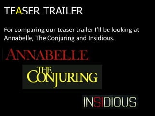
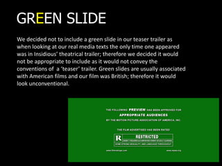
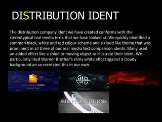
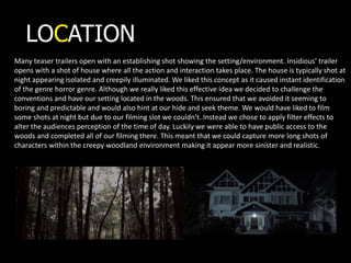
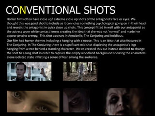
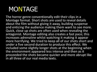
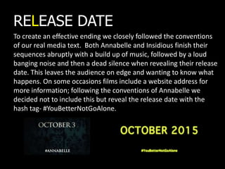
IN WHAT WAYS DOES YOUR
MEDIA PRODUCT USE, DEVELOP
OR CHALLENGE FORMS AND
CONVENTIONS OF REAL MEDIA
PRODUCTS?
For comparing our teaser trailer I’ll be looking at
Annabelle, The Conjuring and Insidious.
TEASER TRAILER
GREEN SLIDE
We decided not to include a green slide in our teaser trailer as
when looking at our real media texts the only time one appeared
was in Insidious’ theatrical trailer; therefore we decided it would
not be appropriate to include as it would not convey the
conventions of a ‘teaser’ trailer. Green slides are usually associated
with American films and our film was British; therefore it would
look unconventional.
DISTRIBUTION IDENT
The distribution company ident we have created conforms with the
stereotypical real media texts that we have looked at. We quickly identified a
common black, white and red colour scheme and a cloud like theme that was
prominent in all three of our real media text comparison idents. Many used
an added effect like a shine or moving object to illustrate their ident. We
particularly liked Warner Brother’s shiny white effect against a cloudy
background an so recreated this in our own.
LOCATION
Many teaser trailers open with an establishing shot showing the setting/environment. Insidious’ trailer
opens with a shot of house where all the action and interaction takes place. The house is typically shot at
night appearing isolated and creepily illuminated. We liked this concept as it caused instant identification
of the genre horror genre. Although we really liked this effective idea we decided to challenge the
conventions and have our setting located in the woods. This ensured that we avoided it seeming to
boring and predictable and would also hint at our hide and seek theme. We would have liked to film
some shots at night but due to our filming slot we couldn’t. Instead we chose to apply filter effects to
alter the audiences perception of the time of day. Luckily we were able to have public access to the
woods and completed all of our filming there. This meant that we could capture more long shots of
characters within the creepy woodland environment making it appear more sinister and realistic.
VOICEOVER & SOUND
We used a voiceover like most teaser trailers to give an insight into character types and storylines. This
helps our audience identify with the genre due to the use of language and tone; some shots otherwise
would not necessarily make sense and may cause confusion among potential consumers. The horror genre
relies heavily on its use of sound when trying to represent sinister themes and so we felt it would be
important to re-create a similar soundtrack. Both Annabelle and The Conjuring used child like non-diegetic
sounds such as a music box to represent their brand and enforce fear among the audience. We decided to
include the idea of music box soundtrack in our own teaser as we felt it would establish the similar sinister
feel we wanted to capture among our audience. We also decided that due to our film being so child
focused that we include a nursery rhyme linking to both our genre and film location. The nursery rhyme
had a warped twist appearing creepy and revealing themes about our woodland environment; this engages
the audience and becomes an obvious representative of the genre. The Conjuring used a crunching sound
effect over a shot of someone being hung from a tree. This was a particular shot that featured In our own
sequence and so we also recreated it and applied it to our own shot effectively reproducing the creepy feel
it established. In insidious’ trailer their release date shot was highlighted by the sound of an old fashioned
camera flashing. We thought this was a good idea as by inserting such a drastic sound it draws the attention
of the audience to the significant information being displayed. We also included this on our title but instead
used a loud ‘boom’ sound’ as we thought these two pieces of information were the most important within
our teaser trailer and we wanted them to be as memorable as possible. We included a clip of heavy
distressed breathing at the very end of our trailer during the reveal of our antagonists face to build
suspense and shock the audience. This idea featured in both The Conjuring where the sounds of children
laughing is present and in Insidious where a scream is applied over the close up shot of the antagonist.
PLAY-
TITLES
A lot of trailers include titles such as ‘directors of’ and ‘makers of’, along
with names of other associated films. We decided not to use a lot of titles,
following the conventions of our real media text as they did not. We did
however include tag lines to enforce an element of terror and build
suspense among the audience. We took this from another real media text
‘The Woman In Black’. We used our brands toxic yellow, swirled writing
continuously through the titles that appeared in the teaser. We took
inspiration from ‘The Conjuring’ who’s writing style is In the same bold
yellow and a similar old fashioned writing style font. We thought this
effectively represented the genre and highlighted sinister themes because
of its eye catching creepy look.
CONVENTIONAL SHOTS
Horror films often have close up/ extreme close up shots of the antagonists face or eyes. We
thought this was good shot to include as it connotes something psychological going on in their head
and reveals the antagonist in quick close up shots. This concept fitted in well with our antagonist as
the actress wore white contact lenses creating the idea that she was not ‘normal’ and made her
appear psycho-creepy. This shot appears in Annabelle, The Conjuring and Insidious.
Our film had horror themes including a hanging with a noose. This is an idea that also features in
The Conjuring. In The Conjuring there is a significant mid shot displaying the antagonist's legs
hanging from a tree behind a standing character. We re-created this but instead decided to change
the shot to a long shot in order to capture the empty woodland background showing the characters
alone isolated state inflicting a sense of fear among the audience.
MONTAGE
The horror genre conventionally edit their clips in a
Montage format. Short shots are used to reveal details
about the film without giving it away, building suspense
and enticing the audience making them want to see more.
Quick, close up shots are often used when revealing the
antagonist. Montage editing also creates a fast pace; this
increases adrenaline whilst watching it making it appear
more horrifying. We tried to keep all of our shots short and
under a five second duration to produce this effect. We
included some slightly longer shots at the beginning when
the environment appeared less intense and then as it
proceeded the shots became quicker and more abrupt like
in all three of our real media texts.
To create an effective ending we closely followed the conventions
of our real media text. Both Annabelle and Insidious finish their
sequences abruptly with a build up of music, followed by a loud
banging noise and then a dead silence when revealing their release
date. This leaves the audience on edge and wanting to know what
happens. On some occasions films include a website address for
more information; following the conventions of Annabelle we
decided not to include this but reveal the release date with the
hash tag- #YouBetterNotGoAlone.
RELEASE DATE

Evaluation Question 1

  • 1.
    IN WHAT WAYSDOES YOUR MEDIA PRODUCT USE, DEVELOP OR CHALLENGE FORMS AND CONVENTIONS OF REAL MEDIA PRODUCTS?
  • 2.
    For comparing ourteaser trailer I’ll be looking at Annabelle, The Conjuring and Insidious. TEASER TRAILER
  • 3.
    GREEN SLIDE We decidednot to include a green slide in our teaser trailer as when looking at our real media texts the only time one appeared was in Insidious’ theatrical trailer; therefore we decided it would not be appropriate to include as it would not convey the conventions of a ‘teaser’ trailer. Green slides are usually associated with American films and our film was British; therefore it would look unconventional.
  • 4.
    DISTRIBUTION IDENT The distributioncompany ident we have created conforms with the stereotypical real media texts that we have looked at. We quickly identified a common black, white and red colour scheme and a cloud like theme that was prominent in all three of our real media text comparison idents. Many used an added effect like a shine or moving object to illustrate their ident. We particularly liked Warner Brother’s shiny white effect against a cloudy background an so recreated this in our own.
  • 5.
    LOCATION Many teaser trailersopen with an establishing shot showing the setting/environment. Insidious’ trailer opens with a shot of house where all the action and interaction takes place. The house is typically shot at night appearing isolated and creepily illuminated. We liked this concept as it caused instant identification of the genre horror genre. Although we really liked this effective idea we decided to challenge the conventions and have our setting located in the woods. This ensured that we avoided it seeming to boring and predictable and would also hint at our hide and seek theme. We would have liked to film some shots at night but due to our filming slot we couldn’t. Instead we chose to apply filter effects to alter the audiences perception of the time of day. Luckily we were able to have public access to the woods and completed all of our filming there. This meant that we could capture more long shots of characters within the creepy woodland environment making it appear more sinister and realistic.
  • 6.
    VOICEOVER & SOUND Weused a voiceover like most teaser trailers to give an insight into character types and storylines. This helps our audience identify with the genre due to the use of language and tone; some shots otherwise would not necessarily make sense and may cause confusion among potential consumers. The horror genre relies heavily on its use of sound when trying to represent sinister themes and so we felt it would be important to re-create a similar soundtrack. Both Annabelle and The Conjuring used child like non-diegetic sounds such as a music box to represent their brand and enforce fear among the audience. We decided to include the idea of music box soundtrack in our own teaser as we felt it would establish the similar sinister feel we wanted to capture among our audience. We also decided that due to our film being so child focused that we include a nursery rhyme linking to both our genre and film location. The nursery rhyme had a warped twist appearing creepy and revealing themes about our woodland environment; this engages the audience and becomes an obvious representative of the genre. The Conjuring used a crunching sound effect over a shot of someone being hung from a tree. This was a particular shot that featured In our own sequence and so we also recreated it and applied it to our own shot effectively reproducing the creepy feel it established. In insidious’ trailer their release date shot was highlighted by the sound of an old fashioned camera flashing. We thought this was a good idea as by inserting such a drastic sound it draws the attention of the audience to the significant information being displayed. We also included this on our title but instead used a loud ‘boom’ sound’ as we thought these two pieces of information were the most important within our teaser trailer and we wanted them to be as memorable as possible. We included a clip of heavy distressed breathing at the very end of our trailer during the reveal of our antagonists face to build suspense and shock the audience. This idea featured in both The Conjuring where the sounds of children laughing is present and in Insidious where a scream is applied over the close up shot of the antagonist. PLAY-
  • 7.
    TITLES A lot oftrailers include titles such as ‘directors of’ and ‘makers of’, along with names of other associated films. We decided not to use a lot of titles, following the conventions of our real media text as they did not. We did however include tag lines to enforce an element of terror and build suspense among the audience. We took this from another real media text ‘The Woman In Black’. We used our brands toxic yellow, swirled writing continuously through the titles that appeared in the teaser. We took inspiration from ‘The Conjuring’ who’s writing style is In the same bold yellow and a similar old fashioned writing style font. We thought this effectively represented the genre and highlighted sinister themes because of its eye catching creepy look.
  • 8.
    CONVENTIONAL SHOTS Horror filmsoften have close up/ extreme close up shots of the antagonists face or eyes. We thought this was good shot to include as it connotes something psychological going on in their head and reveals the antagonist in quick close up shots. This concept fitted in well with our antagonist as the actress wore white contact lenses creating the idea that she was not ‘normal’ and made her appear psycho-creepy. This shot appears in Annabelle, The Conjuring and Insidious. Our film had horror themes including a hanging with a noose. This is an idea that also features in The Conjuring. In The Conjuring there is a significant mid shot displaying the antagonist's legs hanging from a tree behind a standing character. We re-created this but instead decided to change the shot to a long shot in order to capture the empty woodland background showing the characters alone isolated state inflicting a sense of fear among the audience.
  • 9.
    MONTAGE The horror genreconventionally edit their clips in a Montage format. Short shots are used to reveal details about the film without giving it away, building suspense and enticing the audience making them want to see more. Quick, close up shots are often used when revealing the antagonist. Montage editing also creates a fast pace; this increases adrenaline whilst watching it making it appear more horrifying. We tried to keep all of our shots short and under a five second duration to produce this effect. We included some slightly longer shots at the beginning when the environment appeared less intense and then as it proceeded the shots became quicker and more abrupt like in all three of our real media texts.
  • 10.
    To create aneffective ending we closely followed the conventions of our real media text. Both Annabelle and Insidious finish their sequences abruptly with a build up of music, followed by a loud banging noise and then a dead silence when revealing their release date. This leaves the audience on edge and wanting to know what happens. On some occasions films include a website address for more information; following the conventions of Annabelle we decided not to include this but reveal the release date with the hash tag- #YouBetterNotGoAlone. RELEASE DATE