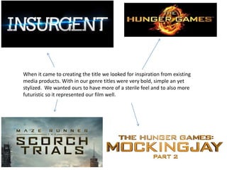
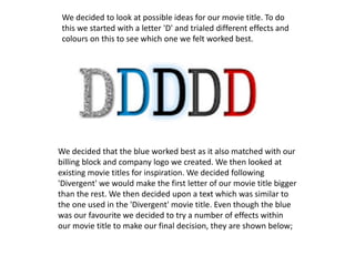
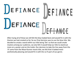
Creating The Title
When it came to creating the title we looked for inspiration from existing
media products. With in our genre titles were very bold, simple an yet
stylized. We wanted ours to have more of a sterile feel and to also more
futuristic so it represented our film well.
We decided that the blue worked best as it also matched with our
billing block and company logo we created. We then looked at
existing movie titles for inspiration. We decided following
'Divergent' we would make the first letter of our movie title bigger
than the rest. We then decided upon a text which was similar to
the one used in the 'Divergent' movie title. Even though the blue
was our favourite we decided to try a number of effects within
our movie title to make our final decision, they are shown below;
We decided to look at possible ideas for our movie title. To do
this we started with a letter 'D' and trialed different effects and
colours on this to see which one we felt worked best.
After trying all of these we still felt the blue looked best and would fit in with the
themes we had created so far. So our final decision was to use the blue title. We
decided to create a word within our title being 'Die' so that we could create
mystery among our audience, we also felt it would help our title to stand out
more on a poster and on the trailer. Our decision to take the line away from the
'A' came from the Maze Runner movie title, we felt that it looked more
aesthetically pleasing and would fit in with the sci-fi part of our genre.

Creating the title

  • 1.
  • 2.
    When it cameto creating the title we looked for inspiration from existing media products. With in our genre titles were very bold, simple an yet stylized. We wanted ours to have more of a sterile feel and to also more futuristic so it represented our film well.
  • 3.
    We decided thatthe blue worked best as it also matched with our billing block and company logo we created. We then looked at existing movie titles for inspiration. We decided following 'Divergent' we would make the first letter of our movie title bigger than the rest. We then decided upon a text which was similar to the one used in the 'Divergent' movie title. Even though the blue was our favourite we decided to try a number of effects within our movie title to make our final decision, they are shown below; We decided to look at possible ideas for our movie title. To do this we started with a letter 'D' and trialed different effects and colours on this to see which one we felt worked best.
  • 4.
    After trying allof these we still felt the blue looked best and would fit in with the themes we had created so far. So our final decision was to use the blue title. We decided to create a word within our title being 'Die' so that we could create mystery among our audience, we also felt it would help our title to stand out more on a poster and on the trailer. Our decision to take the line away from the 'A' came from the Maze Runner movie title, we felt that it looked more aesthetically pleasing and would fit in with the sci-fi part of our genre.