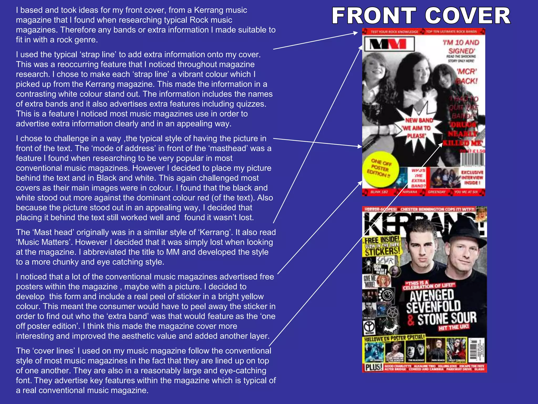
The document summarizes the design choices made for the front cover of a mock rock music magazine. Key aspects included using a "strap line" with band names and feature advertisements in vibrant colors, placing the black and white main image behind the text to make it stand out, abbreviating the "Mast head" title to make it more eye-catching, and including a peel-off sticker with a hidden band name to increase interactivity and aesthetic appeal. The "cover lines" were designed in a conventional lined-up format and large font to advertise magazine features.