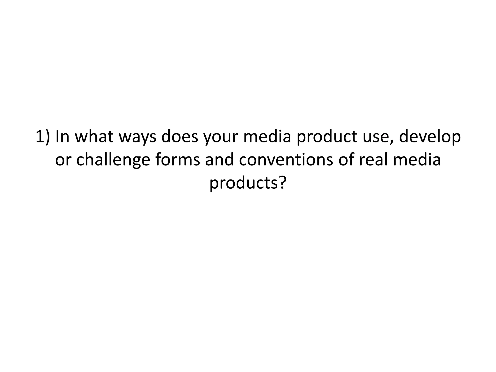
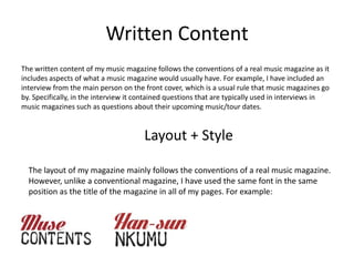
1) The magazine challenges some conventions by having the masthead on the top left rather than spanning the entire top. It follows conventions by using similar fonts and color schemes to other music magazines.
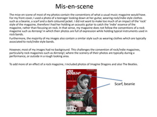
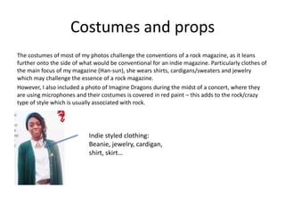
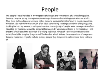
2) Photos mostly follow conventions by featuring indie-styled clothing and guitars, though lack backgrounds unlike typical rock magazine photos.
3) While costumes lean more indie, a photo of Imagine Dragons in rock attire and paint is included to represent the rock genre.
4) People featured are young teenagers rather than adults, though well-known bands are also included to appeal to general audiences.
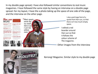
5) Written content like interviews follows conventions, though all internal pages use the same font placement unlike conventional magazines.
7 Alternatives to Bullet Points in PowerPointAlvis Oh
So you tried all the ways to beautify your bullet points on your pitch deck but it just got way uglier. These points are supposed to be memorable and leave a lasting impression on your audience. With these tips, you'll no longer have to spend so much time thinking how you should present your pointers.
Can AI do good? at 'offtheCanvas' India HCI preludeAlan Dix
Invited talk at 'offtheCanvas' IndiaHCI prelude, 29th June 2024.
https://www.alandix.com/academic/talks/offtheCanvas-IndiaHCI2024/
The world is being changed fundamentally by AI and we are constantly faced with newspaper headlines about its harmful effects. However, there is also the potential to both ameliorate theses harms and use the new abilities of AI to transform society for the good. Can you make the difference?
Unleash Your Inner Demon with the "Let's Summon Demons" T-Shirt. Calling all fans of dark humor and edgy fashion! The "Let's Summon Demons" t-shirt is a unique way to express yourself and turn heads.
https://dribbble.com/shots/24253051-Let-s-Summon-Demons-Shirt
White wonder, Work developed by Eva TschoppMansi Shah
White Wonder by Eva Tschopp
A tale about our culture around the use of fertilizers and pesticides visiting small farms around Ahmedabad in Matar and Shilaj.
Transforming Brand Perception and Boosting Profitabilityaaryangarg12
In today's digital era, the dynamics of brand perception, consumer behavior, and profitability have been profoundly reshaped by the synergy of branding, social media, and website design. This research paper investigates the transformative power of these elements in influencing how individuals perceive brands and products and how this transformation can be harnessed to drive sales and profitability for businesses.
Through an exploration of brand psychology and consumer behavior, this study sheds light on the intricate ways in which effective branding strategies, strategic social media engagement, and user-centric website design contribute to altering consumers' perceptions. We delve into the principles that underlie successful brand transformations, examining how visual identity, messaging, and storytelling can captivate and resonate with target audiences.
Methodologically, this research employs a comprehensive approach, combining qualitative and quantitative analyses. Real-world case studies illustrate the impact of branding, social media campaigns, and website redesigns on consumer perception, sales figures, and profitability. We assess the various metrics, including brand awareness, customer engagement, conversion rates, and revenue growth, to measure the effectiveness of these strategies.
The results underscore the pivotal role of cohesive branding, social media influence, and website usability in shaping positive brand perceptions, influencing consumer decisions, and ultimately bolstering sales and profitability. This paper provides actionable insights and strategic recommendations for businesses seeking to leverage branding, social media, and website design as potent tools to enhance their market position and financial success.
1. 1) In what ways does your media product use, develop
or challenge forms and conventions of real media
products?
2. Title
The convention of music magazines usually have their masthead at the top of their page. Usually, most
magazines take up the entire space of the top, therefore my magazine is slightly challenging the convention
because it is on the top left, rather than taking the entire top space like RollingStone has.
For my magazine’s masthead, the title is “Muse LIVE” using the fonts ‘Lighthouse Personal use’ for ‘Muse’ and
‘Telegraphem’ for ‘LIVE’. Similar to conventional soft rock/rock indie music magazines, for example, comparing
it to Rolling Stone they have also used similar types of font for their magazine’s masthead.
I have also followed the convention which is shown in a lot of music magazines where the title is behind the
main photo of the front cover.
I have used the colours red, black and white for my masthead because that is the main colour scheme of my
entire magazine. I chose these colours because I felt that they were the conventional colours used for the
genre (rock/indie) of my magazine, which Rolling Stone has also used for their masthead.
Furthermore, keeping consideration of my audience, I used these colours because I wanted the colours of
this music magazine to be neutral to both genders.
3. Mis-en-scene
The mise-en-scene of most of my photos contain the conventions of what a usual music magazine would have.
For my front cover, I used a photo of a teenager looking down at her guitar, wearing rock/indie style clothes
such as a beanie, a scarf and a dark coloured jacket. I did not want to make too much of an impact of the ‘rock’
style of the magazine, therefore I had her holding an acoustic guitar to catch the ‘indie’ essence of the
magazine, rather than focusing on rock. In that sense, my magazine does not follow the conventions of a rock
magazine such as Kerrang! in which their photos are full of expression while holding typical instruments used in
rock bands.
Furthermore, the majority of my images also contain a similar style such as wearing clothes which are typically
associated to rock/indie style bands.
However, most of my images had no background. This challenges the convention of rock/indie magazines,
particularly rock magazines such as Kerrang!; where the scenery of their photos are typically during a
performance, or outside in a rough looking area.
To add more of an effect of a rock magazine, I included photos of Imagine Dragons and also The Beatles.
Scarf, beanie
4. Costumes and props
The costumes of most of my photos challenge the conventions of a rock magazine, as it leans
further onto the side of what would be conventional for an indie magazine. Particularly clothes of
the main focus of my magazine (Han-sun), she wears shirts, cardigans/sweaters and jewelry
which may challenge the essence of a rock magazine.
However, I also included a photo of Imagine Dragons during the midst of a concert, where they
are using microphones and their costumes is covered in red paint – this adds to the rock/crazy
type of style which is usually associated with rock.
Indie styled clothing:
Beanie, jewelry, cardigan,
shirt, skirt…
5. People
The people I have included in my magazine challenges the conventions of a typical magazine,
because they are young teenagers whereas magazines usually contain people who are adults.
Also, their style and appearance are not as extreme as several artists shown in music magazines.
However, I do not think this is much of an issue considering the target audience of my magazine.
Looking back to my research and questionnaire, the majority of people were teenagers therefore
I decided my magazine would be aimed at teenagers. By using young teens in my magazine, I felt
that this would catch the attention of a young audience. However, I also included well known
artists/bands like Imagine Dragons and The Beatles, which follows the conventions of magazines
because magazines typically include famous people that the general audience are likely to know
of.
6. Written Content
The written content of my music magazine follows the conventions of a real music magazine as it
includes aspects of what a music magazine would usually have. For example, I have included an
interview from the main person on the front cover, which is a usual rule that music magazines go
by. Specifically, in the interview it contained questions that are typically used in interviews in
music magazines such as questions about their upcoming music/tour dates.
Layout + Style
The layout of my magazine mainly follows the conventions of a real music magazine.
However, unlike a conventional magazine, I have used the same font in the same
position as the title of the magazine in all of my pages. For example:
7. My contents page and double page spread mainly follows the layout of a conventional
magazine. In my contents page, I have distinguished the font type of the page
numbers to the text. But I have also made the layout in a conventional style by placing
it on one side of the page, rather than taking up the entirety of the page.
Furthermore, I have included photos of which my magazine will be featuring such as
who I’m interviewing, articles on bands, etc…
Different font styles.
Contents and photos on different sides of the
page.
8. In my double page spread, I have also followed similar conventions to real music
magazines. I have followed the same style by having an interview on a double page
spread. For my layout, I have the a photo taking up the space of one side of the page,
and the interview on the other page.
I also used large font of a
quote from Han-sun, so that
there isn’t too much empty
space.
I edited a red
boarder around
Han-sun so that
it follows the
colour scheme of
The magazine.
Other images from the interview
Kerrang! Magazine. Similar style to my double page