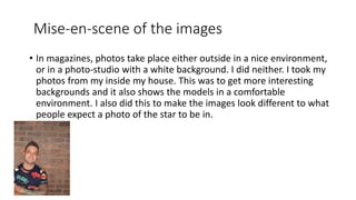
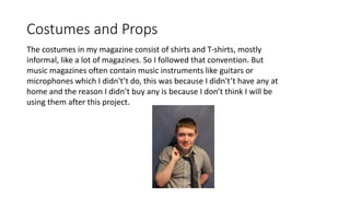
By Brandon Hudson
1. In what ways does your media
product use, develop or challenge
forms and conventions of real media
products
Title of the magazine
• The name of my magazine is Noise. When I was thinking of a name for
it, I wanted something related to music. Many music magazines have
a name witch relates to music such as Total Guitar or DJ Times for
example. However some of them have odd names such as magazines
like Big Cheese, where cheese has nothing to do with music, or
Kerrang, what is a Kerrang? Yet somehow that magazine is very
popular.
• The reason I made the name of my magazine relate to music is to tell
the regular person it’s a music magazine and to not confuse people.
Title font and style
• The title font I used for my magazine was called A Bite Regular. I chose
this one because it looks grainy and rough, which are connotations
associated with rock. So I have followed this particular convention
because if I went against it would turn off fans of rock music as they
would see he magazine as a betrayal of their culture and for them
they will be entering out of their comfort zone. E.g. you won’t see a
pink and brightly coloured rock magazine as it doesn’t fit.
• So in order for my magazine to be a rock music one it had to be a
particular style to fit.
Mise-en-scene of the images
• In magazines, photos take place either outside in a nice environment,
or in a photo-studio with a white background. I did neither. I took my
photos from my inside my house. This was to get more interesting
backgrounds and it also shows the models in a comfortable
environment. I also did this to make the images look different to what
people expect a photo of the star to be in.
Costumes and Props
The costumes in my magazine consist of shirts and T-shirts, mostly
informal, like a lot of magazines. So I followed that convention. But
music magazines often contain music instruments like guitars or
microphones which I didn't’t do, this was because I didn't’t have any at
home and the reason I didn’t buy any is because I don’t think I will be
using them after this project.
Written content
• The article was an interview, many magazines,
not just music one have these types of articles.
In the article I included alliteration, punctuation
and a running gag through the article.
• The language in the article is rather formal, but
the conversation isn't completely serious in it’s
tone. The interviewer laughs, Mortdog makes
jokes. Basically I tried to make the interview
sound human as opposed to question and
answer only, which is what a lot of magazine
interviews do.
Music genre and how magazine suggests it
• The music genre in my magazine is rock. The way I present it in my
magazine is that it’s a topic that links together these stories of rock
stars. The way my magazine talks about it is that it treats it normally,
it isn't slagging it off or being cynical of other genres of music, it has
its own genre of music to focus on and stays inside its own bubble, it’s
like this with other magazines, for example, total guitar doesn’t
acknowledge other pop magazines, but it doesn’t say anything bad
about them.
layout
• The layout of my front cover (like many rock magazine covers) has a
lot of stuff on the front to make it look busy and have lots of
content inside. I followed this as it is a trait seen in lots of rock
music magazine covers like Kerrang, total guitar, NME, etc.
• The layout of my DPS is more neat and tidy, one page has only a
image on it and the other side has the article, a lot of music
magazine articles do this as well as some other conventions I have
followed like including a pull quote, drop capital, columns and a
caption. I followed these conventions because lots print media uses
those things and not including them will take away its identity as a
print media product.
Contents page
Contents pages in rock magazines usually are
brimming with lots of content and generally list
out a lot. Contents pages are organised in two
ways, one is where they order the contents in
page numbers, or to sort them out into
sections. I chose the former because I think its
easier to navigate the articles. On the contents
page I included some puffs, which are not
common on contents pages. This was to make
the articles look more interesting. I did follow
other conventions like including images and a
subscribe box to look more visually interesting
and realistic.

Evaluation 1

  • 1.
    By Brandon Hudson 1.In what ways does your media product use, develop or challenge forms and conventions of real media products
  • 2.
    Title of themagazine • The name of my magazine is Noise. When I was thinking of a name for it, I wanted something related to music. Many music magazines have a name witch relates to music such as Total Guitar or DJ Times for example. However some of them have odd names such as magazines like Big Cheese, where cheese has nothing to do with music, or Kerrang, what is a Kerrang? Yet somehow that magazine is very popular. • The reason I made the name of my magazine relate to music is to tell the regular person it’s a music magazine and to not confuse people.
  • 3.
    Title font andstyle • The title font I used for my magazine was called A Bite Regular. I chose this one because it looks grainy and rough, which are connotations associated with rock. So I have followed this particular convention because if I went against it would turn off fans of rock music as they would see he magazine as a betrayal of their culture and for them they will be entering out of their comfort zone. E.g. you won’t see a pink and brightly coloured rock magazine as it doesn’t fit. • So in order for my magazine to be a rock music one it had to be a particular style to fit.
  • 4.
    Mise-en-scene of theimages • In magazines, photos take place either outside in a nice environment, or in a photo-studio with a white background. I did neither. I took my photos from my inside my house. This was to get more interesting backgrounds and it also shows the models in a comfortable environment. I also did this to make the images look different to what people expect a photo of the star to be in.
  • 5.
    Costumes and Props Thecostumes in my magazine consist of shirts and T-shirts, mostly informal, like a lot of magazines. So I followed that convention. But music magazines often contain music instruments like guitars or microphones which I didn't’t do, this was because I didn't’t have any at home and the reason I didn’t buy any is because I don’t think I will be using them after this project.
  • 6.
    Written content • Thearticle was an interview, many magazines, not just music one have these types of articles. In the article I included alliteration, punctuation and a running gag through the article. • The language in the article is rather formal, but the conversation isn't completely serious in it’s tone. The interviewer laughs, Mortdog makes jokes. Basically I tried to make the interview sound human as opposed to question and answer only, which is what a lot of magazine interviews do.
  • 7.
    Music genre andhow magazine suggests it • The music genre in my magazine is rock. The way I present it in my magazine is that it’s a topic that links together these stories of rock stars. The way my magazine talks about it is that it treats it normally, it isn't slagging it off or being cynical of other genres of music, it has its own genre of music to focus on and stays inside its own bubble, it’s like this with other magazines, for example, total guitar doesn’t acknowledge other pop magazines, but it doesn’t say anything bad about them.
  • 8.
    layout • The layoutof my front cover (like many rock magazine covers) has a lot of stuff on the front to make it look busy and have lots of content inside. I followed this as it is a trait seen in lots of rock music magazine covers like Kerrang, total guitar, NME, etc. • The layout of my DPS is more neat and tidy, one page has only a image on it and the other side has the article, a lot of music magazine articles do this as well as some other conventions I have followed like including a pull quote, drop capital, columns and a caption. I followed these conventions because lots print media uses those things and not including them will take away its identity as a print media product.
  • 9.
    Contents page Contents pagesin rock magazines usually are brimming with lots of content and generally list out a lot. Contents pages are organised in two ways, one is where they order the contents in page numbers, or to sort them out into sections. I chose the former because I think its easier to navigate the articles. On the contents page I included some puffs, which are not common on contents pages. This was to make the articles look more interesting. I did follow other conventions like including images and a subscribe box to look more visually interesting and realistic.