The document summarizes how the media product uses, develops, and challenges conventions of real music magazines. Key points:
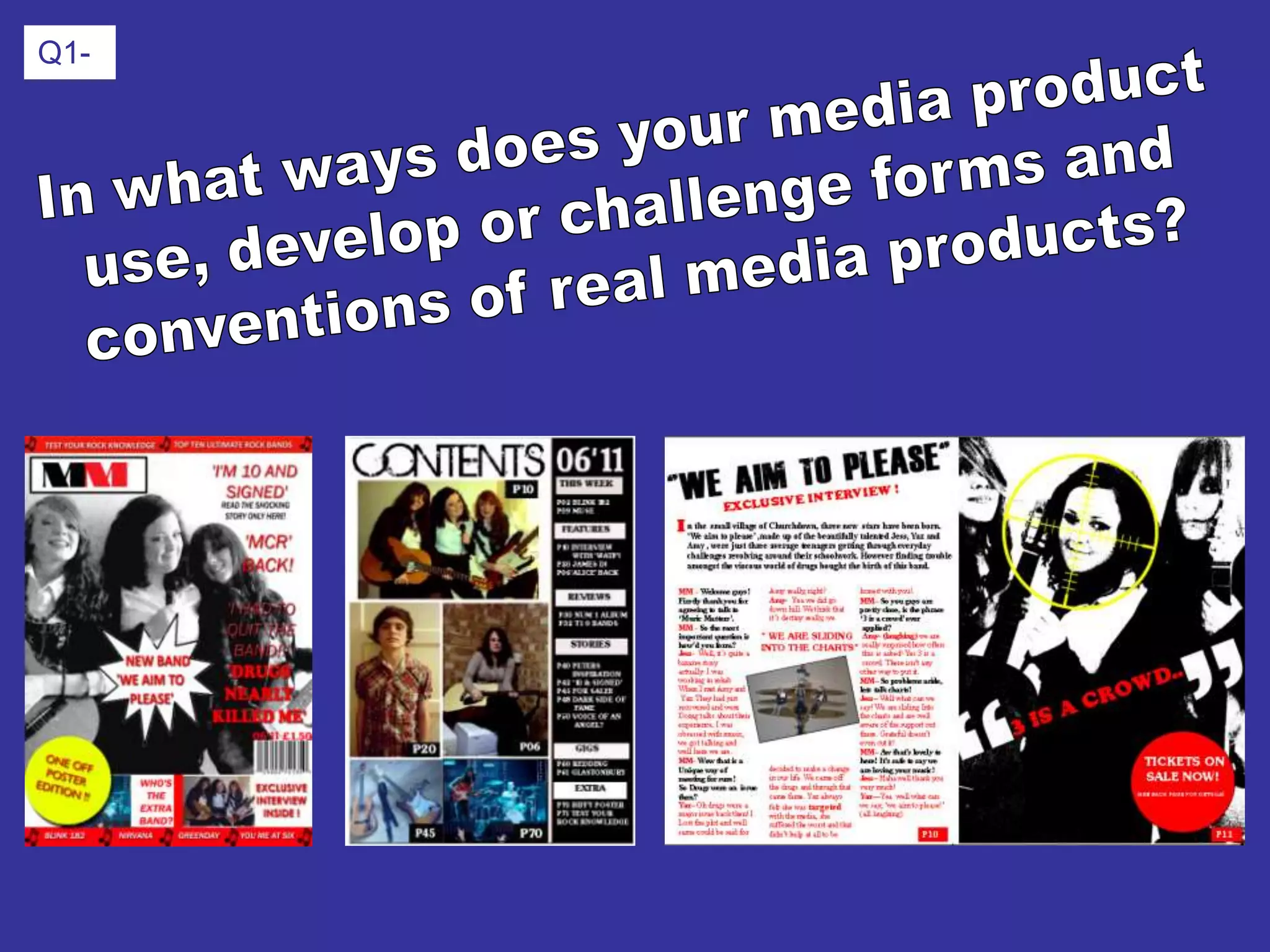
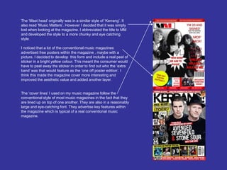
- The front cover is based on Kerrang magazine but challenges conventions by placing the photo behind text and using black and white.
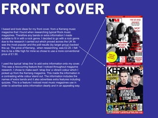
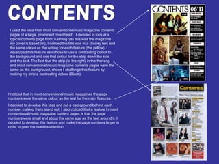
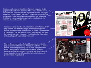
- The contents page develops conventions by making page numbers and masthead larger/more prominent and uses contrasting colors.
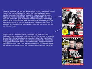
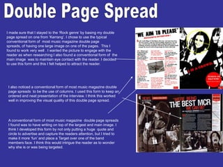
- The double page spread follows conventions like large central image and columns but develops them with a target over a band member's face and smaller inner images.