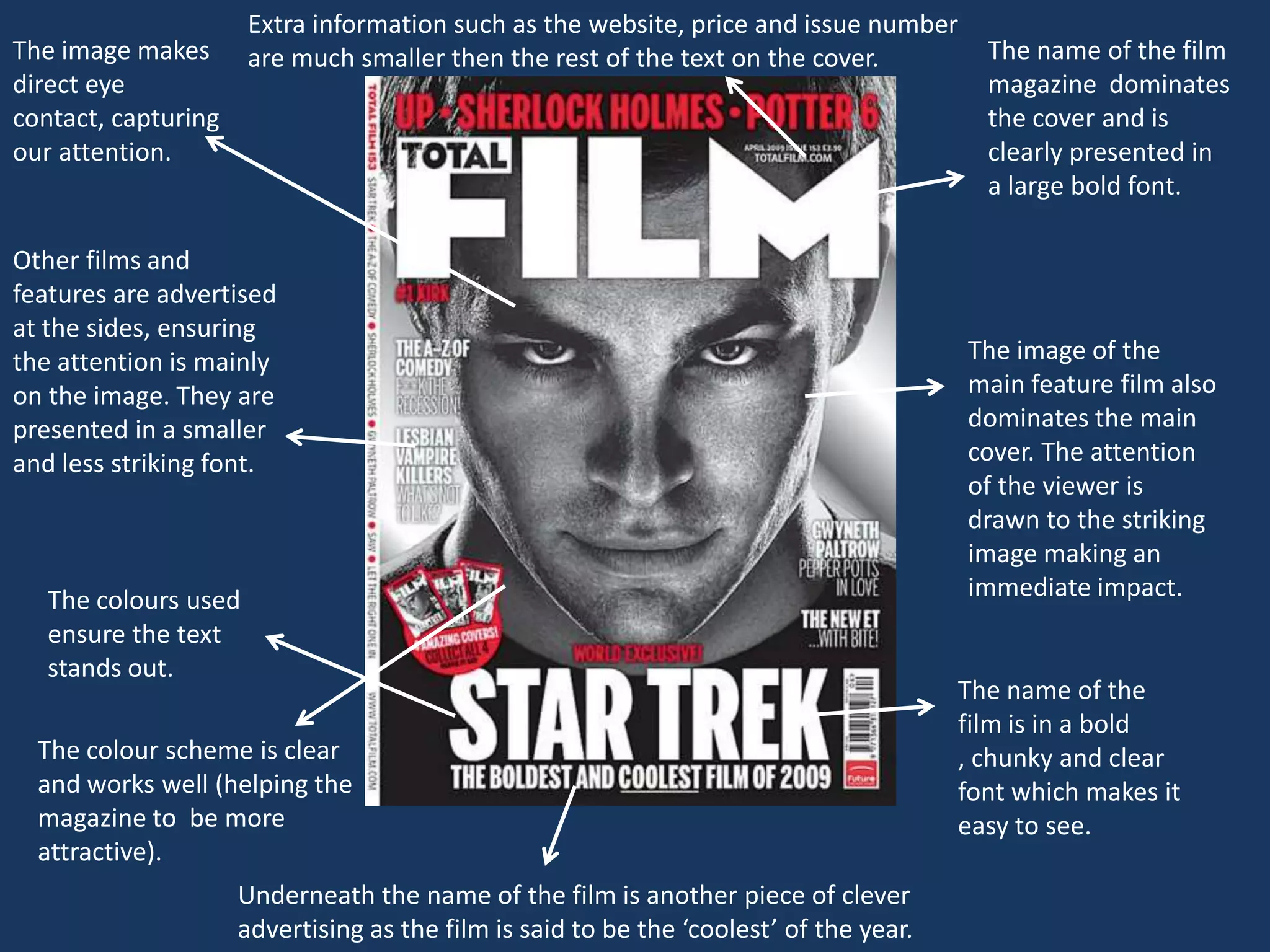
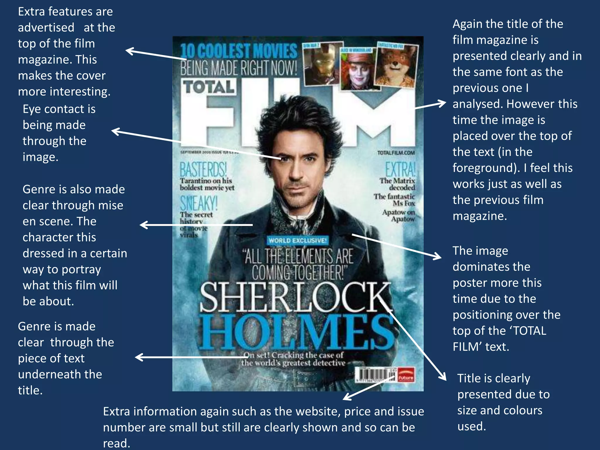
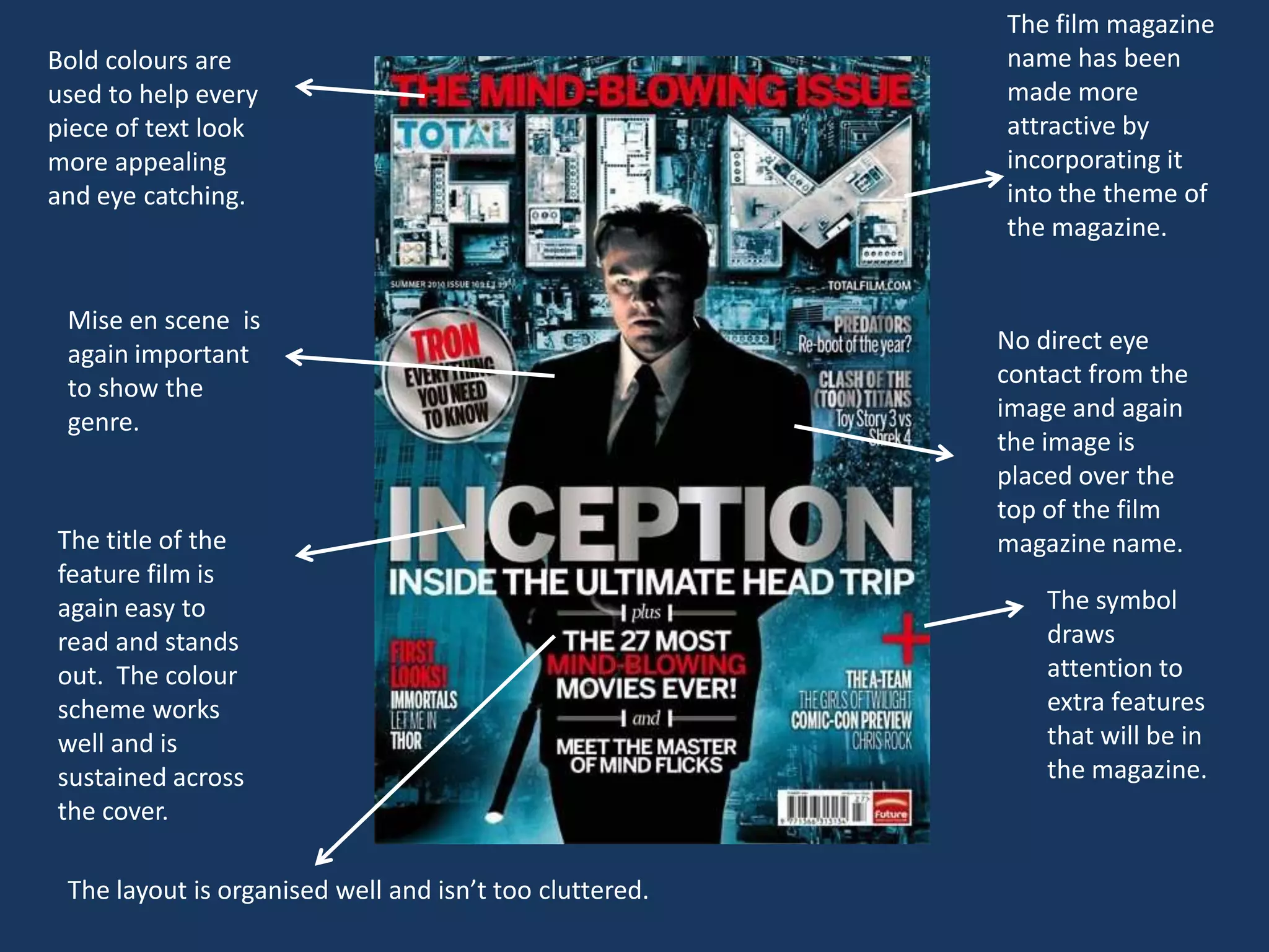
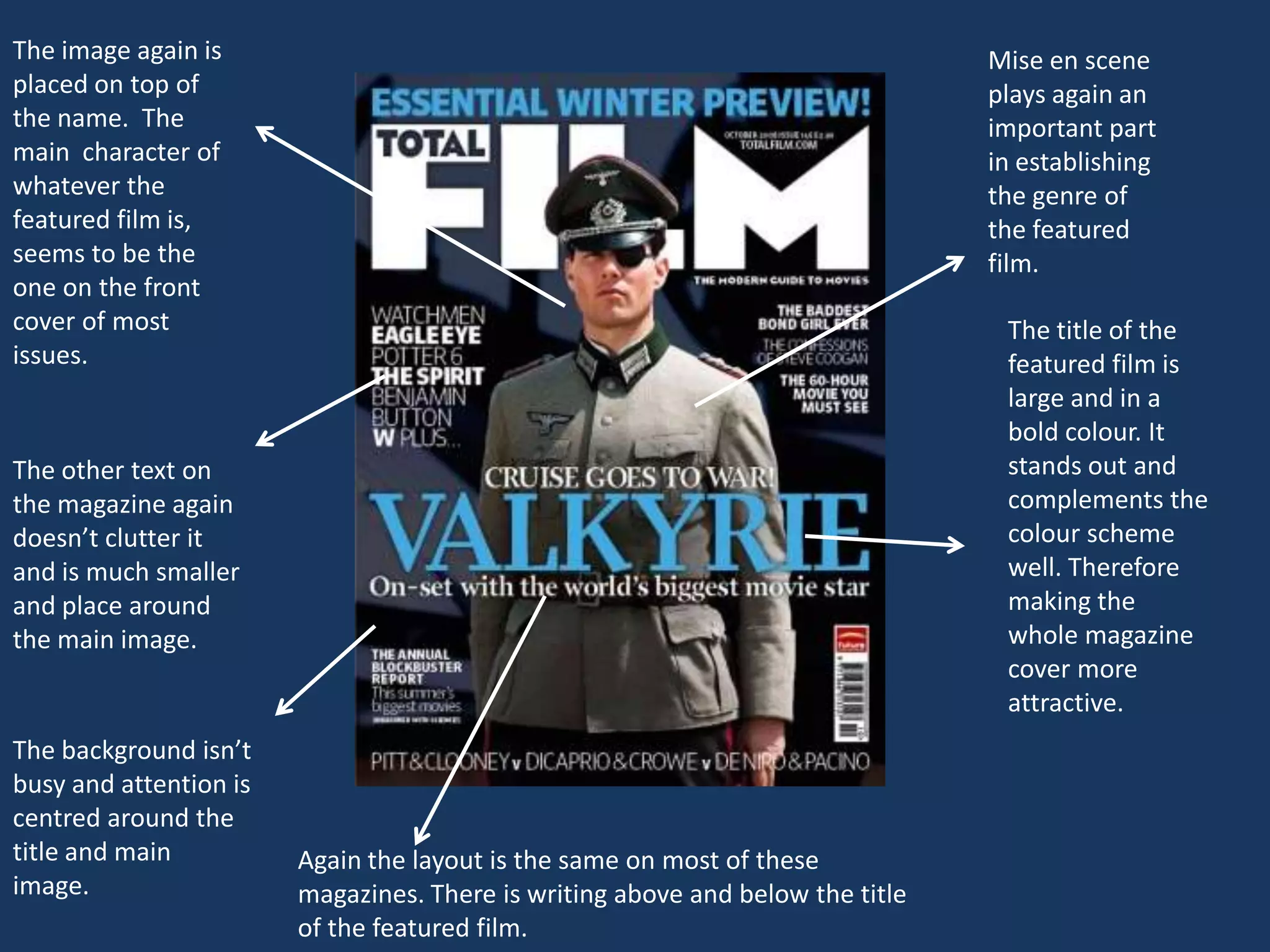
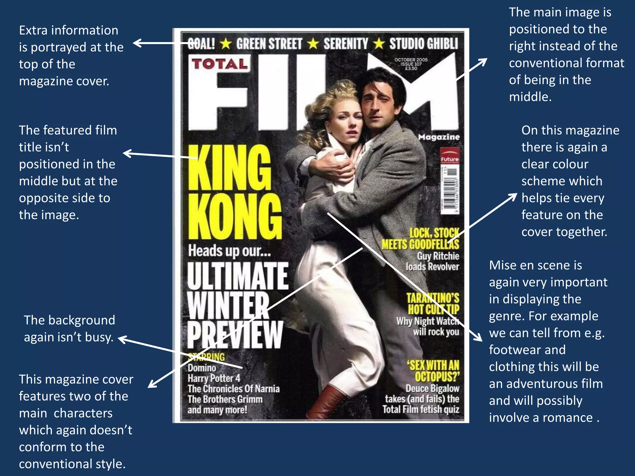
http://www.totalfilm.com/
Extra information such as the website, price and issue number
The image makes       are much smaller then the rest of the text on the cover.            The name of the film
direct eye                                                                                magazine dominates
contact, capturing                                                                        the cover and is
our attention.                                                                            clearly presented in
                                                                                          a large bold font.

Other films and
features are advertised
at the sides, ensuring
the attention is mainly                                                                 The image of the
on the image. They are                                                                  main feature film also
presented in a smaller                                                                  dominates the main
and less striking font.                                                                 cover. The attention
                                                                                        of the viewer is
                                                                                        drawn to the striking
                                                                                        image making an
   The colours used                                                                     immediate impact.
   ensure the text
   stands out.
                                                                                        The name of the
                                                                                        film is in a bold
  The colour scheme is clear                                                            , chunky and clear
  and works well (helping the                                                           font which makes it
  magazine to be more                                                                   easy to see.
  attractive).
                     Underneath the name of the film is another piece of clever
                     advertising as the film is said to be the ‘coolest’ of the year.
Extra features are
advertised at the                                                             Again the title of the
top of the film                                                               film magazine is
magazine. This                                                                presented clearly and in
makes the cover                                                               the same font as the
more interesting.                                                             previous one I
 Eye contact is                                                               analysed. However this
 being made                                                                   time the image is
 through the                                                                  placed over the top of
 image.                                                                       the text (in the
                                                                              foreground). I feel this
Genre is also made                                                            works just as well as
clear through mise                                                            the previous film
en scene. The                                                                 magazine.
character this
dressed in a certain                                                          The image
way to portray                                                                dominates the
what this film will                                                           poster more this
be about.                                                                     time due to the
                                                                              positioning over the
Genre is made                                                                 top of the ‘TOTAL
clear through the                                                             FILM’ text.
piece of text
underneath the                                                                Title is clearly
title.                                                                        presented due to
               Extra information again such as the website, price and issue   size and colours
               number are small but still are clearly shown and so can be     used.
               read.
The film magazine
Bold colours are                                         name has been
used to help every                                       made more
piece of text look                                       attractive by
more appealing                                           incorporating it
and eye catching.                                        into the theme of
                                                         the magazine.


 Mise en scene is
 again important                                         No direct eye
 to show the                                             contact from the
 genre.                                                  image and again
                                                         the image is
                                                         placed over the
                                                         top of the film
The title of the                                         magazine name.
feature film is
again easy to                                                The symbol
read and stands                                              draws
out. The colour                                              attention to
scheme works                                                 extra features
well and is                                                  that will be in
sustained across                                             the magazine.
the cover.

 The layout is organised well and isn’t too cluttered.
The image again is                                                              Mise en scene
placed on top of                                                                plays again an
the name. The                                                                   important part
main character of                                                               in establishing
whatever the                                                                    the genre of
featured film is,                                                               the featured
seems to be the                                                                 film.
one on the front
cover of most                                                                    The title of the
issues.                                                                          featured film is
                                                                                 large and in a
                                                                                 bold colour. It
The other text on                                                                stands out and
the magazine again                                                               complements the
doesn’t clutter it                                                               colour scheme
and is much smaller                                                              well. Therefore
and place around                                                                 making the
the main image.                                                                  whole magazine
                                                                                 cover more
                                                                                 attractive.
The background isn’t
busy and attention is
centred around the
title and main          Again the layout is the same on most of these
image.                  magazines. There is writing above and below the title
                        of the featured film.
The main image is
Extra information        positioned to the
is portrayed at the      right instead of the
top of the               conventional format
magazine cover.          of being in the
                         middle.

The featured film          On this magazine
title isn’t                there is again a
positioned in the          clear colour
middle but at the          scheme which
opposite side to           helps tie every
the image.                 feature on the
                           cover together.

                      Mise en scene is
                      again very important
                      in displaying the
The background        genre. For example
again isn’t busy.     we can tell from e.g.
                      footwear and
                      clothing this will be
This magazine cover   an adventurous film
features two of the   and will possibly
main characters       involve a romance .
which again doesn’t
conform to the
conventional style.
• The image should dominate the cover in order to make it more
appealing and eyecatching.
•The title of the film should follow the overall colour scheme
and stand out.
•Extra information on the cover should be placed around the
image.
•Don’t make the cover too clustered.
•Use vibrant and bold colours .
•The background should not be busy.
•It’s more effective to have an image that makes eye contact
with the reader.
•Mise en scene will help to display genre.

Presentation1

  • 2.
  • 3.
    Extra information suchas the website, price and issue number The image makes are much smaller then the rest of the text on the cover. The name of the film direct eye magazine dominates contact, capturing the cover and is our attention. clearly presented in a large bold font. Other films and features are advertised at the sides, ensuring the attention is mainly The image of the on the image. They are main feature film also presented in a smaller dominates the main and less striking font. cover. The attention of the viewer is drawn to the striking image making an The colours used immediate impact. ensure the text stands out. The name of the film is in a bold The colour scheme is clear , chunky and clear and works well (helping the font which makes it magazine to be more easy to see. attractive). Underneath the name of the film is another piece of clever advertising as the film is said to be the ‘coolest’ of the year.
  • 4.
    Extra features are advertisedat the Again the title of the top of the film film magazine is magazine. This presented clearly and in makes the cover the same font as the more interesting. previous one I Eye contact is analysed. However this being made time the image is through the placed over the top of image. the text (in the foreground). I feel this Genre is also made works just as well as clear through mise the previous film en scene. The magazine. character this dressed in a certain The image way to portray dominates the what this film will poster more this be about. time due to the positioning over the Genre is made top of the ‘TOTAL clear through the FILM’ text. piece of text underneath the Title is clearly title. presented due to Extra information again such as the website, price and issue size and colours number are small but still are clearly shown and so can be used. read.
  • 5.
    The film magazine Boldcolours are name has been used to help every made more piece of text look attractive by more appealing incorporating it and eye catching. into the theme of the magazine. Mise en scene is again important No direct eye to show the contact from the genre. image and again the image is placed over the top of the film The title of the magazine name. feature film is again easy to The symbol read and stands draws out. The colour attention to scheme works extra features well and is that will be in sustained across the magazine. the cover. The layout is organised well and isn’t too cluttered.
  • 6.
    The image againis Mise en scene placed on top of plays again an the name. The important part main character of in establishing whatever the the genre of featured film is, the featured seems to be the film. one on the front cover of most The title of the issues. featured film is large and in a bold colour. It The other text on stands out and the magazine again complements the doesn’t clutter it colour scheme and is much smaller well. Therefore and place around making the the main image. whole magazine cover more attractive. The background isn’t busy and attention is centred around the title and main Again the layout is the same on most of these image. magazines. There is writing above and below the title of the featured film.
  • 7.
    The main imageis Extra information positioned to the is portrayed at the right instead of the top of the conventional format magazine cover. of being in the middle. The featured film On this magazine title isn’t there is again a positioned in the clear colour middle but at the scheme which opposite side to helps tie every the image. feature on the cover together. Mise en scene is again very important in displaying the The background genre. For example again isn’t busy. we can tell from e.g. footwear and clothing this will be This magazine cover an adventurous film features two of the and will possibly main characters involve a romance . which again doesn’t conform to the conventional style.
  • 8.
    • The imageshould dominate the cover in order to make it more appealing and eyecatching. •The title of the film should follow the overall colour scheme and stand out. •Extra information on the cover should be placed around the image. •Don’t make the cover too clustered. •Use vibrant and bold colours . •The background should not be busy. •It’s more effective to have an image that makes eye contact with the reader. •Mise en scene will help to display genre.