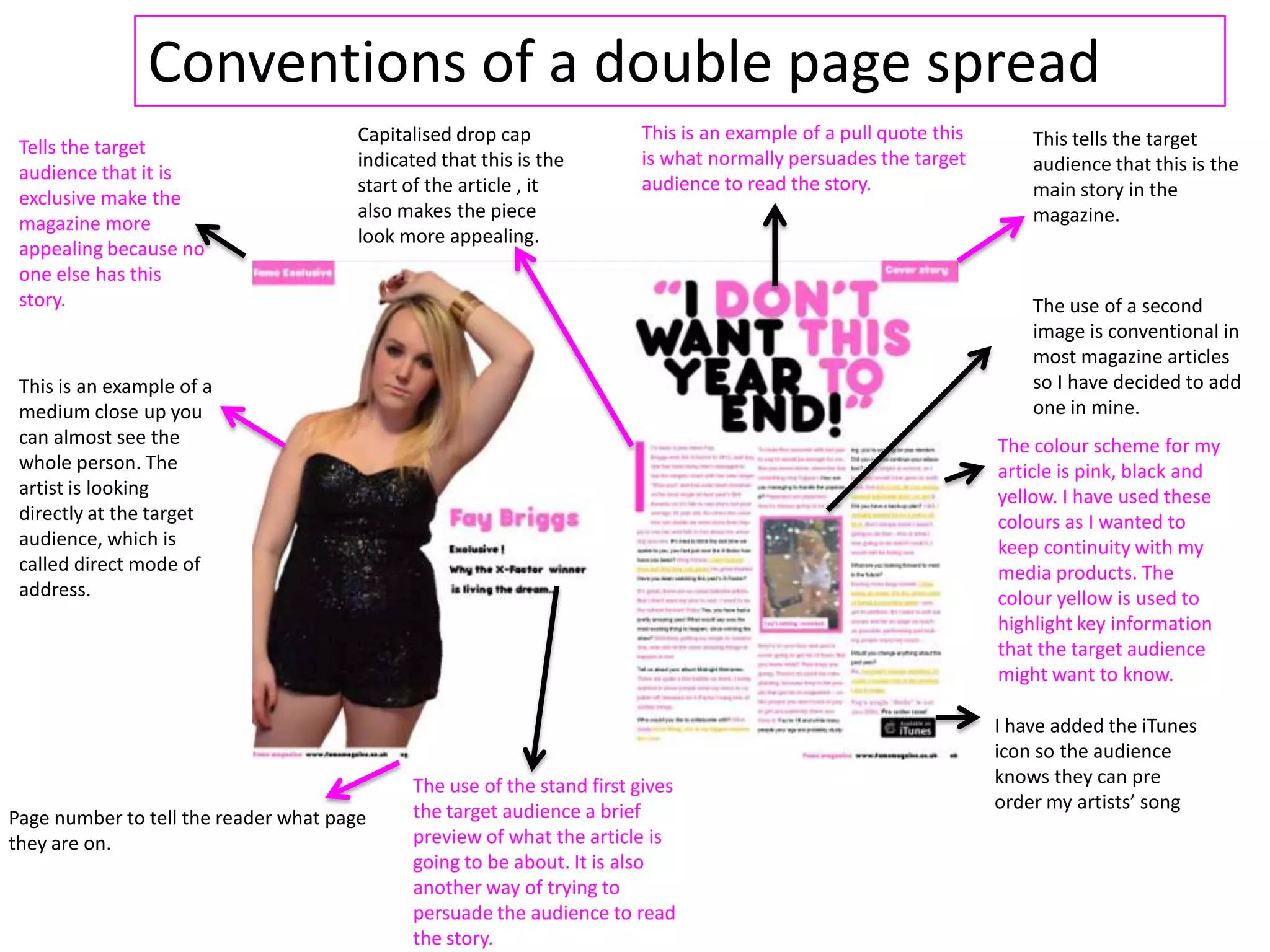
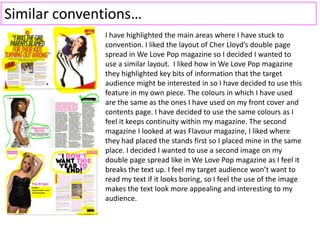
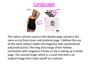
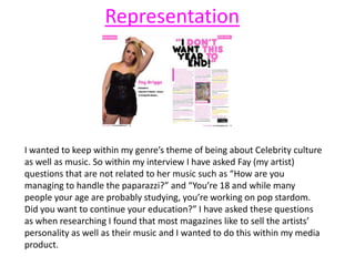
Conventions of a double page spread
This is an example of a
medium close up you
can almost see the
whole person. The
artist is looking
directly at the target
audience, which is
called direct mode of
address.
The use of the stand first gives
the target audience a brief
preview of what the article is
going to be about. It is also
another way of trying to
persuade the audience to read
the story.
Page number to tell the reader what page
they are on.
The colour scheme for my
article is pink, black and
yellow. I have used these
colours as I wanted to
keep continuity with my
media products. The
colour yellow is used to
highlight key information
that the target audience
might want to know.
This is an example of a pull quote this
is what normally persuades the target
audience to read the story.
Capitalised drop cap
indicated that this is the
start of the article , it
also makes the piece
look more appealing.
This tells the target
audience that this is the
main story in the
magazine.
Tells the target
audience that it is
exclusive make the
magazine more
appealing because no
one else has this
story. The use of a second
image is conventional in
most magazine articles
so I have decided to add
one in mine.
I have added the iTunes
icon so the audience
knows they can pre
order my artists’ song
Similar conventions…
I have highlighted the main areas where I have stuck to
convention. I liked the layout of Cher Lloyd’s double page
spread in We Love Pop magazine so I decided I wanted to
use a similar layout. I liked how in We Love Pop magazine
they highlighted key bits of information that the target
audience might be interested in so I have decided to use this
feature in my own piece. The colours in which I have used
are the same as the ones I have used on my front cover and
contents page. I have decided to use the same colours as I
feel it keeps continuity within my magazine. The second
magazine I looked at was Flavour magazine, I liked where
they had placed the stands first so I placed mine in the same
place. I decided I wanted to use a second image on my
double page spread like in We Love Pop magazine as I feel it
breaks the text up. I feel my target audience won’t want to
read my text if it looks boring, so I feel the use of the image
makes the text look more appealing and interesting to my
audience.
Language
The colour scheme used on this double page spread is the
same as my front cover and contents page. I believe the use
of the same colours makes my magazine look conventional
and professional. The long shot image of her follows
convention with magazine articles as she is taking up a whole
page. The second image which is a small mid shot is an
original image that I took myself at a concert.
I wanted to keep within my genre’s theme of being about Celebrity culture
as well as music. So within my interview I have asked Fay (my artist)
questions that are not related to her music such as “How are you
managing to handle the paparazzi?” and “You’re 18 and while many
people your age are probably studying, you’re working on pop stardom.
Did you want to continue your education?” I have asked these questions
as when researching I found that most magazines like to sell the artists’
personality as well as their music and I wanted to do this within my media
product.
Representation

Conventions of dps

  • 1.
    Conventions of adouble page spread This is an example of a medium close up you can almost see the whole person. The artist is looking directly at the target audience, which is called direct mode of address. The use of the stand first gives the target audience a brief preview of what the article is going to be about. It is also another way of trying to persuade the audience to read the story. Page number to tell the reader what page they are on. The colour scheme for my article is pink, black and yellow. I have used these colours as I wanted to keep continuity with my media products. The colour yellow is used to highlight key information that the target audience might want to know. This is an example of a pull quote this is what normally persuades the target audience to read the story. Capitalised drop cap indicated that this is the start of the article , it also makes the piece look more appealing. This tells the target audience that this is the main story in the magazine. Tells the target audience that it is exclusive make the magazine more appealing because no one else has this story. The use of a second image is conventional in most magazine articles so I have decided to add one in mine. I have added the iTunes icon so the audience knows they can pre order my artists’ song
  • 2.
    Similar conventions… I havehighlighted the main areas where I have stuck to convention. I liked the layout of Cher Lloyd’s double page spread in We Love Pop magazine so I decided I wanted to use a similar layout. I liked how in We Love Pop magazine they highlighted key bits of information that the target audience might be interested in so I have decided to use this feature in my own piece. The colours in which I have used are the same as the ones I have used on my front cover and contents page. I have decided to use the same colours as I feel it keeps continuity within my magazine. The second magazine I looked at was Flavour magazine, I liked where they had placed the stands first so I placed mine in the same place. I decided I wanted to use a second image on my double page spread like in We Love Pop magazine as I feel it breaks the text up. I feel my target audience won’t want to read my text if it looks boring, so I feel the use of the image makes the text look more appealing and interesting to my audience.
  • 3.
    Language The colour schemeused on this double page spread is the same as my front cover and contents page. I believe the use of the same colours makes my magazine look conventional and professional. The long shot image of her follows convention with magazine articles as she is taking up a whole page. The second image which is a small mid shot is an original image that I took myself at a concert.
  • 4.
    I wanted tokeep within my genre’s theme of being about Celebrity culture as well as music. So within my interview I have asked Fay (my artist) questions that are not related to her music such as “How are you managing to handle the paparazzi?” and “You’re 18 and while many people your age are probably studying, you’re working on pop stardom. Did you want to continue your education?” I have asked these questions as when researching I found that most magazines like to sell the artists’ personality as well as their music and I wanted to do this within my media product. Representation