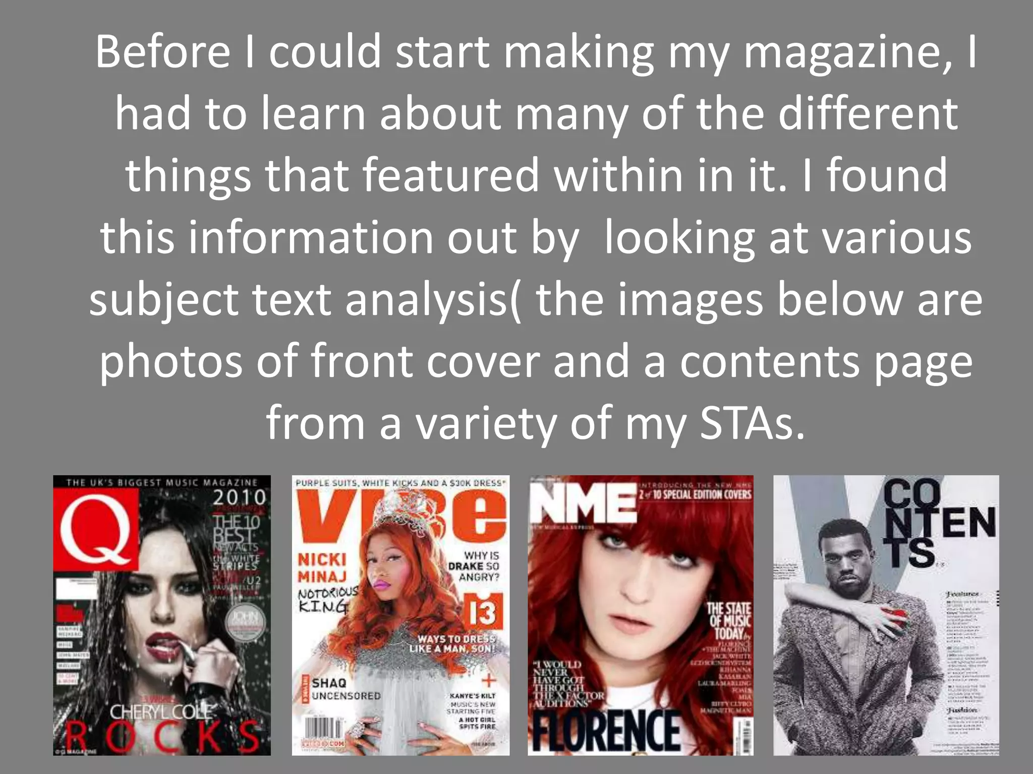
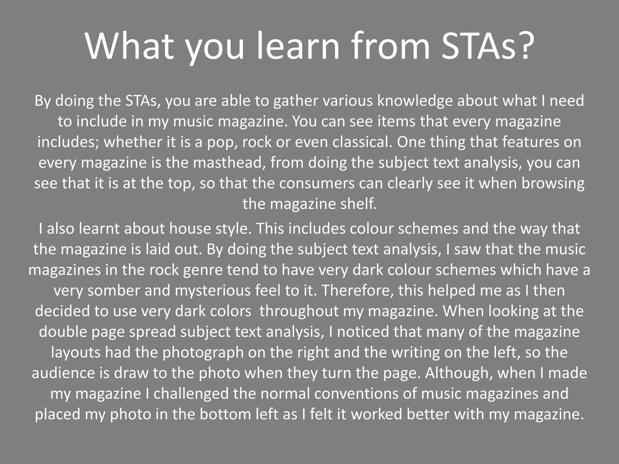
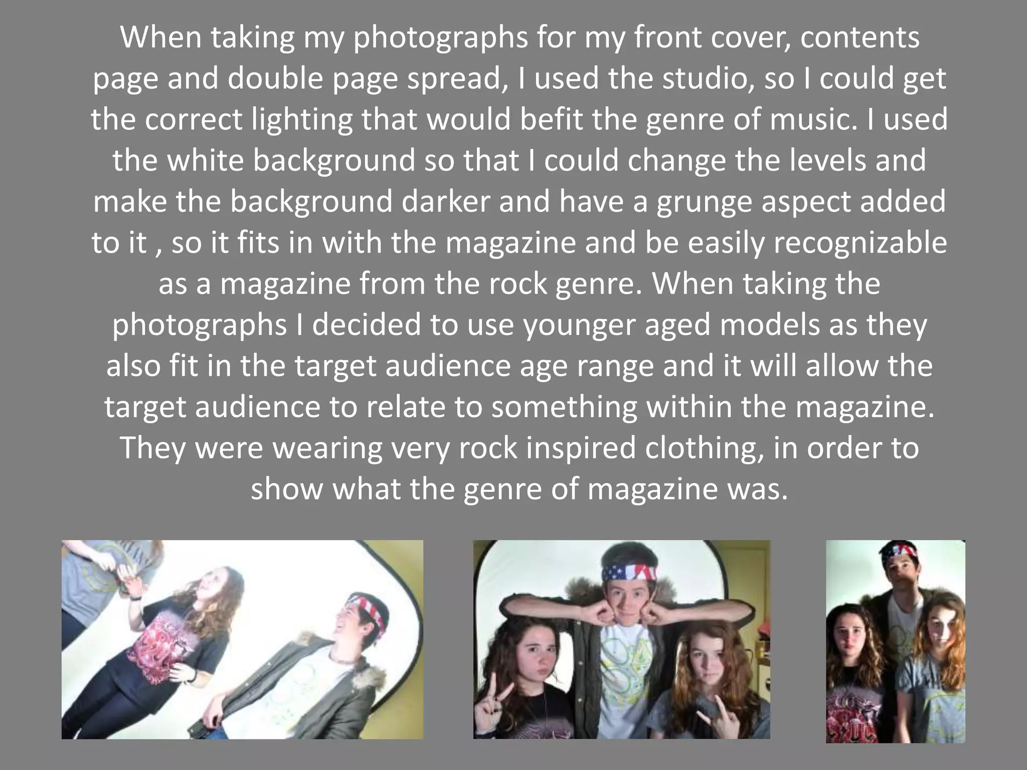
By analyzing existing music magazines, the author learned about common conventions like the masthead location, color schemes, and page layouts. Dark colors and somber feels are commonly used for rock magazines. Most magazines place photos on the right and text on the left of spreads. However, the author challenged this convention by placing the photo on the bottom left for their magazine. To capture photos that fit the rock genre, the author used a studio setting with white backgrounds, grunge effects, younger models, and rock-inspired clothing.


![Reading Techniques [Autosaved].pptxReading Techniques [Autosaved].pptx](https://cdn.slidesharecdn.com/ss_thumbnails/readingtechniquesautosaved-251211193055-b8821f9d-thumbnail.jpg?width=640&height=640&fit=bounds)


