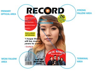
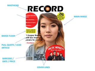
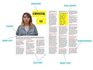
The document provides commentary on the page layout and design choices for a magazine cover and double page spread. For the magazine cover, various Photoshop tools were used to edit images and the layout was inspired by other music magazines. Bold and varying fonts were used for the masthead and cover lines to catch readers' attention. For the double page spread, the interview questions are used as subheadings and the article fills both pages with gutters splitting up the text. Only 4 colors were used throughout for the white background, black text, red boxes and yellow highlights. The target audience is described as 16-30 year olds from lower middle class backgrounds.