The document outlines various codes and conventions used in magazine double page spreads. These include using a large main image of the artist to represent them and entice readers. Subsidiary images illustrate topics discussed in the article. Captions provide context for images. Articles typically use a drop cap, columns, and simple color schemes and typography to make the content easy to read.
Book Formatting: Quality Control Checks for DesignersConfidence Ago
This presentation was made to help designers who work in publishing houses or format books for printing ensure quality.
Quality control is vital to every industry. This is why every department in a company need create a method they use in ensuring quality. This, perhaps, will not only improve the quality of products and bring errors to the barest minimum, but take it to a near perfect finish.
It is beyond a moot point that a good book will somewhat be judged by its cover, but the content of the book remains king. No matter how beautiful the cover, if the quality of writing or presentation is off, that will be a reason for readers not to come back to the book or recommend it.
So, this presentation points designers to some important things that may be missed by an editor that they could eventually discover and call the attention of the editor.
Top 5 Indian Style Modular Kitchen DesignsFinzo Kitchens
Get the perfect modular kitchen in Gurgaon at Finzo! We offer high-quality, custom-designed kitchens at the best prices. Wardrobes and home & office furniture are also available. Free consultation! Best Quality Luxury Modular kitchen in Gurgaon available at best price. All types of Modular Kitchens are available U Shaped Modular kitchens, L Shaped Modular Kitchen, G Shaped Modular Kitchens, Inline Modular Kitchens and Italian Modular Kitchen.
You could be a professional graphic designer and still make mistakes. There is always the possibility of human error. On the other hand if you’re not a designer, the chances of making some common graphic design mistakes are even higher. Because you don’t know what you don’t know. That’s where this blog comes in. To make your job easier and help you create better designs, we have put together a list of common graphic design mistakes that you need to avoid.
Transforming Brand Perception and Boosting Profitabilityaaryangarg12
In today's digital era, the dynamics of brand perception, consumer behavior, and profitability have been profoundly reshaped by the synergy of branding, social media, and website design. This research paper investigates the transformative power of these elements in influencing how individuals perceive brands and products and how this transformation can be harnessed to drive sales and profitability for businesses.
Through an exploration of brand psychology and consumer behavior, this study sheds light on the intricate ways in which effective branding strategies, strategic social media engagement, and user-centric website design contribute to altering consumers' perceptions. We delve into the principles that underlie successful brand transformations, examining how visual identity, messaging, and storytelling can captivate and resonate with target audiences.
Methodologically, this research employs a comprehensive approach, combining qualitative and quantitative analyses. Real-world case studies illustrate the impact of branding, social media campaigns, and website redesigns on consumer perception, sales figures, and profitability. We assess the various metrics, including brand awareness, customer engagement, conversion rates, and revenue growth, to measure the effectiveness of these strategies.
The results underscore the pivotal role of cohesive branding, social media influence, and website usability in shaping positive brand perceptions, influencing consumer decisions, and ultimately bolstering sales and profitability. This paper provides actionable insights and strategic recommendations for businesses seeking to leverage branding, social media, and website design as potent tools to enhance their market position and financial success.
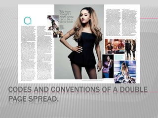
2. MAIN IMAGE.
The main image usually
takes up a large space in
the article.
The artist in the image
usually uses direct
address to entice the
reader and make them
want to read the article.
The image is usually used
to represent who/what the
artist wants to be
portrayed as.
3. IMAGE MISE-EN-SCENE
The main image usually
represents the artist. The
way the artist is standing,
how their hair is styled, their
outfit, their make-up, their
facial expression and their
use of direct address or not
all represent the artist in a
way they choose to be
represented. This way may
also match the article and
what it is about.
4. SUBSIDIARY IMAGES.
Subsidiary images are
smaller images used in
the article, they are
usually images of what
the artist has talked
about in the article.
They entice the reader
because if they see an
interesting image they
will want to read the
article.
They are used as a
representation of the
artist.
5. CAPTIONS.
Captions are used next
to or underneath the
images to give the
reader more information
on what the pictures are.
They can sometimes be
a quote from the article.
6. DROP CAP.
A drop cap is the big capital
letter at the start of the
article.
It is usually a different colour
and different font from the
rest of the text in the article.
It can be up to 10 lines
deep.
It adds style to the magazine
and creates a brand.
7. The page number is usually in
11pt writing and is sometimes
bold. It is used so the reader
can find articles they are
looking for.
The mast head is the same as it
is throughout the magazine. It is
used to create a band for the
magazine and make it
recognisable. However,
normally in other magazines it is
a lot bigger.
The date
is used so
regular
readers
can see
what issue
it is and
how often
new
issues
come out.
8. COLOUR SCHEME
The colour scheme
is usually 3-4
colours and very
simple. It usually
matches the main
image and can
often be a
representation of
the artist. The main
colours uses here
are black, white,
grey and blue.
9. TYPOGRAPHY.
The typography
for the bulk body
of the text is
usually 11pt in
size and a very
simple font. This
is so it is easy for
readers to read.
10. FIRST LINE OF ARTICLE IN BOLD OR CAPS.
The first line of the
article can either be
in bold or capital
letters. In my
example it is in
capital letters. This is
used to start he
article off and make it
entice the reader.
11. COLUMNS
An article is usually
set between 2 – 4
columns. This
makes it look neat
which will ultimately
make the reader
more likely to read
the article. It is also
done to fit the article
onto the double
page. My example
has 4 articles.
12. DROP QUOTES.
Some magazine
quotes may
include drop
quotes, which are
selected quotes
from the article
that are used o
entice the reader
and make them
want to read the
article to find out
what the quote is
13. CODES AND CONVENTIONS THAT DID NOT
FEATURE IN MY EXAMPLE.
Headline
Bold questions
Article summary
By-lines
Website
14. HEADLINE
Most articles have a headline across the top
which is a few words long and draws the
audience in.
BOLD QUESTIONS
Some articles may have the questions they
have asked the artist in bold to make them
stand out from the rest of the text
15. ARTICLE SUMMARY
Some magazines may have an article
summary before the article which sums up
what it is going to be about. This entices the
reader and can also help them decide if they
feel the article is worth reading or not.
BY-LINES
Some articles also feature by-lines which
tell you the name of the writer and the name
of the photographer.
16. WEBSITE
Some articles may also feature a website for
the magazine. This may be used to give
further article information or competition
information. It may also be used for
subscription information.