SlideShare a Scribd company logo
Vogue (AUS) Front Cover
The needs are met for the audience of 15-30 middle class/working class people because of
the font’s used and the portrait image of Lana del Rey, everybody knows who she is and she
isn’t a tacky singer she’s modest and elegant. In the primary optical and strong fallow area
you can see the start and end of the title ‘vogue’ and when people are looking for a
magazine to read this is where they normally look to see the titles so it is in the right place.
In the axis of orientation you can see Lana del Rey and all of her beauty so of course that is
an attraction, and a lot of people are inspired by her so if they see her on the cover they will
expect there to be an article/interview inside about her although it does just say she’s the
cover girl. In the terminal area it says ‘fashion and music’ in beautiful bright white writing,
normally vogue is directed at fashion but they are involving music and that will be a
connection to Lana being on the cover.
Close-up of Lana you can see the details of her makeup and accessories, it’s more personal,
direct mode of address, she’s an attractive model which is what you expect in a vogue
The font colour is gold,
in a way it matches Lana
because of her
accessories,gold
represents wealth,
glamour etc.
Some of the subheadings
are in boldto either show
the importance or to just
grab the audience’s
attention.
magazine. The font appeals more to women not just because of the font used but because
of the words ‘cover girl’ ‘super spring style’ ‘girls club’ ‘beauty update’ also it’s more
sophisticated than other magazines you see. It’s not only attracting vogue readers but it’s
attracting her fan base as well, many of her fans may not read vogue but will read it because
she’s on the cover and will know that there will be an interview inside from her. Gold
connotes rich, glamorous, sophisticated and that’s what vogue is but also what Lana Del Rey
is.
VOGUE DOUBLE PAGE SPREAD
CHERYL COLE
The subheadingisinboldcapital
lettersandisin the primary
optical area.
Colourful background,
colourful clothing,
unrelatedtothe feel of
the sub-heading‘survivor’.
The needs are met for the target audience of 14 to 30 year olds because of the person that’s
on the page ‘cheryl cole’ she has a lot of fans ranging from the age of 14 and up, I’m
stopping at 30 because that’s the age range of which people read vogue. The layout is
straightforward for the first page, and the thing that most attracts you as soon as you look is
the headline ‘survivor’ which is in the primary optical area and is in bold black font so that’s
where the audience’s eyes will look first, immediately it hooks you because of the title, a lot
of people know what survivor means but in this case they don’t know what it means for
Cheryl cole and want to find out what she’s a survivor of. On the second page to the double
spread you see Cheryl cole which is where you’ll look next because she’s in the strong
fallow area, the background behind her is a nice calmblue and she’s dressed in a neutral
colour dress with red shoes, this shoot isn’t really to do with her article as it’s no way
emotionally related to the title ‘survivor’ but it does relate to vogue in ways of fashion.
ELLE MAGAZINE – DAKOTA FANNING
Primaryoptical area – you
first see the letter ‘E’ which
continues as ‘ELLE’ and it’s in
red boldletters andalso ‘how
to reinvent your hair tonight’
so there’s two things you spot
first.
Strongfallowarea– price of
magazine,the date of the
magazine ‘Feb2012’ and
alsothe endof ELLE.
Weakfallowarea–
youcan understand
whyit isthe weak
fallowareabecause
there isnothing
there to interest
you.
Terminal area– Here is
where youlooklast,and
here iswhere yousee ‘its
prettyit’splayful it’sall
here’whatishere?What is
prettyand whatis playful?
Dakota fanning?Idon’t
know so I’mgoingto buyit
and findout!
White back-ground,it
looksas if she’sstood
infront of an ancient
Greekpillar.
The audience for ELLE would be the same as Vogue; age 15-30 and is aimed at girls instead
of boys, as you can see straight away on the cover is Dakota Fanning, the young woman who
has been in endless films, on endless covers of fashion magazines and who is known for her
pale skin and blonde hair. The background colours are a contrast compared to the colours
Dakota fanning is wearing, so she stands out more instead of the background standing out,
the background looks really nice and you have to have a close look to see what it actually is
– a Greek pillar. The colours she is associated with is red, blue and yellows, her hair is
blonde but her skirt is a shade of the same ‘yellow’ as her hair, her lipstick is a lovely shade
of red just like the font behind her ‘ELLE’ and the other sub-headings are also in red, I think
it’s really cool how the font is connected to her lips.
One of the subheadings say ‘why fashion is falling in love with Dakota fanning’ another says
‘the most exciting season ever for british fashion’ I suppose to purchase this magazine you
would have to be a fashion lover because you can tell as soon as you read the sub-headings
that the magazine is going to be filled with women’s fashion and how to get ‘fit’.
Q Magazine Double-Spread
S
Primaryoptical area–
The lightingonthe left
side isredwhichis a
colouryou wouldspot
straightaway.
Strongfallow area–
Afterlookingatthe primary
optical area,your eyesthen
go to the strong fallow area
where yousee a heavenly
blue,abig contrastto red.
Extreme close
up of Jay-Z is
used, on the
left sideof the
double spread.
The big ‘J’further
suggeststhatJay-Zis a
bigartist,the colourred
alsosuggeststhathe is
currentlyina dark,evil
state of mind.
Thisstateshe hasa
splitpersonality –a
calm side (blue)anda
evil side (red)
This double page spread shows the rapper JAY-Z. Therefore the Genre of the magazine is Hip
Hop. However the name of the magazine is 'Q-magazine' and it's published monthly in the
UK. The rapper Jay-z is placed on the left page and is photographed as a close up. On the
right side is the article about Jay-z and the background shows a capital 'J' in red, I think the
use of a drop capital in the background of the text is effective because it immediately allows
readers to see that the artist featured is Jay-Z. This would appeal to the target audience of
people interested in Rap/Hip-Hop music because of the layout. The text is quite small as it is
an article and all of the information needs to be in. The font is a mature, plain font to appeal
to the target audience, and making it easy to read. The vocabulary used is a lot of quotes
from Jay-Z and other artists, relevant to the article. The language is formal and it uses wide
range of sentences - no puns or colloquial language is used because of their target audience.
I also think the colouring is very effective on Jay-Z’s profile because it isn’t showing just one
primary colour, it’s showing two – red and blue, I think the meaning of this is split
personality; that he has two personality’s and red is his anger and blue is his serenity which
he shows both in his music and that is an excellent use of a connotation.

More Related Content

What's hot

Magazine Cover Analysis
Magazine Cover AnalysisMagazine Cover Analysis
Magazine Cover AnalysisFran Davies
 
Planning
Planning Planning
Planning
felicity myers
 
Task 5 – deciding which genre and style
Task 5 – deciding which genre and styleTask 5 – deciding which genre and style
Task 5 – deciding which genre and style
AS Media Column D
 
Cover page essay[1]
Cover page essay[1]Cover page essay[1]
Cover page essay[1]MorganClough
 
Q dps
Q dpsQ dps
Analysis of front covers
Analysis of front coversAnalysis of front covers
Analysis of front covers
EsmeJosling8299
 
Analysis of contents pages
Analysis of contents pagesAnalysis of contents pages
Analysis of contents pages
EsmeJosling8299
 
Magazine Front Cover Analysis 2
Magazine Front Cover Analysis 2Magazine Front Cover Analysis 2
Magazine Front Cover Analysis 2
StephanieAlabi
 
Analysis of double page spreads
Analysis of double page spreadsAnalysis of double page spreads
Analysis of double page spreads
EsmeJosling8299
 
Signs and Signifiers
Signs and SignifiersSigns and Signifiers
Signs and Signifiers
jademason
 
Question 2
Question 2 Question 2
Question 2
ginagoodall
 
Music magazine analysis
Music magazine analysisMusic magazine analysis
Music magazine analysis
webbyboi3
 
Deconstructions
DeconstructionsDeconstructions
DeconstructionsCalsMC
 
Contents
ContentsContents
Brina Johnson Media CA Research Presentation
Brina Johnson Media CA Research Presentation Brina Johnson Media CA Research Presentation
Brina Johnson Media CA Research Presentation
brinajohnson
 
Media magazine essay
Media magazine essayMedia magazine essay
Media magazine essayNicoleTonge
 
Analysis of my own magazine
Analysis of my own magazineAnalysis of my own magazine
Analysis of my own magazineasmediaf13
 
Front cover analysis essay and labelled analysis
Front cover analysis essay and labelled analysisFront cover analysis essay and labelled analysis
Front cover analysis essay and labelled analysisLizRose2012
 

What's hot (20)

Magazine Cover Analysis
Magazine Cover AnalysisMagazine Cover Analysis
Magazine Cover Analysis
 
Planning
Planning Planning
Planning
 
Task 5 – deciding which genre and style
Task 5 – deciding which genre and styleTask 5 – deciding which genre and style
Task 5 – deciding which genre and style
 
Cover page essay[1]
Cover page essay[1]Cover page essay[1]
Cover page essay[1]
 
Q dps
Q dpsQ dps
Q dps
 
Analysis of front covers
Analysis of front coversAnalysis of front covers
Analysis of front covers
 
Analysis of contents pages
Analysis of contents pagesAnalysis of contents pages
Analysis of contents pages
 
Magazine Front Cover Analysis 2
Magazine Front Cover Analysis 2Magazine Front Cover Analysis 2
Magazine Front Cover Analysis 2
 
Magazine analysis
Magazine analysisMagazine analysis
Magazine analysis
 
Analysis of double page spreads
Analysis of double page spreadsAnalysis of double page spreads
Analysis of double page spreads
 
Signs and Signifiers
Signs and SignifiersSigns and Signifiers
Signs and Signifiers
 
Question 2
Question 2 Question 2
Question 2
 
Music magazine analysis
Music magazine analysisMusic magazine analysis
Music magazine analysis
 
Deconstructions
DeconstructionsDeconstructions
Deconstructions
 
Contents
ContentsContents
Contents
 
Brina Johnson Media CA Research Presentation
Brina Johnson Media CA Research Presentation Brina Johnson Media CA Research Presentation
Brina Johnson Media CA Research Presentation
 
Media magazine essay
Media magazine essayMedia magazine essay
Media magazine essay
 
Analysis of my own magazine
Analysis of my own magazineAnalysis of my own magazine
Analysis of my own magazine
 
Task 5
Task 5Task 5
Task 5
 
Front cover analysis essay and labelled analysis
Front cover analysis essay and labelled analysisFront cover analysis essay and labelled analysis
Front cover analysis essay and labelled analysis
 

Viewers also liked

Pr11 production commentary
Pr11 production commentaryPr11 production commentary
Pr11 production commentary
shaunaeleacy
 
Preparing Images
Preparing Images Preparing Images
Preparing Images
kelseykiki
 
Pr11 Production Commentary
Pr11 Production CommentaryPr11 Production Commentary
Pr11 Production Commentary
kelseykiki
 
Pr9 – sourcing images
Pr9 – sourcing imagesPr9 – sourcing images
Pr9 – sourcing imageswolllfie
 
Production comentary
Production comentaryProduction comentary
Production comentarywolllfie
 
Analysing text (emilys article)
Analysing text (emilys article)Analysing text (emilys article)
Analysing text (emilys article)
shaunaeleacy
 
Review on dan's work
Review on dan's workReview on dan's work
Review on dan's workwolllfie
 
Corrections
CorrectionsCorrections
Corrections
danhops888
 
Pr8 Unit 51 Task 1
Pr8 Unit 51 Task 1Pr8 Unit 51 Task 1
Pr8 Unit 51 Task 1SarahMurrayy
 
Product research
Product researchProduct research
Product research
shaunaeleacy
 
Unit 51 PR9 sourcing images
Unit 51 PR9 sourcing imagesUnit 51 PR9 sourcing images
Unit 51 PR9 sourcing images
kelseykiki
 
Music questionnaire
Music questionnaireMusic questionnaire
Music questionnaireLuke Finlay
 
Image manipulation
Image manipulationImage manipulation
Image manipulation
shaunaeleacy
 
Unit 51 evaluation
Unit 51 evaluationUnit 51 evaluation
Unit 51 evaluationLuke Finlay
 
Magazine cover analysis
Magazine cover analysisMagazine cover analysis
Magazine cover analysis
danhops888
 
Unit 51 page layout & design task 2
Unit 51 page layout & design task 2Unit 51 page layout & design task 2
Unit 51 page layout & design task 2wolllfie
 
Magazine analysis
Magazine analysisMagazine analysis
Magazine analysisHaiiEmmaa
 
Layout presentation
Layout presentationLayout presentation
Layout presentation
shaunaeleacy
 
Pr11 production commentary sarah murray
Pr11 production commentary sarah murrayPr11 production commentary sarah murray
Pr11 production commentary sarah murraySarahMurrayy
 

Viewers also liked (20)

Pr11 production commentary
Pr11 production commentaryPr11 production commentary
Pr11 production commentary
 
Preparing Images
Preparing Images Preparing Images
Preparing Images
 
Pr11 Production Commentary
Pr11 Production CommentaryPr11 Production Commentary
Pr11 Production Commentary
 
Pr9 – sourcing images
Pr9 – sourcing imagesPr9 – sourcing images
Pr9 – sourcing images
 
Production comentary
Production comentaryProduction comentary
Production comentary
 
Analysing text (emilys article)
Analysing text (emilys article)Analysing text (emilys article)
Analysing text (emilys article)
 
Review on dan's work
Review on dan's workReview on dan's work
Review on dan's work
 
Corrections
CorrectionsCorrections
Corrections
 
Pr8 Unit 51 Task 1
Pr8 Unit 51 Task 1Pr8 Unit 51 Task 1
Pr8 Unit 51 Task 1
 
Product research
Product researchProduct research
Product research
 
Unit 51 PR9 sourcing images
Unit 51 PR9 sourcing imagesUnit 51 PR9 sourcing images
Unit 51 PR9 sourcing images
 
Music questionnaire
Music questionnaireMusic questionnaire
Music questionnaire
 
Image manipulation
Image manipulationImage manipulation
Image manipulation
 
Unit 51 evaluation
Unit 51 evaluationUnit 51 evaluation
Unit 51 evaluation
 
Magazine cover analysis
Magazine cover analysisMagazine cover analysis
Magazine cover analysis
 
Pr10
Pr10Pr10
Pr10
 
Unit 51 page layout & design task 2
Unit 51 page layout & design task 2Unit 51 page layout & design task 2
Unit 51 page layout & design task 2
 
Magazine analysis
Magazine analysisMagazine analysis
Magazine analysis
 
Layout presentation
Layout presentationLayout presentation
Layout presentation
 
Pr11 production commentary sarah murray
Pr11 production commentary sarah murrayPr11 production commentary sarah murray
Pr11 production commentary sarah murray
 

Similar to PR8: Product Research

Music magazine analysis
Music magazine analysis Music magazine analysis
Music magazine analysis
ellentozer1
 
Music magazine analysis
Music magazine analysis Music magazine analysis
Music magazine analysis
ellentozer
 
Music magazine analysis
Music magazine analysisMusic magazine analysis
Music magazine analysis
ellentozer
 
Front Cover Analysis
Front Cover AnalysisFront Cover Analysis
Front Cover Analysisrebeccadahl98
 
Music Magazine Analysis
Music Magazine Analysis Music Magazine Analysis
Music Magazine Analysis
Vic Addis
 
Music Magazine Analysis
Music Magazine AnalysisMusic Magazine Analysis
Music Magazine Analysis
Vic Addis
 
Front Cover Analysis
Front Cover Analysis Front Cover Analysis
Front Cover Analysis
Shauna-Mullen
 
Music magazine analysis
Music magazine analysisMusic magazine analysis
Music magazine analysis
Vic Addis
 
Signs and Signifiers
Signs and SignifiersSigns and Signifiers
Signs and Signifiers
anniemyatt
 
UNIT 14 LEARNING AIM A
UNIT 14 LEARNING AIM AUNIT 14 LEARNING AIM A
UNIT 14 LEARNING AIM A
BenWalmsley8
 
Learning Aim A
Learning Aim ALearning Aim A
Learning Aim A
BenWalmsley8
 
Music magazine presentation task
Music magazine presentation taskMusic magazine presentation task
Music magazine presentation taskmeghannallardd
 
magazine analysis.
magazine analysis. magazine analysis.
magazine analysis.
rebecca14150330
 
Q is a popularddad music magazine which features a variety of different artists
Q is a popularddad music magazine which features a variety of different artistsQ is a popularddad music magazine which features a variety of different artists
Q is a popularddad music magazine which features a variety of different artists
rebecca14150330
 
Signs and Signifiers
Signs and SignifiersSigns and Signifiers
Signs and Signifiers
theogoodman
 
Presentation1.pptx signs and signifiers
Presentation1.pptx signs and signifiersPresentation1.pptx signs and signifiers
Presentation1.pptx signs and signifiers
anniemyatt
 
Task two Evaluation
Task two Evaluation Task two Evaluation
Task two Evaluation
Pancakes31
 
Task 3
Task 3 Task 3
Task 3
sheenaaustinn
 
GCSE Media Studies Coursework - Magazine research and planning
GCSE Media Studies Coursework - Magazine research and planningGCSE Media Studies Coursework - Magazine research and planning
GCSE Media Studies Coursework - Magazine research and planning
Neill Ford
 
Analysing music magazine 2
Analysing music magazine 2Analysing music magazine 2
Analysing music magazine 2
Mariah Loizou
 

Similar to PR8: Product Research (20)

Music magazine analysis
Music magazine analysis Music magazine analysis
Music magazine analysis
 
Music magazine analysis
Music magazine analysis Music magazine analysis
Music magazine analysis
 
Music magazine analysis
Music magazine analysisMusic magazine analysis
Music magazine analysis
 
Front Cover Analysis
Front Cover AnalysisFront Cover Analysis
Front Cover Analysis
 
Music Magazine Analysis
Music Magazine Analysis Music Magazine Analysis
Music Magazine Analysis
 
Music Magazine Analysis
Music Magazine AnalysisMusic Magazine Analysis
Music Magazine Analysis
 
Front Cover Analysis
Front Cover Analysis Front Cover Analysis
Front Cover Analysis
 
Music magazine analysis
Music magazine analysisMusic magazine analysis
Music magazine analysis
 
Signs and Signifiers
Signs and SignifiersSigns and Signifiers
Signs and Signifiers
 
UNIT 14 LEARNING AIM A
UNIT 14 LEARNING AIM AUNIT 14 LEARNING AIM A
UNIT 14 LEARNING AIM A
 
Learning Aim A
Learning Aim ALearning Aim A
Learning Aim A
 
Music magazine presentation task
Music magazine presentation taskMusic magazine presentation task
Music magazine presentation task
 
magazine analysis.
magazine analysis. magazine analysis.
magazine analysis.
 
Q is a popularddad music magazine which features a variety of different artists
Q is a popularddad music magazine which features a variety of different artistsQ is a popularddad music magazine which features a variety of different artists
Q is a popularddad music magazine which features a variety of different artists
 
Signs and Signifiers
Signs and SignifiersSigns and Signifiers
Signs and Signifiers
 
Presentation1.pptx signs and signifiers
Presentation1.pptx signs and signifiersPresentation1.pptx signs and signifiers
Presentation1.pptx signs and signifiers
 
Task two Evaluation
Task two Evaluation Task two Evaluation
Task two Evaluation
 
Task 3
Task 3 Task 3
Task 3
 
GCSE Media Studies Coursework - Magazine research and planning
GCSE Media Studies Coursework - Magazine research and planningGCSE Media Studies Coursework - Magazine research and planning
GCSE Media Studies Coursework - Magazine research and planning
 
Analysing music magazine 2
Analysing music magazine 2Analysing music magazine 2
Analysing music magazine 2
 

More from wolllfie

Task 4 final images landscape
Task 4 final images landscapeTask 4 final images landscape
Task 4 final images landscapewolllfie
 
Task 4 final images landscape
Task 4 final images landscapeTask 4 final images landscape
Task 4 final images landscapewolllfie
 
Olivia singleton fmp diary main
Olivia singleton fmp diary mainOlivia singleton fmp diary main
Olivia singleton fmp diary mainwolllfie
 
Magazine research
Magazine researchMagazine research
Magazine researchwolllfie
 
Task 1 part 2
Task 1 part 2Task 1 part 2
Task 1 part 2wolllfie
 
Task 1 part 1
Task 1 part 1Task 1 part 1
Task 1 part 1wolllfie
 
New evaluation fmp completed
New evaluation fmp completedNew evaluation fmp completed
New evaluation fmp completedwolllfie
 
Task 7 previous work
Task 7 previous workTask 7 previous work
Task 7 previous workwolllfie
 
Task 6 research magazine covers
Task 6 research magazine coversTask 6 research magazine covers
Task 6 research magazine coverswolllfie
 
Task 5 research styles of makeup and hair
Task 5 research styles of makeup and hairTask 5 research styles of makeup and hair
Task 5 research styles of makeup and hairwolllfie
 
Task 4 photography theme ideas
Task 4 photography theme ideasTask 4 photography theme ideas
Task 4 photography theme ideaswolllfie
 
Task 3 mind map ideas
Task 3 mind map ideasTask 3 mind map ideas
Task 3 mind map ideaswolllfie
 
Task 2 research different settings
Task 2 research different settingsTask 2 research different settings
Task 2 research different settingswolllfie
 
Task 1 research famous portrait photographers
Task 1 research famous portrait photographersTask 1 research famous portrait photographers
Task 1 research famous portrait photographerswolllfie
 
Unit 51 page layout & design task 2
Unit 51 page layout & design task 2Unit 51 page layout & design task 2
Unit 51 page layout & design task 2
wolllfie
 
Pr7 remake
Pr7 remakePr7 remake
Pr7 remakewolllfie
 
Pr7 remake
Pr7 remakePr7 remake
Pr7 remakewolllfie
 

More from wolllfie (20)

Task 4 final images landscape
Task 4 final images landscapeTask 4 final images landscape
Task 4 final images landscape
 
Task 4 final images landscape
Task 4 final images landscapeTask 4 final images landscape
Task 4 final images landscape
 
Olivia singleton fmp diary main
Olivia singleton fmp diary mainOlivia singleton fmp diary main
Olivia singleton fmp diary main
 
Magazine research
Magazine researchMagazine research
Magazine research
 
Task 1 part 2
Task 1 part 2Task 1 part 2
Task 1 part 2
 
Task 1 part 1
Task 1 part 1Task 1 part 1
Task 1 part 1
 
New evaluation fmp completed
New evaluation fmp completedNew evaluation fmp completed
New evaluation fmp completed
 
Task 7 previous work
Task 7 previous workTask 7 previous work
Task 7 previous work
 
Task 6 research magazine covers
Task 6 research magazine coversTask 6 research magazine covers
Task 6 research magazine covers
 
Task 5 research styles of makeup and hair
Task 5 research styles of makeup and hairTask 5 research styles of makeup and hair
Task 5 research styles of makeup and hair
 
Task 4 photography theme ideas
Task 4 photography theme ideasTask 4 photography theme ideas
Task 4 photography theme ideas
 
Task 3 mind map ideas
Task 3 mind map ideasTask 3 mind map ideas
Task 3 mind map ideas
 
Task 2 research different settings
Task 2 research different settingsTask 2 research different settings
Task 2 research different settings
 
Task 1 research famous portrait photographers
Task 1 research famous portrait photographersTask 1 research famous portrait photographers
Task 1 research famous portrait photographers
 
Db17 new
Db17 newDb17 new
Db17 new
 
Db17
Db17Db17
Db17
 
Db17
Db17Db17
Db17
 
Unit 51 page layout & design task 2
Unit 51 page layout & design task 2Unit 51 page layout & design task 2
Unit 51 page layout & design task 2
 
Pr7 remake
Pr7 remakePr7 remake
Pr7 remake
 
Pr7 remake
Pr7 remakePr7 remake
Pr7 remake
 

PR8: Product Research

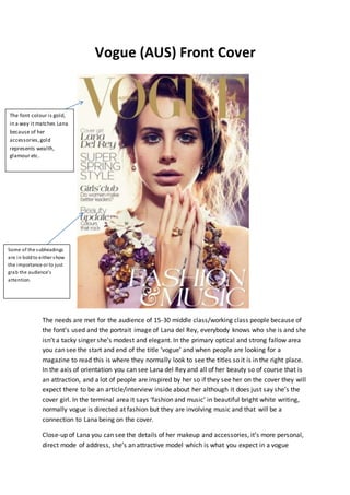
  • 1. Vogue (AUS) Front Cover The needs are met for the audience of 15-30 middle class/working class people because of the font’s used and the portrait image of Lana del Rey, everybody knows who she is and she isn’t a tacky singer she’s modest and elegant. In the primary optical and strong fallow area you can see the start and end of the title ‘vogue’ and when people are looking for a magazine to read this is where they normally look to see the titles so it is in the right place. In the axis of orientation you can see Lana del Rey and all of her beauty so of course that is an attraction, and a lot of people are inspired by her so if they see her on the cover they will expect there to be an article/interview inside about her although it does just say she’s the cover girl. In the terminal area it says ‘fashion and music’ in beautiful bright white writing, normally vogue is directed at fashion but they are involving music and that will be a connection to Lana being on the cover. Close-up of Lana you can see the details of her makeup and accessories, it’s more personal, direct mode of address, she’s an attractive model which is what you expect in a vogue The font colour is gold, in a way it matches Lana because of her accessories,gold represents wealth, glamour etc. Some of the subheadings are in boldto either show the importance or to just grab the audience’s attention.
  • 2. magazine. The font appeals more to women not just because of the font used but because of the words ‘cover girl’ ‘super spring style’ ‘girls club’ ‘beauty update’ also it’s more sophisticated than other magazines you see. It’s not only attracting vogue readers but it’s attracting her fan base as well, many of her fans may not read vogue but will read it because she’s on the cover and will know that there will be an interview inside from her. Gold connotes rich, glamorous, sophisticated and that’s what vogue is but also what Lana Del Rey is. VOGUE DOUBLE PAGE SPREAD CHERYL COLE The subheadingisinboldcapital lettersandisin the primary optical area. Colourful background, colourful clothing, unrelatedtothe feel of the sub-heading‘survivor’.
  • 3. The needs are met for the target audience of 14 to 30 year olds because of the person that’s on the page ‘cheryl cole’ she has a lot of fans ranging from the age of 14 and up, I’m stopping at 30 because that’s the age range of which people read vogue. The layout is straightforward for the first page, and the thing that most attracts you as soon as you look is the headline ‘survivor’ which is in the primary optical area and is in bold black font so that’s where the audience’s eyes will look first, immediately it hooks you because of the title, a lot of people know what survivor means but in this case they don’t know what it means for Cheryl cole and want to find out what she’s a survivor of. On the second page to the double spread you see Cheryl cole which is where you’ll look next because she’s in the strong fallow area, the background behind her is a nice calmblue and she’s dressed in a neutral colour dress with red shoes, this shoot isn’t really to do with her article as it’s no way emotionally related to the title ‘survivor’ but it does relate to vogue in ways of fashion. ELLE MAGAZINE – DAKOTA FANNING Primaryoptical area – you first see the letter ‘E’ which continues as ‘ELLE’ and it’s in red boldletters andalso ‘how to reinvent your hair tonight’ so there’s two things you spot first. Strongfallowarea– price of magazine,the date of the magazine ‘Feb2012’ and alsothe endof ELLE. Weakfallowarea– youcan understand whyit isthe weak fallowareabecause there isnothing there to interest you. Terminal area– Here is where youlooklast,and here iswhere yousee ‘its prettyit’splayful it’sall here’whatishere?What is prettyand whatis playful? Dakota fanning?Idon’t know so I’mgoingto buyit and findout! White back-ground,it looksas if she’sstood infront of an ancient Greekpillar.
  • 4. The audience for ELLE would be the same as Vogue; age 15-30 and is aimed at girls instead of boys, as you can see straight away on the cover is Dakota Fanning, the young woman who has been in endless films, on endless covers of fashion magazines and who is known for her pale skin and blonde hair. The background colours are a contrast compared to the colours Dakota fanning is wearing, so she stands out more instead of the background standing out, the background looks really nice and you have to have a close look to see what it actually is – a Greek pillar. The colours she is associated with is red, blue and yellows, her hair is blonde but her skirt is a shade of the same ‘yellow’ as her hair, her lipstick is a lovely shade of red just like the font behind her ‘ELLE’ and the other sub-headings are also in red, I think it’s really cool how the font is connected to her lips. One of the subheadings say ‘why fashion is falling in love with Dakota fanning’ another says ‘the most exciting season ever for british fashion’ I suppose to purchase this magazine you would have to be a fashion lover because you can tell as soon as you read the sub-headings that the magazine is going to be filled with women’s fashion and how to get ‘fit’. Q Magazine Double-Spread S Primaryoptical area– The lightingonthe left side isredwhichis a colouryou wouldspot straightaway. Strongfallow area– Afterlookingatthe primary optical area,your eyesthen go to the strong fallow area where yousee a heavenly blue,abig contrastto red. Extreme close up of Jay-Z is used, on the left sideof the double spread. The big ‘J’further suggeststhatJay-Zis a bigartist,the colourred alsosuggeststhathe is currentlyina dark,evil state of mind. Thisstateshe hasa splitpersonality –a calm side (blue)anda evil side (red)
  • 5. This double page spread shows the rapper JAY-Z. Therefore the Genre of the magazine is Hip Hop. However the name of the magazine is 'Q-magazine' and it's published monthly in the UK. The rapper Jay-z is placed on the left page and is photographed as a close up. On the right side is the article about Jay-z and the background shows a capital 'J' in red, I think the use of a drop capital in the background of the text is effective because it immediately allows readers to see that the artist featured is Jay-Z. This would appeal to the target audience of people interested in Rap/Hip-Hop music because of the layout. The text is quite small as it is an article and all of the information needs to be in. The font is a mature, plain font to appeal to the target audience, and making it easy to read. The vocabulary used is a lot of quotes from Jay-Z and other artists, relevant to the article. The language is formal and it uses wide range of sentences - no puns or colloquial language is used because of their target audience. I also think the colouring is very effective on Jay-Z’s profile because it isn’t showing just one primary colour, it’s showing two – red and blue, I think the meaning of this is split personality; that he has two personality’s and red is his anger and blue is his serenity which he shows both in his music and that is an excellent use of a connotation.