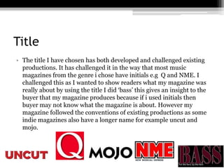
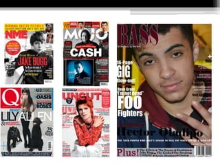
My media product uses and challenges some conventions of existing music magazines. It uses conventions like a focus on indie music, red coloring associated with that genre, and layouts that make content easy to find. However, it challenges conventions by having a longer descriptive title rather than initials, and not including text on one side of the double page spread to focus solely on the image. Overall, the goal was to be unique while still attracting readers through some familiar conventions.